Salvador Salort-Pons, Director of the Detroit Institute of Art, at the media preview introducing Detroit Collects.
Detroit Collects: Selections of African-American Art from Private Collections
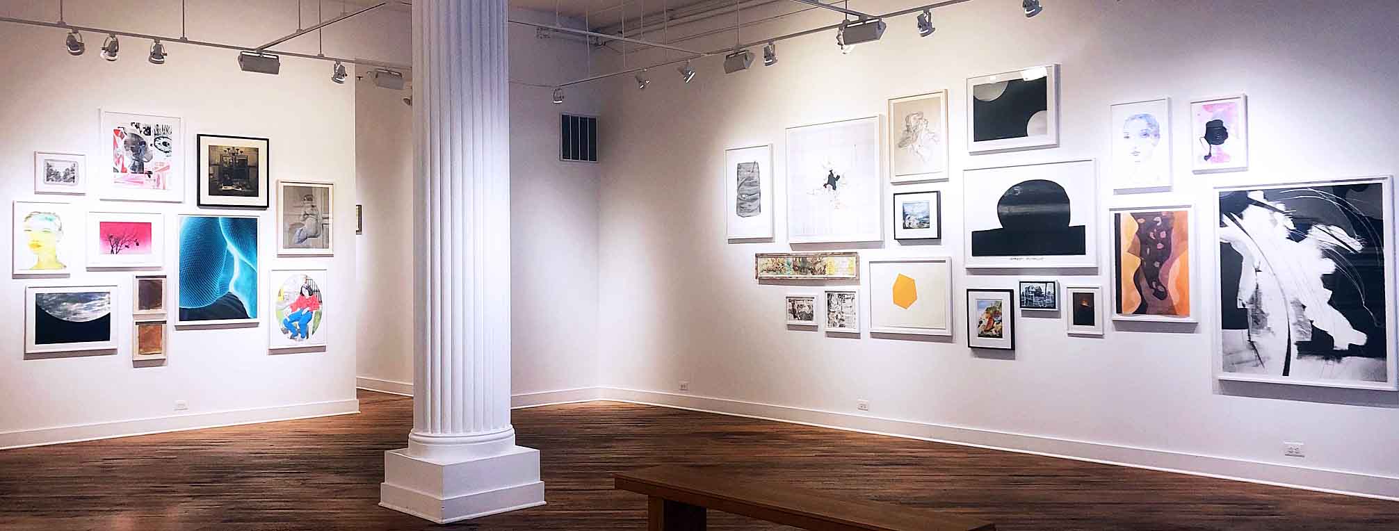
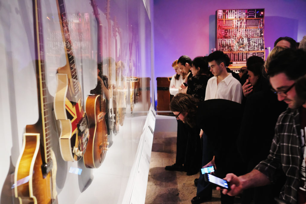
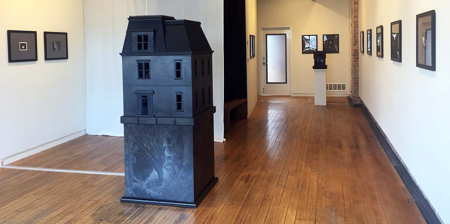
I knew the DIA was working on an exhibition of African American Art that was scheduled to open in mid-November, 2019. Still, I did not know anything about the curation process. This exhibition of sixty works of art with a range of media is on loan and is comprised of nineteen local Detroit collectors. In all my experience, just the concept was interesting, intriguing and unique.
At the media preview, from the moment DIA Director Salvador Salort-Pons took the podium to introduce the exhibition, it was clear this project was personal. He said,” When I became the director of the Detroit Institute of Arts (DIA), it was immediately clear to me that the museum needed to acknowledge an extraordinary effort to connect with these communities of art lovers, tell their stories and show in our galleries the fruit of their long-standing passion.”
Not since I bought my first DIA poster in 1972 of a traveling Matisse Exhibition had I ever seen or heard of a museum taking this approach to curating from local collectors. That morning, Director Salort-Pons talked about how he and his wife Alex, after many years of living outside the city, quickly recognized the need to connect and acknowledge the art by recognizing artists living in a city community that was 80% African American. He mentioned a memory he had of the gatherings of artists and writers called “tertulias” which used to take place in the local cafes of Spain in the late 19th and early 20th century that were the cultural engines of the time. Over the past three years, along with his curator, Valerie J. Mercer, the General Motors curator for African American art since 2000, they began to support and execute a new vision, drawn from the many dinners, breakfast meetings and lunches to identify artists and collectors of African American art in Detroit.
“The DIA’s General Motors Center for African American Art is the first curatorial department dedicated to African American art in the U.S.,” said Salort-Pons. “This exhibition builds on our history of collecting and displaying African American art and creates a new opportunity for our visitors to see themselves reflected in the museum’s galleries.”
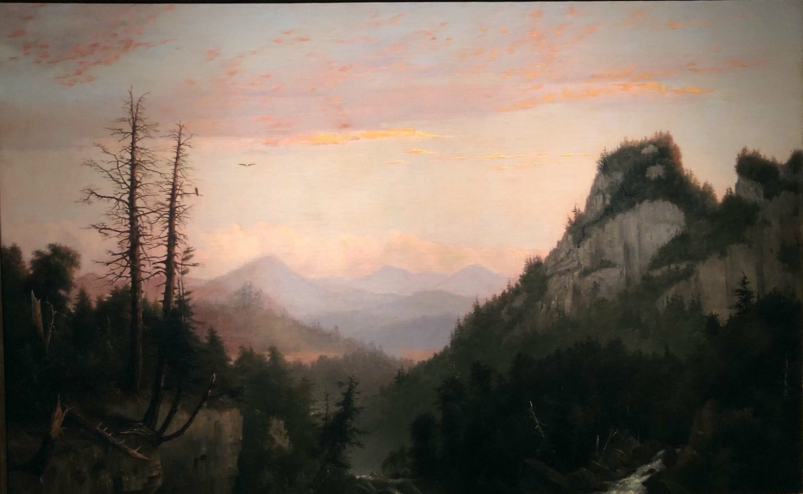
Robert S. Duncanson, Flight of the Eagle, Oil on Canvas, 1856
The artist Robert S. Duncanson was prevented from any kind of formal art training because of the institutional racism that existed in the 19th century. Yet, this forested landscape, Flight of the Eagle, completed in 1856, could be compared to the work of William Mason Brown or Frederic Edwin Church. At the center a soaring eagle, the U.S. National bird, has flown from its mate on the branch of a dead tree. Duncanson was born in Seneca County, New York, in 1821 to an African-American mother and Scottish-Canadian father, who sent his son to Canadian schools during his youth. In 1841 Duncanson and his mother moved to Mt. Healthy, Ohio, near Cincinnati. His biography says that in 1849, Duncanson established a studio in Detroit where he had been active as early as 1846. His artistic activities were favorably noted in both Cincinnati and Detroit, where he worked throughout his career supported by abolitionists who commissioned his work. For the Detroit Collects exhibition, this work is on loan from the collection of Walter O. and Linda Evans.
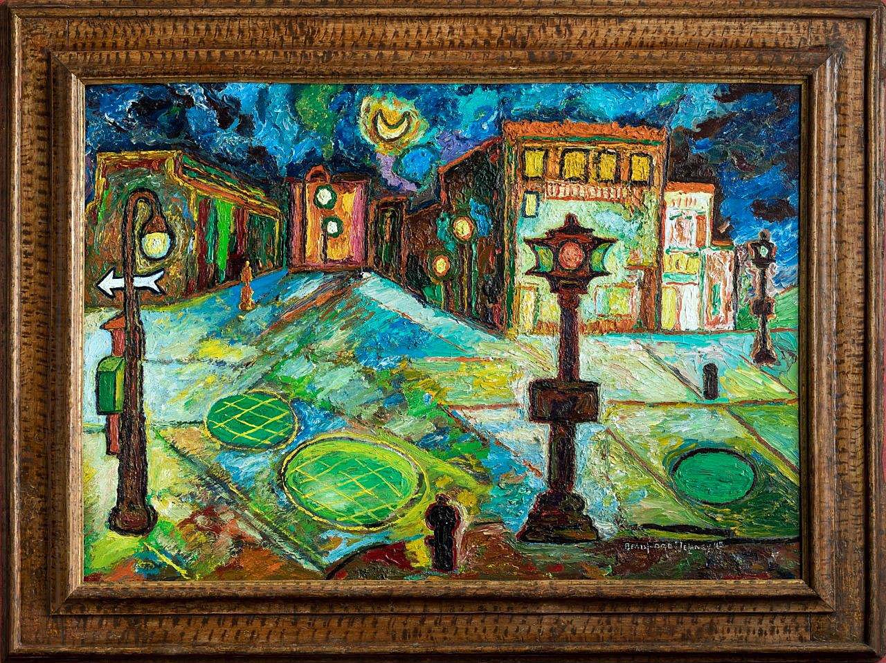
Beauford Delaney, Greenwich Village, Oil on Canvas, 1945
Beauford Delaney was born December 30, 1901, in Knoxville, Tennessee where his parents were prominent and respected members of Knoxville’s African-American community. His father Samuel was both a barber and a Methodist minister, but he is remembered for his work with the Harlem Renaissance in the 1930s. In his work, Greenwich Village, Delaney depicts the illuminated streets of New York City’s Greenwich Village where the artist settled in the mid-1930s. Having a studio in Greenwich Village, he became part of a gay bohemian circle of friends. He established himself as part of the NYC art scene, which included artists such as Alfred Stieglitz, Georgia O’Keeffe, and the young writer James Baldwin. For the Detroit Collects exhibition, this work is on loan from the collection of Mary Anne and Eugene A. Gargaro Jr.
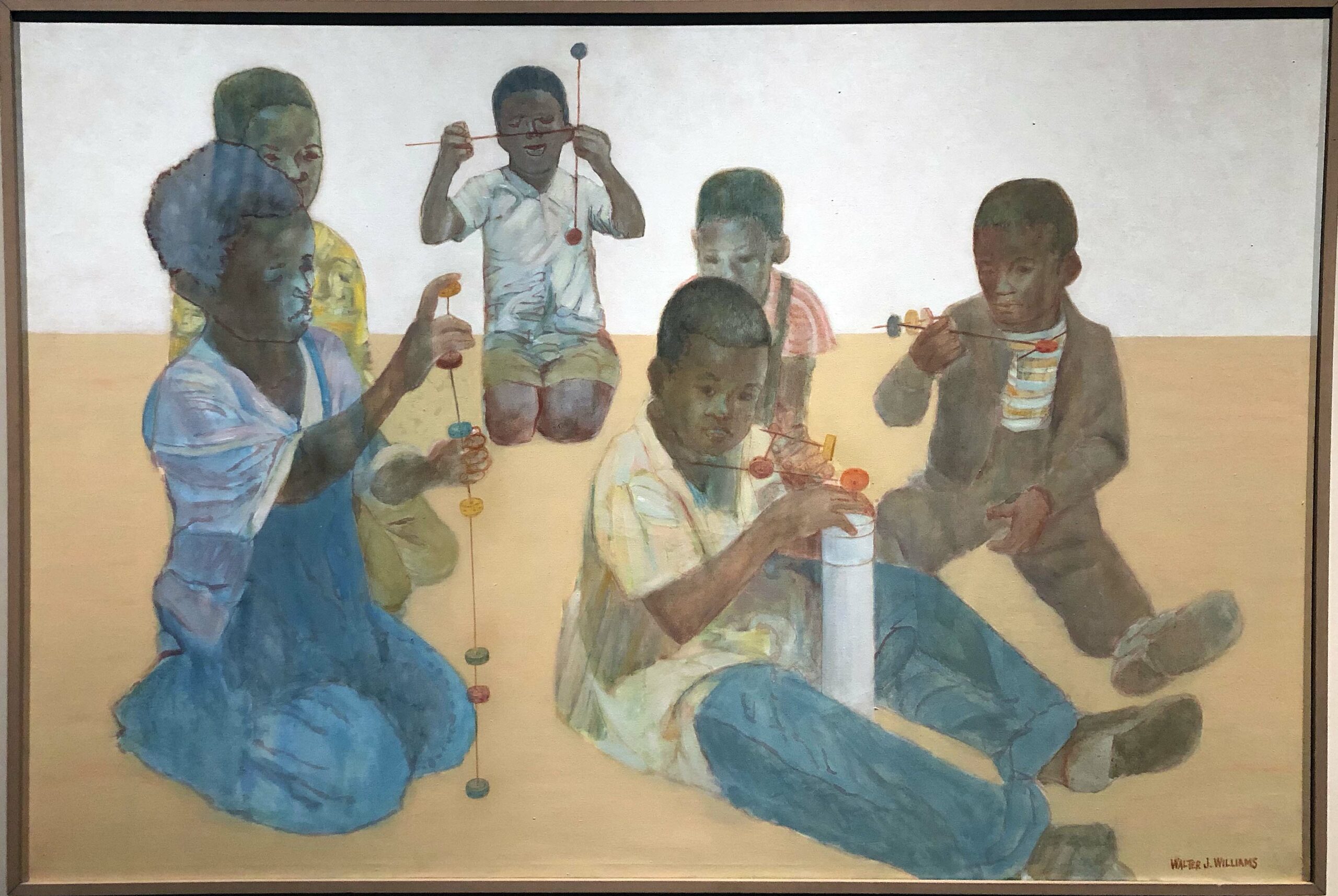
Walter J. Williams Jr., Children at Play, Oil on Canvas, 1975
Children at Play, by Walter J. Williams Jr., is a touching figure painting that conveys the innocence of childhood while boys play without a worry in the world. The composition contrasts six figures with soft and translucent oil paint colors while they explore the simplest of abstract shapes. The idyllic and peaceful setting draws the viewer into a place where everyone would want their child to live and learn. Williams enrolled at the Brooklyn Museum Art School in 1951, where he was scholarly and was said to have paid close attention to his lessons. In the summer of 1953, he studied at the Skowhegan School of Art in Maine and participated in his first major group show, the Whitney’s 1953 Annual Exhibition of Contemporary American Painting. For the Detroit Collects exhibition, this work is on loan from the collection of Darnell and Shirley A. Kaigler.
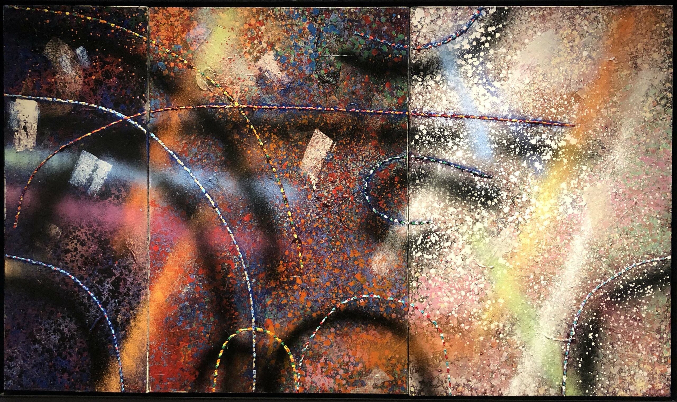
Alvin Loving, untitled Triptych, Oil and Collage on Canvas, 1981
Al Loving was born in Detroit in 1935 and is one of the best known national artist whose work grew from his interest in the work of Josef Albers. Loving earned a BFA from the University of Illinois at Urbana-Champaign in 1963 and an MFA from the University of Michigan, Ann Arbor. In 1969, Loving famously became the first African-American to have a one-person show at the Whitney Museum of American Art. In the work Untitled Triptych, Loving’s abstraction knocks the viewer off their feet with this vast array of shape, line, color, and depth of space. I was familiar with much of Al Loving’s work, but not this magical triptych that keeps the viewer spellbound. For the Detroit Collects exhibition, this work is on loan from the collection of Roy and Maureen Roberts.
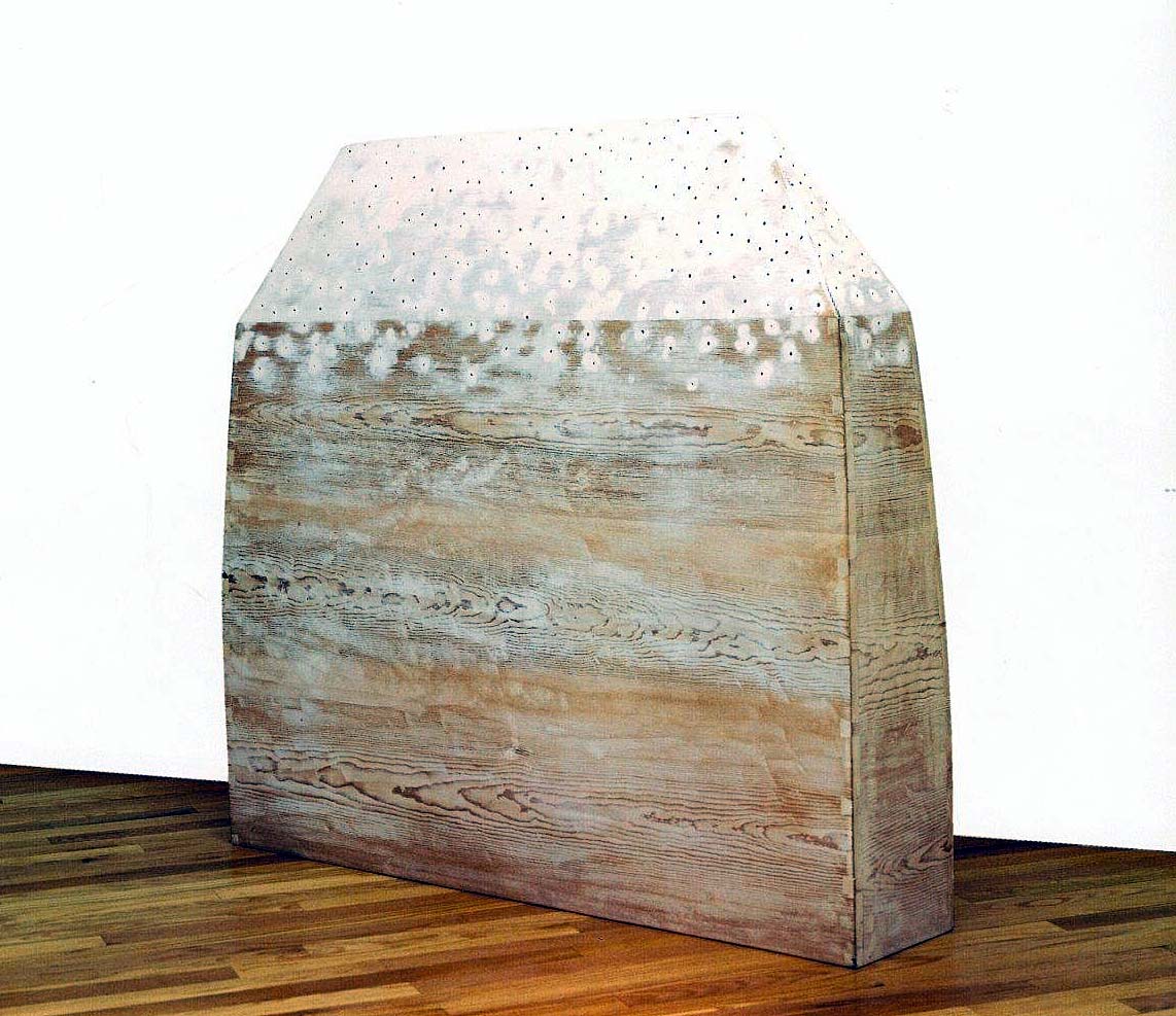
Martin Puryear, Reliqary, Gessoed Pine, 1980
Martin Puryear was born in 1941 in Washington, D.C., and began exploring traditional craft methods in his youth, making tools, boats, musical instruments and furniture. After receiving a B.A. in Fine Art from the Catholic University of America in 1963, Puryear spent two years as a Peace volunteer in Sierra Leone, where he learned local woodworking techniques. In the work Reliquary, one could see something spiritual as in a tombstone-like object made of pine planks with dovetail joints, but the field of holes covered in a translucent gesso coating suggests otherwise. Over his lifetime, this work has remained visibly complex, both organic and geometric, where he falls into both areas of Minimalism and Formalistic sculpture. Puryear earned his MFA from Yale and began teaching at Fisk University in Nashville and at the University of Maryland in College Park. In 1977, following a devastating fire in his Brooklyn studio, Puryear had a solo show at the Corcoran Gallery of Art in Washington, D.C. For the Detroit Collects exhibition, this work is on loan from the collection of Gayle and Andrew Camden.
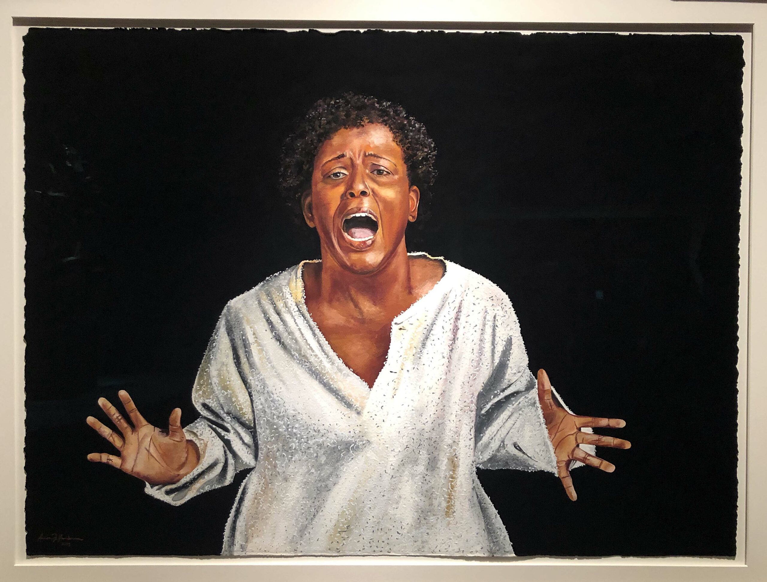
Aaron F. Henderson, Stomp It Down, Gouache, 2015
Aaron F. Henderson, a native of Birmingham, Alabama, has been an artist all his life. The self-proclaimed narrative artist has always loved to draw and paint. He works mainly in oils and gouache on canvas, linen and 100% cotton paper using bold, vibrant colors in his artwork that is showcased in exhibits, museums and corporations and private homes around the world. Henderson’s style has been influenced by such legendary artists as Elizabeth Catlett, William H. Johnson, Charles White and Jacob Lawrence. The woman in Stomp It Down is so beautifully and realistically rendered that she seems to emerge from the paper. The work is part of a series that visualizes the spirituals sung by enslaved people of African descent as an act of defiance and self-expression. The song called “Stomp It Down” refers to the injustices that will be eradicated once freedom is achieved. For the Detroit Collects exhibition, this work is on loan from the collection of David and Linda Whitaker.
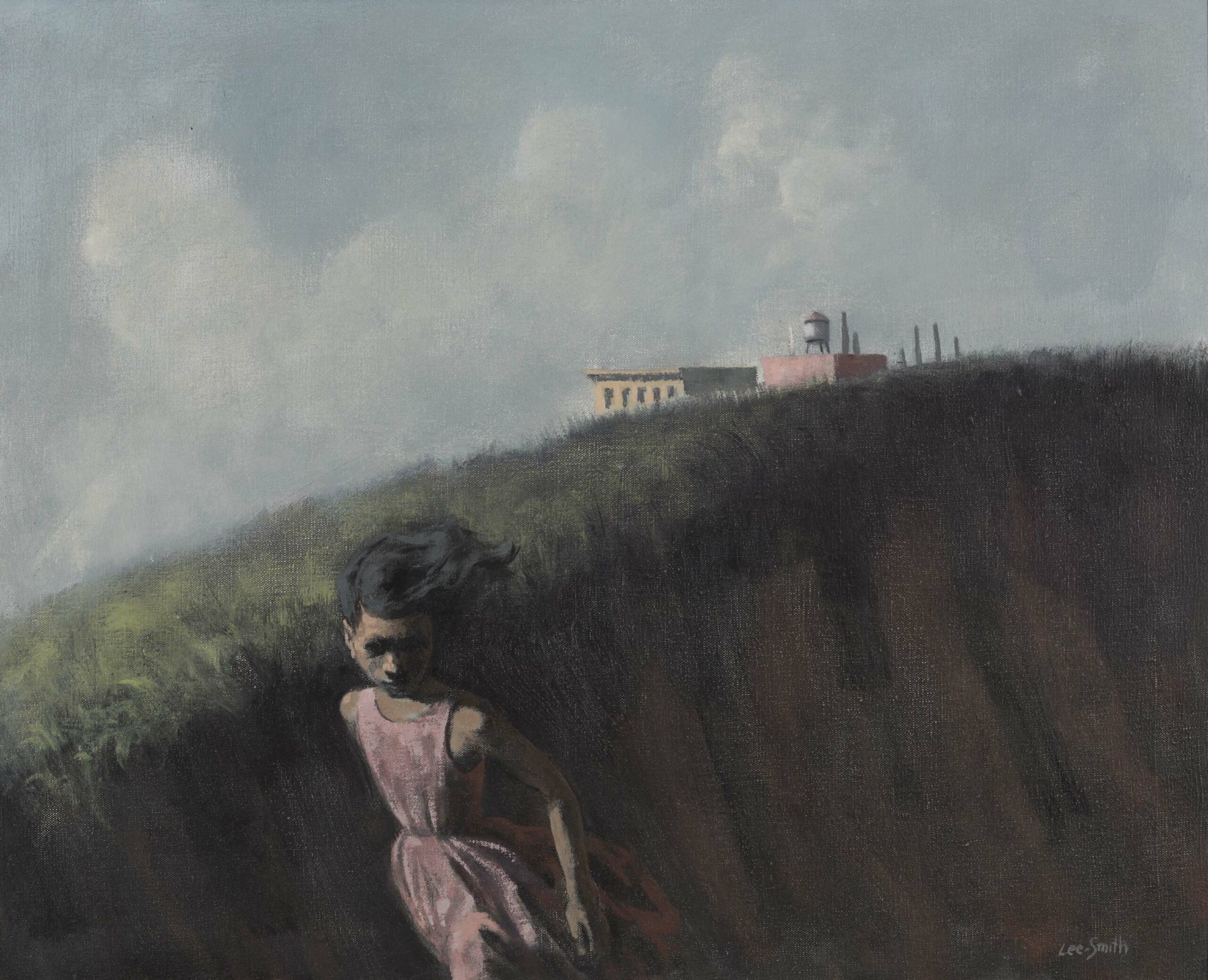
Hughie Lee-Smith, Girl Fleeing, Oil on Canvas, 1959
Hughie Lee-Smith was an African American artist and teacher whose surreal paintings often featured distant figures under vast skies and desolate urban settings. In 1958 Lee-Smith moved to New York City and taught at the Art Students League for 15 years. Holland Cotter of the New York Times wrote, “Mr. Lee-Smith’s paintings usually have spare settings suggestive of theater stages or bleak urban or seaside landscapes. Walls stretch out under gray skies. Men and women, as lithe as dancers, seem frozen in place. Most are dressed in street clothes; some wear exotic masks. Children frequently appear, as do props reminiscent of circuses. The work has an air of mystery associated with the paintings of Giorgio and Edward Hopper.” In the painting Girl Fleeing, the young girl is escaping from the factory without explanation, reminiscent of the woman in Andrew Wyeth’s “Christina’s World.” For the Detroit Collects exhibition, this work is on loan from the collection of Jerome Watson and Deborah Ford.
Sam Gilliam, Wave Composition, Acrylic, 1979
Sam Gilliam was raised in Louisville, Kentucky, where he received his Bachelor of Arts degree from the University of Louisville in 1955, served in the Army from 1956-58, returned to Louisville, and completed his MFA in 1961. Gilliam has dramatically influenced the direction of American Art. He is particularly known for his innovation in draping the canvas stained with a large variety of colors providing a multidimensional and sculptural quality to the work. The work Wave Composition was created in 1979 as a study for a large drape painting commissioned for the Detroit Receiving Hospital, where it has been on display since 1980. In 1972 Sam Gillian became the first African American artist to represent the United States at the Venice Biennale, and in 2017, his work was included in its prestigious Central Pavilion. Sam Gillian lives and works in Washington D.C. For the Detroit Collects exhibition, this work is on loan from the collection of Jerome Watson and Deborah Ford.
Richard Mayhew, Transition II, Acrylic on Canvas, 2013
Richard Mayhew, born April 3, 1924, is an Afro-Native American landscape painter and arts educator. His abstract, brightly colored landscapes are informed by his experiences as an African American/Native American musician. He studied at the Art Students League of New York and later attended the Brooklyn Museum Art School. In his work,Transition, his fluorescent depictions of the American countryside tackle ideas surrounding African-American identity, jazz music and Abstract Expressionism. “Landscape has no space, no identity,” he once said. His body of work is based on his extensive travels throughout the United States, and he was notably a member of the black painters’ collective “Spiral,” which included other members such as Romare Bearden and Hale Woodruff. For the Detroit Collects exhibition, this work is on loan from the collection of Lorna Thomas, M.D.
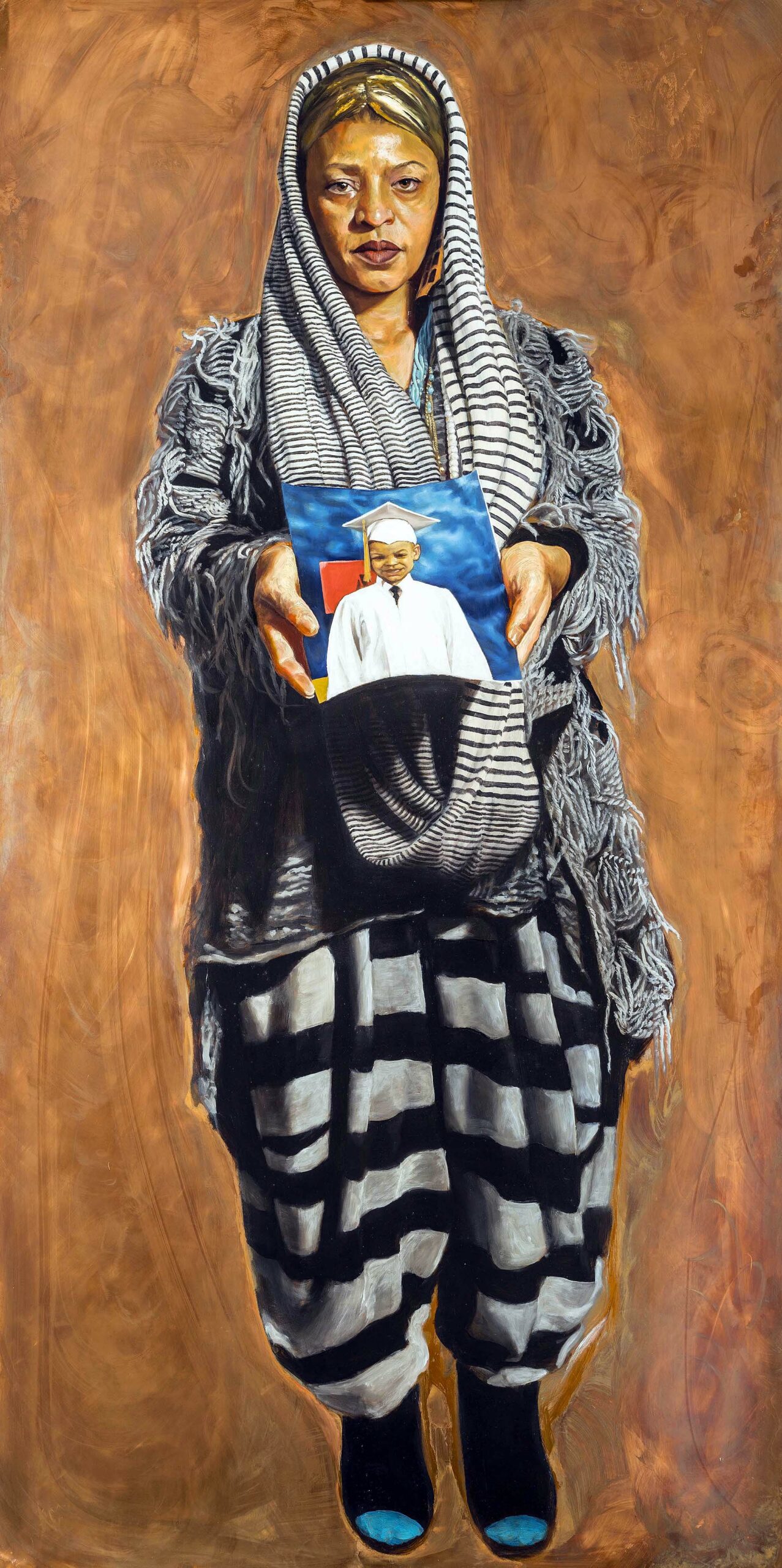
Mario Moore, Mom Says I’m Her Sun, Oil on Copper, 2015
The youngest artist in the Detroit Collects exhibition is Mario Moore with his painting Mom Says. Moore is a source of pride for the Detroit art community and is represented by the David Klein Gallery. His mother is Sabrina Nelson, a long-time studio teacher at the Detroit Institute of Arts, where Moore has been surrounded by the Detroit African American art community for most of his life. He earned his BFA from CCS and his MFA from Yale University and for a figurative artist there is an extraordinary quality about not only his technical ability but his choice of subjects. Recently Moore has spent his time as a Hodder Fellow at Princeton University, depicting large-scale paintings of black men and women who work around the campus in blue-collar jobs. When I think about the work of Mario Moore, there is a message of social justice that reminds me of Kehinde Wiley, who addresses the issue of inequality in the selection of the figurative subjects in paintings of the past. For the Detroit Collects exhibition, this work is on loan from the collection of David and Linda Whitaker.
The are many other institutions that have contributed to the development and exhibitions of artists with African American roots. The Charles H. Wright Museum of African American History was founded in 1965 to explore and celebrate African American Art, History, and Culture. The N’Namdi Center for Contemporary Art, under the ownership of George N’Namdi who has furthered the careers of prominent and emerging African American artists since 1981. The Detroit Fine Arts Breakfast Club co-founded by Harold Braggs and Henry Harper has been meeting since 2009, attracting artists, collectors, and art enthusiasts who discuss, sell, and purchase African American Art. The Detroit Artist Market played a pioneering role in curating exhibitions that furthered the work and careers of many African American Detroit artists.
Collectors in the exhibition include long-time supporters of the DIA, such as Maureen and Roy Roberts — a contemporary African American gallery bears their names in recognition of a generous contribution to the museum. Other collectors include Nettie Seabrooks, the first African American woman executive at General Motors and deputy mayor, chief of staff and COO of the City of Detroit during the administration of Mayor Dennis Archer; and Rhonda D. Welburn, practicing attorney and former board member of the DIA who serves on the board of many nonprofit and charitable organizations such as the DMC Foundation and the Fred A. and Barbara M. Erb Family Foundation. Published in conjunction with Detroit Collects: Selections of African American Art from Private Collections is a 136 color catalog by Valerie J. Mercer.
Detroit Collects: Selections of African-American Art from Private Collections is free to all residents living in Wayne, Oakland, and Macomb counties through March 15, 2020.