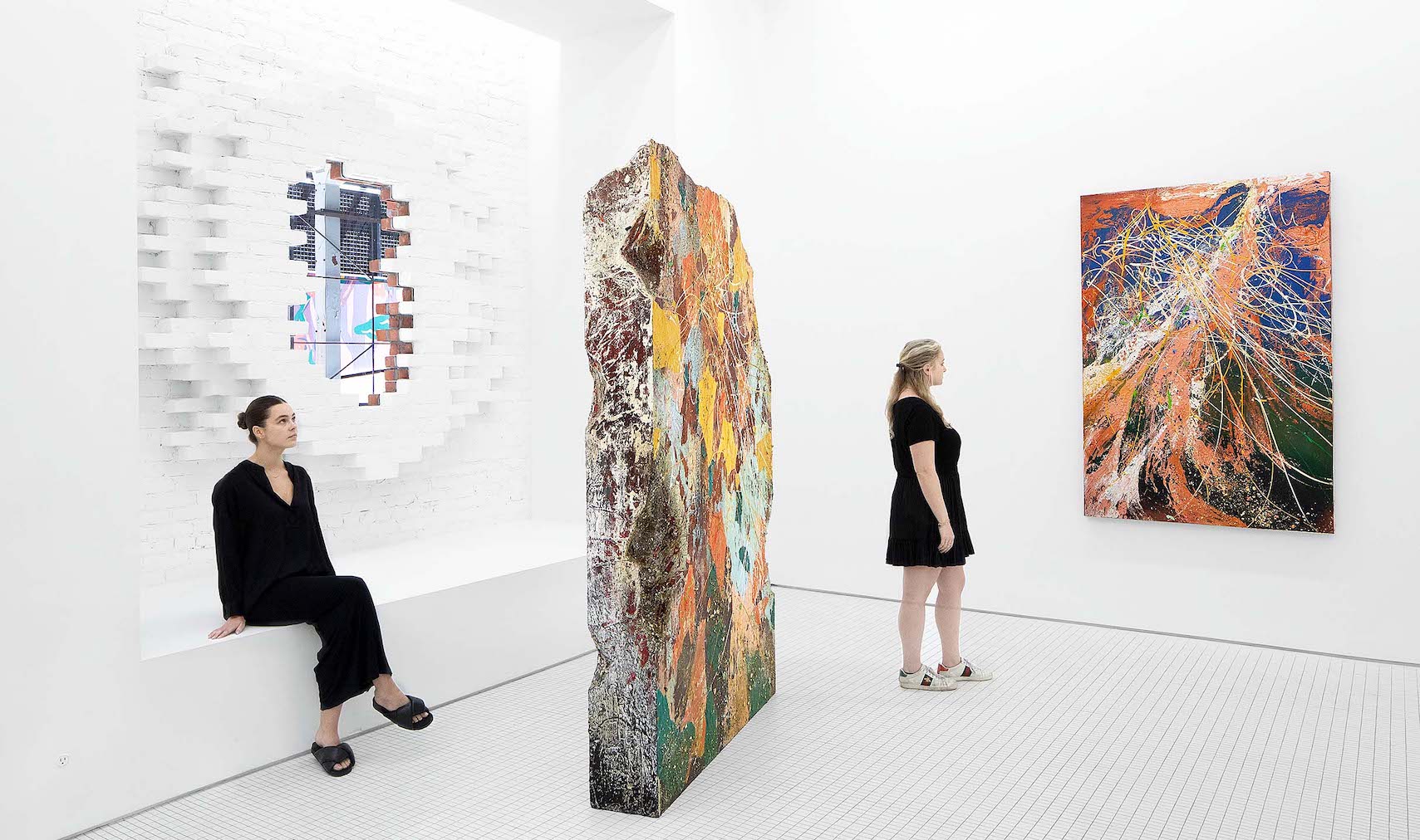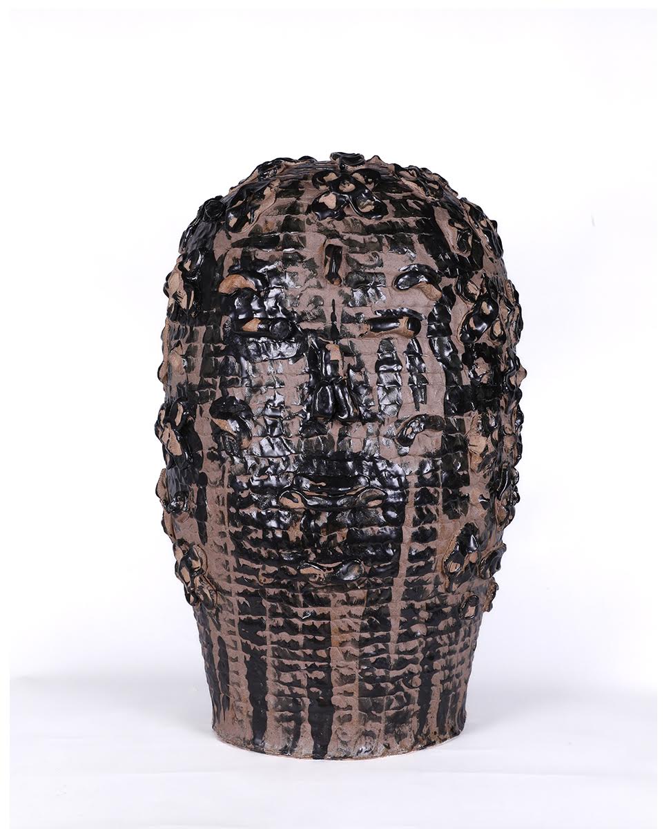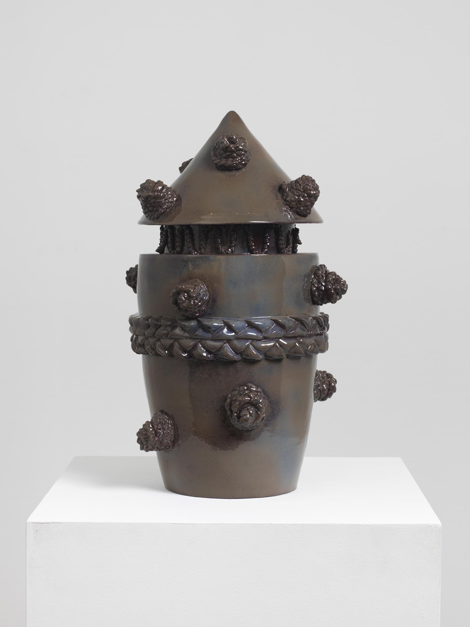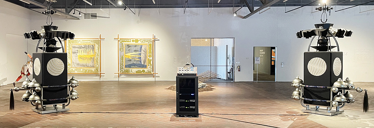
MOCAD-Installation, Nep Sidhu, Paradox of Harmonics, photo: Charles E. Letts
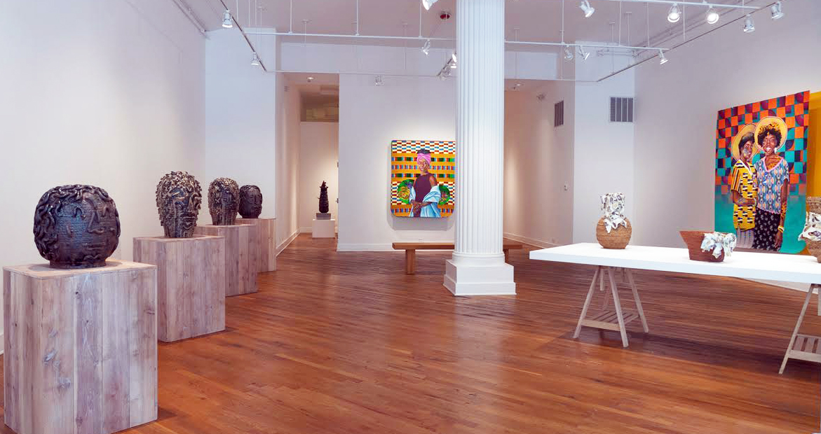
An atmosphere of renewal marks the summer of 2022 in the Detroit arts community as the city’s creatives have returned to action after two years of COVID isolation, Mighty Real/Queer Detroit started the season off during Pride Month in June with a comprehensive and inclusive exhibition of work by 150 LGBTQ+ artists in 17 galleries throughout the city. This wide-ranging series of exhibits, performances and events was the first–but will not be the last–celebration of gender diversity in Detroit. The Museum of Contemporary Art (MOCAD) had an especially impressive roster of summer shows: remarkable paintings, sculpture, tapestries, performance and video by multi-media Toronto artist Nep Sidhu, along with dream hampton’s Freshwater, an elegiac video of flooding in Detroit, artworks from the James Dozier collection of Black Detroit abstract artists and Sterling Toles’s S(h)elves? a community-based project at the Mark Kelly Mobile Homestead.
During this relatively quiet month of August, a couple of group shows have opened–one at Belle Isle Viewing Room and the other at David Klein Gallery–that hint at what we can anticipate for Detroit art this fall.
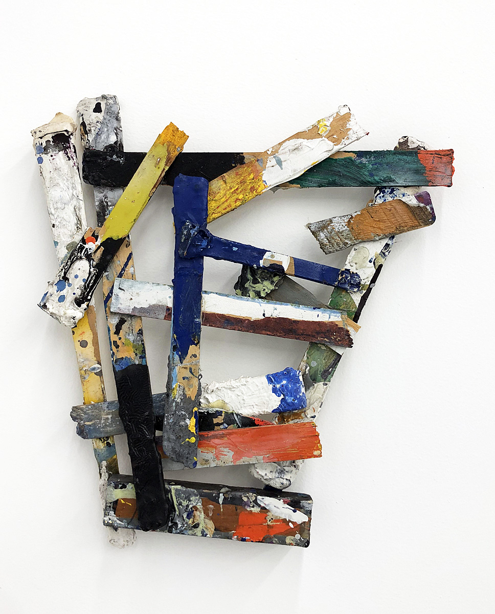
Allie McGhee, 2008, Self Portrait, enamel and acrylic on paint sticks, photo: Belle Isle Viewing Room
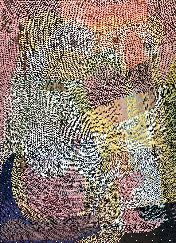
Carlo Vitale, 1979-1988, The Embrace, acrylic on canvas, 51.5 x 72.25 photo: Belle Isle Viewing Room
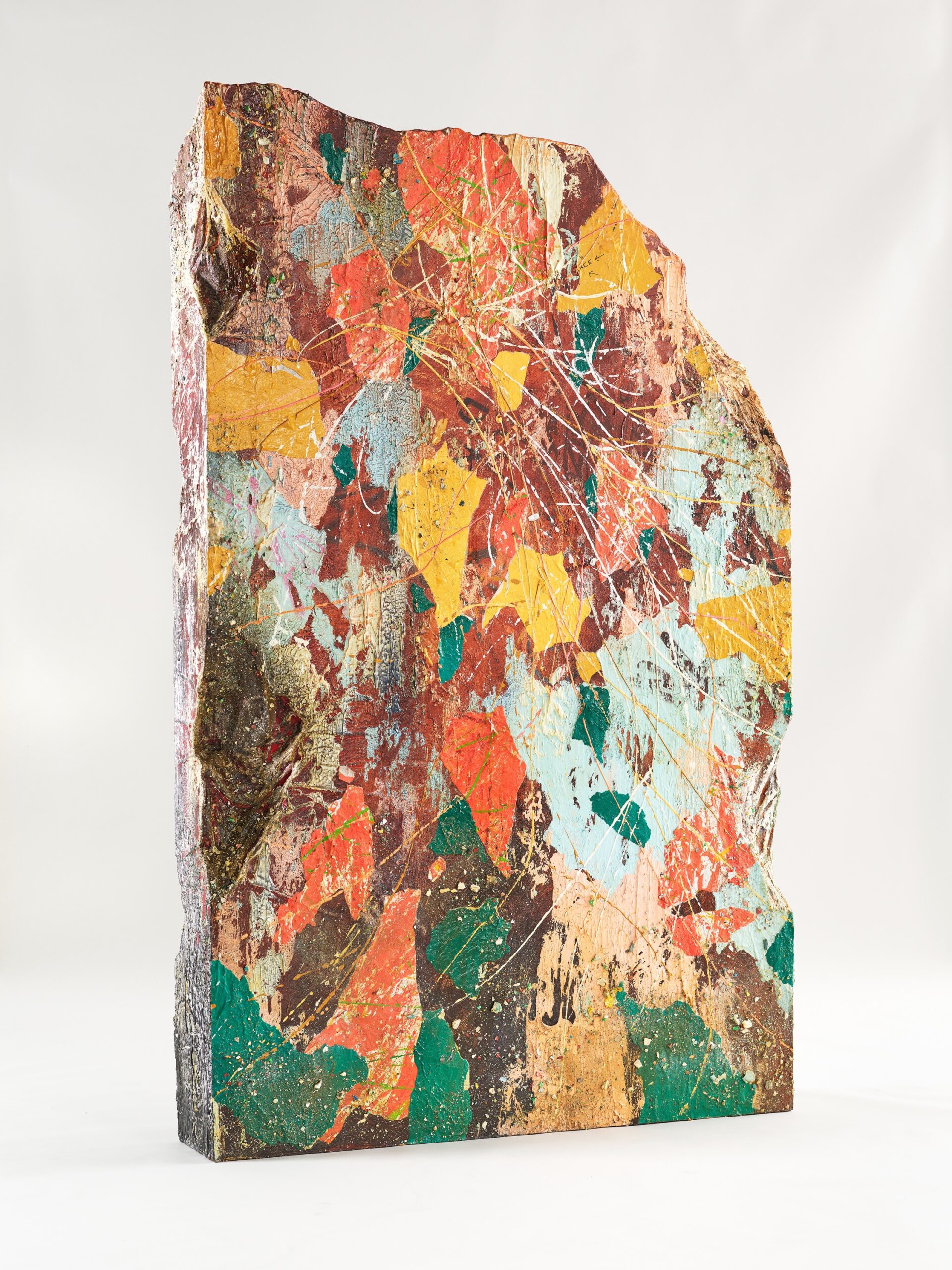
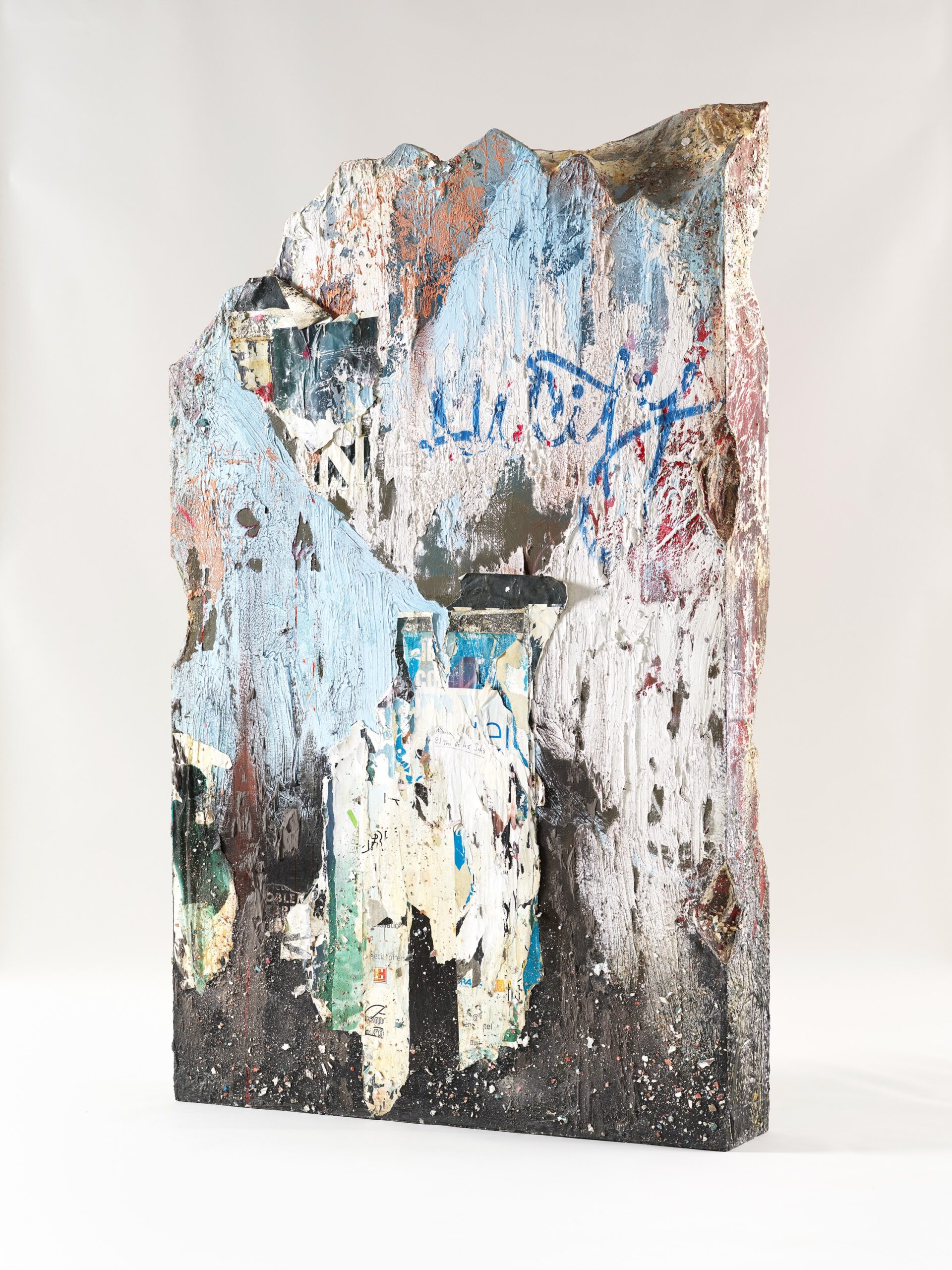
Belle Isle Viewing Room is a relative newcomer to the Detroit gallery scene. Nik Pence, the gallerist behind the enterprise, opened a small one-room space on East Jefferson eighteen months ago, and in the short time he has been in operation, has attracted a formidable collection of talent. The group show that opened on August 13 includes nine of the artists whose work Pence has shown since the gallery opened. Allie McGhee, fresh from his recent solo exhibition Banana Moon Horn at the Cranbrook Museum of Art, has contributed two artworks that reprise elements of his retrospective. A large painting entitled The Embrace by Carlo Vitale–whose work was new to me–occupies a lively corner of the space with fizzy, dotty abstraction. Martha Mysko’s monumental, wall-size piece Forecasting incorporates elements of home décor from the final edition of the Sears catalog and touches on themes of class and consumerism. The current show coincides with a doubling in size of the previously modest gallery space.
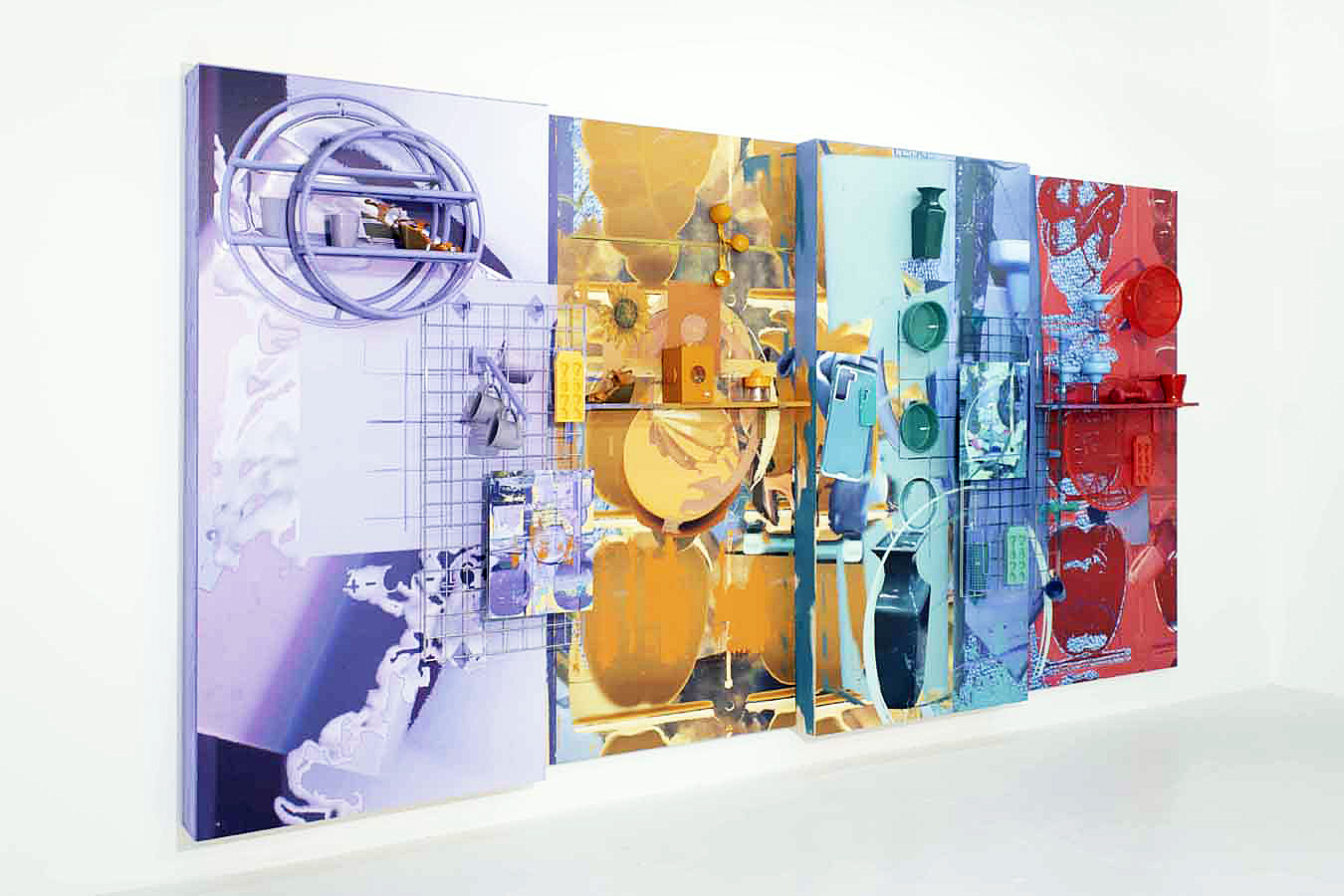
Martha Mysko, 2022, Forecasting, digital prints on vinyl on wood, house paint, spray paint, sublimation dye prints on aluminum, chrome display grids and hardware, wood shelves, cast plastic, ice cube trays, ceramic mugs, plastic margarita cups, ceramic vases, plastic bowls, plastic drinking cups, and wire-mesh cup holder, measuring cups, necktie, wooden box, shoes, fabric, plastic colander, hand weights, hand juicer. 192” x 12” x 96”, photo: Belle Isle Viewing Room.
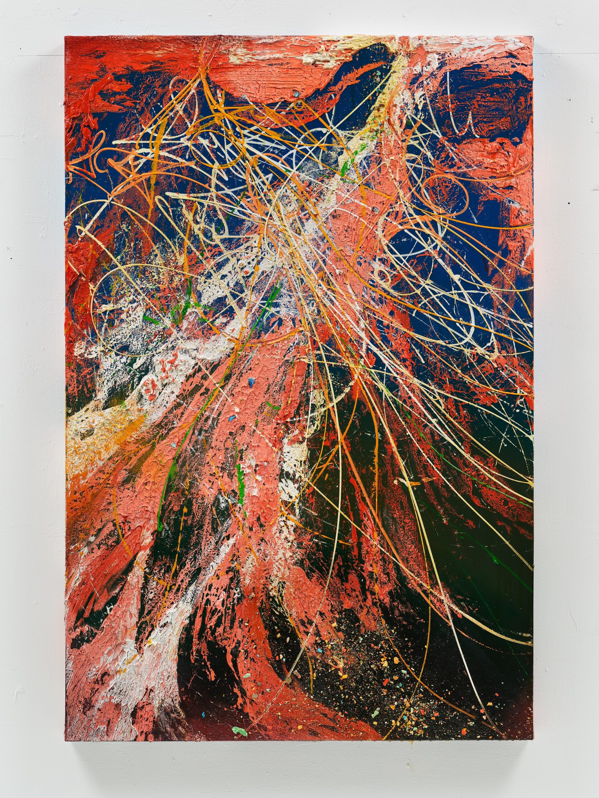
August Selections, which opened at David Klein Gallery Detroit gallery on August 13 and continues through September 2, is an eclectic assortment of work by many of the gallery’s artists. Kelly Reemstra’s murderous debutantes share a wall with a painting by Marianna Olague, Blond Grass. The portrait, which features the artist’s sister, shows the subject’s face in shadow and adds an element of emotional resonance to Olague’s characteristic flat southwestern light. Silvain Malfroy-Camine’s confetti-infused pink-and-blue party of a painting, Riviere, is an exercise in spirit-lifting alchemy. Kim McCarty’s giant, diaphanous watercolor butterflies combine art and entymology. Selections features four pieces by Scott Hocking, a preview of sorts for his upcoming solo show at the Cranbrook Museum of Art in November. Celestial Ship of the North (Emergency Ark) aka The Barnboat and Detroit Nights, Boblo Boat , Rouge Reflection are photographic documentation of the fugitive artifacts for which the artist has become well-known, while two small copper wire sculptures occupy the windows of the gallery and hint at what’s coming to Cranbrook this fall.
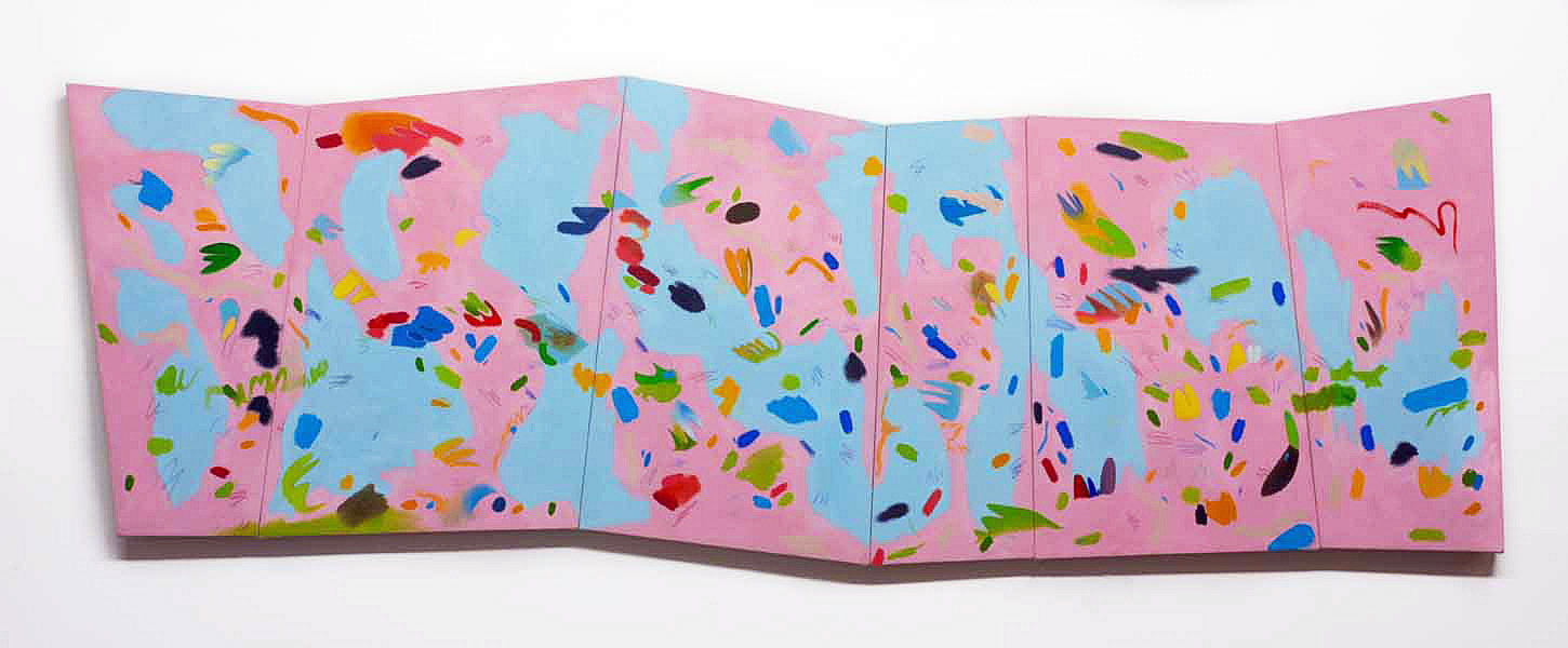
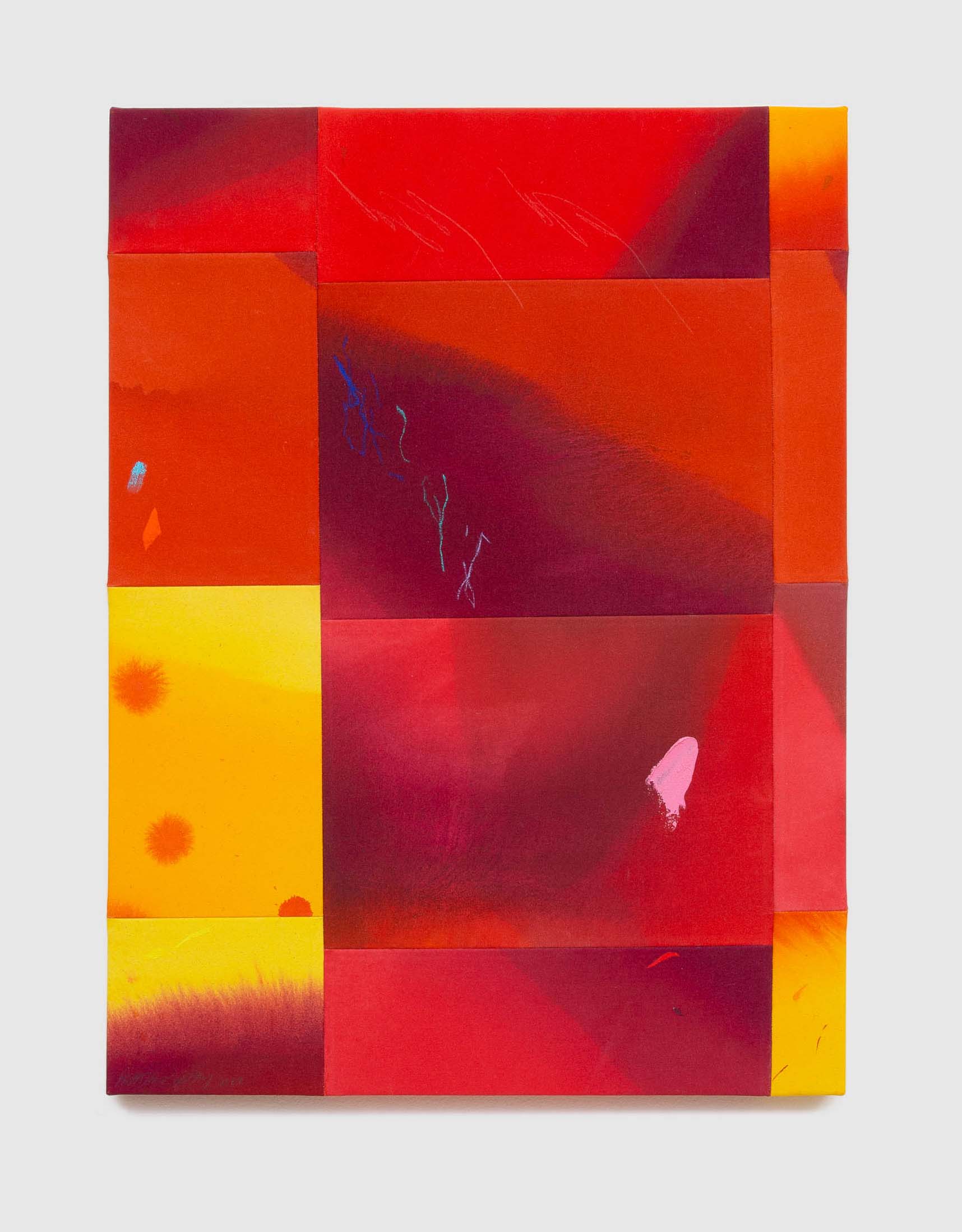
Silvain Malfroy-Camine, Riviere, 2022, oil and colored pencils on six canvas panels, 23” x 67” Image courtesy of the artist and David Klein Gallery
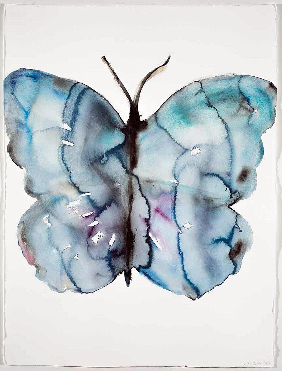
Kim McCarty, Blue Butterfly, 2021, watercolor on arches paper, 30” x 22” Image courtesy of the artist and David Klein Gallery
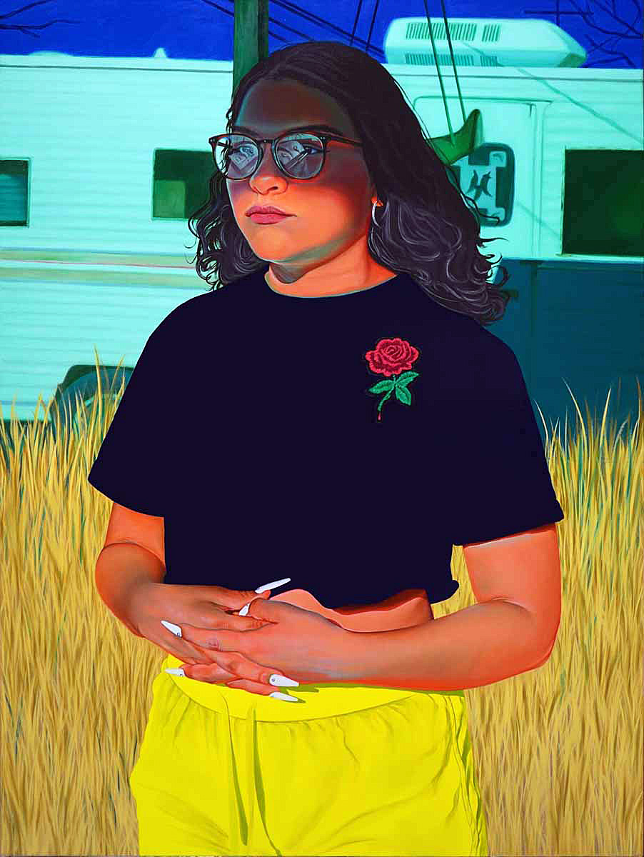
Marianna Olague, Blond Grass, 2021, oil on canvas, 40” x 30” Image courtesy of the artist and David Klein Gallery
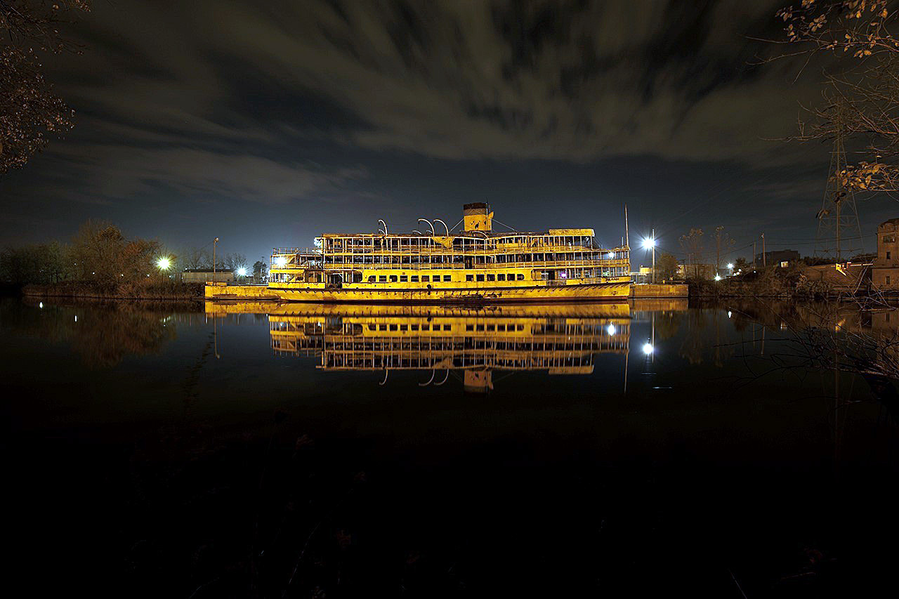
Scott Hocking, 2015, Detroit Nights, Boblo Boat, Rouge Reflection, archival inkjet print, 33” x 49.5”, edition 2 of 11 images courtesy of the artist and David Klein Gallery
Anyone curious about the plans of Simone DeSousa, whose Edition gallery space was closed for renovation during the summer, will be interested to know that the gallery has been reconfigured to provide a more classic display setting for the artists she represents and will re-open this September 16 with a solo show featuring work by the reliably brilliant textile artist Carole Harris. The opening is planned as a celebration of renewal, with music on the patio from jazz musicians selected by Harris. The gallery is now a pristine white box–with improved lighting–and includes an adjoining private viewing room for clients. Many of the prominent artists DeSousa represents–Michael Luchs, Robert Sestok, Brenda Goodman and Kathryn Brackett Luchs—are slated for exhibitions in the 2022-2023 season.
DeSousa has not given up on the Editions concept, which she describes as “a space focused on accessible and collectible art and design.” It will be part of a re-imagined cultural campus the gallerist is developing in cooperation with real estate entrepreneur Philip Kafka in Detroit’s Core City neighborhood, with April 2023 as the date of a planned launch. The complex will include a café and a bookstore along with the Edition space, as well as a gallery for experimental work by young, emerging artists and a pocket park for outdoor installations.
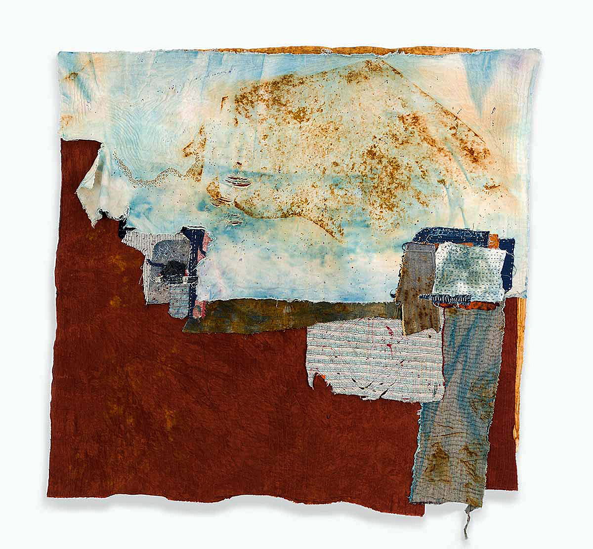
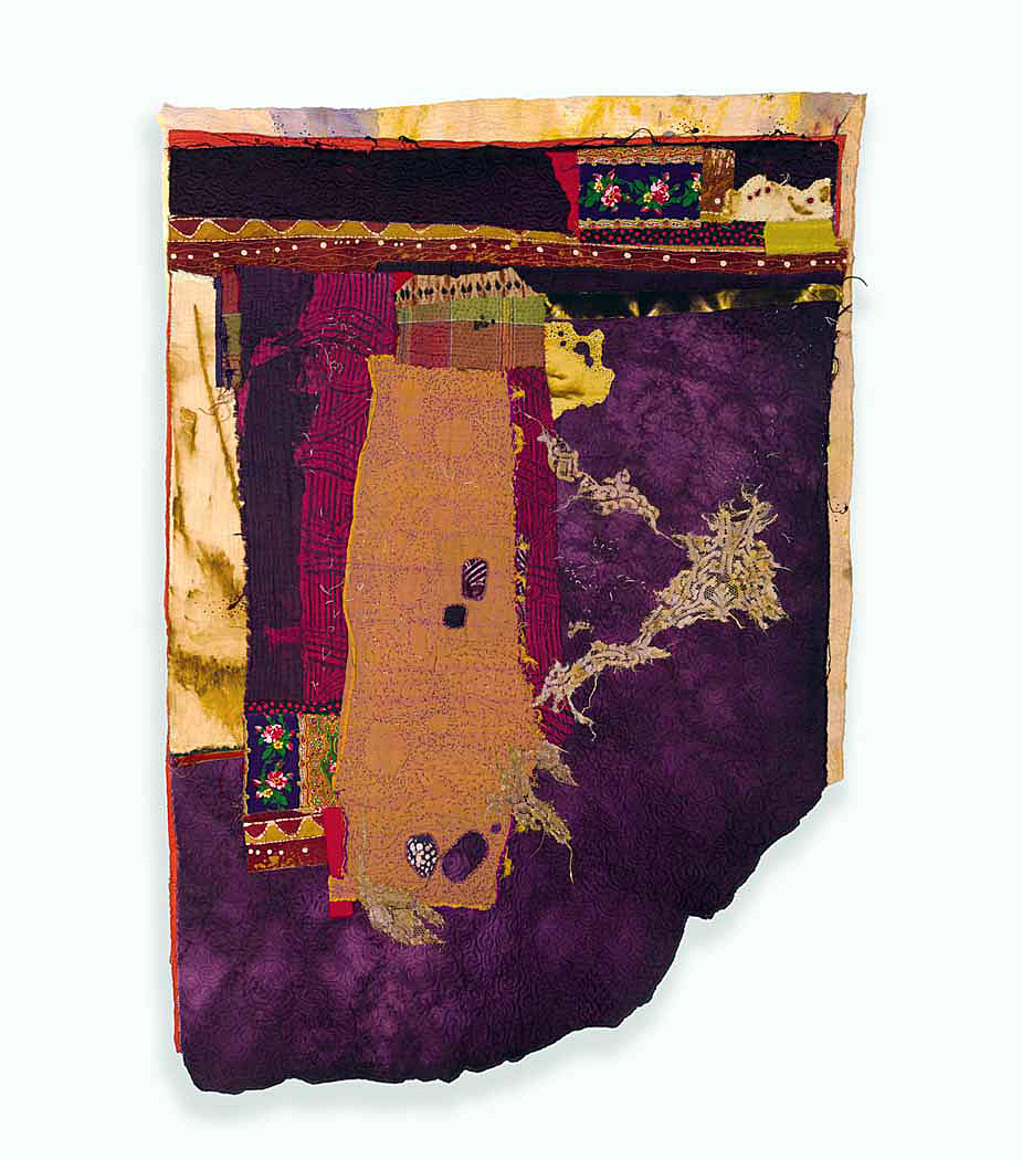
Carole Harris, Motor City Blues, 2021, Commercially printed cottons, raw silk and thread, cotton batting, 455” x 45”, photo courtesy of Simone DeSousa Gallery and the artist.Carole Harris, Other People’s Memories, 2016, commercially printed cottons, raw silk and thread, cotton batting, 57” x 39,” photo courtesy of Simone DeSousa and the artist.
Carole Harris, Motor City Blues, 2021, Commercially printed cottons, raw silk and thread, cotton batting, 455” x 45”, photo courtesy of Simone DeSousa Gallery and the artist.
In this moment of stasis, when the summer shows have ended and the fall art season has not yet begun, we sense that beneath the quiet of this moment that there is plenty of activity in preparation for upcoming events. The one constant in Detroit is change, and these exhibitions foretell what we can anticipate in the art season to come.
The Detroit Art Review looks forward to reviewing visual art exhibitions in the Detroit Metro area and beyond.