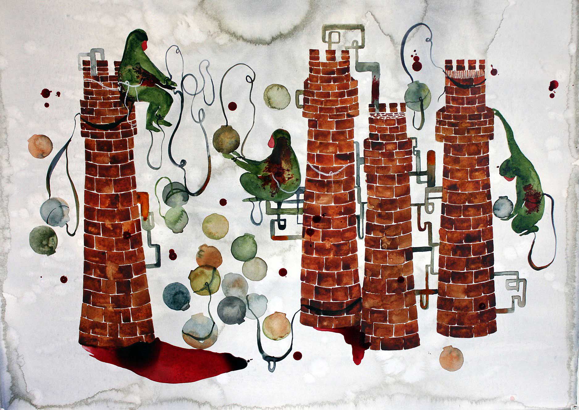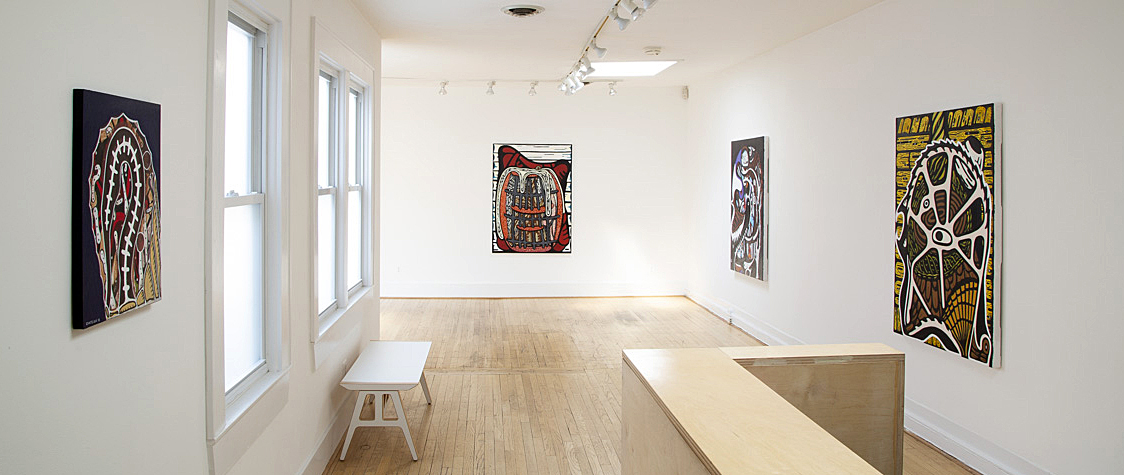
Installation Image, James Chatelain: Home is in My Head at paulkotulaprojects
“Home is in My Head” is the intriguing, tantalizing title of Jim Chatelain’s display of recent paintings at paulkotulaprojects. Delving into Chatelain’s concept of home is well-nigh irresistible given his usual reluctance to discuss the meaning and sources of his art. Linked to Detroit’s Cass Corridor artists of the 70s and 80s, Chatelain has worked in both abstract and figurative modes throughout his career.
For starters, he plucked the title of his latest display from the 1971 Jackie Lomax album and song whose lyrics describe a loner who discovers, after searching far and wide, that he only feels “at home” when living in his head. Hence, the dozen plus canvases in the show, dating from 2018 – 2020 (with one 2016 exception), focus on the “head” (for the most part) represented frontally or in profile, in bold, eccentric color ways and dark, emphatic contours.
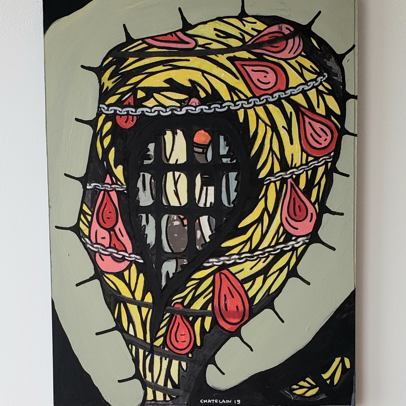
Jim Chatelain, “Untitled,” acrylic and collage on paperboard, 20 x 15” 2019
Moreover, Chatelain’s visages, ranging from life-size to monumental, may be figurative or semi-abstract, as in Untitled from 2019 and Starfish, 2020. In the former, the actual-size head, wrapped in a vine of yellow leaves, is bound with both a crown of thorns and metallic chains. Large teardrops of blood, a recurring motif of the artist, surround the head silhouetted by a greenish aura, while an imprisoning grid offers a partial view of roiling forms within. This unsettling view inward is countered by the liberating, spiraling whiplash of Starfish, whirling out of watery depths (like a waterspout, dancer on toe, or—to stretch a point—the birth of Venus?) while enclosing within its black, red, and yellow contours a chockablock mash-up of fragmented forms.
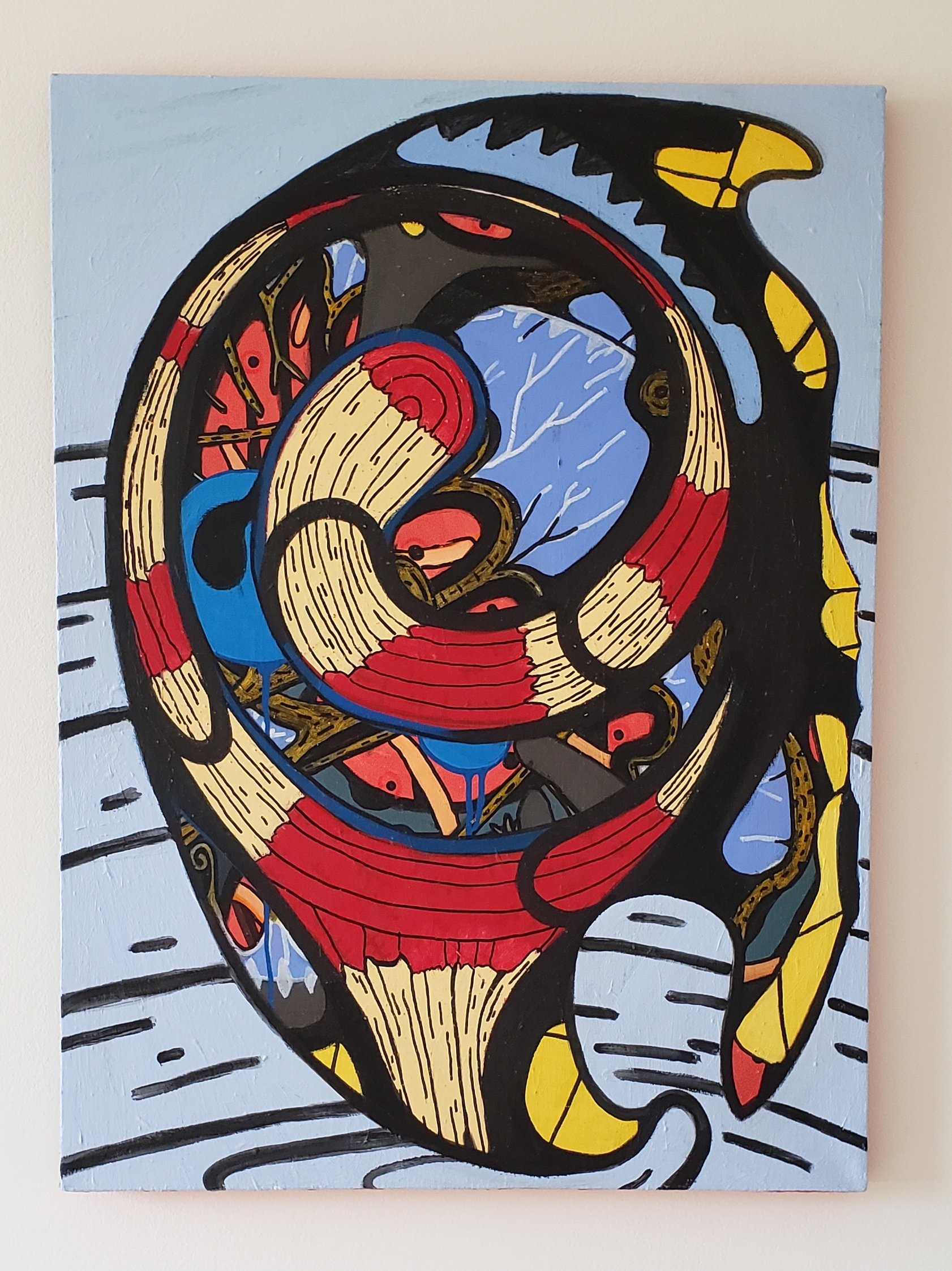
Jim Chatelain, “Starfish,” acrylic on linen, 35 x 25” 2020
Trunk (2018), another small scale, life-size image, similarly bares Chatelain’s predilection to peel away an exterior surface to expose what is concealed. Here, the “trunk” (of a tree) is also, and primarily, the torso of a human body from armpit to groin, beneath which, after cutting away the bark, a phantasmagoria of staring eyes and layered lengths of wood in yellows and reds is exposed. Flanked as well by grasping, finger-like nerve endings (or lightning, electrified tendrils?), both body and nature reveal more than meets the eye.
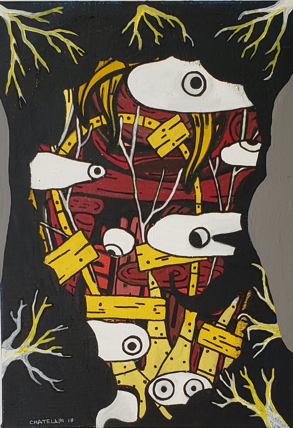
Jim Chatelain, “Trunk,” acrylic on canvas, 26 x 18” 2018
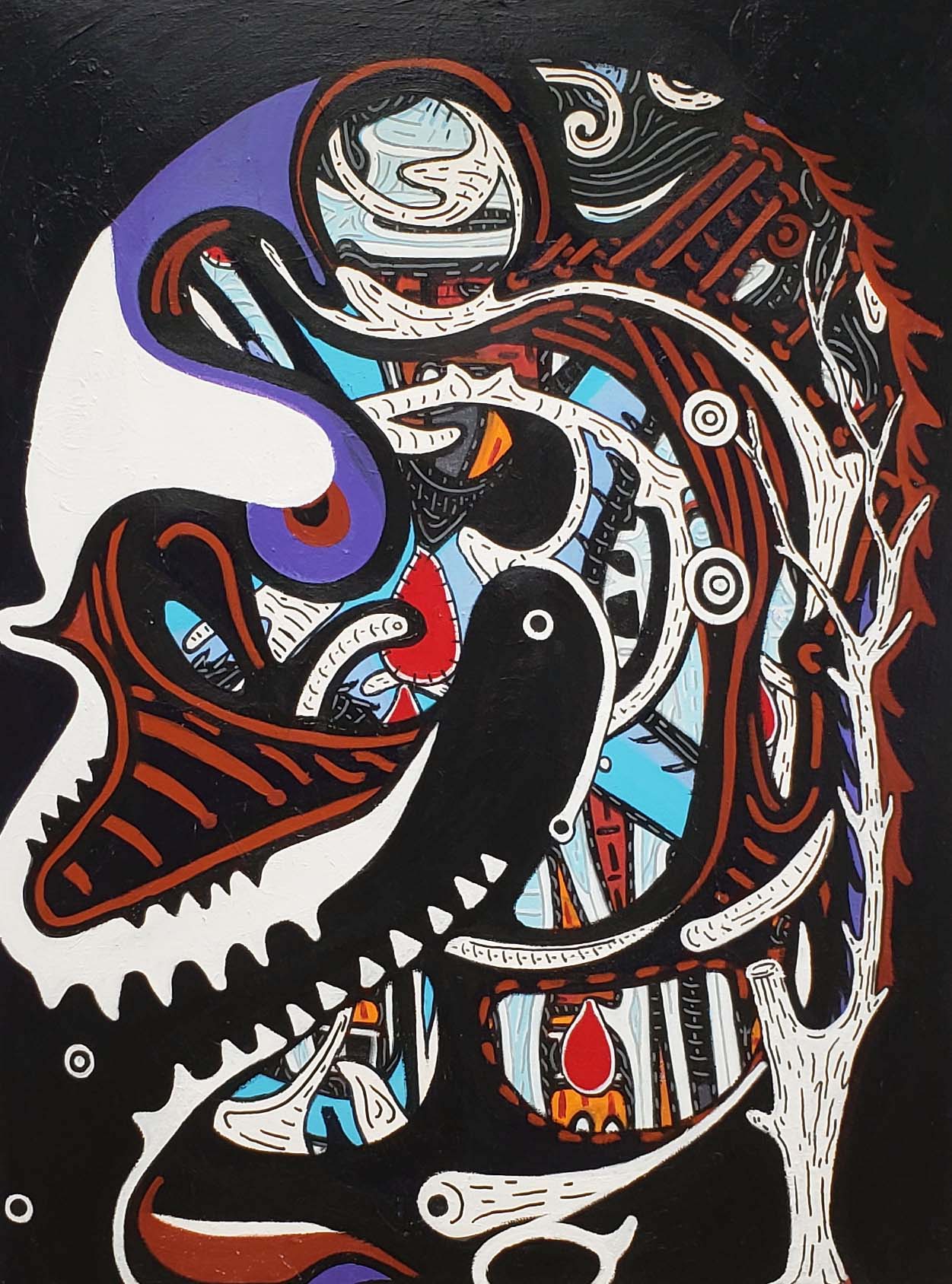
Layers of imagery also dominate the lurking, looming, twice life-size specter of 2018’s Untitled. The large, bristling head, with curling, upturned braids, appears to be wearing a balaclava, but one with a peak reminiscent of a loose-fitting stocking cap. Apparently attired in a black turtleneck, fingers extending downward and upward near the mouth or chin evoke a worrisome gesture. On the picture plane, a delicate white form, perhaps referencing a hat or boat, floats lightly and elegantly in front of the frightening, masked presence behind. The eerie Prussian blue, grass green, sky blue, and luminous white hues reinforce the impact of a stunning, double-take image composed of disparate elements.
Jim Chatelain, “Untitled,” acrylic on linen, 34 x 26” 2018
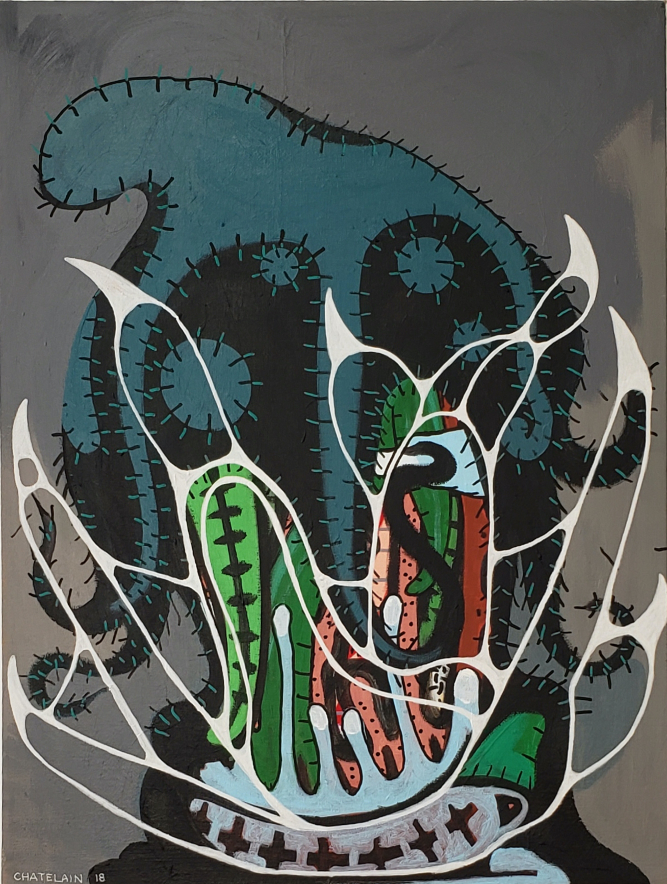
Four monumental images of 2020 (each 53 x 40 in.) dominate the show and confirm the ongoing importance of Chatelain’s “home in my head” variances. (Additional examples reside in the artist’s studio.) Two currently on view illustrate again the artist’s dichotomous figurative/abstract models that heighten the pictorial dynamic of the exhibition. And since both are untitled, Chatelain leaves us somewhat on our own to ferret out their mysteries. In Untitled, the sharply incised profile of a little over four foot tall head with wide open, saw-toothed maw ingesting tiny circular morsels startles. The spine-like tree trunk on the right curls around and into the brain that, subdivided into numerous chambers, is replete with multifarious shapes surging through the cavity, including several droplets of blood. Sentient life, in an ominous, darkling universe, seems rife with blood, sweat, and tears.
Jim Chatelain, “Untitled,” acrylic on canvas, 53 x 40” 2020
Untitled, however, is vessel shaped rather than head-like, with vaguely hieroglyphic or alphabetic shapes inscribed on black tablets/slabs crowned with several eye-like roundels. The flattened shapes and bold black, white, and red color scheme are regally enhanced by a wavy fringe of filaments (a cape, robe, or drapery?) that vivifies the perimeter of the composition. Of particular note, a surreal, floating hand stabilizes the composition and adds a human touch, perhaps suggestive of a stabilizing hand or the positioning of hands in a traditional half-length portrait.
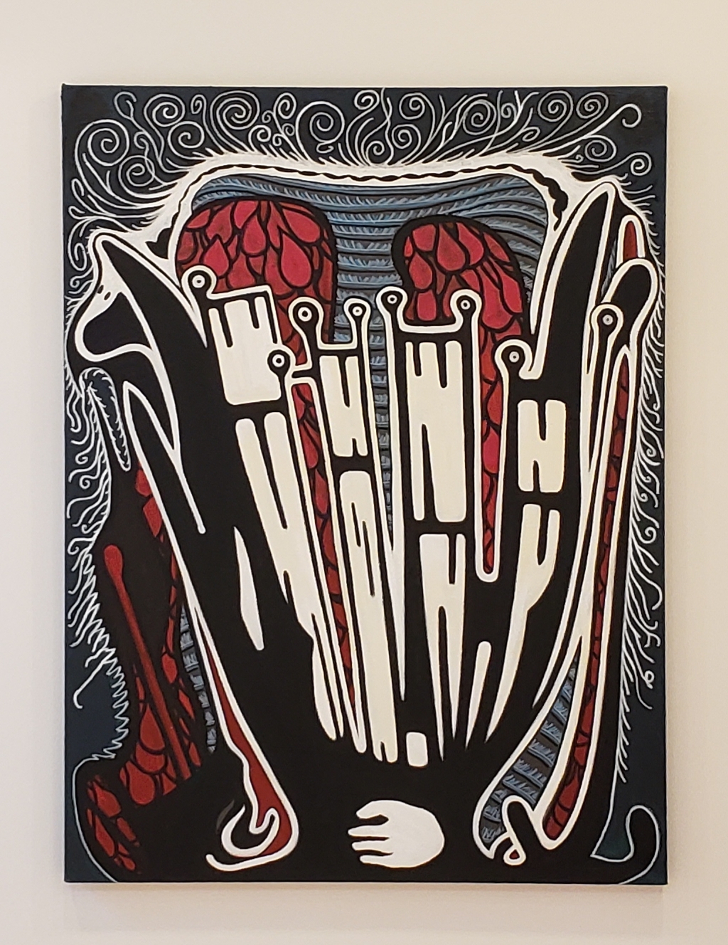
Jim Chatelain, “Untitled,” acrylic on canvas, 53 x 40” 2020 (All images courtesy of paulkotulprojects)
All told, Chatelain has presented a discombobulating compound of heads (primarily) whose chameleon-like extremes present an ambitious, many-faceted hunt for Home. His dozen plus “homes” or dwellings encompass and express contradictory states of mind, moods, personas, temperaments, identities, attitudes, fears, and emotions, basically what we sum up as the human condition. Uncozy and unruly as his findings may be, all are ultimately revelatory re the universal quest to “know thyself.”