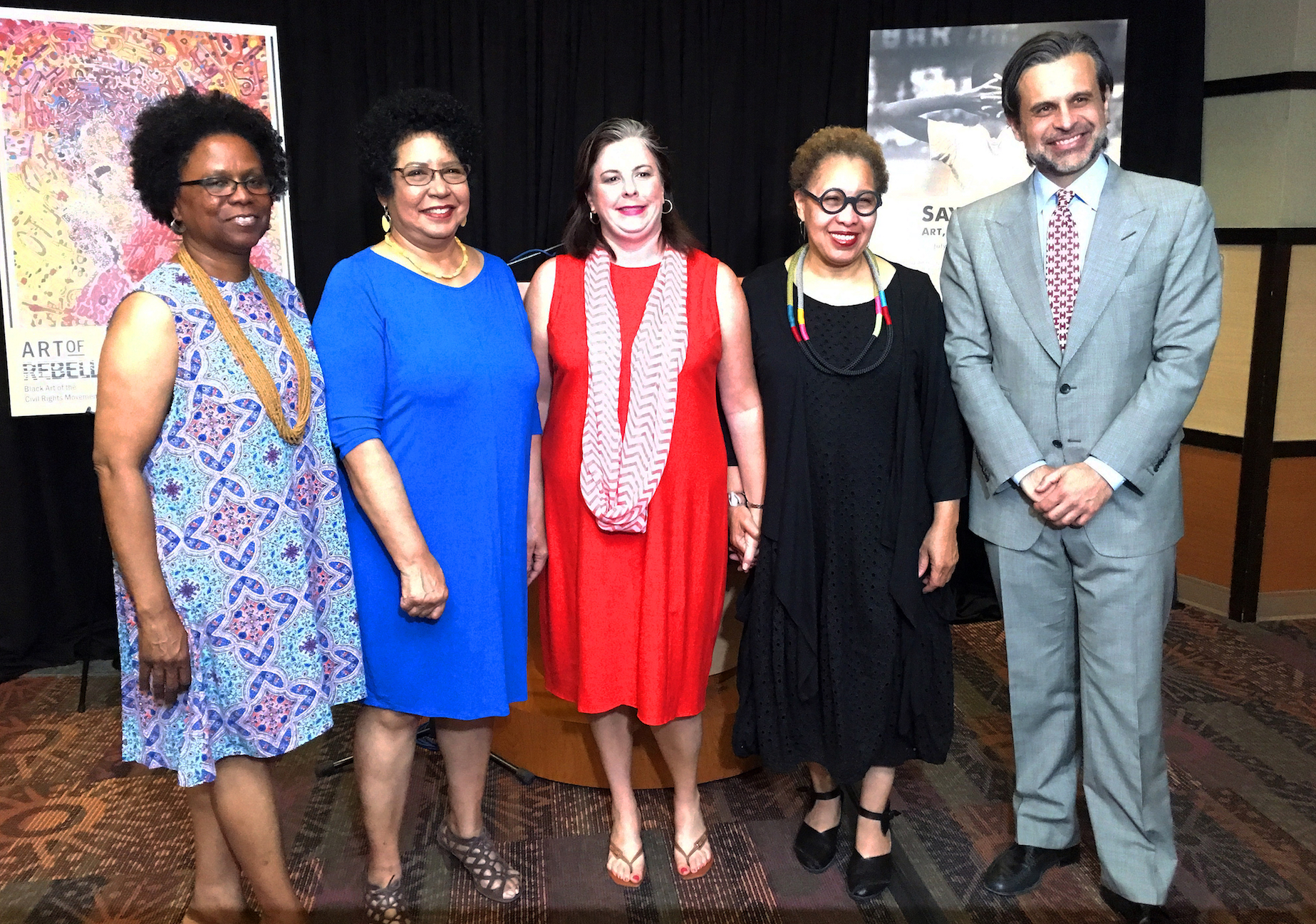
From Left to Right – Patrina Chatman, Curator of collections and exhibitions, Charles Wright Museum of African American History, Valerie J. Mercer, Curator of African American art and head of the General Motors Center for African American Art, Detroit Institute of Arts, Kathy Locker, Program director/Detroit, John S. and James L. Knight Foundation, Juanita Moore, President and CEO, Charles Wright Museum of African American History and Salvador Salort-Pons, Director Detroit Institute of Arts.
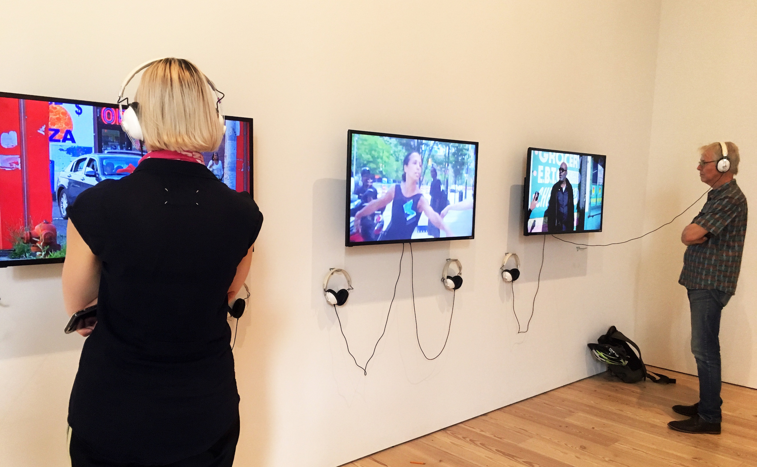
Art of the Rebellion and Say It Loud are coordinating exhibitions to commemorate 50 years since July 23, 1967, when African Americans took to the streets of Detroit to express their anger and frustration with the injustice of law enforcement. To many people, and supported by the then media establishment, the events on 12 Street and Clairmount were conventionally referred to as the Detroit Riots, both in Detroit, Southeastern Michigan and around the country. Over the course of five days, more than 2000 buildings were destroyed, 7,200 people were arrested, 43 people killed and over 1,100 injured.
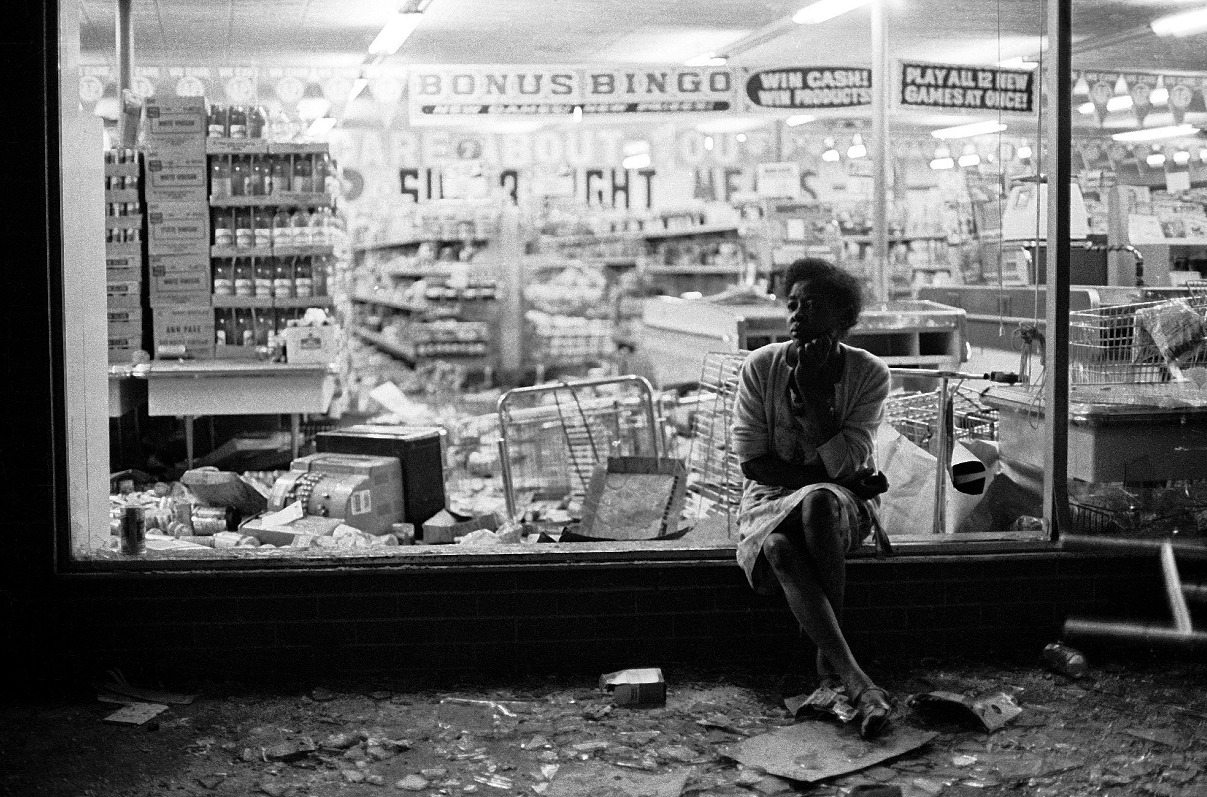
Jim Hubbard, Woman Sitting on Ledge, 13 x 19 B&W 35mm 1967
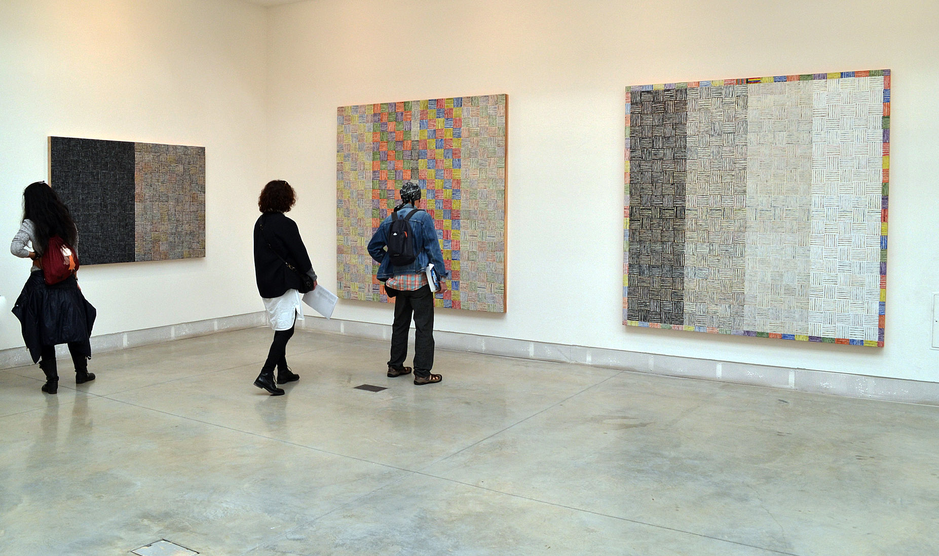
At the DIA, African American Art Curator Valerie Mercer explains that a number of the 34 works on display emerged from black art collectives that in some cases aimed to instruct a community whose self-identity was in rapid flux. “Harlem’s Weusi collective felt we African-Americans needed to learn more about African culture,” Mercer said, “which is hard for us, since it’s typically not taught in schools.”
Salvador Salort-Pons, DIA director said, “The commemoration of the 1967 Detroit rebellion provides an opportunity to call attention to the talented and often overlooked artists who were reacting to the struggle for social, political and racial justice during the 1960s and 70s. The DIA’s collaboration with the Wright Museum lays a foundation from which we are building a strategic and lasting working relationship that will help bring our community closer together.”

Wadsworth Jarrell, Three Queens, Acrylic on Canvas, 1971
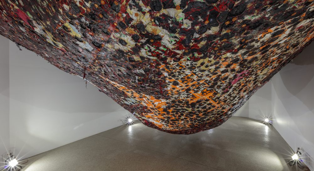
At the Detroit Institute of Arts, Art of Rebellion features 34 paintings, sculptures and photographs mostly by African American artists working both collectively and independently in the 1960s and 70s. Artists in the collectives: Spiral, Kamoinge Workshop, Harlem’s Weusi, AfriCobra, and Black Arts Movement, created art for African American audiences that asserted black identity and racial justice with the Detroit rebellion of 1967 as background. The exhibition also includes works by artists who were not part of a collective and artists working in later decades who were inspired by art from the Civil Rights Movement.
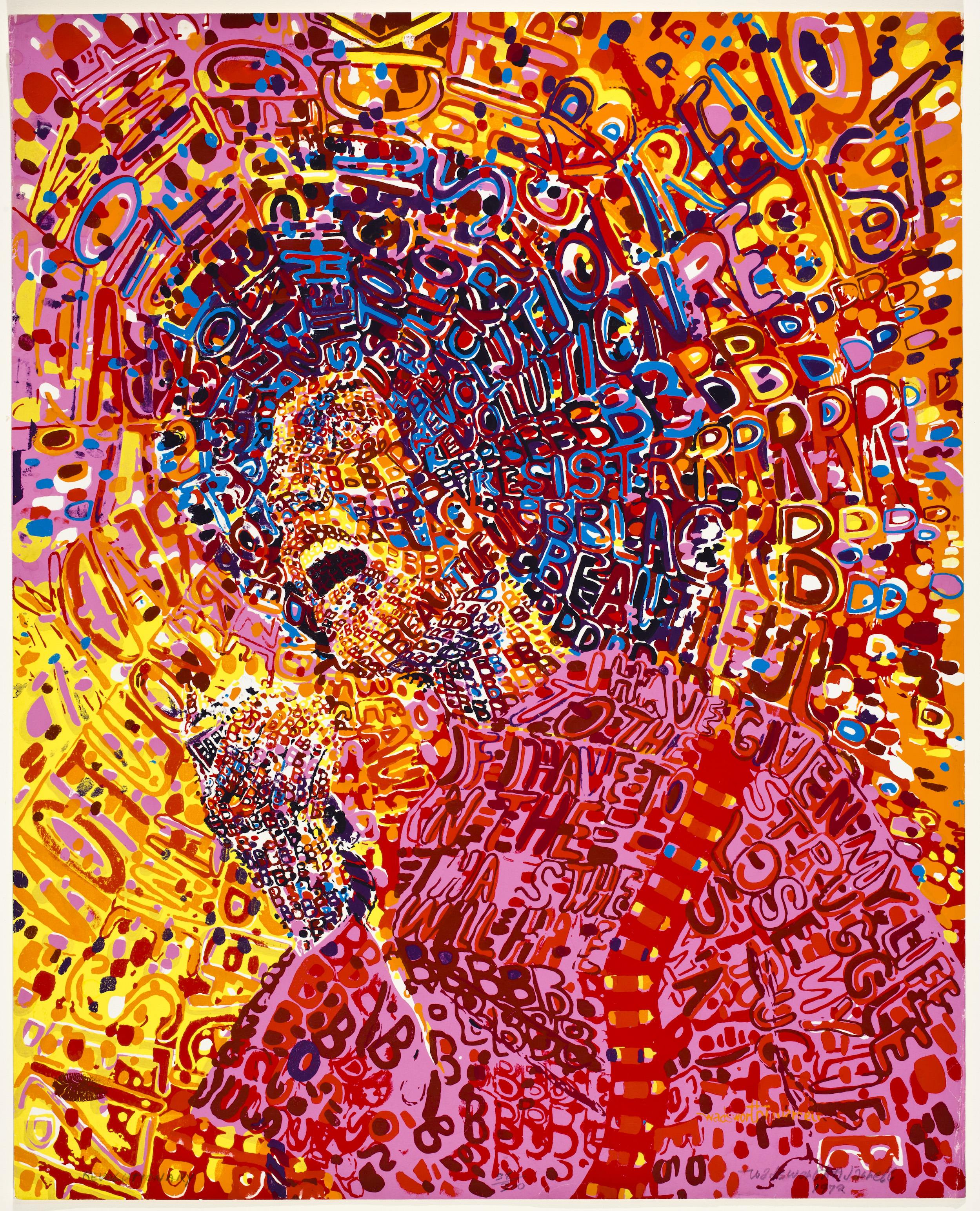
Wadsworth Jarrell, Revolutionary, Acrylic on Canvas 1972
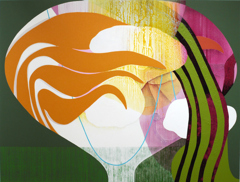
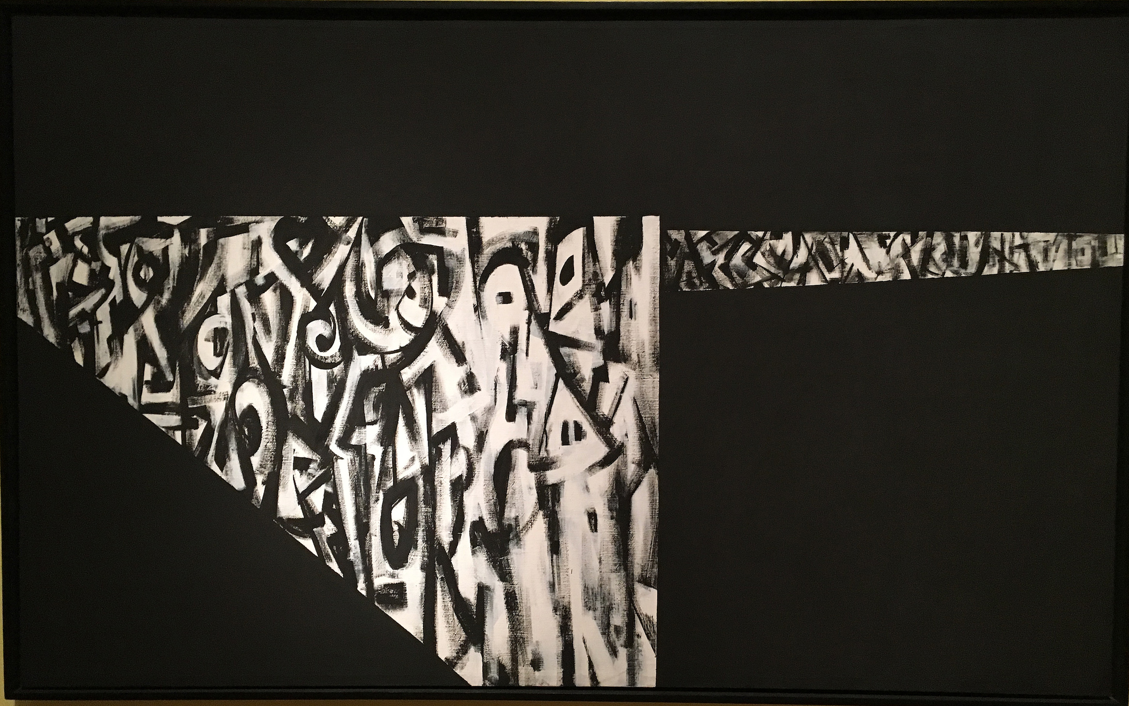
The work of Wadsworth Jarrell is prominent in the DIA exhibition in that it captures a color depiction of African American figures using a kind of alphabet soup to communicate a variety of literary messages. Wadsworth Jarrell is an African-American painter, sculptor, and printmaker who was born in Georgia then moved to Chicago, Illinois, where he attended the Art Institute of Chicago. He is a founding member of AfriCOBRA, a collective of African American artists formed in Chicago in 1968 as a response to the Civil Rights Movement. Its members inspired black pride by exploring and defining a black visual aesthetic that would reflect the style, colors, cool attitude and rhythm associated with their culture. AfriCOBRA artists focused on the social and political issues that affected their communities and were committed to making art that was understandable, relevant and accessible.
Allie McGee, Apartheid, Mixed Media on Masonite, 1984
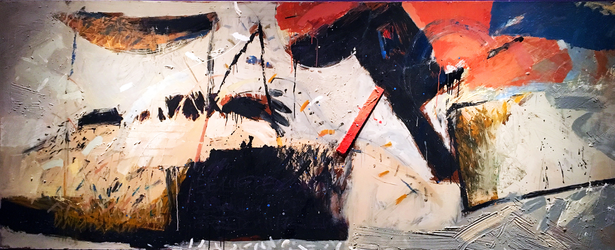
Detroit artist Allie McGee, whose work is represented by the N’Namdi Center for Contemporary Art, is featured with a large abstraction, Apartheid. The work highlights his use of angular shapes and splatters of paint to evoke tension. McGee often used sticks in place of brushes to obtain the effect he wanted. The title refers to the oppressive political system that existed in South Africa. The Civil Rights and Black Power movements inspired many African American artists to address the fight for civil rights faced right here in Detroit.
Norman Lewis, Untitled (Alabama), Oil on Canvas 1967
The outline of a hooded Klansman near the center of this painting converges with sharp angles suggests tension. The title Alabama was code for the complicity of that state’s government in the oppression of African Americans throughout the community. Strong composition and the black and white motif further supports the overall symbol in this oil-on-canvas work.
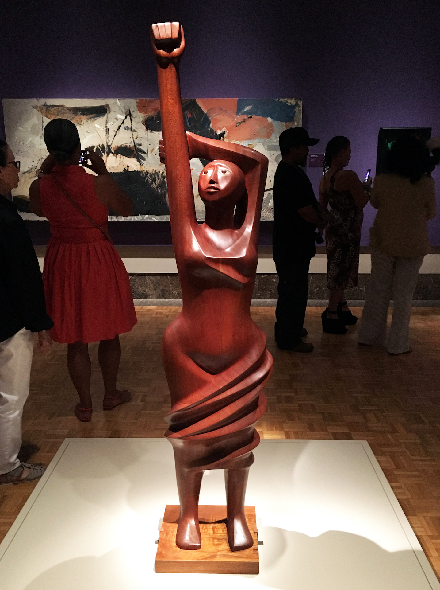
Elizabeth Catlett, Homage to Black Women Poets, Mahogany, 1984
Elizabeth Catlett’s wooden sculpture Homage to Black Woman Poets is carved from one piece of Mahogany and pays tribute to black women poets, such as Gwendolyn Brooks, Jikki Giovanni, Sonia Sanchez and Maya Angelou. Catlett is widely recognized as a contemporary sculptor known for her focus on women subjects.
Titus Kaphar, For Tryvon, Amadou, Sean, and Mike, Calk on Asphalt, 2014
The Chalk on Asphalt drawing by Titus Kaphar in 2014 brings the recent events across the country into the narrative that exists today. The images depict three black boys, perhaps those who were lost to injustice and informs the audience that the events surrounding a young black man like Trayvon Martin live on inside each and every one of our consciences.
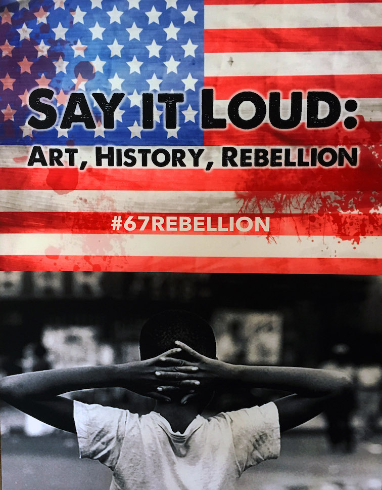
The Charles Wright Museum partnered with the Detroit Institute of Arts to create parallel exhibitions — the DIA’s Art of Rebellion: Black Art of the Civil Rights Movement opened on the same day as Say It Loud. Both are part of a community-wide reflection of the 1967 Detroit Rebellion. More than 100 local institutions will participate in this commemoration, led by the Detroit Historical Museum. The Charles Wright Museum began its remembrance of this complicated and painful historical experience with the unveiling of Detroit artist Charles McGee’s landmark outdoor sculpture United We Stand at the Museum in July 2016. The Detroit Art Review covered that event, and I spoke with McGee, a fellow artist with whomI exhibited more than once. He said, “It’s about togetherness…living together in peace.”
“Artists have a way of bringing moral clarity and promoting empathy,” said Juanita Moore, president and CEO of The Wright Museum. “They can often articulate the emotional truth of a situation in a way that breaks through our mental barriers and opens us to new perspectives in a way that other forms of communication cannot. This new exhibit will both show how some of the most significant African American visual artists have interpreted and resisted social inequities over time, and broaden the historical narrative and dialogue around the 1967 Rebellion.”
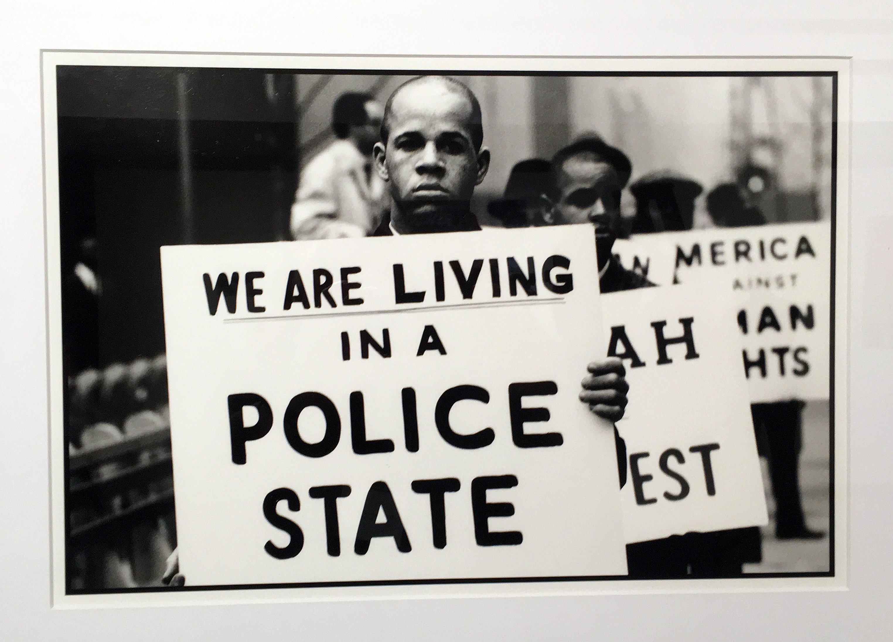
Gordon Parks, Police State, B&W, 35mm, 13 x 19″ 1997
Born in Fort Scott Kansas, at the age of 25, Gordon Parks was struck by photographs of migrant workers in a magazine. He bought his first camera for $7.50 at a Seattle pawnshop and taught himself how to take photos. He started in the fashion industry, but Parks went on to become the first African-American photographer for Life and Vogue magazines. Parks once said, “People in millenniums ahead will know what we were like in the 1930s and the important major things that shaped our history at that time. This is as important for historic reasons as any other.” In this photo Police State, the image is more about capturing a moment that delivers a blunt and literal statement to his audience.
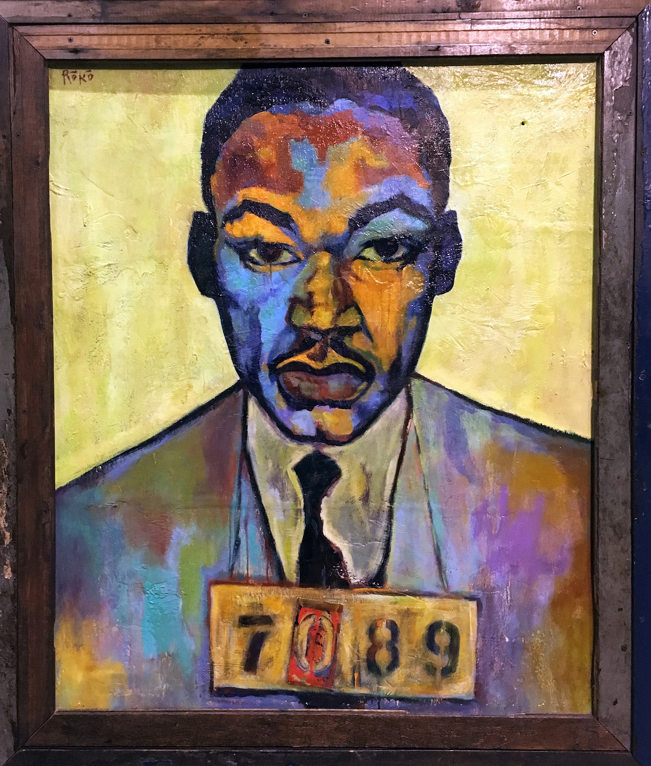
Roko, The King of Montgomery, Oil on Canvas, 28 x 38″ 1988
This mixed media painting by the artist Roko comes from a mug shot of Martin Luther King, one of many, taken by police departments during the Civil Rights period. Known nationally for his dramatic portraits, Roko relies on deep colors and black line to capture the downtrodden state of his subjects. As part of this exhibition, it is well known that Dr. Martin Luther King led Marches in Detroit, such as the Walk to Freedom March down Woodward Ave, in 1963, the precursor to his “I Have a Dream” speech at the Washington Monument just two weeks later. It drew crowds of an estimated 125,000 or more making it “the largest civil rights demonstration in the nation’s history” at that time.
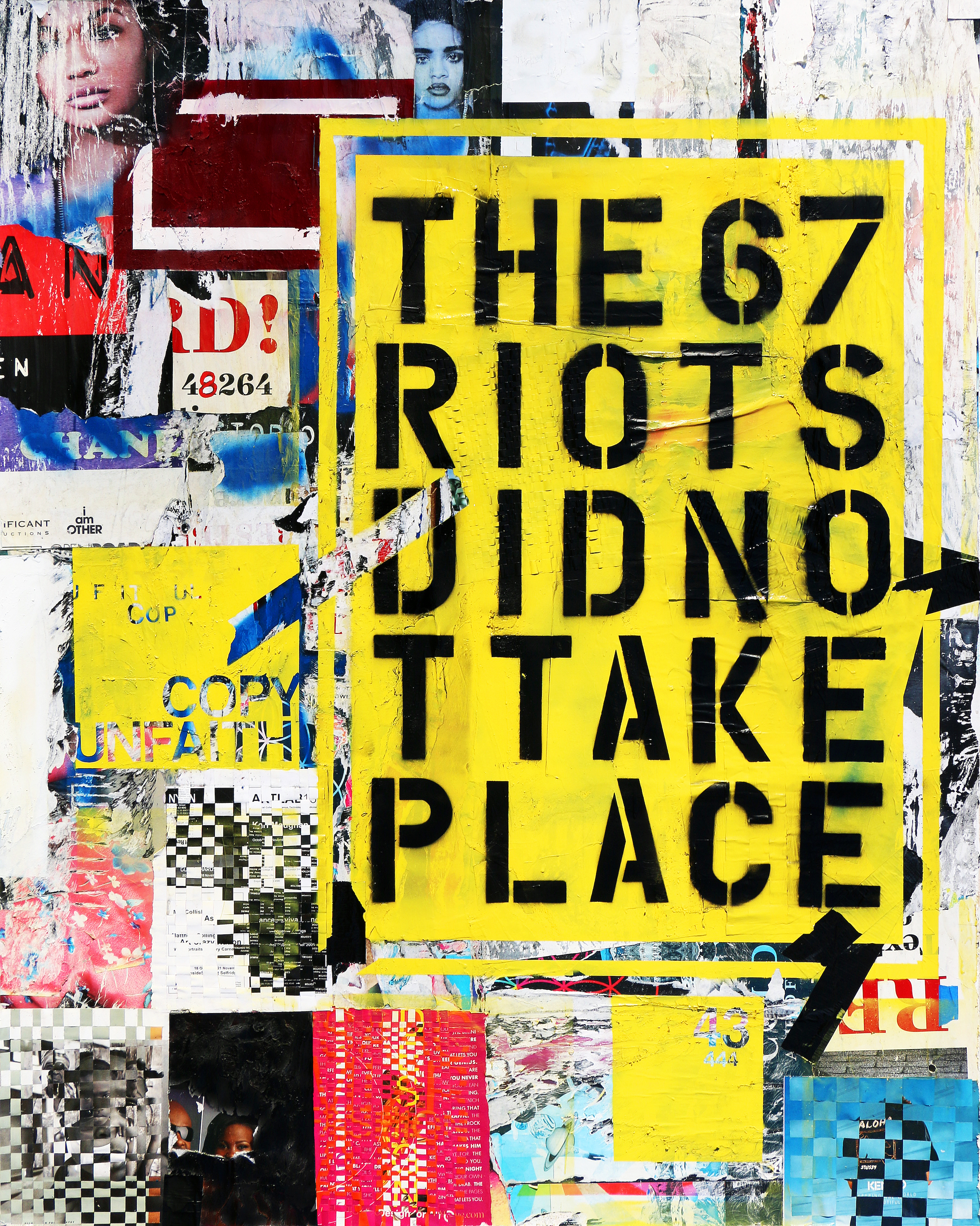
Senghor Reid, Broadcast News, Mixed Media 1971
Detroiter Senghor Reid develops paintings that explore the connections between culture, art and social sciences as in his work “Broadcast News,” with its black-stenciled letters on bright yellow background or “The ’67 Riot Did Not Take Place.” Since he was born in 1976, maybe for him, these events did not take place. He earned a Bachelor of Fine Arts from the University of Michigan, Ann Arbor, and a Master in Art Education from Wayne State University. A recipient of the prestigious ArtServe Michigan Governor’s Award for an Emerging Artist in 2001, Reed was a Kresge Artist Fellow Recipient in 2009.
Postscript
On Monday morning, July 24, 1967, I remember being notified to leave work and go home until further notice. Some people had heard about an overnight disturbance in Detroit, but it wasn’t until I got home that I saw the news stories on our black and white TV. ABC news anchor Bill Bonds was reporting live on a civil disturbance near Clairmount and 12th Street that had broken out when police raided an unlicensed after-hours bar on the city’s west side. When I was allowed to return to work the following Friday I was surrounded by jokes from fellow white suburbanites. I remember being ashamed and disgusted by these pathetic displays. I had no true sense of what was going on then, but now I realized that although there was blatant racism on both sides of my extended families, my parents had met as professional dancers and worked with artists of all persuasions. These people were made up of all races and sexual orientation. Many lived in my home from time to time during my formative years of high school.
At the time, I didn’t understand the true depth of what happened that summer, but it came to form the foundation of my values as a grown man: All people were created equal, and to quote Martin Luther King, “Injustice anywhere is a threat to justice everywhere.”
Art of Rebellion has been generously supported by the Community Foundation for Southeast Michigan and the Whitney Fund.
Say It Loud is the recipient of a prestigious Knight Arts Challenge Detroit grant from the John S. and James L. Knight Foundation.