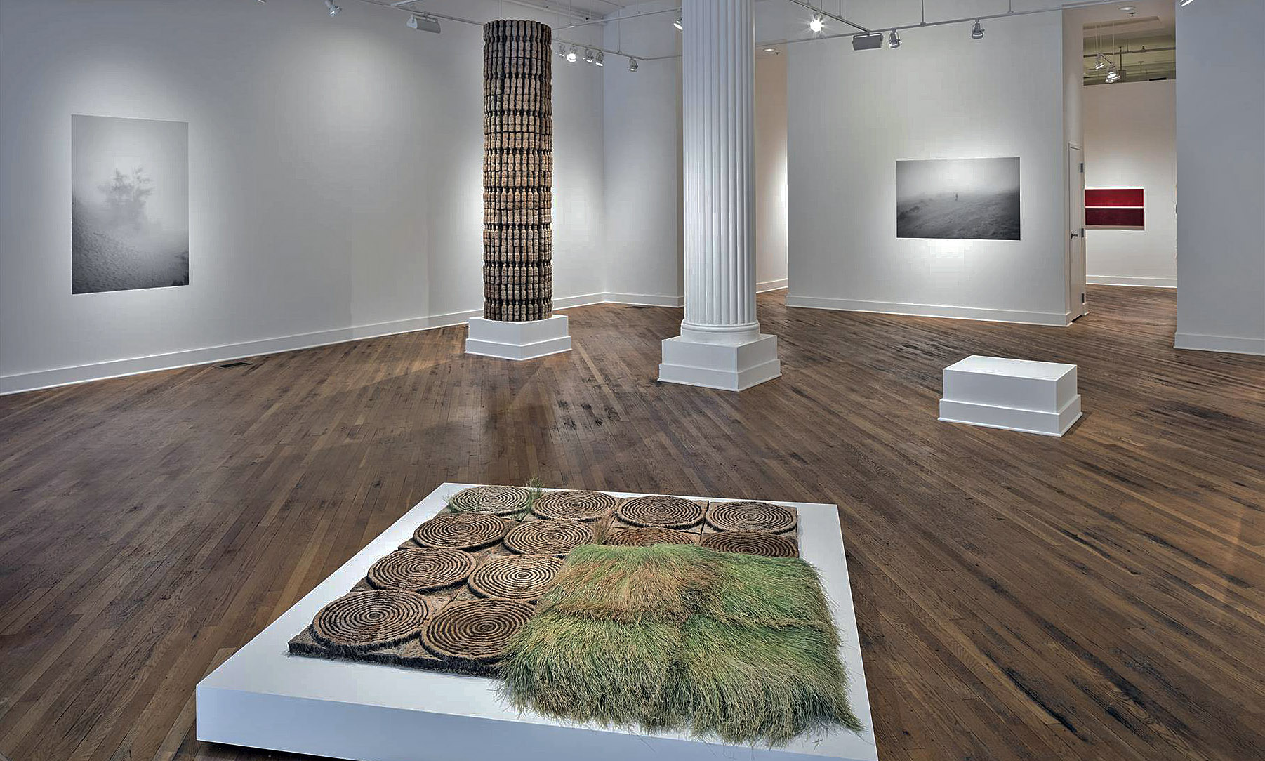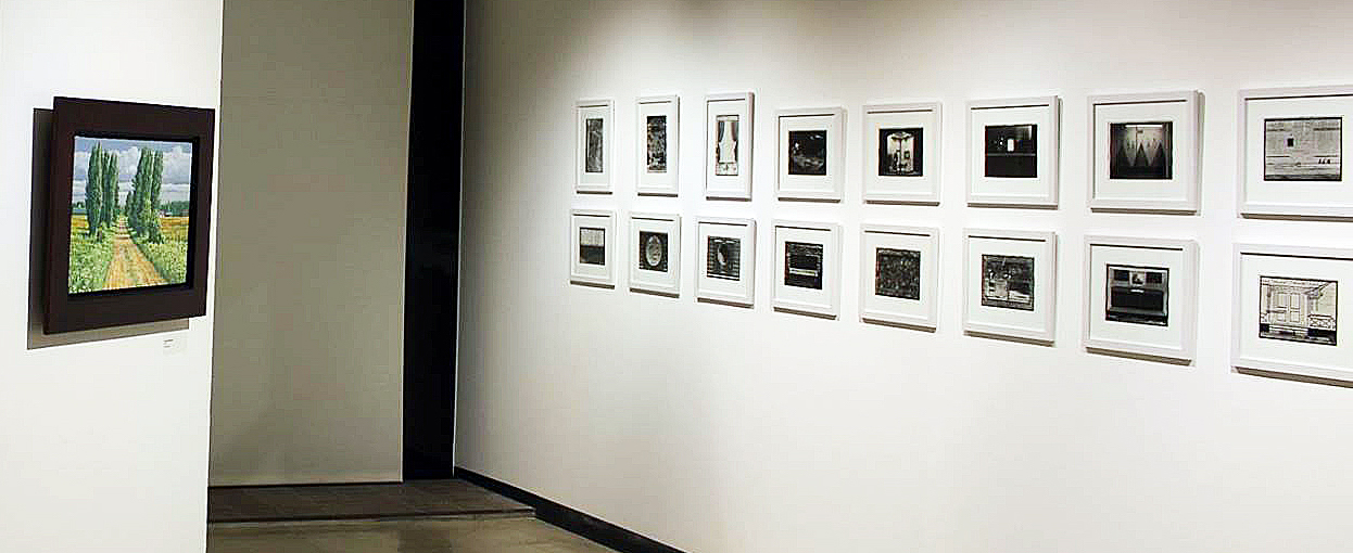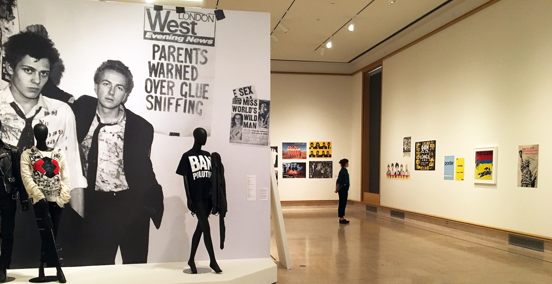
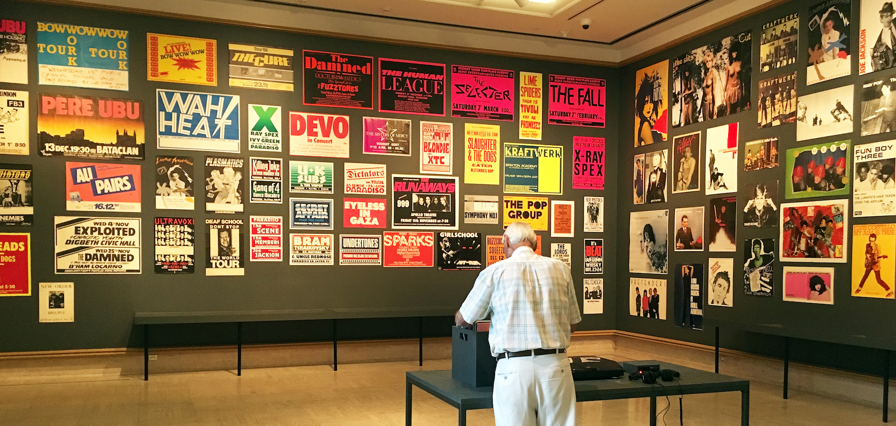
Installation Image, Cranbrook Art Museum, Punk Rock Graphics 1976 – 1986, 2018
Punk Rock is a music genre that developed in the mid-1970s in the United Kingdom, the United States and Australia. Rooted in 1960s garage rock, punk rock bands rejected perceived excesses of mainstream 1970s rock by typically producing short or fast-paced songs, with hard-edged melodies and singing styles, stripped-down instrumentation, and often political, anti-establishment lyrics. Punk Rock embraces a “do it yourself” ethic; many bands self-produce recordings and distributes them through independent record labels and other informal channels. Accompanying the music is byproduct: a distinct style of graphic art.
Installation Image, Cranbrook Art Museum, Punk Rock Graphics 1976 – 1986, 2018
Although I was there during this time, and in the early throws of raising a family, I was not drawn to the anti-establishment, but rather seduce by the music of Motown, Detroit Jazz, and the 60’s music of the Beatles, Rolling Stones, Sting and Bob Dylan. Punk Rock was a distraction for this writer and as an observer, I missed the graphic art side of the cultural phenomenon. If that resonates, no matter what your age, this exhibition opens up a trove of information and design that can take you on a journey and easily introduce you to a culture defined, in part, by its graphic design.
The Cranbrook Art Museum opened a large and sprawling exhibition of Punk Rock Art Graphics (600 pieces), Too Fast to Live, Too Young to Die: Punk Graphics, 1976 -1986, 0n June 15, 2018.
The exhibition features several hundred posters, flyers, fanzines, handbills, record sleeves, badges, clothing and other graphic materials from the New York collector Andrew Krivine. In addition Robert St. Mary, a local author and music historian, helped to curate the Detroit portions of the exhibition at the request of Cranbrook Art Museum. St. Mary was asked to contribute his knowledge of the Detroit punk scene as an extension of a project he is working on as a recipient of the 2017 Knight Foundation Arts Award. In his 2015 book, “The Orbit Anthology,” St. Mary focused mainly on the punk scene at Bookies, known as the original punk nightclub in Detroit. Most people know about the famous London, New York City and Los Angeles bands, but St. Mary points out that the origins of punk are really right here in Detroit.
He says, “When we talk about punk, the primordial ooze of it is here, with The Stooges and the MC-5”
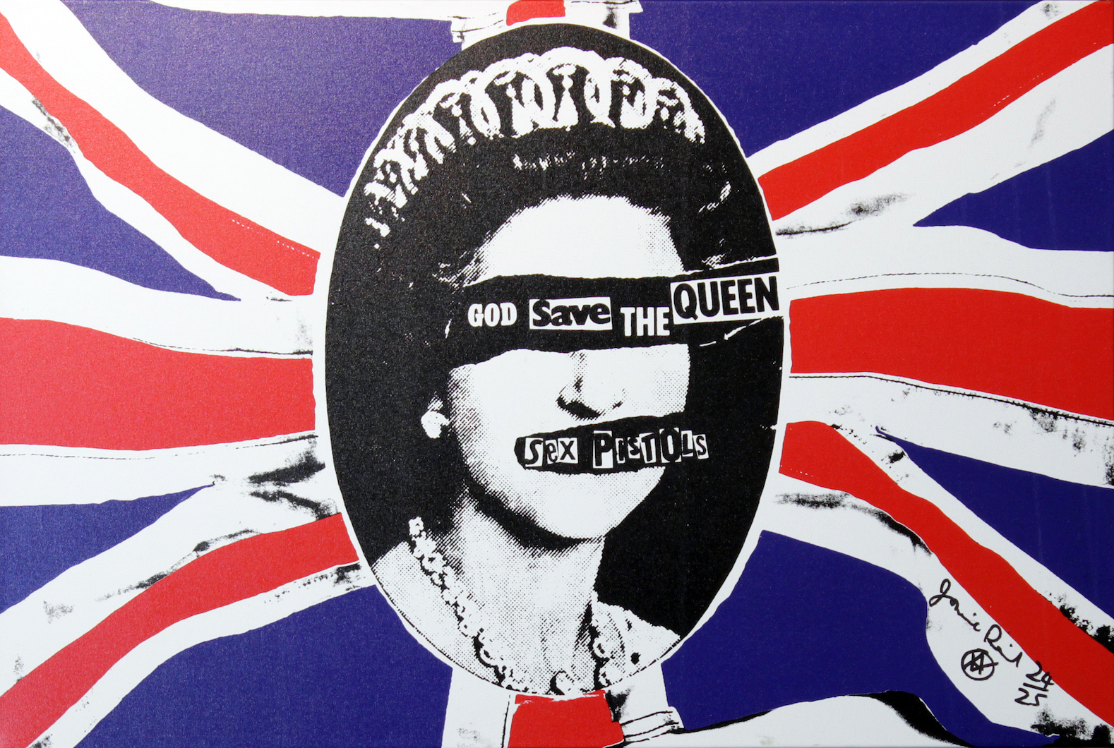
Jamie Reid, Sex Pistols, God Save the Queen, Poster, Collection of Andrew Krivine, 1977
“That’s the arc of the show — from a black-and-white gritty feel to this explosion of color and pattern,” says Cranbrook Art Museum director Andrew Blauvelt. “The graphic language of punk was much broader and really paralleled what was happening — and was even ahead of — contemporary art in the 1970s and 1980s.”
Blauvelt says patrons will be quick to recognize the work of a featured artist who, in many ways, defined the visual representation of the punk rock movement. “What most people think of when they think of punk is the work of Jamie Reid,” says Blauvelt. “They may not know him by name but they would certainly know him by his work with the Sex Pistols.”
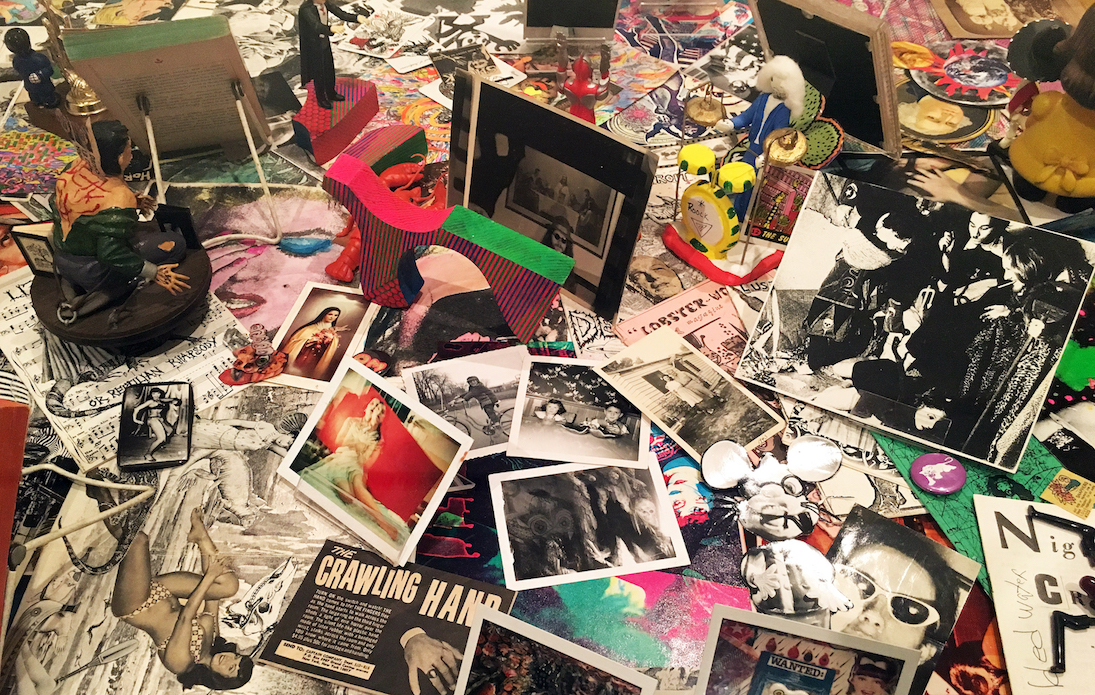
Installation, Punk Rock Memoirs 2018
While Too Fast to Live isn’t an exhibit based on musical history, it does present a chronological timeline tracing the evolution of the punk and new wave music genres overseas and in the U.S. via New York City. During this era, New York served as ground zero for a critical mass of counterculture musicians and artists who were forging an aesthetic that continues to be an influential force in contemporary design.
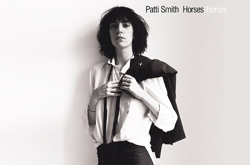
Robert L. Heimall -Design, Robert Mapplethorpe – Photographer, Patti Smith, Horses, Poster, 1975
In her debut album, Horses, 1975, Patti Smith became a fixture in the New York punk rock scene. Critics have viewed the work as one of the most influential albums in the history of the punk rock movement. Her three-cord rock was a simplistic cord structure, with rudimentary guitar work, and lyrics channeled by influences from William Blake to Arthur Rimbaud. Her performances often provided room for musical improvisation, and drew at times on Reggae, and jazz riffs. Horses mixed philosophical elements with traditional rock elements. Her early biography bleeds over into the life of Robert Mapplethorpe, who took the black and white image for the cover, as the two live together for a short time in lower Manhattan.
Smith says, “Horses was a conscious attempt to make a record that would make a certain type of person not feel alone. People who were like me, different … I wasn’t targeting the whole world. I wasn’t trying to make a hit record.”
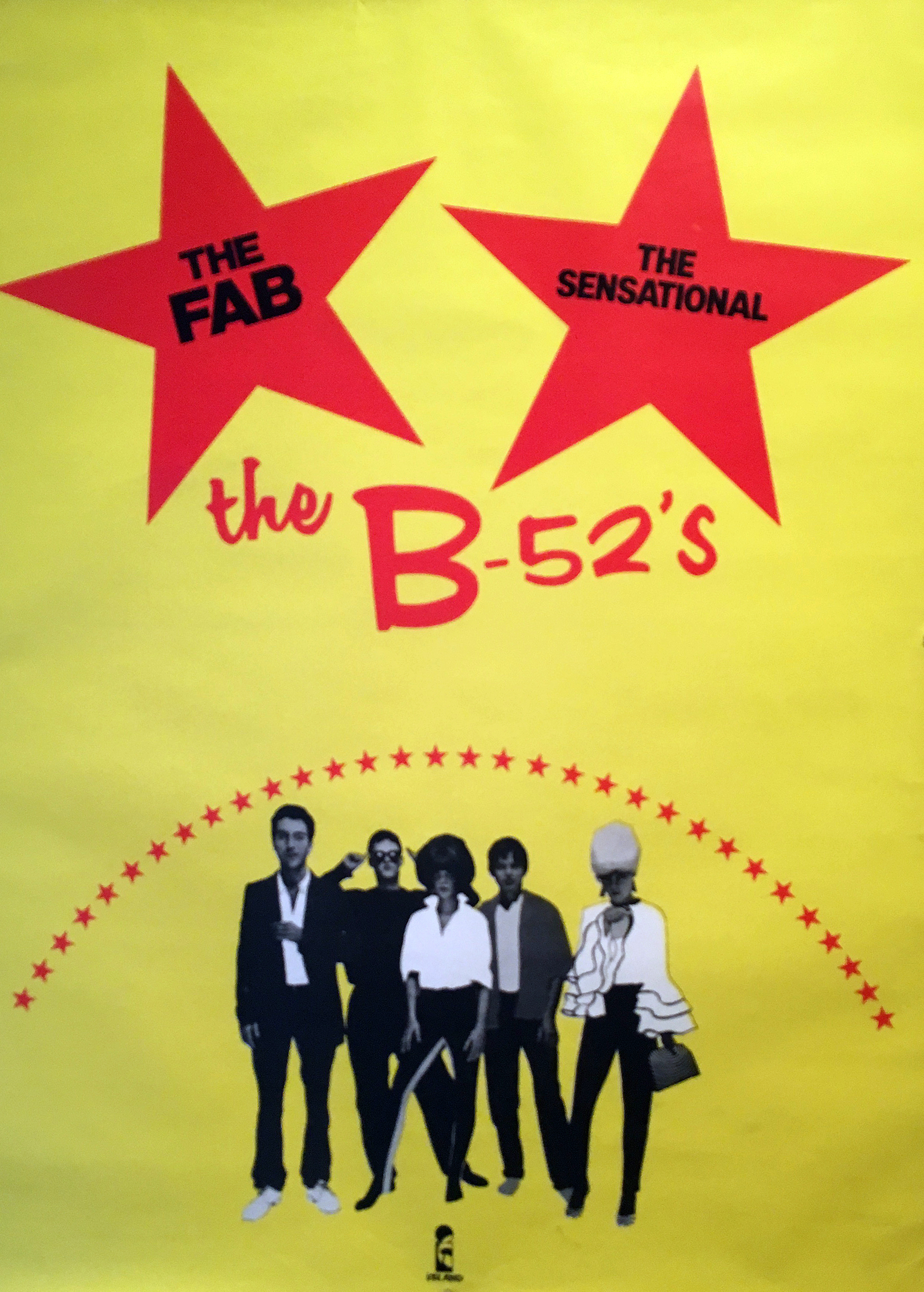
The B-52’s, American rock group, 1979
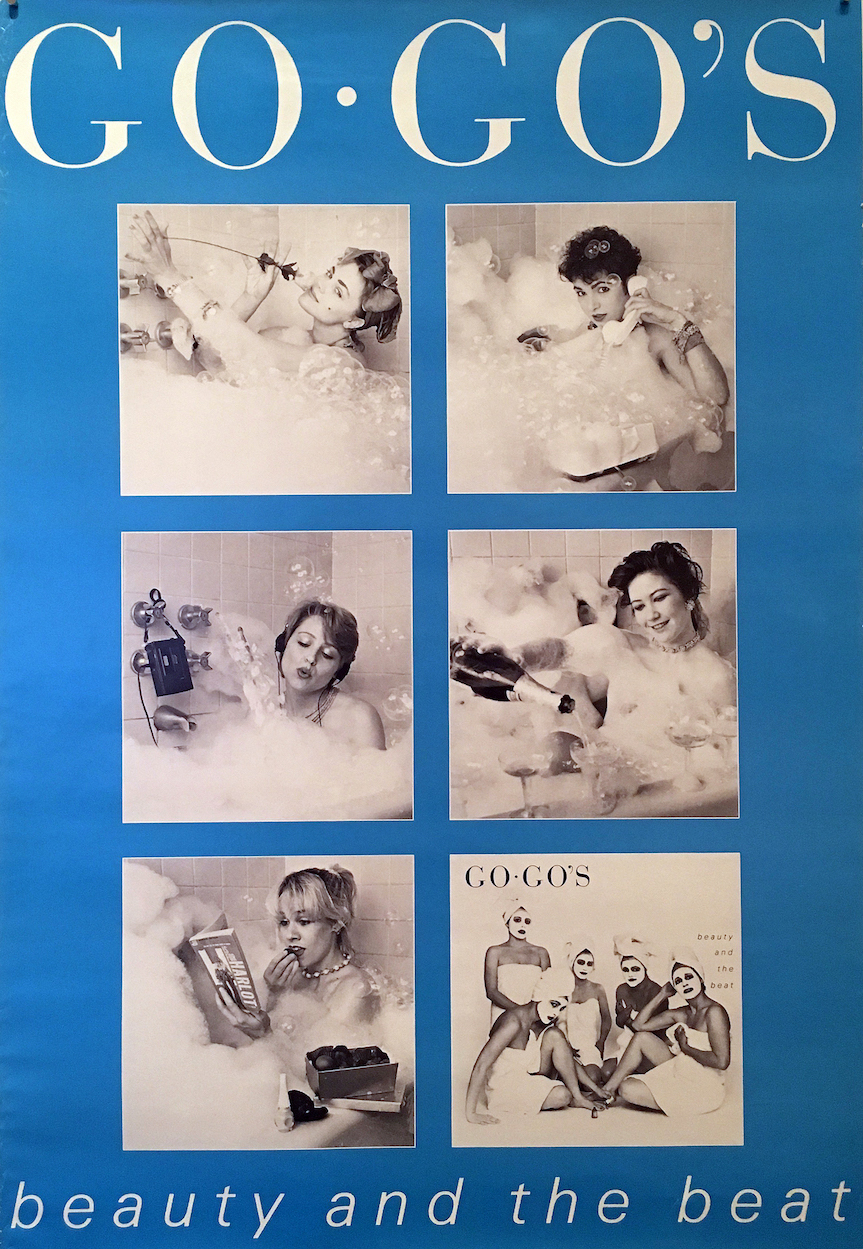
Go-Go”s, American all women rock group, Poster, 1981
The design of punk graphics ran concurrent to postmodern art practices of the times by raiding popular culture, scavenging history, subverting messages, and transgressing aesthetic rules. Punk fed the alternative music scene that would emerge in the late 1990’s as well as today’s do-it-yourself cultures that blur and erase the lines between professionals and amateurs. Punk’s trangressive spirit emboldened people from all walks of life to reimage themselves as creative agents and active participants in a culture driven by music, art, and design.
The legacy of punk has permeated modern culture and society, and its visual vocabulary infuses much contemporary art, while the punk spirit resonates in particular with the anti-elitist, DIY ethos of today’s young, blogging artists and musicians. Too Fast to Live…, recalls the anarchic spirit of authenticity and amateurism, the volatile and ambiguous celebration of negativity, and the creativity that was punk.
Too Fast to Live, Too Young to Die: Punk Graphics, 1976-1986” and the related Shepard Fairey. Salad Days,1989-1999 run June 16-October 7, 2018.