Jennifer Junkermeier Curates and Michaela Mosher Designs an Exhibition: Round in Circles.
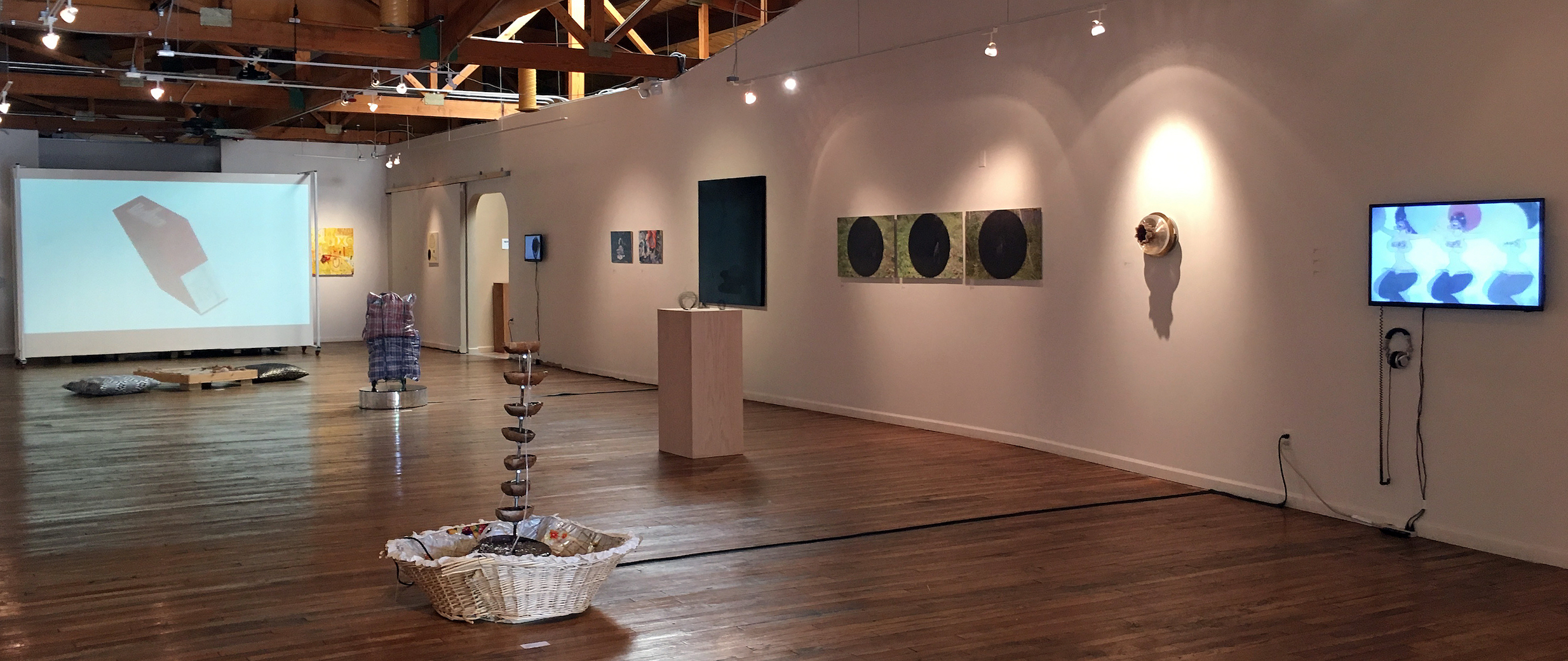
Installation Image, Round in Circles, N’Namdi Center for Contemporary Art, All Image Courtesy of the Detroit Art Review
For a gallery owner to ask someone to curate an exhibition is both exciting and a little risky. But George N’Namdi has been in this business for more than thirty-five years, and he knows exactly what he’s doing. By inviting a guest curator Jennifer Junkermeier, he is injecting new energy into his space, one that capitalizes on Detroit-based artists (33) and may very well bring new audiences into the gallery. Simone DeSousa has done something similar in her gallery, recruiting Nancy Mitchnik to curate some 70’s aging Cass Corridor artists (she is one herself) into her gallery, and both go outside the regular season because summer is the right time to do it. This is N’Namdi’s third annual summer show of Detroit artists with an invited curator. In 2016 it was Essay’d VI by Steve Panton, and 2015 was Mundo ‘Mericas curated by Vito Valdez.
Opening June 16, 2017, Round in Circles, is a collection of Detroit-based visual artists that provide nearly every medium, including painting, drawing, sculpture, video, projection, and literary work on the wall. If you need to tie that together with an idea, why not use the circle as a place to start, if not literally in the work, then probably in the mind of the artist, or a metaphor that applies to almost anything, dating back about 3000 years. She says in her statement, “Yes, going round in circles is dizzying, at once nauseating and exciting, impoverished and plentiful, the form that implies nothing also embraces the possibilities of being everything.”
It’s a pleasure for a writer to pick out some favorites, and say a little something because it is almost impossible to write a review when there is such a variety of work as there is in this exhibition.
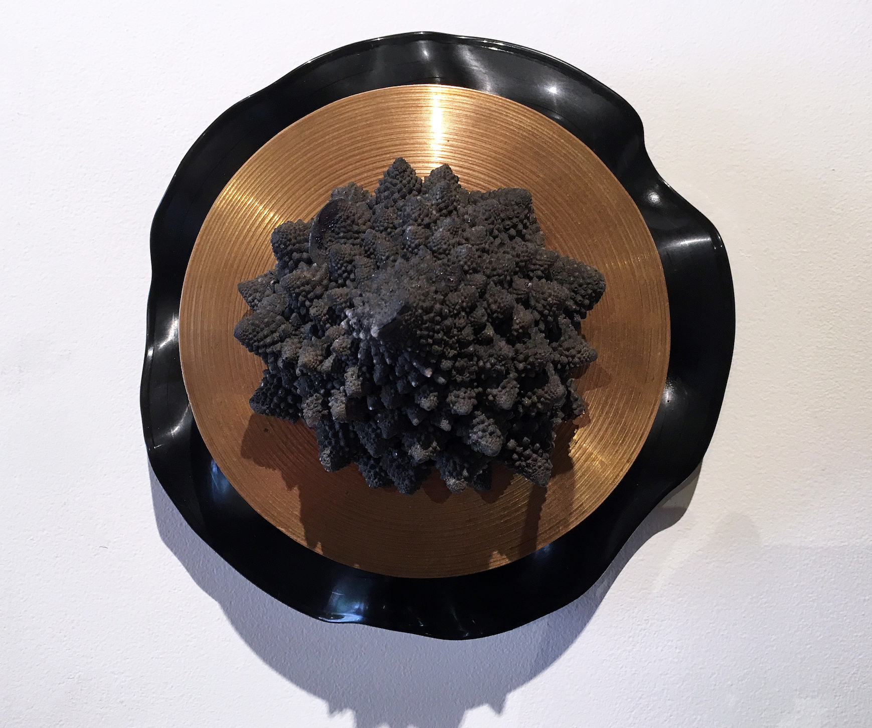
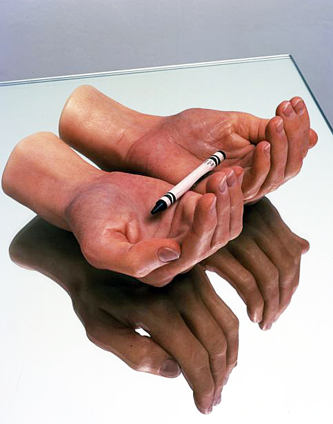
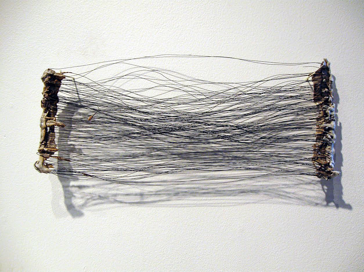
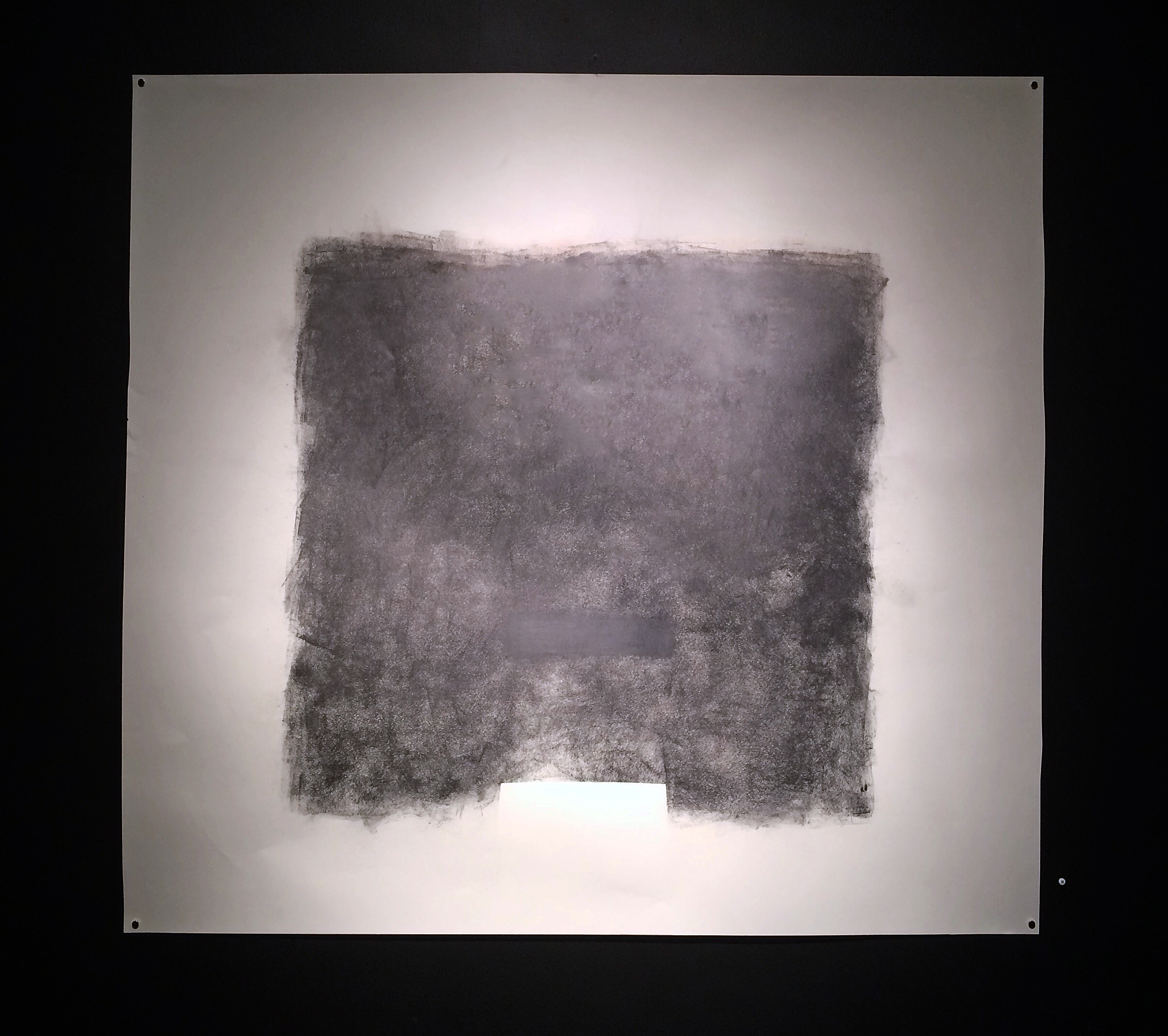
Graem White, You Are Here: Center of the Universe, Mixed Media, 11.5 x 14″
Graem Whyte is an artist that works with a wide variety of three-dimensional material, sometimes on the floor, sometimes on the wall. Born and raised in metro Detroit, Whyte is based in Hamtramck, MI where he and his wife Faina Lerman oversee the community-based activity at Popps Packing. Whyte’s work always feels very unconventional, driven more by the idea than the material, illustrated in his one-person exhibition at Oakland University in 2012. In his work, You Are Here, it seems to play on the border, a manipulated LP record, a gold plate, and a burst of Mixed Media, suggesting that music can be concrete. Graem Whyte is an adjunct art instructor at the Center for Creative Studies.
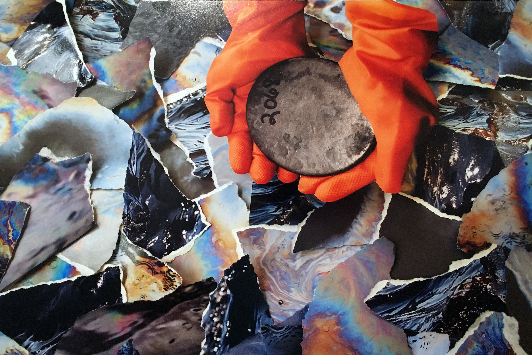
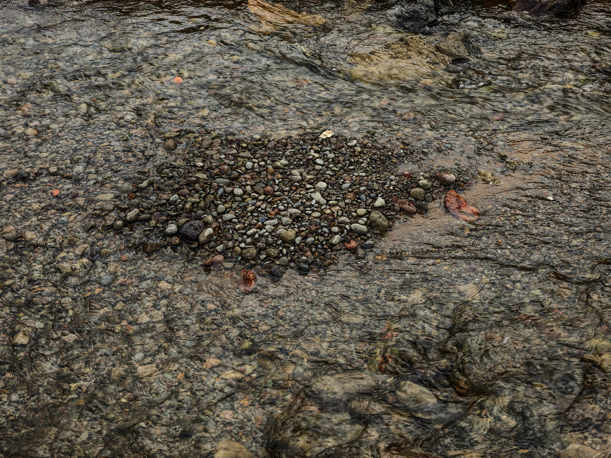
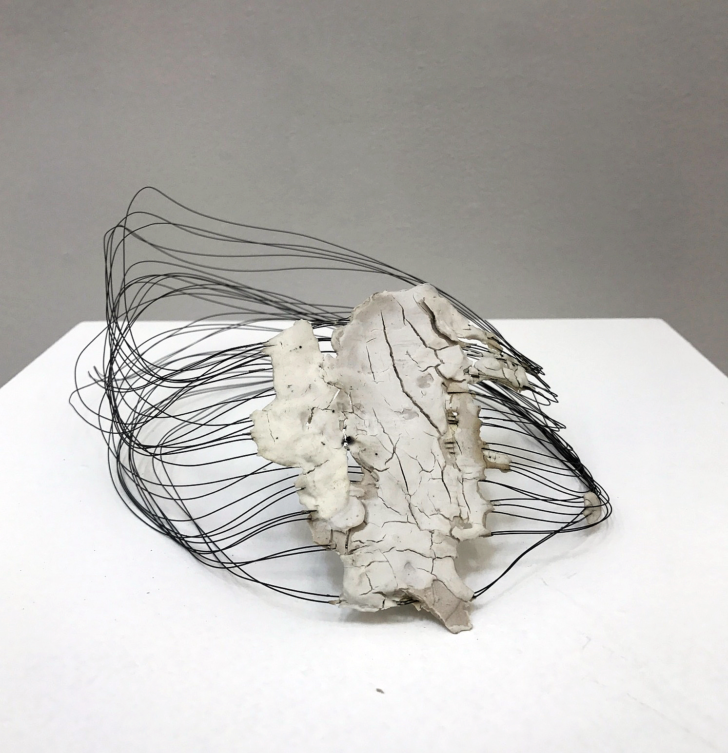
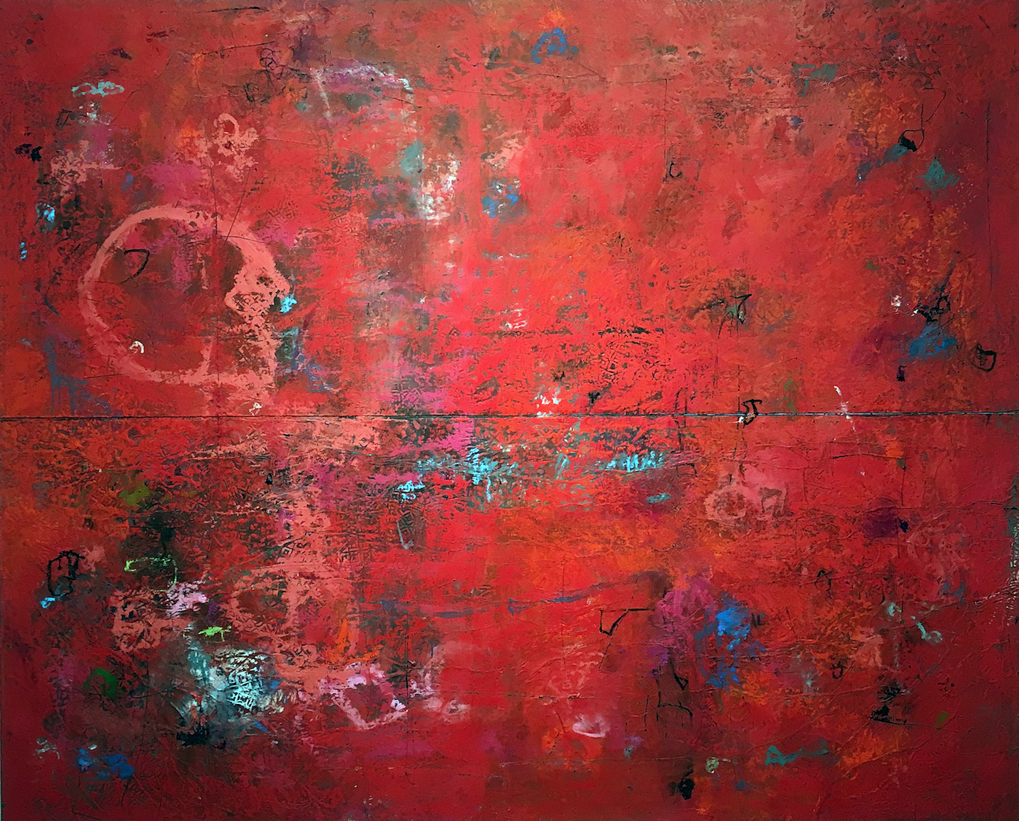
Shanna Merola, Untitled 2, from series “We All Live Downwind”, Archival inkjet pigment print, 14 x 20″
The photograph by Shanna Merola, from the series, We All Live Downwind, seems driven by her interest in documentary photography, and a deep concern for social justice. This writer is not trying to figure out the context of these orange gloves holding a ceramic dish, rather – enjoying the surrounding and colorful pieces of torn paper. Merloa was born in Bridgeport, Connecticut, 1980, earned her BFA at Virginia Commonwealth University, and an MFA Cranbrook Academy of Art. She lives and works in Hamtramck, Michigan.
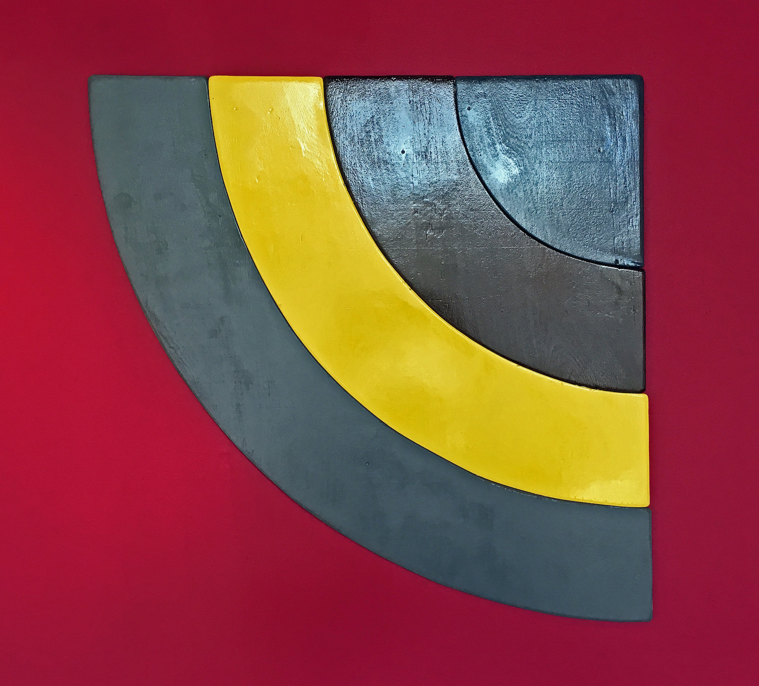
Todd Stovall, Untitled, Acrylic, Wood, 2 x 2′ 2017
Detroit artist Todd Stovall keeps the minimalist shaped canvas work alive in his work, Untitled, although this piece is entirely made of wood. The context for this kind of approach might be artists like Charles Hinman, Ellsworth Kelly, and Frank Stella. Stovall is not trying to do much with color, rather the simple power of shape, although the red wall is there to support his effort.
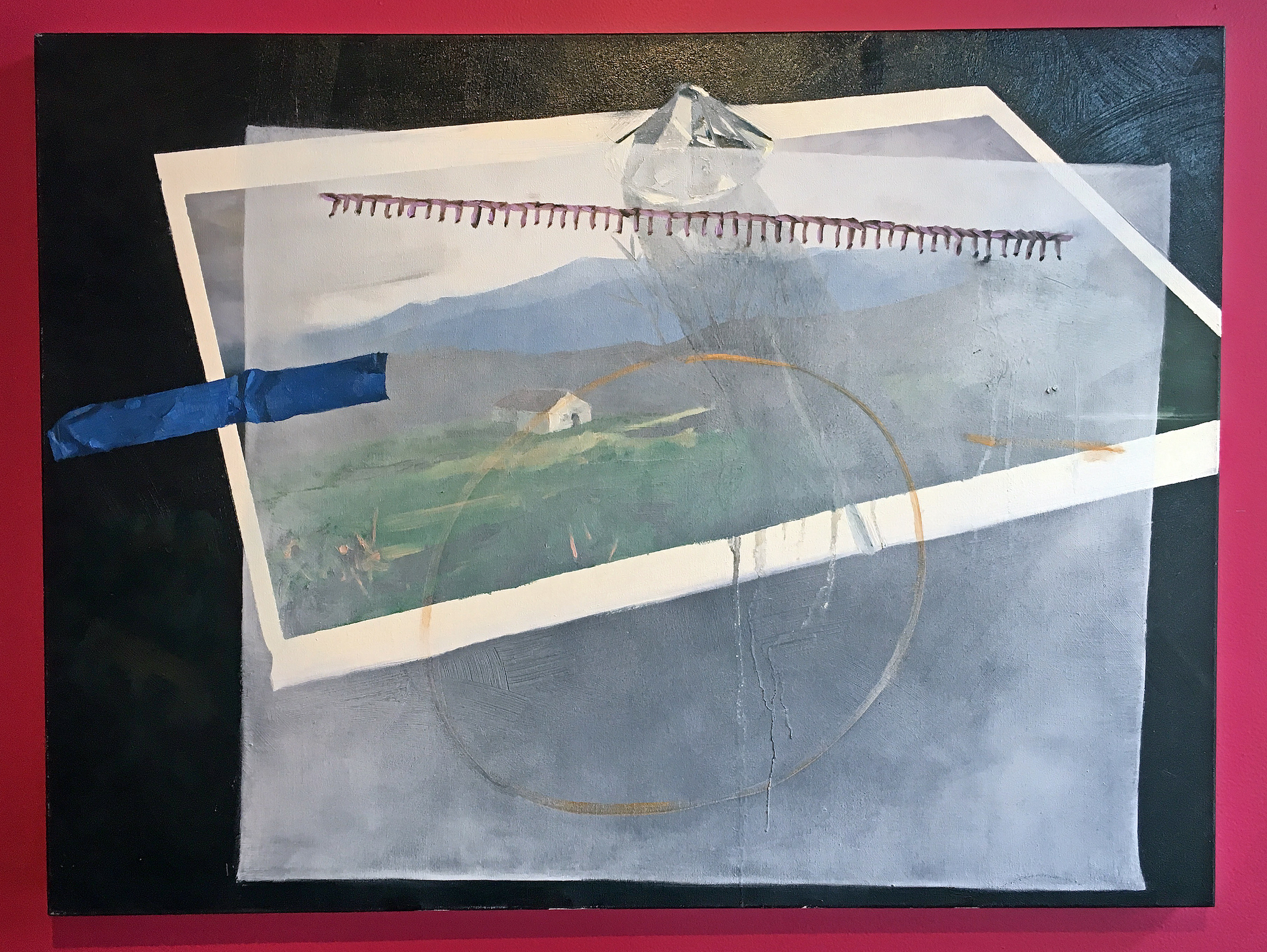
Clara DeGalan, A Veiled Asking, Oil on canvas, 2016
This oil painting, A Veiled Asking, by Clara DeGalan reflects a deep and progressive direction from her earlier work in graduate school, an MFA from Wayne State University in 2015, and a two-person exhibition in 2016 at the Birmingham Bloomfield Art Center. It’s this idea of transparency and the illusion of dimension that creates a mystery that leaves us wanting, combined with an offset but a sturdy sense of composition. All of this held together by a circle and a piece of blue tape. Lovely.
“Round in Circles is a group exhibition that explores formal and metaphorical implications of the circular.” Says Junkermeier. The exhibition could send a signal to other galleries, to experiment (certainly some do) during your summer months, and realizing there is limited space for thirty-three artists, at least I can mention their names as part of this exhibition.
Contributing Artistis: ‘jide Aje, Danielle Aubert, Corrie Baldauf, Davin Brainard, Tyanna J. Buie, Alexander Buzzalini, Shane Darwent, Clara DeGalan, Simone DeSousa, Erin Imena Falker, Jessica Frelinghuysen, Ani Garabedian, Richard Haley, Asia Hamilton, Megan Heeres, Eli Kabir, Osman Khan, Austin Kinstler, Nicola Kuperus, Timothy van Laar, Anthony Marcellini, Adam Lee Miller, Shanna Merola, Eleanor Oakes, Ato Ribeiro, Robert Platt, Marianetta Porter, Dylan Spaysky, Todd Stovall, Gregory Tom, Graem Whyte, Elizabeth Youngblood, and Alivia Zivich
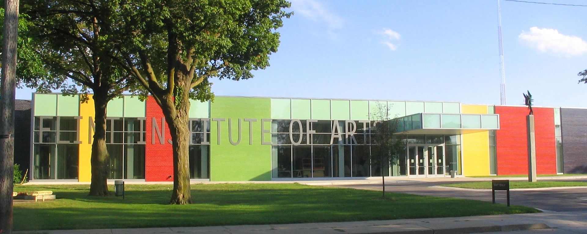
N’Namdi Center for Contemporary Art
Round in Circles through August 26, 2017