Detroit Art Review

Critical art reviews of Detroit galleries and museums weekly

Carole Harris @ WSU

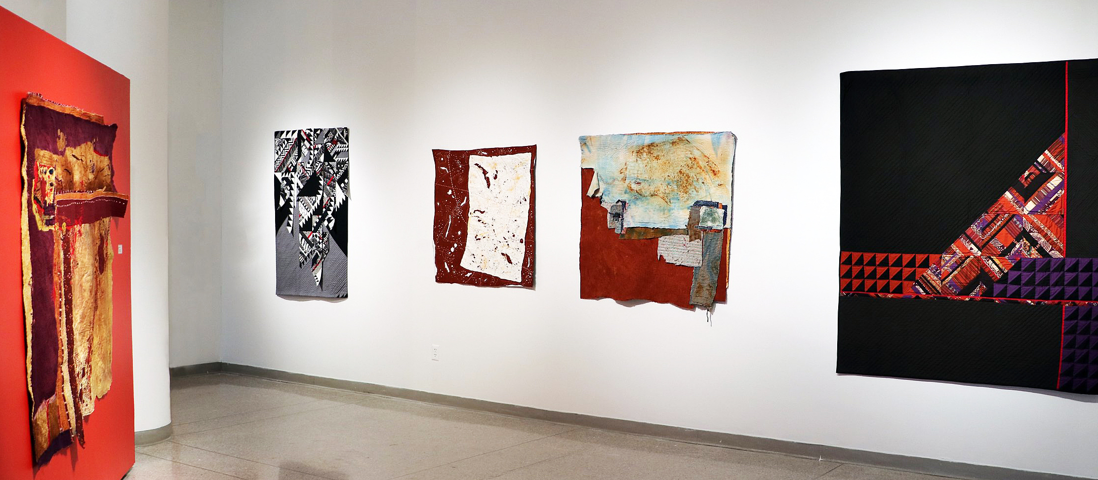
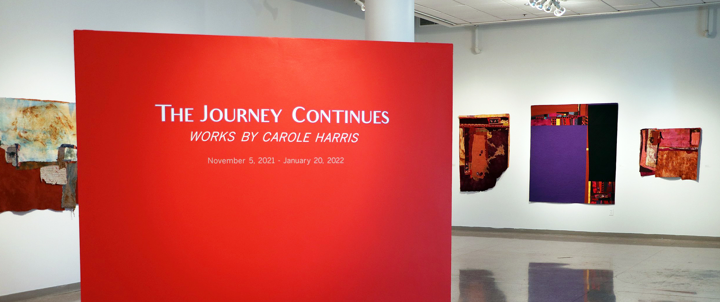
The Exhibition The Journey Continues on display at the Wayne State University’s Elaine L. Jacob Gallery

Carol Harris, Installation image and those to follow are provided by DAR and WSU

The exhibition of Carole Harris’s work on the gallery’s upper level opened November 5, 2021, in conjunction with the lower level exhibition of Harold Neal’s work, both on display through January 20, 2022. Over the last ten or more years, the fiber artist has overcome the trappings of traditional quilting to explore form, shape, and color expressed as non-objective abstract expressionism.

She says, “My work relies on improvisation. I am fascinated by the rhythms and energy created when I combine multiple patterns and textures. I let the materials and colors lead me on a rhythmic journey”.

The video presented here was created as part of her 2015 Kresge Visual Arts Fellowship award and provides insight into how the artist sees her work.

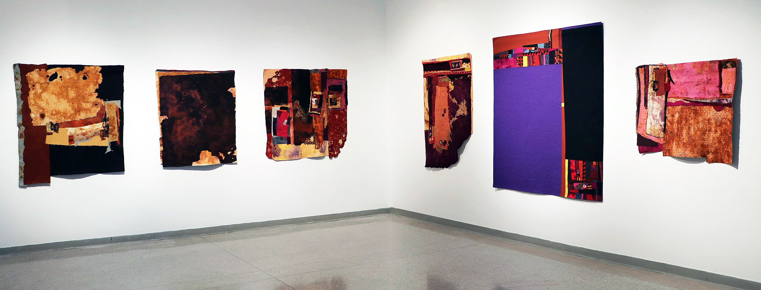
This writer has written about Ms. Harris and her work several times over the past five years at the Detroit Art Review and observed her work that has redefined the basic concepts of quilting to suit her own purposes. In taking her “working background” in fiber, she has expanded those tools to create colorful abstract compositions comprised of stitchery, irregular shapes, and textures.

Carole Harris, Installation image.

It is well known that Harris was taught needlework in her early years by her mother, providing a base of knowledge and experience that served her well as she studied art and design throughout her educational experience. Her abstract compositions have been described as maps, perhaps ariel in nature, and often dominated by warm dark organic colors. The edges of shapes vary from torn to cut, as does the entire form of the works parameter. Although Harris’s work is rooted in a culture that has a deep respect for fiber, there may have come a time when the influences of contemporary artists such as Al Loving, Sam Gillam, or Frank Stella seeped into her sensibility.

Carole Harris, Installation image.

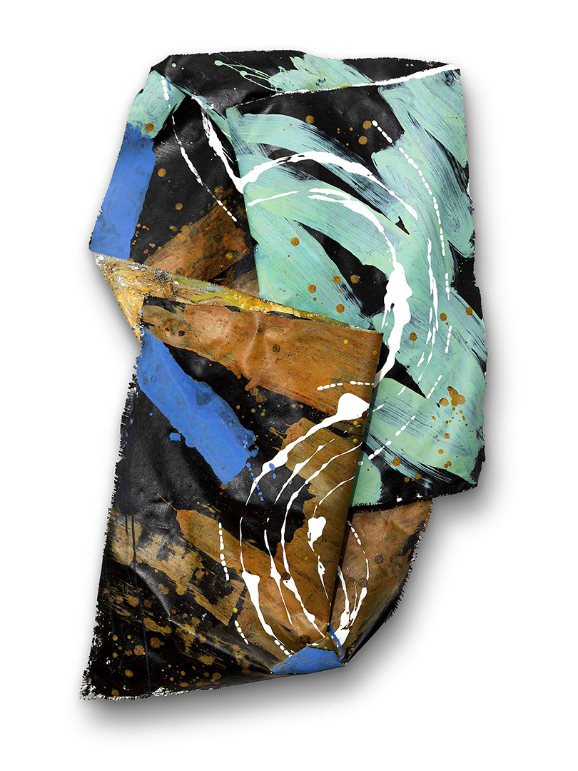
The most recent development in her work is a centuries-old Korean felting technique known as Joomchi, where these layered pieces are built from heavily soaked and worked Mulberry paper. The composition is filled with unique surfaces that often reference maps of real and sometimes imagined landscapes. Using this process, Harris has archived the transformation of multiple elements into completely new structures.

Harris has recently (2021) had an exhibition at the Hill Gallery in Birmingham, MI where she had a display of both paper and fabric collages. From her statement in a recent review by K.A. Letts for the New Art Examiner, she says, “I now draw inspiration from walls, aging structures, and objects that reveal years of use. My intention is to celebrate the beauty in the frayed, the decaying and the repaired. I want to capture the patina of color softened by time, as well as feature the nicks, scratches scars and other marks left by nature or humans. I want to map these changes and tell the stories of time, place and people in cloth, using creative stitching, layering and the mixing of colorful and textured fabrics.”

For those young artists who are studying fabric/fiber visual art, it would seem the work of Carole Harris would be on their radar, not just the compositional designs, but the voyage of a lifetime of quilting and textile collecting – to making a significant transition from functional art to the gallery or museum wall.

Carole Harris’s work has been exhibited in museums and galleries nationally and internationally, including the Renwick Gallery at the Smithsonian Institute in Washington, D.C; The Detroit Institute of Arts in Detroit, MI, The Museum of Art & Design in New York City, as well as exhibitions that traveled throughout Europe & Asia.

Carole Harris earned her BFA from Wayne State University.

Note:  Due to the upsurge in COVID cases and new protocols the show is now only available virtually through WSU Elaine Jacobs Gallery website.


African Fashion & Shirley Woodson @ DIA

The New Black Vanguard: Photography between Art and Fashion & Shirley Woodson: Shield of the Nile Reflections on exhibition at the Detroit Institute of Arts
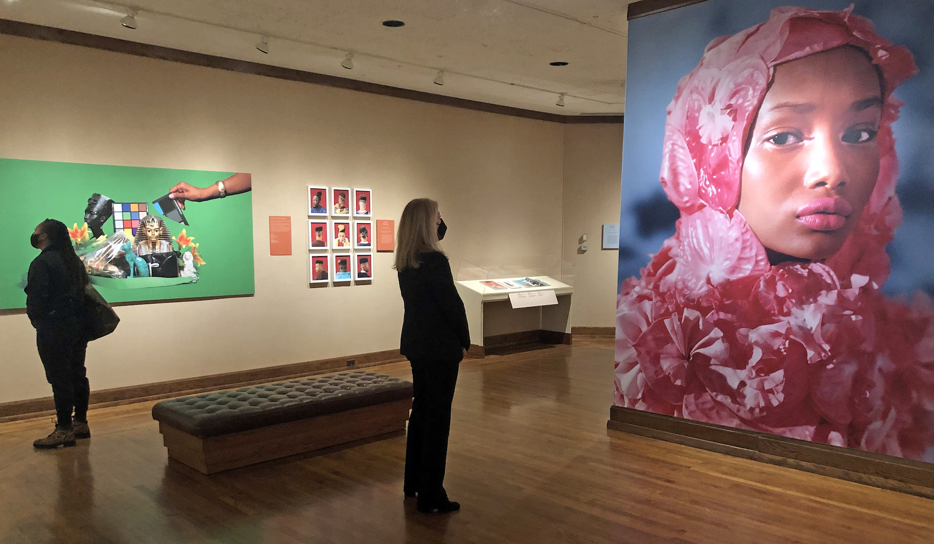
 

The New Black Vanguard Photography, installation image at the DIA, courtesy of DAR

For anyone laboring under the winter blues, two luminous new shows by Black artists at the Detroit Institute of Arts promise a quick, color-saturated cure — “Shirley Woodson: Shield of the Nile Reflections,” up through June 12, and “The New Black Vanguard: Photography between Art and Fashion,” which comes down April 17, 2022.

While the two exhibitions are very different – oil paintings by a Detroit artist vs. international high-fashion photos – they resemble one another in their fresh spirit and the undeniable sense that you’re witnessing something strong and new.

Take “The New Black Vanguard” first, a traveling show organized by Aperture, the photography nonprofit in New York City. This dazzling exhibition features the work of 15 emerging Black photographers from Africa and the African diaspora, working in places as disparate as Johannesburg, Harlem, Lagos, and London. Many of the images on display were drawn from fashion magazines, advertisements, museum collections, and social media.  In a nice localizing touch, there’s also a DIA-curated section in the last gallery, “New Gazes – Detroit,” which focuses on six metro-area Black photographers.

Many of the artists here are pushing boundaries, both aesthetic and cultural, with all their might, engaging topics as diverse as colorism, gender expression and alternate concepts of beauty. Nancy Barr, who heads the museum’s Department of Prints, Drawings, and Photographs, calls the exhibition “inspiring,” and says she’s been gratified by “how easily visitors are connecting with the imagery and quotes from the photographers.” Given the punchiness and variety of pictures on display, that’s no surprise.
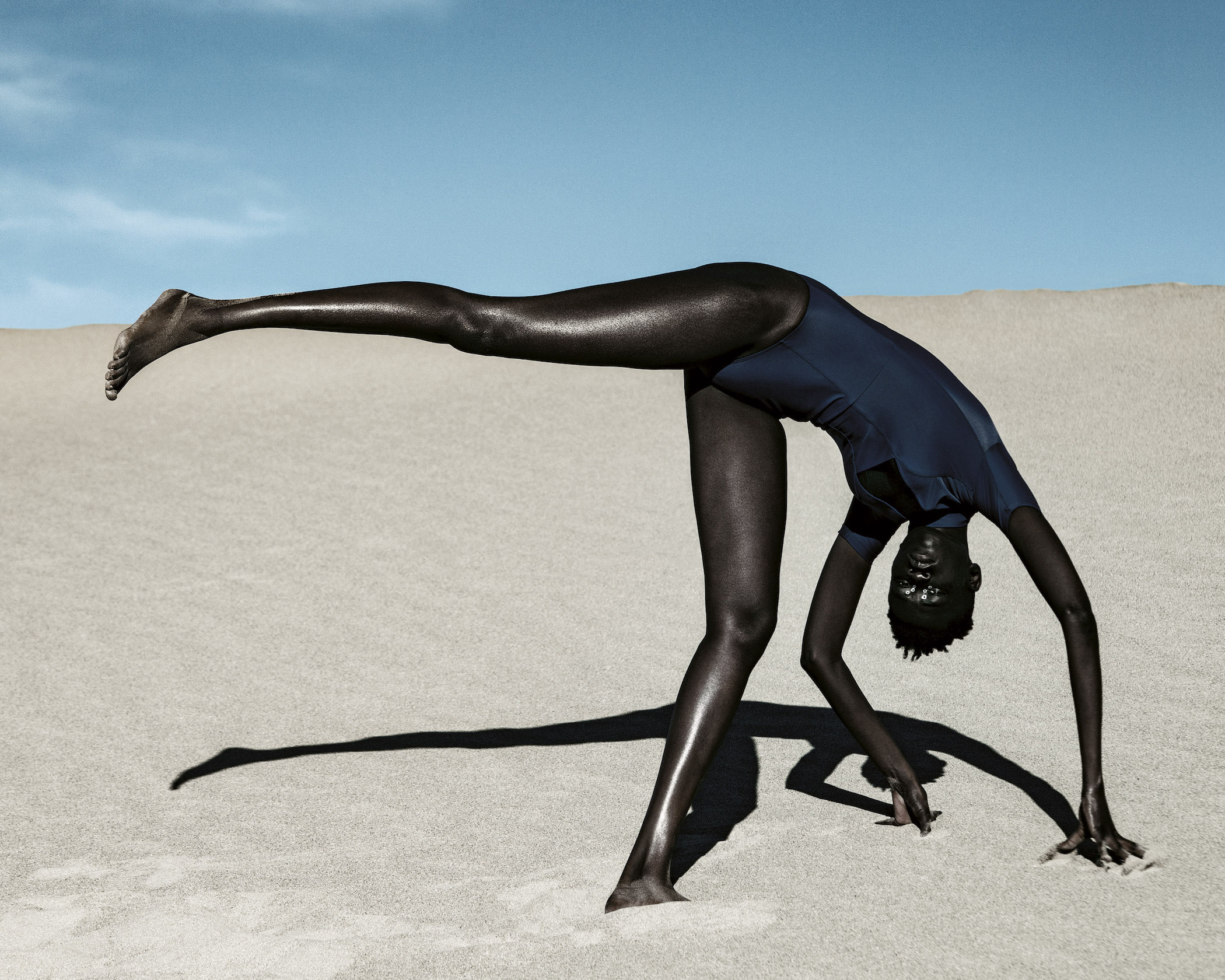
Dana Scruggs, Nyadhour, Elevated, Death Valley, California, 2018, photo print.

 Start with Dana Scruggs. This Chicago-born artist, whose work has appeared in GQ, ESPN magazine, and Rolling Stone, has finessed the fine art of highlighting the drama in very dark skin, playing with an almost Caravaggio-like chiaroscuro that gives her work remarkable tone and depth. The models in question, of course, are the sorts who in an earlier, more-colorist era, would likely have been shunned as “too Black.” But in Scruggs’ prints, their chiseled features and sculpted bodies pass beyond mere beauty into something more profound — an almost mythic presence, simultaneously universal and individual.

Her 2018 “Nyadhour, Elevated, Death Valley, California” is one of the most captivating images in a show full of them. The lean, striking American model Nyadhour Deng wears a one-piece black swimsuit that virtually disappears against her skin in the blinding desert glare. She appears to be one-third of the way into a cartwheel – both hands planted in the sand, and one leg starting its aerial rotation. The odd, arched pose is echoed by the sharp shadow beneath. Set against sun-baked dunes, the composition reads more like contemporary sculpture than a fashion shoot.

Daniel Obasi, from Lagos, Nigeria, also creates something monumental with his remarkable tableau, “Moments of Youth,” featuring four young men fashionably attired in tropical colors, and shot from below as they balance precariously on the prow of a wooden vessel. This being a fashion shoot (first published in the journal Primary Paper), the bare-chested man in front in the 1940s-style slacks has a green, gauzy fabric wrapped about his black-marble torso, but while setting up a cool visual contrast, it does nothing to lessen the photo’s heroic vibe.
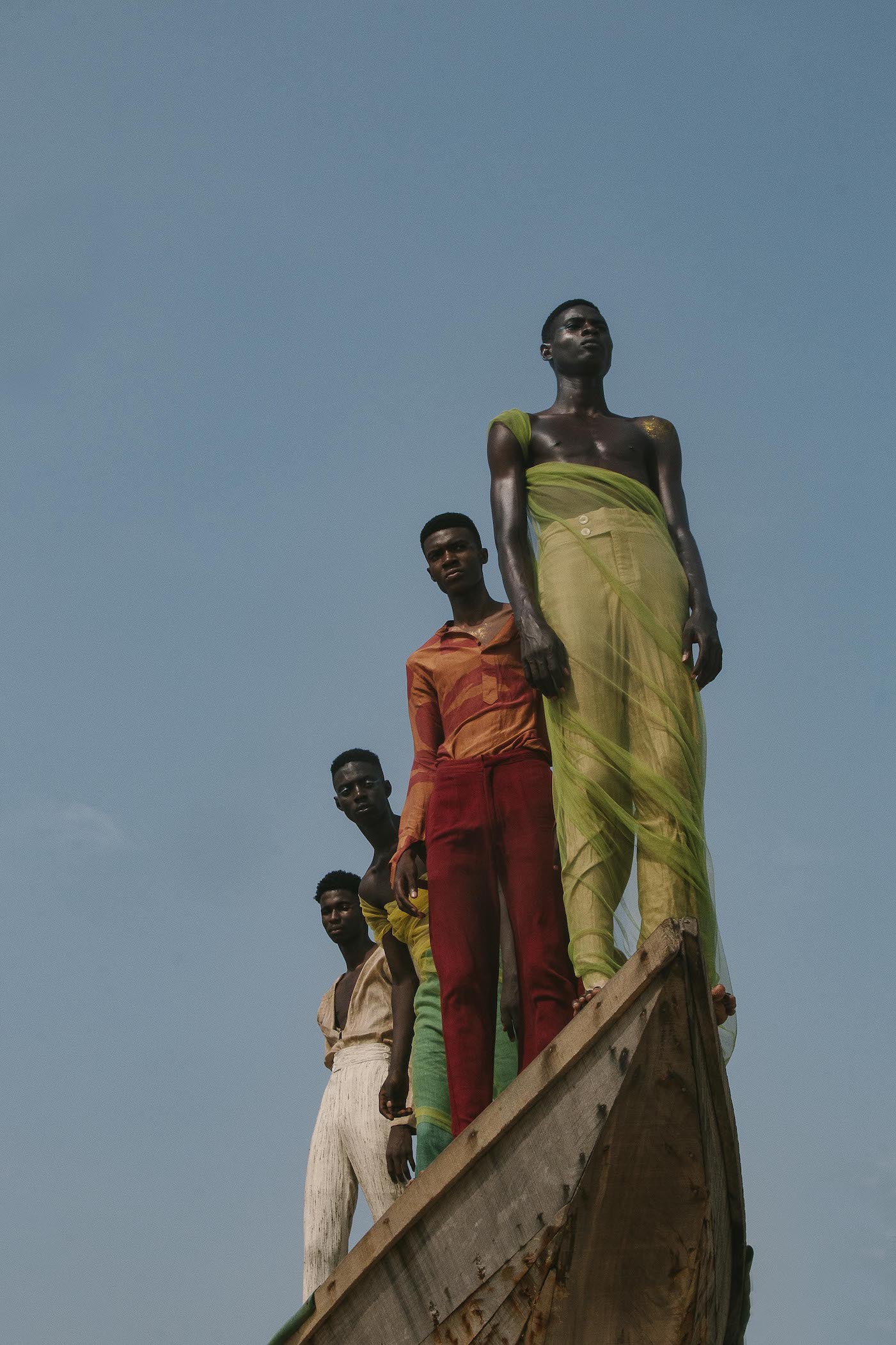
Daniel Obasi, Moments of Youth, Lagos, Nigeria, 2019, photo print

 Color, in this case, strong pink, plays a huge role in Tyler Mitchell’s 2019 “Untitled (Hijab Couture), New York,” resulting in an image that’s both puckish and breathtaking. Its young beauty is encased, as it were, from head to toe by a garment made of huge, pink flower petals that form a sort of impenetrable shell. For all the hauteur in the young woman’s eyes above her pink-pink lips, Mitchell – whose September 2018 Vogue cover shot of Beyoncé was a first, remarkably, for a Black photographer – has created an intimate, albeit intense, portrait. So too with his “Untitled (Hat), New York, 2018,” a gender-bending study of a young man with challenging eyes beneath a large, tilt-disc hat of the sort favored by British royalty.

(Visitors who enjoy “Black Vanguard’s” intensely colorful display might also want to walk through “Black is Beautiful: The Photography of Kwame Brathwaite,” a black-and-white show of work from the 1960s that’s up at the museum through Jan. 16.)
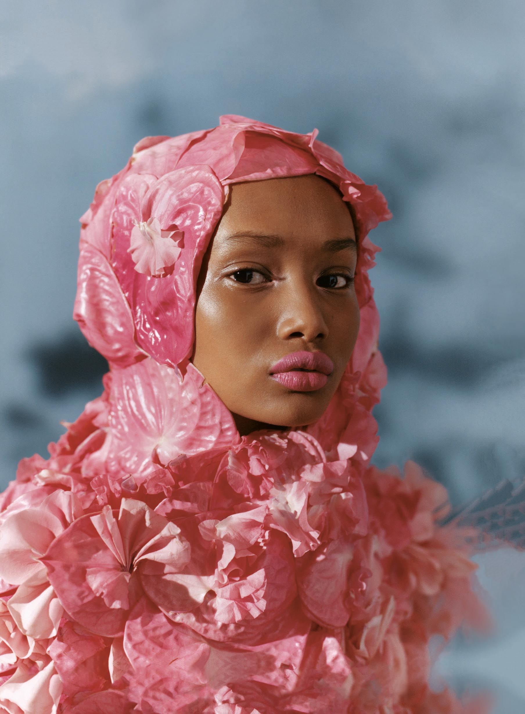
Tyler Mitchell, Untitled (Hijab Couture), New York, 2019, photo print

For her part, Detroit artist Shirley Woodson, now in her mid-80s, has had quite a year. Last January, she was named the Kresge Foundation’s 2021 Eminent Artist, an honor that spotlights a lifetime of artistic achievement and community engagement, and comes with a $50,000 no-strings stipend. And earlier this fall, Detroit Artists Market hosted a career retrospective, “Shirley Woodson: Why Do I Delight,” which closed just before Halloween.

Now comes the artist’s first solo show at the DIA, “Shirley Woodson: Shield of the Nile Reflections,” with 11 brightly colored canvases guaranteed to staunch your seasonal affective disorder. As the title suggests, a river runs through almost all of these, Woodson’s testament to the spiritual and cultural significance of the Nile for Black Africans, both on the continent and in the diaspora.

Detroit artist Allie McGhee (whose solo show, “Banana Moon Horn,” is up at the Cranbrook Art Museum through March 20), calls Woodson’s richly textured style “a sort of bridge between abstract and Impressionism,” and there’s no denying her freely rendered, lush canvases pack a vibrance and hard-to-define emotional punch. Wielding vivid color, symbols and figures, Woodson creates bright, inscrutable canvases laden with totemic meaning. Interestingly, however, most of her female figures look out at the world with blank faces. The artist explains she doesn’t assign them features “because I think the viewer can become a part of the work using [their] own imagination.”
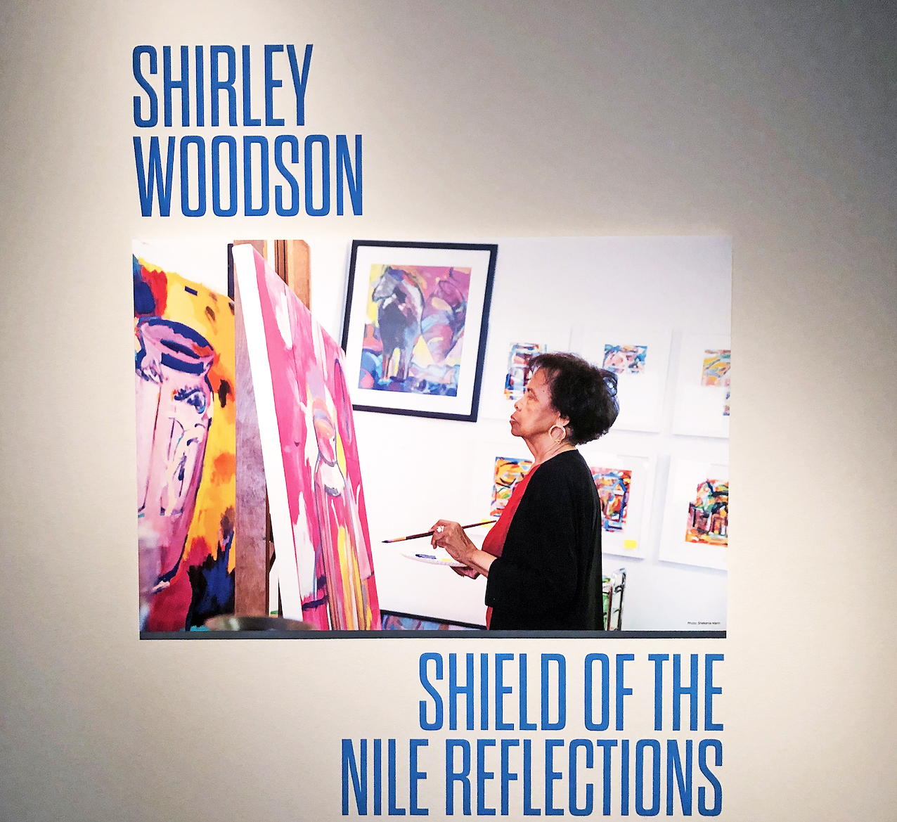
Shirley Woodson, Shield of the Nile Reflectins, installment image,

As it happens, Woodson – a longtime Detroit Public Schools art teacher with graduate degrees from Wayne State University and the School of the Art Institute of Chicago — has been working with the Nile for decades, seeing in the world’s longest river a metaphor for Africa and the African experience generally. With her 1984 “Shield of the Nile, No. 2,” a pair of women deeply immersed in water balance an oval shield between them. The two, apparently treading the rainbow-hued water, are also armed with arrows, suggesting a fierceness that calls to mind the legendary Amazons. Indeed, Woodson has said her figures were partly inspired in part by another mythic figure, Diana, Roman goddess of the hunt. But for all its possible symbolism, “Shield of the Nile” succeeds most extravagantly as a lavish color study whose warmth you can practically feel from across the room.
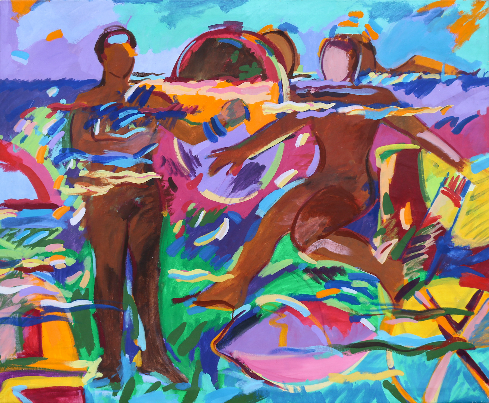
Shirley Woodson, Shield of the Nile, No. 2, Acrylic on canvas, 1984.

In “Flight with Mirror,” a 2014 work starring a determined-looking woman riding a horse through the waters, the artist has constructed a scene of seeming triumph, never mind the title,  that underlines women’s power and innate creativity long ignored by a male-dominated cultural elite. Interestingly, this woman, unlike so many of her figures, is fully equipped with facial features. If you’re tempted to see Woodson herself in the painting, go right ahead.

Her longtime friend and protégé, the late Gilda Snowden — quoted in the Kresge Foundation monograph “A Palette for the People: The Vibrant World of Shirley Woodson” – put it as well as anyone: “Shirley deftly unites color, myths, historical references with a little bit of magic into works that are glorious renditions of what life could be and should be.”
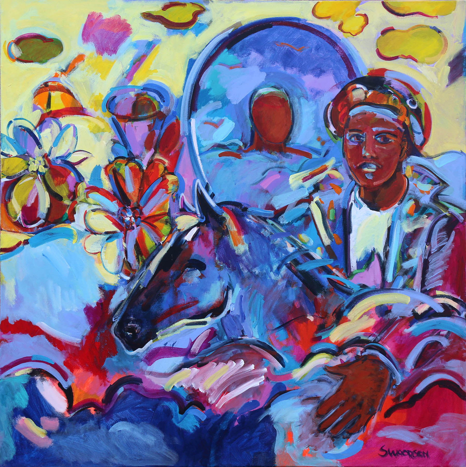
Shirley Woodson, Flight with Mirror, Acrylic on canvas, 2014.

The New Black Vanguard: Photography between Art and Fashion” will be at the Detroit Institute of Arts through April 17. “Shirley Woodson: Shield of the Nile Reflections” will come down June 12, 2022.
 

Allie McGhee @ Cranbrook

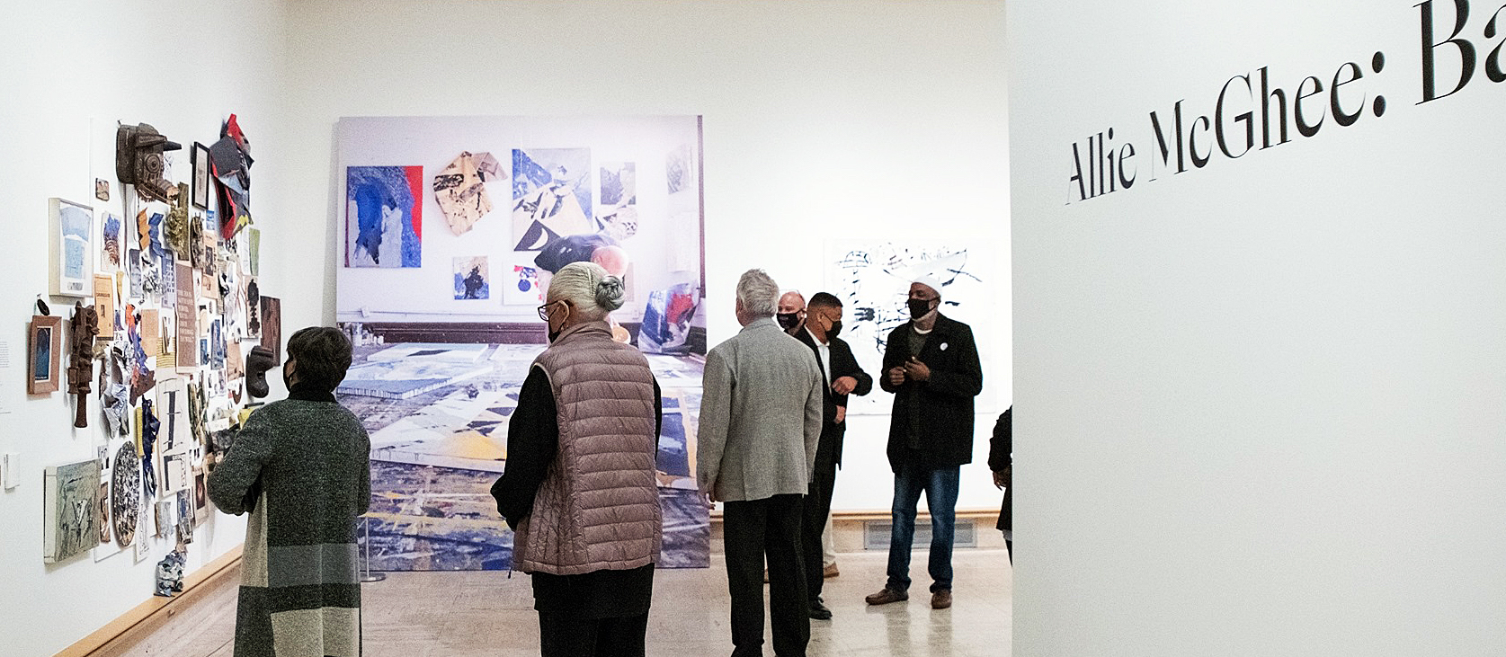
Detroit Artist Allie McGhee exhibits a Retrospective, Banana Moon Horn, at Cranbrook Art Museum

Installation image, Allie McGhee, Retrospective, Banana Moon Horn, at Cranbrook Art Museum, all images courtesy CAM

Cranbrook Art Museum (CAM) opened a retrospective exhibition of artwork by artist Allie McGhee on October 30, 2021, which spans five decades of work produced at McGhee’s Jefferson Avenue studio in Detroit.

Laura Mott, the chief curator of contemporary art and design at Cranbrook Art Museum, curated the exhibition. She says, “My interest in Allie McGhee’s work came from seeing his paintings at local galleries in Detroit, but when I did my first studio visit with him, it was a revelation.  In his studio, I saw decades of work and an incredible arc of his artistic practice since the 1960s.  There is also a richness of ideas in his methods of production and research into history and science. When one encounters an incredible mind like Allie’s, it becomes a necessity to tell his story.  Furthermore, his work needed to be contextualized in art history, which is why it was important to have both an exhibition and publication.”

The exhibition brings together artwork that demonstrates the evolution of McGhee’s work back to the 1960’s, beginning with early representational work that quickly evolved to abstraction. McGhee’s work was heavily influenced by trends in the abstract expression movement and influenced by jazz musicians in the Black community.

Andrew Blauvelt, director of Cranbrook Art Museum, said of some of McGhee’s work, “Learning of McGhee’s interest in astronomy, their crumpled and twisted forms have taken on a new resonance, one that recalls the spatial complexities of Catastrophe theory and, in particular, the relative notion of the fold.”

This exhibition takes on more than forty years of paintings and drawings and documents the growth of one of Detroit’s most important artists. The museum produced this short 6-minute video as an introduction to Allie McGhee and his work.

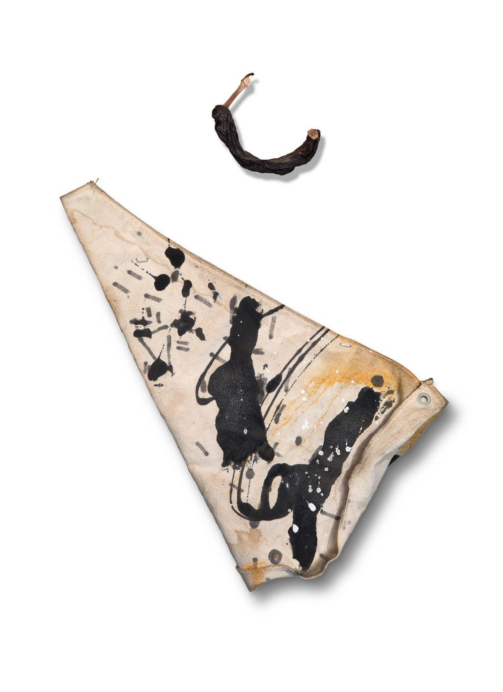
From his recent talk at Cranbrook, the story goes that McGhee came upon an object in the street that reminded him of a KKK hood.  The object was an icing cone used in a bakery.  This occurred in a time period just a year or so after the 1967 Detroit Rebellion and caused McGhee to harness that energy and create an object that hung on the wall alongside a petrified banana, foreshadowing what would repeat itself for years to come.

Allie McGhee, The Ku Klux Klown, Mixed Media on found object, petrified banana, 1961.  All images courtesy of CAM

Ku Klux Klown coincided with his association with a black artist cooperative founded by Charles McGee. Charles organized the landmark 1969 exhibition Seven Black Artists at the Detroit Artists Market and founded Gallery 7. Along with Allie McGhee, members included Lester Johnson, Robert Murray, James Lee, Harold Neal, and Robert J. Stull.  For years, Allie McGhee pursued abstract expressionism using a variety of sizes, shapes, and materials on a flat canvas that hung on the wall. The object and the banana became the center of what was to be called Banana Moon Horn, the title of this exhibition and the Cranbrook publication.

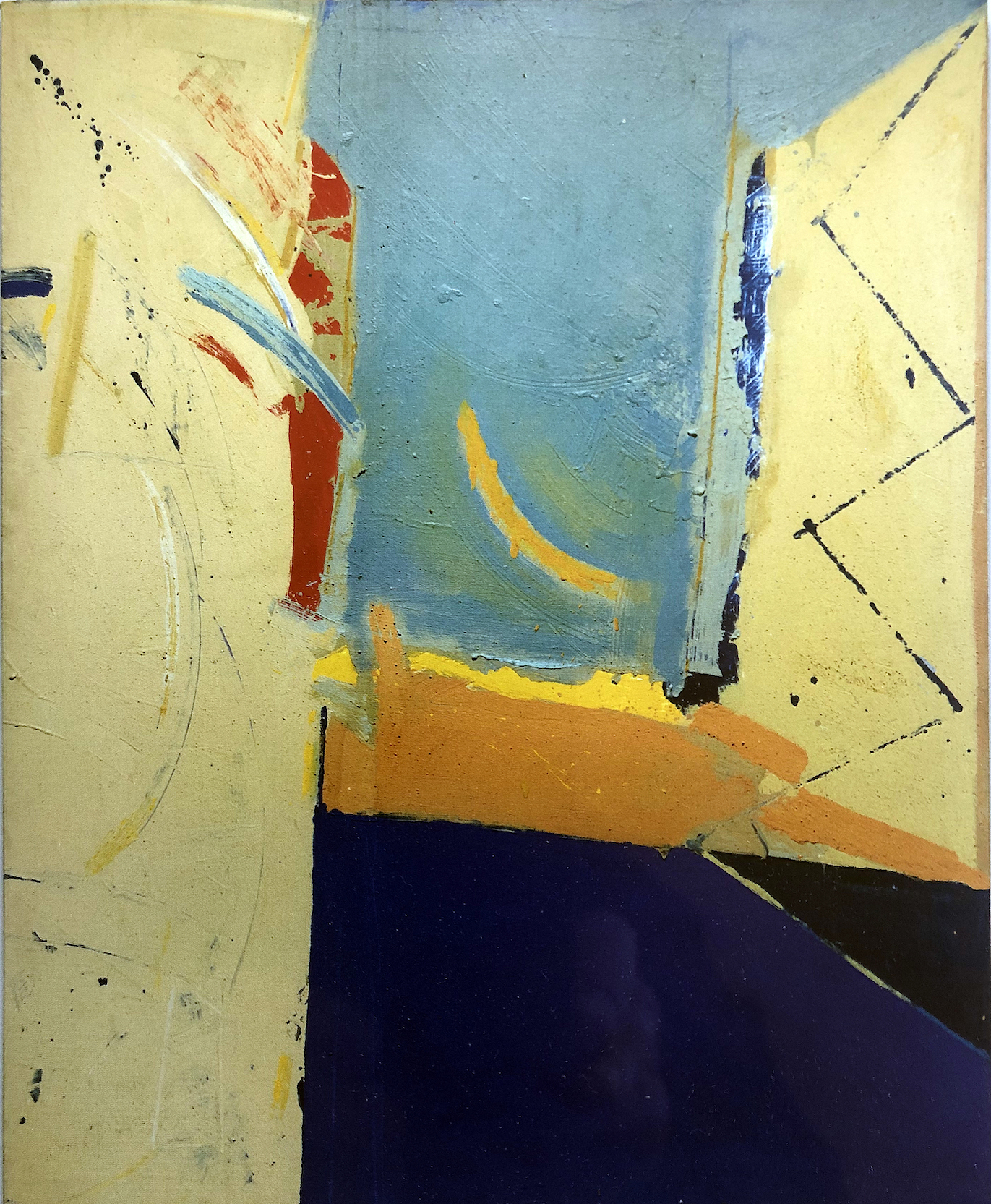
Allie McGhee, TWA Light on Washburn, Mixed Media on canvas, 1989

One of the strongest compositions in the exhibition was from 1989. TWA Light on Washburn, repeats the reoccurring banana symbol that follows him over time. One of the trademarks of McGhee’s work is that he leaves behind the use of traditional brushes for flat sticks of varying sizes to move paint across the surface. In addition, he has a variety of tools to remove paint from a given area, be it cloth, wood or plastic.  This could easily have been when he preferred placing the canvas on the floor instead of using an easel to hold the stretched canvas on a frame. Gravity is his friend on the floor, not an obstacle, where mixing paint worked to his advantage.  In TWA Light on Washburn, we see the primary colors dominating the composition while using the spacing of thirds on the grid, both vertical and horizontal.  There is no evidence of brushwork on the canvas, only the stroke of a long stick he used to create geometric lines, shapes, and sometimes texture. Various values of red, blue, and yellow assist in holding everything together.

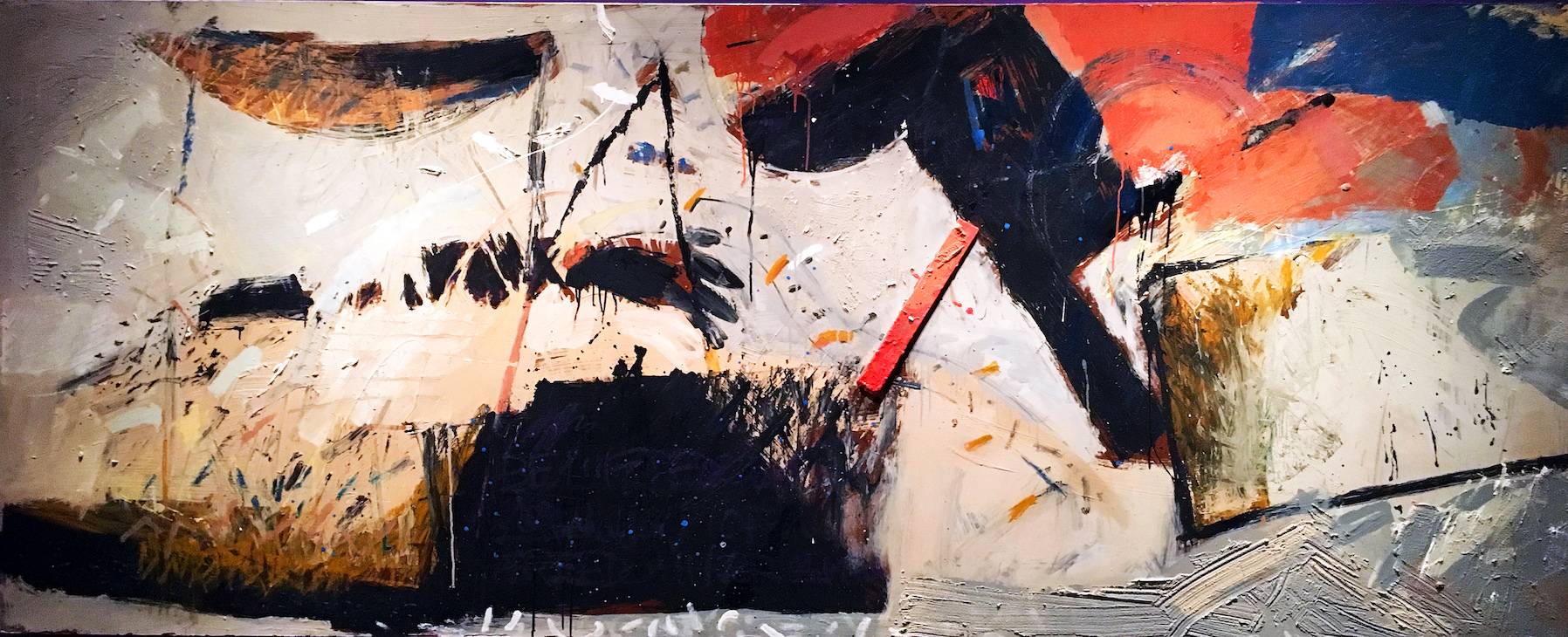
Allie McGhee, Apartheid, Mixed Media on Masonite, 48 x 120″, 1984

Most recently viewed in 2017 at the Detroit Institute of Arts as part of a large exhibition, McGhee’s Apartheid was on display in the Art of the Rebellion and Say It Loud, commemorating 50 years since July 23, 1967, when African Americans took to the streets of Detroit to express their anger and frustration with the injustice of law enforcement. It would come to be called the Detroit Rebellion.  McGhee’s work was then being shown by the N’Namdi Center for Contemporary Art. This painting highlights his use of angular shapes and splatters of paint to evoke and represent the tension of the time. The title Apartheid refers to the oppressive political system that existed in South Africa. The Civil Rights and Black Power movements inspired many African American artists to internalize the fight for civil rights in Detroit.

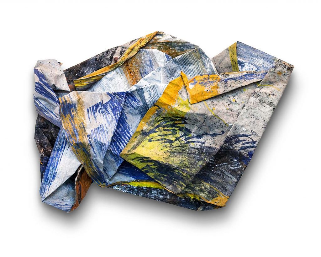
Allie McGhee, Fall Rush, Acrylic on enamel paper, 2013

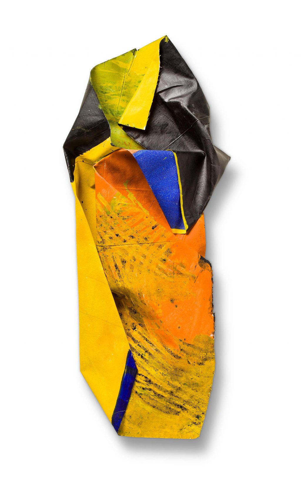
Throughout his talk at Cranbrook Art Museum, McGhee continued to stress and talk about his approach. “ The process is more important than the subject.” Thanks to his diligent years of daily work, we see the artwork on the floor begin to evolve and ultimately create something very new. The work Fall Rush (2013) is acrylic and enamel on paper where McGhee has applied his sensibility to both sides of this heavy-duty paper and then worked on producing a crushed and folded object that would present itself on the wall. When I first viewed the work, my only context was the artwork by sculptor John Chamberlain who did something similar with scrap metal, usually mounted on a base as in Homer, 1960.  Chamberlain didn’t paint the metal, instead, he would find parts from scrap car lots where he discovered his colors in the parts of fenders and related shapes of metal. Here, McGhee, the painter, created his own material by painting both sides of the paper, canvas or vinyl, and inventing his shape using his well-developed sensibility. He puts his trust in the process.

Allie McGhee, Flip Side, Acrylic on enameled vinyl, 2015

In the piece Flip Side (2015), we see the evolution of this work where he adds elements after the object is created and on the wall. During the artist talk, he mentioned his interest in science and the various visual aspects of the universe, either through a telescope or a microscope.  McGhee mentioned participating in an Art & Science program that paired artists with scientists from the University of Michigan. The artists then made an artwork that was auctioned off to support scientific research. McGhee was seeking information based on scientific discovery where he sought truth and imagery in the cosmos.

And Allie McGhee talked briefly about the role of music in creating art with an emphasis on the Black jazz musicians John Coltrane, Thelonious Monk, and Charles Mingus. They all co-mingled with his process.

Russian abstract artist Wassily Kandinsky has said he was deeply inspired by music. He played the violin from an early age and even gave his works of art musical titles: ‘Improvisations’, Compositions’ and ‘Fugue.

I know I carefully select what I play in my studio. I always select instrumental-only by a variety of musicians like Dave Brubeck, Mozart, or Arvo Part.

Richard Dorment, the art historian, said of Paul Klee, “He started every picture with an abstract mark—a square, a triangle, a circle, a line or a dot—and then allowed that motif to evolve or grow, almost like a living organism.” Whether it is from subconscious dreams or Eric Dolphy on the Saxophone, Allie McGhee worked daily to the sound of jazz. The improvisational riffs provided support for the creation of rich abstraction in the studio, experimenting with materials, making the same mistakes over and over until something emerges and falls into place or rises to the top. What resonates in my thoughts is McGhee’s emphatic statement, “It’s the process, not the subject.”

In the Cranbrook publication, McGhee says, “A really good picture looks as if it’s happened at once. It is an immediate image. For my own work, when a picture looks labored and overworked, and you can’t read in it…there is something in there that has not got to do with beautiful art.  And I usually throw these out, though I think very often it takes ten of those over labored efforts to produce one really beautiful wrist motion that is synchronized with your head and heart, and you have it and therefore it looks as if it were born in a minute.”

Allie McGhee, Bloom, Acrylic, and enamel on fiberglass, 2019

In the acrylic and enamel on fiberglass Bloom, McGhee gives the viewer some insight with the title and adds details to the piece after its painted and folded creation. Who knows? The inspiration may have come from a memory of sitting at his mother’s kitchen table where some flowers were blooming in a vase. We see the surface where the artist draped and dragged the stick over the fiberglass on the floor, then the folding produced fluidity and pattern.

Laura Mott quoted McGhee in her writing about him as saying, “I can tell stories in my paintings about these significant contributions made through our history. To me, that’s a lot more exciting scientifically, spiritually, and visually to feed off of. It’s never-ending. The only limitation is the entire cosmos…I don’t think I will be able to use that up in my lifetime.”

Allie McGhee, Long Look, Acrylic and enamel on vinyl on wood. 2021

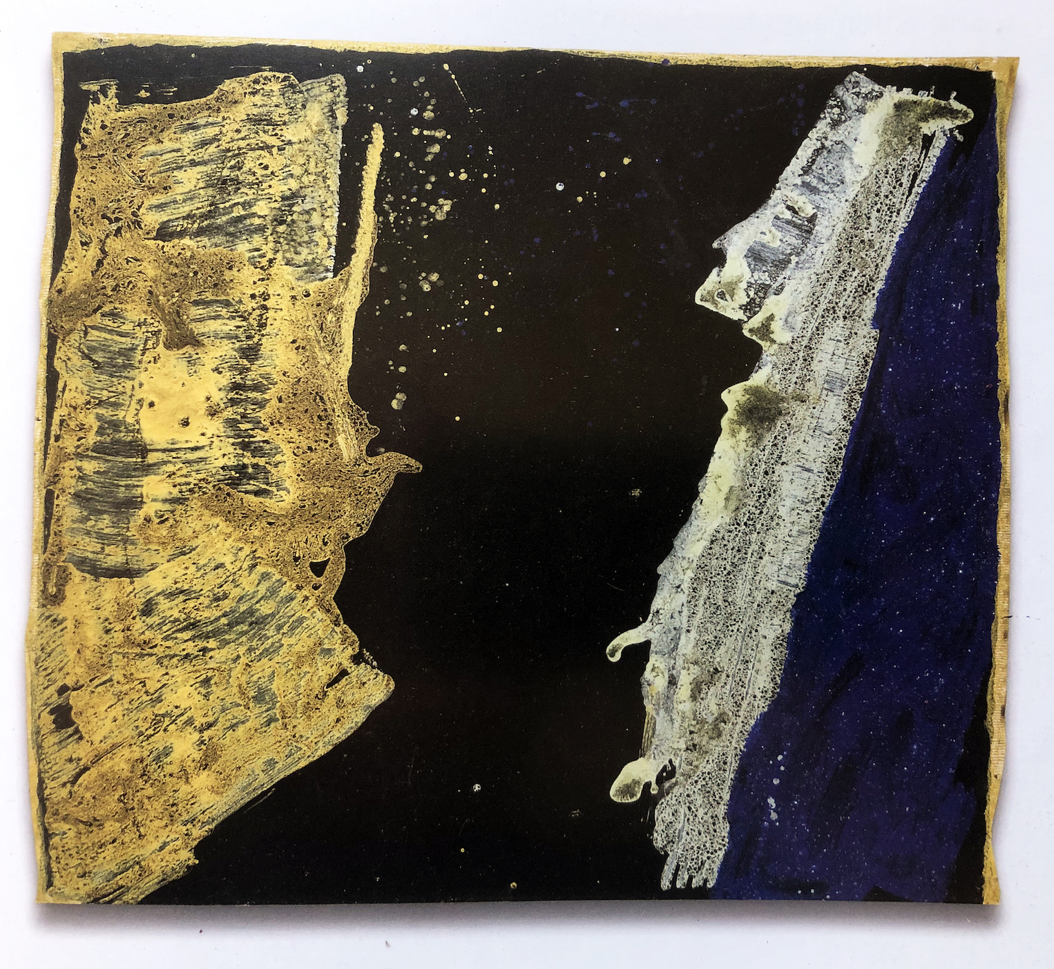
Right when you think these folded and crushed colorful objects art are the beneficiaries of a life’s work and might be his last body of new work, he comes back with new flatwork on the wall, like the painting, Long Look, an acrylic and enamel paint on vinyl attached to wood. Is he looking through a microscope or a telescope? Or is he reading The Elegant Universe by Brian Greene about how artists look to science for inspiration?  From the Cranbrook publication, McGhee writes, “I will see the Science section of The New York Times where there will be a photograph that is almost identical to something I painted years ago, like a picture from the Hubble telescope.”

There is something to be said about McGhee’s longevity with respect to being able to continue his process and reap the success of this later work. He is still exploring his evolutionary process, a painter of extraordinary ability who continues to contribute to the art record of Western civilization.

Allie McGhee exhibits a Retrospective, Banana Moon Horn, at Cranbrook Art Museum, through February 13, 2022.


Zenax @ Library Street Collective

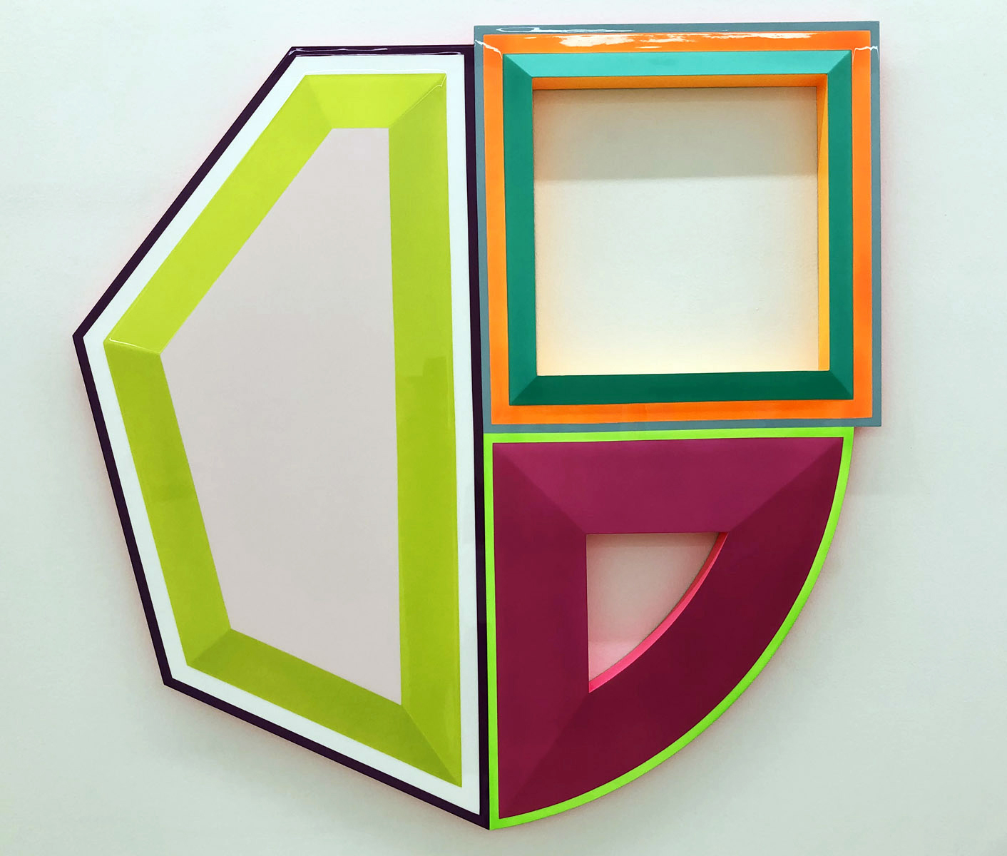
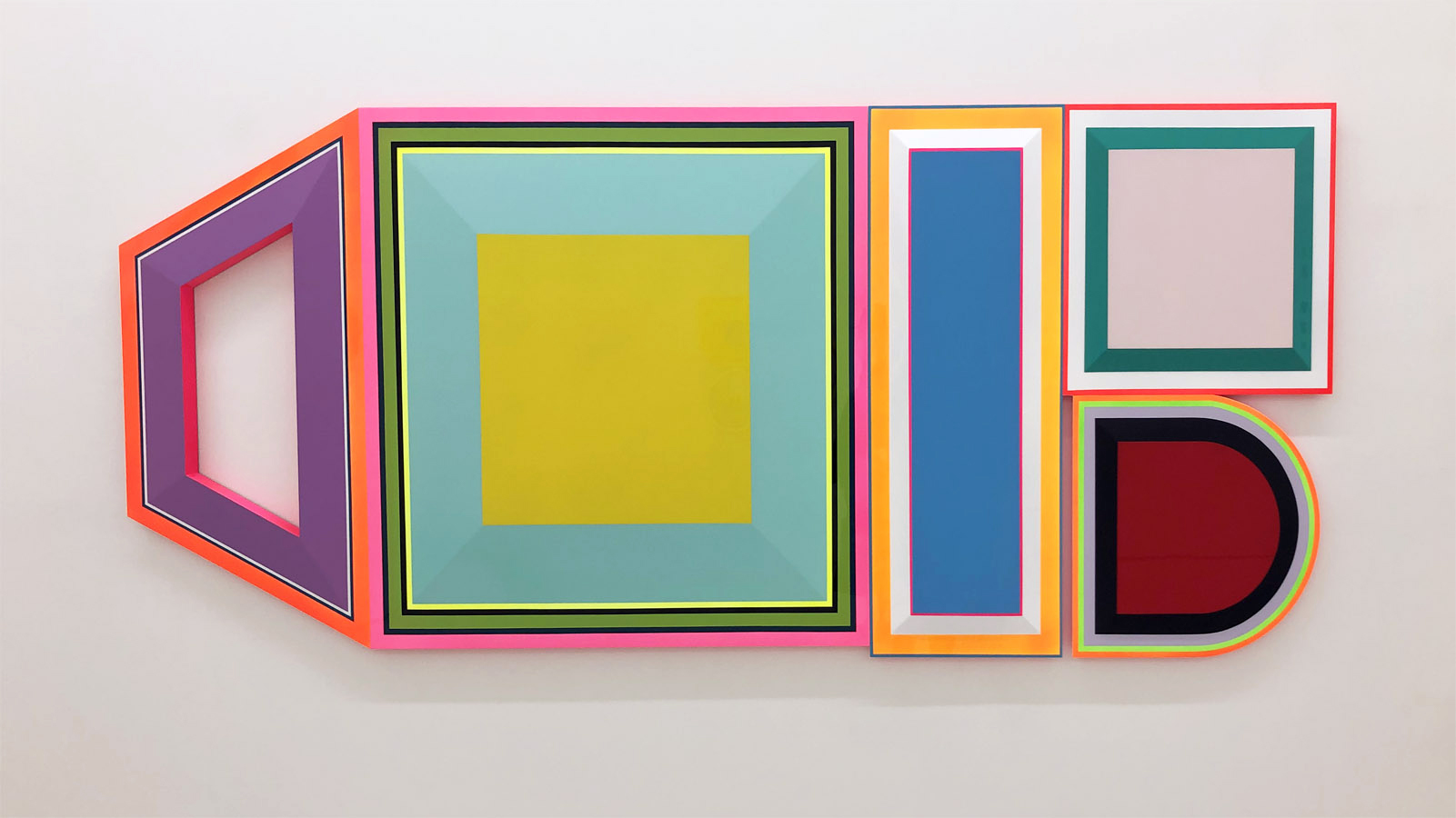
Untitled (high blood pressure, depression, antipsychotic, depression, anxiety) by Beverly Fishman, 2021, urethane on wood panel, 48” x 113” photo: K.A. Letts

Zenax, an exhibit featuring thought-provoking work by two creative voices in dialog, is on view at the Library Street Collective until January 6. Detroit artist Beverly Fishman and California painter Gary Lang have combined the words Zen and Xanax in the exhibit’s title, creating a neologism that deftly names each artist’s thematic intent. The work of both bears a passing resemblance to the self-referential minimalist paintings and constructions of Frank Stella and Kenneth Noland, but Fishman and Lang appropriate and subvert the memes and tropes of 1960’s and 70’s minimalism to achieve their very different–and quite specific–goals.

Beverly Fishman

Fishman’s wall constructions speak the language of manufactured consumer products, of blister packs and digital devices. But most especially they speak the language of pharmaceuticals. As part of her ongoing studio practice, she explores the implications, both good and not-so-good, of pharmacological self-modification in emotion and behavior.

Fishman has researched, online, the seductive shapes, colors, and surface sheen of pills and drug packaging to develop her idiosyncratic visual vocabulary. Using these found shapes as source material, she begins her creative process with collages in a variety of materials and in colors that range from the fleshy pink tints of makeup to paint sample colors from the hardware store. Specialists then fabricate the slightly convex trapezoids, rounded polygons and bisected sections of circles. They are finished with smooth, featureless surfaces in consumerist colors, which are assembled into the final artworks. Fishman links the slickly constructed components based on her intuitive sense of how the shapes and colors interact. Her compositional intention is tore-configure and re-arrange them “until they finally surprise me.”

Untitled (depression, depression, adhd) by Beverly Fishman, 2021, urethane on wood panel, 42´x 43” photo: K.A. Letts

Fishman’s 5-piece wall construction, Untitled (high blood pressure, depression, antipsychotic, depression, anxiety), is the largest of the four pieces she has contributed to Zenax, and showcases her creative strategy. The color palette is an aggressively pleasant combination of pastel and neon hues that are at once both attractive and slightly ominous. The consumer-friendly colors—pinks, aquas and burgundies—are bordered by neon reds, greens and oranges that both unify the composition and militantly guard the boundaries of the constituent shapes.

Perhaps more than most artists, Fishman uses the titles of her wall constructions to guide the viewer toward her underlying theme. She both praises and condemns modern medicine for giving us the dubious capacity to deliver social control on a molecular level–scientific advances with unexpected side effects. Her somber observation:  pharmacology has advanced to the point that drugs can control not only how we behave, but what we are allowed to feel.


Gary Lang

After the chilly perfection of Fishman’s shaped artworks, the three paintings by Gary Lang in Zenax seem almost lyrical. While subtle, the sweep of his brush and its interaction with the surface of the painting is palpable and ever-present. Lang works within the same visual language of geometry and optics as Fishman, but his aim is transcendence. His meditative use of repetition and a highly organized, yet intuitive compositional methodology results in paintings that seem to vibrate with silent energy.

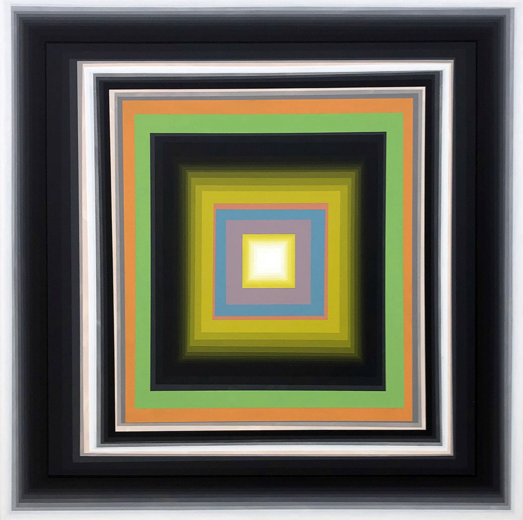
Maverick 2 by Gary Lang, 2021, acrylic on canvas, 53” x 53” photo: K.A. Letts

Lang skillfully wields the optical properties of his colors to manipulate the perception of the space within his paintings. Maverick 2, shows this strategy at work. A black square-framed in white marks the outer boundary of the painting. A thinner black and white frame repeats the outer boundary and seems to invite entrance. Two flat bands of green and orange mark the surface of the inner picture plane, with a gray shadow seeming to raise them slightly off the surface. Lang leads the eye into the fictive space behind the surface with carefully calibrated, concentric veils of translucent yellow-green. Yet another double band of flat color delivers us–finally–to the glowing inner core of the painting.

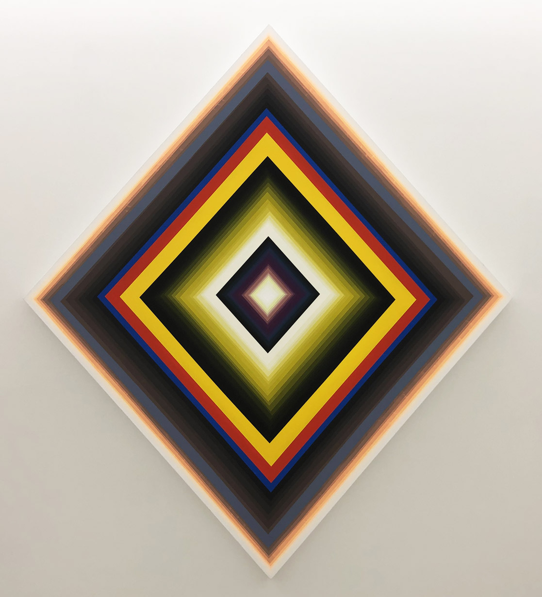
His painting ROR bears a passing resemblance to the Ojo de Dios, a native American votive object, and provides another clue to the meditative aims of the artist. The repeated black diamonds alternating with flat primary bands and the graded yellow-green layers fading into white light once again beckon the viewer toward a higher state of being.

ROR by Gary Lang, 2021, acrylic on canvas, 91” x 103” photo: K.A. Letts

While the alternating and telescoping colors within the paintings appear calculated, for Lang they are intuitive. In a 2015 interview with Eric Fischl, he describes his method: “I juggle colors and spatial ratios compulsively prior to painting in order to get a mutable footprint, and adjust and articulate my notations spontaneously once [I am] painting.” The result is a body of work that invites comparison to sacred objects and altered states.

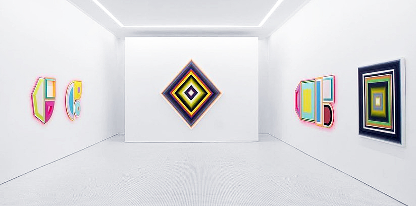
The artworks in Zenax share a common formal vocabulary that allows an interesting dialog between two artists who wield similar means toward contrasting ends. Fishman flatly rejects the purely formal; her work is specifically referential and represents a kind of socially engaged abstraction. Lang’s aims are specific as well but refer to the life of the spirit. Consciousness is the subject at hand for both artists though: its nature, its susceptibility to alteration by means pharmacological or spiritual. It’s a conversation worth having.

Zenax @ Library Street Collective install image courtesy LSC.

Zenax @ Library Street Collective through January 6, 2022


Rosalind Tallmadge @ David Klein Gallery

David Klein Gallery Hosts Rosalind Tallmadge Exhibition: Terrain

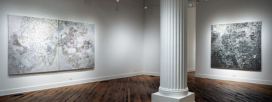
The lion’s share of Rosalind Tallmadge’s large, luminous paintings in “Terrain” at Detroit’s David Klein Gallery call to mind relief maps, drone’s-eye views of alien, metallic worlds with surfaces both beautiful and hard, and utterly inhospitable to human life. The show, which features work all completed in 2021, is up through Dec. 18, 2021.

But these light-filled, fraught surfaces are actually more earth-bound than you might initially guess because, in addition to piling up natural elements in rich, stratified layers, Tallmadge pulls in a range of man-made materials that evoke both fashion and femininity, whether sequins, glass beads, or glitter. And who doesn’t like glitter?

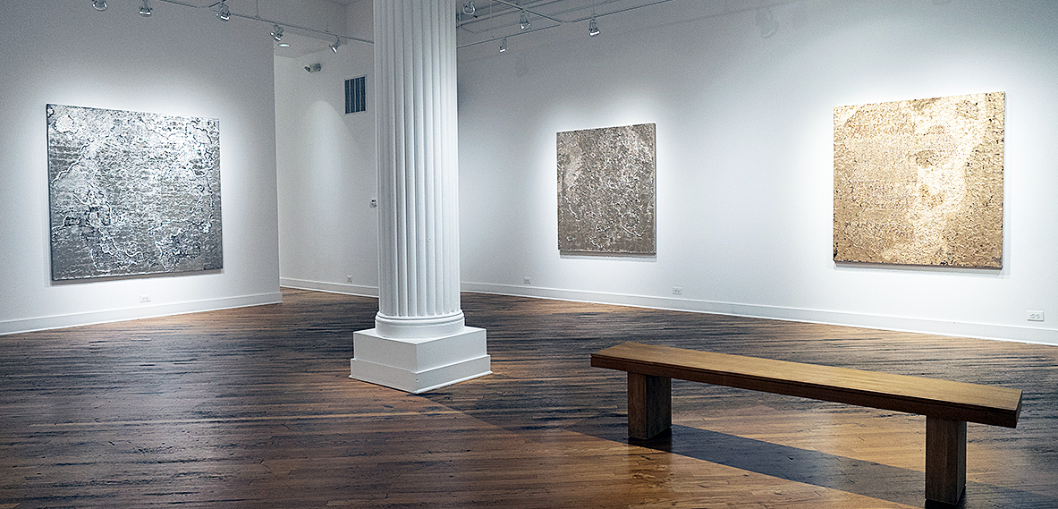
Installation image of “Rosalind Tallmadge, Terrain,” which is up at Detroit’s David Klein Gallery through Dec. 18. Images courtesy of David Klein Gallery

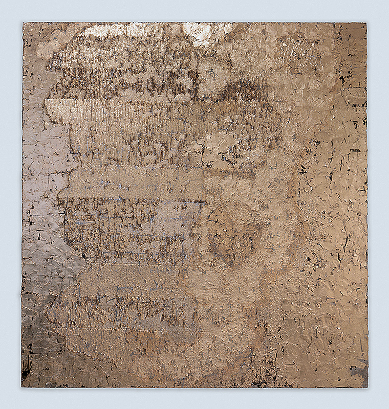
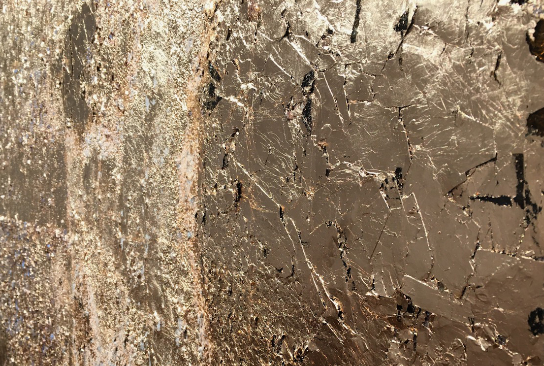
Several of the most striking pieces on display, including “Ember,” “Dusk Lightning” and “Cross Section X” are so highly reflective, despite their variegated texture, you’d swear they were giving off heat. This is particularly the case with the appropriately named “Ember,” which is covered in a rose-toned gold leaf that resembles polished copper and hooks you with seductive warmth and the lure of the sparkle.

These are paintings with a visceral physical presence, products of a creative synthesis Tallmadge, a 2015 Cranbrook Academy of Art graduate now living in Brooklyn, N.Y., terms “disco alchemy.” For all their brightness, these works ideally call for consideration over the long term, an unhurried process of getting to know the idiosyncratic geography on each sequin-fabric canvas. They’re not cheap dates. They’ll reveal even more of themselves over time.

The rewards associated with this work, it must be noted, are not of the chirpy sort. The paintings exude an almost Cassandra-like vibe, glimpses of an out-of-control future, however glittering. Some pieces are utterly beautiful – there’s no other word. But they’re all grave in aspect as if they sprang from worlds where the zeitgeist is grim.

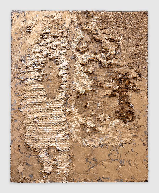
Rosalind Tallmadge, “Cross Section XII,” Pewter leaf, mica flakes & powdered glass on sequin fabric, 20 x 16 inches, 2021.

Unspooling the cosmic metaphor a bit further, Tallmadge has invested these works with a certain timelessness, geologic in breadth, that seems to span millennia by the hundreds. There’s something ancient and fire-blasted about them. Indeed, some look very much like metallic lava of impossible purity, somehow produced in the igneous cataclysm of a volcanic eruption. Or perhaps they’re the product not of catastrophe but unending, unyielding metamorphic heat and pressure, like gemstones. In any case, time hangs heavy on them. Little wonder, perhaps, that a 2018 exhibition Tallmadge had at Marquee Projects in Bellport, N.Y. was titled “Deep Time.” For its part, Brooklyn’s Carvalho Park gallery, where Tallmadge had a show in 2019, termed the Cincinnati native’s work “nebulous and spectral.”

This is what you hope for when you’re a serious art student. Shortly after Tallmadge got out of grad school, David Klein mounted a solo show for her in 2016. Her work has also been exhibited in New York City, Seattle, and Chicago. Prestigious residences she’s snagged include ones at the Oxbow School of Art and the Yale Summer School of Art.

For her part, Tallmadge says in her artist’s statement that she wants to create “elusive, experiential paintings that activate the viewer’s body through their seductive light-based surfaces.” They’re meant to evoke, she adds, “degraded urban surfaces or worn rocks you would happen upon in nature.”

The online, French-language mezzanine notes that Tallmadge “does not paint canvases. She creates atmosphere.” The journal added, “With her, the celestial immensity becomes tangible, though always remains mysterious.” For her part, the artist responds to a question by noting that her paintings “are also a reflection of my daily life in New York. The asphalt surfaces, the worn-out sidewalks, and subway walls furnish my subconscious.”

Rosalind Tallmadge, “Ember,” 22K rose gold leaf, mica flakes & glass beads on sequin fabric, 64 x 60 inches, 2021. An oblique angle highlights Tallmadge’s remarkably textured surfaces.

The natural material that Tallmadge employs most, jammed up against her beads, glitter, and sequins, is mica. There’s an intriguing balancing act going on here between, to use the terms very loosely, the feminine and the masculine. Falling into the latter category are surely the chunks of glittering mica – a shiny form of silica that breaks into wafer-thin, translucent layers—that Tallmadge employs all over her thickly textured canvases. There’s something in mica’s very instability, always threatening to fracture, that plays a role here as if to say, “I glitter, but beware – I’m also brittle. I shatter.”

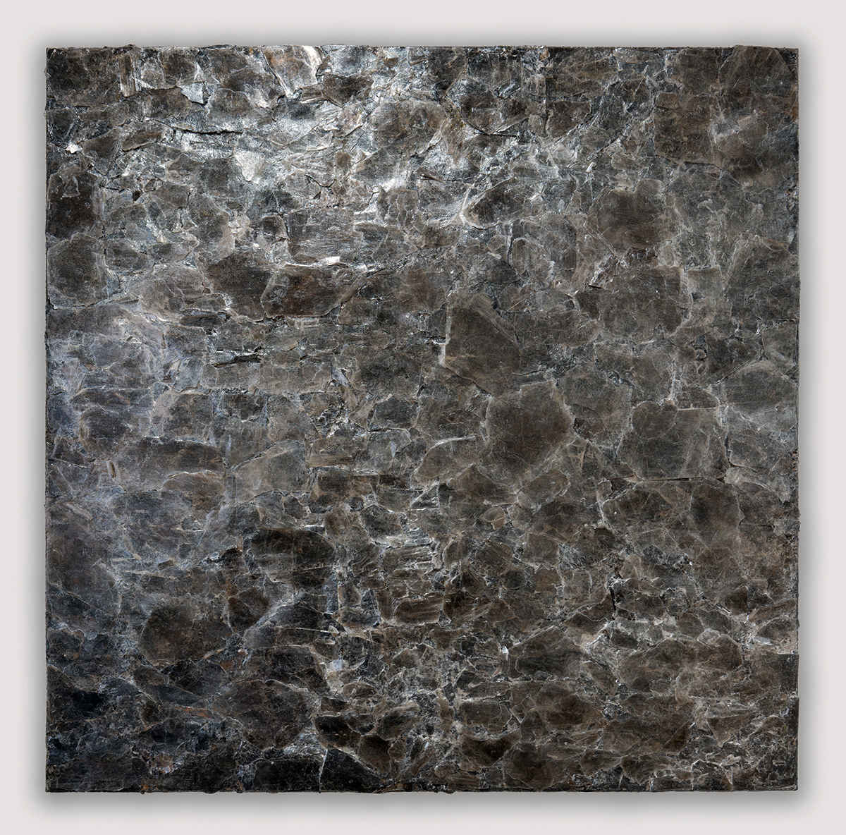
Rosalind Tallmadge, “Omen,” Mica stone, liquid glass concentrate & pumice on birch panel, 30 x 30 inches, 2021.

 These qualities are on full display with “Omen” and “Estuary,” both crafted from larger pieces of mica stone and pumice. They’ve got smoother surfaces, a break from Tallmadge’s rich impasto elsewhere, and are less raked and eroded than many of the other works on display. “Omen” almost looks like one sheet of black-brown glass that’s been violently shattered but still miraculously holds together. “Estuary,” despite its riverine name, when viewed up-close, looks a bit like the inside of an astonishing geode when you’ve sawed a rock in half and polished the surface.

By contrast, “Cross Section XII,” fabricated with powdered glass and pewter leaf – Who knew?— is blistered and brooding. To return once again to the planetary metaphor, it looks a bit like a silvery moon that’s been battered and scoured by solar winds and remorseless radiation.

Rosalind Tallmadge, “Ember” (detail), 22K rose gold leaf, mica flakes & glass beads on sequin fabric, 64 x 60 inches, 2021.

Particularly with the most heavily textured canvases, it’s fun to examine the surface off to one side and at an acute angle to maximize your appreciation of just how 3-D and stratified these meticulous constructions really are. It’s also gratifying that this is a spaciously hung show, with no cramming works together in unnatural, close proximity. This is important in part because of the glow most of these give off, a nimbus you wouldn’t want competing with radiance from another work right next door.

Rosalind Tallmadge, Terrain” will be up at the David Klein Gallery in Detroit through Dec. 18, 2021


Page 23 of 79

Powered by WordPress & Theme by Anders Norén