Detroit Art Review

Critical art reviews of Detroit galleries and museums weekly

Compo/Site @ Scarab Club

“Compo/Site”, Installation view at the Scarab Club, All images: Ryan Standfest

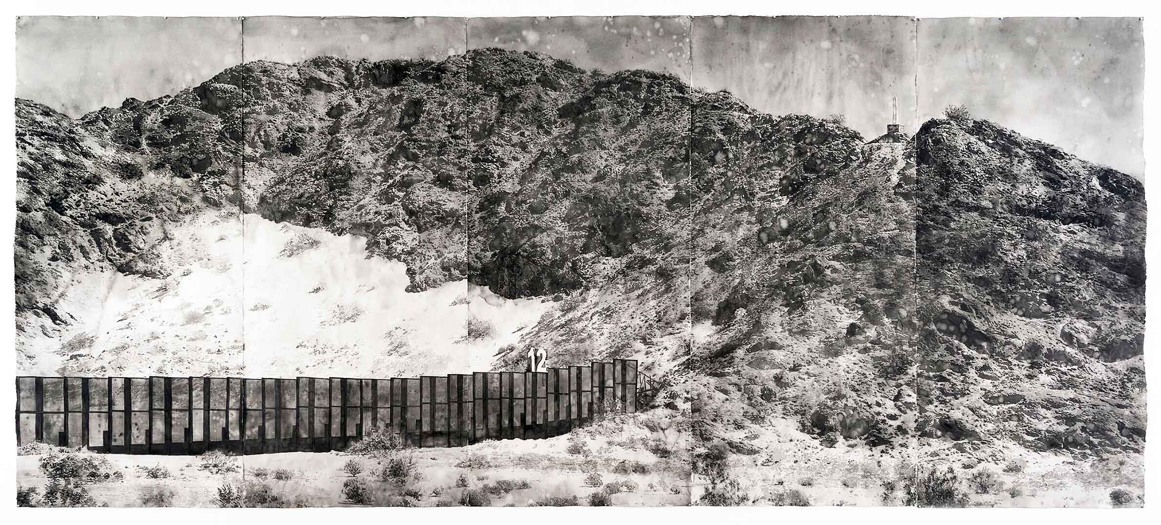
The current politically-charged discourse surrounding the construction of a wall at a secured southern border, is as much as anything a conceptual conversation giving material form to immaterial psychological barriers. The “Trump wall,” conceived as a talking point in the 2016 presidential campaign, is representative of something far more than the control of illegal immigration traffic. Its physical manifestation in the public imagination is a singular structure that forcefully cuts through the landscape, creating a geographic forcefield through which no body nor any view may pass. It is a potent symbol that negates the very notion of free passage.

Underlying the idea of it, is a sense of paranoia and xenophobia; the need to separate oneself from “the other.” It is also about turning inward, and embracing the notion that one’s sense of place is not a shared space, but an individually-owned and protected one. An isolationist perspective in which landscape itself must be divided, detached and organized into manageable zones to ease psychogenic stresses.

“Compo/Site” at The Scarab Club,  is an exhibition of forty works by six artists, all employing print media to investigate environmental psychology and the parameters of space and place. With a few exceptions, there is the noticeable absence of representations of the human body in most of the work on view, and yet there is a cultivated awareness throughout of human motivation behind structures that reshape physical landscapes into cognitive ones. Each of these artists question how we construct place and manufacture a phantom ownership over space—a personal space and a public space, a space for desire and a space for loss.

Zach Fitchner: “Housing Units”, Installation, monoprints on cut paper, 20 x 16 inches each, 2019

In Housing Units and Passenger Plane, Zach Fitchner assembles two installations within the gallery that proposes a set of containers, both private and public. Housing Units, a row of five monoprints each measuring 20 x 16 inches, employs a reconfigured matrix of wood relief and half tones, to minimally suggest a house on each shaped sheet of paper. The use of wood grain and screen pattern bridges the organic and the mechanical, but also summons two print processes to speak to concepts of pre-fabrication in housing. Fitchner smartly makes use of the monoprint process, whereby multiple iterations of an image can be achieved from a single changeable matrix, to underscore the development of postwar suburban communities in which a housing template was reproduced endlessly with minor variation in decorative choices. It is a visually stunning representation of the suburban phenomenon where the concept of community is performed as assimilation within a highly planned environment.

Zach Fitchner: “Passenger Plane”, installation, monotype, lithography and relief on panels with supergloss epoxy resin, 6 x 22 inches each, 2015-2016

Zach Fitchner: “Passenger Plane”, detail, monotype, lithography and relief on panel with supergloss epoxy resin, 6 x 22 inches each, 2015-2016

 With Passenger Plane, Fitchner transforms the white of the gallery wall into an airspace with seven passenger jets taking off and landing. The jets are a mixture of monotype, lithography and relief prints, with a supergloss epoxy resin on cut plywood panels each measuring 6 x 22 inches. The programmatic routine of air flight is disrupted with the organic, printed fuselage skins—a patchwork camouflage that enlivens the representations of these flying containers as they glide over the irregular plaster surface of the Scarab Club’s gallery walls, which in this context resembles a sculpted airspace of stylized clouds. The sighting of Fitchner’s installations work quite well: suburbs and air traffic—a basic mechanics of procedural living speaking to one another. You can practically hear the distant jet engines overhead.

Arron Foster: “Lost in the Sand”, stone lithography, relief, digital inkjet, 22 x 17 inches, 2017

Arron Foster’s Lost in the Sandand Fossil Firealso address a relationship between the manufactured and the natural by way of setting drawn objects resembling smooth cast concrete forms alongside objects resembling a rough tree branch or section of bark. Lost in the Sand, a stone lithograph with relief and inkjet, floats this pairing of opposite sensations above a desert landscape with a transparent haze of color shifting from yellow to orange to red, from the top to the bottom of the piece. It conjures a strong sense of a place without specificity. Similarly, Fossil Fire, a stone lithograph with inkjet, depicts its pair of objects floating over a desert landscape which this time is turned on its side. The light however, remains a pale yellow. Both prints possess a timelessness—objects taken out of time, perhaps archeological remnants of environments lost whether through the collapse of an ecosystem or the fall of a civilization or both. Whether grown or constructed, each has been buried and dug back up. The precision with which each object is rendered with a lithographic crayon, has a studious clarity. The objects are able to crystallize specific, contrasting sensations in the mind. The landscape in each image, however, conjures a non-specific place, a dislocation from time, an environment of reverie where the objects may remain lost to us.

Matthew McLaughlin: “PS_Sample” (counterclockwise: 15, 13, 14, 10, 5, 2), monotype with charcoal drawing, 3 x 10 inches, 2018

Matthew McLaughlin confronts the paradox of the planned community. In PS_Sample (numbered variously 2, 5, 10, 13, 14, 15), a series of six monotypes with charcoal drawing, and with an untitled installation comprised of printed and cut wood relief fragments assembled into an image, he delves into the poetics of fencing. Specifically, the image of the suburban backyard fence. The PS_Sample configuration presents six different samples or sections of a fence type. The PS in the title refers to “Personal Space,” and McLaughlin creates a space that is about imposition—the imposition of the fence on the landscape to disconnect the view from the viewer. The fence becomes a blockage, an interruption, another act of dislocation as the ambiguous, sublime color field of the monotyped background, with its alluring half-light, is divided and obscured by the dark silhouette of the fencing. This is the establishment of a personal space, but at the risk of distorting a view to the outside. Each is a window into a landscape that denies access to that landscape. Are those of us behind the fence imprisoned or protected or both? The space of the images is intentionally ambiguous.

Matthew McLaughlin: “Untitled”, wall installation, monoprint on cut paper, variable dimensions, 2019

With his Untitled installation, we are given another fence—this time a series of deconstructed fences and barriers, reassembled via collage into a single ragtag barrier stretched across the gallery wall. The single unifying element beyond the overlap of its individual sections, is that of its printed woodgrain. But the reality of the cut paper fragments pinned together, with the shapes drooping and wavering here and there, is the impression of a hasty fortification. But against what? Who is keeping whom out, and for what purpose? What is personal space in the context of community? How do you integrate and separate yourself simultaneously?

Taryn McMahon: “Massive Barrier”, monoprint, 14 x 18 inches, 2017

Taryn McMahon employs a layering of color and form in a series of monotypes in the exhibition, whereby the process of printmaking as an act of image projection addresses how we construct our relationship with the natural world. In Rising Water, Distant Garden, Massive Barrier and Wall, McMahon fragments and disrupts our depth of vision as a means to complicate how we are viewing her work. What can appear at first as deceptively simple visual texture and pattern existing on a shallow plane opens up and gives way to a slippage of foreground and background. Each image is a landscape. What we are experiencing is not clear at first and we must navigate our way into the space of the composition, finding our place as it were. The work demands that we enter it. The colors are not insistent, but are suggestive. These are highly atmospheric works that quietly intrude on consciousness. The layers vibrant between negative and positive space, light and shadow, heaviness and weightlessness. We are both inside and outside of these images. Their apparent flatness at first glance, gives way to an unfolding of space as more time is spent with each work. They are a fascinating conundrum: consisting of barriers that open up. This is perhaps a conceptual reversal of how we mediate the natural world: we tend toward flattening it, cutting it up, boxing it in, imposing our will upon it when we image it with our shallow depth of vision. And yet, we also see the natural world as boundless, infinite in its ability to surround us. The truth however is more complicated. As we are bound to our environment, the way in which we perceive it will determine its existence.


Nick Satinover : “ Northwoods Suite ( 4 ) ” and “Northwoods Suite ( 3 )”, both screen print and drawing on panel, 12 x 18 inches each, 2013

With Northwoods Suite (4) and (3), both screen print and drawing on panel, Nick Satinover is concerned with the poetics of place via half remembered maps and diagrams, the vernacular of hand-painted roadside signs and midcentury children’s educational books. There is something satisfying in the instructive playfulness of Satinover’s images. A warmth emanates from the work as he pairs abstraction with playfulness. The works are familiar without being specific. These are maps and diagrams, but only in the most suggestive sense. If maps and diagrams are about anchoring knowledge, Satinover does something wondrous by loosening their didactic boundaries so that we are given a poetic variation on mapping. The works summon the memory of early learning minus the demands of teaching. A child-like universality is on display: we are locating ourselves in someplace that could be anyplace. Place names and lines of demarcation soften and become gestural. Zones of information become pure passages of shape and color. He constructs a memory space. An evocation of discovering place for the first time.

Brett Schieszer: “Head on Backwards, Feet at Funny Angles” and “Smile Before You Want To”, both reductive woodcut, screen print, lithography and digital collage with foil, 10 x 10 inches each, 2018

The work of Brett Schieszer seems to emerge from memory as well. The memory of expectation. In Head on Backwards, Feet at Funny Angles, Smile Before You Want To, and Really There is No Need, It’s Fine, each made with an amalgam of reductive woodcut, screen print, lithography, digital collage and foil, we are shown dynamic, bright, seemingly optimistic constructions, that conjure Russian Constructivist propaganda collages from the late 1920’s, such as those by artist Gustav Klutsis (1895-1938), as well as mid-century American advertising, both harnessing an optimism to promote a belief system and a lifestyle. For Schieszer, the past is a landscape, as the glossy surfaces, glowing colors, and radiant patterns of his images beckon entry into a dreamscape, a vacationland of the mind fueled by nostalgia. And yet, these are impossible places. Their unreality heightened by cutout photographic figuration placed against open expanses of color. Dreamland is nowhere. It is an imaginary space. Schieszer’s titles even have contradiction baked into them: a head is on backwards, feet are at funny angles. The natural act of smiling is something done before you want to. There is the false reassurance that everything is fine, and no other need should be considered. The images are each bordered on two edges by gold foil with a perspective that lends a false thickness to the composition. It is as if these are panels, tiles, or thick postcards projecting outward, persuading a visitation to this place where things seem to be alright.

Collectively, all of the work  in “Compo/Site” shuttles between abstraction and representation and suggest a split, a perceptual struggle between the concrete recognition of place and the effects of our fleeting personal impressions and projections upon it. That print is the primary vehicle for such an exploration is not without reason. As a process predicated on projection and memory—the transference of an image from one surface to another for the sake of creating an impression—there is much resonance between medium and subject here. Recording a mark on a surface, fixing it, is akin to the physical and mental marks we impose on the environments we inhabit or pass through. The history of mapping has been the history of print. To devise a system for spatial demarcation on a landscape in order to navigate it, possess it, name it, is also a form of psychological mapping. We construct the world as we wish it to be by projecting our identity upon it. In essence, we are constructing by compositing—merging the real and the unreal, the past and the present, the natural and the manufactured, the meaningful and the meaningless—resulting in a boundless psycho-geographic container whose definition is elastic and ultimately incapable of being colonized in any state of permanence.

Scarab Club exhibition “Compo / Site” through May 18th, 2019


Corine Vermeulen @ David Klein Gallery

Corine Vermuelen, Installation image, 2019, courtesy of DAR

Photography is front and center in the exhibition, by the Dutch artist Corine Vermeulen at the David Klein Gallery’s contemporary art gallery on Washington Boulevard in Detroit, Michigan.  The exhibition is a collection of two separate bodies of work, one more grounded in her previous work depicting street portraits.  In this new figurative-based work, Nachtwerk, mostly shot at night, the figurative images are integrated in what might be called surreal elements.

In a statement, the artist says, ” I am intervening retrospectively in my own image making, doing something different with the images of the past.  This occurs during a time of ‘revival’ in Detroit when different processes are deployed over the same terrain, interfering with the historical round.”

Corine Vermeulen, 00:25, August 14, 2018- 2018, Pigment print, 40 x 30 inches, Edition 1 of 5

Corine Vermeulen, 12:17, August 20, 2018- 2018, Pigment print, 26 2/3 x 20 inches, Edition 1 of 5

Corine Vermeulen, ISON (Belle Isle)- 2018, Pigment print, 42 x 42 inches, Edition 1 of 5

The second body of work, Kodak and the Comet,  the photography is comprised of large colorful abstract images. The idea of creating an abstract photographic image has been around dating back to artists experimenting with contact sheet photography, and more recently been executed by Frances Seward, Alexander Jacques, Ola Kolehmainen, and Graham Crumb, but these artists were capturing abstraction in natural environments where they are looking at their subject through the lens and taking an exposure.

What is different in these Vermeulen abstracts is that she is taking her existing film negatives (2.25 x 2.25”) and applying chemicals that move and distort the layers of color within the existing emulsion. (Spoiler alert: Not all images are created using digital technology.) This is why you see the numerals along the edges that help differentiate one negative from the next, something only found at the edges of the film. The end result could be achieved by trial and error, selecting a more desirable image, perhaps overlapping a negative or reworking the negative chemically until the required results are obtained. She may then possibly scan her negative and move into the digital printing process. To gain the size and scale of these prints, the artist needs to use a large digital printer where the photographic paper comes on a roll, and these kinds of sizes are obtainable. Vermeulen uses her existing color negatives as the vehicle to produce her lush and beautiful colorful abstractions.

Corine Vermeulen, Q2 (Gratiot)- 2018, Pigment print, 42 x 42 inches, Edition 1 of 5

These organic manifestations of shape and color are manipulations of existing negatives, exposed slightly in the backgrounds be it landscape or cityscapes. Vermeulen has taught herself what drops of chemicals create certain colors in the emulsion.  Regardless of how the work is created, it is an appealing type of abstract expressionism on its own.

Corine Vermelulen, 209P/LINEAR (Belle Isle)- 2019 Pigment print 84 1/2 x 98 inches Edition of 5

Many of the images are 42 x 42 inches, but in the large 209/LINEAR (Belle Isle) image, the square is divided up into eight related negatives creating an 84 x 98-inch image against the back wall of the gallery illustrating the factor of scale as it demonstrates the possibilities. These images are organic and poetic both in shape, form and color.

Corine Vermeulen is a photographer who set up her studio practice in Detroit in 2006 shortly after earning her MFA from Cranbrook Academy of Art and was selected as a Kresge Artist in 2009.  She is known for her long-term, immersive projects portraying resilient urban communities amid reinvention. Her photographs have been featured in The New York Times, Brooklyn Rail, Time Magazine, The Guardian and The Fader, among others. She has had numerous solo and group exhibitions at national and international venues, including a solo exhibition at The Detroit Institute of Arts: The Walk-In Portrait Studio (2015), and group exhibitions Constant as the Sun at MOCA Cleveland (2017), and This Land at Pier 24 in San Francisco (2018).


Lester Johnson @ David Klein Gallery

Lester Johnson, Three Women II. Oil on Canvas, 60 x 50, 1973

Established in 1990 as a gallery in Birmingham, Michigan, David Klein opened with both contemporary exhibitions and a specialty in Post War American Art. On his 25th anniversary in September of 2015, he began a second location in downtown Detroit devoted to contemporary art and continued with his Birmingham space dedicated to his thirty-two Post War American artists.  The American artist Lester Johnson’s work has been part of Klein’s compendium from early on and Klein recently opened an exhibition of his artwork March 16, 2019.

Lester Johnson was born January 27, 1919, in Minneapolis and after high school began an apprenticeship at the Cosmopolitan Art Company where he learned to copy calendar landscapes.  Determined to be an artist he studied at the Minneapolis School of Art, then transferred to the Chicago Art Institute. Johnson left for New York City.  After living in a variety of locations and studios, he established a studio space on the Bowery and ended up sharing a studio with Phillip Perlstein on 10th street. He eventually accepted an offer by Jack Tworkov to teach at Yale where he was able to work as an artist and raise a family in Milford, CT.

Lester Johnson(right) with Willem DeKooning, 1971

Perhaps no decade in the history of American art continues to generate quite so much debate as the 1950s, when the United States, and in particular New York City, supplanted Europe as the primary focus of international attention. The success of Abstract Expressionists like Jackson Pollock, Mark Rothko, and Franz Kline represented a kind of cultural coming of age in America at precisely the moment when the country’s military and economic fortunes seemed brightest. As a figurative expressionist and member of the Second Generation of the New York School, painter Lester Johnson remained dedicated to the human figure as means of declaration through the many stylistic changes of his body of work. In his formative years Lester Johnson was in the thick of the zeitgeist. It’s what informs the passion, energy, and enduring power of those early primitive works. There was angst and reckless risk taking. There was something demonic in the frenzied execution of the early heads and figures. Taking from the Abstract Expressionists he painted from the shoulder in broad, messy, drippy strokes as if Lester was striving to find the essence of universal man.

In a 2004 review Hilton Kramer approached the work as “…some painters have made it a fundamental tenet of their art to resist the templates of their own facility. Rather than aiming for ease of expression they deliberately cultivate certain obstacles to it, either through distortion in draftsmanship or by creating a facture that eschews suavity in favor of a distressed painterly surface. Figurative painters who came of age in the heyday of Abstract Expressionist aesthetic were especially likely to play a role in this effort to undermine the effects of facility.”

In New York, Johnson exhibited at the Martha Jackson Gallery, Zabriskie Gallery, and James Goodman Gallery as well as having been included in group shows at the Guggenheim, The Whitney, Museum of Modern Art, and Metropolitan Museum of Art.

Lester Johnson, Classic Figure #2, Oil on Canvas, 50 x 49″ 1965

David Klein is a member of the Art Dealers Association of America (ADAA) a non-profit membership organization of the nation’s leading galleries in the fine arts. Founded in 1962, ADAA seeks to promote the highest standards of connoisseurship, scholarship and ethical practice within the profession. ADAA members deal primarily in paintings, sculpture, prints, drawings, and photographs from the Renaissance to the present day. Each ADAA member is an experienced and knowledgeable dealer in their field. ADAA has nearly 180 member galleries in 29 U.S. cities.

Lester Johnson: A Centennial Exhibition, at David Klein Birmingham,  runs through April 27, 2019


Dustin Cook @ Playground Detroit

Dustin Cook, Installation Playground Detroit, 2019, Courtesy of DAR

In a recent New York Times review of the exhibition “Lucio Fontana: On the Threshold” held at the Met Breuer in the Winter of 2019, critic Holland Cotter wrote of the Argentine-Italian Modernist “As for Fontana, he understood that his own most important contribution remained the “Holes” and “Cuts,” which both brutalized tradition and preserved it. He made abstraction look dangerous.”  At Playground Detroit, artist Dustin Cook, with a nod to Lucio Fontana, makes abstraction look funny.

In the one-person exhibition “TUMBLE,” Cook presents thirty new works on canvas that poke fun at tradition while also paying homage to it. This is a witty exhibition served up in a state of serious play.

Dustin Cook, “Lucio’s Skin”,  2019, Acrylic and cast plastic on canvas, 36 x 24 inches

Stabbing and Bandaging Fontana

Lucio’s Skin is a 36 x 24 inch canvas painted in acrylic to resemble a surface area of flesh stretched over a rectangular frame. Although there is an awareness that this is a painting and only a painting—the woven texture of the canvas emerges through the thin application of acrylic—its surface is mottled with skin blemishes that suggest otherwise. There are possible age spots, moles, warts or acne. At the right edge of the composition is a vertical zigzagging stack of six cuts made in the canvas, each sutured with a thick cast plastic, soft-pink Band-Aid. The piece is both about Fontana but also one-ups his cut canvases, what he called Taglior Cuts, calling forth issues of abstraction versus figuration, the fetishization of the painted surface, the cut as gestural mark and action for the unfastening of space, and image construction as an act of deconstruction. By allowing the canvas to appear as actual flesh, the addition of painted blemishes is a corollary to Fontana’s cuts as both initiate the disruption of surface. The placement of fake Band-Aids over the cuts is an act of satirizing Fontana’s concept of Spazialismoor Spatialism, in which he pursued “plastic emotions and emotions of colour projected upon space.” Cook takes the concept of “plastic emotions” literally and imposes his cast plastic bandages over what can now be seen as a wounded canvas, to both seal up the novel use of penetrated space that Fontana created and to reopen space by means of adding relief elements projecting outward from the surface of the canvas. The color of these plastic band-aids is in stark contrast with the color Cook has chosen to paint the skin. It is a darker beige and although it appears as flesh at first glance, aided by the blemishes, it more closely resembles the color of unpainted, unprimed raw canvas used in some of Fontana’s Tagli works. Canvas isLucio’s skin. Cook is therefore able to make canvas appear as flesh and flesh appear as canvas, while always speaking to painting.

The presence of Fontana hovers as there are five other works on view that take a similar stab at Spazialismo by way of incorporating a cast plastic knife, a safety pin, more of those soft pink Band-Aids and even the word OUCH into other wounded canvases. This is an exhibition in part concerned with the disruption of surfaces.

Dustin Cook, detail of “Lucio’s Skin”,2019, Acrylic and cast plastic on canvas, 36 x 24 inches

No Clemency for Greenberg

The story of Modernist painting is one of flatness as a defining virtue set down by the critic and aesthetician Clement Greenberg, who extolled the virtues of Mondrian as being a master of the flat by creating the flattest of flat pictures. For Greenberg and many Modernist painters, literal surface flatness and the depiction of flatness was an essential means to emphasize formal properties on the planar field. It was about self-consciously drawing attention to the artifice of the image and the nature of its construction through the use of autonomous forms in isolation for maximum clarity.

By affixing his simple cast plastic forms onto the surface of canvasses seemingly committed to their own flatness, Cook takes a humorous jab at the Greenbergian position. For although the plastic relief elements in his paintings remain independent, never overlapping one another, Cook utilizes them in a way that is both detached and integrated into the conversation of the picture. They act as both kitschy bauble and as comical grace note, but also direct our attention to the inherent absurdity of the flat painted image. In these sculpture-painting hybrids, Cook is able to have his cake and eat it too. These works are both smart and dumb at the same time: a simple gesture of sticking cast, toy-like plastic representational forms onto a flat, formally austere canvas creates a conversation both humorous and serious. Cook knows what he is doing.

Dustin Cook, “TUMBLE”, Installation Wall, All images courtesy of Playground Detroit

Within “TUMBLE” there is a wall installation of 21 canvases each measuring 12 x 9 inches, that amounts to a comedy set, comprised of visual jokes each with a setup and punchline, and callbacks between the jokes. The canvases are presented as three horizontal rows of seven, hung against a painted blue sky populated with summer day white clouds. The paintings appear to be mathematically suspended in the air, in a state of ordered levitation found in the paintings of the Belgian Surrealist René Magritte. It should be noted that Magritte was a painter of the deadpan joke, having utilized an unemotional, representational flatness to deliver visual gags with the straightest of faces. So too is Cook a painter of the deadpan gag.

Dustin Cook, “Clouds”, 2019, Acrylic and cast plastic on canvas, 12 x 9 inches

Dustin Cook, “Stone and Cloud”, 2019, Acrylic and cast plastic on canvas, 12 x 9 inches

Five of the 21 works reference Fontana, and they form a cross in the center of the group. There are two paintings, Cloud sand Stone and Cloud, that feel closer in spirit to Magritte as each confronts the artifice of representation. In Clouds, Cook depicts eight clouds in four pairs. Each pair depicts a painted cloud form on the blue sky of the canvas, alongside a cast plastic cloud. In Stone and Clouds, direct reference is made to the 1959 Magritte painting La Bataille del’Argonne (The Battle of the Argonne), in which a large cloud and a large floating stone confront one another in a sky at dawn before a waning crescent moon. Below is a landscape possibly depicting the Forest of Argonne in France, where during World War I fierce combat occurred between German and Allied forces. Cook simplifies and flattens Magritte’s setting down to an essential banding of color from earth to atmosphere, retains the waning crescent, and replaces the cloud and rock with cast plastic replicas, smaller and more ridiculous in scale than the source painting’s suspended behemoths. If Magritte’s painting reveled in oppositional dualities, so does Cook in his. As Magritte posited “Visible images conceal nothing.” Persistent clarity therefore reveals the contradictions inherent in perception. A plastic cloud and a plastic stone are just as absurd as the flat painted landscape they are floating within. Another, larger work in the exhibition, Window from 2018, references Magritte’s 1964 painting Le Soir qui tombeor Evening Falls II, but makes ingenious use of wood window blinds to fragment the image as Magritte had depicted the glass of his window, and the image itself, as shattered.

Dustin Cook, “Two Tulips in a Color Field”, 2019, Acrylic, clay and silicone on canvas, 36 x 42 inches

Two Tulips in a Color Field, a 36 x 42 inch composition with acrylic, clay and silicone on canvas, utilizes a Magritte-like approach to simultaneously obscure and reveal. The surface of the painting is comprised of two diffused, loosely painted horizontal rectangles of white and blue, one stacked atop the other, floated atop a larger area of blue. This is a clear nod to Mark Rothko (1903-1970), a pioneer of Color Field Painting, which grew out of Abstract Expressionism and was championed by Clement Greenberg as the way forward in painting. Large areas of flat, solid color are spread across a canvas as an attempt to merge figure and ground in a field that suggests an extension beyond the canvas. Color was intended to become the subject itself. In another wonderful, smartass gesture, Cook adheres two clumsily sculpted tulips right onto his approximation of a color field painting, thereby overturning Greenberg’s proposition. Their verticality suggests two standing figures that reduce the background to a landscape, an actual field. The choice of the tulip calls forth the tradition of the Dutch Still Life and its pursuit of the representational, although Cook’s stems and bulbs are considerably less believable than those employed in 17thcentury bedriegertje or “little deceptions,” which may indeed be his point—to draw attention to the artifice of both the representational and the abstract and place them on equal footing.

Dustin Cook, “Eat Like Andy”, 2019, Acrylic and cast plastic on canvas, 12 x 9 inches

Warhol Eating Warhol

Eat Like Andy, a 12 x 9 inch canvas included in the “cloud wall” group, presents a minimalist composition of seven horizontal bands: white, red, white, yellow, white, blue, white—the purity of the primary color palette as embraced by Modernism. Each color is isolated, painted without signs of the brush. This is flat, hard-edged, post-painterly painting, summoning mid-century abstraction. But then Cook sticks a hamburger right in the middle of the whole thing. A cast plastic, painted hamburger. The figure-ground juxtaposition is funny. One neat, the other a cheap representation of a greasy fast food item. The scale of the burger is such that it becomes an Eye of Providence surrounded by rays of Modernist glory. But it makes strange sense. The colors plus white, are the colors of the Burger King brand. Burger King (first known as Insta-Burger King) was founded in 1953—when Ellsworth Kelley was pushing the primary color palette in painting to a place of startling reduction. Fast food chains and Modernist art—two great American cultural projects embracing the limitless possibility the mid-century had to offer. Not only does Cook bring these two things together, but he adds a title that complicates the matter further. Eat Like Andy references the hashtag #EatLikeAndy that accompanied a 45-second clip of the late Andy Warhol eating a Burger King Whopper in a commercial that aired during the 2019 Super Bowl.

In 1982, Danish film director Jørgen Leth documented Warhol eating a hamburger for the project 66 scener fra Amerika (66 Scenes from America). The set-up was simple: a single, unedited take lasting four-and-a-half minutes. Leth allowed his camera to run as Warhol unpacked the burger, struggled to empty ketchup from a glass bottle, ate the burger, packed up the container and napkins into the bag, crumpled it up and cleared everything to one side, awkwardly sat staring for a lengthy amount of time before declaring to the camera “My name is Andy Warhol. I have just eaten a hamburger.”

Burger King managed to secure the rights to show a portion of this episode as an advertisement, although it was never meant to be an advertisement and the choice of consuming a Whopper was arbitrary. It was known by Leth that in 1982 Warhol charged $75,000 for a mere minutes of commercial acting work. Leth did not want to pay Warhol for his documentary, and so he provided him with three hamburgers to choose from: two without any brand packaging and one from Burger King. Warhol wanted to know why McDonald’s was not an option since it “has the best design.” But rather than prolonging the shoot to secure a Big Mac, he agreed to eat the Whopper. He made an aesthetic rather than a commercial decision at that point. Leth made his film and then packed up and returned to Denmark. The actual four-and-a-half minute clip is a perfectly absurd image not unlike Cook’s painting: a collision of the controlled albeit noticeably uncomfortable Pop Art icon turned brand struggling to eat a fast food hamburger in a highly controlled setting.  The image of the hamburger, as in Cook’s piece—a seed adorned lumpy bun, drooping slices of processed cheese, the meat patty, a pickle, ketchup—devoured by a master of image maintenance. And yet both are products of the postwar cultural factory in all its branded, consumerist glory.

The reemergence of the footage as an actual Burger King commercial, making Warhol’s ghost an advertisement for hamburgers during a football game, completes Warhol’s project. The postmodern serpent is devouring its own tail (tale). The consumer becomes the consumed as the artist is decontextualized and commodified himself. Warhol becomes the Whopper.

What does it mean, then, to Eat Like Andy? To eat and be eaten? To become a part of the art as life as art continuum, merging artifice and reality? Sticking a plastic hamburger on a Minimalist composition somehow makes sense in this light.

Dustin Cook, “Falling Piano”, 2019, Acrylic and cast plastic on canvas, 12 x 9 inches

Look Out for Falling Pianos

Cook is a relaxed strategist, a rigorous anecdotalist, and is a practitioner of self-reflexivity. With a background firmly rooted in graphic design, he brings the rigor of a designer’s eye to the situations he constructs. The precision Cook applies to his work serves to heighten the deadpan character of his images, making them funnier. The works in “TUMBLE” are immaculately told jokes whose well-honed surfaces and cast relief figures arranged in perfect relationship to their ground, serve to sharpen the delivery. Like all good comedy that stands the test of time, these are self-aware jokes intended to deconstruct themselves in the process of their telling.

Falling Piano is a little grace note, a time-honored comic trope: the black laquered grand piano falling seemingly from nowhere to crush the innocent who happens to be walking below it. A sign of wealth, the piano generally falls from the side of a city high-rise as it is being hoisted to a posh apartment. The street level victim is normally never of the same social stature as the owner of that murderous musical instrument. The scene is generally a death by accident, but it is also death by absurdly comic design. Cook presents the falling piano as a quiet, funny, small moment in the show, with a cast plastic black piano and comical lines representing its fall on a plain white painted canvas. It appears to be sliding off the canvas itself, ready to end up on the gallery floor. Crushing no one, except perchance an ant strolling beneath it, this little moment could be a metaphor for what Cook is doing throughout the exhibition: setting up a comic scenario predicated on tradition. Like that piano, he is dropping a thing on top of another thing to observe the comic results and unexpected meanings. Like Fontana’s Tagli and Magritte’s startling moments of clarity, Dustin Cook creates a series of “tumbles” in which he disarranges meaning with a clumsy fall and then makes a quick turn over backwards to gain a new perspective, to view the hidden implications of the situation that just unfolded.

“TUMBLE” remains on view at Playground Detroit through April 27, 2019


Katherine Gray: (Being) in a Hotshop @ Toledo Museum of Art

Katherine Gray, Installation image, Toledo Museum of Art, 2019, all images courtesy of TMA

There’s more than meets the eye in the exhibition Katherine Gray: (Being) in a Hot Shop, hosted by the Toledo Museum of Art.  This intimate exhibition of glass art and glass-inspired art by Canadian-born artist Katherine Gray is a conceptual and immersive show that aspires to give visitors a sense of what it’s like to be in a glass studio, and it does this through touch, sight, sound, and smell.  It’s a multimedia show, but most of the works are glass, and for this exhibition the medium is the message.

Glassblowing is a multisensory experience for both artists and spectators alike, so this exhibition incorporates nearly all the senses.  Upon entering the space, viewers are welcome to touch the various glassblowing tools used by Joseph Rosenberger, a longtime veteran of Toledo’s iconic Libby Glass Company back in the 19thcentury when it was in its first iteration as New England Glass.

Nancy Callan, Paper, Sleeve, Wax, Block. Blown glass, diffusers, motion sensors, 2015. Courtesy of the Heller Gallery.

Nearby, a sculptural ensemble of four monumental glass vessels playfully subvert the nature of the bottle as a vessel of containment, and they disperse the distinct hotshop smells of steaming wood, beeswax, wet newspaper, and Kevlar, each material of which plays a small but essential role in the glassblowing process—for example, Kevlar gloves are used to transfer the completed work from the blowpipe to a special oven, which safely allows the glass to gradually cool to room temperature over the course of many days (or, depending on the size of the form, sometimes weeks and even months).  For this work, Gray collaborated with master-perfumer Kendra Hart.

Katherine Gray (Canadian, born 1965), Irridescent Aura Diptych. Iridized blown glass, 2017. Courtesy of the Heller Gallery.

Central to the glassblowing process of course is the furnace, which Gray represents in several minimalist sculptures mounted on the wall. Her Iridescent Aura Diptych comprises two squares of iridized blown glass in which viewers see a radiating sunburst of color.  The colors subtly change and pulsate as we move around the diptych, and in this work Gray abstractly visualizes the tactile sensation of working so close to blinding heat.  Similarly, the two works which comprise the ensemble This Makes Me Think of That also subtly change color when we approach.  Here, Gray takes the furnace and the glory hole (from which glassblowers collect molten glass onto their blowpipes) and reduces them into the elemental shapes of the circle and the square.

Katherine Gray, This Makes Me Think of That. Iridized blown glass, steel, 2015. Courtesy of the Heller Gallery.

This exhibition’s pièce de résistance is Gray’s glass and light installation A Rainbow Like You.  Here, Gray illuminates a glass table from below, upon which rest a veritable rainbow of glass goblets, cups, and saucers.  Their luminous reflections are cast onto the wall, where the colors merge and mingle in surprising ways, creating a brilliant and immensely satisfying symphony of color.  The glass vessels themselves are created in various historical styles, so the work is a kind of introduction to the history of glassmaking.  The magic of the installation is in Gray’s ability to take common, domestic glass forms and with them create a work of arresting beauty which even evokes the shafts of light and color we might expect to see in grand spaces like Chartres Cathedral.

Kathrine Grey, Installation image, 2019, image courtesy of TMA

After viewing this exhibit, viewers should complete the experience by wandering over to the TMA’s Glass Pavilion to actually watch glassblowers at work.  (Being) in a Hotshop can ultimately only go so far to convey the sights and smells of the real thing, after all. But Gray’s intention was certainly not to replicate hotshop in the first place, and we should be glad—the  glass furnaces blaze at about 2,000 degrees Fahrenheit, after all.  In this exhibition, Gray celebrates glassmaking itself with palpable affection, and it’s abundantly clear that for her the glassmaking process is a labor of love.

Katherine Gray: (Being) in a Hotshop is on view at the Toledo Art Museum through May 12


Mary Ann Aitken @ Birmingham Bloomfield Art Center

Installation Image, Mary Ann Aitken, Indomitable Spirit, BBAC, All Images Courtesy of DAR, except Maureen Aitken.

The exhibition of work by Mary Ann Aitken, Indomitable Spirit, opened at the BBAC in the Robinson Gallery on March 8, 2019, providing many viewers with a first time look at the Detroit artist who painted her expressionistic landscapes and still life work during the 1980s from her studio in the Cary Building in downtown Detroit at Gratiot and Broadway.

“It is a privilege to showcase a small sample of Mary Ann Aitken’s work.  The exhibit demonstrates the rawness and emotional underpinnings of a lifelong artist and an art therapist.” Annie VanGelderen, BBAC president and CEO said for this review, “As you examine the deliberate and urgent paint strokes, one can feel the energy and need that Mary Ann had to document a moment of her time.”

Aitken was born in Detroit in 1960 and attended Wayne State University where she earned her Bachelor of Fine Arts and maintained her art practice in Detroit, exhibiting locally, until she moved to New York City in 1989. Her second master’s degree in Art Therapy provided her employment at the Woodhull Hospital in Brooklyn where she assisted her patients through their medical struggles using the art process. Aitken shared her talent through art therapy in the decades that followed and continued to exhibit her work around the Detroit Metro area. She passed away after a long, four-year battle with cancer in Brooklyn in 2012. Her close friend, Detroit artist, Ed Fraga, recipient of the 2009 Kresge Arts fellowship for visual arts, has shepherded her work in and around Detroit since her passing and acted as liaison for a joint exhibition at Trinosophes and What Pipeline in 2013.

Fraga says,  “Mary Ann had a keen eye for illuminating scenes of Detroit and everyday objects in her studio through her unique palette and style of painting. She dared to paint floral images on the daily newspaper, testing the boundaries of permanence, and now 35 years later as the paper has yellowed the paint still remains.”

Mary Ann Aitken, Untitled (Broadway), Oil on Masonite, 1985-89

There is something in this work that draws this painter to the way Aitken handles the spontaneous use of paint while capturing a strong composition.  This aerial looks down on Broadway in a way that speaks to an intuitive approach to the use of space that dominates her sensibility. She blocks in the expanse without concern about representation, exposes the brush marks and, in this work, plays with the strength in a parallelogram and the use of black line.

Mary Ann Aitken, Untitled, (Gratiot & Broadway), Oil on Masonite, 1985-89.

Here again, Aitken is working from an elevated point of view and flirts with a naïve impression, yet there is nothing primitive about this streetscape. This brown boulevard dominates the composition with aesthetically raw, textured layers of paint, while paying little attention to the rendering of the trees. Here, Aitken’s work moves more toward abstraction than expressionistic streetscape.

Mary Ann Aitken, Untitled, (Projector), Oil on Masonite, 1985-89

The Aitken exhibition demonstrates her interest in still life and ordinary objects as in The Projector that uses an object to paint an expressionistic abstraction with the focus on composition and the application of paint.  She is dividing the rectangle with an object, not worried about representation, or color, but with concern for shape, line, and space. Aitken is using the object to facilitate her abstraction.

Mary Ann Aitken, Untitled (flower pot) Oil, sand, mounted on canvas, 1985-2011

She does this again with her still life,  Untitled (flower pot),with an emphasis on black line and frame. In both these still-lifes her touch is heavy, with thick layers of paint that create these unmediated impressions of these objects, whether a projector or a potted flower. Aitken experimented with substrates for her oil painting, including canvas, wood, and Masonite.  An example would be the (flower pot) where she adds either pumice or sand to the thick black oil paint border. It is interesting that this painting is an example of where the artist returns to her 1980 motif and applies heavy paint to canvas. She is quoted as saying, “Art is a part of my life—it belongs to me. No one can take that away from me.”

Mary Ann Aitken, Untitled, (view from Cary Building fire escape), Oil on Canvas, 1985-89

Grabbing a view from the Cary Building using foreground, mid-ground, and background, the city becomes her grid-like painting for her sublime abstraction.   Having gone to Wayne State University and studied under Robert Wilbert, there is no question she was influenced by artists Nancy Mitchnick, Michael Lukes, and Gordon Newton, but this writer is a little tired of various entities trying to capitalize on the overly used term “Cass Corridor Artist.”  I say this because I graduated from the WSU graduate program in painting in 1971 and had a studio in Detroit, but I would never use that term to describe my work, and many artists would fit my profile.  I am sure Aitken was there and influenced by all of it in a positive way, but also remember that she left for New York City in 1989 in search of greener pastures, much like John Egner. Is it a coincidence they both return to Detroit, Aitken posthumously and respected,  and Egner with his Cass Corridor repute?

As part of the exhibition, Mary Ann Aitken’s sister, Maureen Aitken attended a talk at the BBAC where she read from her book, The Patron of Lost Girls, in first person stories about her resilience in the face of injustice growing up in Detroit where the recession hit hard on Midwest families.  She gives the name Megan in her story, as her sister’s name, representing Mary Ann, who provided the audience with a glimpse of family dynamics while traveling on the road and mentions her sister’s devotion to her artwork. Maureen Aitken teaches creative writing at the University of Minnesota.

Mary Ann Aitken has had Posthumous solo shows at Cleopatra’s, Brooklyn; What Pipeline, Detroit; Trinosophes, Detroit; and Urban Institute of Contemporary Art, Grand Rapids, MI. Group exhibitions include Greene Naftali, NYC; Andrew Kreps, NYC (with Dylan Spaysky), Museum of Contemporary Art Cleveland; Tomorrow Gallery, NYC; Marianne Boesky, NYC; Marlborough Chelsea, NYC; and PSM Gallery, Berlin. Her work is in the collections of Wayne State University, Grand Rapids Art Museum, Flint Institute of Arts, and the Detroit Institute of Arts.


Mary Ann Aitken, Indomitable Spirit, at the Birmingham Bloomfield Art Center runs through April 18, 2019.


Page 43 of 79

Powered by WordPress & Theme by Anders Norén