Detroit Art Review

Critical art reviews of Detroit galleries and museums weekly

David Opdyke @ The University of Michigan Institute for the Humanities

Paved With Good Intentions

For Queens-based artist David Opdyke, the manipulation of scale as a means to transform great existential threats posed by the ceaseless appetites of late capitalism conjoined with the convulsions of American politics, into something more relatable–models that collapse overwhelming chaos into tragicomic vignettes–is an essential tool to remind his audience of its place in a complex narrative of global survival. In sculpture, installation, animation and drawing, Opdyke relies upon our innate sense of childlike wonder at a miniaturized world as it transforms the relationship we have with our own full scale world, teetering on the edge of collapse and brimming with grown-up trauma. With a vision that is both epic and intimate, balancing the sublime with the grotesque, he threads the marvelousness of the microcosmic with macrocosmic socio-political concerns. Having previously worked as a scenic painter and architectural model-maker for 20 years, tweaking perception to clarify the structure of the world seems a natural fit.

David Opdyke, “This Land” (2019), 528 vintage postcards modified with gouache and ink, full installation view

“David Opdyke: Paved With Good Intentions,” on view at The University of Michigan Institute for the Humanities in Ann Arbor, where Opdyke is the 2019 Efroymson Emerging Artist in Residence, presents a selection of eight works, including a collection of animated shorts, a two-channel video, and most notably an ambitious site-specific installation comprised of 528 postcards, titled “This Land” which gathers many of the artist’s preoccupations into a single monumental statement.

David Opdyke, “This Land” (2019), Detail of vintage postcard modified with gouache and ink

To start with one of the 528 postcards, at the top of which is a caption: “676: –FORD ROTUNDA AND ADMINISTRATION BUILDING AND FACTORY, DETROIT, MICH.” The card, from the mid-20thcentury was printed on a stock using a process that replicated the texture of linen. Its horizontal image appears at once photographic, but also painted, since it has been hand-tinted. Upon closer inspection, the character of its printednessemerges: the image breaks down into a fuzzy pattern, accentuated by transparent colors that bleed and overlap– a patch of grass seems to become a building and vice versa.

The subject of the card is a landscape containing the Ford Rotunda, a Streamline Moderne structure originally built for the 1934 “A Century of Progress International Exposition” World’s Fair in Chicago, to serve as a pavilion for the Ford Motor Company. It was later moved to Dearborn, Michigan on the outskirts of Detroit where it housed elaborate displays celebrating industrial progress, until it was destroyed in a fire in 1962.  Additionally, the original Ford Administration Building (destroyed in 1997) is shown, the River Rouge and in the distance Ford’s massive Rouge factory. All of this is seen from a bird’s eye view as a celebration of the way in which Ford transformed the landscape of Dearborn into an Industrial metropolis that promised a better future.

However, there is a hand-painted intervention within the image that is not quite right. There are large grey pipes horizontally slicing through the view; massive pipelines dwarfing the scale of the architecture in the postcard. A pipe slams into the Administration Building causing cracks in its limestone. A pipe penetrates the roof of the rotunda. There also appears to be a flood whose crashing waves are encroaching upon the Rotunda. Where are the pipes coming from? Where are they going? From where are the flood waters emerging?

The answers appear when perception is adjusted and one steps back and finds that this is a single postcard situated within a grid of 528 postcards, assembled as “This Land.” But as the sources of the pipelines and the flooding are revealed, many more questions emerge. Stepping even further back, the individual postcards coalesce into a view of the sublime. Remarkably, although each postcard is of a unique landscape in disparate US locations, Opdyke achieves the sort of geographic sleight-of-hand normally reserved for Hollywood cinema, in which far-flung locations are collapsed into a single unified setting. This single setting resembles a Hudson River School landscape, complete with mountains and valleys, snow-covered peaks, bodies of water, a blue sky. But before Woody Guthrie can be conjured, and his refrain of this land being made for you and me, the entire picture falls apart.

David Opdyke, “This Land” (2019), Detail of installation


David Opdyke, “This Land” (2019), Detail of installation

The grid of cards collapses as the panorama is fractured. Cards slide down the surface of the wall, with some having dropped to the floor. You can read the reverse of some of these, with the handwritten sentiments of marveling travelers frozen in time. With the breaking apart of the whole comes the need to reexamine each card closer. What was once sublime is now complicated as the mural begins to resemble Thomas Cole’s “The Course of Empire” (1833-1836),  a cycle of five paintings that charts the rise and fall of human civilization: “The Savage State”, “The Arcadian or Pastoral Phase”, “The Consummation of Empire”, “Destruction” and finally “Desolation.”

David Opdyke, “This Land” (2019), Detail of installation


David Opdyke, “This Land” (2019), Detail of installation

As with the ironic intervention seen in the depiction of the Ford Rotunda, ruin and destruction has been embellished upon most of the other postcards depicting an idealized American landscape. Aside from occasional moments of calm, on an almost biblical scale there is famine, flood, fire and pestilence. Dark grey maelstroms and tornado funnels abound, frogs rain down, locusts swarm, forests burn, crops freeze, and lightning bolts emerge from black clouds that conjure visions of the English Romantic painter John Martin (1789-1854). But this is no mere visitation by the Four Horsemen of the Apocalypse, as Opdyke reminds us that humanity is perfectly capable of delivering its own end times, daily.

David Opdyke, “This Land” (2019), Detail of vintage postcard modified with gouache and ink

There is fracking and oil pumping and water diversion… endless pipes serve to carve up and bleed the dying landscape before us. What was once idealized in these postcards: industry, agriculture, transportation, glorious infrastructure projects advertised as the youthful ambitions of a country building itself by way of engineering the land, has soured. A dream of opportunity for constructing a utopia has morphed into the ruinous late capitalist agenda of monstrous development at any cost. Excessive waterfront high rises have been erected, massive walls are built, as human behavior results not in an organized response to tackle its own mistakes head-on, but instead leads to ineffectual political infighting and ever more chaos in the form of panic, cults, and tribal division.

David Opdyke, “This Land” (2019), Detail of vintage postcard modified with gouache and ink

And then there are the B-Movie monsters populating this postcard landscape: giant insects, sea creatures and omnivorous plant life. Mutant spawns that could be the result of unchecked capitalism reengineering nature. B-movie horror and disaster scenarios have always been a stand-in for human irresponsibility and the monstrosities on display here are no exception. There a moments that seem to nod toward “It Came from Beneath the Sea” (1955) with a set of Ray Harryhausen tentacles overtaking a riverboat on the Mississippi. There are crumbling edifices and cataclysmic cracks  that could have been manufactured on a studio backlot for a film such as “Earth vs. the Flying Saucers” (1956). Roadways and bridges clogged with motorists attempting to escape certain doom recall the mass hysteria of Spielberg’s “War of the Worlds” (2005).

David Opdyke, “This Land” (2019), Detail of vintage postcard modified with gouache and ink

Opdyke is establishing an allegorical narrative of ironic critique by repurposing and rupturing romantic, idealized panoramas of the past. There is a kinship with contemporaries such as Walton Ford and Alexis Rockman, who both conflate scientific illustration and heroic history painting into large scale Quasi-Romantic works ironically embedded with destabilizing minutiae. Along with Ford and Rockman, these are images that compress past, present and future into a single tragicomic narrative. That Opdyke sets all of these hand-embellished catastrophes against the miniature hand-tinted backdrop of the vintage postcard as a contemporary gesture, makes perfect sense. These are souvenirs of place, and by extension of historical memory and the subsequent abandonment of the past. They represent an ideal once embraced and long-since discarded. The postcard was once a way to communicate “I’ve seen this. I was here.” It was a forerunner to Instagram as a means to place ourselves into the world and report back home as a way of confirming our feats of travel and locating ourselves within a larger narrative of collective experience.

David Opdyke, “This Land” (2019), installation view

Most of those who attended the opening of “Paved With Good Intentions,” crowded before “This Land” while taking iPhone photos of select views. Were they seeking out places they had been? Places where they were from? Documenting specific horrors that amused? Rarely did I see any of the viewers backing up to read the entire piece in its state of faux sublimity. All were pushed in, investigating at the closest possible viewing distance. Locating themselves in the details. Opdyke’s use of the postcard acts as a time machine for what has, is and will be seen. It is a way to implicate the viewer within the continuum of this catastrophic narrative in the Instagram era by way of asking us “You see this, don’t you?” Yes, we do.

David Opdyke @ The University of Michigan Institute for the Humanities  Through February 27, 2019


David McMillan’s Chernobyl @ OUAG

“McMillan’s Chernobyl: An Intimation of the Way the World Would End,” at the Oakland University Art Gallery

David McMillian, Pripyat Rooftop, Inkjet Print, 23 x 30″, 1994

If you are a Detroiter, it is impossible not to find an uncanny similarity between the (de)evolution of the Ukraine city of Chernobyl after the nuclear disaster there in 1986, as photographed by Scottish born, Canadian photographer David McMillan, and the photos of demolished-by-neglect Detroit over the roughly same years. Both cities became subjects for photographers, both became, are, victims of romanticizing modern urban ruins. One was an economic disaster and the other a technological accident. Both have tour agencies that offer tours of the spectacle of the, seeming oxymoronic, modern industrial city ruins. Both have artists whose photos and sculptural works have been celebrated as significant contributions to contemporary culture and art. But most significantly, both have had profoundly detrimental effects on the people who lived there, and somehow it seems like the least significant.

David McMillan, Pripyat Rooftop, Inkjet Print, 23 x 30″ 2017.”

“McMillan’s Chernobyl: An Intimation of the Way the World Would End,” currently at Oakland University Art Gallery, is the result of McMillan’s twenty-two sojourns to Chernobyl since 1994 to photograph the heart wrenching changes over two decades in the radioactive urban landscape. It amounts to lifetime commitment.  His photographs range from capturing the rapidity of nature’s (time is nature) eroding effects on the built landscape, the infrastructure that structures everyday life and the forgotten, forlorn artifacts of everyday life itself. From his first picture of the Chernobyl nuclear reactor from a rooftop in the nearby city of Prypiat one can sense absence and desolation. A complete city with proud looking apartment buildings and roads and landscaping but not a person or automobile evident, not a clothesline with a drying towel visible. A forced abandonment. Another photo taken from the same rooftop twenty-three years later palpably reveals the built world, having lain fallow for over thirty years, being swallowed and digested by nature.

David McMillan, Hotel Room, Inkjet Print, 23 x 30, 1996.

McMillan’s are not romantic landscapes photos that aestheticize the ruins but revelational: he photographs the same site periodically to show change.  At least eight sites in the exhibition were photographed periodically to show the invasive dynamics of nature. Aside from the photo of Chernobyl from the rooftop, dramatic changes can be seen in a number of intimate spaces. In 1996 he photographed a hotel room with an elm sapling growing in the middle of the room surrounded by small plants including a couple of ferns. Eight years later he photographed it again, revealing multiple saplings thriving in the small room. Photographed again nine year later, the sapling has become a full-fledged tree with large roots reaching out across the room. Meanwhile the atmosphere (fluctuating hot and freezing, humid and dry air) has stripped the walls of paint and plaster, leaving the room an inhospitable ruin.

David McMillan, Portrait of Lenin, Inkjet Print, 25 x32, 1997.

McMillan isn’t without appreciation for the beauty of the derelict ruin and the well composed image. “Portrait of Lenin” is a beautifully decomposing school room with gorgeous scabs of paint peeling off the wall, children’s chairs upended and strewn around the room, one chair supporting a broken, abandoned doll, all watched over by a portrait of Soviet Russia’s famed leader Vladimir Lenin that sits on the floor, leaning against the wall. A subtle slant of light illuminates the room and particularly Lenin’s eye and a dark doorway in the back corner of the room balances the image.

David McMillan, Photo Studio, Inkjet Print 30 x 38″, 2016.

There are a number of interior photographs, especially in the kindergarten rooms, that in their fragmented, disintegrating state, appear as constructed collages and, pardon the painting model, even abstract paintings. In a recent visit, he photographed a “Photo Studio, 2016” with a ream of moss covered photo paper, strewn and evolving toward becoming dirt. “Floor with Slippers, 2006,” while beautiful with its toxic looking pigments and randomly dispersed shoes, has the terrifying intimation of the wearers of those various shoes having been vaporized. While they might suggest a romantic indulgence with ruins, McMillan is much more interested in exploring the processes and results of decay, its inevitability everywhere.

David McMillian, Floor with Slipper, Inkjet Print, 38 x 48″ 2006.

Yet we must abide by McMillan’s visual essay here and realize that there is a persistent optimism throughout. Everywhere we look there is a process of rebirth. McMillan focuses his camera on the ironic dispersal of berries, all kinds of fruits of bushes, as a counterpoint to decay. Rose hips (the fruit of rose bushes), blackberries, rowanberries, Mountain Ash berries, Wolfeberries, all photographed as if in competition with the chaos and the democracy of entropy.

Ironies and wry surprises abound everywhere you go in in McMillan’s Chernobyl. Photographed in 2006, “Trees and Fence” sees a galvanized fence enmeshed in a thicket of tree branches and shrubs making the fence a visual redundancy.  “Blue Slide, 2009” reveals a children’s playground slide in the middle of an overgrown area, its graceful arc mimicking the desperate new growth of neighboring trees preventing any kind of play.

McMillan’s quiet, somber meditation on the phenomenon of nuclear disaster in Chernobyl is then always close to emotional grief as well as a bemused recognition of the dynamic resolution that is nature. It seems that in the course of twenty-two visits he himself evolved toward this passive acceptance and understanding of decay and rebirth. The baroque image “Geometry Classroom, 2015” with its wire models of geometric forms and it images of famed mathematicians, such as Sophie Germain and Johannes Kepler, framed by a lyrical geometric bookcase, is the arch commentary on human endeavor. Amidst the best laid plans of geometricians, the corrosive power of time has turned the geometry classroom into a geometric molecular nightmare.

David McMillan, Geometry Classroom, Inkjet Print, 28 x 42″ 2015.

Curated by Oakland University professor of art history, Claude Baillargeon, in conjunction with the publication of McMillan’s monographGrowth and Decay: Prypiat and the Chernobyl Exclusion Zone (Steidl, 2018).

“McMillan’s Chernobyl” will run through March 31, 2019 at Oakland University Art Gallery
Rosen & Binion @ Cranbrook Art Museum

Annabeth Rosen: Fired, Broken, Gathered, Heaped and McArthur Binion: Binion/Saarinen, opens at the Cranbrook Art Museum

Annabeth Rosen: Fired, Broken, Gathered, Heaped (installation view), 2017. Photo by Gary Zvonkovic. Courtesy the artist and the Contemporary Arts Museum Houston.

McArthur Binion, Binion/Saarinen: I, 2018, oil paint stick and paper on board, Courtesy Modern Ancient Brown

Two Cranbrook MFA graduates, Annabeth Rosen (81) and McArthur Binion (73), have returned to the Cranbrook campus at the Cranbrook Art Museum (CAM) as seasoned artists with exhibitions that provide a platform to exemplify their accomplishments. The exhibition opened November 17th, 2018 and runs to March 10, 2019, easily utilizing the spacious galleries, especially the Annabeth Rosen exhibit, which is nothing less than mammoth in its scope.

I’ve written about McArthur Binion before and seen his work representing the United States at the Venice Biennale in 2017, so when this exhibition first came to my attention, I assumed Binion would be my focus.  But the exhibition of his work here at CAM is modest in comparison to the work of Rosen in both the Main and the Larson galleries.  Her work is the artist’s first major museum survey that archives more than twenty years of work. A critically acclaimed pioneer in the field of ceramics, Rosen brings a deep knowledge of the material’s history and processes to the realm of contemporary art.

Annabeth Rosen: Fired, Broken, Gathered, Heaped (installation view), 2018. Photo by Detroit Art Review.

Rosen’s work is curated by Contemporary Arts Museum of Houston’s senior curator, Valerie Oliver, and surveys two decades of her ceramic additive work that has a derivative aspect found in abstract expressionistic art. Her studies at Cranbrook under Artist in Resident Jun Kaneko encouraged her to experiment with non-functional forms and separate her work from the traditional role of ceramics as functional craft. Much of Rosen’s work is assembled with already-fired broken parts which have been reassembled, re-glazed, and ultimately re-fired, adding wet clay to the process.

Rosen says, “I work with a hammer and chisel, and I think of the fired pieces as being as fluid and malleable as wet clay.”

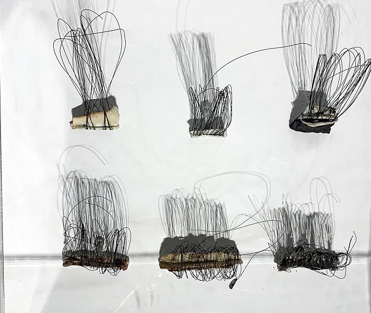
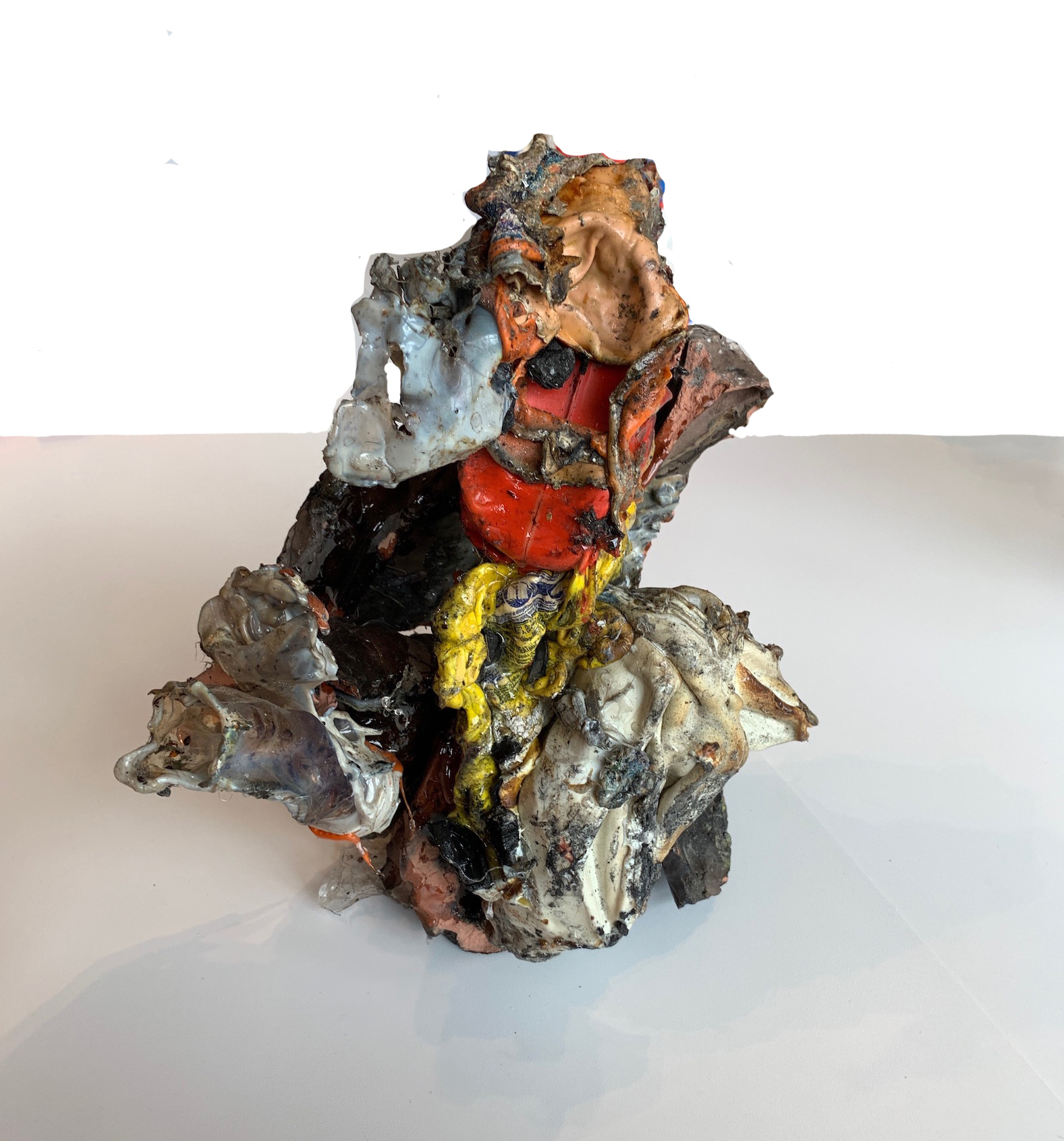
Annabeth Rosen, Fired and glazed ceramic, Bundle, and rubber ties.

The ceramic work is divided up into categories: Mash Ups, Bundles, Mounds and Drawings.  Some of the Mounds are bound together by wire, and others are smaller shapes (Bundles) that have been bound using rubber that might be made from a bicycle inner tube. Rosen began vertically stacking these bundles of ceramic and mounting them on a steel frame set on four wheels.  Rosen has developed an acute interest in non-functional ceramic forms as abstract expressionistic sculpture along with painterly compositions of paint on paper.

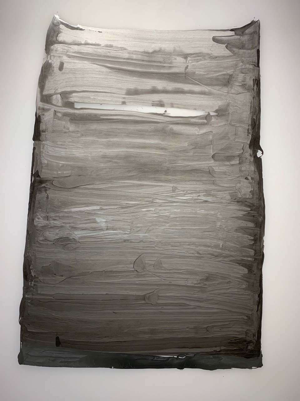
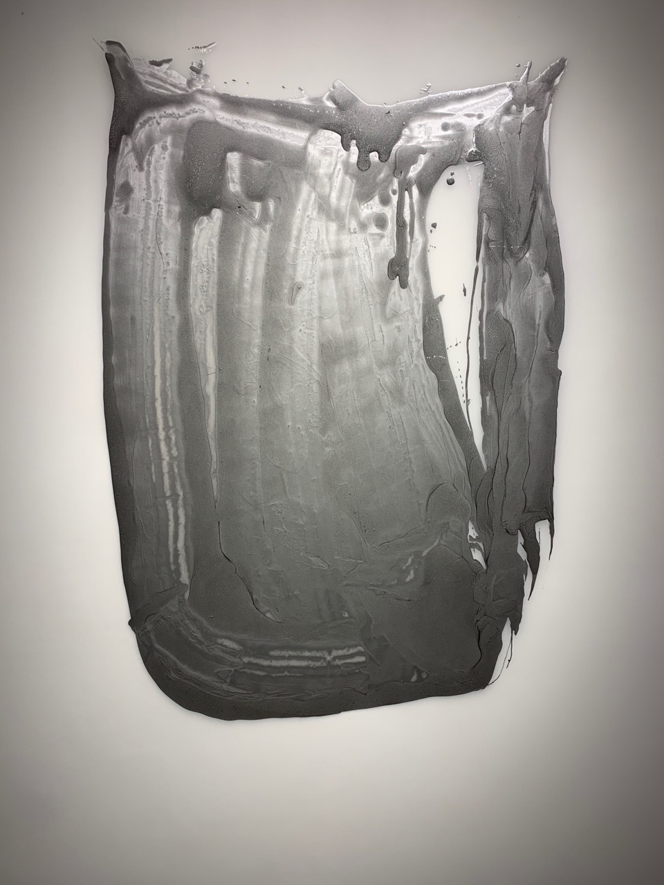
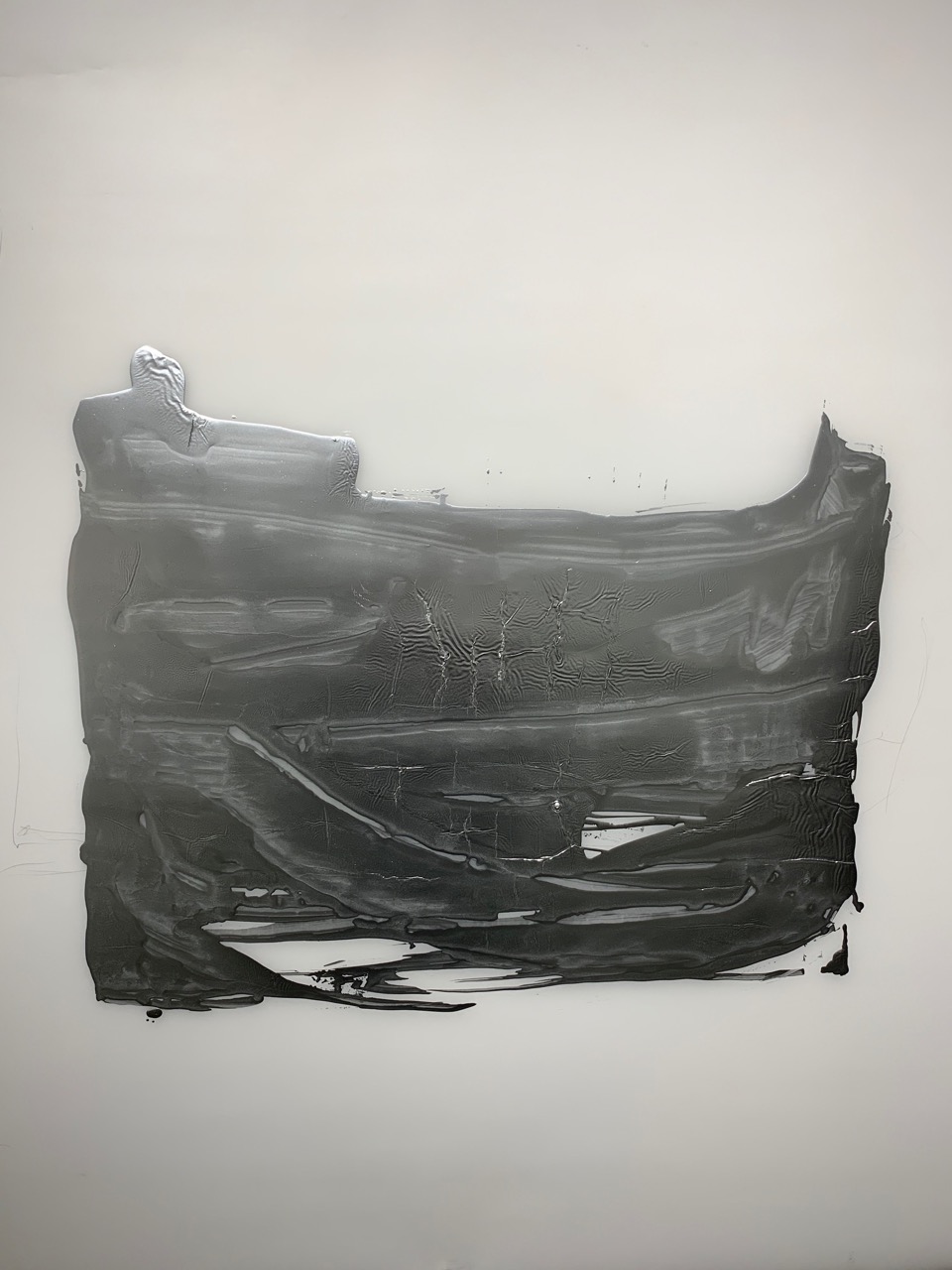
Annabeth Rosen, Paint on paper, 2014

It would be impossible to ignore the works on paper as a major force that directly relates to the ceramic work.  These compositions that are constructed with a gestural stroke are both studies and stand-alone work that underpins a philosophical and conceptual driven force behind her sense of creation.  The process in the drawing and ceramic work reveals her hand is symbiotic, where one influences the other.  Rosen seems to muster strength in her drawings as inspiration and influence for the ceramic sculpture work that follows. All the drawings, which could easily be considered paintings, are created without the consideration of color and this seems to this viewer to place the emphasis on the compositional creation of line, movement, shape and space. All the work, ceramic and on paper, is a bi-product of her internal meditations and illustrates a unique utilization and application of materials, techniques and concepts.

Annabeth Rosen, Installation view, Fired and glazed ceramic, and steel baling wire.

Annabeth Rosen studied at Alfred University (BFA) and the Cranbrook Academy of Art (MFA), and has gone on to teach at the Rhode Island School of Design, the University of the Arts in Philadelphia and the Art Institute of Chicago. Since 1997 she holds the Robert Arneson Endowed Chair at the University of California, Davis.


McArthur Binion, Binion/Saarinen: I, 2 – 2018, oil paint stick and paper on board, Courtesy Modern Ancient Brown

In Cranbrook Art Museum’s North Gallery, the Chicago-based artist McArthur Binion says that he had a note pinned to his wall for decades that read “Binion/Saarinen”,obviously something that came from his graduate studies at Cranbrook Academy of Art during the early 1970s. This idea is obviously generated from literally living on the campus and being surrounded by the Finnish architecture of Eliel Saarinen who immigrated to America in 1923 after the completion of the Chicago Tribune building in 1922 and who went on to be a visiting professor at the University of Michigan before developing the entire Cranbrook campus for George Booth. Perhaps it was the grids inherent in these architectural structures that made a deep impression on Binion, a Mississippi-born African American who developed his own visual language-based graphic elements, particularly circles and grids.

He says, “My work begins at the crossroads—at the intersection of bebop improvisation and Abstract Expressionism”, and at times he has described his work as rural Modernist.Binion uses oil stick, crayon and, more recently, laser-printed images to create his lushly textured and colored geometrically patterned works. The work in the Cranbrook exhibition is produced on board with small photo printed images as a background field for this tightly knit grid produced with hard pressed oil paint stick. These carefully measured grids and hand-done hatchings cover tiny images that usually have some personal meaning to the artist. In the past, the work often incorporated biographical documents, such as copies of his birth certificate or pages from his address book.

McArthur Binion, Binion/Saarinen: 2018, oil paint stick and paper on board, Courtesy Modern Ancient Brown

These new paintings use autobiographical photo imagery of both Saarinen and himself in their early thirties as a background for his delicate squared-off grid that could be easily described as minimalist abstraction from a distance.  Upon close examination, this personal element attempts to bond the two together, at least from Binion’s perspective.  In addition, the gallery space includes painting, drawings and furniture by Eliel Saarinen.

McArthur Binion’s paintings are largely symbolic and achieve an expressive resonance that defies the reductive materialism of minimalism. They are formed out of an unlikely confluence of influences, including such Modernist masters as  Piet Mondrian, and Wifredo Lam, as well as his own southern African-American heritage, reflected in his mother’s quilts and West African textiles. Persistence and discipline fortifies Binion’s practice and his succinct, richly personal compositions.

His work is included in the permanent collections of the Metropolitan Museum of Art, New York, and the Smithsonian National Museum of African American History and Culture, Washington, D.C.

Binion/Saarinen: A McArthur Binion Project is organized by Cranbrook Art Museum and curated by Laura Mott, Senior Curator of Contemporary Art and Design.

Annabeth Rosen: Fired, Broken, Gathered, Heaped and McArthur Binion: Binion/Saarinen, at the Cranbrook Art Museum runs through March 10, 2019.


Art in the Age of the Internet @ UMMA

University of Michigan Museum of Art brings the Boston Institute of Contemporary Art exhibition to its audience.

Penelope Umbrico, 33,930,694 Suns from Flickr (Partial) 9/05/17, 2006-ongoing, chromogenic machine prints. Courtesy of the artist. ©Penelope Umbrico.

In 1969, the United States Department of Defense harnessed groundbreaking technology to relay a message from a computer at UCLA to a computer at Stanford University; it simply read “Login,” but even that was enough to overload and crash the system.  For twenty more years, rudimentary Internet technology remained exclusively in the hands of scientists and government agencies until the creation of the World Wide Web in 1989, which radically democratized the Internet, making it accessible, comprehensible, and useable to anyone. It also irrevocably changed the way we experience the world.  Responding to the thirtieth anniversary of the World Wide Web, the University of Michigan is hosting “Art in the Age of the Internet,” a massive multimedia show which, like the Internet itself, is visually eclectic, immersive, and loud.

Three years in the making, this show first launched in 2018 at the Boston Institute of Contemporary Art, garnering substantial critical acclaim.  As one would expect given the subject, the show liberally makes use of video-art displayed on screens and monitors, but it also includes media ranging from painting, drawing, and photography to emerging technologies such as 3D printing.  The forty works that comprise the show are categorized in five sections: Networks of Circulation, Hybrid Bodies, Virtual Worlds, States of Surveillance, and Performing the Self.  Together they form an impressive ensemble of work by both emerging and established artists, including a few surprise-appearances by artists one might not immediately associate with the Internet, such as Cindy Sherman, but whose inclusion in the show makes perfect sense.

Cindy Sherman, Untitled #463, 2007—08. Cindy Sherman, Chromogenic color print. Collection of John and Amy Phelan, New York. Courtesy of the artist and Metro Pictures, New York. © Cindy Sherman

Many works explore the increasingly reality-altering nature of the Web.  A large photograph of the perennially shape-shifting Cindy Sherman seems an apt metaphor for the way many of us might use social media to fabricate idealized narratives about our better selves via Facebook, Instagram, Twitter, or Snapchat (pick your platform) at the expense of authenticity.  Commenting on this photograph of women at a social gathering of some kind, Sherman states that the image “was inspired by the idea of party photos seen so often where people, desperate to show off their status and connections, excitedly pose have their picture taken with larger-than-life-sized smiles and personalities.”  The photograph was taken in 2007, the infant years of social-media, but Sherman’s collective body of work, decades in the making,  prophetically anticipates the way many of us (including presidents and world leaders) painstakingly curate our own images, ideas, and personalities on social media as we present our digital personas to the digital world.

An entirely different commentary on the blurring of digital and actual realities comes from Harun Farocki’s two-channel video Serious Games IV: A Sun with No Shadow, which explores how the US military uses virtual reality technology to prepare soldiers for combat and to treat soldiers who experience post-traumatic stress disorder.  One screen shows soldiers interacting with the technology as another screen relays to us the same simulated combat scenarios the soldiers see.

Rafael Lozano-Hemmer, “Surface Tension”, 2007. ”Trackers”, La Gaïté Lyrique, Paris, 2011. Photo by: Maxime Dufour

The most compelling works in the exhibition are those that address government surveillance technologies; the disclosures in 2013 by NSA whistleblower Edward Snowden lend these works considerable weight.  Rafael Lozanno-Hemmer’s Surface Tension is a deceptively playful interactive screen with an eyeball that follows viewers who come within a certain distance; one can’t resist the game of pacing back and forth in front of it, testing its speed and unerring accuracy.  But to work, this installation applies the same military camera used by American smart bombs to pinpoint targets during the wars in Iraq and Afghanistan.  The original iteration of this work was created in 1992, well before the creation of the NSA and the “surveillance state” as it exists today.

Trevor Paglen, “Autonomy Cube”, 2015. Plexiglas box with computer components. (MP# TP—95). Courtesy the artist and Metro Pictures, New York. @ Trevor Paglen

With just under a billion users, more people access the Internet in China than in any other country, but users in China can’t access sites like Google, Facebook, Youtube, Twitter, the New York Times, or thousands of other websites.  Addressing the Great Firewall of China, the country’s censorious implementation of Internet restrictions, artist and activist Xu Wenkai’s Gfwlist is a black, rectilinear monolith which, for the duration of the exhibition, will print out, in encrypted form, a lengthy sheet of  Web addresses blocked by the Chinese government.  In addition to raising awareness of the problem, the artist’s use of encryption suggests a potential way for activists to hack their way towards a solution.  On a similar note, American artist Trevor Paglen’s Autonomity Cube, straddling the boundary between sculpture, technology, and activism, is a functional Wi-fi hub that anonymizes user Internet activity and hides it from surveillance systems.  Though perhaps this work bends more toward pure technology than traditional art, it admittedly recalls some of the work of Bauhaus superstar Maholy Nagy.

Art in the Age of the Internet certainly doesn’t dispiritingly present the Internet as a negative phenomenon, inevitably ushering in a Big Brother State.  Today, anyone with an I-Phone is a potential news-reporter, and social media has been the impetus that has propelled movements ranging from the Arab Spring to #blm.  Driving the point home, a wall of monitors reminiscent of the electronic sculptures of Nam Jun Paik relays algorithmically-sourced footage from the Internet showing police brutality against people of color.  On the one hand, it champions the Internet as a medium that exposes and heightens awareness of the problem, though it also painfully suggests that things haven’t changed much during the interval between the pre-social-media days of Rodney King in 1991 and Tamir Rice in 2014.

A show like this could easily veer toward envisioning a bleakly Orwellian vision of the future. But Art in the Age of the Internet wisely refrains from suggesting that the Internet has been bad for humanity– to do so would be equivalent to railing against the printing press on the grounds that there’s been much bad literature.  After all, while the term “fake news” has only recently gained currency in modern political discourse, propelled largely by the ease with which (dis)information transmits over the Internet, readers can easily find rollickingly laughable gaffs without much difficulty in the Historiesof Herodotus and Pliny the Elder.   Rather, this exhibition dispassionately presents the Internet as an irrevocable facet of modern life, and, for better or for worse, the medium though which we increasingly look, learn, love, and live.


Art in the Age of the Internet is currently on exhibition at the University of Michigan Museum of Art through April 17, 2019

Ruben and Isabel Toledo: “Labor of Love” @ the Detroit Institute of Arts

Ruben Toledo, “Broomstick Librarian Shirtwaist Dresses,” 2008, Designed by Isabel Toledo, Painted by Ruben Toledo, image by DIA – William Palmer.

We normally think of industry as the machinery of the production for making a particular thing, like the steel industry, or, especially in Detroit, the auto industry, but entering the current exhibition, “A Labor of Love,” at the Detroit Institute of Arts, we are greeted by a magnificent image of twisted swirls of colors and pleats of seven dresses. This very energetic image was composed and painted by Ruben Toledo of his wife, Isabel Toledo’s dress designs for Anne Klein, one of the leaders in the Fashion Industry. It’s not a huge leap of the imagination to go from car design, with its annual turnover and retooling for the latest, sexiest, avatars of human desire, to the fashion industry and its latest adjustments of hem and neckline and introduction of the latest color to elaborate on the human body. That’s just what this famous New York husband and wife team of artist and designer did in “Labor of Love,” their investigative interventions in the encyclopedic collection of the Detroit Institute of Arts.

Ruben and Isabel Toledo, “The Choreography of Labor,” 2018 Remaining images by DIA Eric Wheeler

Situated in the DIA’s Special Exhibitions galleries, the main thrust of their installation is an exploration of Diego Rivera’s “Detroit Industry Murals,” the heart and soul of the museum and, art lovers might say, Detroit itself. In her exploration of the collection, Isabel Toledo saw the connection in Rivera’s fresco murals between the fashion and auto industry immediately and brought them together in a large collage (Image #2) that depicts a flowing dance of her dress designs across silkscreened representation of Rivera’s painting of the factory with workers depicted engaged in car production. The darkened gallery, filled with sculpted manikins wearing formal gowns of various cultural origin, suggests a grand promenade celebrating immigration and integration of world cultures to Detroit.

Installation image of Special Exhibitions Gallery with Isabel Toledo’s first sewing machine in foreground.

There is a haunting tableau composed of Isabel Toledo’s first sewing machine wrapped in black taffeta, with ghostly gowns floating in the air above, with a quote on the wall from Isabel that offers the idea of the fashion industry and (by proximity) the auto industry, as a metaphor for the generational influence of migration and change, of death and rebirth: “The combination of ideas, time and imagination can all be triggered by fashion and how people dress, undress, expose, or cover their bodies, fashion offers the perpetual next—the never ending now, the reinvention of inventions.” It is a twist on Darwinian Evolution that goes back to LeCorbusier’s use of it to explain the evolution of design. (Incidentally Isabel’s sewing machine, in looking like a little animal, echoes Rivera’s drawing of an V-8 engine block that looks like a dog).

Diego Rivera drawing from DIA Collection

Throughout the exhibition the female body is explored as the medium of exchange for cultural expression and happily this exhibition gives us the opportunity of seeing four of Rivera’s breathtaking Detroit Industry preparatory cartoons, two of which are female figures representing the seed and fruit of the female body. Because of their fragile paper the cartoons are not displayed often.

Much of the “Labor of Love” exhibition becomes a treasure hunt. Spread throughout the museum are nine Isabel Toledo’s playful, sexy, even downright erotic designs for female adornment which are in response to particular themes and moments of the history of art arranged in the chronological galleries. It is intriguing to ferret out the connections to the specific art or gallery theme. A map is provided but, even for a seasoned museum visitor, it’s a joy to walk through the museum, with chance encounters of things that catch your eye, trying to find Isabel’s interventions. It is a clever way to break the museum’s “ideology” and cast a completely different agenda on its organization, and get the public into the galleries.

Isabel Toledo, “Synthetic Cloud,” 2018, Nylon

There are many intriguingly inventive responses and fashion interventions by the Toledos including Isabel Toledo’s design for Michele Obama’s inauguration outfit found in the American Colonial house and interesting twists on the shenanigans of the surrealists, and to Alison Saar’s “Blood/Sweat/Tears” sculpture, but the most engaging is “Synthetic Cloud.” Installed in the “minimalist” gallery and inspired, it appears mostly by Robert Irwin’s diaphanous acrylic disc, “Untitled, “ but as well by the hard-edged paintings and sculpture of Donald Judd, Sol Lewitt, Eva Hesse and Ellsworth Kelly.  Above Irwin’s chimerical disc, the most mysterious piece of art in the museum, hang eleven multicolored, nylon, tulle tutus that float like a formation of clouds high above our heads. Layer upon layer of pastel underskirts support the dancing figures that also support the rigid wire bodices of the imaginary ballerinas. Somehow echoing Irwin’s ineffable image of light and shadow, Toledo’s fantastic ballerina clouds are worth the trek.

Panoramic installation view of gallery

Isabel and Ruben Toledo: Labor of Love, Detroit Institute of Arts    –  Through July 7, 2019


Page 45 of 79

Powered by WordPress & Theme by Anders Norén