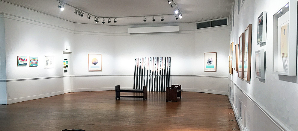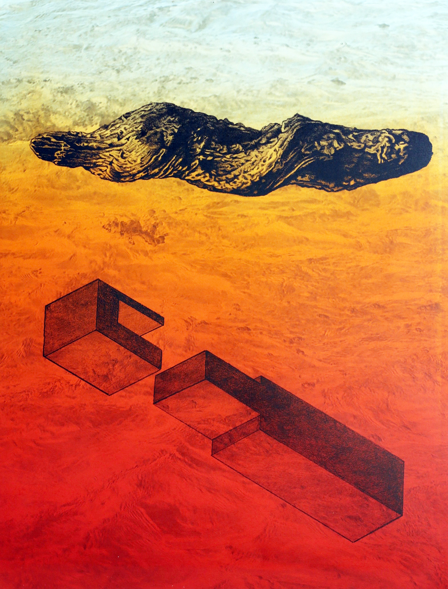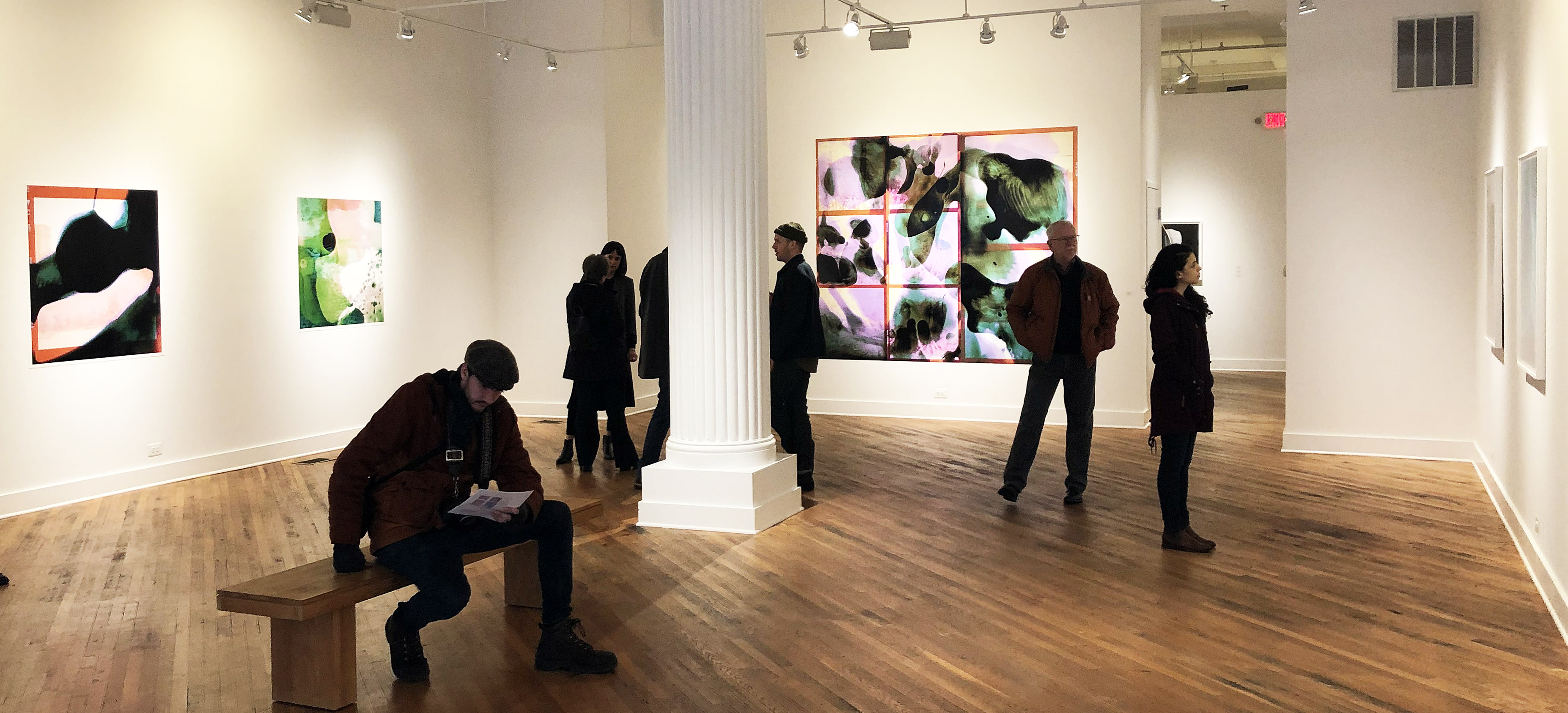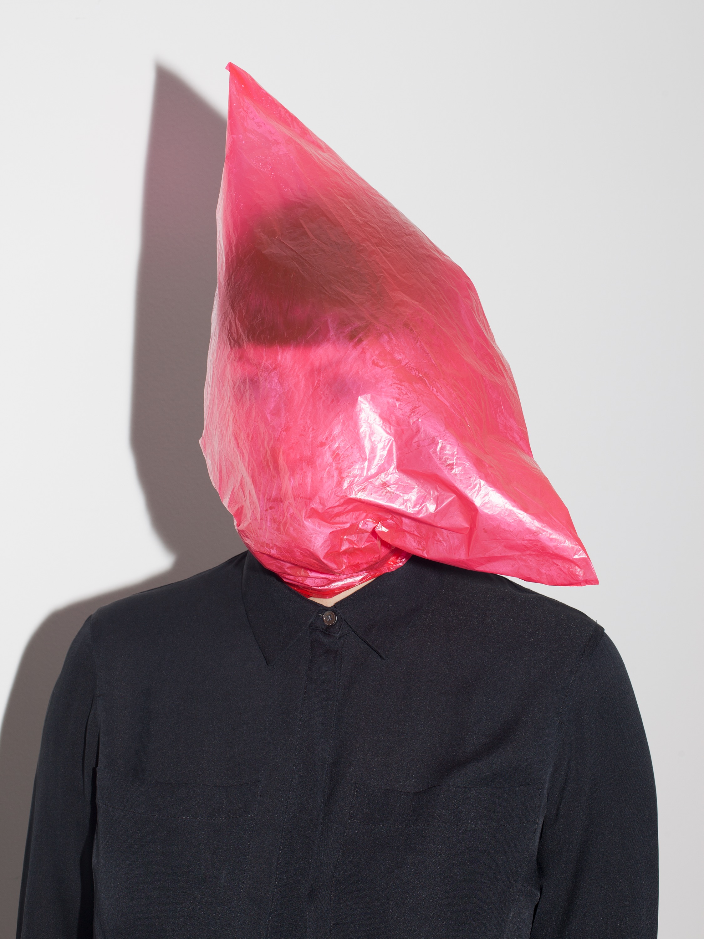
Dustin Cook, Installation Playground Detroit, 2019, Courtesy of DAR
In a recent New York Times review of the exhibition “Lucio Fontana: On the Threshold” held at the Met Breuer in the Winter of 2019, critic Holland Cotter wrote of the Argentine-Italian Modernist “As for Fontana, he understood that his own most important contribution remained the “Holes” and “Cuts,” which both brutalized tradition and preserved it. He made abstraction look dangerous.” At Playground Detroit, artist Dustin Cook, with a nod to Lucio Fontana, makes abstraction look funny.
In the one-person exhibition “TUMBLE,” Cook presents thirty new works on canvas that poke fun at tradition while also paying homage to it. This is a witty exhibition served up in a state of serious play.
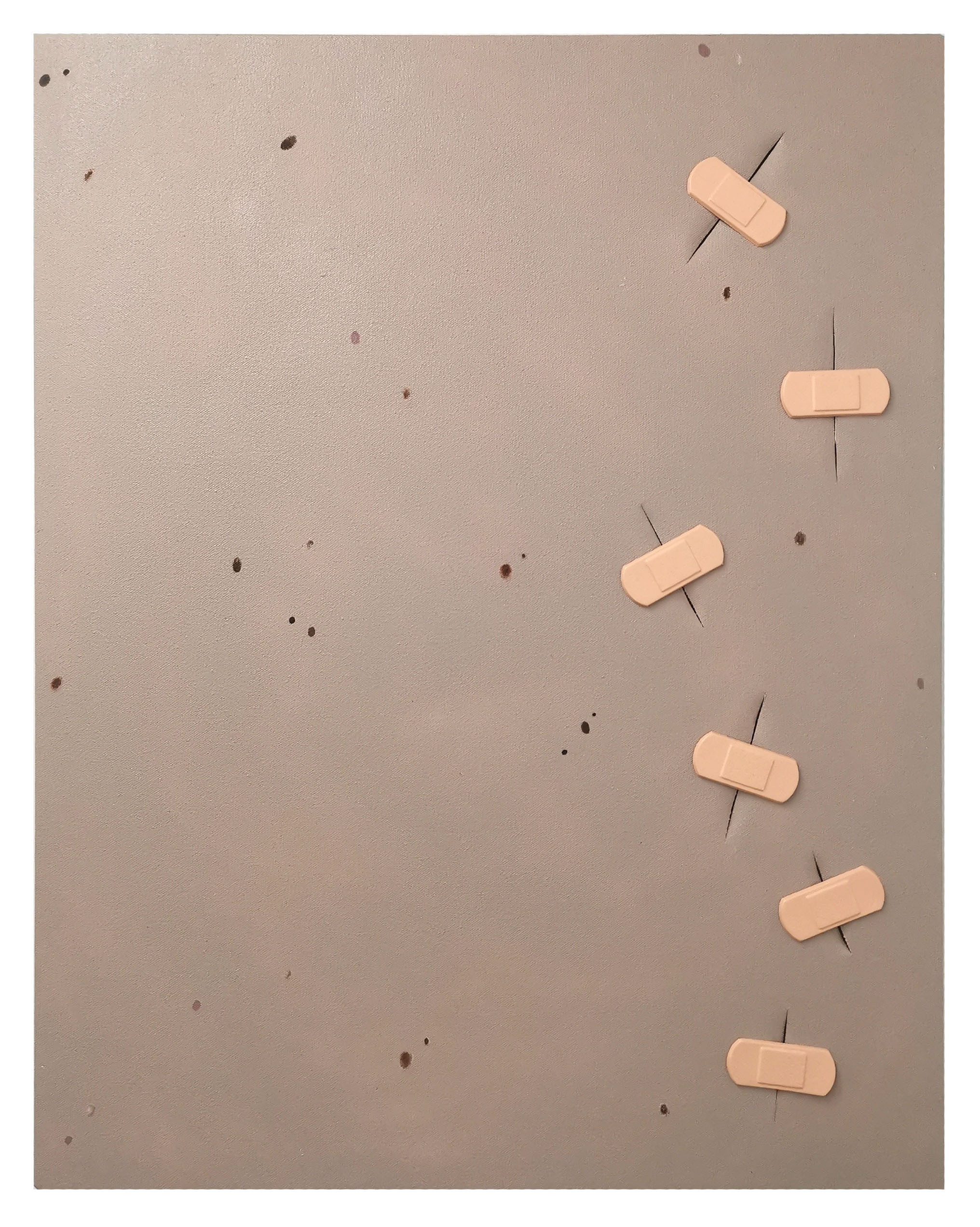
Dustin Cook, “Lucio’s Skin”, 2019, Acrylic and cast plastic on canvas, 36 x 24 inches
Stabbing and Bandaging Fontana
Lucio’s Skin is a 36 x 24 inch canvas painted in acrylic to resemble a surface area of flesh stretched over a rectangular frame. Although there is an awareness that this is a painting and only a painting—the woven texture of the canvas emerges through the thin application of acrylic—its surface is mottled with skin blemishes that suggest otherwise. There are possible age spots, moles, warts or acne. At the right edge of the composition is a vertical zigzagging stack of six cuts made in the canvas, each sutured with a thick cast plastic, soft-pink Band-Aid. The piece is both about Fontana but also one-ups his cut canvases, what he called Taglior Cuts, calling forth issues of abstraction versus figuration, the fetishization of the painted surface, the cut as gestural mark and action for the unfastening of space, and image construction as an act of deconstruction. By allowing the canvas to appear as actual flesh, the addition of painted blemishes is a corollary to Fontana’s cuts as both initiate the disruption of surface. The placement of fake Band-Aids over the cuts is an act of satirizing Fontana’s concept of Spazialismoor Spatialism, in which he pursued “plastic emotions and emotions of colour projected upon space.” Cook takes the concept of “plastic emotions” literally and imposes his cast plastic bandages over what can now be seen as a wounded canvas, to both seal up the novel use of penetrated space that Fontana created and to reopen space by means of adding relief elements projecting outward from the surface of the canvas. The color of these plastic band-aids is in stark contrast with the color Cook has chosen to paint the skin. It is a darker beige and although it appears as flesh at first glance, aided by the blemishes, it more closely resembles the color of unpainted, unprimed raw canvas used in some of Fontana’s Tagli works. Canvas isLucio’s skin. Cook is therefore able to make canvas appear as flesh and flesh appear as canvas, while always speaking to painting.
The presence of Fontana hovers as there are five other works on view that take a similar stab at Spazialismo by way of incorporating a cast plastic knife, a safety pin, more of those soft pink Band-Aids and even the word OUCH into other wounded canvases. This is an exhibition in part concerned with the disruption of surfaces.
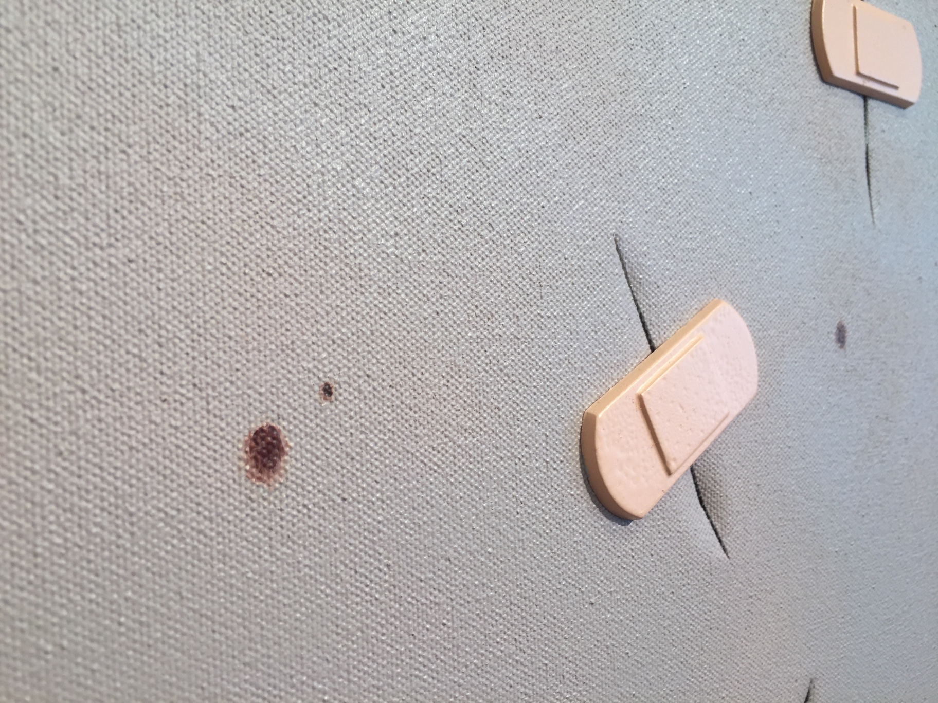
Dustin Cook, detail of “Lucio’s Skin”,2019, Acrylic and cast plastic on canvas, 36 x 24 inches
No Clemency for Greenberg
The story of Modernist painting is one of flatness as a defining virtue set down by the critic and aesthetician Clement Greenberg, who extolled the virtues of Mondrian as being a master of the flat by creating the flattest of flat pictures. For Greenberg and many Modernist painters, literal surface flatness and the depiction of flatness was an essential means to emphasize formal properties on the planar field. It was about self-consciously drawing attention to the artifice of the image and the nature of its construction through the use of autonomous forms in isolation for maximum clarity.
By affixing his simple cast plastic forms onto the surface of canvasses seemingly committed to their own flatness, Cook takes a humorous jab at the Greenbergian position. For although the plastic relief elements in his paintings remain independent, never overlapping one another, Cook utilizes them in a way that is both detached and integrated into the conversation of the picture. They act as both kitschy bauble and as comical grace note, but also direct our attention to the inherent absurdity of the flat painted image. In these sculpture-painting hybrids, Cook is able to have his cake and eat it too. These works are both smart and dumb at the same time: a simple gesture of sticking cast, toy-like plastic representational forms onto a flat, formally austere canvas creates a conversation both humorous and serious. Cook knows what he is doing.
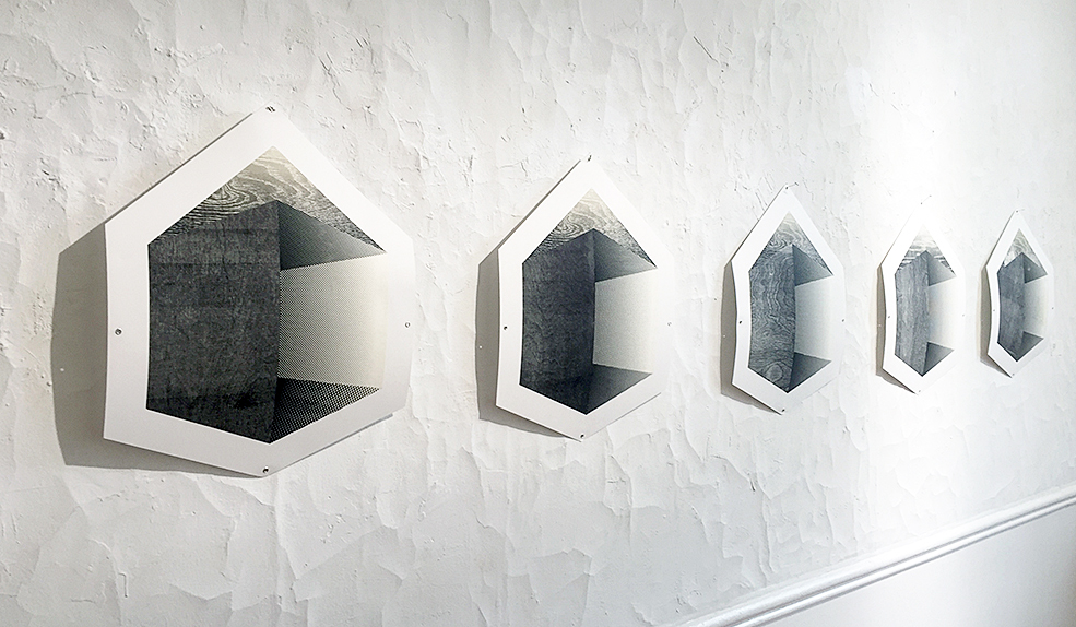
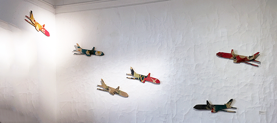
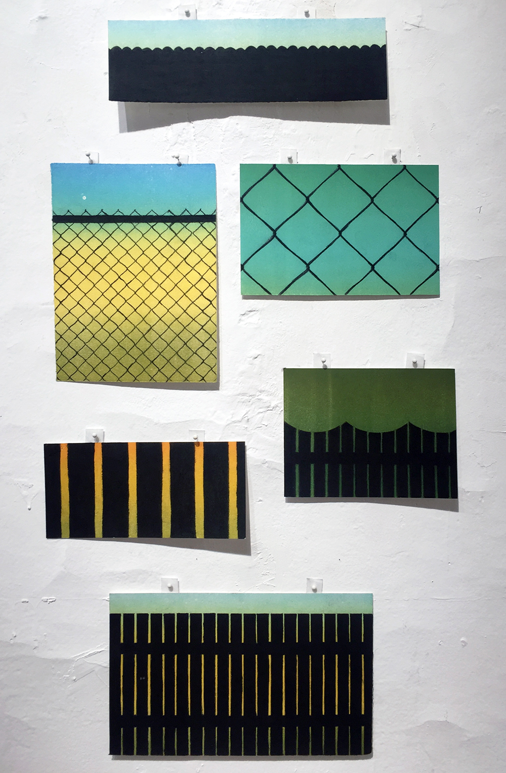
Dustin Cook, “TUMBLE”, Installation Wall, All images courtesy of Playground Detroit
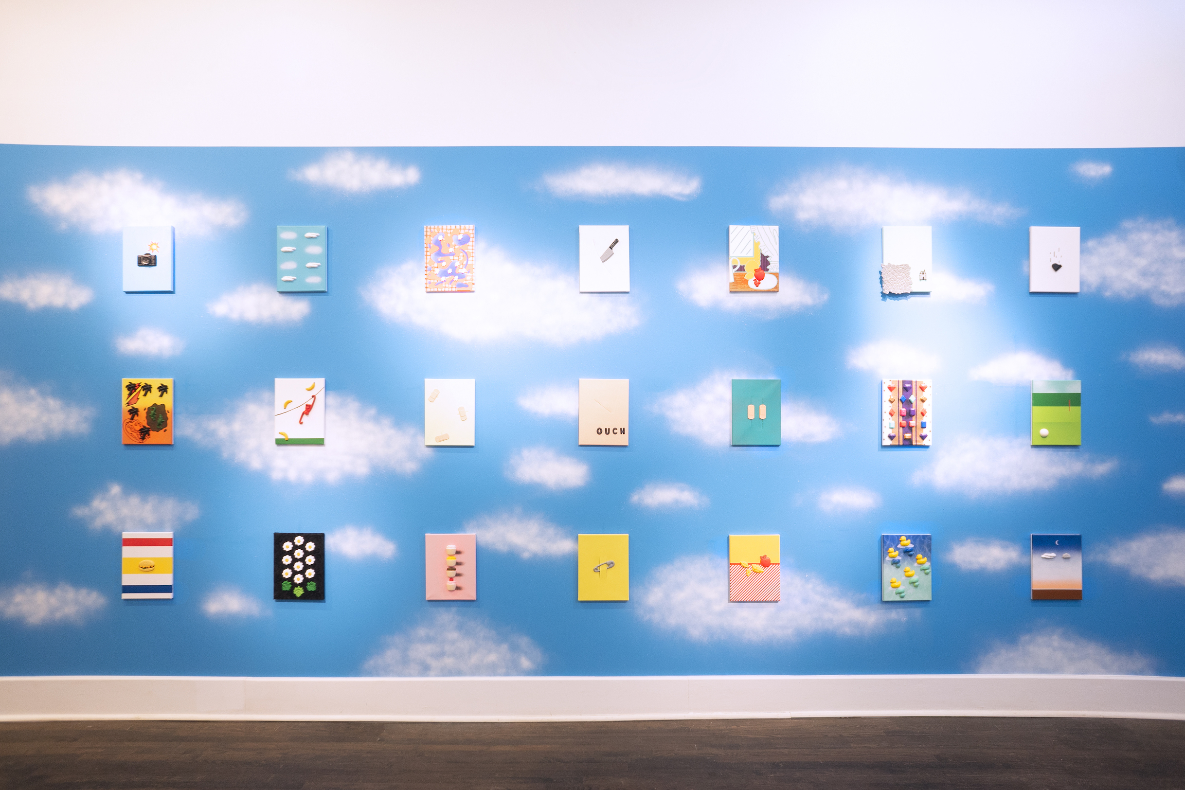
Within “TUMBLE” there is a wall installation of 21 canvases each measuring 12 x 9 inches, that amounts to a comedy set, comprised of visual jokes each with a setup and punchline, and callbacks between the jokes. The canvases are presented as three horizontal rows of seven, hung against a painted blue sky populated with summer day white clouds. The paintings appear to be mathematically suspended in the air, in a state of ordered levitation found in the paintings of the Belgian Surrealist René Magritte. It should be noted that Magritte was a painter of the deadpan joke, having utilized an unemotional, representational flatness to deliver visual gags with the straightest of faces. So too is Cook a painter of the deadpan gag.
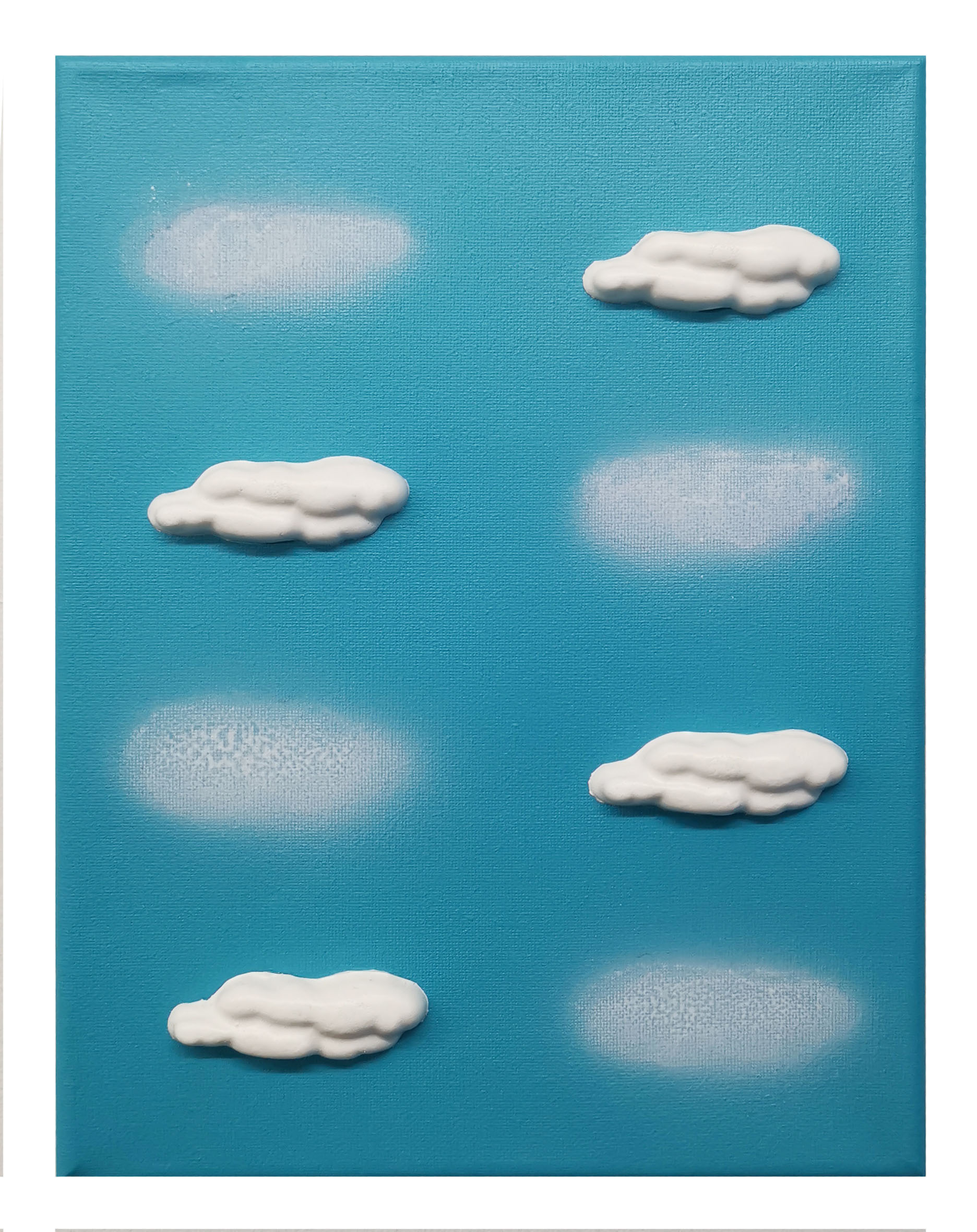
Dustin Cook, “Clouds”, 2019, Acrylic and cast plastic on canvas, 12 x 9 inches
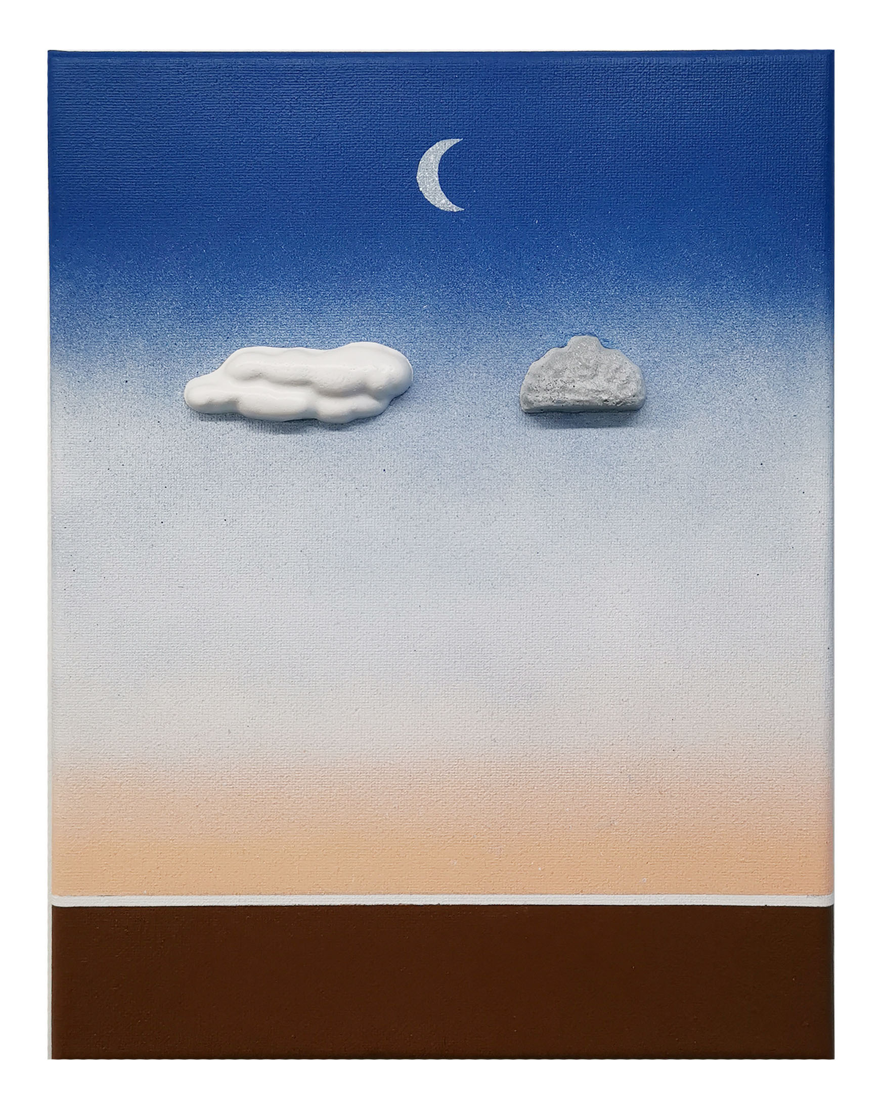
Dustin Cook, “Stone and Cloud”, 2019, Acrylic and cast plastic on canvas, 12 x 9 inches
Five of the 21 works reference Fontana, and they form a cross in the center of the group. There are two paintings, Cloud sand Stone and Cloud, that feel closer in spirit to Magritte as each confronts the artifice of representation. In Clouds, Cook depicts eight clouds in four pairs. Each pair depicts a painted cloud form on the blue sky of the canvas, alongside a cast plastic cloud. In Stone and Clouds, direct reference is made to the 1959 Magritte painting La Bataille del’Argonne (The Battle of the Argonne), in which a large cloud and a large floating stone confront one another in a sky at dawn before a waning crescent moon. Below is a landscape possibly depicting the Forest of Argonne in France, where during World War I fierce combat occurred between German and Allied forces. Cook simplifies and flattens Magritte’s setting down to an essential banding of color from earth to atmosphere, retains the waning crescent, and replaces the cloud and rock with cast plastic replicas, smaller and more ridiculous in scale than the source painting’s suspended behemoths. If Magritte’s painting reveled in oppositional dualities, so does Cook in his. As Magritte posited “Visible images conceal nothing.” Persistent clarity therefore reveals the contradictions inherent in perception. A plastic cloud and a plastic stone are just as absurd as the flat painted landscape they are floating within. Another, larger work in the exhibition, Window from 2018, references Magritte’s 1964 painting Le Soir qui tombeor Evening Falls II, but makes ingenious use of wood window blinds to fragment the image as Magritte had depicted the glass of his window, and the image itself, as shattered.
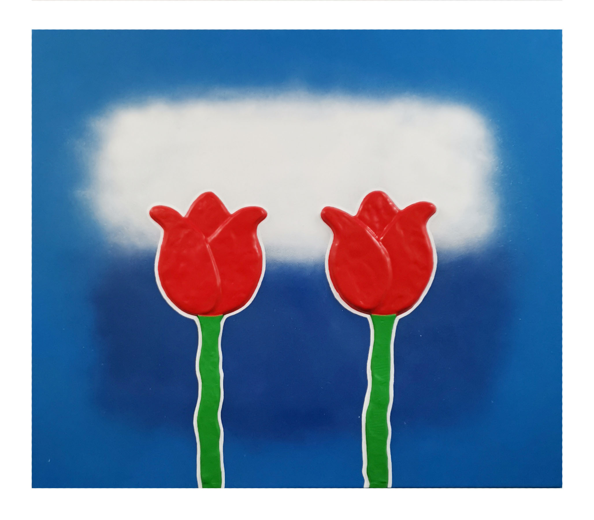
Dustin Cook, “Two Tulips in a Color Field”, 2019, Acrylic, clay and silicone on canvas, 36 x 42 inches
Two Tulips in a Color Field, a 36 x 42 inch composition with acrylic, clay and silicone on canvas, utilizes a Magritte-like approach to simultaneously obscure and reveal. The surface of the painting is comprised of two diffused, loosely painted horizontal rectangles of white and blue, one stacked atop the other, floated atop a larger area of blue. This is a clear nod to Mark Rothko (1903-1970), a pioneer of Color Field Painting, which grew out of Abstract Expressionism and was championed by Clement Greenberg as the way forward in painting. Large areas of flat, solid color are spread across a canvas as an attempt to merge figure and ground in a field that suggests an extension beyond the canvas. Color was intended to become the subject itself. In another wonderful, smartass gesture, Cook adheres two clumsily sculpted tulips right onto his approximation of a color field painting, thereby overturning Greenberg’s proposition. Their verticality suggests two standing figures that reduce the background to a landscape, an actual field. The choice of the tulip calls forth the tradition of the Dutch Still Life and its pursuit of the representational, although Cook’s stems and bulbs are considerably less believable than those employed in 17thcentury bedriegertje or “little deceptions,” which may indeed be his point—to draw attention to the artifice of both the representational and the abstract and place them on equal footing.
Dustin Cook, “Eat Like Andy”, 2019, Acrylic and cast plastic on canvas, 12 x 9 inches
Warhol Eating Warhol
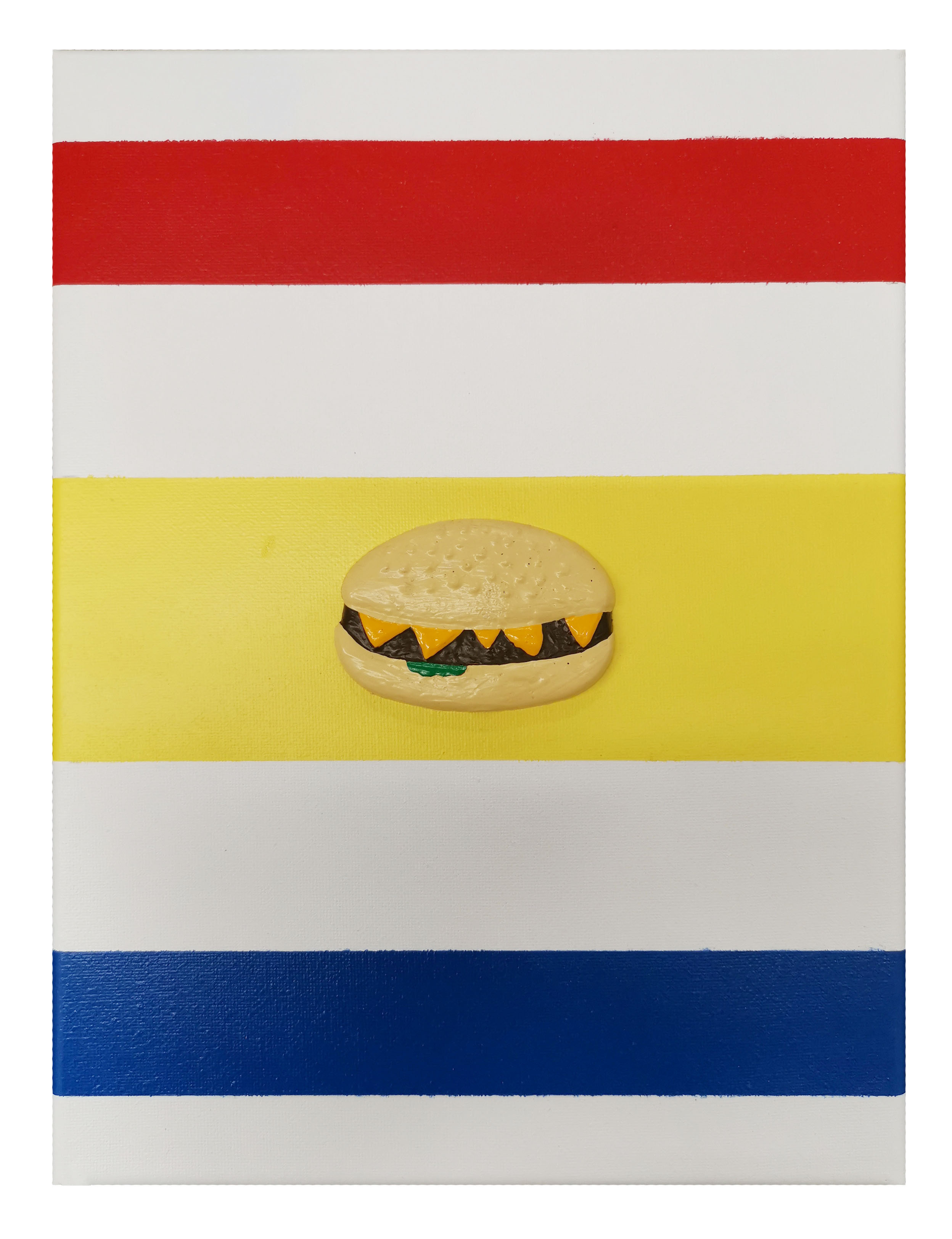
Eat Like Andy, a 12 x 9 inch canvas included in the “cloud wall” group, presents a minimalist composition of seven horizontal bands: white, red, white, yellow, white, blue, white—the purity of the primary color palette as embraced by Modernism. Each color is isolated, painted without signs of the brush. This is flat, hard-edged, post-painterly painting, summoning mid-century abstraction. But then Cook sticks a hamburger right in the middle of the whole thing. A cast plastic, painted hamburger. The figure-ground juxtaposition is funny. One neat, the other a cheap representation of a greasy fast food item. The scale of the burger is such that it becomes an Eye of Providence surrounded by rays of Modernist glory. But it makes strange sense. The colors plus white, are the colors of the Burger King brand. Burger King (first known as Insta-Burger King) was founded in 1953—when Ellsworth Kelley was pushing the primary color palette in painting to a place of startling reduction. Fast food chains and Modernist art—two great American cultural projects embracing the limitless possibility the mid-century had to offer. Not only does Cook bring these two things together, but he adds a title that complicates the matter further. Eat Like Andy references the hashtag #EatLikeAndy that accompanied a 45-second clip of the late Andy Warhol eating a Burger King Whopper in a commercial that aired during the 2019 Super Bowl.
In 1982, Danish film director Jørgen Leth documented Warhol eating a hamburger for the project 66 scener fra Amerika (66 Scenes from America). The set-up was simple: a single, unedited take lasting four-and-a-half minutes. Leth allowed his camera to run as Warhol unpacked the burger, struggled to empty ketchup from a glass bottle, ate the burger, packed up the container and napkins into the bag, crumpled it up and cleared everything to one side, awkwardly sat staring for a lengthy amount of time before declaring to the camera “My name is Andy Warhol. I have just eaten a hamburger.”
Burger King managed to secure the rights to show a portion of this episode as an advertisement, although it was never meant to be an advertisement and the choice of consuming a Whopper was arbitrary. It was known by Leth that in 1982 Warhol charged $75,000 for a mere minutes of commercial acting work. Leth did not want to pay Warhol for his documentary, and so he provided him with three hamburgers to choose from: two without any brand packaging and one from Burger King. Warhol wanted to know why McDonald’s was not an option since it “has the best design.” But rather than prolonging the shoot to secure a Big Mac, he agreed to eat the Whopper. He made an aesthetic rather than a commercial decision at that point. Leth made his film and then packed up and returned to Denmark. The actual four-and-a-half minute clip is a perfectly absurd image not unlike Cook’s painting: a collision of the controlled albeit noticeably uncomfortable Pop Art icon turned brand struggling to eat a fast food hamburger in a highly controlled setting. The image of the hamburger, as in Cook’s piece—a seed adorned lumpy bun, drooping slices of processed cheese, the meat patty, a pickle, ketchup—devoured by a master of image maintenance. And yet both are products of the postwar cultural factory in all its branded, consumerist glory.
The reemergence of the footage as an actual Burger King commercial, making Warhol’s ghost an advertisement for hamburgers during a football game, completes Warhol’s project. The postmodern serpent is devouring its own tail (tale). The consumer becomes the consumed as the artist is decontextualized and commodified himself. Warhol becomes the Whopper.
What does it mean, then, to Eat Like Andy? To eat and be eaten? To become a part of the art as life as art continuum, merging artifice and reality? Sticking a plastic hamburger on a Minimalist composition somehow makes sense in this light.
Dustin Cook, “Falling Piano”, 2019, Acrylic and cast plastic on canvas, 12 x 9 inches
Look Out for Falling Pianos
Cook is a relaxed strategist, a rigorous anecdotalist, and is a practitioner of self-reflexivity. With a background firmly rooted in graphic design, he brings the rigor of a designer’s eye to the situations he constructs. The precision Cook applies to his work serves to heighten the deadpan character of his images, making them funnier. The works in “TUMBLE” are immaculately told jokes whose well-honed surfaces and cast relief figures arranged in perfect relationship to their ground, serve to sharpen the delivery. Like all good comedy that stands the test of time, these are self-aware jokes intended to deconstruct themselves in the process of their telling.
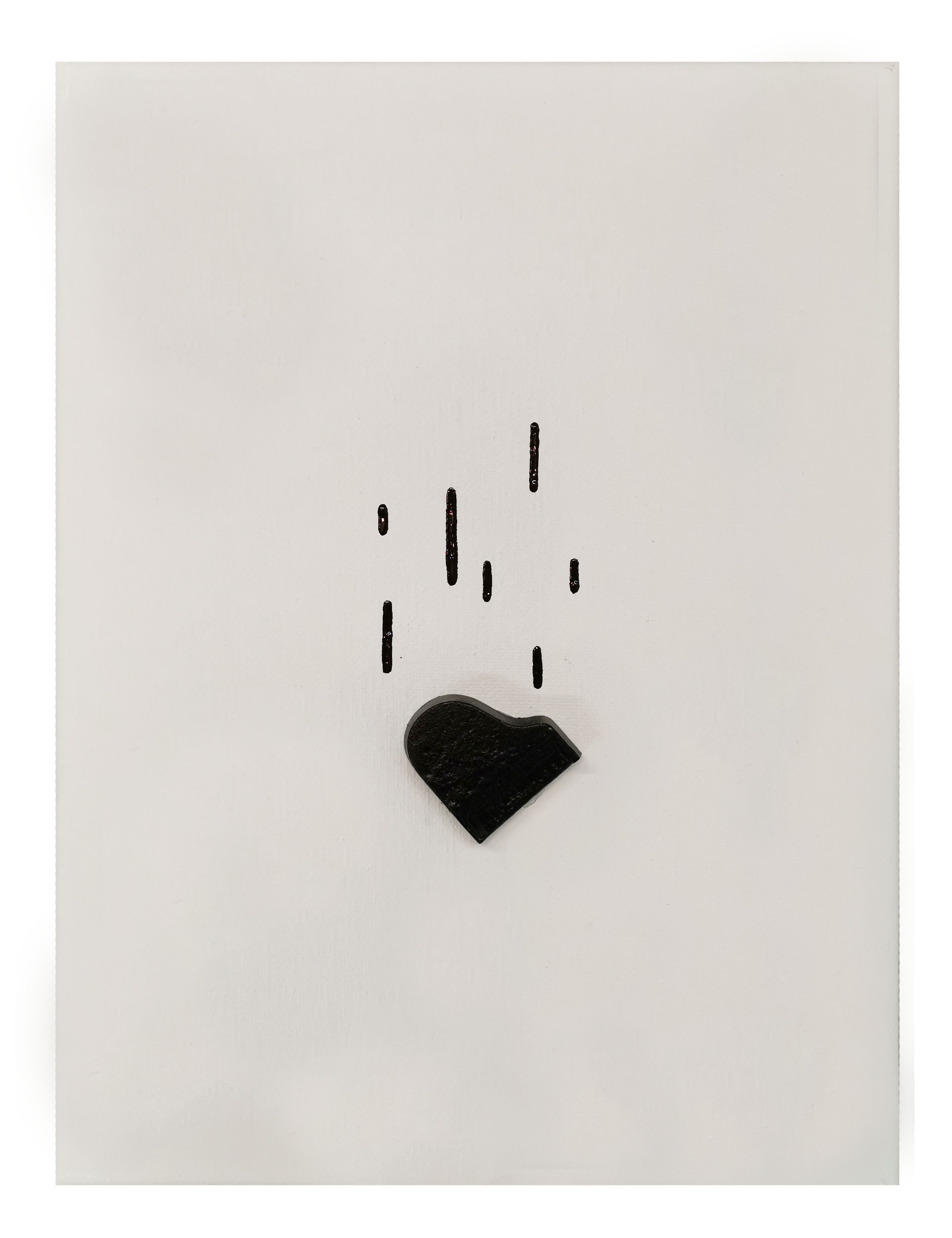
Falling Piano is a little grace note, a time-honored comic trope: the black laquered grand piano falling seemingly from nowhere to crush the innocent who happens to be walking below it. A sign of wealth, the piano generally falls from the side of a city high-rise as it is being hoisted to a posh apartment. The street level victim is normally never of the same social stature as the owner of that murderous musical instrument. The scene is generally a death by accident, but it is also death by absurdly comic design. Cook presents the falling piano as a quiet, funny, small moment in the show, with a cast plastic black piano and comical lines representing its fall on a plain white painted canvas. It appears to be sliding off the canvas itself, ready to end up on the gallery floor. Crushing no one, except perchance an ant strolling beneath it, this little moment could be a metaphor for what Cook is doing throughout the exhibition: setting up a comic scenario predicated on tradition. Like that piano, he is dropping a thing on top of another thing to observe the comic results and unexpected meanings. Like Fontana’s Tagli and Magritte’s startling moments of clarity, Dustin Cook creates a series of “tumbles” in which he disarranges meaning with a clumsy fall and then makes a quick turn over backwards to gain a new perspective, to view the hidden implications of the situation that just unfolded.
“TUMBLE” remains on view at Playground Detroit through April 27, 2019