Detroit Art Review

Critical art reviews of Detroit galleries and museums weekly

Biennial All Media Exhibition: Terrain @ Detroit Artist Market


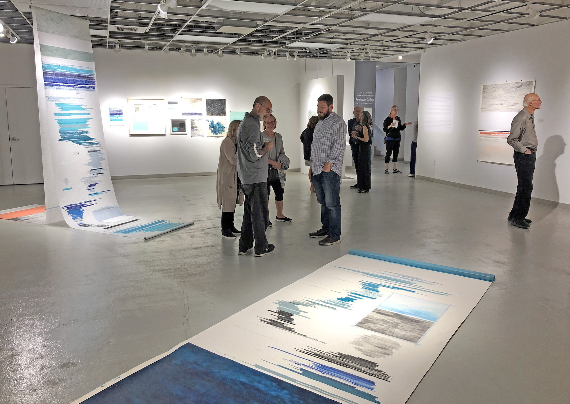
Installation View of Detroit Artist Market’s “Terrain” exhibition, Photos courtesy of The Detroit Artists Market, Matt Fry, DAR

Steadfast in its mission as a non-profit gallery devoted to contemporary art and community, the Detroit Artists Market once again opened its doors to the whole art community in its Biennial All Media Exhibition juried by Detroit’s visionary landscape painter Jim Nawara. In his call for entries Nawara made it clear that the definition of landscape was pretty much wide open:

The works for this exhibition may present engaging, evocative images and ideas that employ illusion, allusion, and/or representation of observed, interpreted, or imaginary landscapes.

Beyond that, his nuanced description of the possible parameters of landscape is a tutorial itself:

Natural and unnatural phenomena in urban, suburban or rural landscape subjects, concepts about geology, memory and landscape, history embedded in landscape, archaeology, space archaeology, aerial views, maps and cartography, seascapes, layered space, camouflage in landscape, still life in landscape, figure in landscape, skyscapes, nocturnes, weather effects, atmospherics, optical phenomena in landscape (opposition effect, sun pillars, fogbows, glories, etc.), or microcosmic and macrocosmic landscapes may be of interest. 

Nawara’s description of what he calls “Terrain,” increases our post-digital visual vocabulary for all things called “landscape” and certainly our appreciation of what he has included in the exhibition.

Sergio DeGiusti, “Time and the River,” (2014) Hydrostone, 21”X31”

Master Detroit sculptor Sergio DeGiusti’s hydrostone relief “Time and the River” is perhaps the exhibition’s quintessential representation of the earth’s terrain and sets the stage for much of the imagery of the exhibition. Sculpted and tinted in waves of iron oxide red, the hydrostone relief evokes the metaphor of primal forces shaping the earth’s molten magma interior into phantoms arising over millions of years, to structure the interior of the planet as we know it now. The blood red waves accumulate to congeal into enormous crystalline mountains of iron evolving into animated figures that shape the history of the planet. The figurative shapes that arise suggest the powerful, destructive forces of nature, even human nature, that are seen in early twentieth century neoclassical sculpture.

There are forty artists represented in “Terrain” fulfilling virtually every feature of Nawara’s description of landscape and every media but they all somehow suggest the classic dynamics of DiGiusti’s “Time and the River,” in which the powerful, yet graceful forces, of nature shape our planet. Ryan Herberholz’s “Reservoir,” is built around the image of a hallucinogenic derelict house, an all too familiar image to Detroiters, caving in upon itself and sliding into a sinkhole, which is kind of a metaphysical reservoir or sewer. Pastel colored oil floor boards and ceilings seem to melt and flow into the dark hole at the center of the image. Meanwhile out of the windows we can see utopian fields of green and a pastel landscape of tidy, cobbled together, rescued houses.

Ryan Herberholz, “Reservoir,” (2017), Oil on Panel, 48”X64”

Deborah Kingery’s large format, black and white photo, “Target,” captures the foreboding towers of the Enrico Fermi 2 nuclear power plant near Monroe, Michigan. Fermi 1, once a major threat to SE Michigan, due to a nuclear meltdown, has been decommissioned. Kingery’s infrared film print (film stock of the psychedelic 60’s because of its surrealistic effects on light and vegetation), beneath a huge ominous sky of vaporous clouds produced by the twin nuclear stacks, with the deer target in the foreground, pictures Fermi 2, the replacement for Fermi 1.

Deborah Kingery, “Target,” Infrared Silver Photograph, 33”X43”

One of the fine ironies of the exhibition is two works of art that document human interaction and collectively create a wonderful human landscape. Donita Simpson’s very humanizing photo of the artist Jo Powers pictures her in studio amidst art making materials, photos and sketches, including a study for a “steam shovel,” a tiny, toy model of one, and one of her enigmatic self-portraits and other accoutrements of an artist studio. Powers stares, meditatively, from the landscape of her studio, into the distance. The atmospheric, completed painting itself hangs above Simpson’s photo. It is of a fully-clothed woman in an excavated hole standing up to her knees in water, the steam shovel poised on an earth mound behind her. As always with Powers’ evocative images, interpretation is open but there is always both a solitary search and an enigmatic mission suggested. Powers’ modest, tonalist paintings, rich in painterly chops, always stay within themselves, and because of that are deeply satisfying.

Donita Simpson, “Portrait of Jo Powers,” (2016), 30”X30”

Jo Powers, “Site,” (2015), 12”X16”

There are not many group-exhibitions that, at least for this writer, gain much traction because of the, often-random application of art to a specific theme. Nawara however, has attracted, probably because of his own fine artistic history, a group of Detroit’s best artists who have addressed the mission with sincerity.

In other words, there’s many fine works in “Terrain” that make a dynamic contribution to developing the concept of terrain and only a few that seem a stretch. Jill Nienhuis insightful painting, “Boulevard Bob,” tracks the flora and fauna of typical alley terrain culture with the juxtaposition of a nomadic black dog, probably named Boulevard Bob, on the prowl for dinner and a stellar rendering of sunset lit mullein plant in the foreground. That there can be a beautiful sunset in an alley, with overgrown plants and trees and a derelict car, is fundamental to urban dwellers, especially Detroit, but that there is a specific alley culture that is recognized and celebrated, and punctuated by the noble mullein, is sensational!

This years’ Detroit Artist Market Biennial has many treasures and fulfills Nawara’s diversely imaginative definition of Terrain. Mel Rosas’ retablo influenced painting of an iconic street scene in Mexico is quietly suggestive of the elemental simplicity of that picturesque culture and climate. Sue Carmen-Vian’s articulate graphite drawing, “Pancake Race,” seems a comic commentary on the stereotypical role of women in the Human Race. Bill Schwab’s photograph “Roosevelt at Buchanan, Detroit/ Projection Djupavik, Iceland,” is layered projection of a dystopic factory with crumbling concrete walls, derelict clapboard house and building and haphazard electrical wiring punctuating the apocalyptic vision. One of the only ruin-porn-noir images that engages the surfaces of the derelict with technical invention and cinemagraphic sensibility. “Terrain” is rich in Detroit artists with many gems to be discovered.

Bill Schwab, “Roosevelt and Buchanan, Detroit/Projection Djupavik, Iceland” (2017), Photograph, 32”X42”

Biennial All Media Exhibition: Terrain, April 27-May 26, 2018,  Detroit Artist Market

Address   –  4719 Woodward Avenue,  Detroit, MI 48201

Contact  –  Web: [email protected]  – Phone: (313) 832-8540

Hours – Tuesday – Saturday,  11:00 A.M. – 6:00 P.M.


Cynthia Greig @ Paul Kotula Projects

“Cynthia Greig: Sans Souci”

Installation view of “Cynthia Greig: San Souci,” Paul Kotula Project, all images courtesy of Cynthia Greig

We have been looking at Cynthia Greig’s elemental photographs for years now. We look at them for their elegant and deceptive simplicity and uncanny calm. She has choreographed complex, intriguing photographic projects that engage art history and manipulated narratives that parody the representation of gender construction and sexuality. Both her “Representation” and “Nature Morte” (Still Life) series, with their ghostly picturing of common objects (household fan, globe, coffee cups) and traditional still lifes (with fruit, wine glasses, books, flowers) befuddle our definition of painting and photography, while exuding a formal sensuality and intriguing beauty.

Cynthia Greig, “Gallery Horizons,” archival pigment prints, 14.5”X 22,” 2013

Her current project, “Cynthia Greig: Sans Souci,” at Paul Kotula Project, continues her interrogation of the institution of art, with images of the interiors of well-known art galleries. A series she refers to as “Gallery Horizons,” features five pictures of the intersecting seam of where the floor of the gallery meets the wall. One of the iconic features of contemporary galleries is their characteristic flat gray cement or shiny, polyurethane floors. The best background color for exhibiting art is commonly thought to be white, so art gallery’s walls are almost always white with gray or wooden floors. The museum or gallery is an idealized space for showing art that has evolved since the mid 19thcentury into the proverbial “white cube.” Since Alfred Barr curated the famous 1936 Museum of Modern Art exhibition, “Cubism and Abstract Art,” the white cube has been the model for the ritualized exhibition of art and the ritualized social space of art patrons. However, in Greig’s “Gallery Horizons,” photographed in many galleries the United States and Europe, the art has been erased. Invariably, the intersection of drywall or plaster and the cement floor is left unfinished, resulting in a jagged seam at the bottom of the wall. With only a portion of floor and wall shown the image becomes something else and, remarkably, the image appears to be like a horizon line of where the sky meets the earth or sea.

Exploring her Gallery Horizons, you look at a jagged fissure bordered by shades of gray and white, at figure-ground ambiguity. A photo is incomplete until the viewer engages and with Greig’s images the viewer is even more complicit because of the uncertainty of what is pictured. Ultimately a white wall meeting a floor is identified but each of the five photos suggest other readings specifically. They become enigmatic images of open spaces which evoke emotions contrary to the social construct of art galleries: rolling ocean wave beneath icy sky, jagged coastlines along the sea, barren farm fields with lonely village in the distance. The viewer has an option to either enter the fiction or resist.

There is in Greig’s photographic practice a subversive action to question the role of the gallery by looking elsewhere, at the other, instead of the subject, which in a gallery is art. Each of the Horizons is photographed in a specific gallery, with the name of the artists who are being exhibited identified, which creates a conceptual context. In this hyperbolic space where nuanced perception of images–artistic as well as the vanity of curating ourselves—are almost solely the issue, the absence is rupture. “The horizons” themselves are something else, not only do they become something other than floors with walls they are the thing that shouldn’t be looked at. The floor meets the wall beneath the subject that hangs on the wall. There is an aspect of surveillance and appropriation in her project. These are main stays of contemporary photographic practice and of course all of them challenge concepts of beauty but Greig accomplishes both a critique and sublime representations of the white cube simultaneously.

Cynthia Greig, “David Novros/Paula Cooper/ New York, 30.5”X44,” 2017

A related and more recent series is entitled “Threshold,” which are large scale prints of gallery interiors. An edition of five is included in the exhibition, and again, the “white cube” is depicted with people looking at blank, white walls. Greig has erased the art. Like the “Horizons,” the galleries in “Threshold” create an austere, existential landscape, with the inhabitants– real people looking at art– becoming like characters in a Samuel Becket, Theater of the Absurd play. They stand in quizzical postures, performing nonsensical actions and, one imagines, articulating one artistic “cliché” after another. The Paula Cooper print is particularly evocative of this existential script with a figure, wearing trousers that seem too short, standing in an epic sized space with images of art surrounding him in reflections on the floor. The idea that all photographs are unanswered questions is even more doubly true with Cynthia Greig’s “Gallery Horizons” and “Threshold,” because they pose the riddle of “what’s going on here?”

Cynthia Greig, “Replication (Galerie Thaddeus Ropac/Paris), 80.5”X32,” 2014/2018

To emphasize the discursive eye that Greig has on the art world she has included two actual sized replicas of a doorstop that she has appropriated from an art gallery. One is composed acrylic resin and the other of plaster, graphite and wax. She also had one fabricated out of crystal but it was not shiny enough so she went with plastic one instead. They sit on classic gallery pedestals and, like the “Gallery Horizons” and “Thresholds,” perform an enigmatic subversion of the ideals of most art galleries by celebrating a derelict object found behind a door of a gallery. And perhaps the most decorative intervention is “Replication (Galerie Thaddeus Ropac/Paris),” a manipulated image of a gallery staircase in Paris. Both the doorstop and the replication of the stunning backlit metal staircase function, as all of her incisive but brilliantly maneuvered work does, as startling and ironic components of the structure of the art world.

In addition to her photographic practice Greig has also experimented with videos. In “Sans Souci” she has included, “Museum Mandala/Detroit Institute of Arts 2017/2018,” a video that she made of visitor’s legs and feet ascending and descending a stairway at Detroit Institute of Arts. It is edited in a fast moving, almost musical, kaleidoscopic fashion and extends her intervention into the art world as material for her own art practice.

Cynthia Greig, “A.W.E./B.P. Los Angeles, 2015/2016, 1.25X6X1.25 inches

“Cynthia Greig: San Souci,” @ Paul Kotula Projects

April 14-June 2, 2018


Heloisa Promfret & Neha Vedpathak @ N’Namdi Center for Contemporary Art

Heloisa Promfret & Neha Vedpathak Exhibition Installation image, 2018

There is definitely a synergy in the new exhibition at the N’Namdi Center for Contemporary art. These non-objective abstract works go beyond being executed by two female artists, working with unconventional material, approximately the same scale. The director of the Center fo Contemporary Art, George N’Namdi, is bringing together two artists that share a sensibility that involves an unexpected process. The exhibition opened April 13, 2018 with the work of Neha Vedpathak who works picking at Japanese paper and Heloisa Promfret who involves the palimpsest process where layers of paint are scratched to reveal paint beneath. The synergy that I speak of here is the juxtaposition of energy, both physical and psychological, creating work you cannot ignore.

Neha Vedpathak, Detroit, Plucked Japanese handmade paper, acrylic paint, thread, 70 x 68″ 2017

The large, 70 x 68” paper construction, titled Detroit, is layered in a way that allows for transparency to play a part in the composition.  Neha Vedpathak uses shades of yellow that surround this broken cross and dominates the interior.  She uses the term “plucking” when she picks the surface of the paper, appearing both solid and transparent, while occasionally using acrylic polymer for strength.

She says “I am drawn to paper, it is familiar, flexible and a giving natural material. I have been using Japanese hand-made paper in small parts in my paintings over the years. But since 2009 ”paper” has become the main focus of my investigation. After playing with this paper for a while, I developed a technique I call ‘plucking”. ”Plucking” is the main technique used in all my paper sculptures and installations. Here, I separate the fibers of the Japanese hand-made paper using a tiny pushpin. The resultant paper resembles a lace fabric, which I then use to make individual works.”

Neha Vedpathak, Hold Tight, Plucked Japanese handmade paper, acrylic paint, thread, 34 x 34″ 2018

The piece Hold Tight resembles a terrain map with colors differentiating borders of countries around a body of water.  Here the contrasts between solid and textured surfaces are more evident. The efflorescent paper delicately creates a latticework that draws the viewer close.

Heloisa Pomfret, Untitled (Threshold Series), Oil on Canvas, 34 x 39″ 2018

When first confronted with the work of Heloisa Promfret, as in Untitled, 34 x 39” this viewer gets a feeling of seeing the cross section of a walnut when cut in half using a band saw to reveal the interior design. But on closer observation there is a transformation from this first impulse to acknowledging a more mark-making technique that involves color and texture. In what she describes as her Threshold Series we see canvasses that are cut, re-stitched, and the paint is scratched with metal blades revealing the colors below.

She says “My work is about the energy, order and chaos that occurs during
psychological or physical stress, which serve as theoretical support to the mark-making and constructs of my work. The surface is often an analogy to the body and memory, in which experience occurs and is transformed. The visual elements of the brain, along with its scientific charting and diagrams, serve as inspiration and a starting point of abstraction for paintings/drawings and installations, in both traditional and non-traditional materials.”

Heloisa Pomfret, Clarity II (Threshold Series) Oil on canvas, 33 x 53″, 2018

In Clarity II there is a strong feeling of the feminine for this viewer, almost like an embryo in its early stage of development. The dominating symmetry is something we would find in nature, like a seed, plant or early development in an insect.  This flat high contrast image takes on a sense of three dimension using light and color to create a sculpted form. In addition, her work includes “Maps”, an installation of over 250 images cut from truck tire inner tubes.

Helosia Promfret’s work here, is called “Threshold”. She earned her MFA from Wayne State University in 2002.  Helosia Promfret was born in Soa Paulo, Brazil, lives and works in Detroit, Michgan.

Neha Vedpathak in her work called “Of The Land”.  She earned a five- year diploma in Fine Arts from Abhinav Kala Maha Vidhyala, Pune, India. She currently lives and maintains a studio in Detroit, Michigan.

These two solo shows will be on display at the N’Namdi Center for Contemporary Art through May 5, 2018.


Objects and Place @ The Scarab Club

A Spring Offensive

Be sure, on your next visit to the Scarab Club, to ascend the staircase to the lounge and “history” rooms above the first floor exhibition space. Upon arrival, make your way past the newly installed wood and yarn screens that momentarily obscure and mystify the familiar doorway into the capacious members lounge. There, awaiting your arrival, you’ll discover “Objects and Place,” a smart, telling transformation, by a collaborative trio of artists, of the dusky, fireplace dominated space.  Marie Herwald Hermann, Laith Karmo, and curator Addie Langford, have reconfigured and refreshed the familiar, cluttered space. Fusty vintage furniture (sofas, tables, and chairs) has been shifted to the margins of the room, drawing attention to the two patterned carpets that sprawl across the floor. Nor are any paintings visible on the dark, wood- paneled walls.

Installation view “Objects and Place”, 2018 – Photographic images by Jenna Belevender

After a brief scan, a few, widely spaced objects stand out: beefy white ashtrays dot sturdy oak tables (Karmo), disembodied vacuums pop up underfoot here and there (Langford), and hundreds of tiny multicolored pins, like an insouciant riff on mille-fleurs, adorn two walls (Hermann). Karmo’s stolid ashtrays, titled Meditating on Misogyny, elicit images of a brace of cigar-smoking men of an afternoon or evening opining on art, pulchritude, and the state of the world in an odiferous, nicotine-stained, smoke-filled man cave. Quills of aromatic incense stud the ashtrays, at the ready to exorcise the stale, tobacco-heavy ozone in favor of fresh air—and, presumably, fresh, alternate topics of discourse. One might also note that Karmo, no fan of prescribed, columnar pedestals, has found especially apt and congenial perches for his chunky stoneware receptacles on the Club’s vintage tables.

Laith Karmo, Meditating on Misogyny #1, Stoneware and incense, 2018

For her part, Langford’s wrecked, dismembered vacuums, shorn of handles and refuse bags, focus on the flat, distorted contours of the housing for motor, wheels, and brushes of a standard upright vacuum. Adding overlapping strips of tape in their wake, she suggests the back and forth, overlapping movements of her Sweepscompulsively scarfing up the accumulated dust and dirt—until they crash. While bearing a resemblance to roombas (said another viewer), Langford’s porcelain wrecks seem much more akin to powerful electric machines at the end of a fruitless, abandoned mission to tidy and neaten up the parameters of art and life. Perhaps too, at this point, a visitor, like this writer, belatedly realizes that the pale, lumpy object laid out on a bench on the landing of the Club’s staircase is in fact a porcelain rendering of a hollow vacuum cleaner bag.

Addie Langford, Scarab Club Lounge, Sweep/Head/Pink, Porcelain and mixed media, 2018

Hermann’s contribution to the “less is more” facelift of this dowdy room, except for her psyche altering screens at the entrance, might be overlooked at first. Absent the bevy of members’ paintings usually enlivening the walls, Hermann and Langford have inserted an array of colorful pins into the holes made by nails that secured thousands of pictures gracing the walls of the lounge since the completion of the club’s building in 1928. Now two multihued waves fifteen feet wide drift and flow freely and joyfully across the gravy-toned walls. Like a wide screen view of masses of swallows wheeling across the sky they evoke something of the tenor, breadth, and sheer number of artists and artifacts embraced by the Club over its long and memorable history.

Marie Hermann & Addie Langford, 28 – 62 #2, (detail) Pins, 2018

Admittedly, this décor altering re-do by team Hermann, Karmo, & Langford tweaks and pokes at the vintage ambience of the grand old Scarab Club housed in its venerable Arts & Crafts building, and its storied practices and programs. More significantly, what “Objects and Place”—and its renovating trio of makers–also sensitively and knowingly acknowledge, in concert with the interventions of generations of exhibitors, is the Club’s long-lived, broadly supportive aesthetic legacy. This eye-opening, conceptually savvy installation, albeit short-lived, now becomes part of its institutional history: perhaps in years to come as the spicy, spirited spring cleaning of 2018?

Scarab Club “Objects and Places” continues at the top of the stairs through May 19, 2018.


Al Held @ David Klein Gallery

Installation image of Al Held at David Klein with “Orion V,”1991, Acrylic on canvas,198”X192” and “Duccio VIII,” 1991, Acrylic on canvas, 108”X108”   Photography provided by Robert Hensleigh


In 1979 Detroit’s Cass Corridor art scene was thriving and, while he didn’t represent what was to become the iconic Cass Corridor aesthetic, Wayne State University painting professor John Egner was making interesting art. It was that year that he painted “Burnt Umber,” which eventually was purchased by then Director of the Detroit Institute of Art, Fred Cummings, and hung in the administrative offices of the Detroit Institute of Arts for a while before eventually hanging in the Modern Galleries. “Burnt Umber” is a monumental sized, stunning oil painting of almost spiritual implications, that bridges hard edge geometric abstraction and abstract expressionism with an interesting optical element as well. Incredibly energetic and busy, it was a unique painting for the Detroit art scene and was the centerpiece of Egner’s solo exhibition at the Susanne Hilberry Gallery. It was a very visible painting to all who lived in the Cass Corridor. It was in fact a painting that inspired poets to write poems and this poet to begin writing about painting.

Al Held, “Geocentric IV,” 1990, 96”X144” and “Scand III,” Acrylic on canvas, 72”96”

Walking into the Al Held exhibition at the David Klein gallery this week, it was overwhelming to experience the imposing presence of his geometric abstract painting, “Orion V,” 1991. Immediately reminiscent of Egner’s big painting of nearly 40 years ago in its monumentality (actually the same size) it is what a Renaissance painting is supposed to be and do. Like Egner’s it is awe inspiring.  Like the constellation Orion’s prominence in the night sky itself, the painting demands immediate attention and defies immediate description.  Of course, like the constellation the painting looks nothing like Orion the hunter, after whom it was named, but you make it fit because that is what Held called it. It is ripe with all manner of geometric shapes and perspectives—instead of angels, cherubs and saints, hollow cylinders looming out of a distant sky, a quixotic, puzzle-shaped plane of vibrant orange, concentric rings floating in imagined ether, a pure purple triangular wedge—in fact other than a distant blue sky-like back drop, the colors seem purposely mystifying and the composition is anything but modern. The acrylic paint is seamlessly laid on like powder-coating on a custom car.  Because of the strange, bottomless, topless, perspective the viewer is somehow disembodied amidst the gyre of movement in the painting. Held was inspired by the abstract formulations of Mondrian but because Mondrian was firmly planted on earth, with a stubborn horizon that wouldn’t let him escape, he eventually painted with horizontal and vertical lines. Inspired by Renaissance conceptions of the universe, Held was out in the universe where there is no up and down or in and out, and “Orion V” describes that.

Al Held, “Umbria XXIV,” 1992, watercolor on paper, 49”X 56 ½” and ”Primo V”, 1990, watercolor on paper, 49 3/16” X 57 ½”

Because of its title “Orion V” might be read metaphorically. It could be a celebratory image related to space travel, certainly prominent at the time, but, more likely it could simply be a secular version of the Renaissance vision. Defying famed art critic Clement Greenberg’s prescriptive ideas of flatness, “Orion V” thrives on and exhilarates in the illusion of deep space. It combines the minimalist elements of simple geometry with a hallucinatory landscape.

Another big canvas, “Geocentric IV,” 1990 is more readily grounded in nature, with an emerald green backdrop composed of hollow cylinders, cubes and triangles of heated up primary colors. With a title that sees the earth as the center of the universe, “Geocentric,” a confection of kitschy colors explodes this onslaught of primary forms, reductively standing in for the fundamental forms of nature. A tsunami of these primary forms seems to hurl toward us from a single point in the upper right hand corner. A collection of pinkish-brown cubes in the distant background serves as a substratum (earth?) for the foreground’s explosion of the primary forms. Held spent 1981-2 in Italy at the American Academy studying Renaissance painting and it could be that “Geocentric IV” is as close to a religious painting as he ever painted. Or perhaps more akin to a “Big Bang” Creation myth image, cascading, fluorescing red cubes join with brilliant blue cylinders surrounding a brilliant yellow triangle, cone and cube floating off into space. The classical compositions are unmistakable.

The remaining two paintings are also composed of a multicolored, seamlessly painted, arrangements of triangles, cubes and cylinders, and while they abound in hard-edged geometric shapes, there is a sense of an expressionistic energy behind their composition. There is a playfulness, then, in Held’s painting and brings with it a challenge to sort out perspective and the arrangement of shapes as if in a wilderness composed of a forest of forms.

The backrooms of the gallery include eight watercolors and a black and white painting. It is difficult to compare them to the acrylic painting but they are, it seems, from where the title of the exhibition, “Luminous Constructs,” is derived. Quite simply they exude light as if lit from within. “Umbria XXIV,” 1992, which probably takes its title from Held’s travels to Umbria, the magnificent Italian region of natural beauty and culture, is composed of a brilliant tangerine-orange, cruciform shape, constructed of various sized rectangular forms. The floor, the only reference to a built space in the exhibition, is emerald green and yellow checkered and the cruciform, has red, halo-like rings floating above and around it. The transparent glow of the watercolors give them an immediate, sketch-like or cartoon but sure-handed quality. Of course, the imagery of the forms are Held’s play on Christian iconography.

When John Egner was an entering art student at Yale University,  he was placed at Al Held’s interview table.  Egner told Held that he was there specifically to study with famed Abstract Expressionist Jack Tworkov.  Held called over to Tworkov’s desk and said “Hey Jack this one is for you.” Egner got up and went over to Tworkov for the interview.  Years later Egner told me, “I guess for many years at least if I was asked who was my favorite painter I would have replied “Al Held.” A little Detroit art history to go with a vibrant and rare view of an American master.

Al Held, “Victoria VIII,” 1991, watercolor on paper, 43 5/8” X 49 ¼” and “Plaza IV, 1993, watercolor on paper, 49 ¼”X63”

Al Held one-person exhibition at the David Klein Gallery through April 28, 2018

Page 51 of 79

Powered by WordPress & Theme by Anders Norén