The Robinson Gallery at the Birmingham Bloomfield Art Center (BBAC) is home to a new exhibition by New York artist Michael Scoggins, opening April 28, 2017.
If you’re expecting landscape, figurative, representational, or abstract artwork, this is not one of those. If I had to place it in context, it would more attuned to the Pop art movement, where Andy Warhol took the image of a Campbell’s soup can and increases its scale, often repeating the image multiple times. Here in the United States, Pop art started with the New York artists Andy Warhol, Roy Lichtenstein, James Rosenquist, and Claes Oldenburg, all of who drew on popular imagery that eventually became an international phenomenon. Pop artist’s celebrated commonplace objects and people of everyday life, in this way seeking to elevate popular culture to the level of fine art.
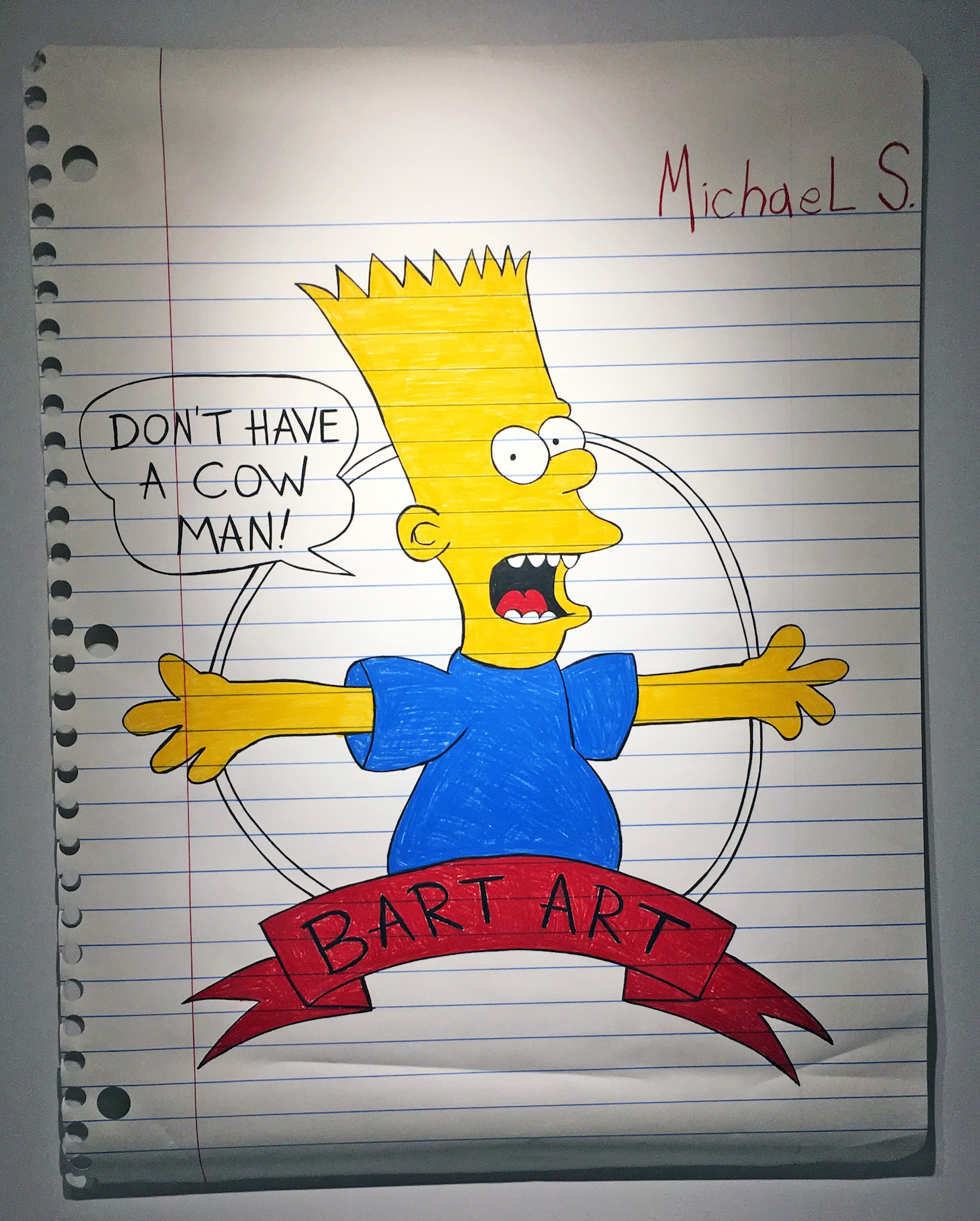
Michael Scoggins, Bart Art #1, Colored Pencil on Paper, 67 x 51″, 2014
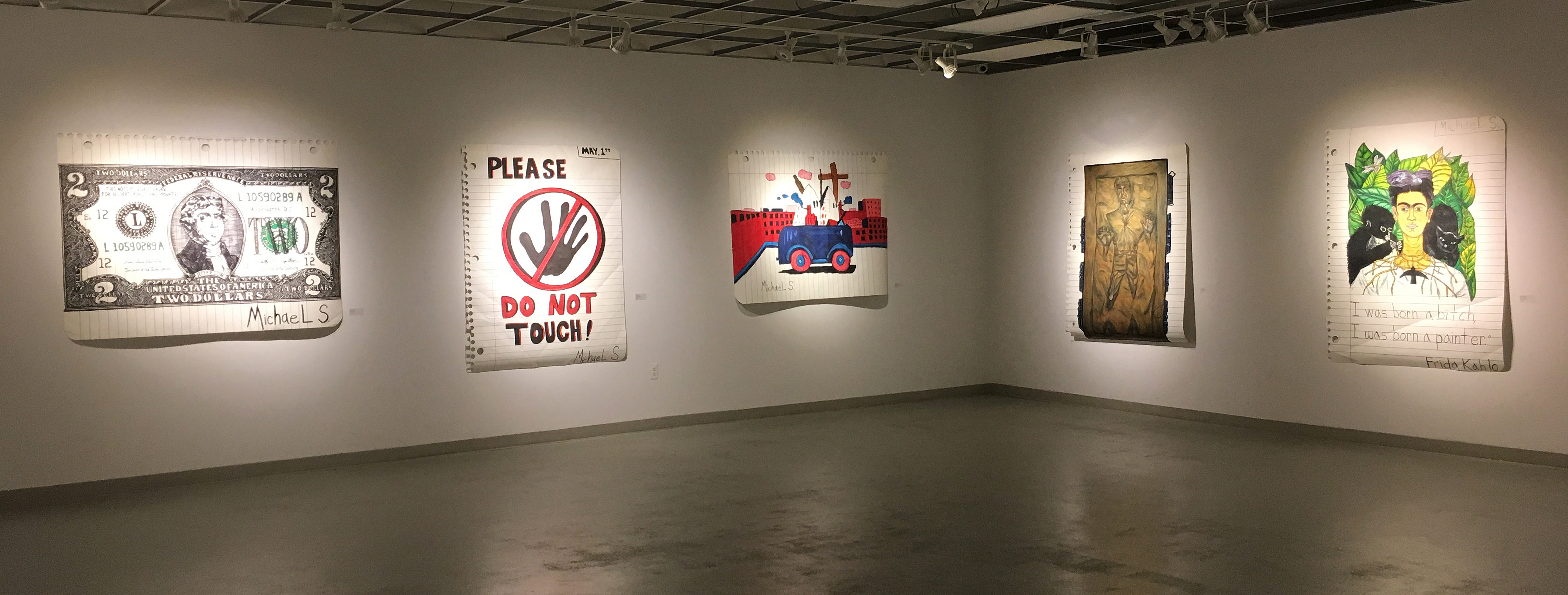
The work of Michael Scoggins takes on the politics of childlike imagery and dramatically changes its scale. If this work were executed on an average piece of notebook paper, 8 ½ x 11”, it would be appropriately displayed in an elementary school gymnasium exhibition. The key concept here is scale. These large 50 x 70” pieces of paper carefully simulate the torn out notebook sheet and illustrate the horizontal thin blue lines and the vertical red line on the left. In the imagery from The Simpsons, the character of Bart is reaching out, “Don’t have a Cow, Man.” Well, maybe he’s reaching out to his audience, a kind of confrontation about this iconic image hanging on a gallery wall while appealing to lovers of this character that was first developed by Matt Groening in 1989, and the Fox sitcom now in its 29th season.
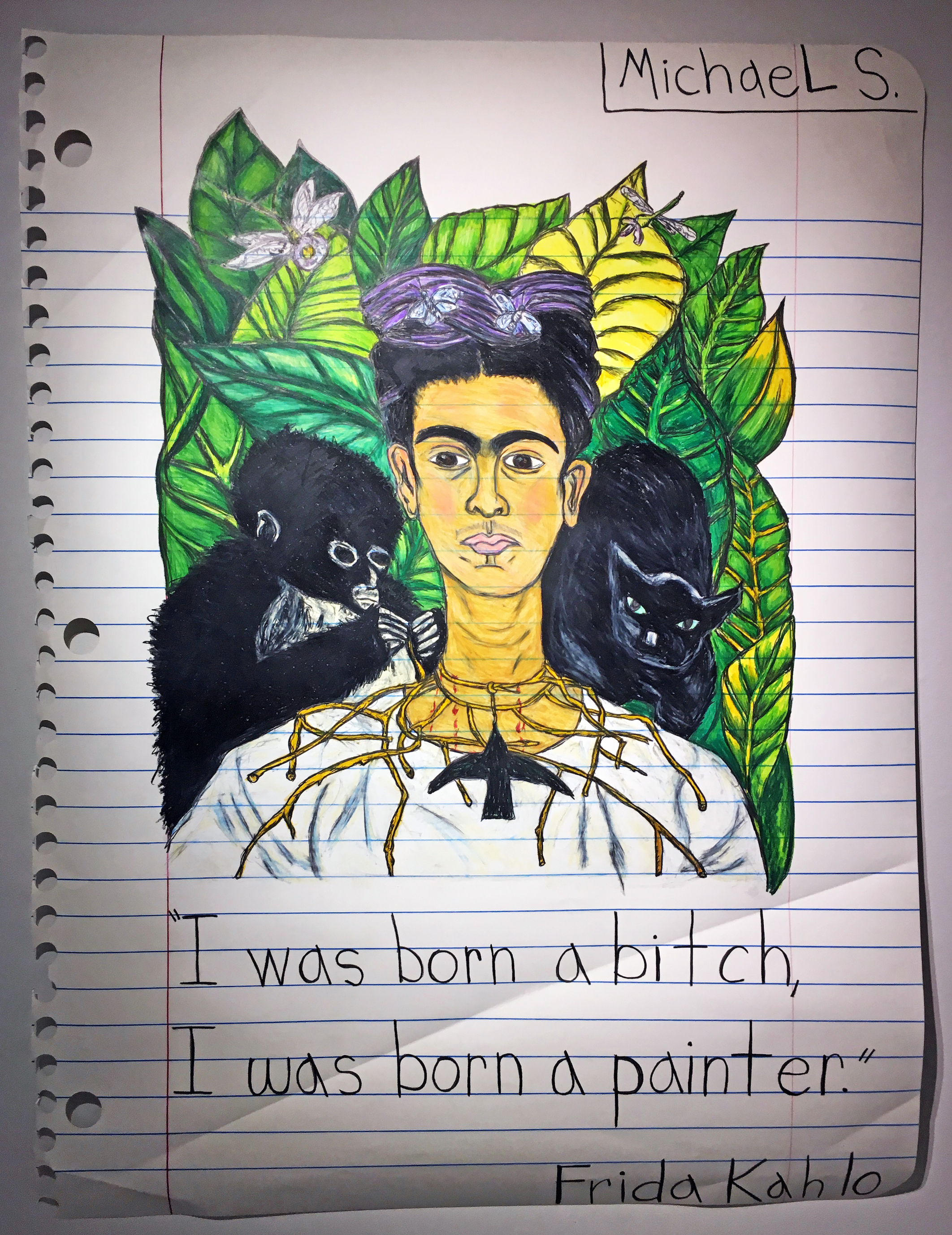
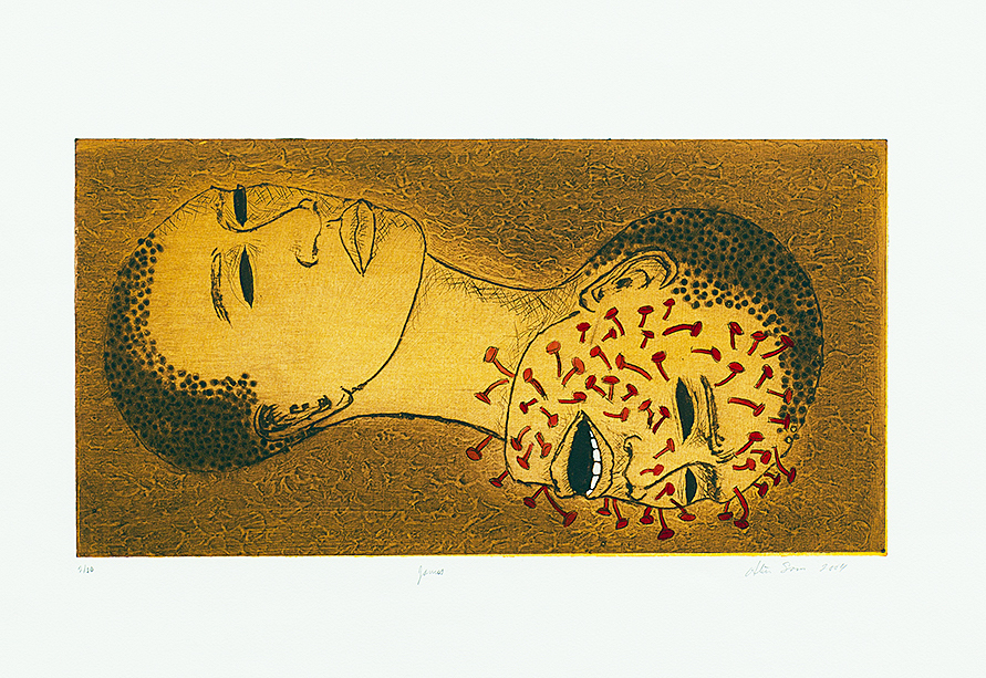
Michael Scoggins, I Was Born…(Frida), Graphite, Color Pencil, on Paper, 67 x 51″ 2016
The imagery displayed in Scoggins work is mixed. You have a child’s rendition of a Frida Kahlo work, as in I Was Born…(Frida) with commentary, to a copy of a two-dollar bill, or often an entire sheet of paper devoted to a page of childlike penmanship, repeating a controversial sentence the entire length of the page. There is the possibility that the work is autobiographical, and takes the viewer back to transformative years of Scoggin’s youth. Few of us would disclose our fourth-grade classroom illustrations and present them later in life, after an MFA in painting, as fine art.
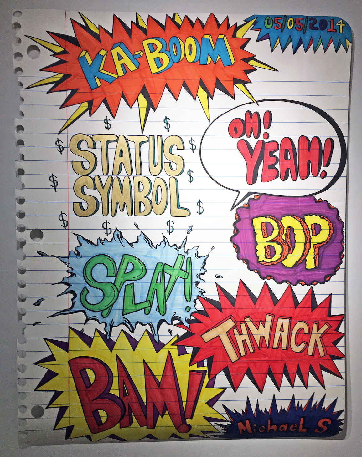
Michael Scoggins, Explosion Drawing #4, Marker, Color Pencil on Paper, 67 x 51″ 2014
In many, if not all, of the labels we have given to artistic movements since the beginning of time, is the reason why I go to the Pop Art movement to explain Michael Scoggins work. We have artists, today, that are producing minimal sculpture, impressionistic paintings, abstract expressionistic canvases, and photographic realism, all part of a continuation of movements that began in the past. This concept is an endeavor that transforms youthful memories onto large re-created sheets of notebook paper, to comment on narratives that are nostalgic images and make us take notice. Scoggins uses “Michael S. as a caricature of his younger self, in deliberately creating a signature, and uses nuances of crumpled, folded, sometimes torn or folded paper, to create the facsimile.
“The work I make is always political,” says Michael Scoggins, who satirizes art-world politics and provincialism in penetrating, disarming schoolboy-style doodles and writings. “I feel the ‘Michael S.’ character has definitely transformed over the years and has become more of an extension of my adult self,” Scoggins has said. “I want to present my work with sincerity, and it is truly a reflection of my inter-self.”
Michael Scoggins work is included in the permanent collections of the Museum of Modern Art (New York, NY); the Hammer Museum, (Los Angeles, CA); the Mattituck Museum (Mattituck, CT); the Gettysburg Museum (Gettysburg, PA); The Savannah College of Art and Design (Savannah, GA); along with several prestigious private collections. In addition, Scoggins is one of Wasserman Projects’ artists and his work was first shown in January 2016 at their gallery in Detroit, Michigan.
He lives and works in Brooklyn, New York
The BBAC mission is “to connect people of all ages and abilities with visual arts education, exhibition, and other creative experiences.” They accomplish this by offering classes, exhibits, workshops, camps, and events to the public since 1957.
Michael Scoggins Birmingham Bloomfield Art Center April 28 – June 9, 2017