Detroit Art Review

Critical art reviews of Detroit galleries and museums weekly

Brittany Nelson & Susan Campbell @ David Klein Gallery

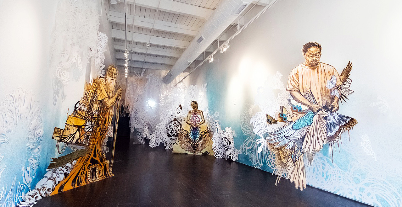
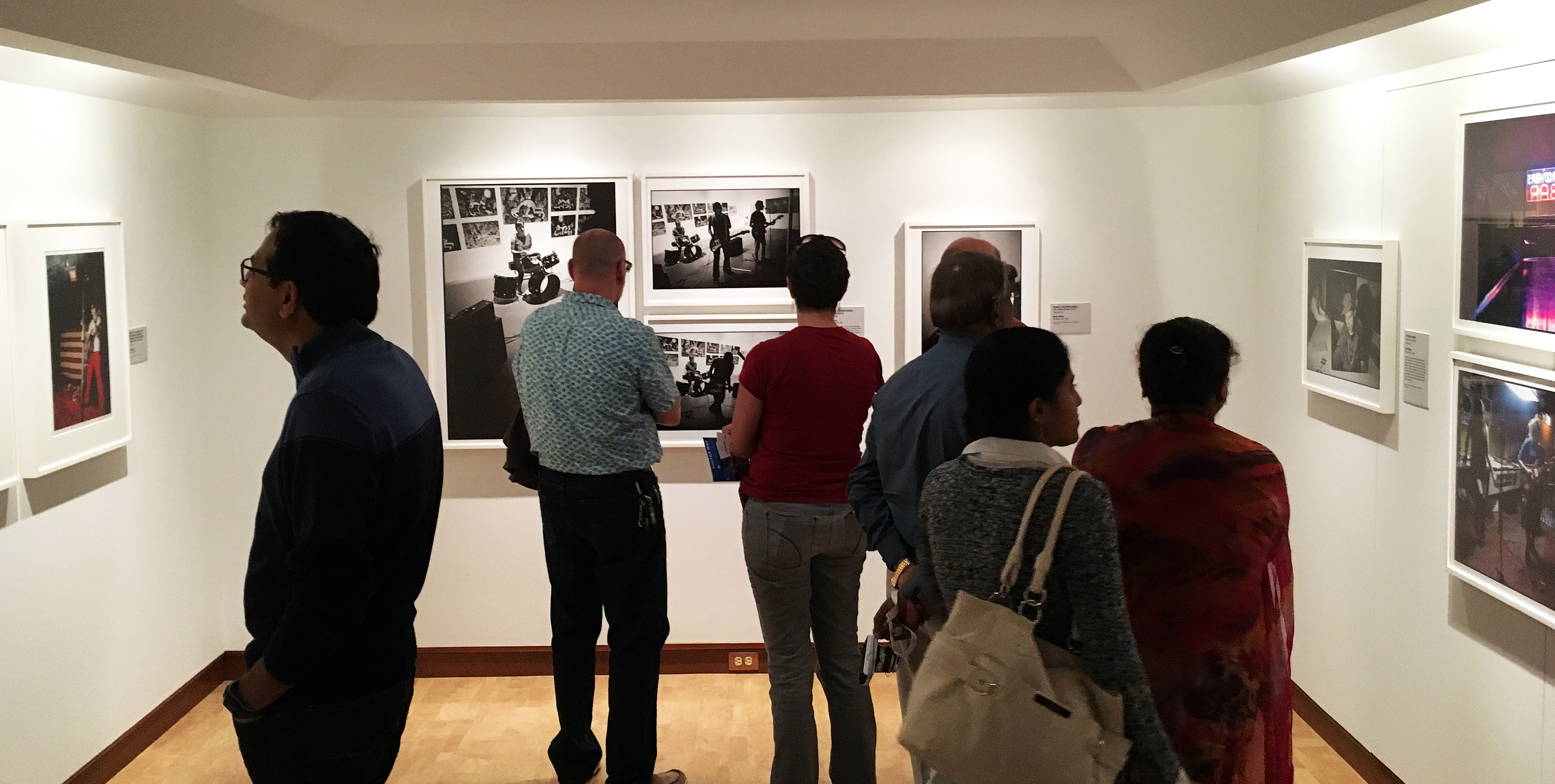
Alternative Process, work by Brittany Nelson, and Chasing Venus, work by Susan Goethel Campbell and window installation by Ellen Rutt.

david-klein-installation-image

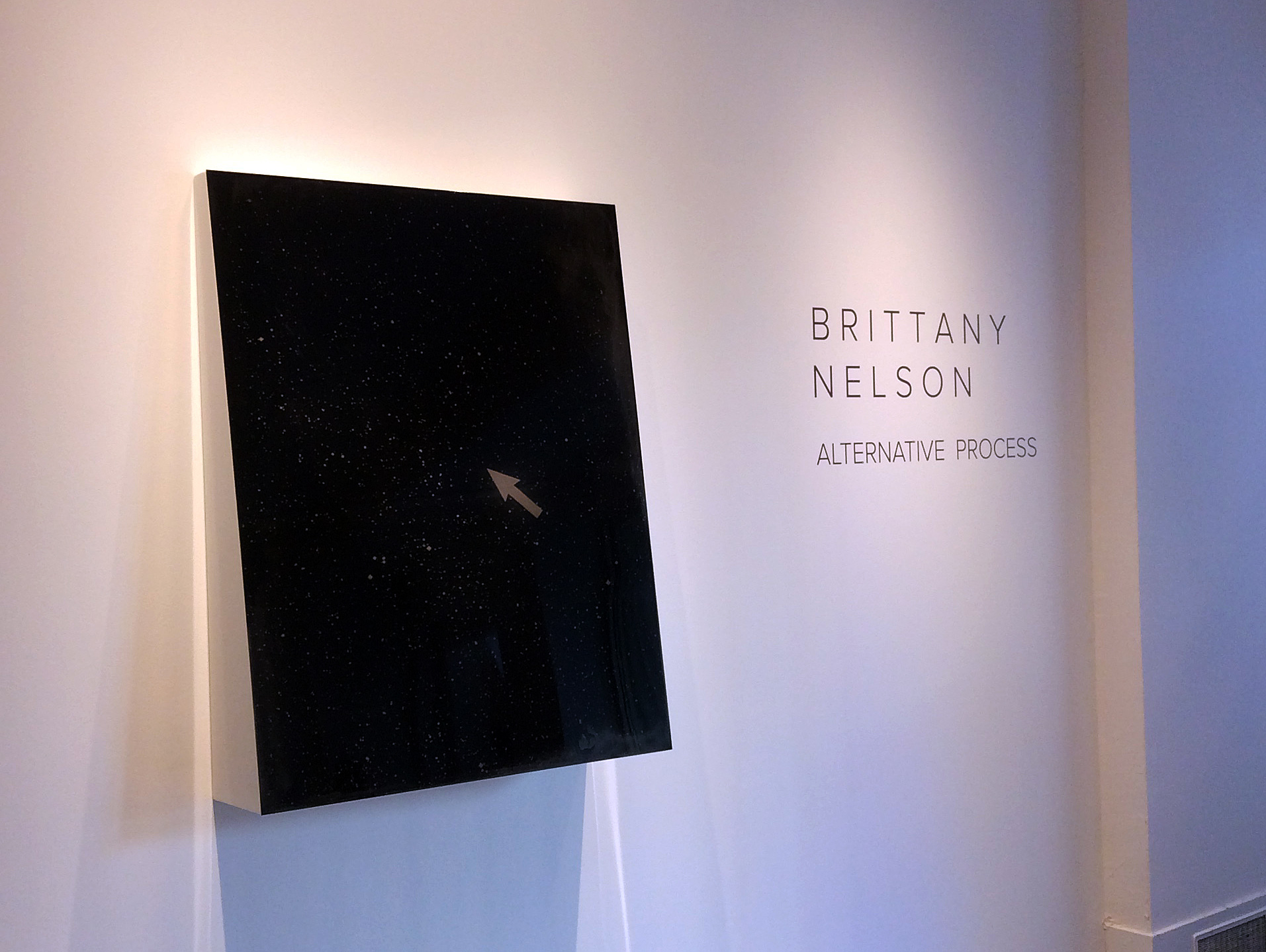
Brittany Nelson, Installation image, All images courtesy of the David Klein Gallery

The newest pairing of artists on view at David Klein Gallery’s Detroit space, photographers Brittany Nelson and Susan Goethel Campbell, engage history, science, and formal beauty in ways that reveal what ancient knowledge and antiquated technology can tell us about the visual stake we hold- and the tissue-thin mastery we take for granted- over the natural world.

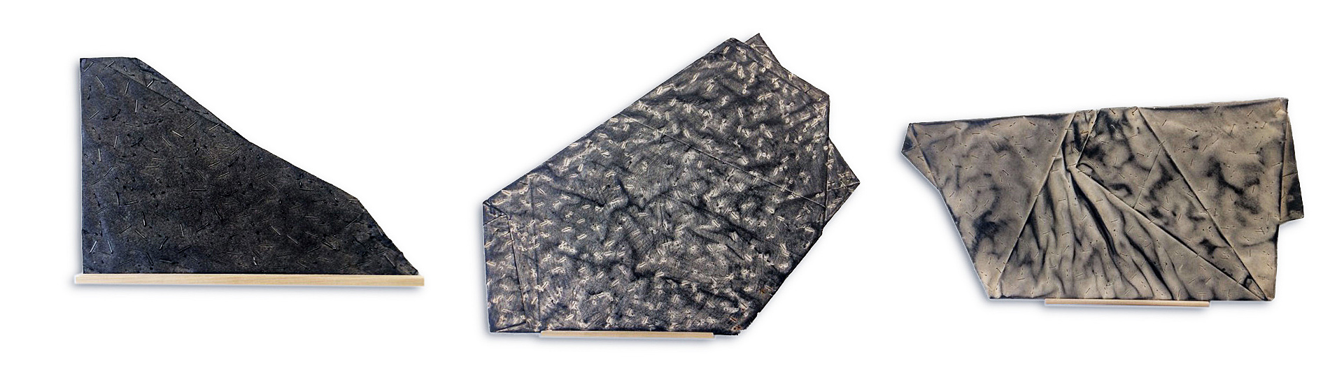
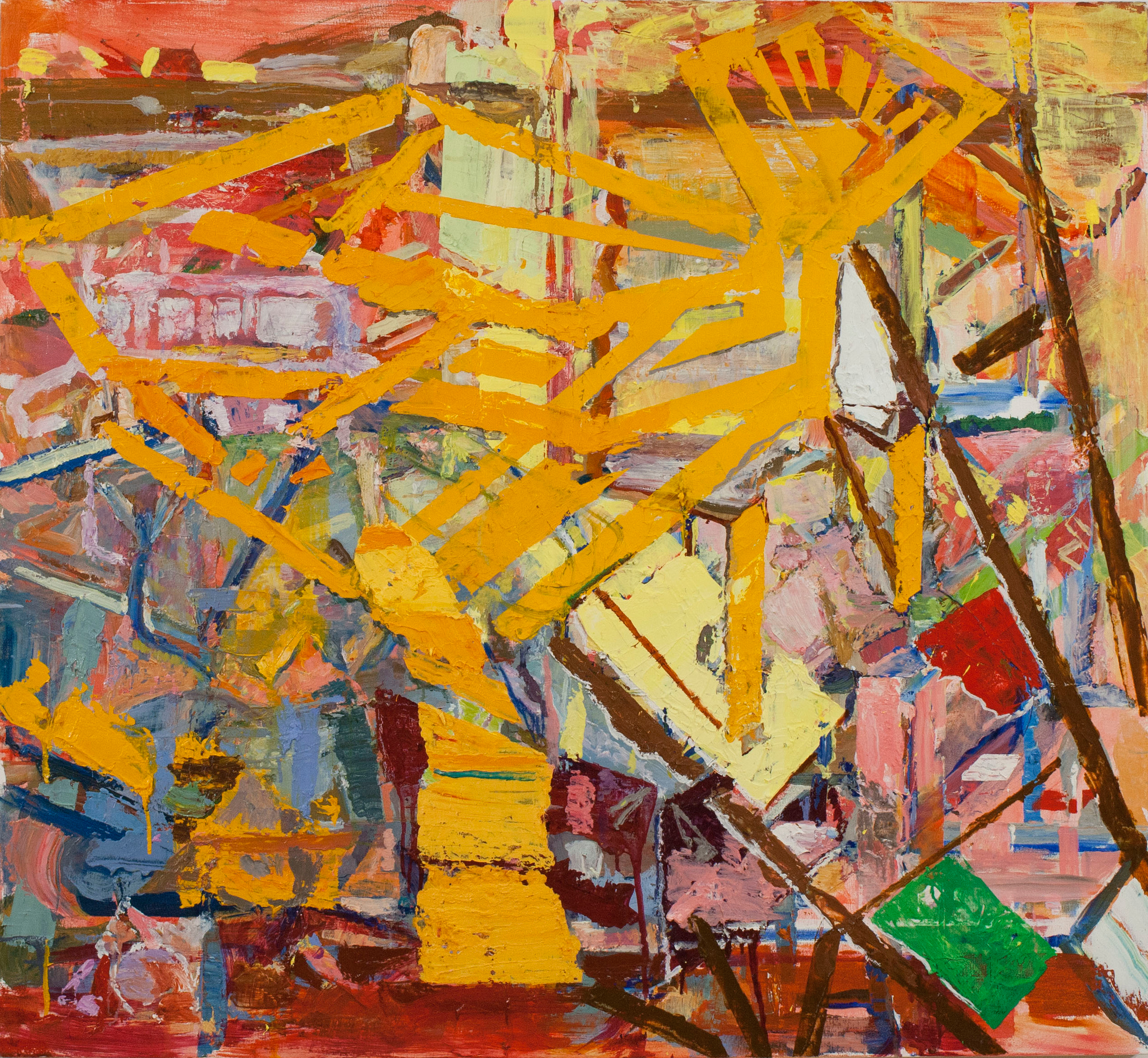
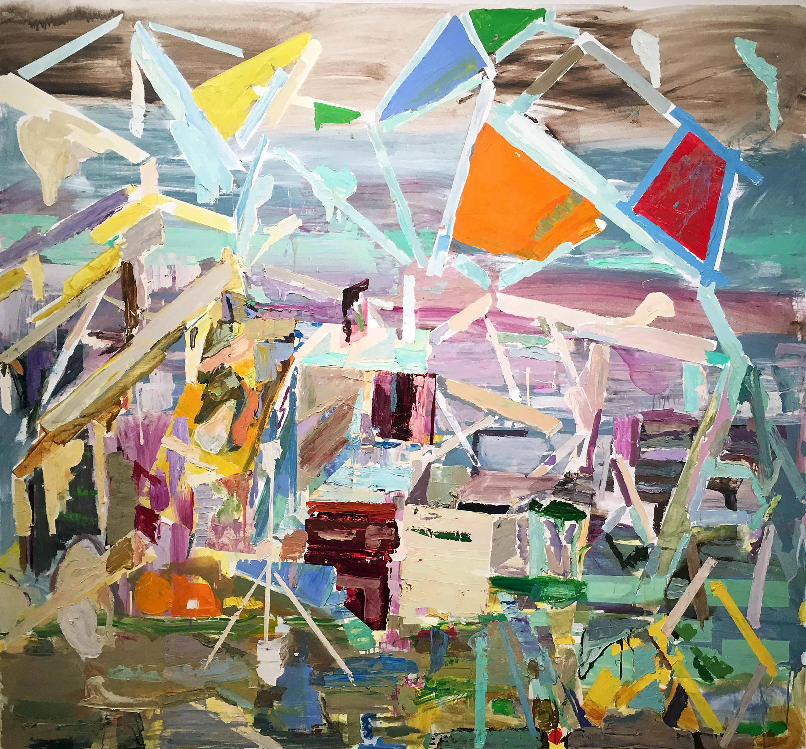
Brittany Nelson’s collages of “science graphics” and 3D Photoshop forms onto tintype prints (one of the earliest photographic mediums) follow a simple, clever formula of overlaying heavy, historic substrates (thickly mounted tintype photographic plates that warp out of foursquare precision and are often hung at a slight angle to the wall, visually reinforcing their whiff of memento mori and the slow melt of age) with graceful, feather-light graphics culled from contemporary modes of visual shorthand- graphics, grids, algorithms, flowcharts.

image-1-brittany-nelson-diagram-i-2016-tintype-photograph-on-poeder-coated-formed-aluminum-10-x-8-x-1-5-in

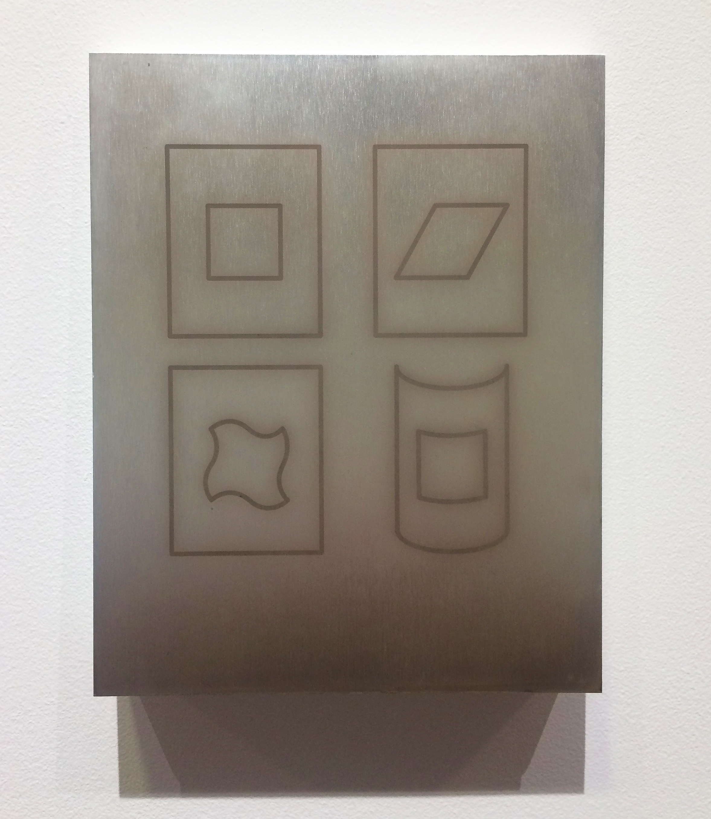
Brittany Nelson, Diagram I, 2016, tintype photograph on Poeder coated formed aluminum,10 x 8 x 15″

These two modes of information capture dance uneasily with one another on Nelson’s dark grounds- there’s a dissonance to seeing these fleeting, fast-moving graphics inlayed on such iron-clad media, designed to catch and house a physical shadow of a once real, living, or tactile thing. Nelson’s work resurrects something of the uncanny magic photographic technology once held for people in the Nineteenth Century- its strange promise of immortality, its mind-bending harnessing of modern science.

image-2-brittany-nelson-mordancage-4-2011-c-print-72-x-72-in-edition-of-3

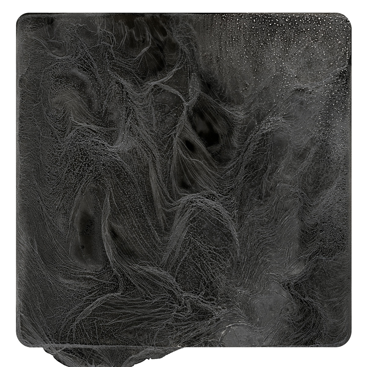
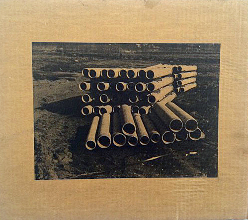
Brittany Nelson, Mordancage 4, 2011, C-print,72 x 72, Edition of 3

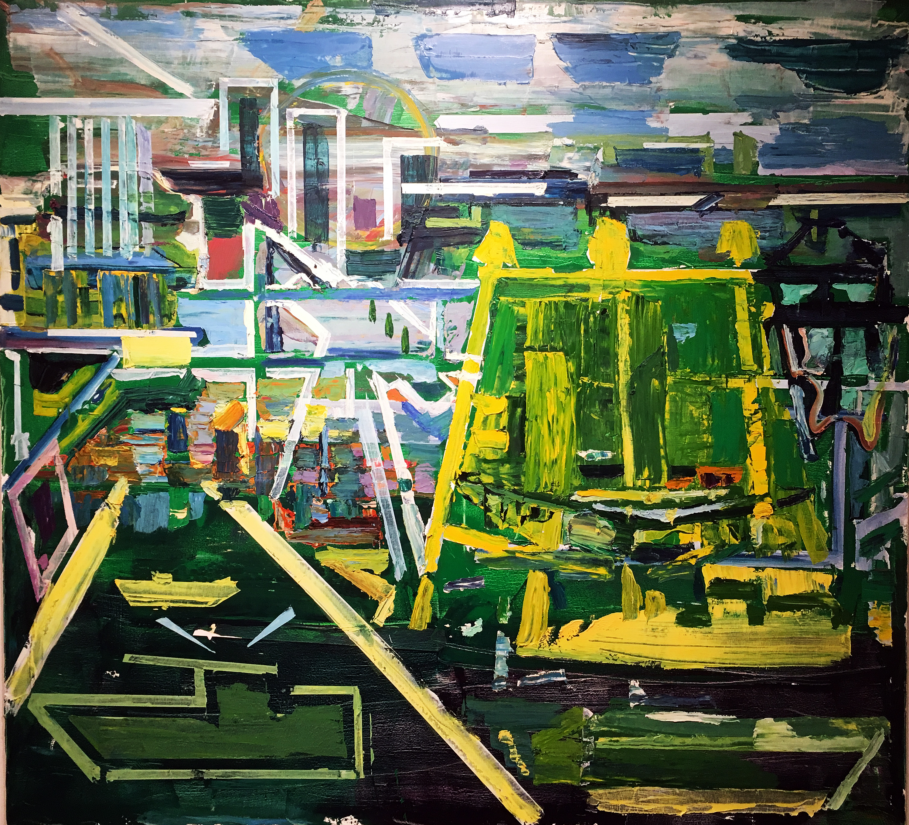
The dark, atmospheric voids characteristic of tintype photography find a visual dialog with Susan Goethel Campbell’s Chasing Venus. This work documents, in film and photography, a patch of sky over the Rocky Mountains in Alberta, Canada, during the Summer Solstice, when the moon appears to be following Venus across the sky.

image-3-susan-goethel-campbell-chasing-venus-1-of-5-2016-3-channel-video-installation-plaster-fregment-1920-x-1080-in

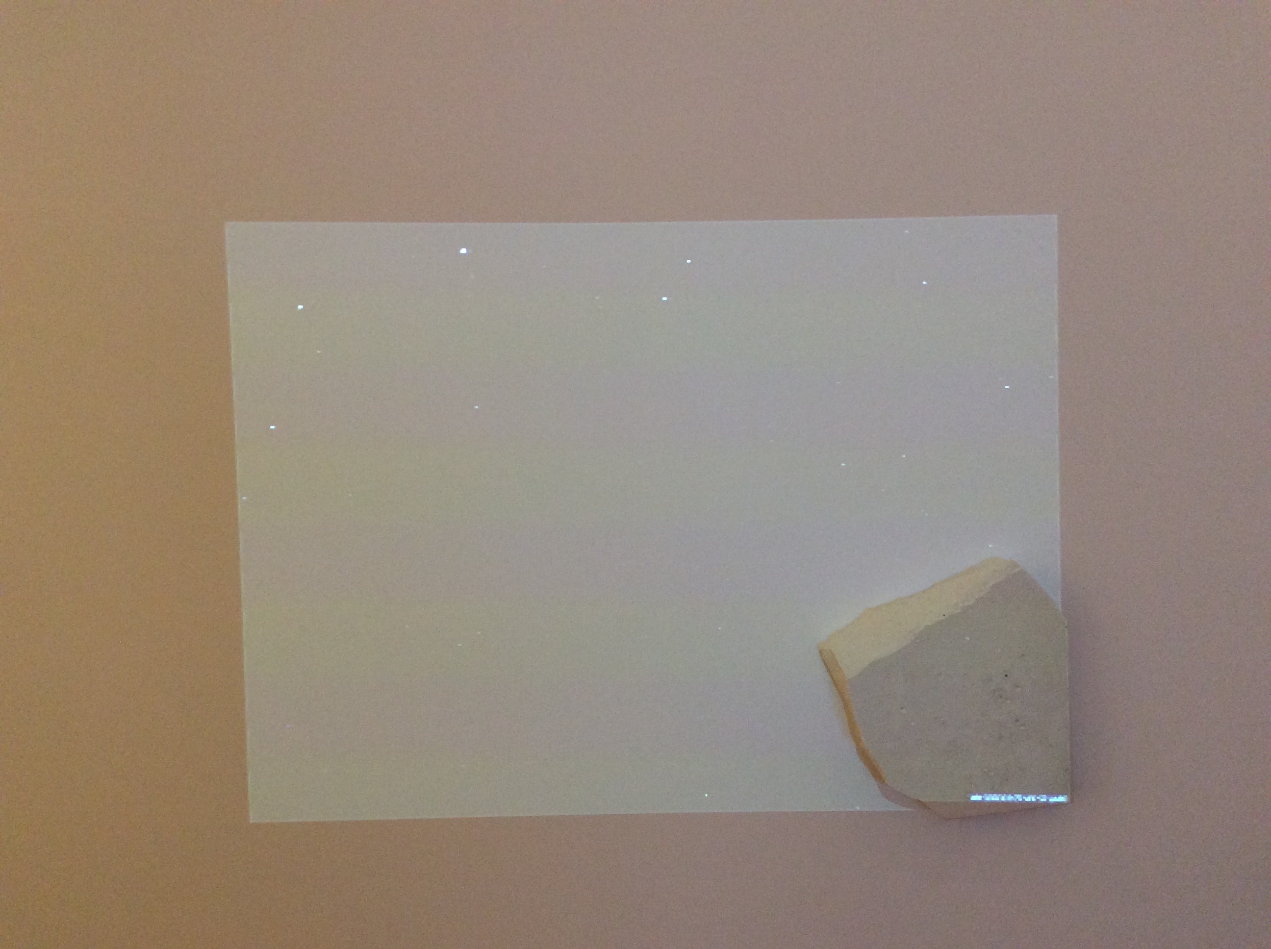
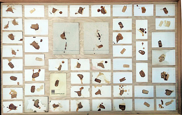
Susan Goethel Campbell, Chasing Venus, 1 of 5, 2016, 3 channel video installation plaster fragment, 1920 x 1080″

Campbell’s work documents, in solemn stills and dizzying, feather-light films, the turning of the planet from day to night, toward and away from an incredible full moon. The faceted surfaces of mountainous landscape, vast sky, and brilliant earth (her installation includes visuals that are nearly impossible to photograph, a video projection of time-lapse sky-scape dancing on a wall mounted with a chunk of granite, a pile of glittering mica poured onto a shallow shelf that casts uncanny tones of light onto every surrounding surface) utilizes straightforward modes of visual documentation to hint at the sublime- crystalizing, in moment-to-moment documentation, both our concept of linear time and the sublime impossibility of conceiving the clock of the universe.

image-4-susan-goethel-campell-chasing-venus-still-i-1-of-5-2016-digital-print-on-polyester-spray-paint-22-x-28-in

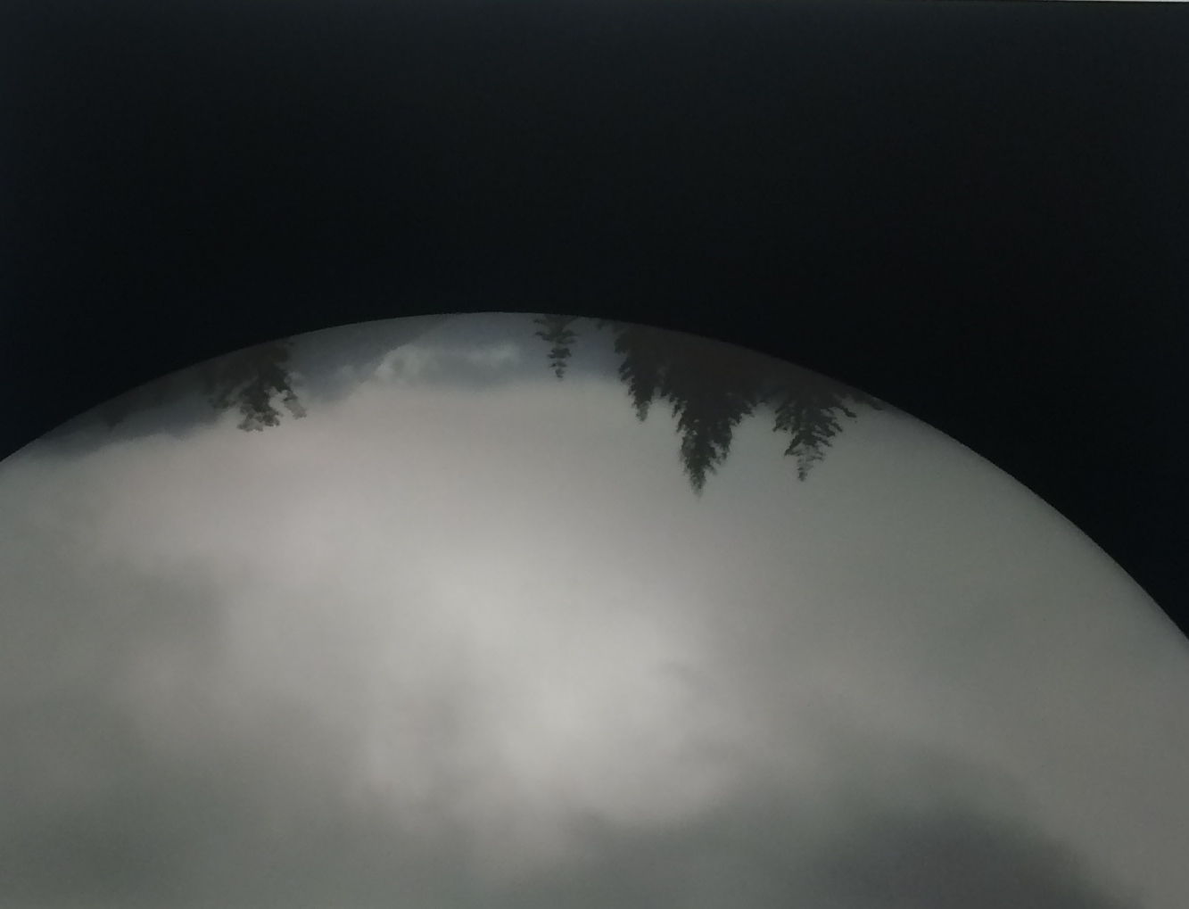
Susan Goethel Campell, Chasing Venus, Still I, 1 of 5, 2016, Digital print on polyester spray paint, 22 x 28″

The kernel that unites Nelson and Campbell’s work in these dark, visually haunting twin exhibitions might be an “exposure,” manifested in the beauty and opacity of both artists’ combinations of technique and content, of the failure of such analytical, documentary methods to capture eternity. Watching the sky and drawing it into visual rhymes with small, shiny objects, as the ancients did, distilling the visible into frozen shadows, as more recent generations did, or collapsing the world into descriptive algorithms, as we do now, may, or may not, bring us any closer to a true understanding of the reason we are here, or why we’ve been given these abilities. Alternative Process and Chasing Venus do not attempt to answer this question- they cross-pollinate materials to broaden, deepen, and beautify its scope.

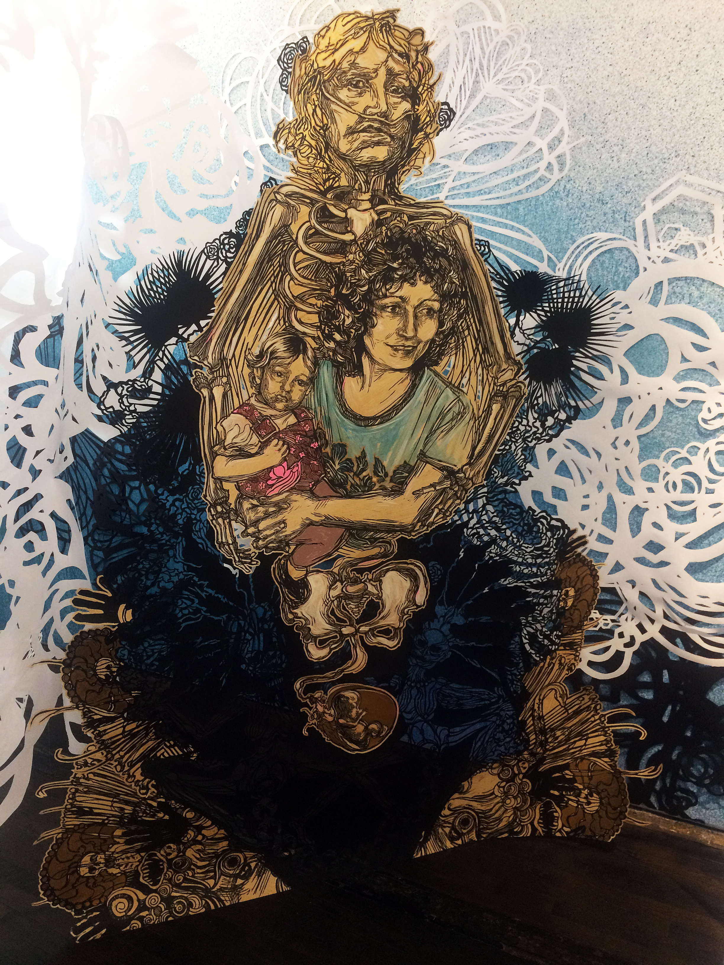
Also on view is a colorful, lively installation by Detroit-based, multi-disciplinary artist Ellen Rutt. Rutt’s window installation provides a vibrant counter-balance to the darkly vibrating grounds and documentary atmospheres of Nelson and Goethel-Campbell’s work.

david-klein-window-installation-ellen-rutt

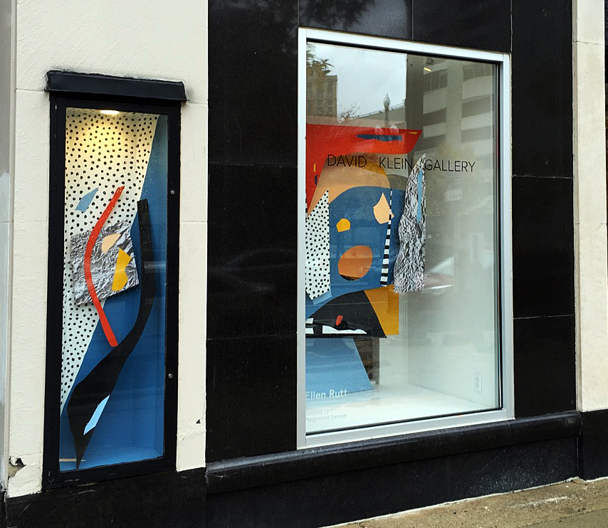
Ellen Rutt, David Klein, Window Installation, 2016

Alternative Process, work by Brittany Nelson, Chasing Venus, work by Susan Goethel Campbell, and Ellen Rutt’s window installation is on view at David Klein Gallery Detroit through December 17, 2016.


Caledonia Curry @ Library Street Collective

A Light at the End of the Tunnel- Caledonia Curry (Swoon) at Library Street Collective

“…You can start to create little cracks in the façade of possibility and inevitability that overlays all of our lives.”-Caledonia Curry at her TED Talk, 2010 

swoon-installation-image

Swoon, Installation Image, All Images Courtesy of Clara DeGalan and Sal Rodriguez

Caledonia Curry (tag name Swoon) seems intimately aware of the ephemeral, fragile nature of both the human body and human endeavor. This sensibility weaves through all of her bodies of work, which make up for the degradability of their materials with iron-clad social consciousness and fierce political engagement. Curry first gained attention on the global art scene for her large scaled, lyrical street art prints, which, like her work at Library St Collective, engage with the figure overlaid with gorgeous lacework of iconic decorative flourishes and symbols. Curry would scout out locations for her prints, then install them, on walls, lamp posts, and other architectural surfaces, using wheat paste. These delicate cut-paper and print collages are not meant to last forever- they fade away, gently and gradually, like distant memories. To Curry, physical immortality of work is beside the point- this seems unusual, given the highly formal, decorative nature of her constructions. What such highly developed technical skill and labor intensive process is meant to foster is less reverence for the made object itself than a holding of space for a new perspective, a chance to recontextualize one’s relationship with place, with symbolism, with one’s own identity.

The same curious mixture of preciousness and ephemerality finds its way from Swoon’s street art practice into Curry’s site specific installation at Library St Collective. As lovingly wrought and beautifully realized as Curry’s life-sized figurative prints and elaborate cut paper confections are, they are installed with no greater measure of preciousness or economic value than her wheat pasted public works. Curry’s figurative cut out prints hang suspended from strands of fishing line, freed from the relative safety, and canonical indexing, of traditional wall installation. They move in the breeze- they’re equally visible from front and back. Curry’s incredible paper cut-outs, executed in black and white and resembling every beautiful, lace-like form a viewer can call up, from snowflakes to double helixes to Celtic knot work, drape freely from the gallery’s ceiling and dangle, like the figure cutouts, from strands of fishing line, inviting touch, uncannily mimicking the slight movements of sentient life.

image-1-swoon-cut-paper-intallation-detail

Swoon cut paper intallation-detail

The heaviness of Curry’s concept for her site specific install at Library St is what grounds these floating works. Taking the narrow, tunnel-like structure of the front part of the gallery as inspiration, Curry is attempting, with The Light After, to recreate for the viewer her own narrative of a phenomenon known as “the empathetic death experience.” Curry encountered this phenomenon in a dream of a space filled with falling snow and “blossoms of light,” during which she felt that her mother had died. Upon awakening, she discovered that her mother had, indeed, passed away.

The snow-blossom motif of Curry’s installation occupies Library St.’s space as a tunnel of atmospheric light similar to those described by people who have had near-death experiences. Dispersed around this bright, ungrounding fairyland are Curry’s life-sized figurative prints which, despite their ephemeral construction, nail the viewer with quietly appraising or imploring gazes, each taking the form of a step on the initiation path toward death. Curry’s figures are iconic- an old, bearded hermit leaning on a walking stick, his lower body morphing into ramshackle architecture which crumbles, at his feet, into a profusion of skulls. A heartbreaking double image of a woman filled with youth and vitality, holding a baby, while her forward-projected shadow looms behind her, emaciated, rigged up with oxygen tubes, her eyes engaging the viewer’s in abject, human terror of proceeding down the very tunnel that surrounds her.

image-2-swoon-memento-mori-2016-block-print-on-hand-cut-mylar-edition-3-of-12-84-x-67-in

Swoon, Memento Mori, 2016, block print on hand cut mylar,edition3 of 12, 84-x-67″

Curry takes the viewer through this legendary tunnel, which leads into a stark hallway painted in black and white geometric and organic forms- a nice visual metaphor for the space between the end of the tunnel and what comes after- into the gallery’s larger, airier back room or, as Curry titles it, “The Meadow.” The figurative prints in The Meadow aren’t allegories of death, but of rebirth- the color scheme of The Meadow is warmer, more organic, the 3D elements more tactile and sensual- piles of green velvet take the place of the ethereal cut-paper hangings within the tunnel. Mother-child pairings and figures surrounded by simple, ancient symbols of life and birth- paisleys, triple knots, spirals- gaze invitingly out or, more often, appear turned inward, eyes closed, in a private ecstasy of union with the life-power of the universe.

image-3-swoon-milton-ii-diogenesis-2016-block-print-on-hand-cut-mylar-edition-3-of-6-89-x-66-in

Swoon, Milton II, Diogenesis, 2016 block print on hand cut mylar edition, 3 of 6 89×66″

There’s an uncanniness, a formal directness, and a powerful combination of personal and political narrative to Curry’s work that makes it difficult to contextualize in contemporary studio practice. The bald allegory and mirror-image rendering of her figure-prints awakens the viewer to the power of such imagery as expressed in every layer of our society, from religious painting to Chuck E. Cheese animatronics- all of them evoke the same frisson. Curry’s work reveals why this is so. Confronted with our own image reworked into symbolism, we begin to examine the foundations of universal truths- birth, death, spirit, the afterlife, the sentience of so-called inanimate objects- with the understanding that these truths emanate from our own bodies. Our bodies are ephemeral. What we can do with them, change with them, what we can leave to succeeding generations, is eternal. It is this truth that forms the kernel of Curry’s work in every medium and context that she engages.

“Swoon- The Light After” is on display at Library Street Collective through November 26, 2016.


After Dark @ Detroit Institute of Arts

dia-install-photo

Installation, Detroit After Dark, Image courtesy of the Detroit Art Review

Photography at night has been around since the late 1800’s when photographers were experimenting with exposing a variety of sensitive chemicals to light, first on plates by Louis Daguerre, followed by salt prints on paper by William Talbot. Later in the early 1900’s Alfred Stieglitz began working at night, and in 1932, Brassai published Paris De Nuit, a collection of black and white photographs of the streets of Paris at night.

The Detroit Institute of Arts (DIA) has turned to its collection under the direction of Nancy Barr, Curator of Photography, to produce Detroit After Dark. She says in her statement in the catalogue, “Detroit After Dark: Photographs from the Collection of the DIA takes a closer look at night photographs made in the Motor City just after 1950 through present day—its city streets and architecture, as well as its diverse and often frenetic music scene.”

For the purpose of this review, this writer will draw a distinction between the journalistic photography (mostly the Detroit music scene) and focus on the art photography in the exhibition.

rf-untitled-%22strawberries%22-1955-gelatin-silver

Robert Frank, Untitled, Gelatin silver print, 1955

With a Guggenheim grant in his pocket, Robert Frank bought a used Ford in June of 1955 and began a 10,000-mile journey around the United States. Detroit was one destination where he stayed long enough to capture images from Belle Isle to this Romeo strawberry stand at night, illuminated with a string of party lights. After developing and making contact sheets from 760 rolls of black and white Tri-X film, 83 images would be enough to make The Americans, first published in Paris, then eventually the United States. Frank didn’t set out to address the issues that faced the country, but inadvertently became an incontestable witness, using his 35mm Leica Rangefinder, to the solitude of American society.

image-457jefferson-at-dearborn

Scott Hocking, Jefferson at Dearborn, Pigment Print, 2012 Courtesy of the DIA

Scott Hocking, a Detroit artist who has created site-specific sculpture installations and a variety of photographic projects, provides the viewer with a stark image of a lonely building on Jefferson Avenue, formally centered with time exposure that provides a lit building against a Windsor backdrop. The exposure is possible because of the stillness in the frame. Detroit Nights is an ongoing project, documenting the streets, railroads, quiet corners and unpredictable public lighting of Detroit at night. In a statement, he says, “I am interested in forgotten places, and things kept out of sight. I don’t know if this is because I’m from Detroit, a city that has become known for urban prairies and empty factories; but I try to work the same way no matter where I am.” Scott Hocking is represented by the Susanne Hilberry Gallery.

jenny-risher

Jenny Risher, Image courtesy of Jeff Cancelosi

Jenny Risher, shown here holding her book with her photograph from the exhibition, is a commercial photographer with a collection of personal work. Known for her book, Heart Soul Detroit, where she interviewed and photographed 50 iconic Detroiters, including Smokey Robinson, Jack White Eminem and Lily Tomlin. Here in this image is Ms. Risher holding open her book, revealing the image from the exhibition, Mr. Porter.


image-462mr-porter

Jenny Risher, Mr. Porter, Pigment print, Courtesy of the DIA


abandoned-brush-park-building-d-jordano

Dave Jordano, Abandoned Brush Park Building, Pigment print, 2010, Courtesy of the DIA

Dave Jordano first established himself as a successful commercial photographer in Chicago working with national print campaigns, before turning his lens to personal work here in Detroit. Jordano was born in Detroit and graduated from the Center for Creative Studies in 1974 with a BFA in Photography. His large image, Abandoned Brush Park Building, dominates the exhibition with its scale depicting the contrast between this abandoned building and the lights of Comerica Park. He says in a statement, “These photographs represent a visual document that speaks to the quiet determination of Detroit residents, both as independent shop operators and as home owners who have survived the long and difficult path of living in a post-industrial city stripped of economic prosperity and opportunity. These photographs speak truth without casting an overly sentimental gaze.” Like other photographers in Detroit, there seems to be a trend in capturing a still image using a tripod to provide the ability to depict a large depth of field and focus, highlighted by a light source.

The Detroit Institute for the Arts and its permanent collection bring powerful imagery in the Detroit After Dark, exhibition. DIA Director Salvador Salort-Pons says in the catalogue, “The DIA is indebted to the photographers committed to their practice in the city and who have contributed to this exhibition. I am grateful to those artists who have gifted their work to the museum and to the patrons who have donated art and contributed funds for the purchase and acquisitions of photographs for the permanent collection.”

Detroit Institute of Arts

5200 Woodward 9 a.m.-4 p.m. Tue. -Thu., 9 a.m.-10 p.m. Fri., 10 a.m.-5 p.m. Sat.-Sun.

Exhibition free with regular museum admission. Admission to DIA is free for residents of Wayne, Oakland, and Macomb counties. Others: $12.50 adults, $8 seniors, $6 ages 6-17.


Jim Crawford @ Trinosophes


sewer-series

Jim Crawford, Pile Series, All images courtesy of Glen Mannisto, with assistance form Robert Hensleigh


The prevailing stereotype of Detroit’s ’60s and ’70s iconic Cass Corridor art scene is misleading. Images of beer-swigging, dope-smoking, post-adolescent boys, spitting on studio floors and recycling beer cans into expressionistic, assemblaged sculptures with which they hoped to violate the hallowed halls of the Detroit Institute of Arts come to mind. It was a myth created by romantic souls who tried to rescue bohemia from Detroit’s growing derelict landscape. Of course there was also a considerable population of heady, intellectual /artist types who cowed up around the Detroit Institute of Arts, read books, went to arty films, listened to music other than the MC5, even went to the opera and had jobs too. Artist Jim Crawford who has a mini-retrospective at Trinosophes, a performance space in downtown Detroit, seems like he could have been one of those.

jim-crawford-tea-stain-vitrine

Jim Crawford, Tea Stain Series in Vitrine, 3 x 5 Cards

Crawford’s art is marked by a psychologically reflexive interiority—it occurs more in the mind as noumenon than as object or phenomenon—and makes what seems an ordinary material world into the extraordinary. Simple gestures or processes, replacing the traditional romance of creating a single object, are repeated and accumulated to explore a sense of time and evolved change, and to challenge our perception in an artistic process sometimes referred to as Conceptual Art. In 1970, in a beautifully measured and meditative ritual production, Crawford translated his daily cups of tea at his job at the Michigan Council for the Arts into a very deliberate series of over one hundred tea bag stains on 3”X5” cards. In the Trinosohes gallery, the tannic-colored blots have been arranged on a grid in two display vitrines to accomplish a stunning array of difference and signifying presence. Each stain records a moment with countless daily variables (temperature, emotional presence, gravity, haptics), or what acute perception can distinguish, becoming a sign of those variable influences as much as a thing to perceive in itself.

crawford-3-paper-edit

Jim Crawford, Folded Paper Series, Graphite, staples, paper, 1971 (smallest: 8″ x 12”, largest: 22” x 26”)

Like many artists Crawford works serially, and the Trinosophe exhibition features six main series that he has explored from the late ’60s until now. The most conventional form in the exhibition (created in the early ’70s, and of which seven individual examples are exhibited) is composed of sheets of paper folded into flat, randomly occurring geometric shapes, punctuated with staples, and marked or patinaed with graphite or paint. Created to be two-sided, they are a unique composition like nothing else: resembling geometric clouds (each is magnificently unique, but best experienced together so go see the show), and apprehended or readable more as signs than as objects. As in the best of human productions, the materials have dictated the form. In a public interview at the gallery, Crawford quipped, “I had a long staple gun,” allowing staples to reach and punctuate everywhere on these manipulated forms, depositing dash-like marks, leaving shadows and an almost musical notational presence. The scribbled or shaded graphite illuminates and posits a “natural” surface (think birch bark); and the creases of the folds give the pieces a sense of volume and mass, but therein lies the challenge. They suggest dimensionality or objectivity, yet are ultimately inscrutable, seductively flat signs, abstracted and void of referent.

crawford-stacks

Jim Crawford, Pile Series, 1972, 20 Untitled photographs (1967, 1972 and 1972) color, black & white photos, paint – 8” x 10”

There is also a suite of photographs that document what Crawford has called the “Pile Series; discovered throughout the city, they record the presence of piles of various industrial or commercial materials that seem, through Crawford’s discerning eye, to achieve the status of sculpture. No doubt he has positioned these twenty images to both serve as ironic description of the identity of the artist (suggesting perhaps that art challenges perception, enabling it to discern “found objects” or objets trouvés as art, thus emphasizing the prominent part that ideas and concepts play in perception), as well as to call attention to the compelling nature of our landscape, and to create a dialogue that compares art to the supposed randomness of everyday material reality. Included in the series are photos of stacks of snow fence, old tires, boxes of fruit, and lumber at a construction site. Each of the photos reveals the particular effect that weather, light, and context play in conditioning both the appearance of the particular stack and our perception of it. The raw quality of the 40-year-old 8”X10” black and white photos and derelict framing of them adds a certain historical charm to the project.

eggshell-series

Jim Crawford, Eggshell Series (2015-2016) Mixed media (paint, glitter, walnut dye)

Two recently created series echo Crawford’s earlier strategies for dealing with recycled materials with an emphasis on personal biographical influences. Inspired by his grandmother’s practice of reading tea leaves at the kitchen table, Crawford, while cooking, has recycled cracked egg shells back into their cartons to produce stark abstracted images of the roundness of eggs. Like his grandmother’s tea leaves, the organic byproducts of his everyday life have become signs: a circle in a square, an egg in a carton, dyed with walnut stain from his walnut tree — painted and decaying they are ever changing and evolving. The delicate egg shells may at first appear as mere garbage or waste, but emerge with a powerful, though fragile, talismanic presence.

jim_crawford_cat-can-series

Jim Crawford, Cat Can Series, 10.5” x 14” x 9.5”, Mixed media, 2015-2016


In another series, Crawford has engaged Midnight, a stray black cat that wandered into his garden, to create the Cat Can Series. “An unlimited supply” of cat food cans from feeding Midnight becomes the material for a somewhat awkwardly stated, perhaps eccentric arrangement of aluminum cat food cans in various conditions: some painted or stained green (Midnight’s eye color), some crushed, some with labels intact (9 Lives and Friskies being the preferred brands), and all enclosed in boxed frames. Employing the same stacking gesture as the early 1970 series, Crawford resuscitates the theme of exploring the visual landscape for architectonic structure.

In wandering through Xavier’s modernist furniture store on Michigan Avenue in Detroit, Trinosophe’s co-director Rebecca Mazzei, along with Joel Peterson, ironically found a stack photos that intrigued her. Pursuing the maker of the photos, she rediscovered the seemingly forgotten artist and art of Crawford. In researching, organizing and designing the exhibition “Jim Crawford,” she has energetically brought to our attention one of the most intriguing figures of the Cass Corridor, one whose work challenges perception and through its changes translates time into evidence for the consideration of big ideas. The exhibition includes various support materials from Crawford’s own archives, such as a post card series and ring binders and files containing Crawford’s copious notations on his projects.

Jim Crawford at Trinosophes – Through December 23, 2016


Thomas Berding @ Oakland University Art Gallery

2013-13-berding-tree

Thomas Berding, Command Tree, 44 X 48″, Oil on Canvas, 2013, Courtesy of Eli and Edythe Broad Art Museum Collection


Oakland University Art Gallery opened an exhibition, The Berding Memorandum, on September 15, 2016, with a collection of abstract expressionist work by Thomas Berdling, Professor of Studio Art at Michigan State University. His abstract expressionism has obliviously evolved over several years where earlier work has more reference to the real world, be it landscape or figures. While his work is not a literal translation, there is no mistake the paintings are a response to a particular situation, often referenced in work’s title. An example is the painting Command Tree, 2013, where you find a reference to an orange-yellow tree that comes forward dominating the composition over a re-shuffled landscape with background structures.

He says in an interview with Dick Goody, Director of the Oakland University Art Gallery, “While my paintings are not literal translations of the reference material I use, the paintings of the last five years have indeed been made in response to sources like the ones you intuitively feel are in the work. This includes the screen-based and two-dimensional schematic constructions that visualize this making and unmaking of the world, such as explosion views common in assembly manuals, flow charts, diagrammatic schemes, encrypted texts, among others.”

breakage-2014

Thomas Berding, Breakage, Oil on Canvas, 70 X 76″, 2014 All Images Courtesy of Oakland University Art Gallery


Abstract Expressionism, born in the mid-1940s and lead the way for ten years as part of the New York City art scene, made a deep and lasting impression on artist Berding’s age group. It’s not hard to see the remnants of early Pollack, de Kooning, and color similarities with Matisse in Berding’s work. In the work Breakage, we experience a landscape that has a busy foreground, making way to a mid-ground of larger shapes, and upward to a sky with transparent building like shapes. His tools are less brush, and more palette knife and tape removed. Through out his work there is a unified effort to create a color feel, often a thematic color arrangement for a particular painting where a sense of mapping, charting or sorting is taking place.

Many historians feel the AE period was cut short as society sped towards change that was mirrored in daily life of the 1960’s and embraced Pop Art, Minimalism, and later conceptual art that thrived on installation. Looking back over the millennium, movements in art typically lasted longer, and this could be why artists of a certain age still want to explore the qualities they relate to in abstract work as if to say, the period wasn’t yet finished.

by-land-sea

Thomas Berding, By Land and By Sea, Oil on Canvas, 70 X 76, 2008


With a palette dominated by green in Land and Sky, this abstraction seems to have an elevated point of view, as if the viewer is located high across the river overlooking the cityscape that leads to a horizon of buildings. The converging yellow shapes create an unreal type of perspective that takes the eye back towards the mid ground of complex color and shape. Richard Diebenkorn started out as a realistic artist, and gradually became an abstract painter that used the landscape in the 1950’s to create his Ocean Park series that depended deeply on his dependence with the local landscape. Here too, Berding give us his distinctively intense yet aloof rendition of his landscape experience, producing an ambiguous degree of abstraction that makes us wonder where he is going with this personal pandemonium?

turning-tables

Thomas Berding, Turning Tables, Oil, Acrylic, Flashe on Canvas, 24 X 24, 2016


In a gallery full of smaller square 24 X 24” work, we experience a work process that some would describe as studies. Here in Turning Tables, Berding gives us a painting that shares a sensibility with Matisse, both in using shape and color. Because smaller work can move along faster, it might be that the artist is using this process to become more spontaneous and intuitive with his internal tools. It’s as if he has said to himself; I need to loosen up and work a bit faster, at least conceptually and see where it goes?

Thomas Berding, born in Cincinnati, Ohio and received his MFA from the Rhode Island School of Design, has been recognized with awards from the National Endowment for the Arts, Pollack-Krasner Foundation, and over his career has exhibited in many venues through out the mid-west. He has obviously been educated and influenced by modernism with its reductive style, drawn to abstraction, resulting in a personal narrative that expresses a kind of controlled explosion of color and shape. For those living in the Metro Detroit area, the OUAG provides their students, and us with a fresh experience in the abstract expressionistic work of Thomas Berding.

Oakland University Art Gallery


Page 63 of 78

Powered by WordPress & Theme by Anders Norén