Detroit Art Review

Critical art reviews of Detroit galleries and museums weekly

Senghor Reid @ NCA Gallery

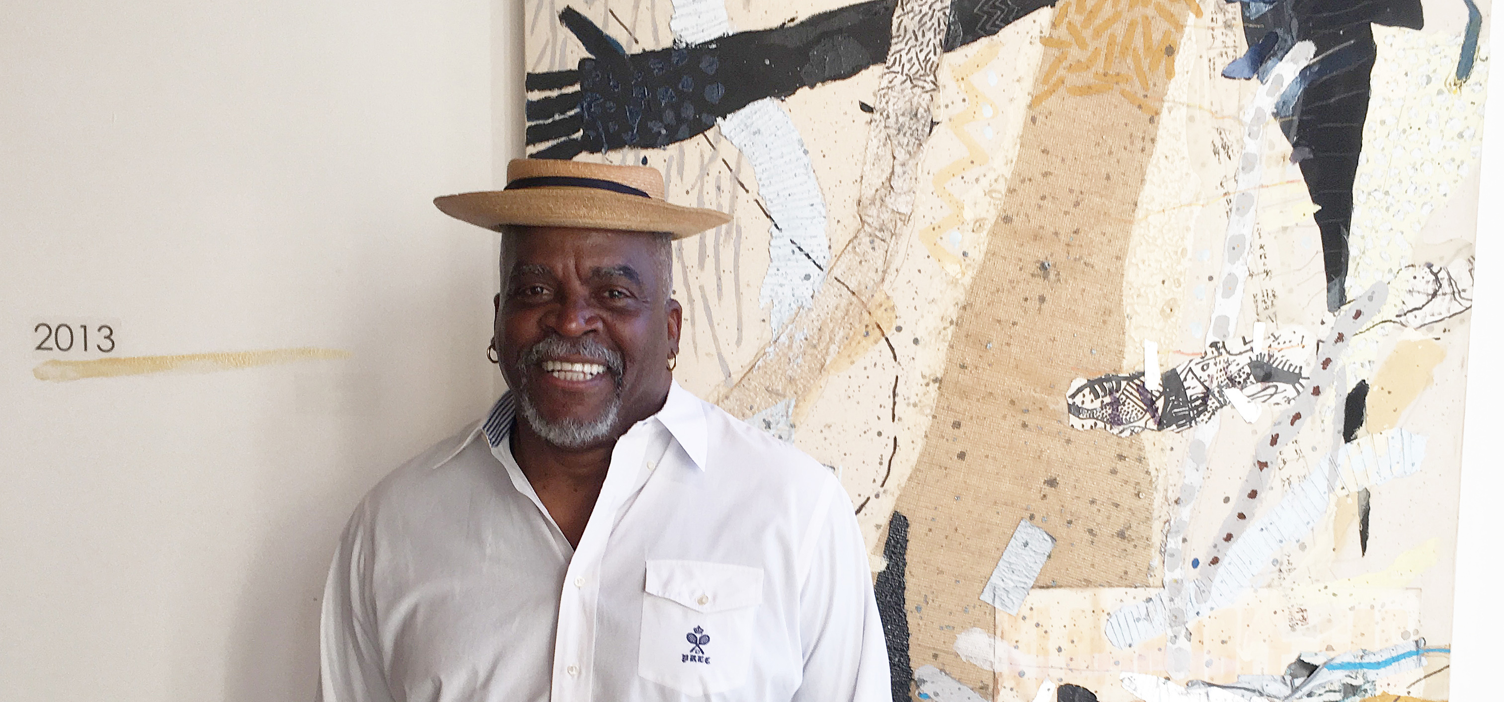
A Diabolical Element – Senghor Reid’s exhibition at the National Conference of Artist Gallery

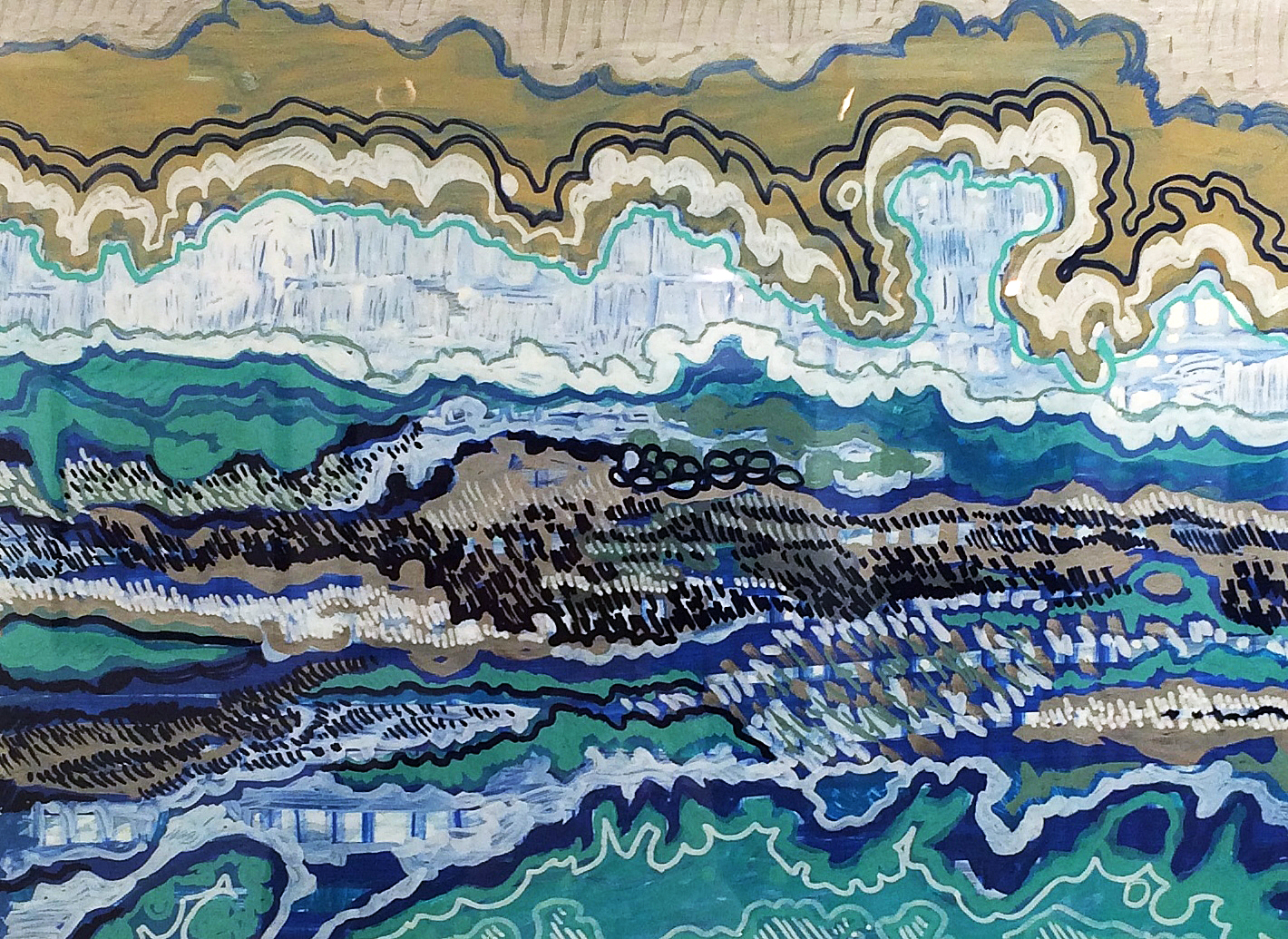
In the hallway outside of NCA Gallery, housed in a vibrant Community Center in Northwest Detroit, you encounter the first wave of Senghor Reid’s solo exhibition Diabolique. The imposing group of large-scale acrylic paintings depict shifting, shimmering surfaces of water in different weather conditions and light. Reid’s dynamic, disquieting treatment of the ever-moving element of water recalls David Hockney’s pool paintings. Both artists weave water as a substance in movements and marks that eerily echo the nature of the element itself- slashes, splotches, dense, doily-like layers of marks that begin to suggest forms even as those forms collapse and drain away before your eyes. Reid’s work evokes Hockney’s, also, in the strange, visually transmitted metaphor presented by both artist’s treatments of this element- that of the complete unknown, the otherworld that mirrors and impacts our own, that lies just beneath the surface.

image-1-senghor-reid-the-ice-storm-2-acrylic-on-canvas-48in-x-60in-2016

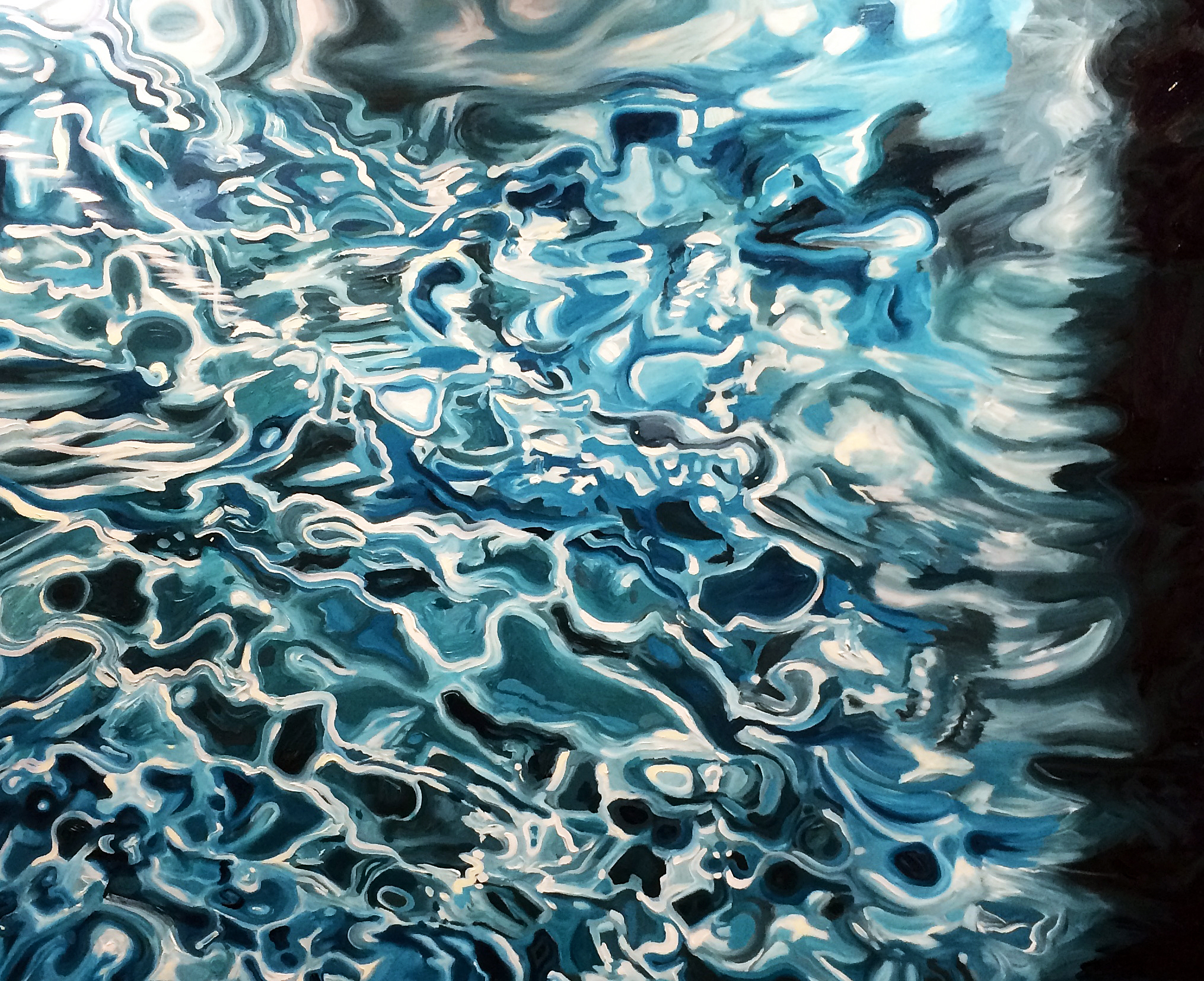
Senghor Reid, The Ice Storm 2, 48 X 60, Acrylic on Canvas, 2016

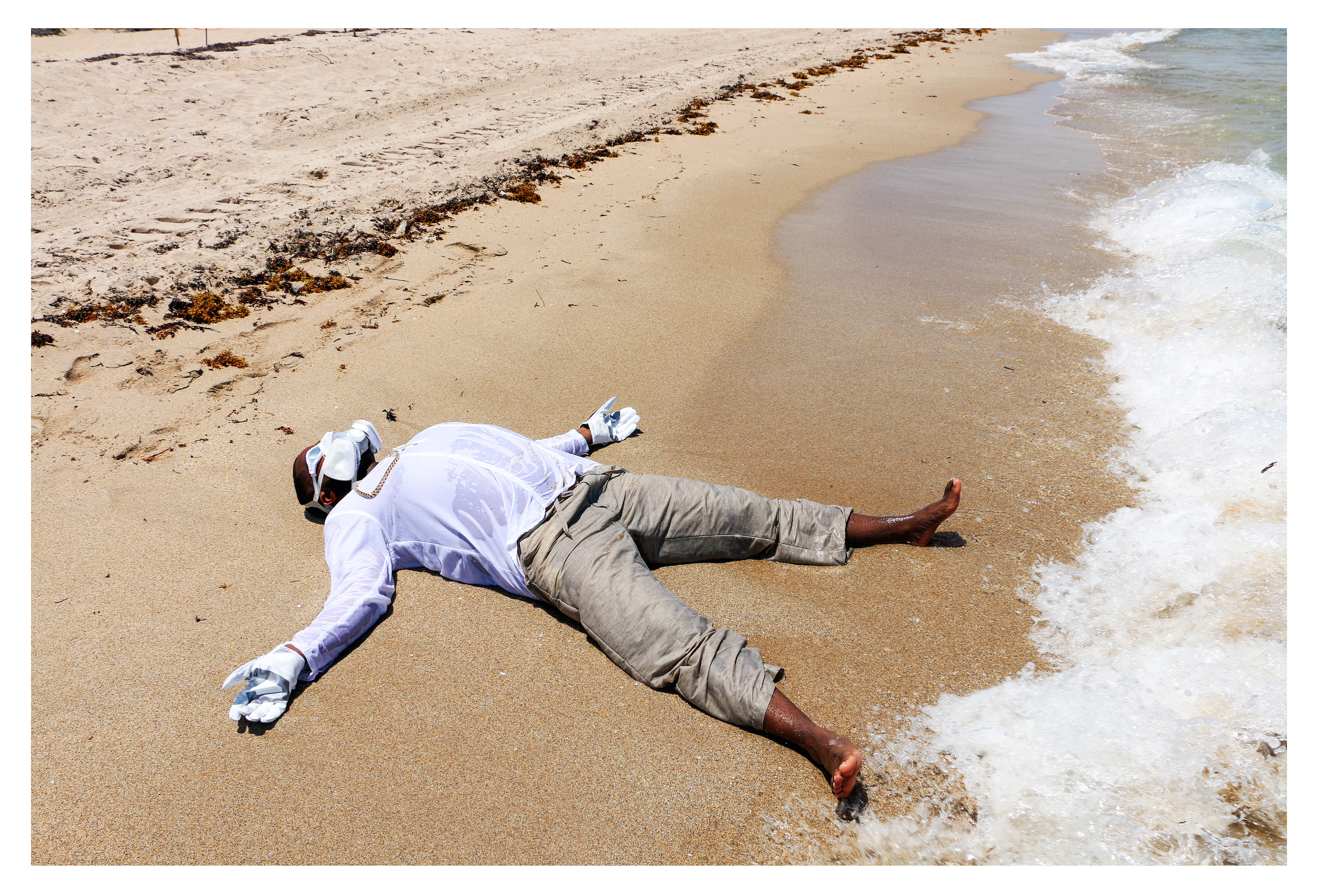
The title of Reid’s exhibition, Diabolique, references the 1955 French film Les Diaboliques, the plot of which revolves around the concealment of a corpse in a body of water. The water swallows the corpse and refuses to yield it up- it appears later, brought uncannily back to life, rising from the waters of a bathtub. The mysterious, treacherous capability of water to give both life and death, to absorb evil only to reveal it later in the most intimate settings, is examined with a plethora of materials and media, through scientific and aesthetic lenses, in Diabolique. True to the origin of its title, the exhibition features a series of self-portraits of the artist washed up on a vaguely tropical shore, an uncanny, amphibious humanoid, his face concealed behind swimming goggles and a gas mask that suggests both survival in a toxic environment and gills. The figure of the artist appears both resurrected and consigned to dwell forever in conditions his body was not designed for.

black-river-photo-4

Senghor Reid, Freshwater Assassins, 12 X 18″, Digital Print, 2016

This could be seen as the fate of humanity at the dawn of the Twenty-first Century- our surroundings are now rife with invisible, and not so invisible, contaminants that have resulted from our misuse of the natural world. Reid uses the element of water as the aesthetic touchstone of his exploration of those harmful elements, and their insidious presence in our daily lives. The most sinister elements on the periodic table- mercury, cobalt, lead- are carried into our communities and bodies through the vehicle of water. These same elements, like water, are aesthetically beautiful- possessed of a seductive, ever-shifting sheen. That paradox of beauty, vitality, nature and toxicity is presented in every one of Reid’s works, the large-scale water paintings, the smaller water studies executed in oil pastel and paint marker, the sensuous prints on gold and copper paper, the installation of crystalline vintage bottles labeled with the acids and heavy metals they once held.

image-3-senghor-reid-the-element-of-crime-shelves-and-apothocary-bottles-24in-x-30in-2016

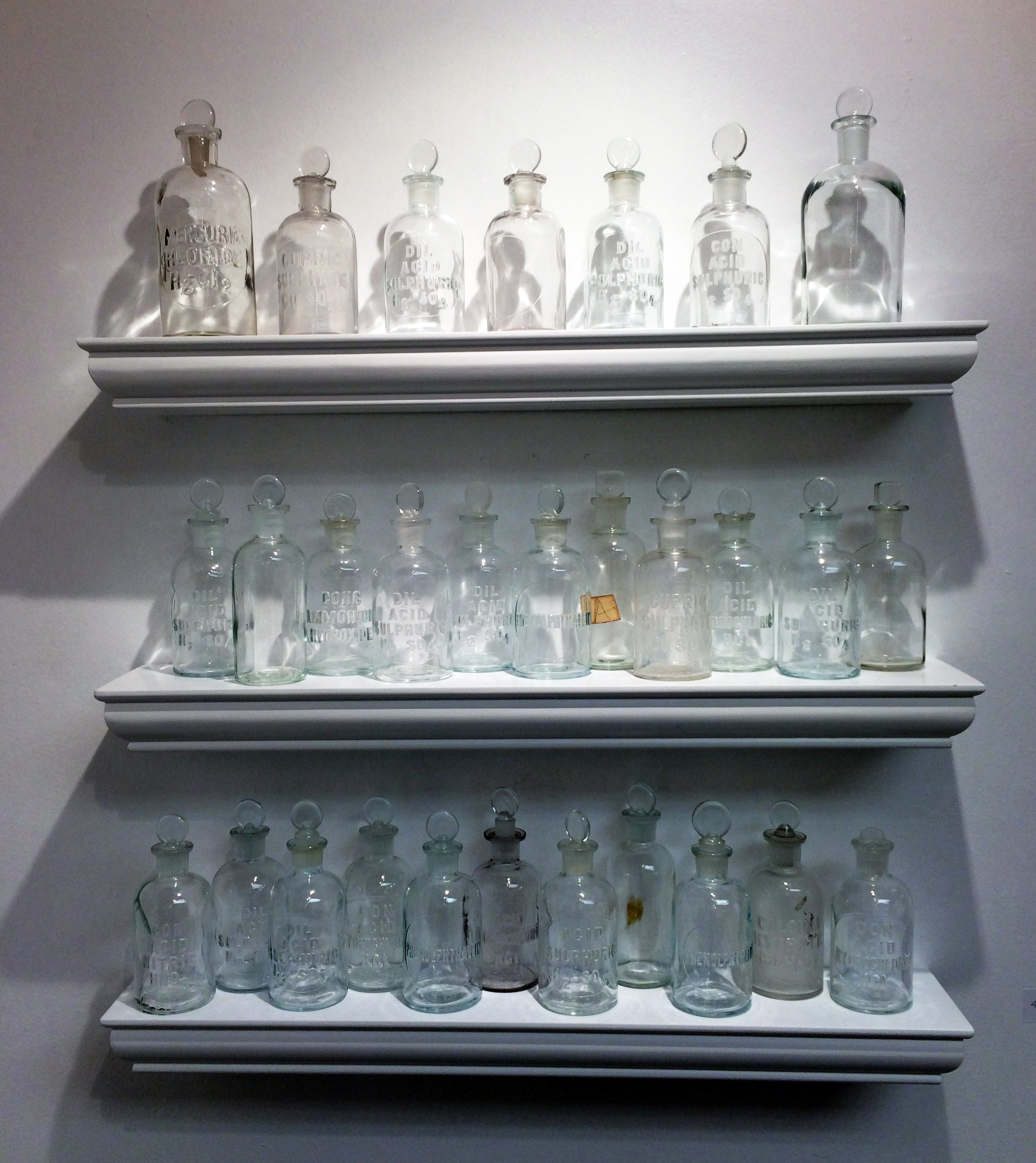
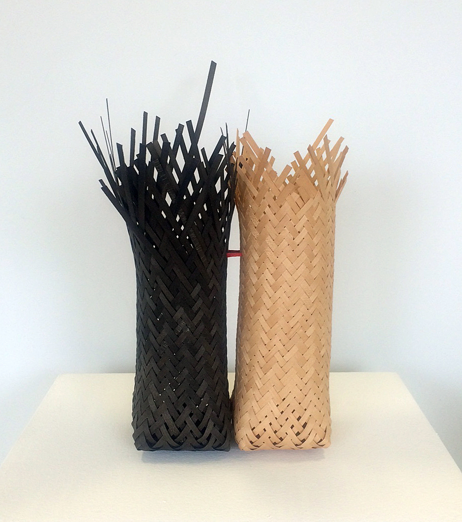
Senhor Reid, The Element of Crime Shelves & Apothecary Bottles, 24 X 30, 2016

The shimmer, and Reid’s capture of it in almost every medium imaginable, wreathes an elegant, fragile dialog between art, science and nature in Diabolique. It is the surface of water, which has become so loaded (the Flint water crisis and Detroit’s ongoing scandal of water shut-offs are only two examples of the element’s presence in crises of health, politics, race, and class) with essential and unanswered cultural urgencies. It is the glint of heavy metals, and the faceted surface of glass, containers and transmitters for elements that delight our eyes and leave putrid, invisible traces. It is deep, lurid, sensuous hues that sing of our love of nature as they paradoxically poison our environment. The shimmer conceals the corpse that will, inevitably, rise up from the murky inheritance of our chemical-spewing forbears. The rest of us may not be so lucky- yet, Diabolique seems to suggest, where there’s beauty, there’s hope.

image-5-senghor-reid-breaking-the-waves-4-paint-marker-11in-x-14in-2016

Senghor Reid, Breaking Waves 4, Paint Marker, 11 X 14″ 2016

 Diabolique,  by Senghor Reid,  at NCA Gallery through October 21, 2016.


35 Years @ N’Namdi Center for Contemporary Art

george-charles-mcgee-at-open-9-2016

George N’Namdi stands next to work by Detroit artist, Charles McGee, Noah’s Ark # 8, 60 X 45 1984

George N’Namdi opened the current exhibition, 35 Years in celebration of all the N’Namdi galleries since 1981, when he opened his first gallery, Jazzonia, on Harmonie Park in downtown Detroit. I remember that location because the Detroit Artist Market was on Randolph street and myself, and many friends were part of those DAM exhibitions. This exhibition features works collected by George N’Namdi before and after 1981, which includes over 40 artists spanning many genres and mediums.

Educator and art dealer, George R. N’Namdi was born September 12, 1946, in Columbus, Ohio. He attended Columbus East High School in 1965 and went on to graduated from Ohio State University in 1970, before obtaining his Ph.D. in psychology from the University of Michigan in 1974. This exhibition brings together a small selection of work that has been represented in the gallery for a span of near forty years.

chakiaia-booker-industrialization-50-x-59-x-15-1980

Chakiaia Booker, Industrialization, 50 X 59 X 15, 1980

Known for her sculpture made from rubber, and her wearable sculptures, Chakaia Booker was one of the artists supported and exhibited by George N’Namdi in the early eighties. Her work “Echoes in Black, ” was accepted into the Whitney Biennial in 2000.  The successful artist exhibits her work at the June Kelly Gallery in New York City and has work in the collection of the Metropolitan Museum of Art.

gerald-jackson-island-people-mixed-media-84-x-108-1985

Gerald Jackson, Island People, Mixed Media, 84 X 108, 1985

Born in Chicago, Gerald Jackson gained notice when his work was included in two influential 1970s exhibitions–the 1970 Afro-American Artists: New York and Boston at the Museum of the National Center of Afro-American Artists, Boston, and the 1971 Black Artists: Two Generations at the Newark Museum.  Jackson’s Island People is a figurative expressionist work from 1985 where the work outline of figures overlaps within a flatten picture plane.

sam-gilliam-71-x-98-x-10-mixed-media-on-canvas-aluminum-1994

Sam Gilliam, 71X 98 X10, Trade Mark, Mixed Media on Canvas-Aluminum, 1994

Sam Gilliam, the African American artists, who was born in the south, eventually spent his life in Washington DC, where he taught painting at the Maryland Institute College of Art, and at Carnegie Mellon University. Known for his color fieldwork, and a lyrical kind of abstraction, he often worked with shaped canvas and was early to move away from using stretcher bars for his canvases.  In the1980s Gilliam’s style changed dramatically to quilted paintings reminiscent of African patchwork quilts from his childhood. In his statement he says, “Only when making the work can I determine the many languages that form the planes on which it is to exist. Like abstract phrases the many intentions of the work (before an audience) passes through an intuitive sieve… The work was not planned, there are ploys, to the way it was laid out and then put together.”

alvin-loving-dreams-of-amorgos-61-x-51-1998

Alvin Loving, Dreams of Amorous, 61 X 51, 1998

Al Loving (1935–2005) was an Abstract Expressionist painter, and one of the few African American artists recognized for his contributions to the movement.  Born and raised in Detroit, he was known for his geometric work using bright color and hard-edge line in his arrangement of cubes and rectangles. Loving receive his BFA from the University of Illinois in 1963, and then his MFA from the University of Michigan in 1965, and soon after moved to New York City.  In 1968, he had a solo exhibition at the Whitney Museum.

The N’Namdi Collection is one of the finest private collections of African-American art in the United States and combines works covering more than a century of art in many genres.  As demonstrated in this exhibition, there as been a commitment by George N’Namdi to the contributions of African art and the discourse surrounding contemporary art in the United States.  Looking ahead, N’Namdi said “We are putting together an investment team for restaurants and galleries to create a gallery district on Grand River around Rosa Parks.  All this development that is taking place downtown will ultimately begin to spread into our neighborhoods.”

The N’Namdi Center for Contemporary Art

Ray Johnson @ CCS’s Valade Family Gallery

The Bob Boxes at the College for Creative Studies and the Valade Family Gallery

rj-1-install-1

Ray Johnson, Installation – All images courtesy of Robert Hensleigh

There is a remarkable exhibition at the College for Creative Studies’ Valade Gallery and the subject, Ray Johnson, has haunted me for years. I thought this obsession was because he was a Finnish kinsman with similar, exotic ethnic roots in the Copper Country of Northern Michigan, or maybe because a seminal figure of Detroit art and culture, Gilbert Silverman, famed for his iconic collection of Fluxus art, was his close friend and became his lifelong patron. Of course the great documentary film about Johnson’s life and death, “How to Draw a Bunny” (a must see for anyone interested in Johnson’s artistic strategies), was also instrumental in creating his haunting identity. I thought maybe my fascination with Johnson was that he was a Detroiter who went to Cass Technical High School and then attended the unique and ultimate, progressive Black Mountain College, where the American avant-garde art was born, and where my own poet-model, Charles Olson, taught. While there in the vital Post WWll years Johnson engaged with John Cage, Merce Cunningham, Elaine and Willem de Kooning, Josef and Anni Albers, Charles Olson, Robert Creeley, Buckminster Fuller, Franz Kline, Jacob Lawrence, Cy Twombly, Fracine du Plessix Gray, and many other art world lights.

But yesterday, curious about his local roots, I went to his childhood home on Quincy Street in Detroit and astonishingly discovered I was born directly behind his house on Holmur Street, the year he left for Black Mountain College. We discovered that my sister went to school with him.

None of this means a thing of course unless you’re Ray Johnson. And then it means everything, because if anything Johnson is about relationships: between people, objects, words, colliding and collaging (his basic gesture as an artist) or putting things together.

rj3-table-2-people

Johnson, often referred to as “the most famous unknown artist in America,” in addition to running with the New York School of famous painters, poets, and composers, spent years developing a network of relationships in the art world via that most democratic of institutions, the United States Postal Service. He basically created the New York Correspondance School (a play on the New York School of Abstract Expressionists and pun on creative movement of his art) and the phenomenon of “mail art” as a way of circumventing the capitalist art market of collectors, galleries, curators, and museums, creating a direct and intimate communication between artists. Using his own very finely crafted collage techniques and a complex personal iconography (rabbits, strange silhouetted portraiture of famous movie stars and artists, homoerotica, spinning on complex language games and puns), he created a network that sent out small-scale art works composed of drawings, photos, and cut-out texts from magazines of movie stars, product packaging, found objects, and ultimately whatever was part of the visual surface of post war popular culture that he swam in.

rj4-3-tables

In the most significant aspect of Johnson’s mail art project, he asked for additions and collaborations on his work, as well as others he had “sent out,” to redirect and create an alternative visual dialogue among chosen artists. Johnson’s interest in both Zen practices and chance operations (through his close friendship with composer John Cage and choreographer Merce Cunningham) played a central part of his artistic practice and even more significantly in his enigmatic philosophical vision and life practice. Ultimately the New York Correspondence School attracted thousands of participants becoming a global network that eventually lost its human connectedness, which perhaps prompted Johnson in 1973 to proclaim the New York Correspondence School dead.

The exhibition at the Valade Gallery, The Bob Boxes, is the result of one particular mail art relationship that Johnson had with artist/collagist, Robert Warner. From 1988 until Johnson’s death in 1995, they maintained a correspondence exchanging mail and phone calls. At one point Johnson delivered thirteen boxes of various “mail art” he had created and collected, including found objects from everyday life and popular culture. (It is probable that the famous boxes of “assemblage” artist Joseph Cornell, whom Johnson had admired and befriended, inspired the “boxes” he created for Bob Warner, “The Bob Boxes.”)

rj5-many-tables

Like Cage and, indeed the ultimate assemblage artist, Marcel Duchamp, Johnson was primarily interested in how chance encounters, between people, objects, or words, created new sets of possibilities or connections, or extended the possibilities for making meaning out of the world. He wasn’t interested in a singular system, visual, linguistic or cinematic, but any kind of “relationship” between things that prompted a vital often satirical critique. He referred to his small collages as “moticos” (an anagram for osmotic), created to stimulate or inspire connective tissue in everyday life. In a very real sense then there was no separation between Johnson’s art and life, and his seamless playful landscape provoked many to call him a Neo-Dada artist, a surrealist, which of course he rejected as just one more effort to classify him.

rj6-suitcase


The Valade Gallery’s exhibition is then really a performance of Bob Warner’s “unpacking” of the 13 boxes that Johnson gave him. Placed on tables, the contents of the boxes — Warner’s humorous title for the exhibition is “Tables of Content” — have been distributed, and the results on each table are a tsunami of the flotsam and jetsam of the American visual landscape that Johnson assembled for Warner and us, providing a ready-made mail art kit for our visual challenge.

rj2-install-2

In addition to the “Tables of Content,” there are three vitrines containing early photographs from Johnson’s life in Detroit, including some wonderful drawings that he made while at Cass Technical High School. There are also seven hours of video — ”The Ray Johnson Videos” made by Nicholas Maravel — of Johnson talking about his work and generally performing himself for the camera.

Amazingly “The Bob Boxes” is the first exhibition of Ray Johnson in his hometown of Detroit for over forty years, and the Valade Gallery’s curator, Jonathan Rajewski, has provided a fine context and perspective on the work of one of the most enigmatic artists of the 20th century.

College for Creative Studies

A.Alfred Taubman Center for Design Education

The Valade Family Gallery       460 W.Baltimore   Detroit, MI 48202

Gallery Hours: Wednesday-Saturday, 12 to 5 p.m.

Domestic Transcendence @ David Klein Gallery

With it’s commercial focus, David Klein Gallery present work that, at times, places a higher value on aesthetics than challenging the dominant paradigm—but a trio of solo exhibits, which opened on Saturday, September 17, 2016 collectively present a playful push and pull around the subject of gender roles and interpersonal relationships.

dk2

Derick Melander, Night Sky, 2016, Folded clothing, wood and steel, 48 x 48 x 6 inches All images Courtesy of Sarah Rose Sharp

Welcoming viewers is a front window display by Derick Melander, working in the typically female-dominated realm of folded laundry. Melander’s meticulous towers and tableaus, rendered in compressed and expertly folded garments, are not only visually pleasing, but carry an intense allure for anyone with OCD aesthetics. Night Sky (2016), on the lefthand side of the gallery’s entryway, goes so far as to depict a Van Gogh-like scene, with the fold lines, punctuated by tight rolls of concentric garments, echoing the swirling brushstrokes of one of the late painter’s most popular works, The Starry Night (1889). Other works present more abstract chroma-towers, that create ombre fades through hundreds of stacked garments, resembling soft core samples or geologic strata.

dk10

Kelly Reemtsen, Presentation, 2016, Oil on panel, 44 x 44 inches

With the gentleman handling the laundry, the gallery’s main room makes way for the ladies of Kelly Reemtsen’s “Over It.” The series is thematically tight, featuring three to five foot oil paintings of women in party dresses, standing on ladders or chairs, and wielding tools. Her subjects are largely generic, depicted from the shoulders, waist, or knees down, wearing lavish skirts and dresses and high heels that evoke a sense of 1950s housewife pageantry. They clutch their tools—sledgehammers, axes, shears, and chainsaws—with calm determination, or trail them coquettishly behind their backs. Already balanced in their frivolous footwear, they seem stable atop footstools and chairs, even kicking back one flirtatious foot off an A-frame ladder in Social Climber (2016). These are not women dressed for the occasion of home demolition or tree removal, and therefore the implication is a little more sinister—as the title would suggest, Reemtsen’s subjects are fed up, and preparing to take some kind of action. This clash of girly accessorizing and a hint of violence is echoed in Reemtsen’s Fuck the System sculptures (Siren Red, Frosted Pink, and Hot Pink, respectively), which feature Oldenburg-scale tubes of lipstick in stainless steel with a dazzling chrome effect, their contents stubbed out onto their pedestals like discarded cigarettes.

dk3

Kelly Reemtsen, installation view

Even the finish of Reemtsen’s paintings warp the edges of gendered labor; the artist manages to administer a thick veneer of stucco to the background of the paintings that would impress the most seasoned contractor. When one considers the language of labor, it is striking to realize that there are gender-coded words for what amounts to the same action—ask a man what “detailing” a car actually means, and he will be forced to admit that it is “cleaning.” The control and appeal that Reemtsen achieves in her identity-neutral portraits mirrors the restraint and artifice that is the daily work of presenting a polished, female-coded facade to the world, and it is heartening to see that women are generally expressing the sentiment that they have had enough of it.

dk7

Kelly Reemtsen, Slammed, 2016, Oil on panel, 60 x 36 inches


All this gender-bending veers into the abstract world of feelings as we progress to the heart of the gallery, where Emmy Bright’s “Why Don’t You Want This?” rounds out the show. Bright presents a collection of silkscreen prints on paper and newsprint, that playfully juxtapose words, sketched out images, and fields of color. These works successfully leverage simple wordplay and open-ended diagrams to create a surprising depth of meaning; Bright is acutely sensitive to the workings of the heart, and manages to spin out a collection that reflects a kind of emotional complexity belied by their visual simplicity.

dk8

Emmy Bright, Tragedies of Desire (Black & White), 2016, Silkscreen on paper (edition of 5 + 2 AP), 25 x 29 inches

Having created this visual lexicon of emotional placeholders, Bright goes a few steps further with the creation of More Stupids: A Tarot. This small edition tarot deck, featuring Bright’s prints as 44 oversized tarot cards with an accompanying book of interpretations, aims to shuffle and deal these fundamental feelings into readable form. Never one to leave her viewer hanging, Bright spent a week following the opening performing scheduled art card tarot readings, where visitors were treated to an emotional forecasting by Bright, or her alter-ego, Dr. Ladybear. The tarot deck collects highlights from Brights “Three Stupids Practice,” a daily process wherein she goes to the studio and makes “three things that are stupid and wrong in some significant way.” As her gallery guide states: “If they are good, they are also right in another significant way.”

dk4

An assistant lays out selections from More Stupids: A Tarot during opening night

In fact, Emmy Bright has it very right, and her sometimes-poignant, sometimes-funny, and exceedingly gentle explorations of emotion provided a beautiful counterpoint to the spirit-draining world outside the gallery walls. If these three artists can take joy in the mundane, draw the line at oppressive categorization, and open their hearts to the possibility of connection, perhaps they can inspire us all to do the same.

David Klein Gallery


Elizabeth Youngblood @ 9338 Campau

 ” Righted” – A Trajectory of Work by Elizabeth Youngblood – A retrospective work in progres

ey-installation

Elizabeth Youngblood, Installation

ElizabethYoungblood defines herself first as a craftsman. A quote that describes her trajectory well is a simple one- “I respect making.” The broad range of media she employs- textiles, drawing, basket-weaving, ceramics, wire sculpture- attest to her democratic fealty to a very personal, singular hunt. With Righted- A Trajectory of Work by Elizabeth Youngblood, Youngblood has transformed 9338 Campau’s sprawling Hamtramck gallery space into a hive of activity, presenting her work in an unprecedented format- a retrospective that includes works in progress that Youngblood is developing within the gallery itself. She is taking advantage of the vast amount of space there to both gather her work into one place large enough to give it breathing room, and realize large works on paper that she has long desired to explore but hasn’t had the space, until now, to properly develop. Youngblood’s residency at 9338 Campau feels revolutionary, both for an artist in full command of her powers with a distinguished career in the bag already, and for an explorer who makes the most of every space she is given for her work to take center stage.

Asked to qualify her vast body of work into a single context, she explains how one branch of her exploration leads, maintaining conceptual consistency, from one medium to the next. Youngblood’s devotion to mastering the strengths of every material that passes through her hands, and the joy she takes in immersing herself in the process of finessing each one, gently, into her lexicon, is doubly striking in the context of Righted, where one can view long-culminated works alongside raw, vulnerable works in progress. The very presence of the works in progress casts Youngblood’s retrospective work in an unusual light- as open-ended, questioning works in progress themselves. This impression suits Youngblood’s whole-hearted focus on process as a studio practice- allowing the current of her concept to carry her from medium to medium, presenting each work as a direct flowering from the clues unlocked, and the questions raised, in the last.

image-1-elizabeth-youngblood

Elizabeth Youngblood, Woven Black Piece, 1992-93 All Images Courtesy of Clara DeGalan

Talking with Youngblood about her work reveals the ultimate unimportance of form in her studio practice. This came as a surprise in light of the striking formal continuity I made out in her work- indeed, it was the first thing that enabled me to pass cohesively from one piece to the next, given what different media she ropes in. This formal consistency, it turns out, is Youngblood’s soul pattern, a template on which she explores such concepts as the dogged devotion of craftsmanship, the solitary joy of wreathing visions out of tactility, and the construction of planes out of lines.

image-2-a-textile-mounted-on-paper-elizabeth-youngblood

Elizabeth Youngblood,Untitled, 1995

Youngblood’s artistic chronology mirrors her bodies of work. Trained as a graphic designer, she has worked in that profession, on and off, since her tenure as an undergraduate student at the University of Michigan. She is quick to point out, rightly, the subtle craft demanded by graphic design. Between her design work, her teaching career, her years spent in New York, and interludes in craft-oriented industries such as bar-tending, she has snatched pockets of time to hone her planar exploration in various media at artist residencies such as Haystack and Penland School of Crafts. Her travels have pulled a variety of media into her exploration- her vision remains remarkably consistent as she applies it to different traditions of making. She emphasizes the importance of material and craft as a conduit toward greater understanding of place, such as North Carolina and its history as a hub of furniture craft (the baskets on display in Righted were created at Penland, inspired by the materials and methods of furniture-making.)

image-3-righted-elizabeth-youngblood

Elizabeth Youngblood, Twin Baskets, 1999

This breath of Place, in turn, enriches Youngblood’s exploration of process as a path toward distillation of an artifact of conceptual, rather than utilitarian or formal value. Youngblood speaks with quiet admiration of the traditions of crafting she has been privileged to explore, and how they have added their own regional, historical voices to her practice.

As she continues to explore, chasing her vision of planes built of carful, joyous repetition, Youngblood pulls traditional craft forms, seemingly effortlessly, into a body of work that maintains an astonishing formal trajectory, presenting razor-sharp meditations on process in various media encased, almost like home-jarred preserves, within an all-encompassing, monolithic form. The form, seductive and enigmatic as it is, is no more than a ground for her process. Asked her opinions on the tension between fine art and craft, high and low art, she expresses less interest in that argument than in the status of media as “women’s work” versus “men’s work.” The large-scaled drawings Youngblood is developing during her tenure at 9338 Campau are an exploration into a quicker, more decisive way of making that has historically been associated with the bodies and thought processes of men.

image-4-elizabeth-youngblood

Elizabeth Youngblood, Large Drawing 1, 2016

“Men’s work” as Youngblood describes it, seems less a political appropriation on her part than a desire to master yet another craft- one she, for the moment, has the physical space to pursue. Spending time with Youngblood in her studio is a lesson in veneration for processes that unite, rather than polarize, the complex history of making as it indexes various times, places, social demographics, races, and genders. To sum up, Youngblood respects making, and, though she is acutely aware of the cultural associations that come with each material she ropes into her vision, her devotion to process and skill-building manage, miraculously, to shed the oppressive political discourse that has hung around craft for decades and present it, unilaterally, as a vast conduit for exploration of an artist’s conceptual vision. Youngblood’s is a true Twenty First Century studio practice- and she’s earned it.

Righted- A Trajectory of Work by Elizabeth Youngblood has percolated at 9338 Campau Gallery in Hamtramck, MI throughout the last breaths of summer. A public reception of her work will be held on Saturday, 9/24/2016 from 7-10 pm.

9338 Campau

Page 64 of 78

Powered by WordPress & Theme by Anders Norén