Critical art reviews of Detroit galleries and museums weekly

Month: January 2018

NAIAS @ Cobo Hall, Detroit, Michigan, USA

Floor View of NAIAS

So last year, I wandered out onto the farthest fringe of the fine art community and made a decision to write about the 2017 North American International Auto Show (NAIAS). At the time I declared it to be an exhibition in the Detroit metro area worthy of our time and effort. Now, the new 2018 review comes on the heels of writing a review of Monet: Framing Life, an exhibition now at the Detroit Institute of Arts.

In my 2017 Auto Show review, I gave recognition to the Eyes on Design competition and to the College for Creative Studies for their exemplary Transportation Design Program. In addition, I acknowledged all the fine artists who worked in the automotive design process by day, and do their own personal and private fine art work in their home studios on weekends and by night. I did this review based on attending the 2017 public viewing of the auto show, packed with a widely diverse audience of families and individuals from all walks of life. When the review was published, I did get positive feedback from NAIAS officials as they recommended that in 2018, I should apply for a press credential. For the 2017 Detroit Art Review, I went about my business and selected a luxury production car, the 2017 Lincoln Continental, as having the highest level of overall aesthetic appeal, followed up by my reasons for the selection and why.

There were critics, of course, both writers and artists who thought I had lost my mind by comparing the design elements of a car to the exhibition of paintings by Van Gogh or Edward Hopper, but many more could easily see the connection between the artisans who work in the automobile design departments and their personal artistic talent, of which many men and women exhibit in galleries, museums, and fine art competitions right here in Detroit.

But that was last year. In December of 2017, I contemplated a new review of 2018 NAIAS. Should I do another?  I began by applying for a press credential and was rejected and then rejected again on appeal. Then I approached the Chairman of the CCS Transportation Design program by email and asked for his input. He said he supported the idea whole-heartedly, but soon his emails stopped and he could not be reached. After the rejection by NAIAS for press access, they suggested that I should simply attend one of the Industry Preview Days. I did that and paid dearly for the, um, privilege. $110 for the ticket, $15 for parking and $4 to hang up my coat, all in a good effort to provide publicity and good will to the auto industry. (I am happy to report that using the men’s room is still free.)

Audi V-10 R8 Coupe convertible

The first thing I bumped into on the showroom floor was the new Audi R8 V-10 sports coupe powered by a 10-cylinder gas guzzling engine with a 14mpg (they may have fudged on the mileage). Considering the price tag of $175,000, that seemed like enough money and cylinders for four cars.

I moseyed up to a high platform where the view consisted of thousands of white men, aged 30-60 years old, in dull slacks, dress shirts, short hair, and glasses. Many were clustered in groups and held an itemized pad for notes and iPhones for taking pictures.

Several times I asked those working the show what was meant by Industry Preview Day. Their responses varied greatly. “Mostly engineers…looking at the competition,” or “VIPs from headquarters” or “today is for the auto designers and their teams,” or “it’s mostly a perk for suppliers or dealers.” My guess is they all were provided with a free ticket.

Bluntly, it was a sea of Caucasian men as far as I could see. I did see an African American security guard in a red coat, and an African American cleaning lady, in that same red coat. To be fair, there might have been one or two women there, probably VIP spouses, and a few Asian engineers. Notable were several undercover police officers with sniffer dogs, and at each entrance, African American security guards (in their red coats) doing body scans with an electronic wand. Well, good. I felt safe, but there was a new experience ahead.

As you might recall or imagine, the Cobo exhibition hall is a large, circular space filled, in this case, with very expensive sets are individually designed and assigned to each automobile manufacturer. What I didn’t expect to see was a section devoted to automotive suppliers. I guess that means more revenue for NAIAS and Cobo Hall.

The first supplier exhibit I came across was Aramco Transport Technologies, which provides technology that improves mileage, emissions, and efficiency. I asked a representative where their headquarters were, and they said, Novi, Michigan. Apparently, they are also located in other parts of the world, like Paris, France. When pressed, they said they were a division of Saudi Aramco in Dhahran, Saudi Arabia, the state-owned oil company that is the world’s top exporter of oil and natural gas.

To be fair, Aramco has developed a Mobile Carbon Capture technology that captures the Co2 before it leaves the car, which is then stored and unloaded for reuse. Although there were electric cars, like Volkswagen’s concept car, in most of the displays, but I did not see a supplier of passive energy sources for automotive use.

There was Denso North America, leaders in corrosion prevention and sealant technology, headquartered in Kariya, Japan. There was a large display by Aisin Group that specialized in powertrain components, also head quartered in Japan, but I asked myself; who is coming to NAIAS to look into the technical parts of a car or cross-sections of a transmission? Are they lobbyists? I would be remiss if I did not mention the Michelin Tire Display, fudge from Kyba’s Mackinaw Island and the candied almond vendor.

2018 Lincoln Continental

But back to my mission to find a car that has the highest level of overall aesthetic appeal, which leads me to another revelation: The design of production cars changes very slowly, as this year’s models demonstrated. I was drawn back inexorably to the Lincoln Continental. The understatement of line, shape, and proportion still provides the viewer with a feeling of strength and security. The lines curve down and inward, an aesthetic sometimes seen in European sports cars. The repetition of roundness is soothing. Stylish elements abound, like the way the E-latch door handles provide a graceful inset in the side door, and five LED lamps create a slender design to what used to be a larger headlamp.

2018 Lincoln Continental Grill Detail

The front grill is refined, delicate and proportionate to the front profile, while the small openings in the grill repeat a similar shape of the car logo. A sleek console serves to open up the cabin, while the sophisticated push-button gearshift integrates seamlessly with classic knobs and buttons. The leather-wrapped, hand-stitched steering wheel is mounted ahead of a 12.3-inch fully configurable digital instrument cluster that displays easy-to-read driver information clearly. Sitting in the car, looking closely at its design elements, I was left with what I experienced last year, which is that the Lincoln Motor Company, the luxury automotive brand of Ford Motor Company, is committed to creating an exquisitely designed vehicle that places itself above their competitors.

2018 Lincoln Continental fron interior


Everything I experienced with the cars themselves remains the same, particularly when it came to recognizing the designers who work hard at deserving their much-earned success around the world. As I mentioned, NAIAS has its own Eyes on Design program, and this year they gave the KIA Stinger their choice for Best Production Car award. (South Korea is hosting this years Winter Olympics) If you’re curious, the awards are decided on by four chief judges, and thirty-two regular judges who must work together on a process that I cannot imagine, but it is their official program, highly honored and celebrated. Congratulations! But as for my experience with NAIAS 2018 Industry Preview Day, it was enlightening and disappointing. The cars were sleek and shiny, the crowd was bland, and the diversity of people packed into Cobo Hall on this day…was racially offensive.

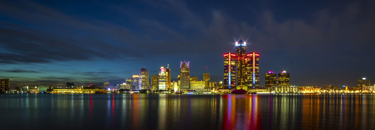
NAIAS 2018 @ Cobo Hall, Detroit


Nabil Mousa @ Arab American National Museum

Flag of a Complicated Nation: Nabil Mousa’s Vision of the American Landscape at Arab American National Museum in Dearborn, MI

Image Courtesy of Artist

It is a complicated time in the United States, with polarizing politics pushing questions of what it means to identify as American. In truth, ideas of nationalism in most countries are increasingly complex, due to the up-tempo of immigration and displacement, and the generally more global nature of contemporary times. Flags, as a starkly graphic symbol of national identity, tend to fall short as representational entities for countries full of individuals with radically divergent backgrounds, experiences, and inter-cultural connections.

Nabil Mousa, American Landscape #38, Mixed Media on board, 24 x 96″, 2008

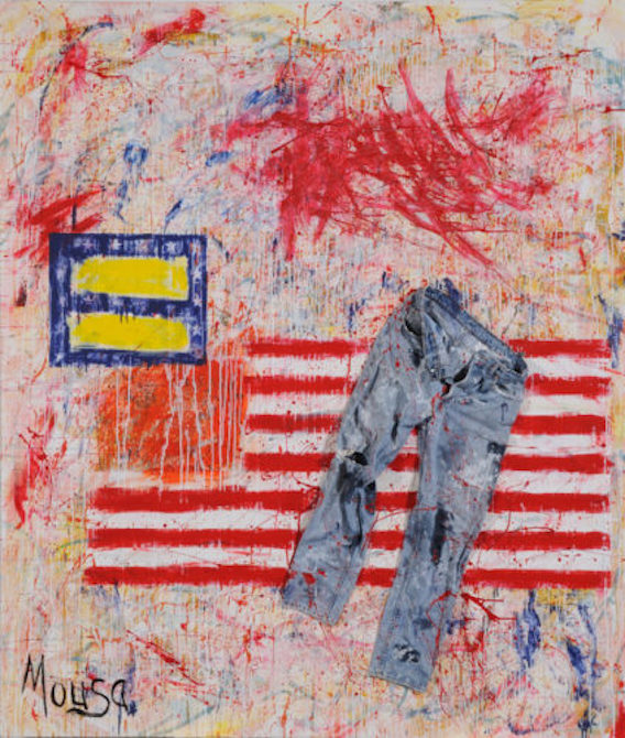
Perhaps this is why Nabil Mousa’s, American Landscape—a series that includes some 40 works produced by the artist between 2008 and 2012—feels so timely and resonant. Nine of these works are on display at the Arab American National Museum, and most of them incorporate the American flag, as a literal or symbolic material. The series is a way for the artist to reconcile his own questions of identity, both as a Syrian immigrant and an openly homosexual man. Mousa came to the States with his family in 1976, at the age of 12, and since coming out as gay, has been estranged by his family, according to their stringently Christian beliefs. It stands to reason that the flags he presents are emotional, messy affairs, with blurring lines, dramatic brushstrokes, mottled palette, and populated by little icons representing anonymous men and women of the LBGTQ+ community.

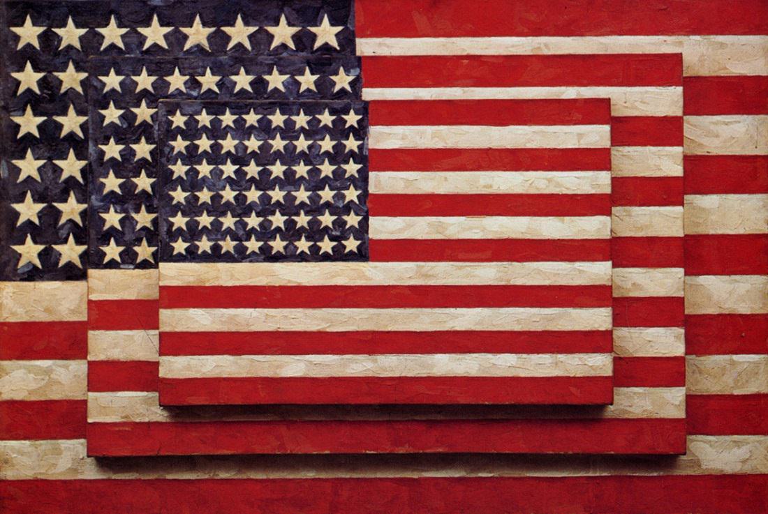
Jasper Johns, Three Flags, 77 x 155cm, Pigment & Warm wax, Image courtesy of the Whitney Museum

Flags in general, and the United States flag in particular, have a long history of use in contemporary are for their symbolic value. Jasper Johns first began to iterate the symbol with the encaustic painting Flag (1954-55), following his discharge from the United States Army, and returned to the flag as subject matter numerous times over the course of his career. Political artist Dread Scott first presented his controversial work, What is the Proper Way to Display a U.S. Flag? In 1989, prompting the passing of the “Flag Protection Act” in Congress. In protest, Dread Scott and two other artists burned a U.S. flag on the steps of the Capitol Building, which resulted in a federal court case that made it all the way to the Supreme Court in 1990. Artist David Hammons famously created the African American Flag, which is in the permanent collection at the Museum of Modern Art. Flags provide pre-loaded symbolism, and evoke strong feelings in those that choose to identify with them as a form of national identity, thus making them appealing to artists who question where they may fit in with such broad social representations.

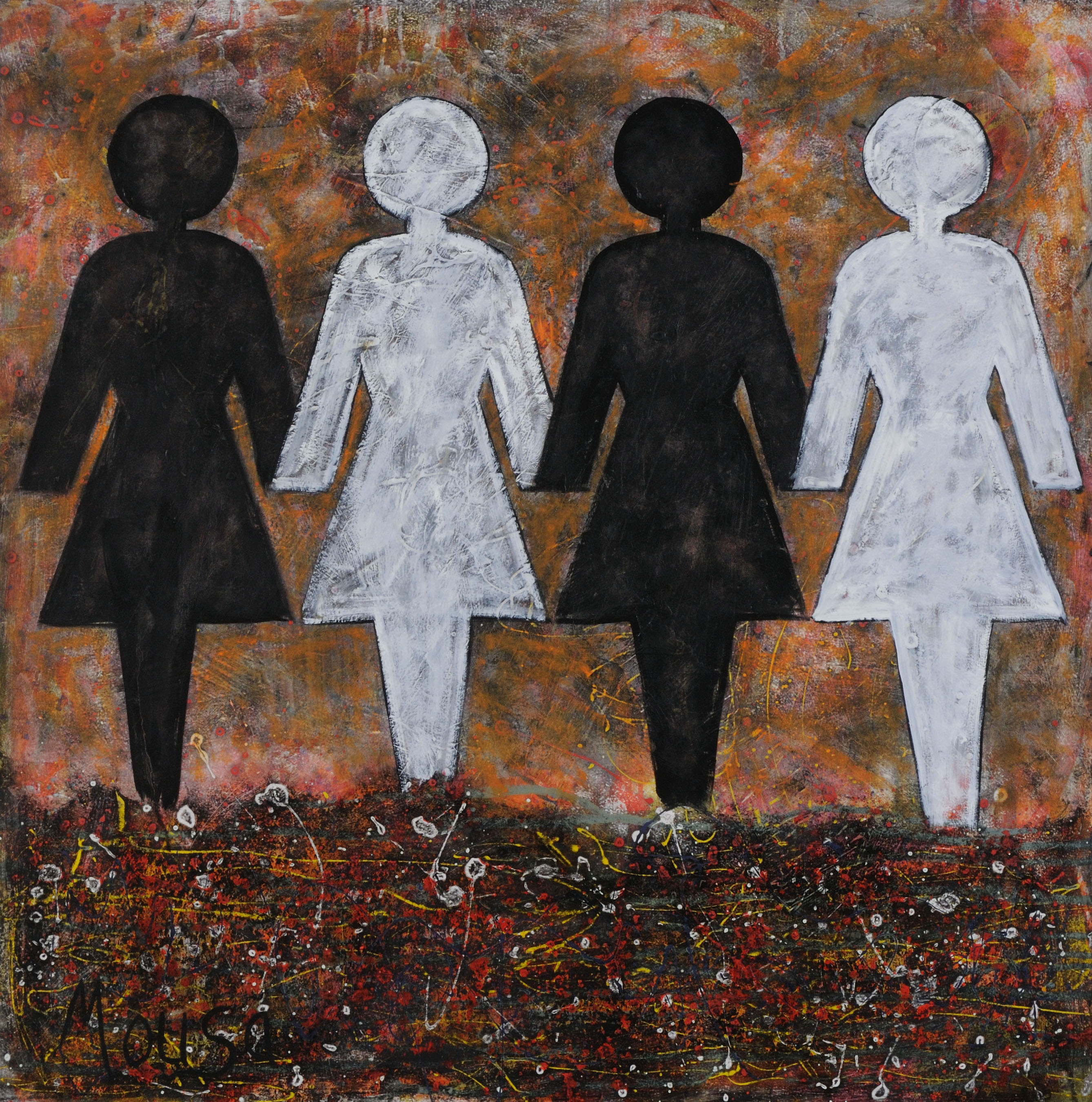
Nabil Mousa, American Landscape, # 34, Mixed Media on oil board, 48 x 48″, 2009

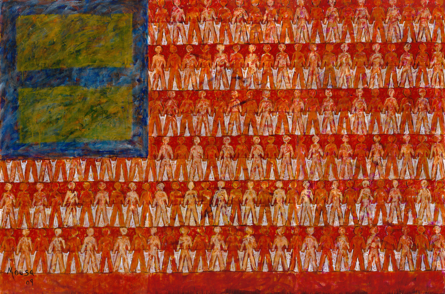
As a member of (at least) two populations that are often vilified, singled out, or marginalized, Mousa has a great deal of personal experience in alienated nationalism to work through in his paintings, yet with American Landscape, he has chosen to present these themes using some of the most universal symbols available—aside from the flag, the majority of figures in Mousa’s landscapes are the male/female icons designating gender on public restroom doors. In Mousa’s context, these figures appear exclusively in same-sex couplings or groups; four women holding hands across an apocalyptic and bleak multi-media landscape in American Landscape #34 (2009), or dozens of men holding hands in rows that fill out the stripes of a 12-foot-wide American Landscape #1 (2009), which dominates the entire entry wall of the gallery, and, as the largest work, serves as the focal point of the exhibition. The figures seem to blend with flag behind them, suggesting their invisibility, and in many of Mousa’s works, the flags themselves smear and drip, or even fragment—as in the case of American Landscape #19 (2009), which incorporates cut-up pieces of an actual U.S. flag in the foreground, obscuring portions of the large-scale male figures in the painting, including the place where they are (presumably) holding hands.

Nabil Mousa, American Landscape #1, Oil on Board, 90 x 144″, 2009

In some ways, Mousa’s work at AANM might be trading in the bluntest symbolism, but the emotive nature of his brushstrokes and the frenetic energy of such bold and colorful works in a relatively small gallery space make the work personal and the exhibition space feel extremely dynamic. Perhaps this is a show that seeks to connect with those who feel excluded by the conventional presentation of the flag, which blithely assumes a one-for-all American spirit that is obviously not borne out in issues of policy-making, opportunities, justice, or social equity. With American Landscape, Mousa has complicated the flag, and in doing so, raised a new version, which seeks to include people whose American identities are more complicated than simple red, white, and blue.

Nabil Mousa, American Landscape, #20, Mixed Media on Board, 96 x 72, 2009


Nabil Mousa: American Landscape continues at the Arab American National Museum in Dearborn, Michigan through April 8.

Matisse Drawings @ UofM Museum of Art

Matisse Drawings: Curated by Ellsworth Kelly from The Pierre and Tana Matisse Foundation Collection

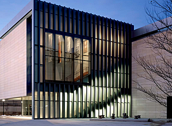
UofM Museum of Art, Exterior, 2017 Images Courtesy of Levi Stroud

Matisse Drawings, a traveling exhibition currently gracing the University of Michigan Museum of Art’s cathedral-like A. Alfred Taubman Gallery, presents a spiritual meeting of two Twentieth Century titans- Henri Matisse, one of Modern Europe’s most beloved painters, and Ellsworth Kelly, king of the hard-edged color field painting that branched from Abstract Expressionism in mid-century America. The exhibition, lovingly curated and meticulously arranged by Kelly, encompasses an unbroken row of neutrally framed drawings that snakes around the walls of the Taubman Gallery. Nestled in a smaller gallery next to Taubman is a collection of Kelly’s own lithographs, made during a stay in France, inspired both by Matisse and the landscape that inspired the Fauvist master.

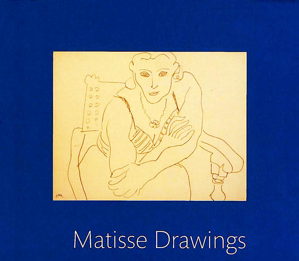
Henri Matisse, Catalog of Drawings from exhibition 2017

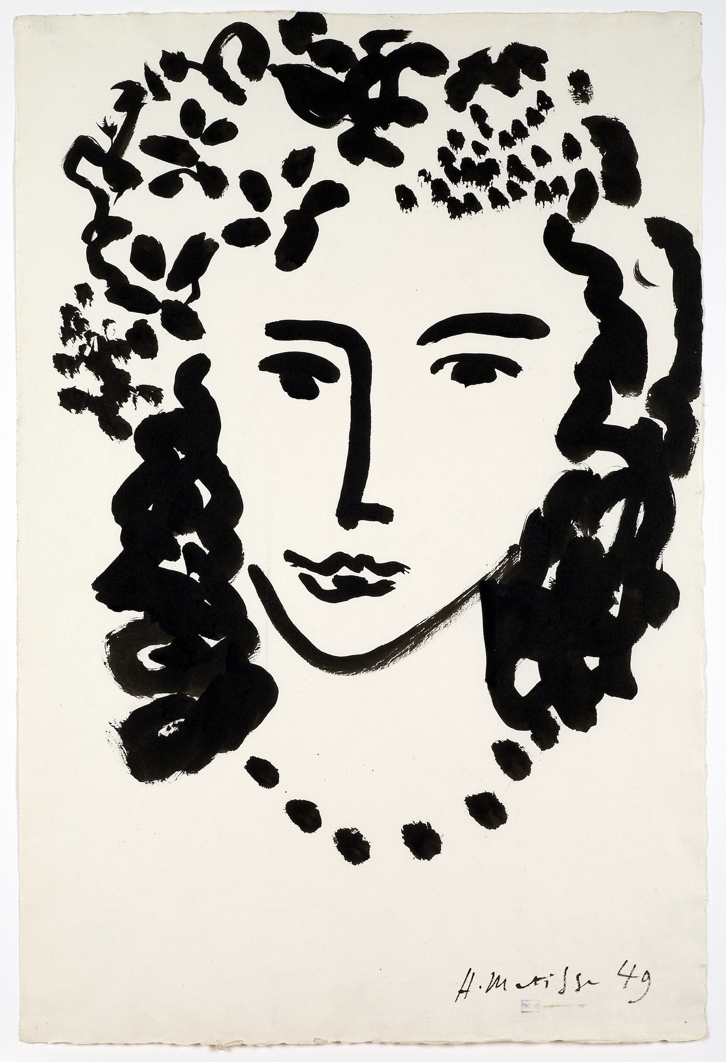
Coming into the presence of a Matisse painting is invariably moving, profound, and difficult to describe. He was a master of emotive, ecstatic visual expression. As formal, flattened, and abstracted as his work can be, there is always, uncannily, a sense of natural light, and plenty of breathing space. Though formidable, Matisse’s works never feel closed off- they invite the viewer in to dance with them. Ellsworth Kelly himself points to this phenomenon in an interview enclosed in UMMA’s gorgeous exhibition pamphlet- “Matisse evoked space. For instance, when he would do leaves or fruit or still lifes, he would leave openings. Like this would be a leaf (gestures in a vaguely C shape in the air). But my drawings are about shapes: the forms are closed.”


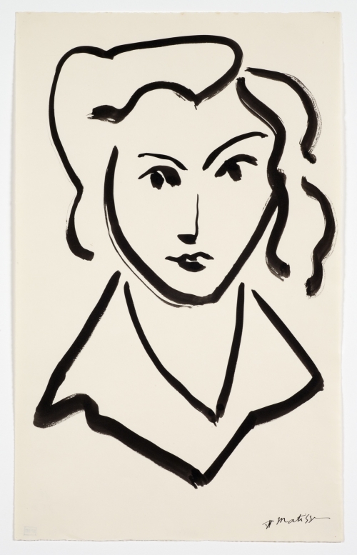
Henri Matisse, Drawing, Head of Woman, 1945

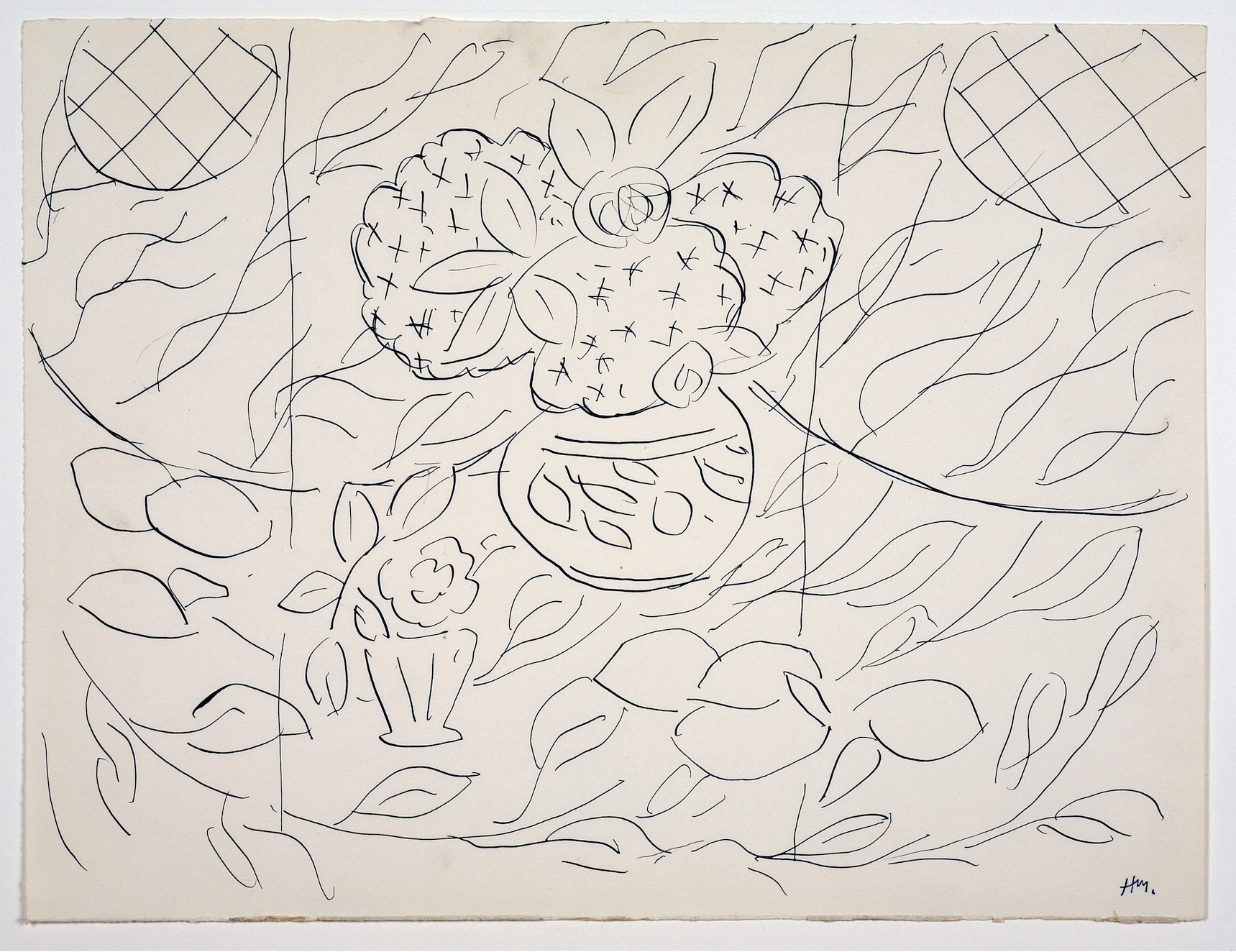
Matisse was a magician of open form. The feeling of completeness, along with the lack of fussy detail, gets more astonishing with each passing drawing. The graceful bend of a plant stem, the nuanced tilt of a woman’s head, the fleeting glance of the artist himself peering around his drawing board in a self-portrait, are conveyed with a mind-bending economy of marks. Matisse’s marks contain multitudes. The shift from point to edge of drawing tool in one sweeping contour imply light, shadow, movement and space with such apparent effortlessness that one is first skeptical, then seduced, then transcended in following it along the curve of a cheek or the plume on a hat. This strikes the deepest in Matisse’s studies of shoulders and arms- as simply as they’re drawn, they distill the formal heart of the Odalisque in bent, foreshortened elbows as hands reach up to tousle hair, the sensuous weight of a torso rests on crossed forearms. There’s a purity to these drawings that somehow transcends Orientalism in way’s Matisse’s predecessors and contemporaries did not- they’re about life, movement and muscle, the glorious freedom of the sensuous body.

Henri Matisse, Drawing, Sketch for Lemons & Mimosas, 1944

Ellsworth Kelly, as curator, positioned his own works adjacent to Matisse’s, not mingling with them- a nice gesture of deference to a master, as well as a sly, unique lens for perspective. According to the exhibition’s press release, the viewer is meant to see Kelly’s lithographs first, and then approach Matisse as if through Kelly’s eyes. I went in the opposite way, washing up to Kelly’s lithographs dazzled by Matisse. The two artists complement each other like a tall glass of water after a shot of bourbon. As Kelly points out in the above-mentioned interview, his forms are closed- sparing in detail like Matisse, but quieter, humbler, more about shape than movement. They are, in their way, as beautiful as Matisse’s drawings- scaled and composed masterfully, describing plants found in the French countryside with a graceful observance not readily apparent in his more famous paintings. The major difference is that Kelly’s minimalism seems wrought from disciplined restraint, while Matisse’s economy of line erupts, magically, from abandon and delight.

Henri Matisse, Drawing, Large Head, 1949

Matisse Drawings- Curated by Ellsworth Kelly is on view at the University of Michigan Museum of Art November 18, 2017, through February 18, 2018.

UofM Museum of Art

Virginia Rose Torrence @ Trinosophes Gallery

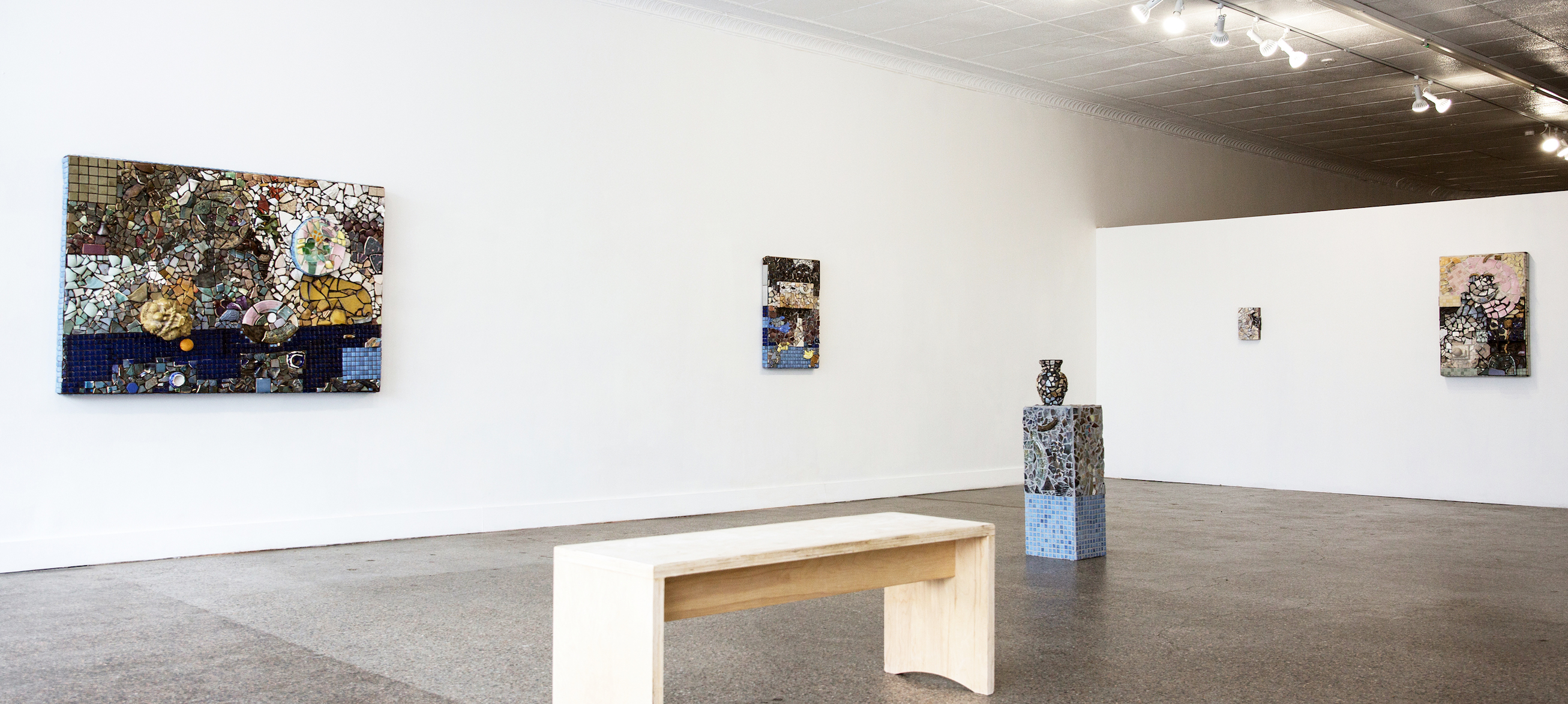
Virginia Rose Torrence, Ceramic, Installation image courtesy of Ali Lapetina.

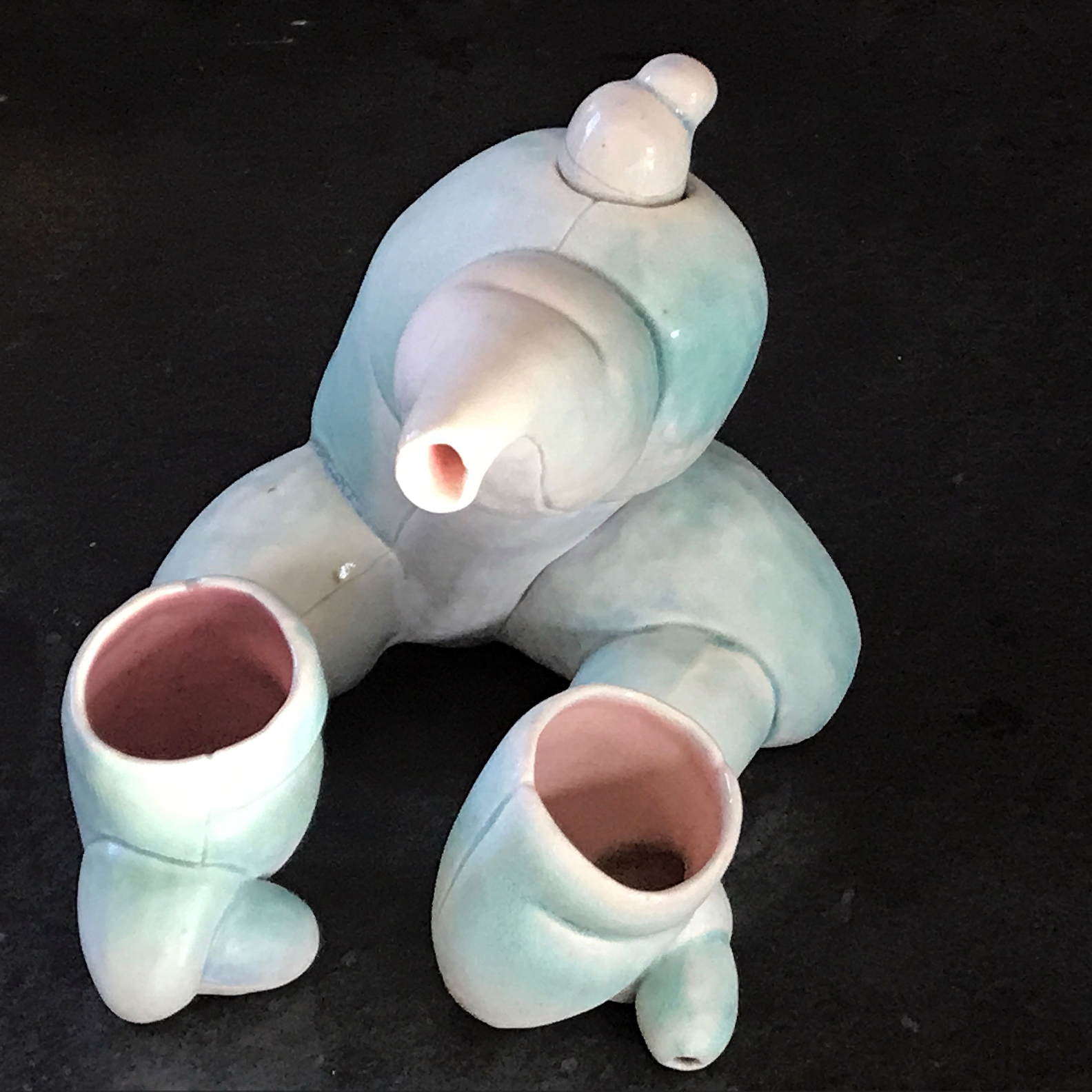
Wandering through Professor Tom Phardel’s department studio at the College for Creative Studies several years ago, I noticed an enigmatic shaped tea set— two small cups and tea pot—sitting on a shelf waiting to be fired in the kiln, that could as well have been made by an artist from the early 20th century. Seductive, biomorphic shapes bulging with curves and openings, lip-shaped edges, and resting in feline-like posture, it was nevertheless restrained, unassuming and, quite simple and strangely beautiful. A few weeks later at the annual CCS student show, I discovered it once again on a display shelf, but now it had a slightly glistening, pinkish, and minty skin like pigmentation; they were now complete and transcendent.

Virginia Rose Torrence, “Untitled (teapot),” 6”x6”x7,” ceramic, 2011  Archive photo.

I only mention these earlier works of Virginia Torrence because of the radical change in the new work exhibiting at Trinosophes Gallery in the market area of Detroit. Since her precocious student work, Torrence has shifted perspectives. Moving from celebrating the palpable and bodily in remarkable forms, the new work’s focus is on the act of assembling parts, to picture, in a painterly-like space, in mosaic, a collage of fragments. It was not just a case of a need for change of artistic strategy but it seems a philosophical and psychological relocation. The time-honored tradition of Detroit artists mining the local landscape for materials to make art seems to have grafted on to her new art process. With her husband, artist Henry Crissman, Torrence has become a tenant of the city, living in an iconic Hamtramck neighborhood and working in Cass Corridor gallery and like all the artists who have lived there before, scouring the landscape for pieces of history. Instead of a focus on an inward awareness and desire (in her writing she speaks of “desire” as the emotional engine that drives artists to make art) her perspective is from the center outward.

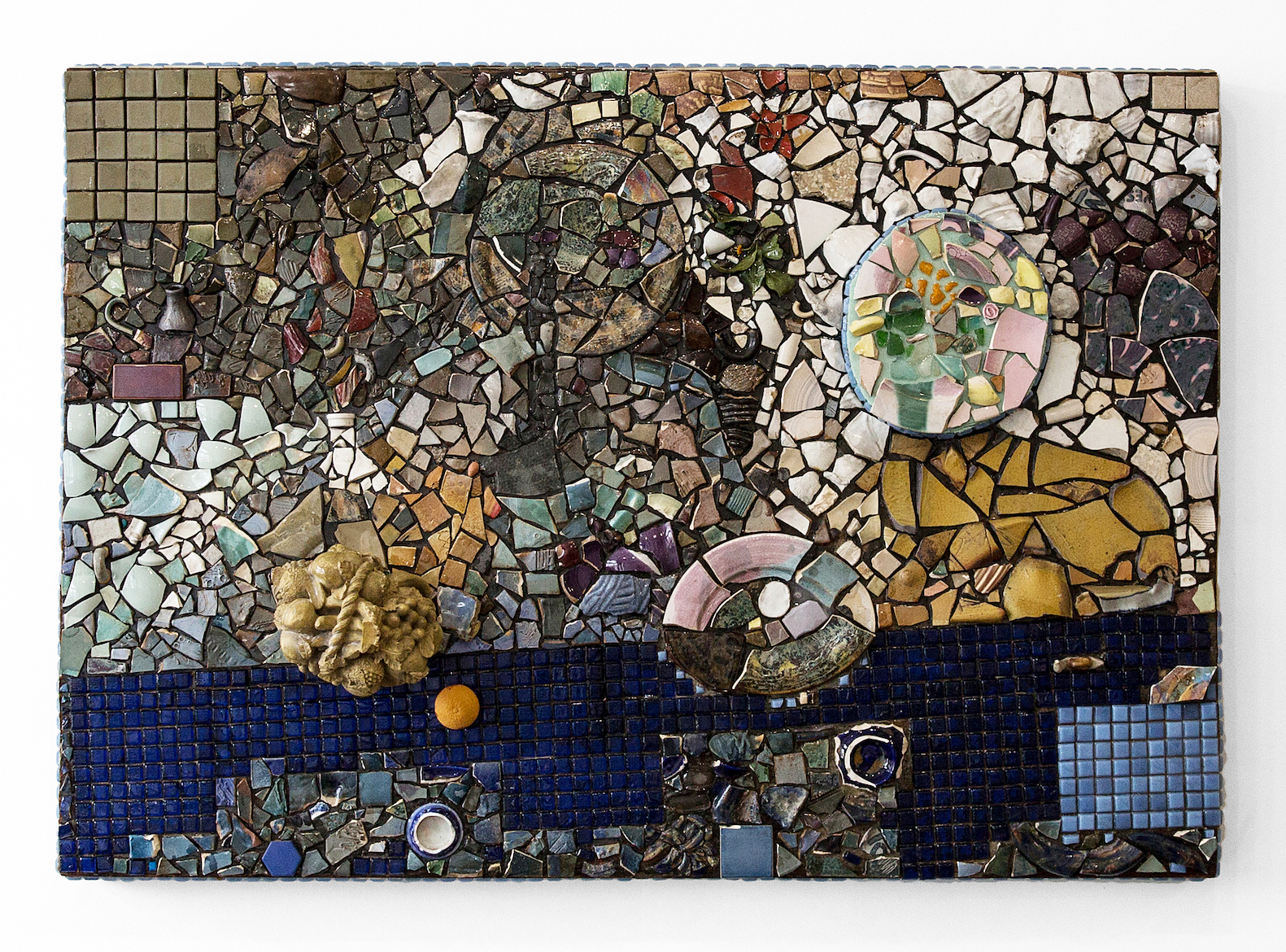
Virginia Rose Torrence, “Untitled,” 48”x69,” ceramics, glass, orange peel, foam, leaves, resin on wood, 2017. Image courtesy of Ali Lapetina

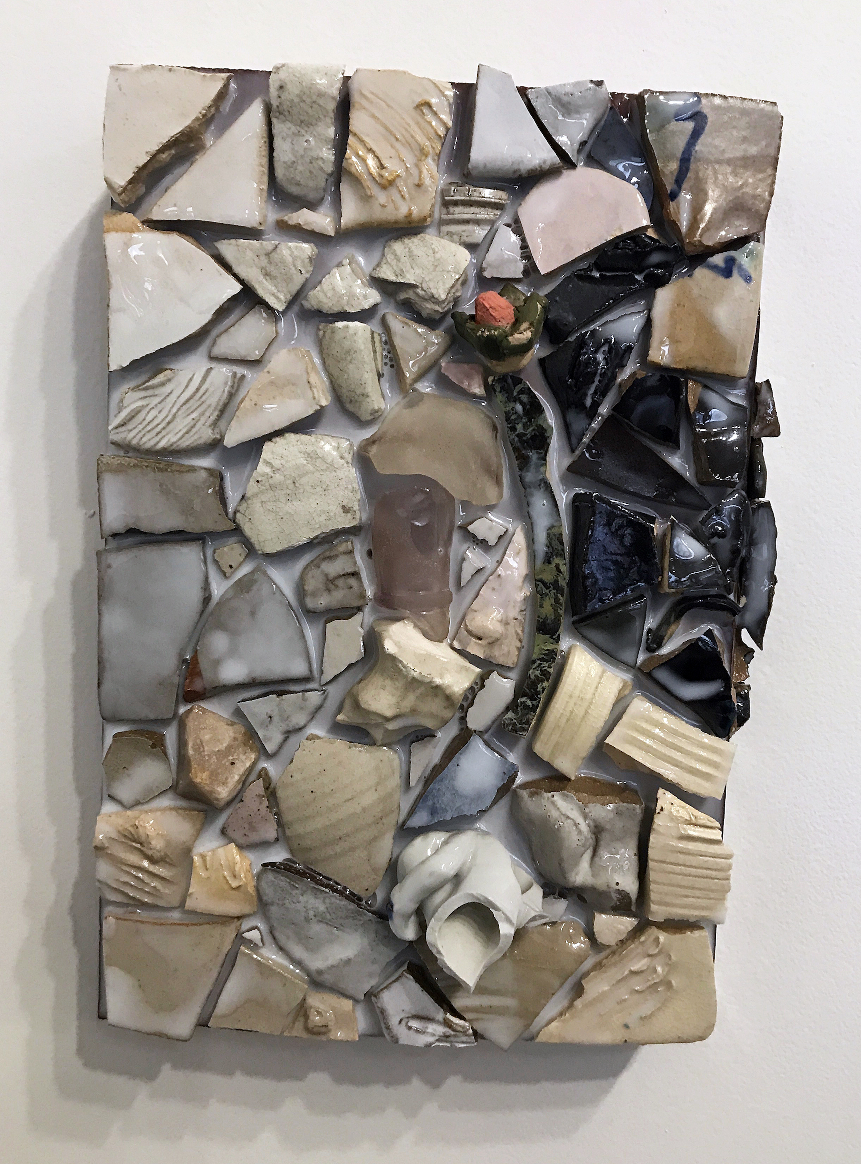
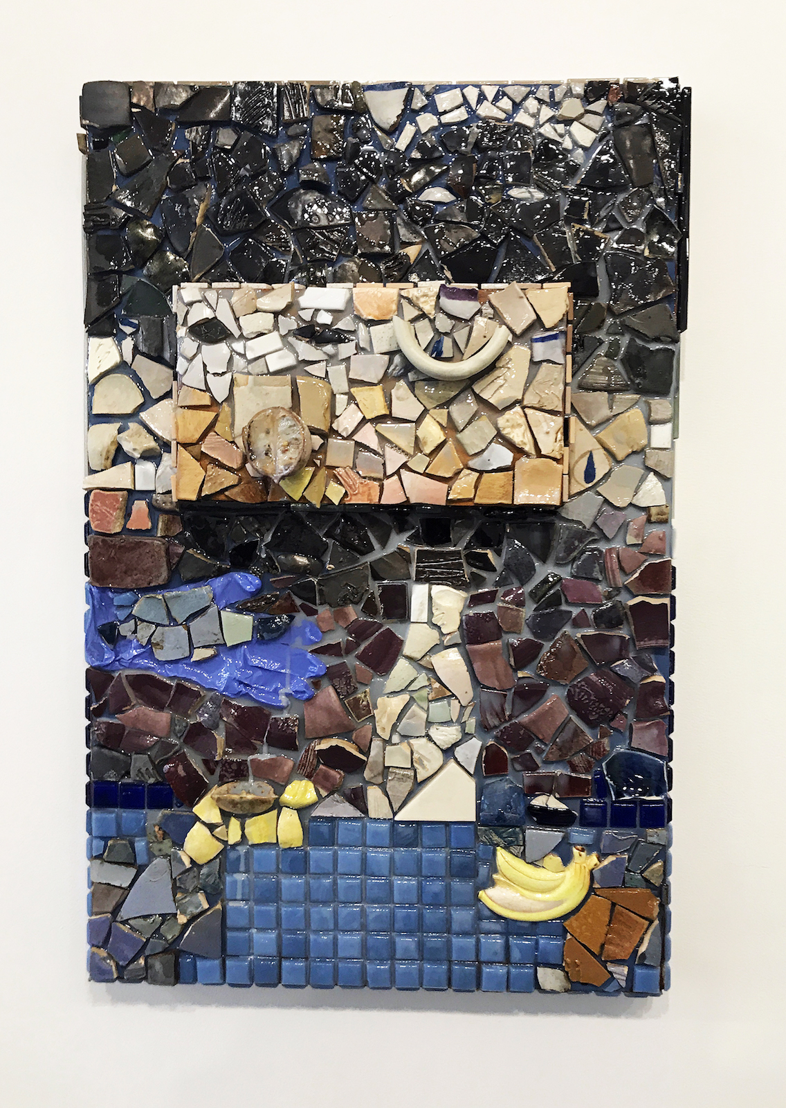
Assembled from gathered ceramic shards and kitschy objects from all over the place—from the shore of Detroit’s Belle Isle, to distant suburban thrift shops, Dollar stores and Craig’s list and remnant shards from other artist’s studios—Torrence has embedded the city in her mosaics. And like her biomorphic tea set her mosaics exhibit a brilliant sensibility. Arranged in a less than a planned scenario, each mosaic suggests an intuitive series of gestures, not unlike the operation of an abstract expressionist painting, that suggest fragments of images and ideas, but not composed narratives. The eye behind the assemblage of shards is fascinating. At once like making a puzzle—finding which shard “fits” where—while composing the spaces between at the same time. It merits a long look, suggesting the honored life of byzantine religious mosaics while revealing the kitschy and derelict simultaneously: a discarded, periwinkle-blue latex glove, an exploding banana, a vase. Torrence’s is a charged poetic strategy.

One can find these “pictures” in the mosaics–references to eating, plastic and real fruit, like sections of an orange or banana, flowers and engaged figures and maybe even self-portraiture and still-lives, even to biblical stories (there’s even a serpent and pear in one mosaic) — but the overall impact of Torrence’s mosaics is celebratory. Each tesserae and object of the eight mosaics is embedded in either a plastic (resin) medium or cement-like grout. The use of plastic resin as a grout gives a glistening, “juicy” (to use Torrence’s word) sensuous vitality to the surface. The mosaics seem to be alive with an inner light and activity and, due to their impeccable positioning, each tesserae seems to vibrate like a molecule. A close-up of one mosaic suggests an ocean tide pool teeming with foamy life, or an erotic flower spreading its seeds.

Virginia Rose Torrence, “Untitled,” 11”x8,” ceramics, glass plastic, resin on wood, 2017. Archive image.

This change, from voluptuous, animal forms to flat, chance driven arrangements, is similar to the shift in the work of the great French-German artist Jean Arp who went from sculpted torsos early in the century, to colorful, flat abstract amoebic shapes by midcentury. In Torrence’s shift, and it seems in Arp’s as well, it is a change from the individual, body-personal to the collective, body-politic, from the sensuousness of smooth sculptural forms to the tantalizing arrangements of objects found in her new space and arranged by the energy of one shape encountering the Other, of Torrence encountering new elements in a new landscape. In a short text about the new work, Torrence said, “I am searching for the piece as I make it. The process is a collaboration between myself and the materials, vestiges of time, that I am piecing together onto a singular plane.” The hybrid mosaic form and expressionistic strategy she employs is an ideal fit in reviving an ancient art for a modern cause.

Virginia Rose Torrence,”Untitled,” 33”x22,” ceramics,glass,rubber glove, lemon, resin on wood, 2017. Archive image.

Trinosophes Gallery – Virginia Rose Torrence’s work through end of January, 2018

1464 Gratiot Avenue, Detroit, MI. 48207     313-737-6606

Basquiat @ Cranbrook Art Museum

BASQUIAT BEFORE BASQUIAT: East 12th Street, 1979-1980

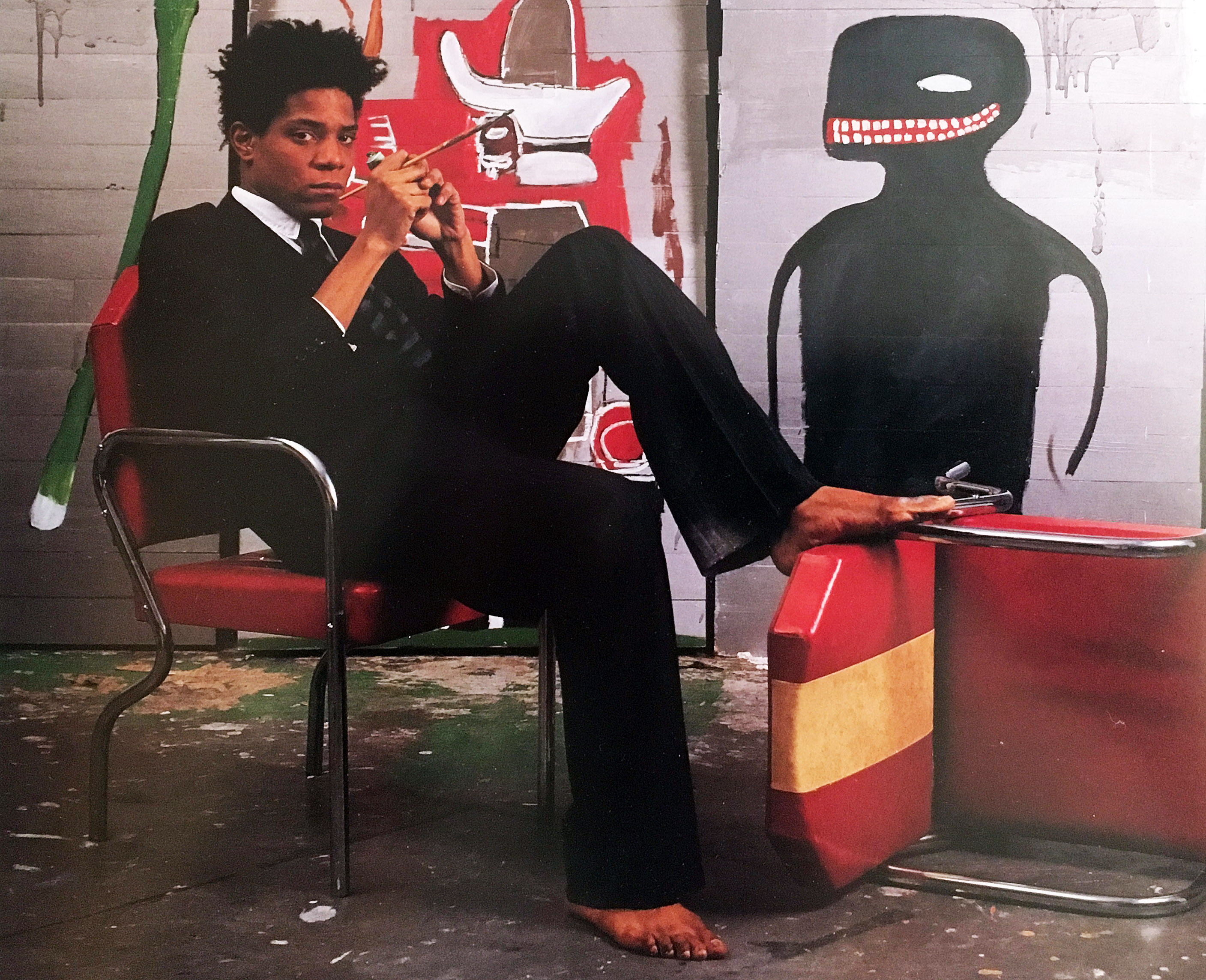
Jean-Michael Basquiat at Great Jones Studio, 1985

In the spring of 1971 when I had just graduated from Wayne State University with an M.A. in painting, I was making surreal landscape paintings. I had not heard of Jean-Michel Basquiat, of course, because he was only ten years old and attending St. Ann’s Catholic school in New York City. Soon after that he was bound for San Juan, Puerto Rico with his father and family for three years, before returning to Brooklyn and finishing high school.

And it wasn’t until the late 1990s when my son Julian Teachworth was finishing his senior year at The Cooper Union in NYC that he told me Basquiat’s work had influenced his painting. It was only then that I became familiar with his work, and that was ten years after his tragic death from a heroin overdose at the age of twenty-seven in 1988.

Andrew Blauvelt, Director of the Cranbrook Art Museum, said, “The exhibition and accompanying catalogue presents New York City in the late 1970s and early 1980s through the prism of Jean-Michel Basquiat’s art and provides a window into the art-rich time that he inhabited and impacted so profoundly. Ultimately, this exhibition will attest to Basquiat’s virtuosity in formation–the creative impulses that yielded a distinctive voice, but also the many diversions or paths he explored as he was developing a signature style.”

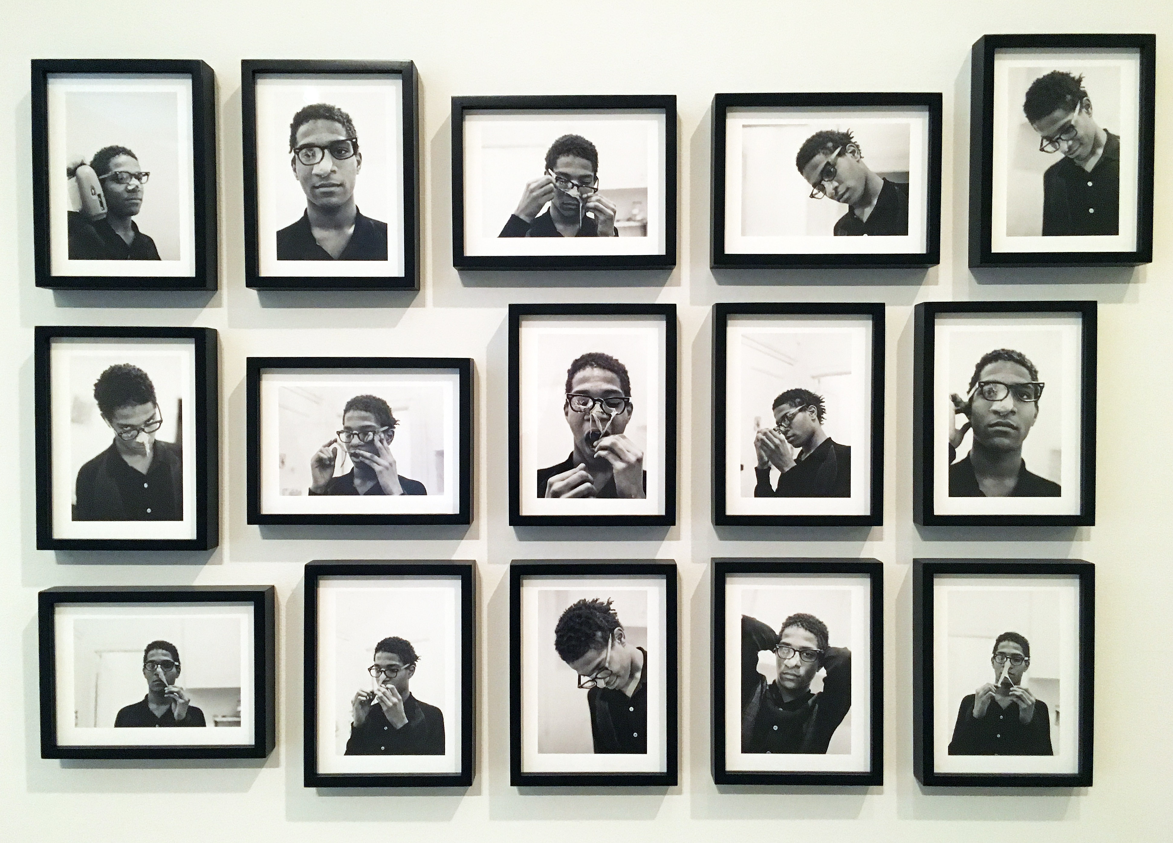
Alexis Adler, B&W photographic images of Basquiat performing in the apartment, 1979

Jean-Michel Basquiat first appeared in New York City in 1980 depicting street graffiti using neat block letters and his SAMO© tags on the surrounding streets of lower Manhattan. It was these early years when Basquiat started dating Alexis Adler and living with a close friend, Felice Ralster, that is the subject for this new exhibition at Cranbrook Art Museum: BASQUIAT BEFORE BASQUIAT: East 12th Street, 1979-1980 that opened November 17, 2017. Basquiat and Adler moved into a small apartment at 527 East 12 Street, commonly referred to as the East Village, and became part of the punk culture largely based around musicians and artists at the Mudd Club scene.

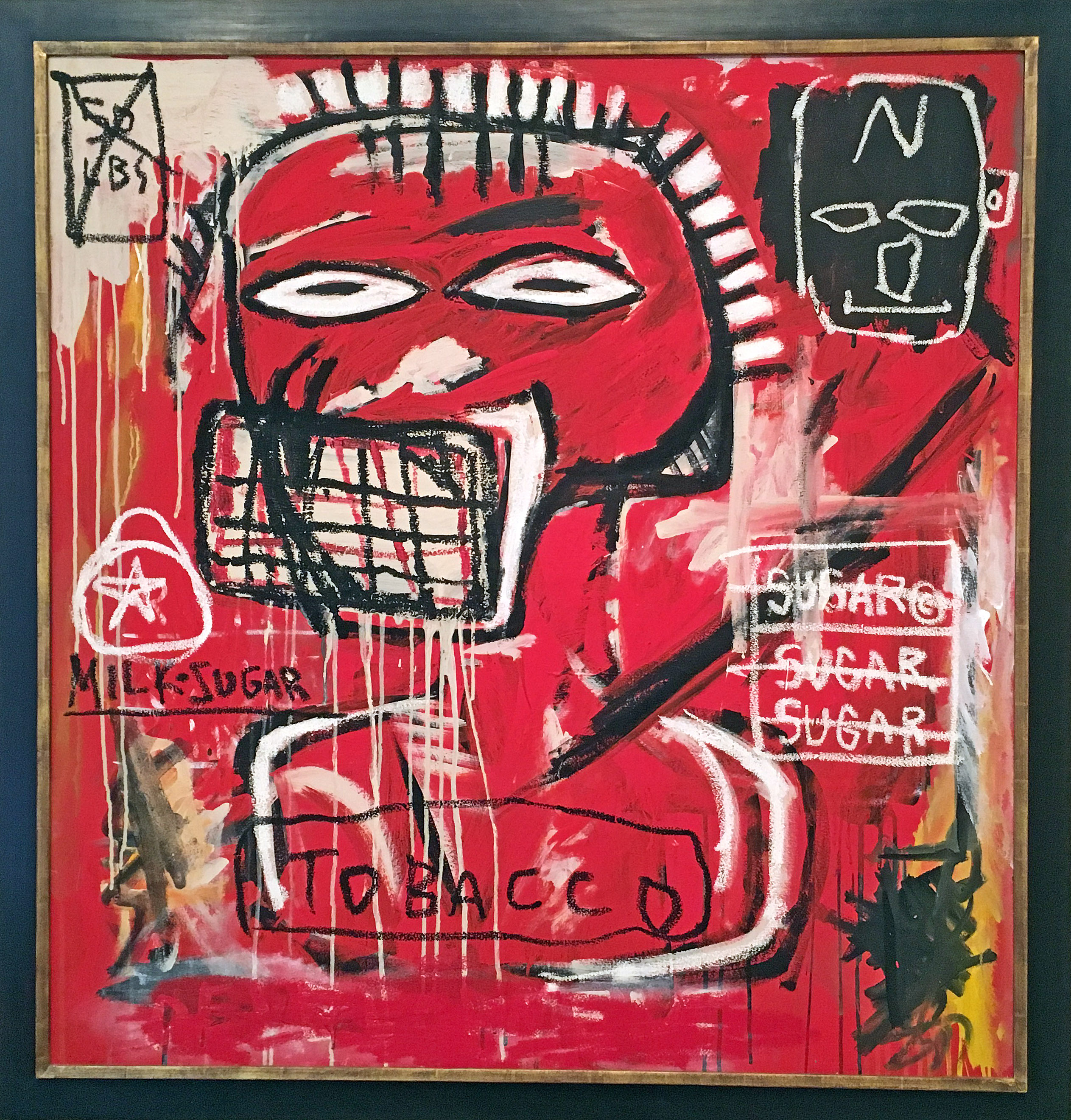
Jean-Michel Basquiat, Untitled, Acrylic and Oil Stick on canvas. 1984

It was at P.S. 1 in a group survey show, New York / New Wave where his work was a step above graffiti street art, as illustrated by his ability for putting things together: masks, words, marks and disconnected phrases. The exhibition included Keith Haring, Robert Maplethorpe, and Andy Warhol. The day after the opening he returned home to Brooklyn around 6:00 in the morning to proclaim to his father, “Papa, I’ve made it!”

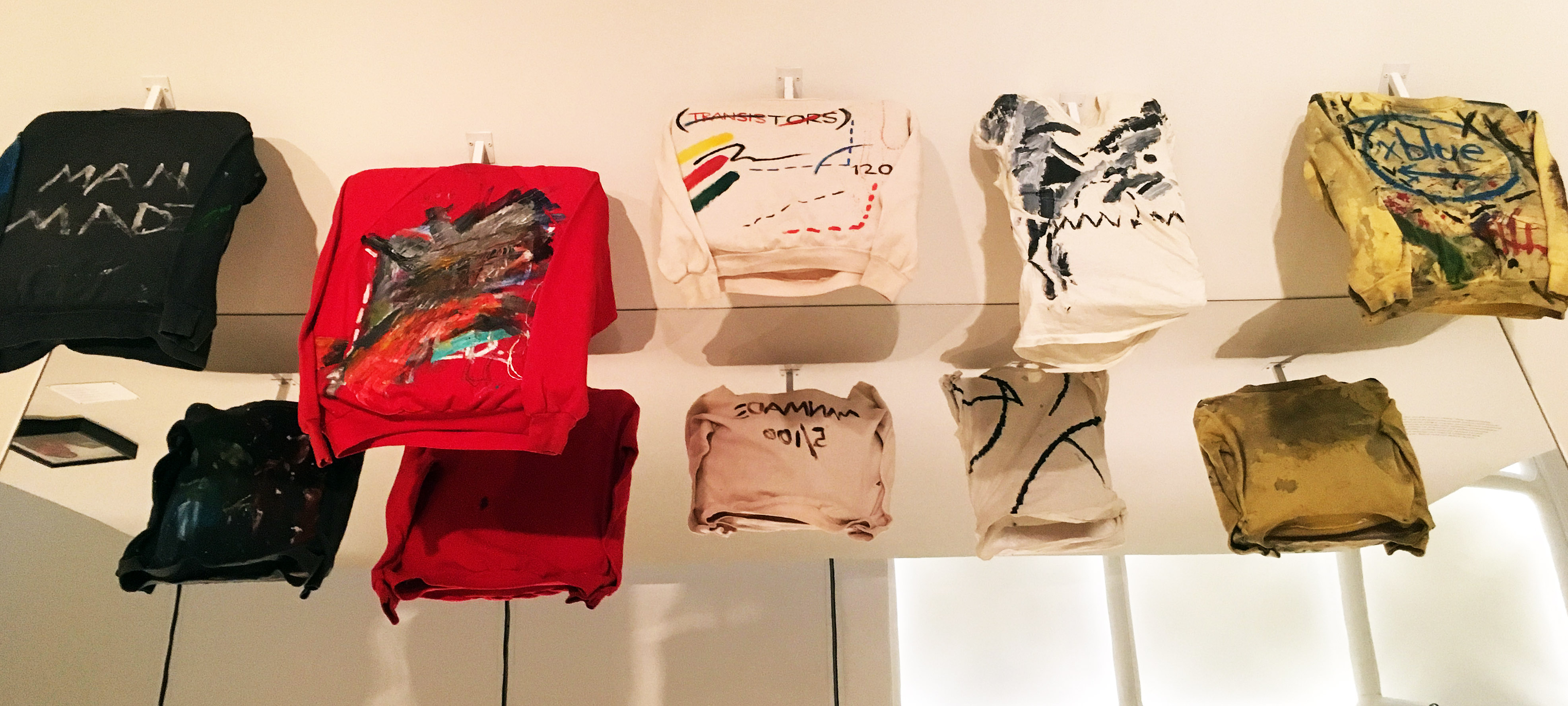
Basquiat made money for paint and his share of the rent by selling T-Shirts on the street. 1979

Basquiat’s riff with his father and his association with Keith Haring and Kenny Scharf, led him to Club 57 and a strong and close relationship with who would become his mentor, Andy Warhol. Back then, Basquiat made his living by selling clothing on the street. On display at the Cranbrook exhibition are T-Shirts he transformed into living works of art to be worn and celebrated as part of his artistic practice.

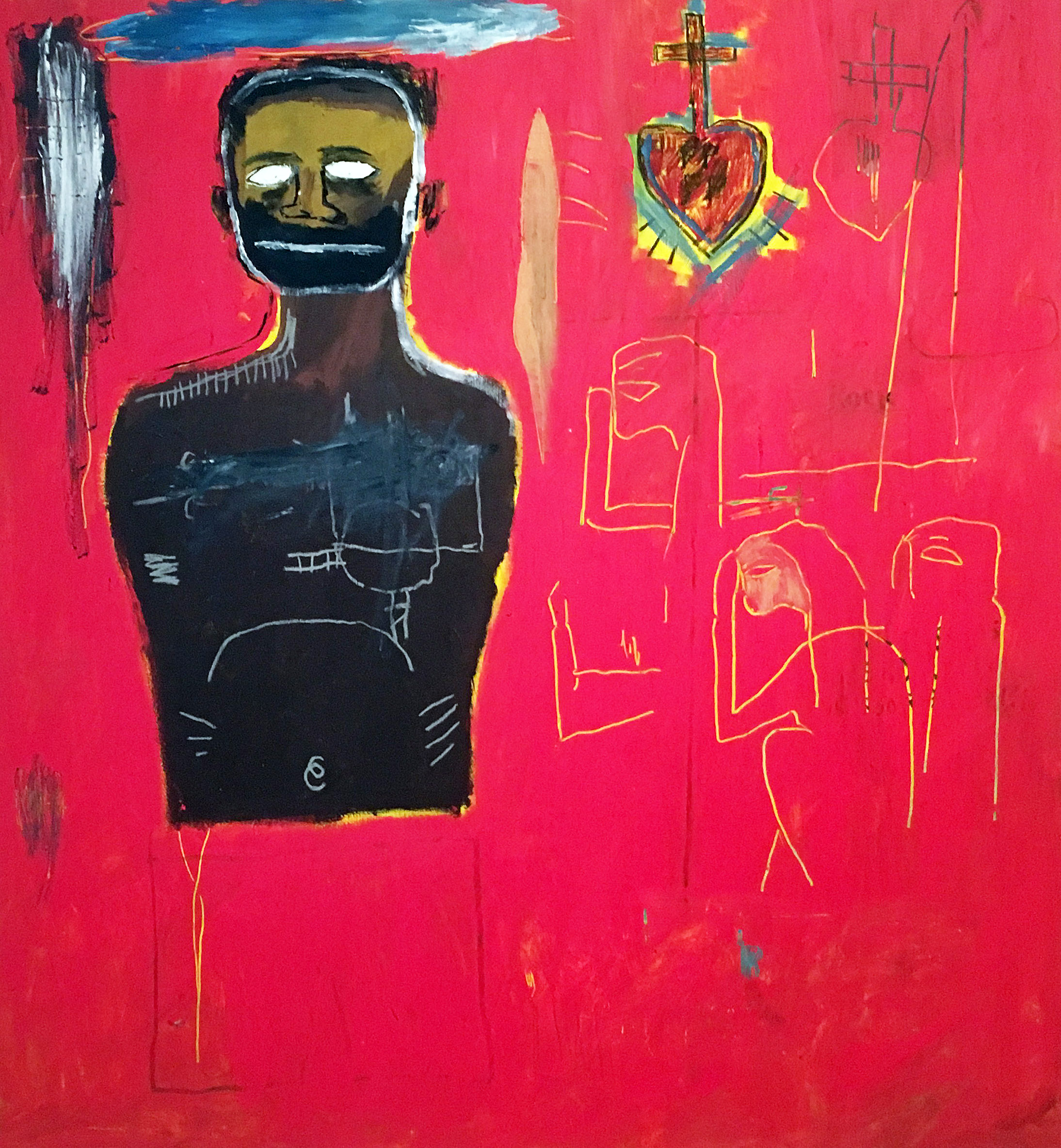
Jean-Michel Basquiat, Untitled (Cadmium) Oil, oil stick, acrylic on canvas 1984

Looking back, I think we see Jean-Michel Basquiat as an artist who emerged from being a graffiti artist during the “punk scene” era, and then ended up as a celebrated artistic phenomenon. Skillfully, he brought together disparate traditions, practices and unconventional styles that established a baseline for artists to come. He was an African-Caribbean artist, who came along at a time when the art world was dominated by exhibitions of Minimal and Conceptual art.

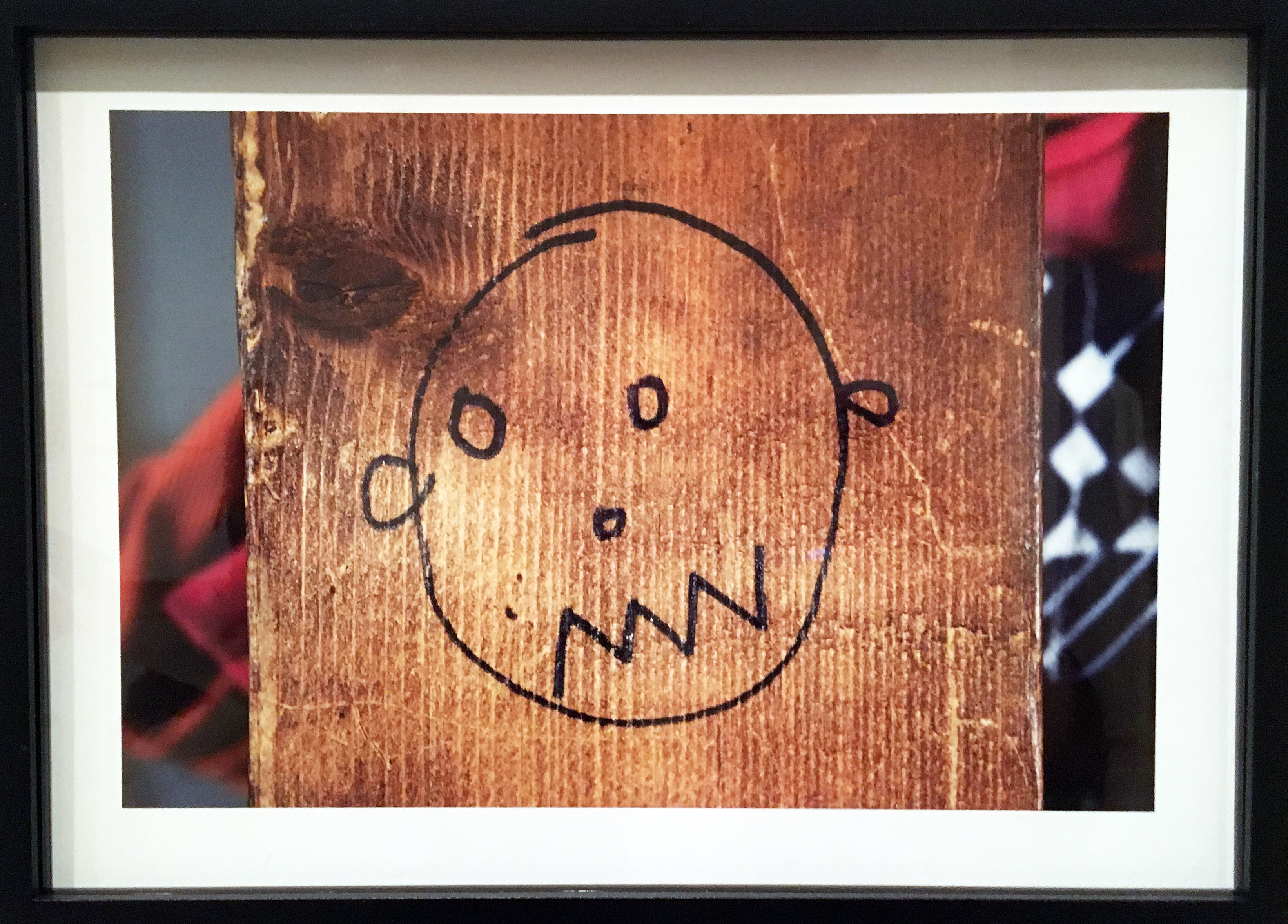
Alexis Adler, Drawing by Basquiat on wall of apartment, Archival pigment print, 1980

Using an archival approach, much of this exhibition comes from the collection of Alexis Adler, and a visit to the exhibition Basquiat Before Basquiat deepens your understanding of this artist while simultaneously providing the viewer with a context of his early work in 1980s New York City. Concurrently, the museum is hosting exhibitions by Keith Haring, Maya Stovall and Ryan McGinness.

Alexis Adler, B&W photograph of Baquiat in the apartment, 1981

BASQUIAT BEFORE BASQUIAT: East 12th Street, 1979-1980, organized by the Museum of Contemporary Art Denver.

Cranbrook Art Museum

Through March 11, 2018


Powered by WordPress & Theme by Anders Norén