Critical art reviews of Detroit galleries and museums weekly

Category: Assemblage / Collage Page 7 of 9

David Opdyke @ The University of Michigan Institute for the Humanities

Paved With Good Intentions

For Queens-based artist David Opdyke, the manipulation of scale as a means to transform great existential threats posed by the ceaseless appetites of late capitalism conjoined with the convulsions of American politics, into something more relatable–models that collapse overwhelming chaos into tragicomic vignettes–is an essential tool to remind his audience of its place in a complex narrative of global survival. In sculpture, installation, animation and drawing, Opdyke relies upon our innate sense of childlike wonder at a miniaturized world as it transforms the relationship we have with our own full scale world, teetering on the edge of collapse and brimming with grown-up trauma. With a vision that is both epic and intimate, balancing the sublime with the grotesque, he threads the marvelousness of the microcosmic with macrocosmic socio-political concerns. Having previously worked as a scenic painter and architectural model-maker for 20 years, tweaking perception to clarify the structure of the world seems a natural fit.

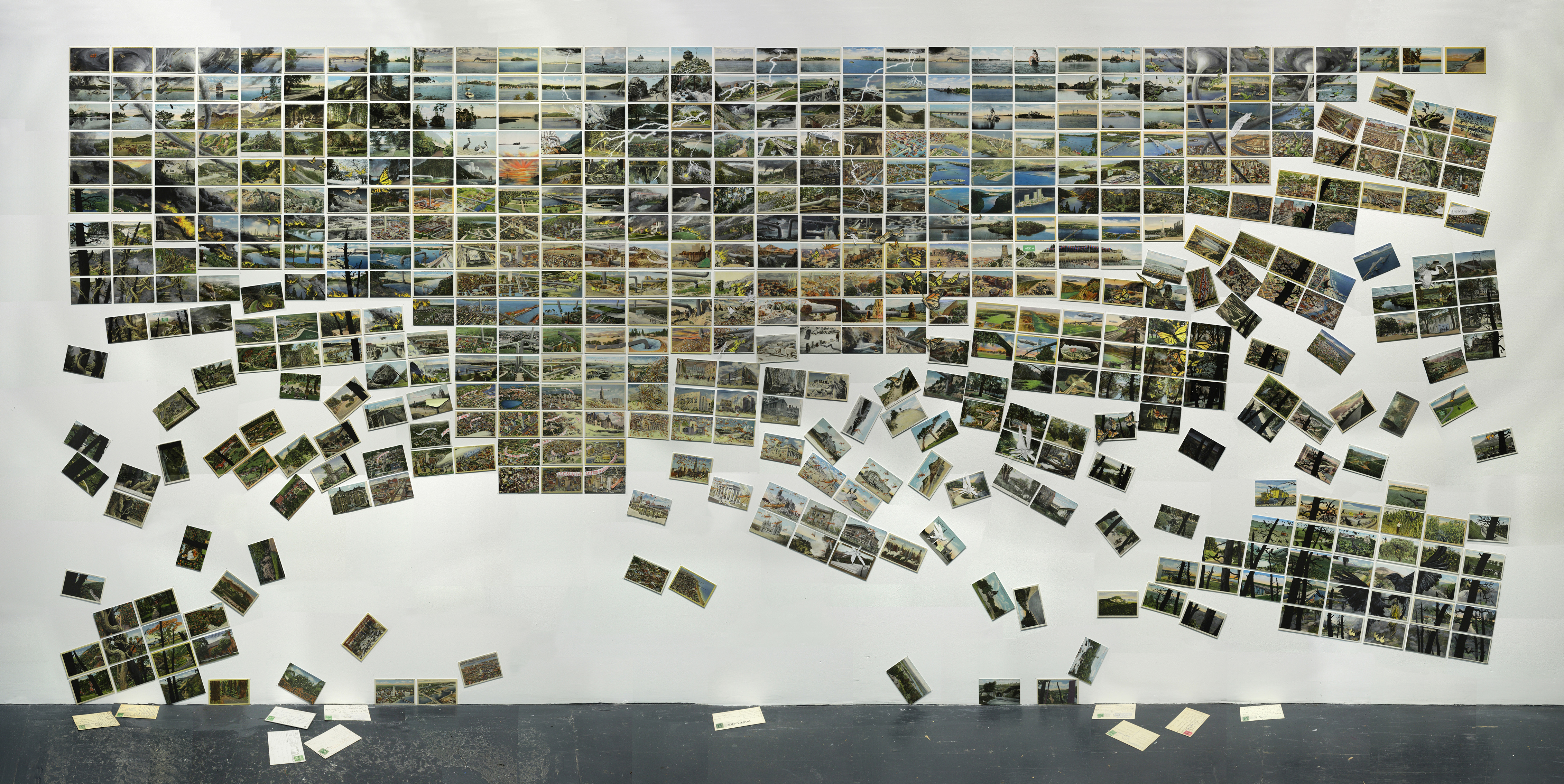
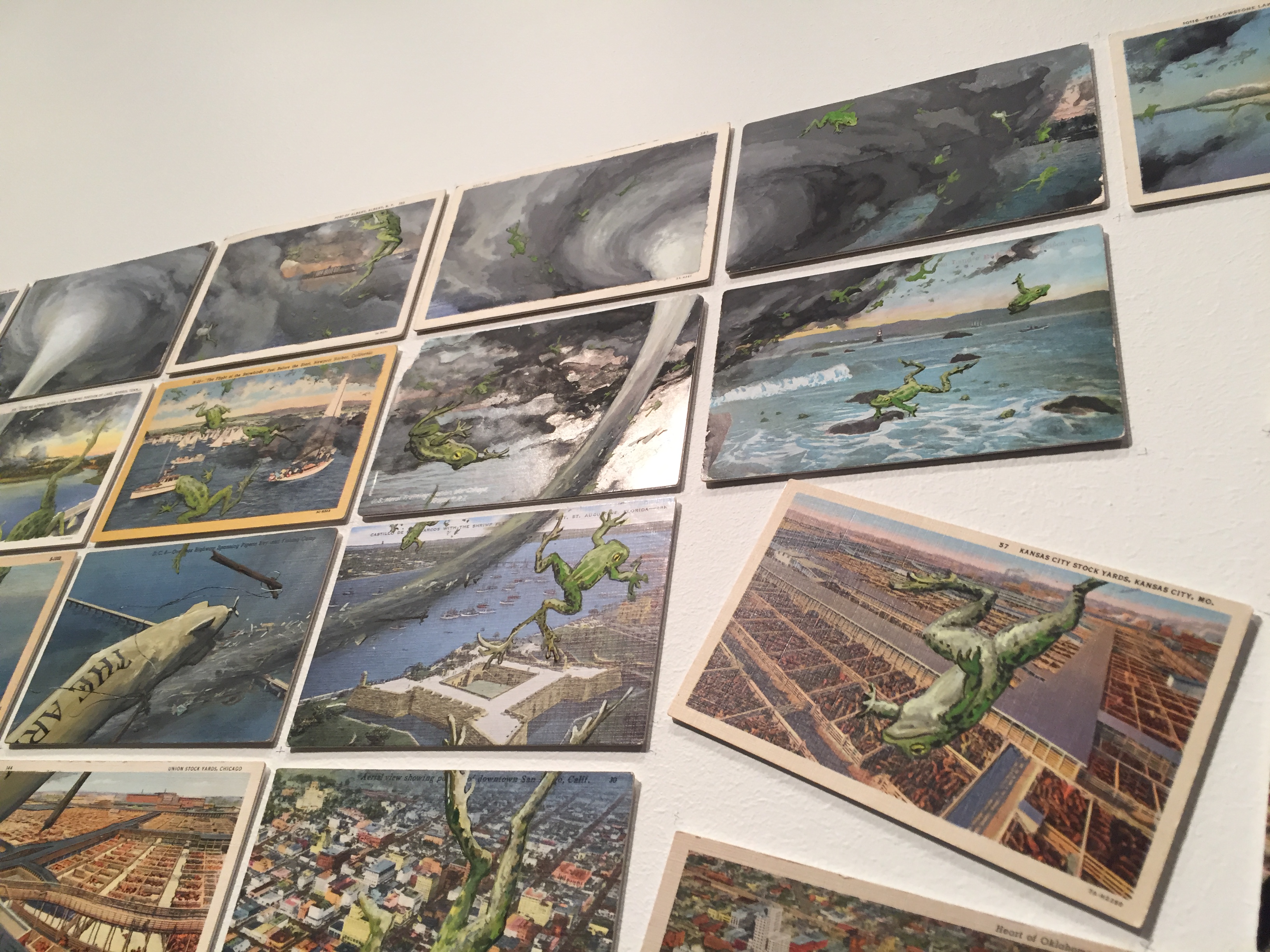
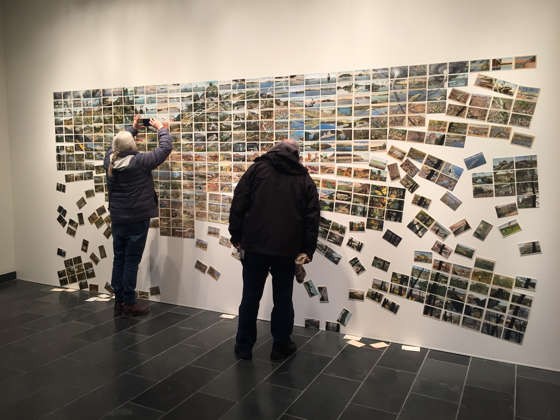
David Opdyke, “This Land” (2019), 528 vintage postcards modified with gouache and ink, full installation view

“David Opdyke: Paved With Good Intentions,” on view at The University of Michigan Institute for the Humanities in Ann Arbor, where Opdyke is the 2019 Efroymson Emerging Artist in Residence, presents a selection of eight works, including a collection of animated shorts, a two-channel video, and most notably an ambitious site-specific installation comprised of 528 postcards, titled “This Land” which gathers many of the artist’s preoccupations into a single monumental statement.

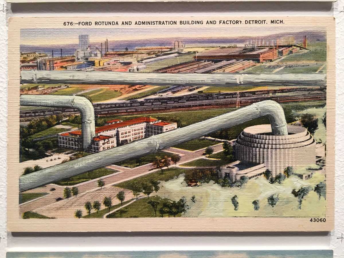
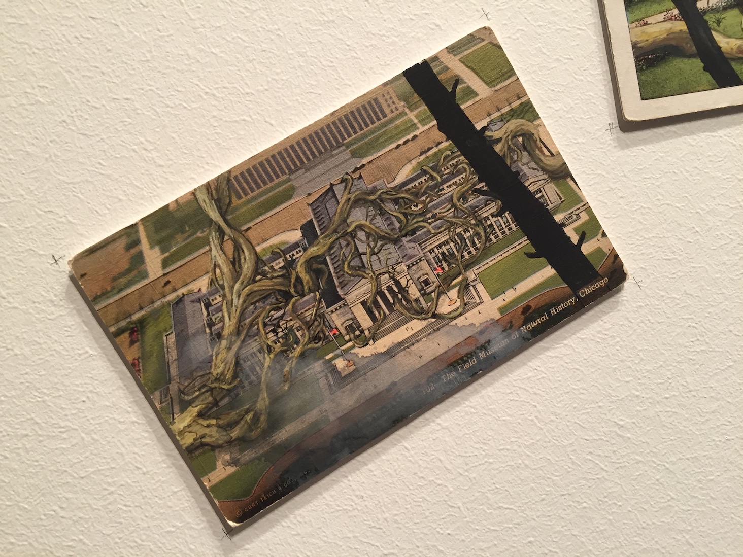
David Opdyke, “This Land” (2019), Detail of vintage postcard modified with gouache and ink

To start with one of the 528 postcards, at the top of which is a caption: “676: –FORD ROTUNDA AND ADMINISTRATION BUILDING AND FACTORY, DETROIT, MICH.” The card, from the mid-20thcentury was printed on a stock using a process that replicated the texture of linen. Its horizontal image appears at once photographic, but also painted, since it has been hand-tinted. Upon closer inspection, the character of its printednessemerges: the image breaks down into a fuzzy pattern, accentuated by transparent colors that bleed and overlap– a patch of grass seems to become a building and vice versa.

The subject of the card is a landscape containing the Ford Rotunda, a Streamline Moderne structure originally built for the 1934 “A Century of Progress International Exposition” World’s Fair in Chicago, to serve as a pavilion for the Ford Motor Company. It was later moved to Dearborn, Michigan on the outskirts of Detroit where it housed elaborate displays celebrating industrial progress, until it was destroyed in a fire in 1962.  Additionally, the original Ford Administration Building (destroyed in 1997) is shown, the River Rouge and in the distance Ford’s massive Rouge factory. All of this is seen from a bird’s eye view as a celebration of the way in which Ford transformed the landscape of Dearborn into an Industrial metropolis that promised a better future.

However, there is a hand-painted intervention within the image that is not quite right. There are large grey pipes horizontally slicing through the view; massive pipelines dwarfing the scale of the architecture in the postcard. A pipe slams into the Administration Building causing cracks in its limestone. A pipe penetrates the roof of the rotunda. There also appears to be a flood whose crashing waves are encroaching upon the Rotunda. Where are the pipes coming from? Where are they going? From where are the flood waters emerging?

The answers appear when perception is adjusted and one steps back and finds that this is a single postcard situated within a grid of 528 postcards, assembled as “This Land.” But as the sources of the pipelines and the flooding are revealed, many more questions emerge. Stepping even further back, the individual postcards coalesce into a view of the sublime. Remarkably, although each postcard is of a unique landscape in disparate US locations, Opdyke achieves the sort of geographic sleight-of-hand normally reserved for Hollywood cinema, in which far-flung locations are collapsed into a single unified setting. This single setting resembles a Hudson River School landscape, complete with mountains and valleys, snow-covered peaks, bodies of water, a blue sky. But before Woody Guthrie can be conjured, and his refrain of this land being made for you and me, the entire picture falls apart.

David Opdyke, “This Land” (2019), Detail of installation


David Opdyke, “This Land” (2019), Detail of installation

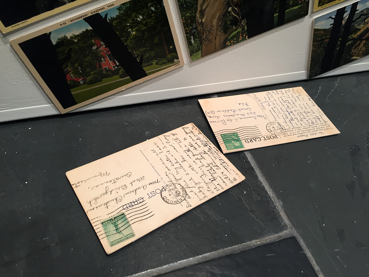
The grid of cards collapses as the panorama is fractured. Cards slide down the surface of the wall, with some having dropped to the floor. You can read the reverse of some of these, with the handwritten sentiments of marveling travelers frozen in time. With the breaking apart of the whole comes the need to reexamine each card closer. What was once sublime is now complicated as the mural begins to resemble Thomas Cole’s “The Course of Empire” (1833-1836),  a cycle of five paintings that charts the rise and fall of human civilization: “The Savage State”, “The Arcadian or Pastoral Phase”, “The Consummation of Empire”, “Destruction” and finally “Desolation.”

David Opdyke, “This Land” (2019), Detail of installation


David Opdyke, “This Land” (2019), Detail of installation

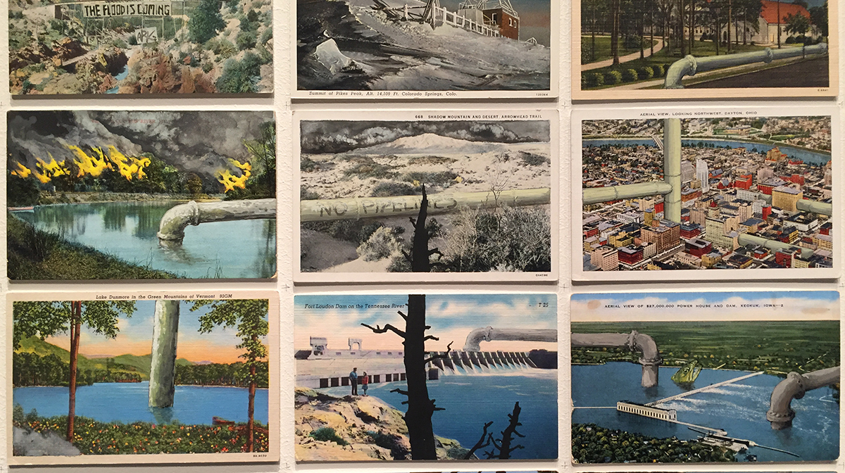
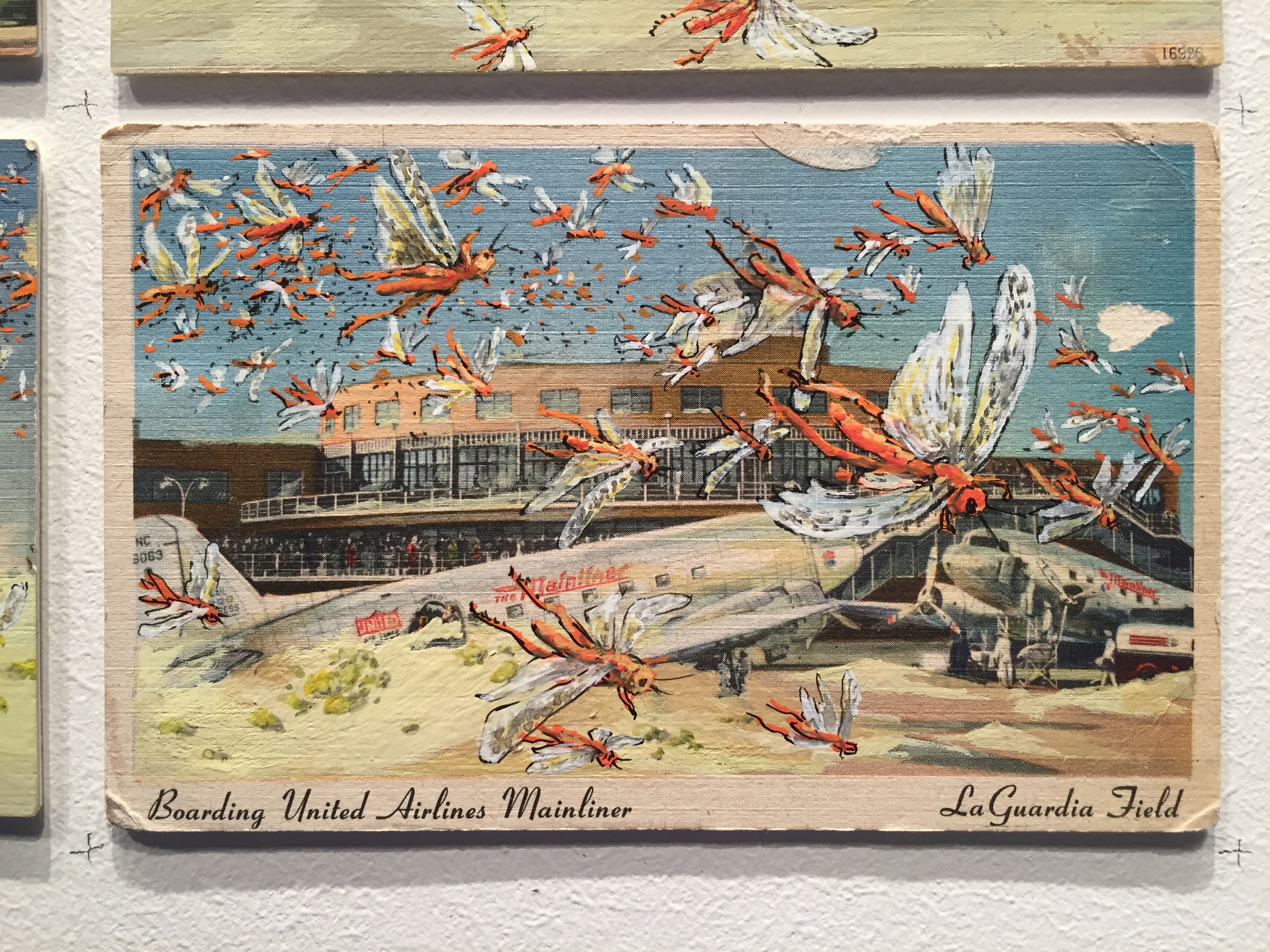
As with the ironic intervention seen in the depiction of the Ford Rotunda, ruin and destruction has been embellished upon most of the other postcards depicting an idealized American landscape. Aside from occasional moments of calm, on an almost biblical scale there is famine, flood, fire and pestilence. Dark grey maelstroms and tornado funnels abound, frogs rain down, locusts swarm, forests burn, crops freeze, and lightning bolts emerge from black clouds that conjure visions of the English Romantic painter John Martin (1789-1854). But this is no mere visitation by the Four Horsemen of the Apocalypse, as Opdyke reminds us that humanity is perfectly capable of delivering its own end times, daily.

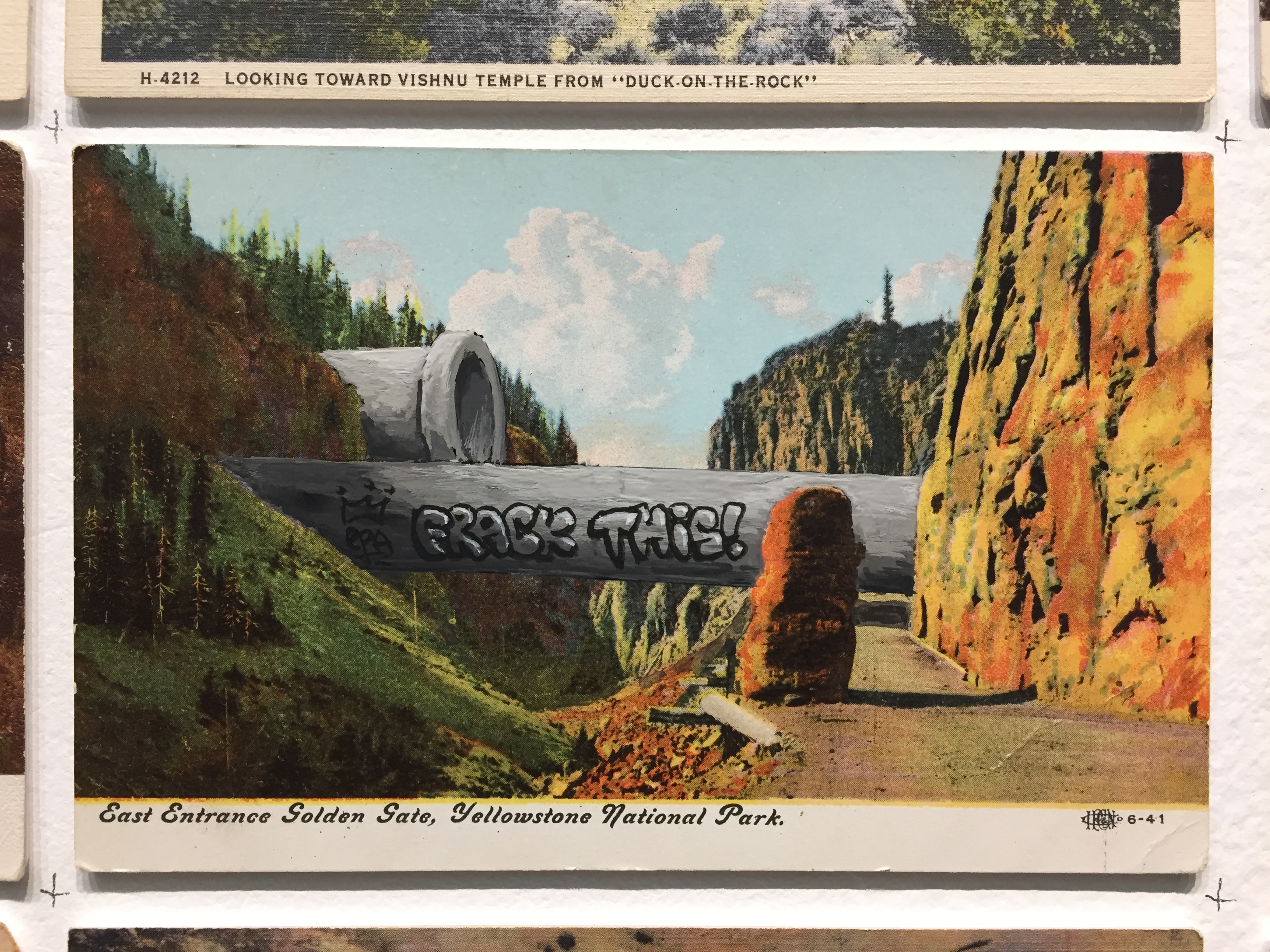
David Opdyke, “This Land” (2019), Detail of vintage postcard modified with gouache and ink

There is fracking and oil pumping and water diversion… endless pipes serve to carve up and bleed the dying landscape before us. What was once idealized in these postcards: industry, agriculture, transportation, glorious infrastructure projects advertised as the youthful ambitions of a country building itself by way of engineering the land, has soured. A dream of opportunity for constructing a utopia has morphed into the ruinous late capitalist agenda of monstrous development at any cost. Excessive waterfront high rises have been erected, massive walls are built, as human behavior results not in an organized response to tackle its own mistakes head-on, but instead leads to ineffectual political infighting and ever more chaos in the form of panic, cults, and tribal division.

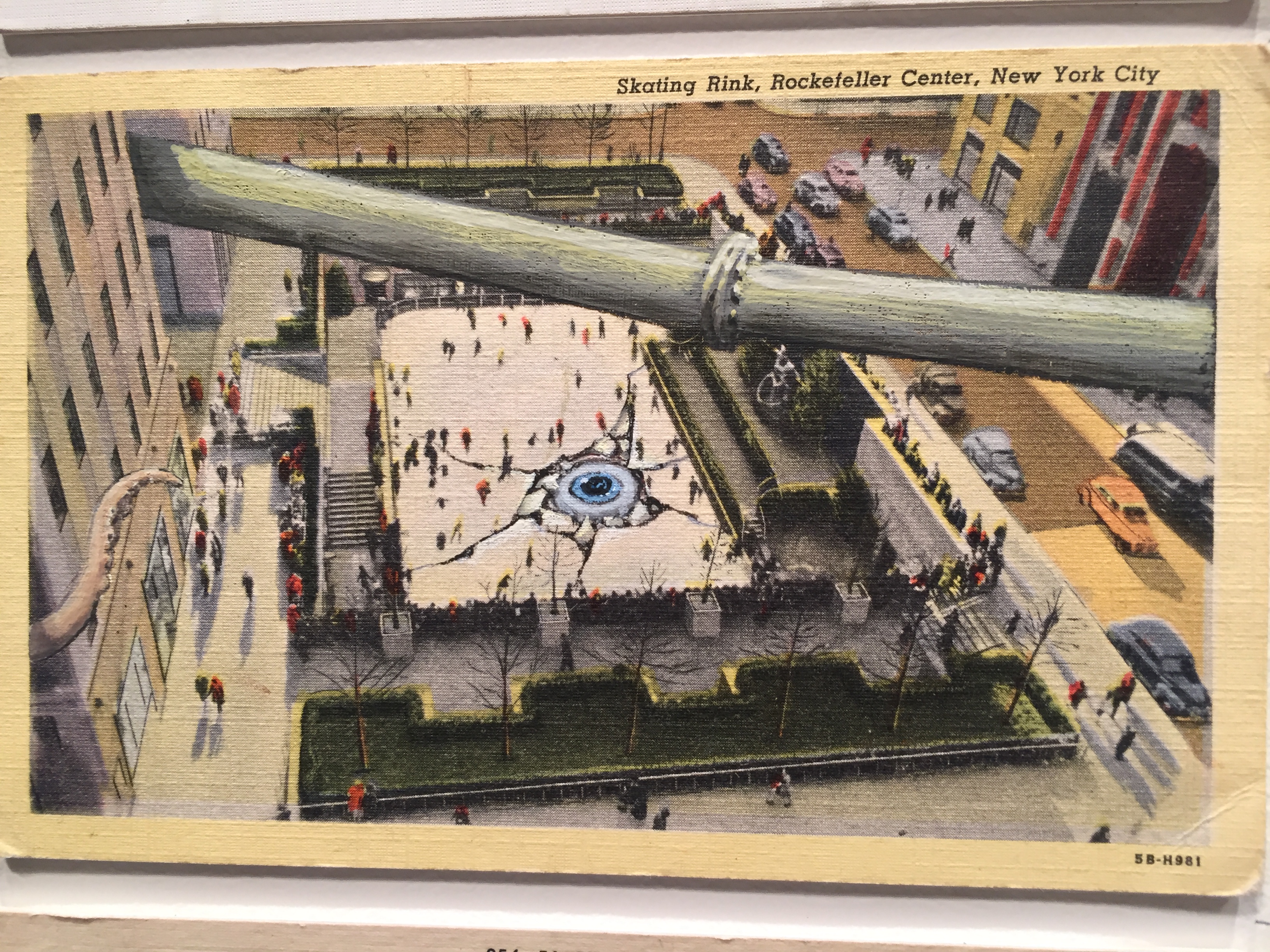
David Opdyke, “This Land” (2019), Detail of vintage postcard modified with gouache and ink

And then there are the B-Movie monsters populating this postcard landscape: giant insects, sea creatures and omnivorous plant life. Mutant spawns that could be the result of unchecked capitalism reengineering nature. B-movie horror and disaster scenarios have always been a stand-in for human irresponsibility and the monstrosities on display here are no exception. There a moments that seem to nod toward “It Came from Beneath the Sea” (1955) with a set of Ray Harryhausen tentacles overtaking a riverboat on the Mississippi. There are crumbling edifices and cataclysmic cracks  that could have been manufactured on a studio backlot for a film such as “Earth vs. the Flying Saucers” (1956). Roadways and bridges clogged with motorists attempting to escape certain doom recall the mass hysteria of Spielberg’s “War of the Worlds” (2005).

David Opdyke, “This Land” (2019), Detail of vintage postcard modified with gouache and ink

Opdyke is establishing an allegorical narrative of ironic critique by repurposing and rupturing romantic, idealized panoramas of the past. There is a kinship with contemporaries such as Walton Ford and Alexis Rockman, who both conflate scientific illustration and heroic history painting into large scale Quasi-Romantic works ironically embedded with destabilizing minutiae. Along with Ford and Rockman, these are images that compress past, present and future into a single tragicomic narrative. That Opdyke sets all of these hand-embellished catastrophes against the miniature hand-tinted backdrop of the vintage postcard as a contemporary gesture, makes perfect sense. These are souvenirs of place, and by extension of historical memory and the subsequent abandonment of the past. They represent an ideal once embraced and long-since discarded. The postcard was once a way to communicate “I’ve seen this. I was here.” It was a forerunner to Instagram as a means to place ourselves into the world and report back home as a way of confirming our feats of travel and locating ourselves within a larger narrative of collective experience.

David Opdyke, “This Land” (2019), installation view

Most of those who attended the opening of “Paved With Good Intentions,” crowded before “This Land” while taking iPhone photos of select views. Were they seeking out places they had been? Places where they were from? Documenting specific horrors that amused? Rarely did I see any of the viewers backing up to read the entire piece in its state of faux sublimity. All were pushed in, investigating at the closest possible viewing distance. Locating themselves in the details. Opdyke’s use of the postcard acts as a time machine for what has, is and will be seen. It is a way to implicate the viewer within the continuum of this catastrophic narrative in the Instagram era by way of asking us “You see this, don’t you?” Yes, we do.

David Opdyke @ The University of Michigan Institute for the Humanities  Through February 27, 2019


Larry Cressman @ K.Oss Contemporary Art

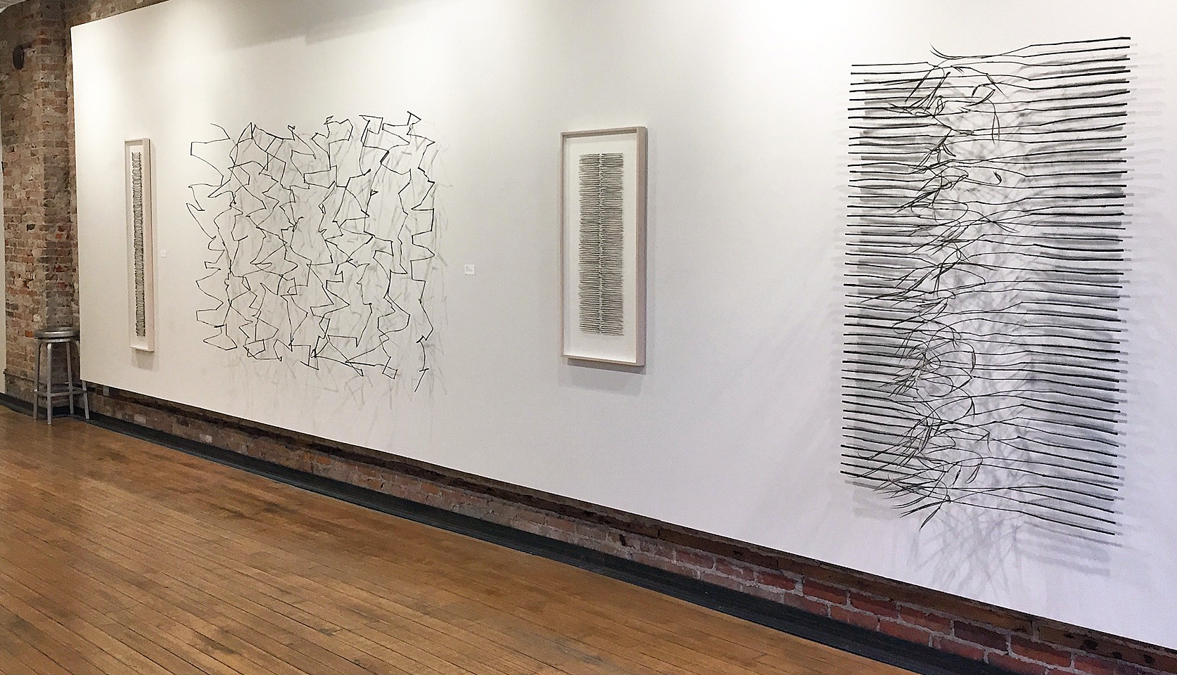
Larry Cressman, Installation, Fieldwork, All images courtesy of K.Oss gallery

Larry Cressman: Fieldwork Exhibition at K.Oss Contemporary Art

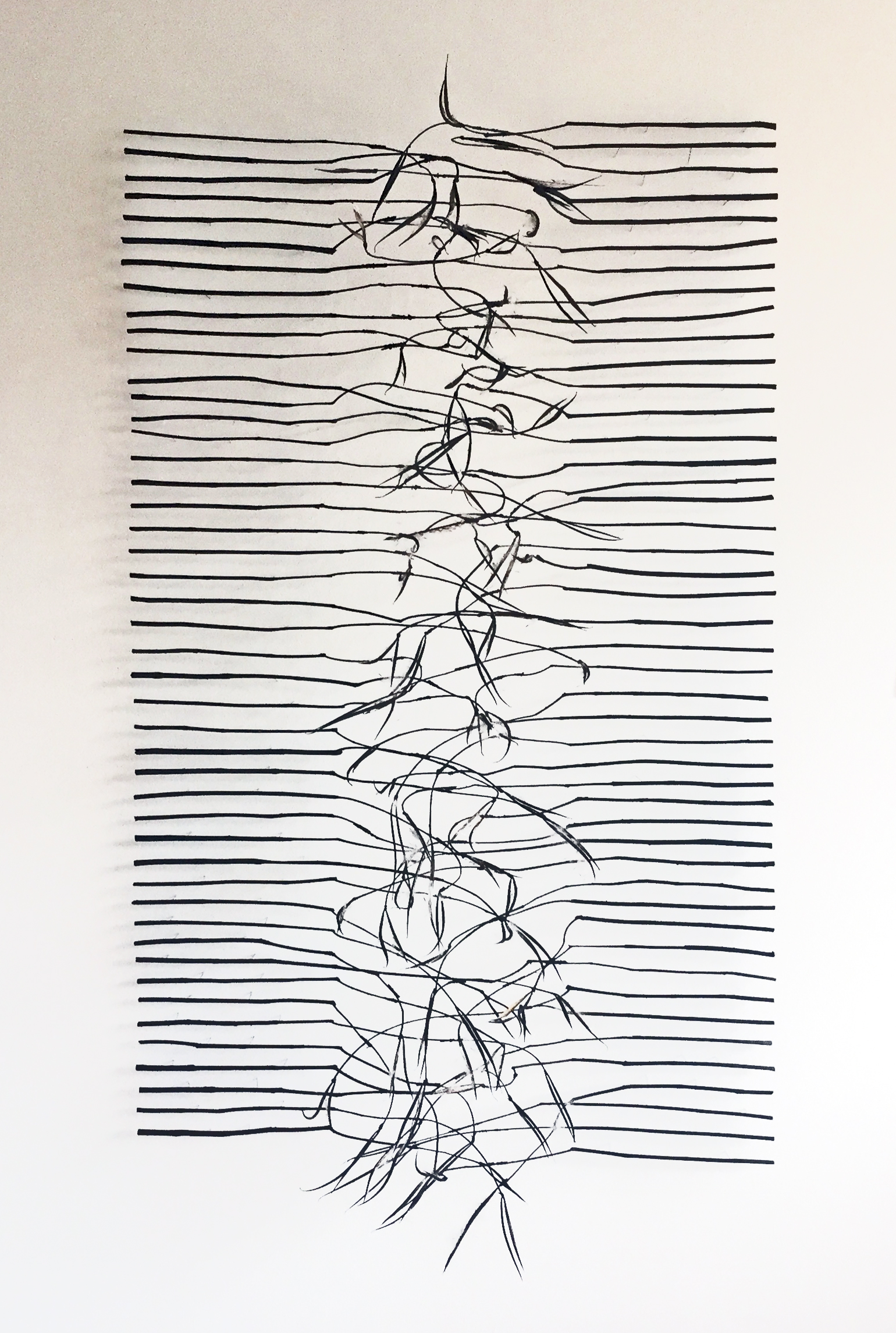
Like a straightforward black and white film liberated from the distractions of color and spectacle, the “Larry Cressman: Fieldwork” exhibition at K.Oss Contemporary Art, given its elemental hues, might have been titled “Black and White.” Upon entering the snug, spartan gallery, Cressman’s reductive, purified palette, content (“fieldwork”), and elemental format (rectangles abound) immediately cue visitors: striking displays lie ahead. Whether framed and portable or installational (bare branches hovering an inch or two in front of a wall), the dozen and a half compositions, essentially shallow reliefs, proffer a bevy of intricate, engaging configurations.

Birthed, as they are, from excursions into the fields near his home and studio, Cressman collects the raspberry cane, dogbane, and dried daylily stalks that initiate the process of gestation. Then, as the slender, fragile branches and twigs are joined one to another with nearly invisible wires, dusted with graphite, and mounted on the walls with thin, sturdy pins, his “linear landscapes” fill out and mature. As many as 200 or more conjoined branches may be necessary to scale up to an easel size armature.

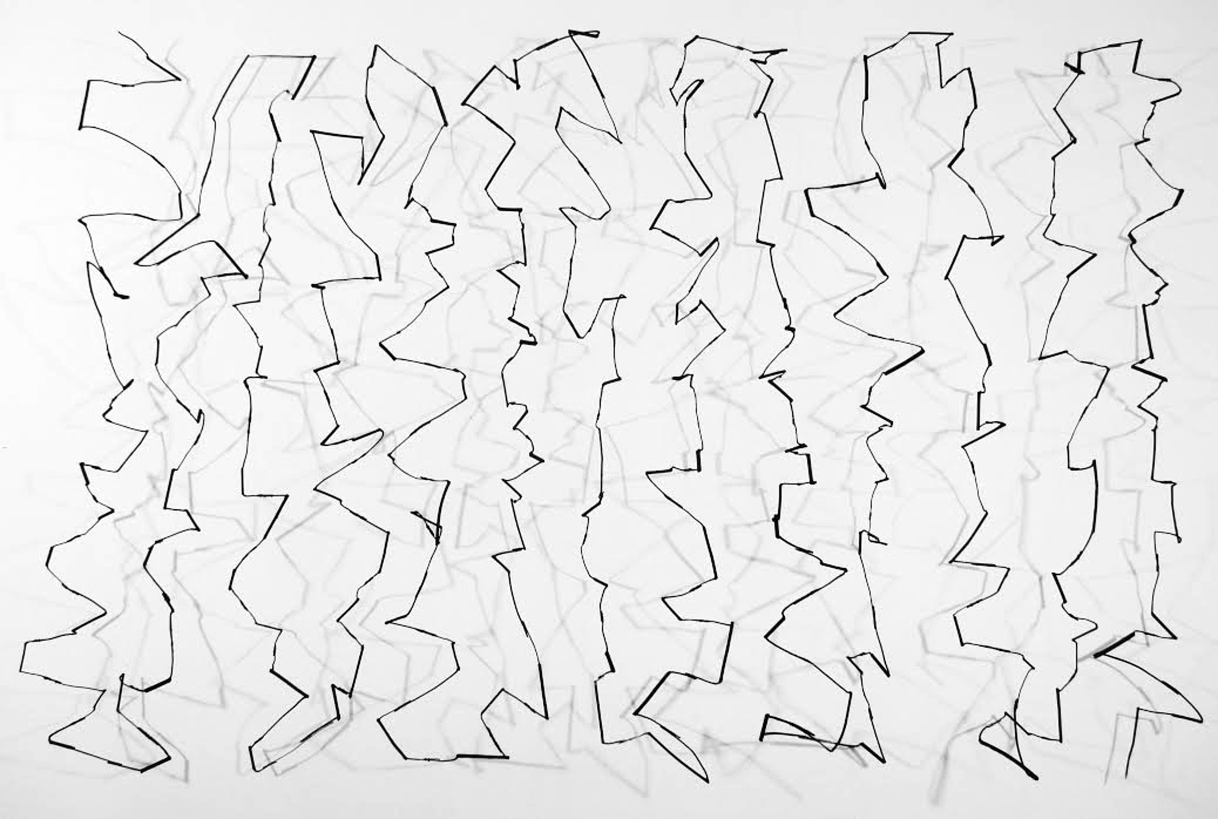
Larry Cressman, On Line, raspberry cane, powdered graphite, matte medium, wire, pins, 60 x 90 x 12 inches, 2017-18

In One Line, for instance, a zig-zagging single line, fabricated from a gross of raspberry canes, begins or terminates at upper left or lower right. Swiftly, it carries the eye, body, and psyche some five feet across (and to heights of nine feet) along the jerky, twitchy pathway, like a marathon runner, rock climber, or artist. Further enhancing the journey are the myriad shadows thrown upon the wall that seem to double or triple the length and aesthetic thrum of the journey. Such adrenal feats, like a host of durational endeavors, literal or figurative, both exhaust and exhilarate participants.

Larry Cressman, Podcast IV, dogbane with seedpods, powdered graphite, matte medium, wire, pins, 60 x 36 x 19 inches, 2018

Podcast IV, another large installation drawing, measures six feet in height, and rather than composed solely of branches, incorporates intact the delicate seedpods of the dogbane plant. The seedpods, intended by nature to be wafted to the four corners of the earth, add a decided note of ephemerality to this singular structure. The way a podcast links listener and speaker, albeit fleetingly, is evoked by the flanking vertical forms to either side. Their charged and electric bond, suggested by the overlapping branches and seedpods in tandem with the whiplashing shadows cast on the wall the length of the central section, is delicate and intimate. This ecstatic, sensual interlacing projects from the wall fully 19 inches, the farthest of any of the works in the show. Such animated liaisons between two entities, albeit reciprocal and intense, may however be short and fleeting. So goes the way of all flesh.

Larry Cressman, Gathering Lines, Raspberry cane, powdered graphite, matte medium, pins, 13 x 41 x 2 inches, 2018

Another striking work, distinctly different in kind from others in the show, is Gathered Lines, an ultra- simple constructed drawing (Cressman’s term for framed vs. installation examples of his art). Here, a densely packed, horizontal sprawl of tightly packed, five inch raspberry canes, thirty-three inches in width, floods one’s peripheral vision. Its concise, dark form seems to belie its “soft” title: gathered lines (as in a family gathering/a gathering of friends). Little breathing space or respite is allotted an observer, as the tug toward the tiny, self-protective cluster envelops one’s whole being, effectively obliterating everything on the margins.

This potent, powerful work, like others in the exhibition, embodies the resonance and spectrum of readings that the artist’s “fieldwork” sets into play, while simultaneously offering aesthetic forms and pleasures. Perhaps Cressman’s summary statement, in which he describes “imagery reflective of the structure, randomness, and fragile nature of the constantly changing Michigan landscape” might be amended to embrace the “changing world” in lieu of the “Michigan landscape.”

“Larry Cressman: Fieldwork” is on view at K.Oss Contemporary Art, 1410 Gratiot Avenue, Detroit, through Dec. 29, 2018. Cressman, who received his BFA and MFA degrees from the University of Michigan, is a Professor Emeritus of the university. An Ann Arbor resident, he has lived and worked in Michigan throughout his career, while exhibiting his works across the United States and Europe.


Mirrors and Intersections @ Grand Rapids Art Museum

Anila Quayyum Agha (American, b. Pakistan 1965). Intersections, 2013. Laser-cut wood, 6.5 x 6.5 x 6.5 feet. Courtesy of the Artist.

Anila Quayyum Agha’s ethereal sculptural installation Intersections is likely the most photographed work of art in Grand Rapids at the moment, surpassing even the city’s iconic, blazing-red Calder.  At Artprize 2014 (the city’s annual public-art festival), Intersections won both the People’s Choice and Judges’ Choice awards, and now, through the end of Summer, it returns to the Grand Rapids Art Museum where it made its auspicious debut.  It was a work calculatedly fashioned to appeal across social and cultural demographics, and if Instagramability is a worthy criterion of a work’s public appeal, then the artist certainly succeeded.

The work is the star of a pair of closely related solo exhibitions on view in adjacent gallery spaces, one showcasing Agha, and the other featuring Iranian artist Monir Shaharoudy Farmanfarmaian. There’s a thematic continuity between their distinctive styles that make the pairing work almost as a single show. Both artists apply sophisticated tessellations and kaleidoscopic patters so characteristic of visual culture in the pan-Arab world, and both artists explore the visual possibilities of reflected light and cast shadow.  Their works are also both—to some degree– participatory and interactive.

Monir Shaharoudy Farmanfarmaian, Installation image, Courtesy of the Grand Rapids Art Museum

The first exhibition space contains Mirror Variations, Farmanfarmaian’s luminous glass sculptures which represent an inventive fusion of traditional Persian art mixed with the American abstraction the artist encountered during her formative years in New York between 1945 and 1957, where she met art-world luminaries like Willem de Kooning and Louise Nevelson.  (In 2015 her work came full circle; New York’s Guggenheim awarded the artist her first solo American show—perhaps a curiously late honor for an artist and socialite of such import that she and her husband once played host to President John and Jackie Kennedy in Tehran.)

Inspired both by Arabic architecture and by principles of Sufi geometry, Farmanfarmaian’s work applies repetition and progression of simple shapes.  Like mosaics in 3D, her sculptures comprise tens of thousands of individual glass components which reflect light, diffusing fragmented geometric shapes across the gallery walls, ceiling, and floor.   One pentagonal sculpture—though prohibitively stowed behind glass on a pedestal—reflects light onto the ceiling and into the viewer’s space, directly involving the GRAM’s architecture into her work.  The lack of artisans in the United States able to help execute such detailed cut-glass work as this is partly why the artist eventually returned to her home country in 2004 after over 20 years of exile initiated by the Iranian Revolution.

Monir Farmanfarmaian (Iranian, b. 1924). Tir (Convertible Series), 2015. Mirror, reverse-glass painting, plaster on wood, 63 x 63 x 6 inches

These stately, ordered sculptures might seem the polar opposite of the often noisy, raucous world of the Postwar New York School, but some of her hanging sculptures invite a certain relinquishment of control that seems to parallel the likes of Robert Rauschenberg—particularly his playfully interactive Synapsis Shuffle (incidentally, a series of paintings which the GRAM exhibited in this very room back in 2012). Her Convertible series explores the myriad of varying geometric possibilities that can be created with a set of identical, interlocking shapes.  Each polygonic component is a fairly complex work in its own right, but the specific way they are arranged on the wall remains entirely fluid, ever-changing wherever they happen to be installed.

The second major gallery space is entirely devoted to Agha’s Intersections.  The work is a suspended black cube (about 7 feet square) crafted out of laser-cut wood, and inside a high-power bulb blasts the form’s intricate geometric shadows onto the gallery’s walls, ceiling, and floor, transforming every cubic millimeter of the space.  Its patterns derive from architectural elements of Spain’s Alhambra,the famed 14thcentury Nasarid dynasty palace and fortress.   It’s visually striking, but the work is conceptual as well.  Agha states that growing up in Pakistan as a female, she was not allowed to enter mosques, and with Intersections, wished to create a work which was open and accessible across all demographics.  Indeed, there’s something democratic and participatory about seeing yourself silhouetted on the gallery wall alongside the shadows of other visitors, all invariably with phones drawn, ready to share the moment on social media.

Video interview with Agha

In an auxiliary exhibition space, viewers confront a final bit of shadowplay.  A circular sculpture comprising  hundreds of identical triangular shapes is affixed from a wall and tactfully illuminated from three different angles.  The shadows it casts resemble a mash-up of a Venn-diagram and a series of tessellations by M.C. Escher.

Together, Mirror Variations and Intersections both manage to tactfully translate centuries-old Arabic visual culture into the language of 21stCentury abstraction.  And both artists manipulate light to transform a gallery space, creating works that transcend the beautiful and perhaps approach the sublime.  Their works slow us down—even in an art museum, after all, one is tempted to rush through to take everything in, spending, according to one study, less than 30 seconds in front of each painting.  But here the artists invite us to linger, and these exhibitions suppress our impulse to hurriedly move on the next thing.

Grand Rapids Museum  – through August 26, 2018

Punk Rock Graphics 1976 – 1986 @ Cranbrook  Art Museum

Installation Image, Cranbrook Art Museum, Punk Rock Graphics 1976 – 1986, 2018

Punk Rock is a music genre that developed in the mid-1970s in the United Kingdom, the United States and Australia. Rooted in 1960s garage rock, punk rock bands rejected perceived excesses of mainstream 1970s rock by typically producing short or fast-paced songs, with hard-edged melodies and singing styles, stripped-down instrumentation, and often political, anti-establishment lyrics. Punk Rock embraces a “do it yourself” ethic; many bands self-produce recordings and distributes them through independent record labels and other informal channels.  Accompanying the music is byproduct: a distinct style of graphic art.

Installation Image, Cranbrook Art Museum, Punk Rock Graphics 1976 – 1986, 2018

Although I was there during this time, and in the early throws of raising a family, I was not drawn to the anti-establishment, but rather seduce by the  music of Motown, Detroit Jazz, and the 60’s music of the Beatles, Rolling Stones, Sting and Bob Dylan. Punk Rock was a distraction for this writer and as an observer, I missed the graphic art side of the cultural phenomenon. If that resonates, no matter what your age, this exhibition opens up a trove of information and design that can take you on a journey and easily introduce you to a culture defined, in part, by its graphic design.

The Cranbrook Art Museum opened a large and sprawling exhibition of Punk Rock Art Graphics (600 pieces), Too Fast to Live, Too Young to Die: Punk Graphics, 1976 -1986, 0n June 15, 2018.

The exhibition features several hundred posters, flyers, fanzines, handbills, record sleeves, badges, clothing and other graphic materials from the New York collector Andrew Krivine.  In addition Robert St. Mary, a local author and music historian, helped to curate the Detroit portions of the exhibition at the request of Cranbrook Art Museum. St. Mary was asked to contribute his knowledge of the Detroit punk scene as an extension of a project he is working on as a recipient of the 2017 Knight Foundation Arts Award. In his 2015 book, “The Orbit Anthology,” St. Mary focused mainly on the punk scene at Bookies, known as the original punk nightclub in Detroit. Most people know about the famous London, New York City and Los Angeles bands, but St. Mary points out that the origins of punk are really right here in Detroit.

He says, “When we talk about punk, the primordial ooze of it is here,  with The Stooges and the MC-5”

Jamie Reid, Sex Pistols, God Save the Queen, Poster, Collection of Andrew Krivine, 1977

“That’s the arc of the show — from a black-and-white gritty feel to this explosion of color and pattern,” says Cranbrook Art Museum director Andrew Blauvelt. “The graphic language of punk was much broader and really paralleled what was happening — and was even ahead of — contemporary art in the 1970s and 1980s.”

Blauvelt says patrons will be quick to recognize the work of a featured artist who, in many ways, defined the visual representation of the punk rock movement. “What most people think of when they think of punk is the work of Jamie Reid,” says Blauvelt. “They may not know him by name but they would certainly know him by his work with the Sex Pistols.”

Installation, Punk Rock Memoirs 2018


While Too Fast to Live isn’t an exhibit based on musical history, it does present a chronological timeline tracing the evolution of the punk and new wave music genres overseas and in the U.S. via New York City. During this era, New York served as ground zero for a critical mass of counterculture musicians and artists who were forging an aesthetic that continues to be an influential force in contemporary design.

Robert L. Heimall -Design, Robert Mapplethorpe – Photographer, Patti Smith, Horses, Poster, 1975


In her debut album, Horses, 1975, Patti Smith became a fixture in the New York punk rock scene.  Critics have viewed the work as one of the most influential albums in the history of the punk rock movement.  Her three-cord rock was a simplistic cord structure, with rudimentary guitar work, and lyrics channeled by influences from William Blake to Arthur Rimbaud. Her performances often provided room for musical improvisation, and drew at times on Reggae, and jazz riffs. Horses mixed philosophical elements with traditional rock elements. Her early biography bleeds over into the life of Robert Mapplethorpe, who took the black and white image for the cover, as the two live together for a short time in lower Manhattan.

Smith says, “Horses was a conscious attempt to make a record that would make a certain type of person not feel alone. People who were like me, different … I wasn’t targeting the whole world. I wasn’t trying to make a hit record.”

The B-52’s, American rock group, 1979

Go-Go”s, American all women rock group, Poster, 1981

The design of punk graphics ran concurrent to postmodern art practices of the times by raiding popular culture, scavenging history, subverting messages, and transgressing aesthetic rules. Punk fed the alternative music scene that would emerge in the late 1990’s as well as today’s do-it-yourself cultures that blur and erase the lines between professionals and amateurs.  Punk’s trangressive spirit emboldened people from all walks of life to reimage themselves as creative agents and active participants in a culture driven by music, art, and design.

The legacy of punk has permeated modern culture and society, and its visual vocabulary infuses much contemporary art, while the punk spirit resonates in particular with the anti-elitist, DIY ethos of today’s young, blogging artists and musicians.  Too Fast to Live…, recalls the anarchic spirit of authenticity and amateurism, the volatile and ambiguous celebration of negativity, and the creativity that was punk.

Too Fast to Live, Too Young to Die: Punk Graphics, 1976-1986” and the related Shepard Fairey. Salad Days,1989-1999 run June 16-October 7, 2018.

Cranbrook Art Museum


Michele Oka Doner @ Wasserman Projects

Michele Oka Doner,  Hominin Relic, The Release, Fertilized Capsule

Wasserman Projects opened an exhibition February 16, 2018 with the work of Michele Oka Doner, the prolific and inventive maker of sculpture, installations, jewelry, furniture, functional objects and handmade books.

Michele Oka Doner, Life Forms, 2005, Project for the Life Sciences Building at Rutgers University, Piscataway NJ. Wide view of atrium floor. Bronze embedded in terrazzo. Image from The Watch All publication

Her work celebrates organic forms, particularly seashore life, but also seeds, trees, the human body and other forms of natural growth. Michele Oka Doner is probably best known for her creation, A Walk on the Beach, an installation on the floors of Miami International Airport. It is one of the largest public artworks in the world, featuring 9,000 unique bronze sculptures inlaid with mother-of-pearl in over a mile-and-a-quarter long concourse of terrazzo.

I recall meeting her and seeing her work at the Gertrude Kasle Gallery in the early 1970s, and then again in 1977 with her one-person exhibition at the Detroit Institute of Arts, Works in Progress, much of what was titled Burial Pieces, was previously laid out on the floor of Gallery 7. She has come full circle since that time in this exhibition at Wasserman Projects.

Michele Oka Doner, Book of Psalm, All Images courtesy P.D.Rearick, Wasserman Projects

Always inspired by nature, Michele Oka Doner composes a collection of flattened plant fronds on a grid with variety in the mono-colored objects, giving it the title Book of Psalm. Traditionally, this is a biblical reference in both Christian and Jewish worship as in the Book of Psalm, comprised of religious verse, many ascribed to King David. With a title like that, the subject matter reaches out to many people and relies on their experience for its explanation.

In this exhibition at Wasserman Projects, forty years later, it’s as if this artist has a genre all her own, work fueled by a lifelong study of the natural world. Mathematicians have long established a code for human forms, from plants to rock formations. Best described by Carl G. Jung and explained by Joseph Campbell, Michele Oka Doner exploits the collective unconscious of these forms, shapes and material in her art work.

Alison Wong, Director of Exhibitions at Wasserman Projects says in a statement, “Michele Oka Doner’s illustrious multi-decade practice has been guided by a passion for the natural world, and a fascination with the history held within the remnants of living things, such as twigs, leaves, seeds, shells, pods and stones. In her diverse installations, public works, sculptures, photographs, and drawings, these organic fragments are integrated, replicated and reimagined in new contexts that speak to the ephemeral yet enduring nature of life.”

Michele Oka Doner, Inlay Study in plaster.

These shell images and assorted shapes set in a plaster inlay are especially interesting in that the object is modest in size and an abstract composition of spiral shapes. The spiral meaning or symbolism can represent the consciousness of nature beginning from its center and expanding outward. So in keeping with the broad theme of the natural world, Michele Oka Doner works with some of the oldest geometric shapes dating back to the Neolithic period, the product of people over thousands of years, as illustrated in the famous ancient spirals at Newgrange in Ireland. Often the spiral is a feminine symbol, representing not only women, but lifecycles, fertility and childbirth. She  places the viewer above and looking down at these various shapes that are cloaked in a gold patina that elevates the meaning.

Michele Oka Doner, Installation of table, objects, and materials.

As part of the exhibition, there is a long table that extends out into the gallery space, which contains a collection of objects, books, various material and sculptures. As the table meets the wall there are two human figures, a child made of porcelain and a standing figure made of terra cotta clay without a head and a spiral-textured surface. These are typical of Michele Oka Doner’s work with the human figure, and in this setting provide a contrast to her dried plant-based work.

Michele Oka Doner, Glyphs

It has been a mark of her work throughout the years to place these glyph objects on the floor where their light color and textures contrast with the dark concrete floor. Her art becomes the process of making, finding and arranging, these small objects to create questions in the mind of the viewer. It feels like a universal language capable of reaching all people. They are hieroglyphic in nature and vary in size, material and spacing, as if you are looking back in time to a Mayan writing system.

Michele Oka Doner, Whip

Michele Oka Doner was born and raised in Miami Beach, but for thirty years she has lived and worked out of her studio in Soho, New York. She says in an interview with CBS News, in Miami, “I really could speak about what I knew and saw which was an accelerated notion of things growing, sprouting, ripening, decaying, the tides coming, bringing me things when I walked the beach in the morning, taking them away. It was full of wonders and richness. By really learning my own trade, it really was coming out of dipping back into myself instead of reaching out in the world and grasping that I learned daily, a step at a time, to manifest an idea, and that’s as much as we can hope to do in this world.”

Michele Oka Doner received a Bachelor of Science and Design from the University of Michigan (1966), a M.F.A. (1968), was Alumna-in-Residence (1990), received the Distinguished Alumna Award from the School of Art (1994) and was a Penny Stamps Distinguished Speaker (2008). She was awarded the honorary degree, Doctor of Arts (2016).

Her work is in collections worldwide, notably the Metropolitan Museum of Art, Whitney Museum of American Art, and The Cooper-Hewitt, New York; La Musée Des Artes Décoratifs, The Louvre, Paris; The Wolfsoniana, Musei de Genova; The Art Institute of Chicago; The Virginia Museum; The St. Louis Museum; The Dallas Museum of Art; The University of Michigan Museum of Art; The Yale Art Gallery; Princeton University Art Museum; and the Perez Art Museum Miami.

Also on display in the rear gallery is the  new work by Detroit based artist/designer Jack Craig.

For the past decade, Oka Doner has been represented by Marlborough Gallery, New York City.

Wasserman Projects, Michele Oka Doner is on exhibit through May 5, 2018.

Page 7 of 9

Powered by WordPress & Theme by Anders Norén