Up, Down, and Around: The Impassioned Art of Susanne Stephenson
Susanne Stephenson, Transfigurement, Installation image by J. C. Perez.
Sweeping curves, twisting curlicues, and swirling whiplashes are the potent, rhythmic movements that generate the larger-than-life vision of the art of Susanne Stephenson. Simultaneously sculpture, vessel, and/or abstract form her terra cottas heave, spiral, and careen up, down, and around as a perceiver circles and dives into the come-hither interiors of her lusty landscapes and seascapes.
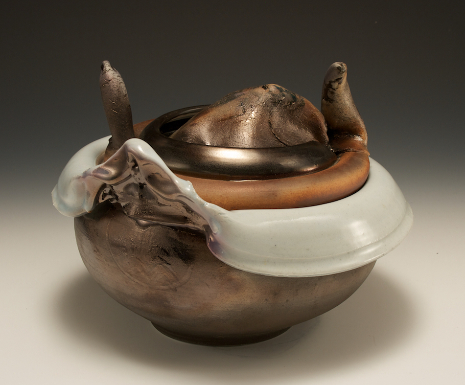
Susanne Stephenson, Bronze Luster Trojan Soup Tureen, 1976, porcelain, 8 x 10 x 10 in.
Handsomely installed in all three galleries of the Pewabic Pottery exhibition space, this expressive and timely retrospective numbers 34 signature works by the estimable Stephenson dating from 1976 through 2016. Ohio born, and a long-time Ann Arborite and professor of ceramics at Eastern Michigan University, she studied at Carnegie Mellon University and Cranbrook Academy of Art. The four decade evolution of her oeuvre now on view illustrates both the comparatively reserved, minding-their-own-business early vessels, such as the Bronze Luster Trojan Soup Tureen with horn-like handles from 1976 and the breakthrough Cut Edge Black Water Mountain of 1983. In the latter, the “mountain” peak has literally blown its top implied by a taut, upraised flap (sliced off and reattached in process), while the creamy, overflowing lava sets up a strong white/black contrast, both coloristic and tactile, between it—matt, chunky–and the dark, shiny circular mountain top.
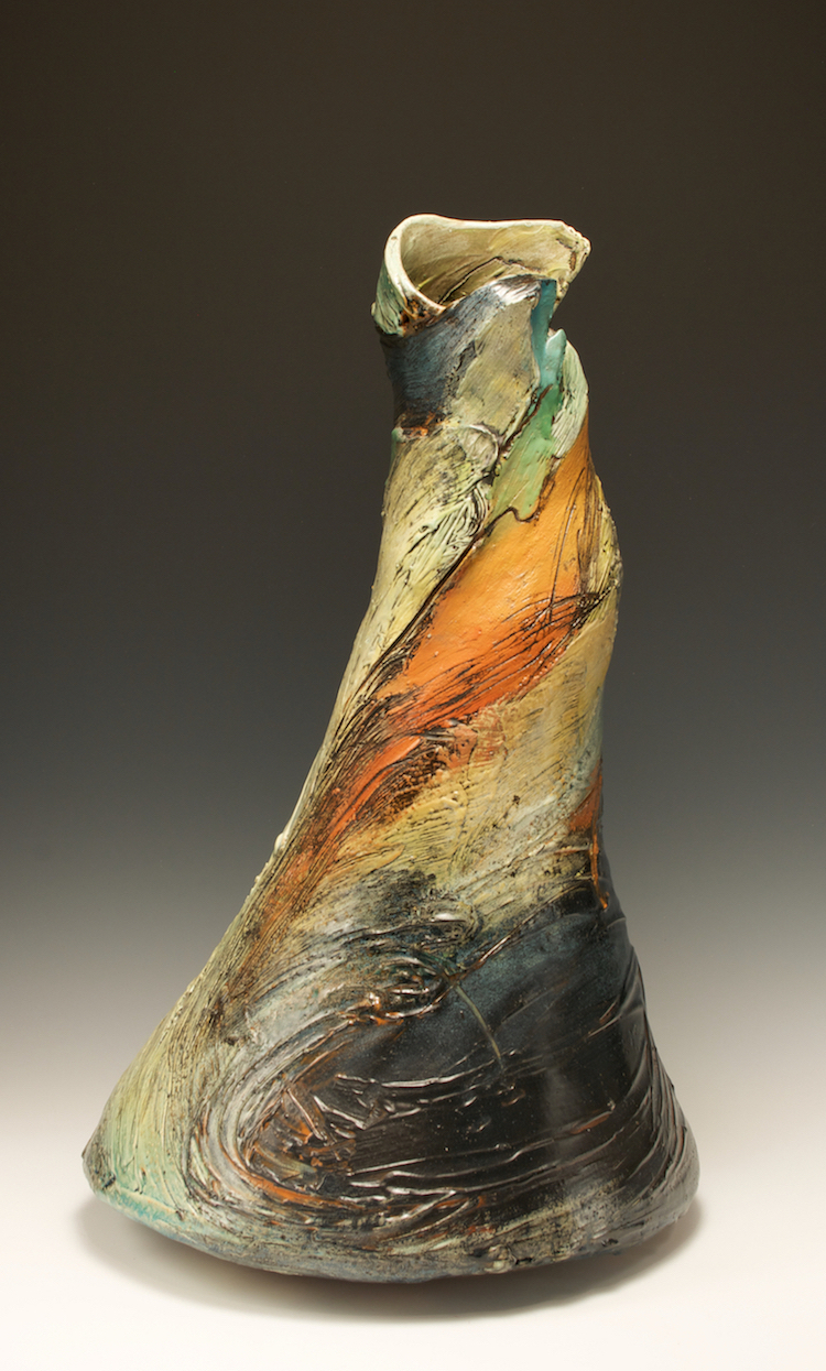
Susanne Stephenson, Cut Edge Water Rush, 2000, terra cotta, 24 x 15 x 15 in.
Traditional vessel forms, such as vases, often serve as starting points for Stephenson’s windswept forms. In Cut Edge Water Rush (2000), for example, the rush of spiraling color and form circumnavigates the two feet tall shape at warp speed, its vibrant, multi-hued palette enhancing passage around the tapering form, as it whirls with the unflagging energy of a whirling dervish. Her universe seems alive with ceaseless motion, not unlike the insistent energy of a Jackson Pollock drip composition. (Stephenson, like many sculptors, was originally a painter.) Indeed, an expressionist aesthetic, whether German or Abstract or Californian (think Peter Voulkos), has surged into view multiple times in the course of the twentieth century.
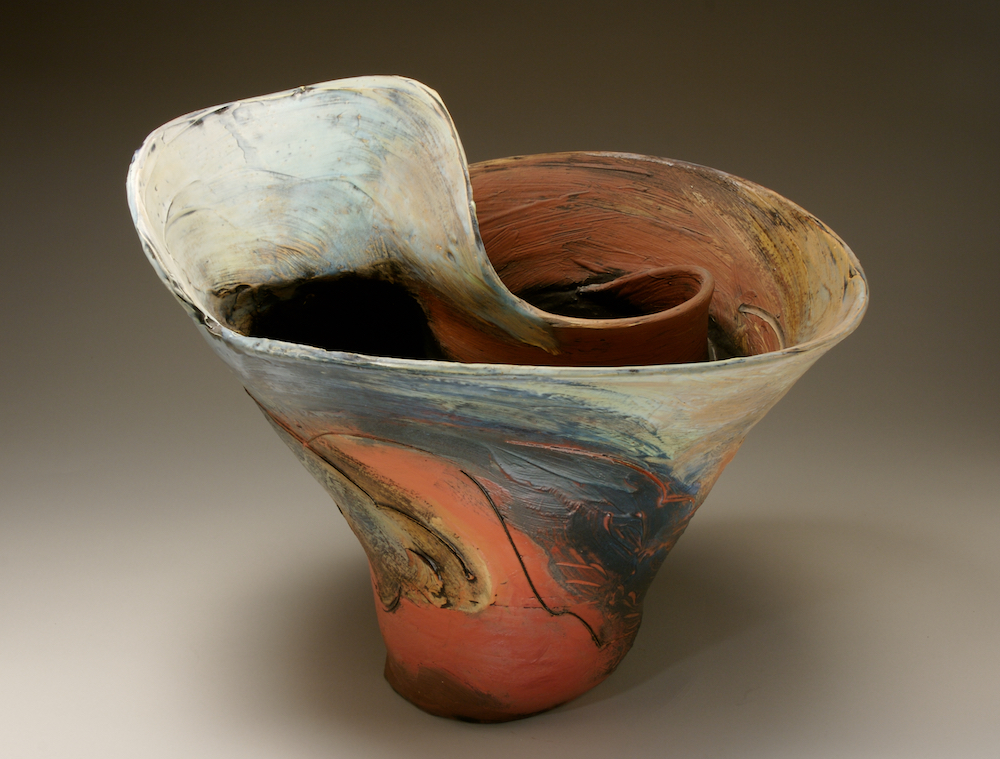
Susanne Stephenson, Red Beach, 1993, terra cotta, 17 x 20 x 15 in.
Stephenson’s bowls, too, work similarly on a visitor, as in Red Beach (1993). One is swiftly swept round its form while the S-shaped, upraised flange, like an undertow, sucks an unwary swimmer-viewer into its depths. Spring Coast, also on display and sculpted the following year, offers another cathartic experience: glazed orange at the bottom segueing to green around the rim, it too seduces the viewer to lean and peer into its alluring recesses.
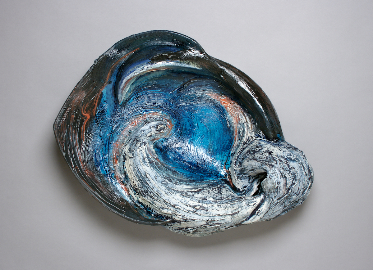
Susanne Stephenson, Blue Wave, 2007, terra cotta, 22 x 29 x 9 in.
The large scale of another cluster of works—thick, hefty, ovoid wall reliefs—may in fact be described as seascapes. Bearing such titles as Blue Wave, Orange Wave I, and Spring Wave II, and often two feet or more in width and projecting up to ten inches, they fully evoke the thrust and even brutality of waves crashing ashore. The weighty physicality of Stephenson’s roiling, tactile surf in these reliefs is heightened by vivid and furrowed swaths of color realized by mixing the slip with paper pulp. As such they resonate with the underlying, inescapable momentum of the universe, essentially Stephenson’s world view whether addressing the immensities of mountains and sea or transfiguring the domestic tropes of the land of clay (vases, bowls, platters).
Organized by a trio of curators, Darlene Carroll, Paul Kotula, and Tom Phardel, “Susanne Stephenson: Transfigurement” remains on view through May 13. Catch it while you can at Pewabic Pottery, 10125 E. Jefferson Avenue in Detroit.