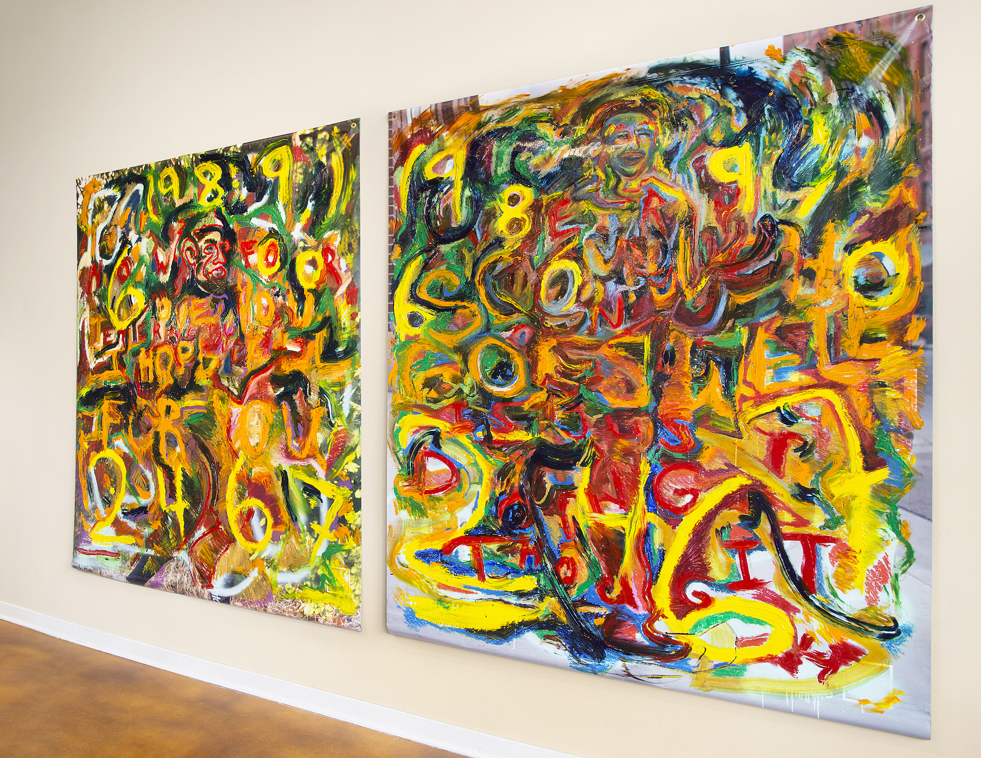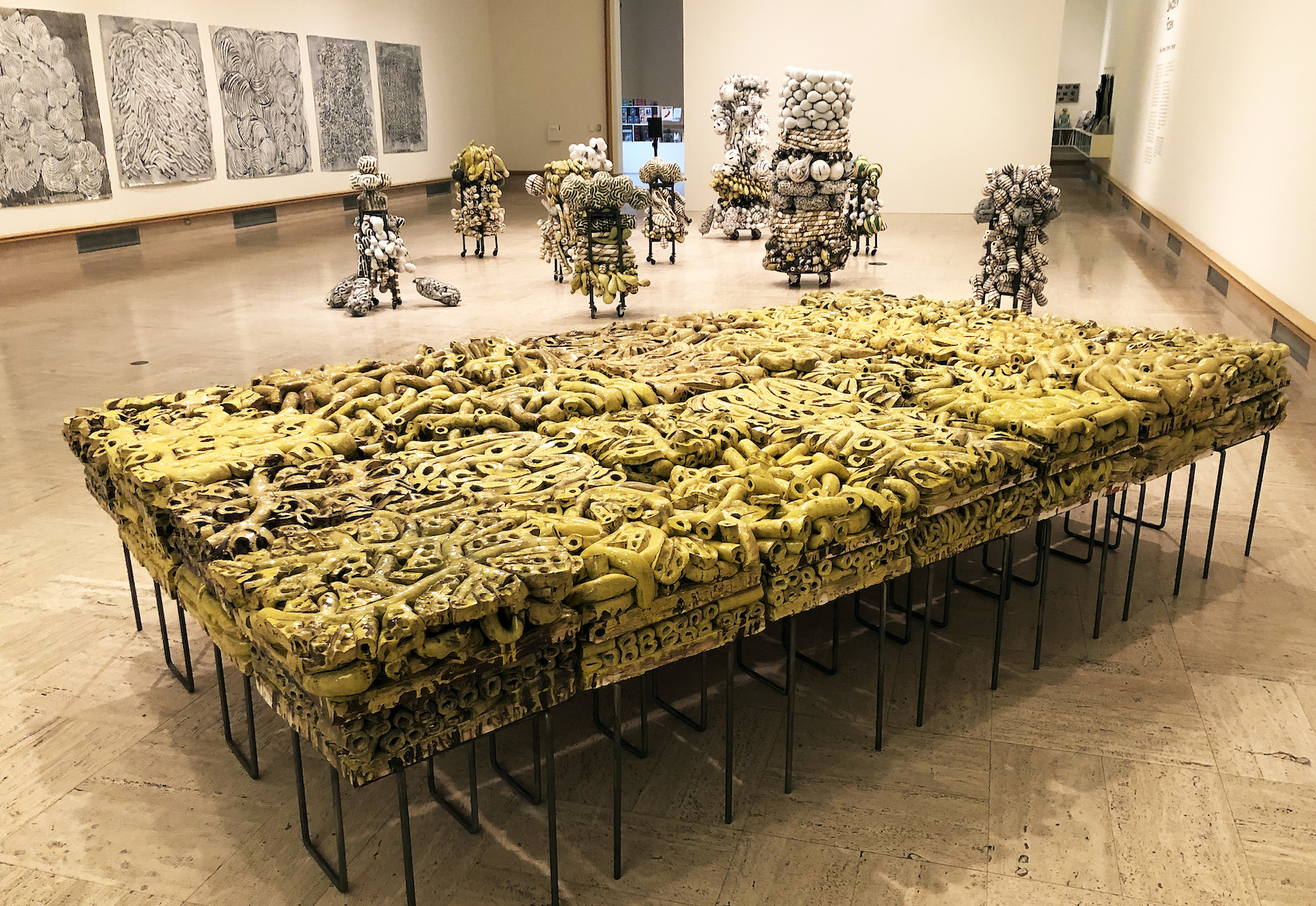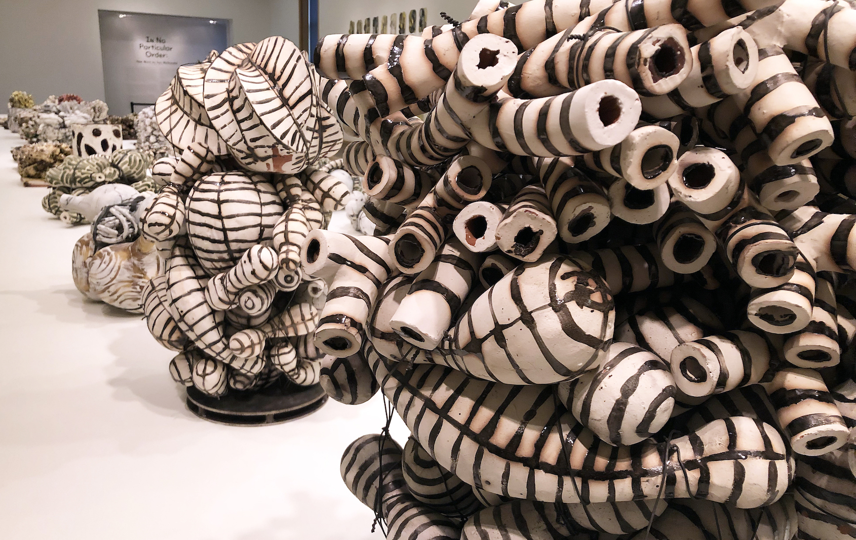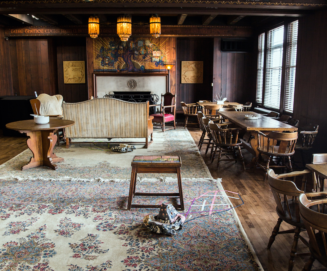
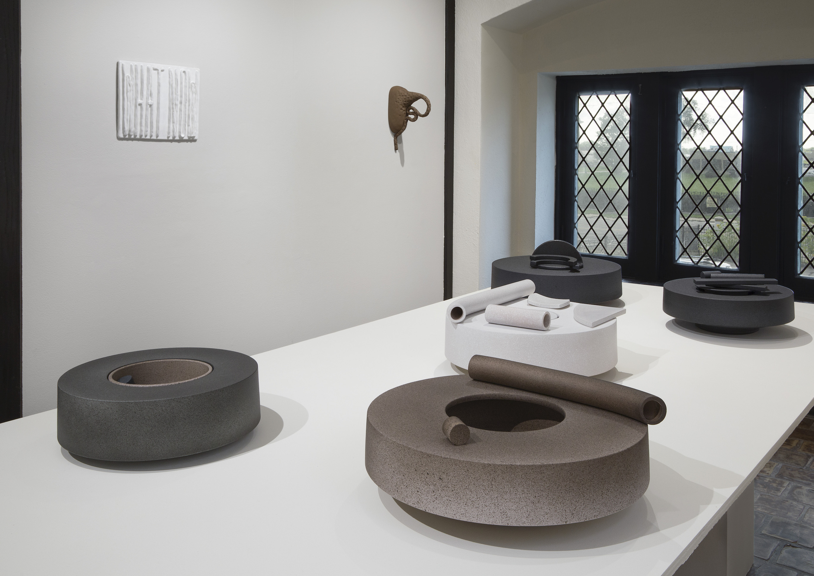
Inspired, Installation image, Pewabic Pottery, 2019 Photo: PD Rearick
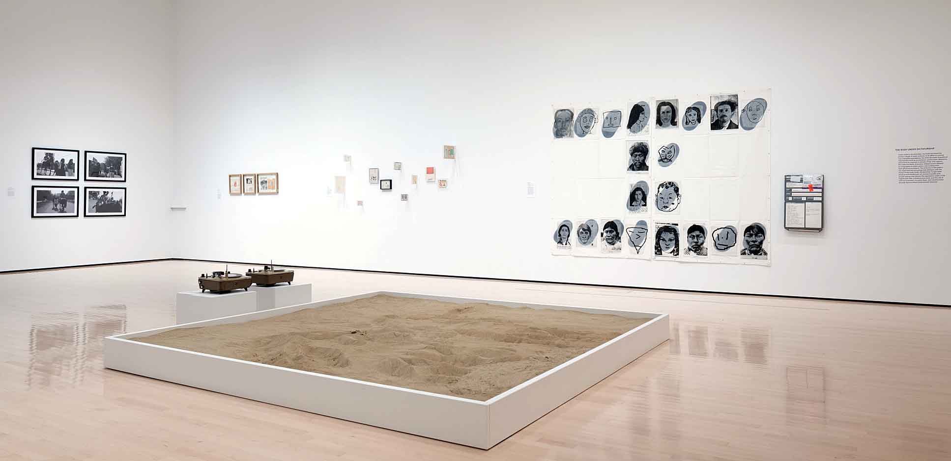
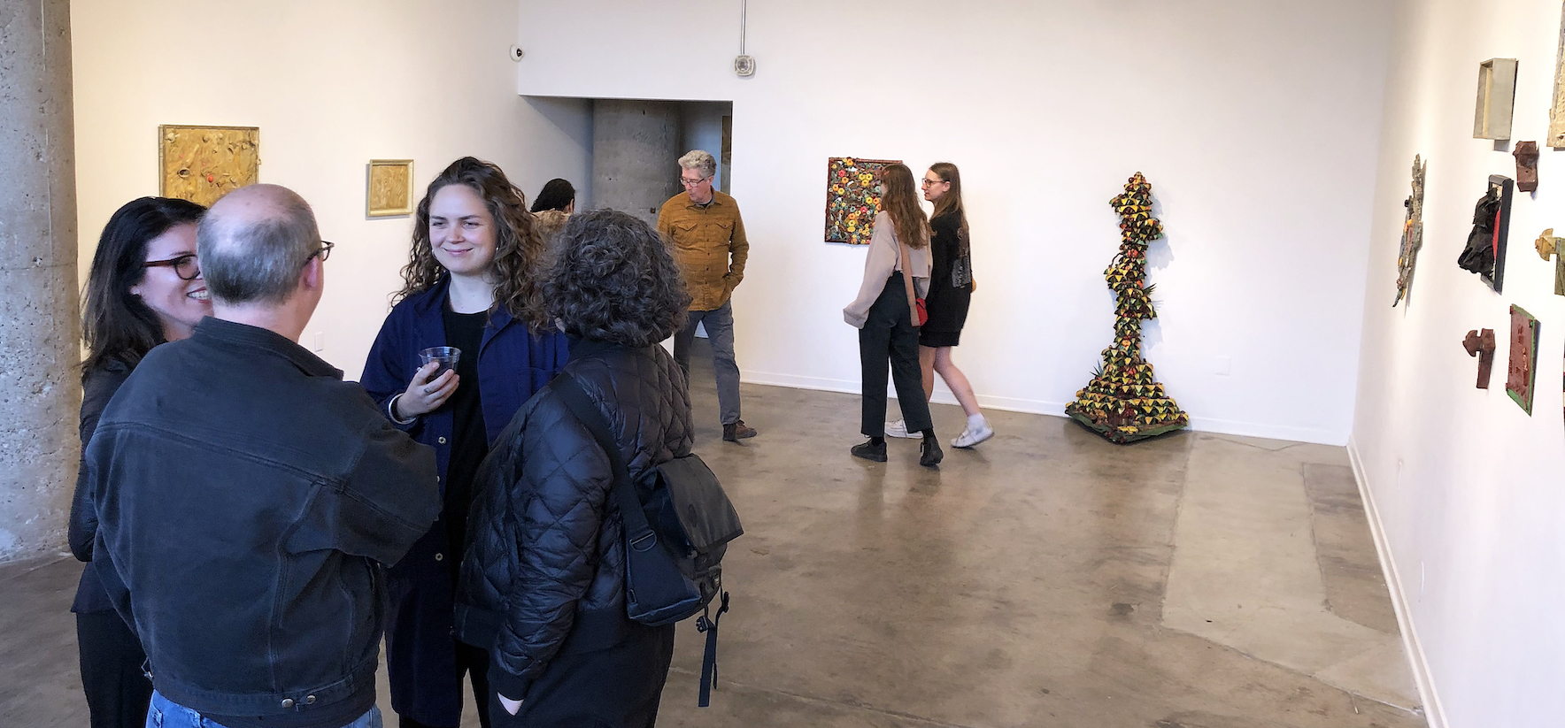
Climbing the narrow, delayed-gratification-stairway to Pewabic Pottery’s second floor galleries, even for the umpteenth time, anticipation mounts until, at the top of the stairs, sightlines to left and right reveal the shiny artifacts of a new exhibition. The current show, confidently entitled “Inspired,” does indeed proffer an eclectic array of ceramic art created by four artists working in diverse, distinctive ways. The display, conceived and installed by Pewabic curator Darlene Carroll, features makers who lead ceramic programs that Pewabic’s co-founder, Mary Chase Stratton, played a role in establishing.
Inspired, Installation image, Pewabic Pottery, 2019 Photo: PD Rearick
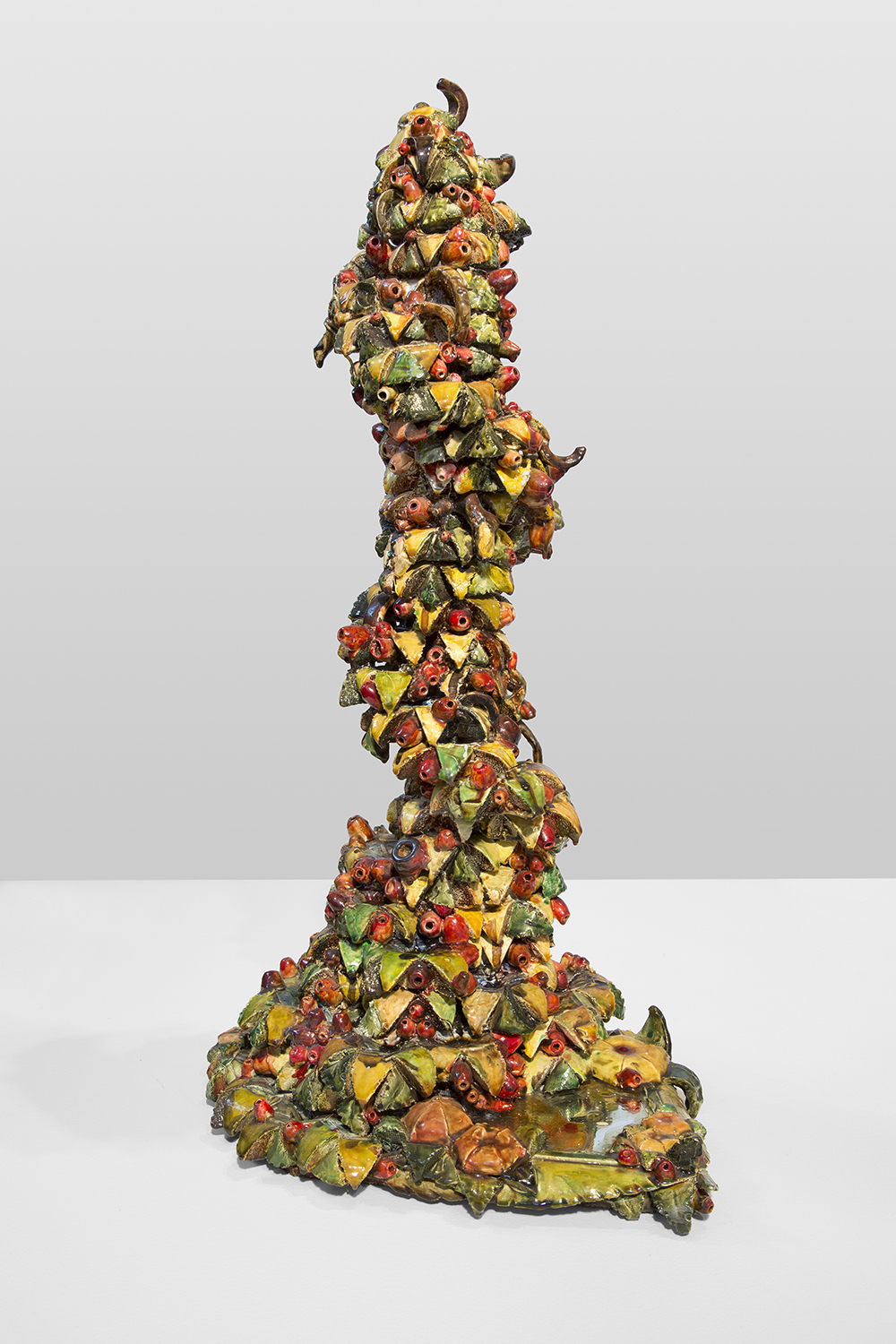
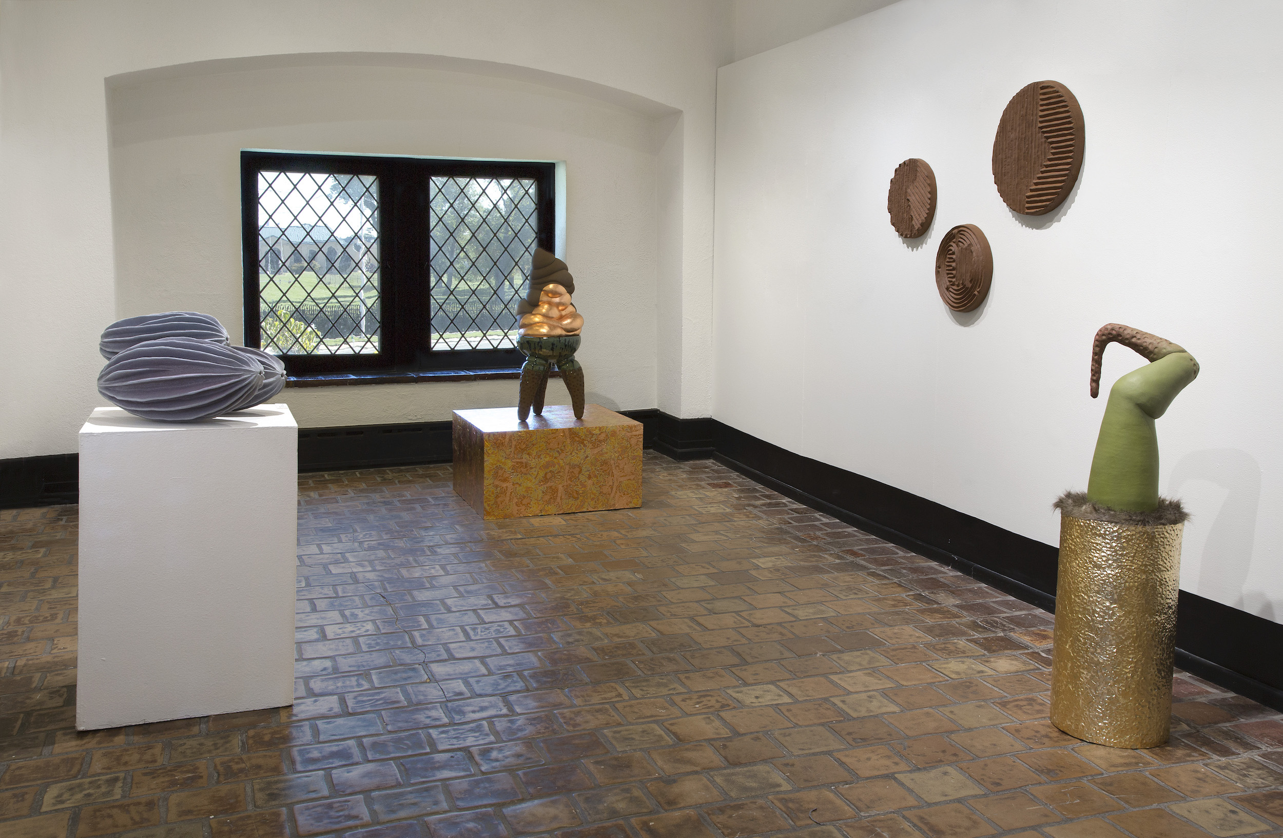
First up, Susan Crowell’s Huckleberry (Vaccinium myrtillus), a single, gigantic, four lobed sculpture of a grain of huckleberry pollen (as seen under a microscope) measuring 12 ½ inches in diameter, is indeed “voluptuous,” as she declares. Its purply-blue glaze and plump, spherical forms embody the lush, caress-me allure and inkling of a tasty, delectable huckleberry. Other of Crowell’s jumbo flora include a lemon yellow cluster of Hazelnut Pollen (Corylus avellane), each pod about the size of a softball, and a nectar-from-the gods spill from wall to pedestal of fourteen, luscious pink Rose-Bay Willow Herb (Onagraceae) triangular pollen forms. Crowell has taught ceramics at the University of Michigan’s Penny W. Stamps School of Art & Design since 2005, and at the Residential College since 1972.
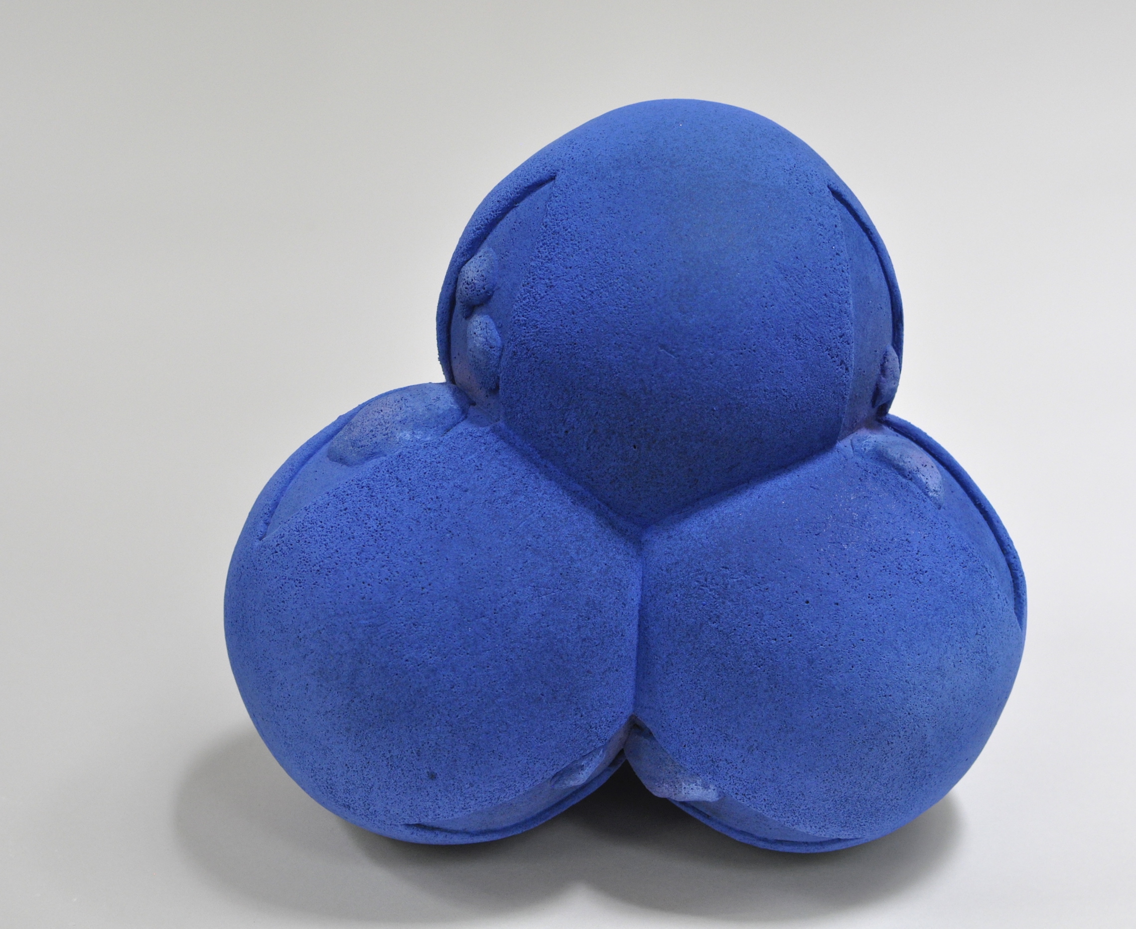
Susan Crowell, “Huckleberry (Vaccinium myrtillus),” Stoneware with vitreous engobes, stains, glazes, 12.5 x 12.5 x 12 in., 2019
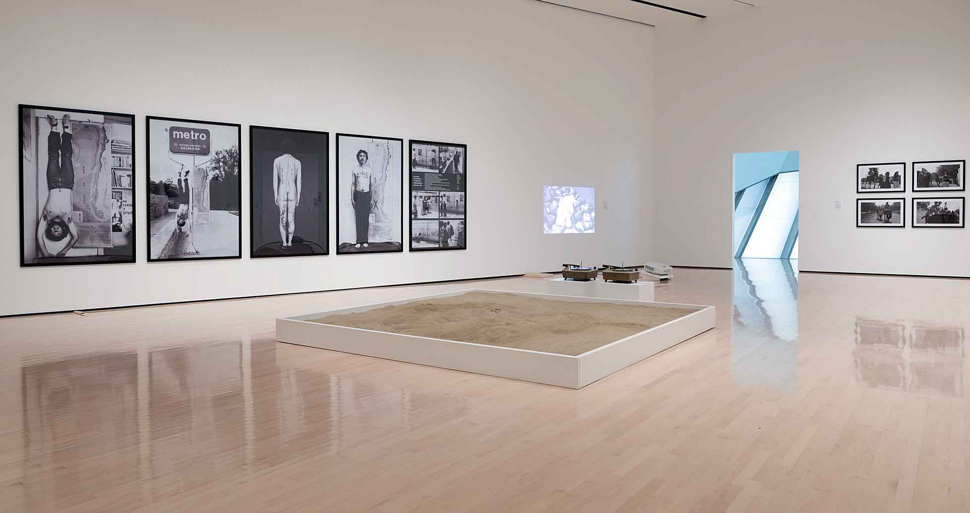
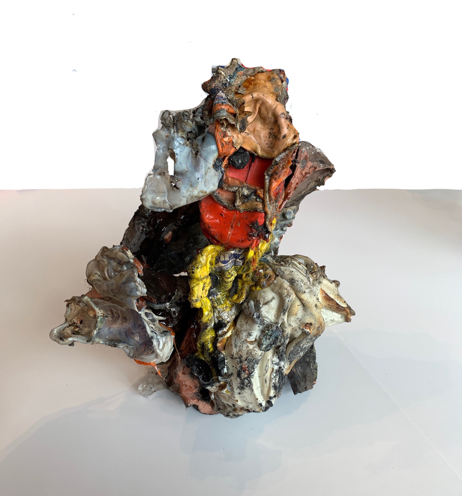
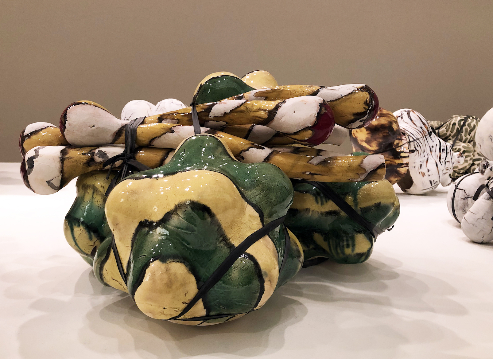
No less alluring is Jessika Edgar’s I want to touch you to be happy inside. A two foot tall ice cream treat—chocolate topping layered over an exotic coppery colored flavor-of-the-week—slumps atop an animate, tri-legged stool, itself ensconced on a glitzy, solid gold pedestal. This popular icon, centralized, pedestaled, and overblown suggests desire incarnate, as does the title, albeit meltingly short-lived in the end. Another suggestive Edgarian title—Get it while you can—coupled with an organic, roly-poly torso festooned with acrylic pearls resting on a mid-century biomorphic end table with canted legs, its top covered with faux fur, embodies as well the contemporary appeal of faux, formless, and real. Edgar is an assistant professor and coordinator of Ceramics at Wayne State University.
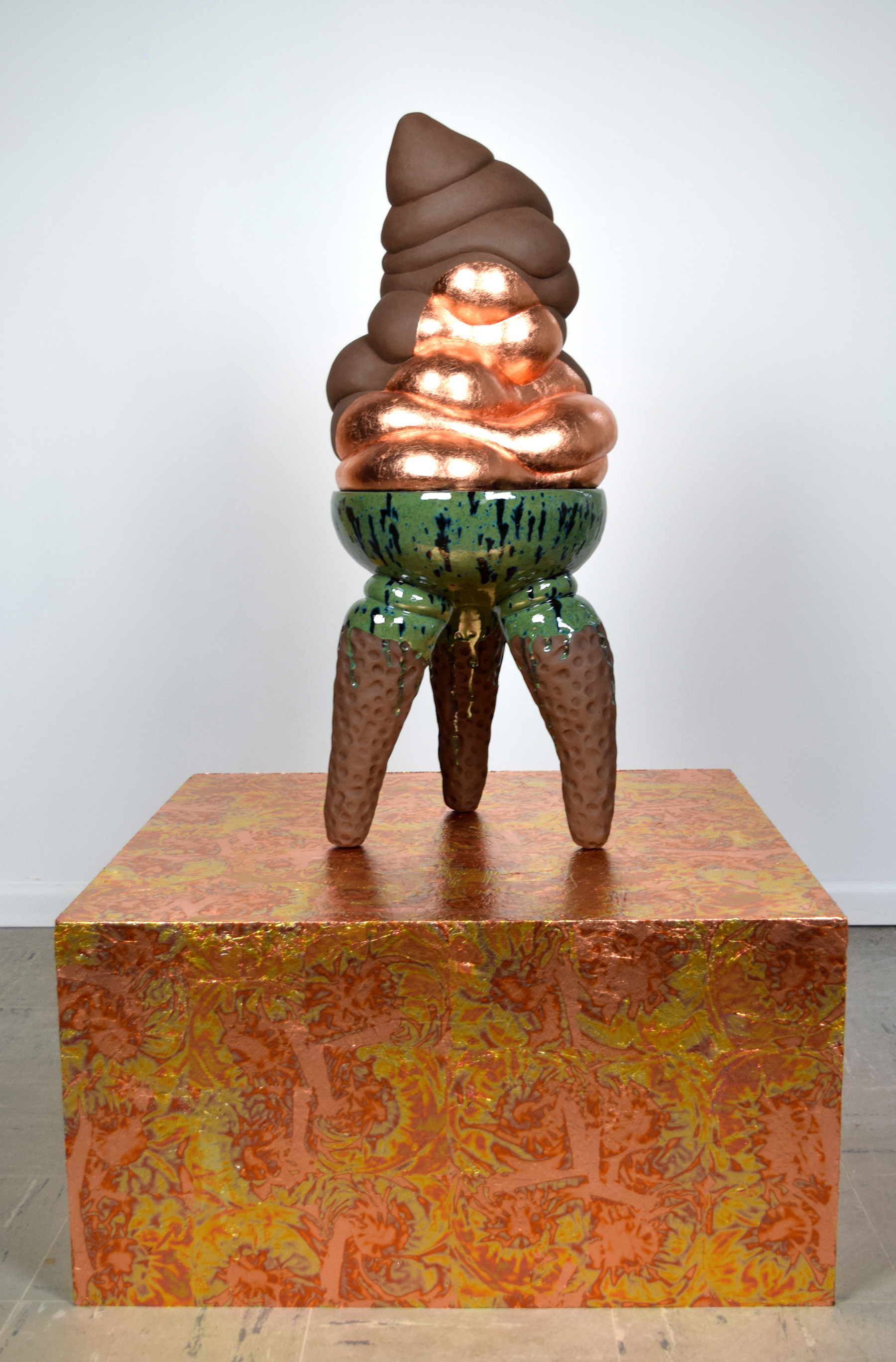
Jessika Edgar, “I want to touch you to be happy inside,” Ceramic, glaze, copper leaf, variegated metal leaf, osb board, 50 x 30.5 x 30.5 in., 2019
Ian McDonald, artist-in-residence and head of ceramics at Cranbrook Academy of Art, presents, among other examples of his ceramic practice, a trio of Shade Vessels, ranging in height from 12 to 16 inches. Severe and minimalist, with precise horizontal ribbing, two are glazed in hushed lavender hues, while the third sports a smoky greenish hue, soft palettes somewhat unexpected on such stark shafts. Hollow and formally composed of cylinder and bowl-like forms, they are however unitary, integral vessels, reminiscent perhaps of trees, umbrellas, or even observation towers that provide protection and shelter. Also on view is a suite of broad, darkly hued, table-hugging bowls (five to six inches in height and up to 17 inches in diameter) that McDonald dubs Low Works.
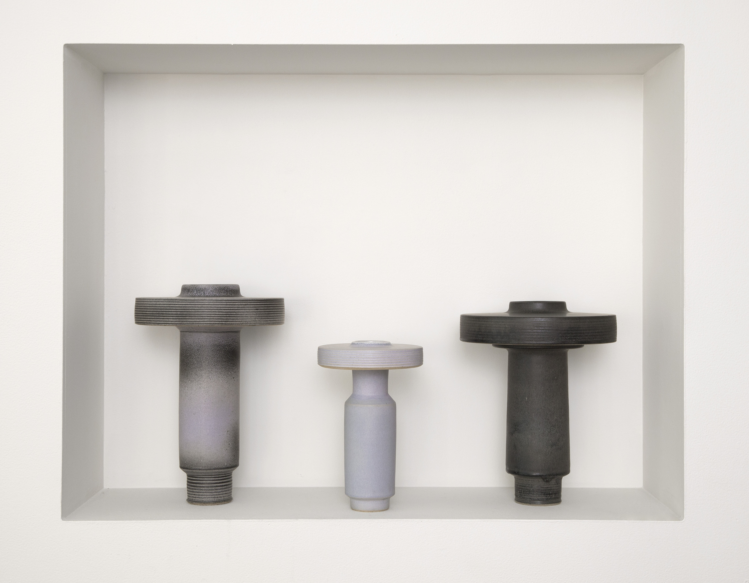
Ian McDonald, “Shade Vessels,” Stoneware with glaze, left to right: 16 x 10.5 x 10.5 in.; 12 x 7.25 x 7.25 in.; 15 x 11 x 11 in., 2017-18 Photo: PD Rearick
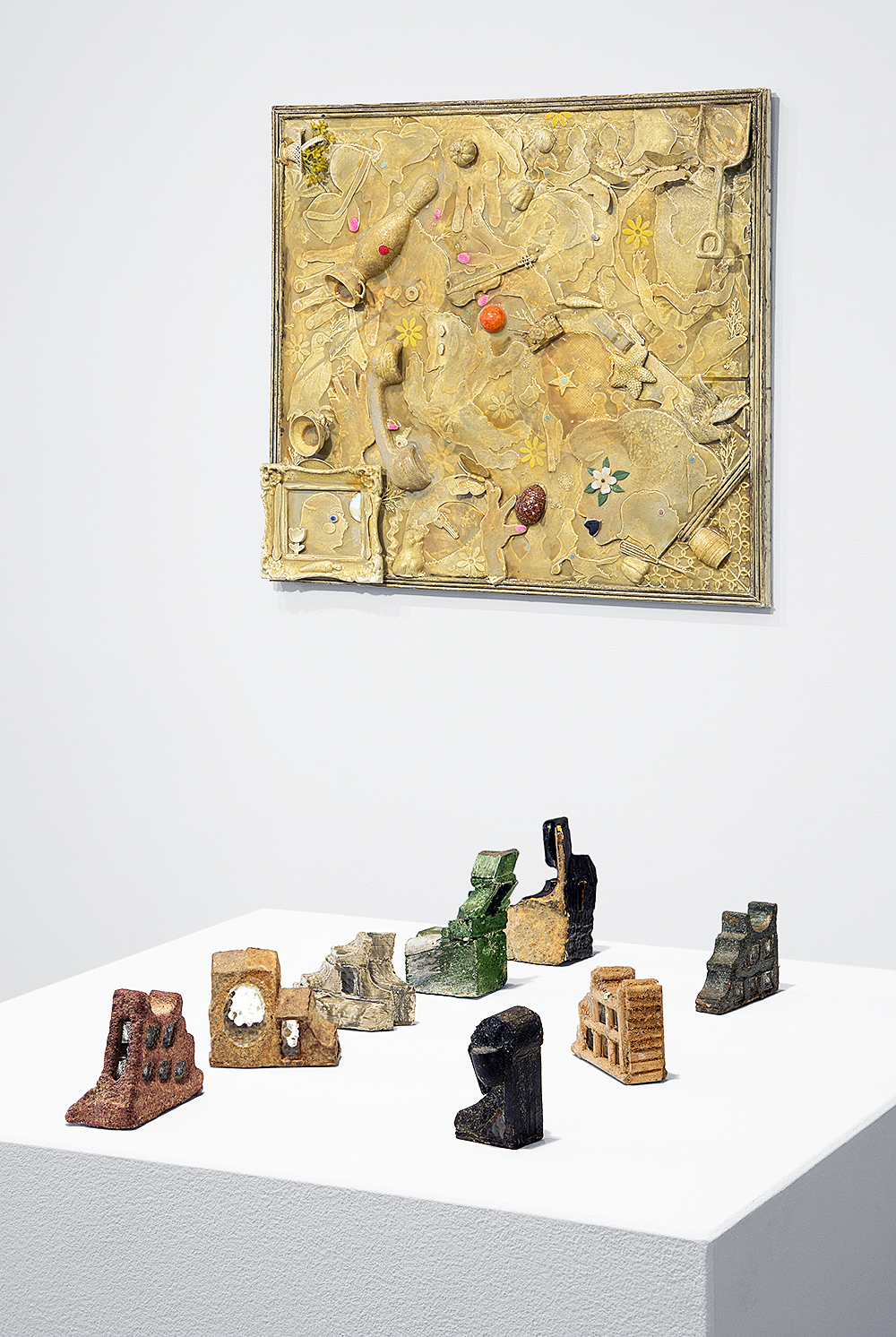
Assistant professor and head of Ceramics at College for Creative Studies, Ebitenyefa Baralaye weighs in as conceptualist and relief sculptor of this collegial foursome. Working in “raw,” unglazed terra cotta, Baralaye’s plaques of mazes, furrowed fields, and enigmatic phrases highlight transitional issues of “feeling, engagement, and displacement.” Real Feels reads a rectangle of raised text, 15 x 20 ½ inches in size. The vertically stretched out letters suggest an emotional tension or anxiety, a state corroborated by the inversion of the identical terms to “Feels Real” on a second plaque (not in the show). Another of Baralaye’s panels on exhibit (glazed white, as it happens) quietly and poignantly asks What Now. His words and low-key art serve as discreet prompts to action for both academe and audiences alike as a new semester and year loom ahead.
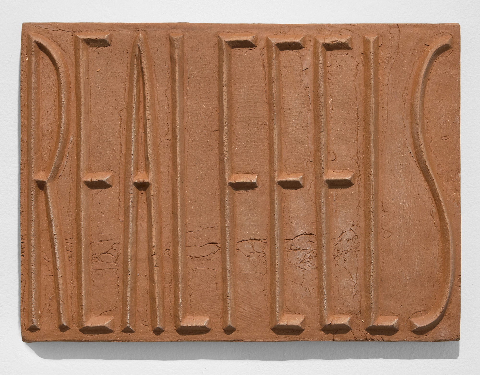
Ebitenyefa Baralaye, “Real Feels,” Terracotta, 15 x 20.5 in., 2019 (courtesy David Klein Gallery) Photo: PD Rearick
Inspired remains on view at Pewabic Pottery through October 21.