Critical art reviews of Detroit galleries and museums weekly

Category: Design Page 2 of 3

With Eyes Wide Opened @ Cranbrook Museum of Art

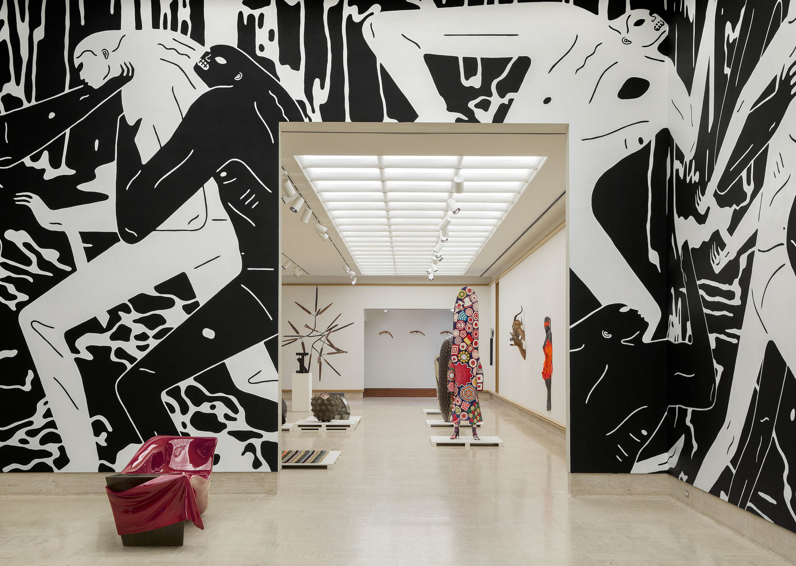
Cranbrook Museum of Art, With Eyes Opened, Sculpture Court and Mixing Chamber, installation, photo: PD Rearick

With Eyes Opened: Cranbrook Academy of Art since 1932 has just opened at the Cranbrook Museum of Art in Bloomfield Hills, to great acclaim and national attention. Covered by the New York Times Magazine with a spiffy video tour and ample media attention both local and national, it’s a hydra-headed beast of a show with many sponsors but no single curator. Objects and images from every period of the Academy’s history compete for space and attention, with no fewer than ten dueling accounts threaded throughout the museum’s seven galleries.

The organizers seem to have had difficulty settling on a single narrative for this exhaustive survey of the Academy’s history–and no wonder. The tapestries, sculptures, paintings, prints, photographs, product prototypes and mass-produced products tell a kaleidoscopic story of the many creative minds whose vision and creativity have emanated from the school over time.

The history of this premier American art institution is told through objects in only piecemeal fashion in the physical exhibit; the accompanying printed volume, a 624-page doorstop of a book, contains a more complete narrative of the school’s history, along with one-page profiles of many (though not all) of the artists and designers represented in the show.
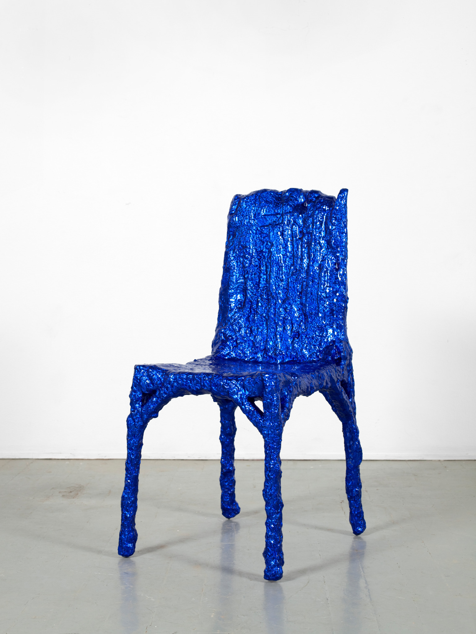
Untitled (Aluchair) by Christopher Schanck (MFA, 3D Design 2011), 2019, aluminum foil, resin Collection Cranbrook Art Museum

At the entrance to the main gallery, visitors can watch American Look. Commissioned in 1958 by Chevrolet, this cold war artifact celebrates many of the post-World War II designed amenities that were newly available to middle class consumers of a certain limited demographic.  Throughout the celebratory video, the “American-ness” of the consumer lifestyle is promoted relentlessly. Even though the uncritical materialism may seem cringe-worthy to a modern viewer, the optimism and can-do mentality expressed in the video amply show why the period beginning in 1950 is often called the American Century. The film provides a good starting point for With Eyes Opened, which takes us on a visual tour not only of the mid-century American esthetic, but also, by implication, through a consideration of how those perceptions and values have grown and changed over time to include contemporary preoccupations with equity, diversity and sustainability.
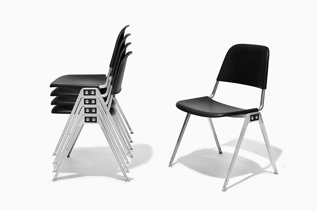
Model 1601 Stacking Chair by Don Albinson (Cranbrook Academy of Art Sculpture, 1940-1941), 1965, aluminum, nylon, molded plastic. Photo PD Rearick

The video serves as an introduction to one of the more successful elements of the exhibit, which celebrates the modern chair. Designers like Charles and Ray Kaiser Eames and Don Albinson  were uniquely successful at conceptualizing and producing practical, relatively inexpensive and attractive mass production chairs, many instantly recognizable today as fixtures of modern life in home and office.  The chair as a concept unifies this display;  in addition to the mass produced chairs there are a number of hand-crafted, one-of-a-kind examples such as Chris Schank’s Alufoil  Chair and Terence Main’s  Queen Anne, Queen Anne doubled chair. Here, as throughout the exhibit, the organizers have decided to mix the mass-produced and the hand-crafted, without comparing or contrasting the purposes and philosophies involved.
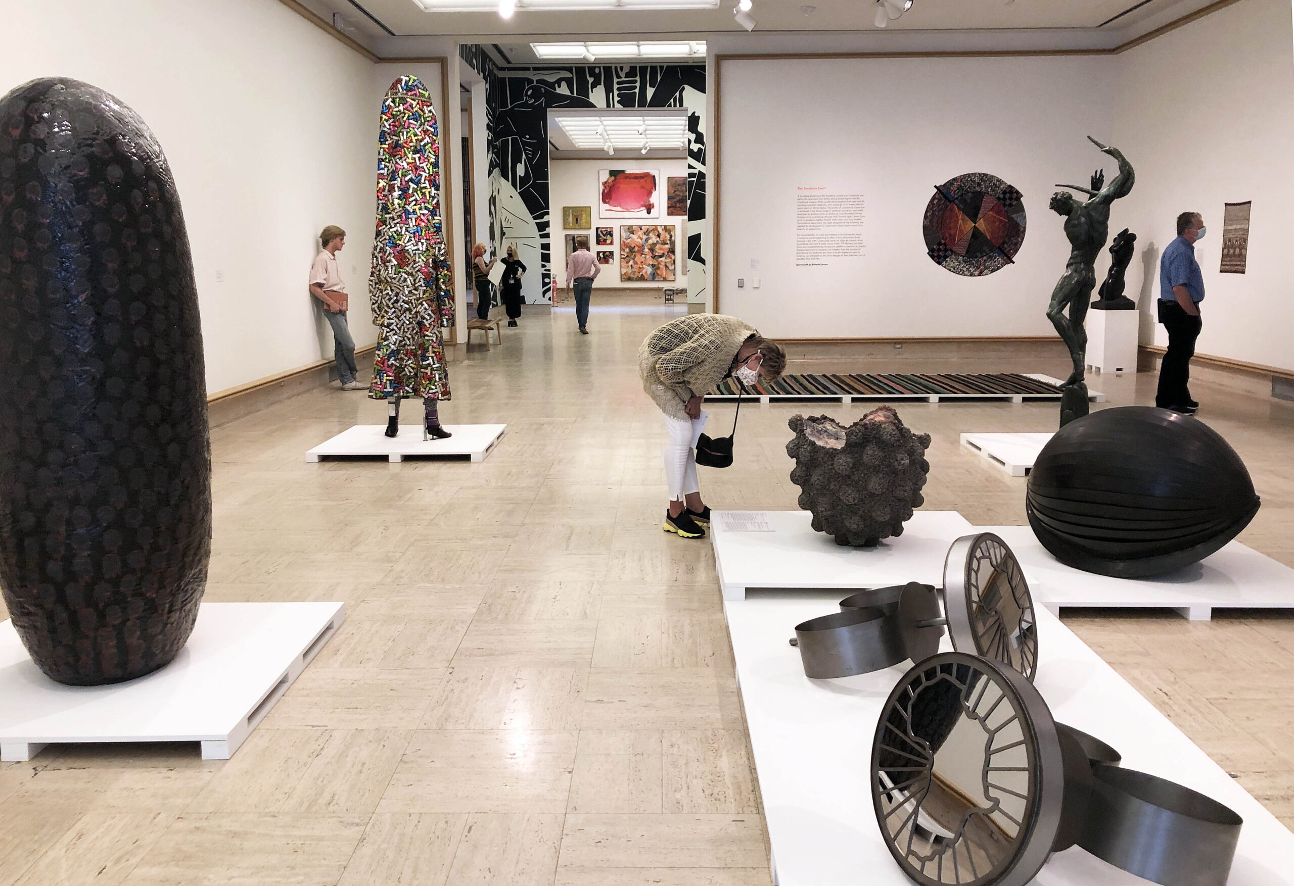
Cranbrook Museum of Art, Sculpture Court, installation. Photo: DAR

The physical and esthetic center of the exhibition, which brings the concept of design and art to a satisfying apotheosis of the handmade and the mass-produced, comes in the Mixing Chamber. There,  the room-sized mural of black and white figures by Cleon Peterson suggests the sensibility of a 21st century Egon Schiele. Tortured, semi-nude bodies surround the wittily conceived bench by Vivian Beer, whose automotive-painted red drape on the slipper shape is at once modern and baroque.
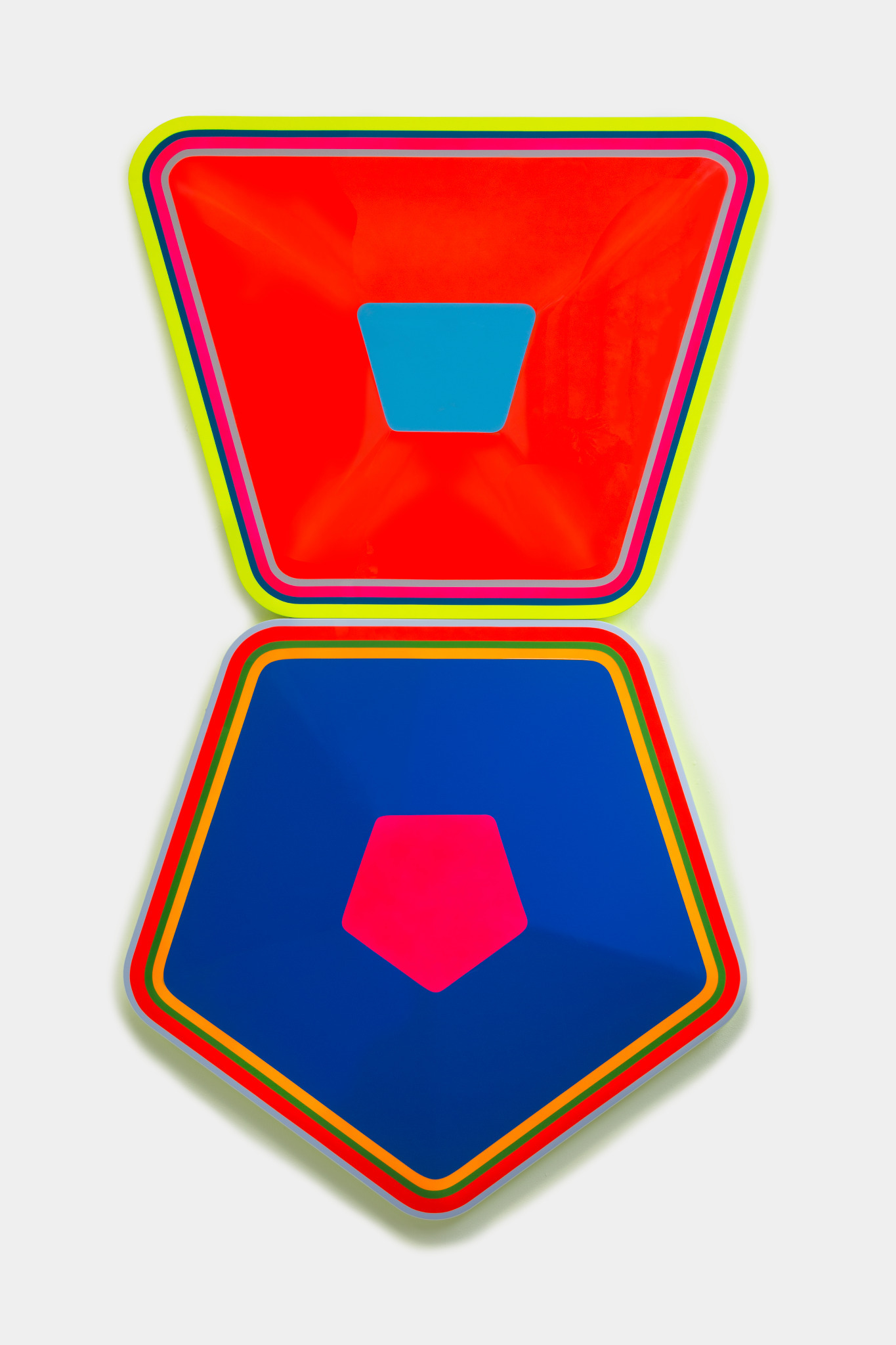
Untitled (Asthma, High Blood Pressure) by Beverly Fishman (Artist-in-Residence, Dept. of Painting 1992-2019) 2018, urethane paint on wood. Photo: PD Rearick

In the adjacent North Gallery, 34 paintings, works on paper and photographs hang floor to ceiling, with abstraction as the ostensible unifying theme. The hanging of contemporary art salon style is a fraught strategy that calls for sensitively selected and carefully coordinated curation and enough space around each piece to allow the work to breathe.  Here the disparate artworks compete visually, like guests at a crowded cocktail party shouting to be heard.  Beverly Fishman’s brightly colored, sharp-edged geometric polygons (almost) hold their own, and McArthur Binion manages to succeed simply by installing a painting, DNA: Study (Lake St. Clair), too large to share the space with other artwork. As worthy as each piece in the gallery may be, a little editing would have been welcome.
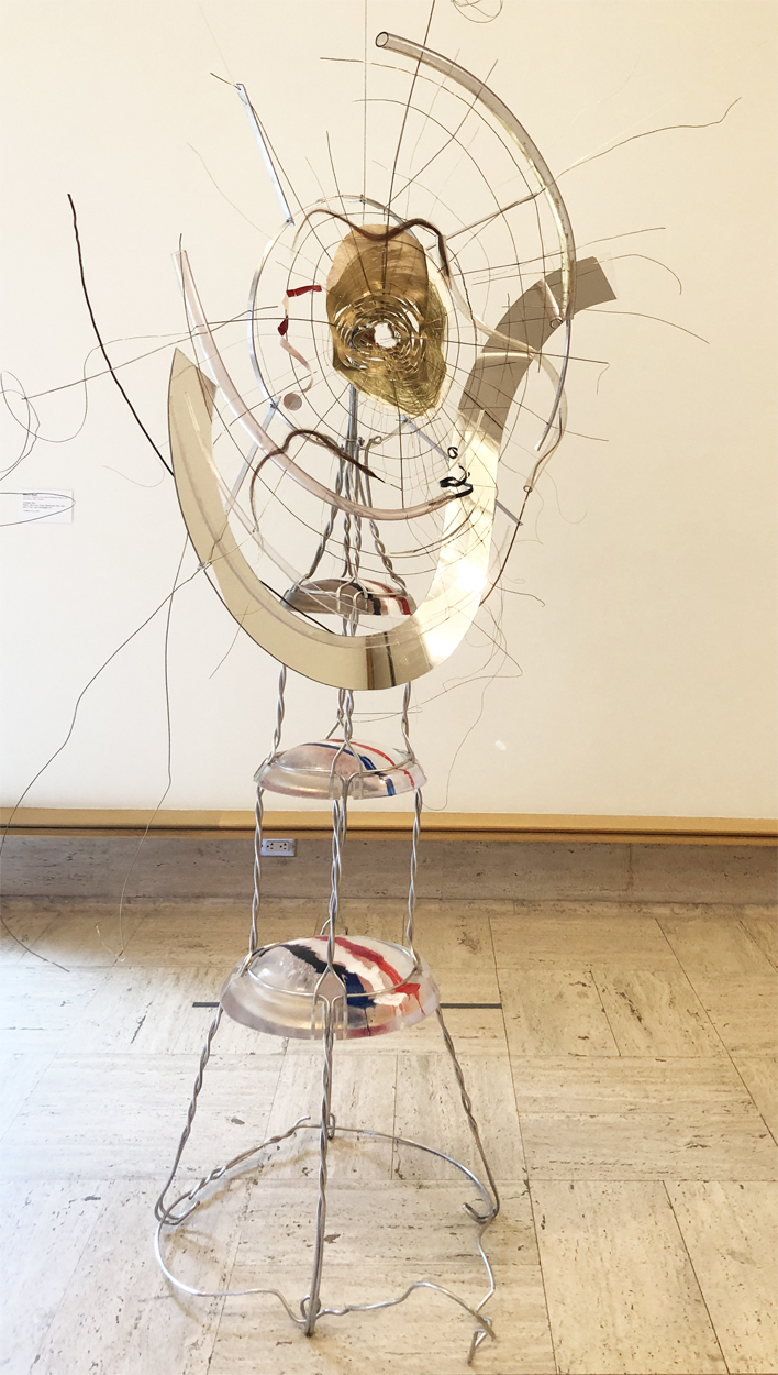
Untitled by Rebecca Ripple (Artist-in-Residence, Dept. of Sculpture, 2017-present) 2016, plastic, aluminum brass, photocopy, pencil, hair, champagne foil. Photo: K.A. Letts

In the Sculpture Court, through the Mixing Chamber ‘s other doorway, Nick Cave’s exuberant  SoundSuit (2012) holds the floor, with a recessive companion, Flamer, by Mark Newport, hanging on the adjacent wall.  Duane Hanson’s provocatively banal figure lounges nearby, unimpressed. Other strong work in the sculpture court includes several fiber pieces which seem to have wandered in, perhaps to provide space between the large and diverse 3-dimensional works–not a bad idea as it turns out. The white-on-white tapestry Montana 30, by Colombian artist Olga de Amaral, made up of small squares of white painted canvas relieved with touches of red, is especially welcome here. Sculptures by artists of the past such as Marshall Fredericks and Carl Milles share the space, more or less peacefully, with artworks by younger artists like Tyanna Buie and Kate Clark. Toward the back of the gallery, James Surl’s spiky mobile floats in its own private galaxy, next to a terrific assemblage by Rebecca Ripple that radiates an ad hoc starburst of Miro-esque energy.
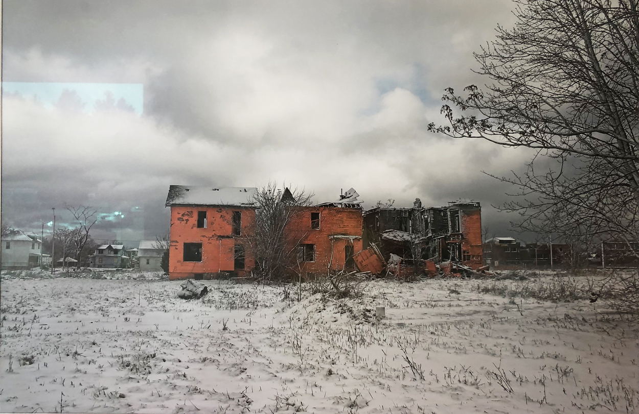
Auburndale Site, Detroit MI (#4) by Object Orange, 2006, archival color photograph, 1/25 Cranbrook Museum of Art. Photo: K.A. Letts

In a small side gallery near the elevators, three photographs by the art collective Object Orange deliver a moment of surreal surprise. From 2005-2007, these (anonymous) Cranbrook graduates undertook a conceptual project called Detroit, Demolition, Disneyland which involved painting–in “Tiggerific” Orange– derelict structures in the city as a form of both public performance and protest. The photographs, brilliant orange structures against bleak gray backgrounds, are arresting, unexpected and a bit melancholy.
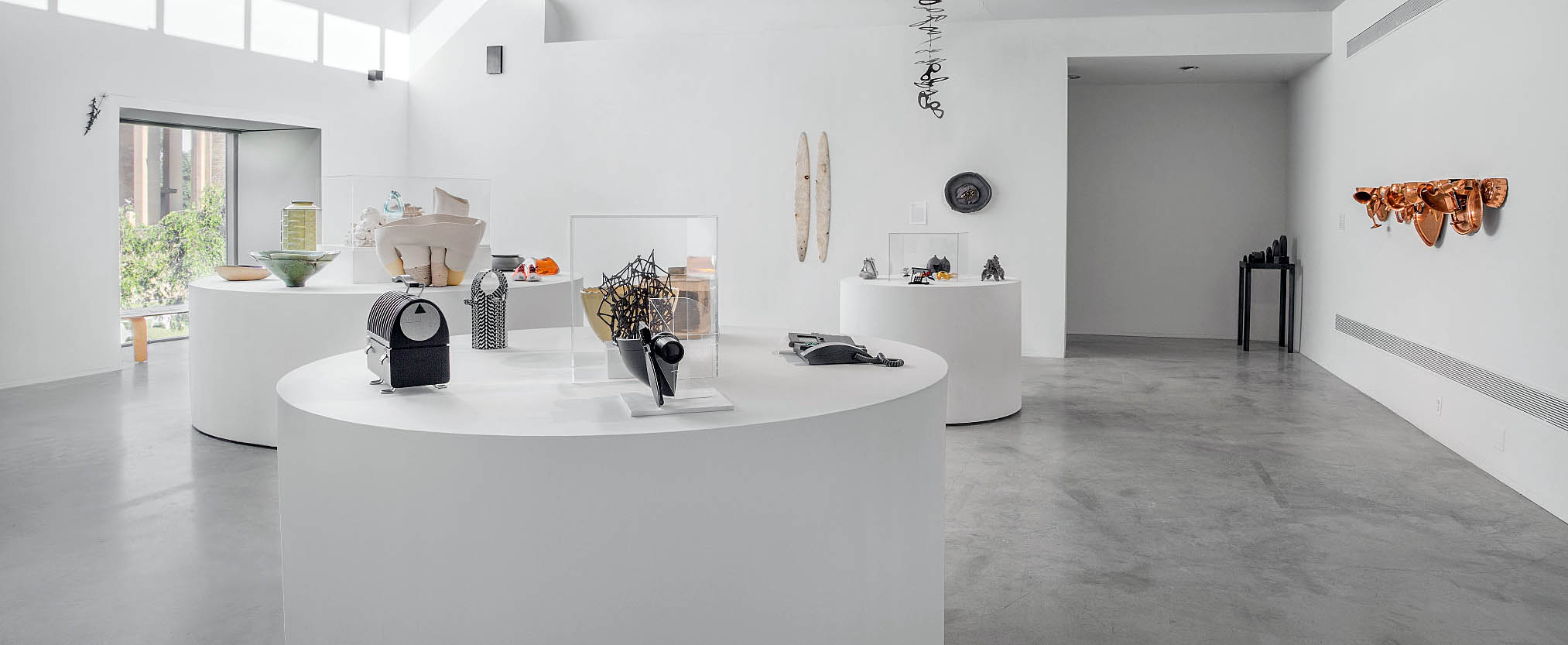
Cranbrook Museum of Art, With Eyes Opened, Object Islands, installation, Photo: PD Rearick

The Wainger Gallery, last stop on the main floor galleries, features a clever installation of “object islands,” table height circular plinths that subtly guide the viewer through a broad array of fairly small- scale ceramics, metal objects and product design prototypes. Many of the objects in this gallery are one-of-a-kind art objects in a variety of media, often in unusual combinations, such as Iris Eichenberg’s untitled brooch made of porcelain, silver and linen.

With Eyes Opened takes on a lighter tone in the museum’s lower level gallery with The Menagerie, a whimsical collection of figures and objects inspired by the natural world, from Marshall Frederick’s chunky Two Bears to Stephen Malinowski’s photograph Cafeteria, a surreal bison-in-a-dining room.  The playful theme of The Menagerie is echoed nearby with a small collection of toy and playground designs that, while welcome, seem like an afterthought.

In the adjacent hall gallery, prints and posters highlight Cranbrook’s influential graphic design program. Installed next to printed media that feature collage, photomontage and progressive typography, several unique works hint at the endless formal potential of paper as a medium.  Elizabeth Youngblood’s elegant, silvery process drawing is tucked into a corner near Laurence Barker’s more exuberant hand-made paper piece.  Layers from the Disemboweled Series by Winifred Lutz takes the medium into the realm of expressionism.
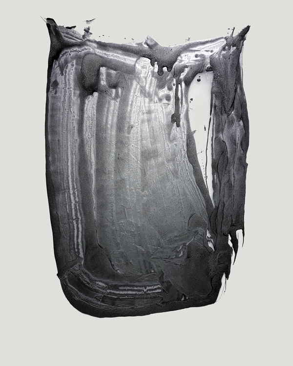
Yet Untitled by Elizabeth Youngblood (MFA Design, 1975) 2018, paint, mylar. Photo: Glenn Mannisto

And last–but not least–some of Cranbrook Academy’s most recent graduates inhabit the lower level deSalle Gallery with distinction. Many of these young artists currently live and work in Detroit and continue the Academy’s tradition of excellence in both craft and conception. The growing diversity of the school is on display here, pointing to a more inclusive future, now enabled by the recent $30 million gift from Dan and Jennifer Gilbert to support student diversity.  Ricky Weaver’s gray and white photo-apparitions emanate spirituality, across from Ebitenyefa Baralaye’s Portrait II, a comic-sinister stoneware head.  Around the corner, Marianna Olague’s painting El Pleno Dia seems to emit its own light.  The emerging artists in this gallery demonstrate the continuing influence of the Academy’s alumni on the Detroit art scene and beyond.
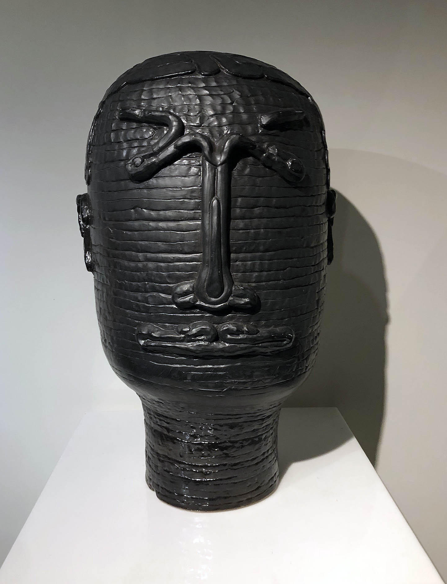
With Eyes Opened is multi-faceted, rich and a little chaotic, more of a class reunion than a retrospective.  What comes through loud and clear in this exhaustive–and sometimes exhausting–survey, though, is the Academy’s continued vitality and its ongoing relevance to any discussion of the 21st century designed environment. And really, that’s enough.
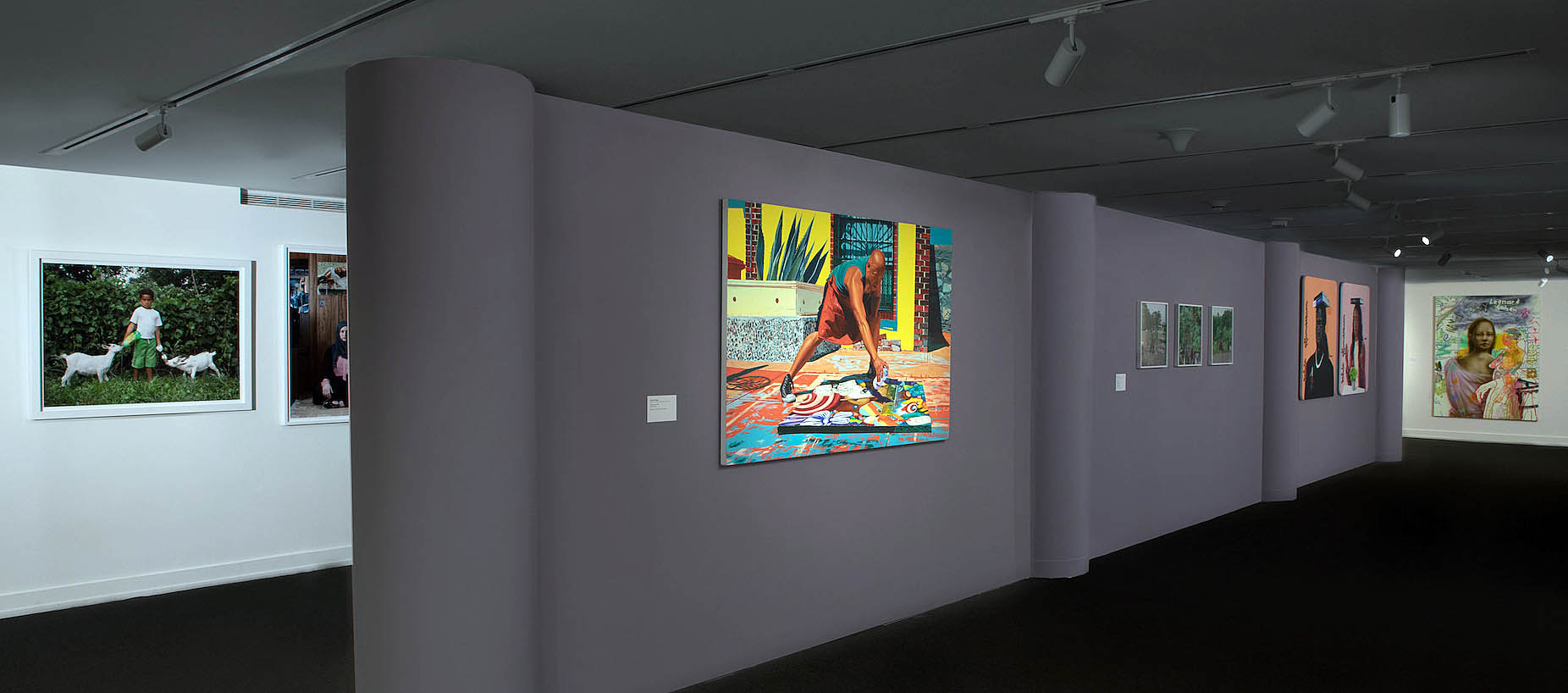
Cranbrook Museum of Art, With Eyes Opened, deSalle Gallery, installation, Photo: P.D. Rearick.

Eyes Wide Open at Cranbrook Museum of Art through September 19, 2021
Car Design in the Motor City @ DIA

Detroit Style: Car Design in the Motor City, 1950 – 2020 at the Detroit Institute of Arts

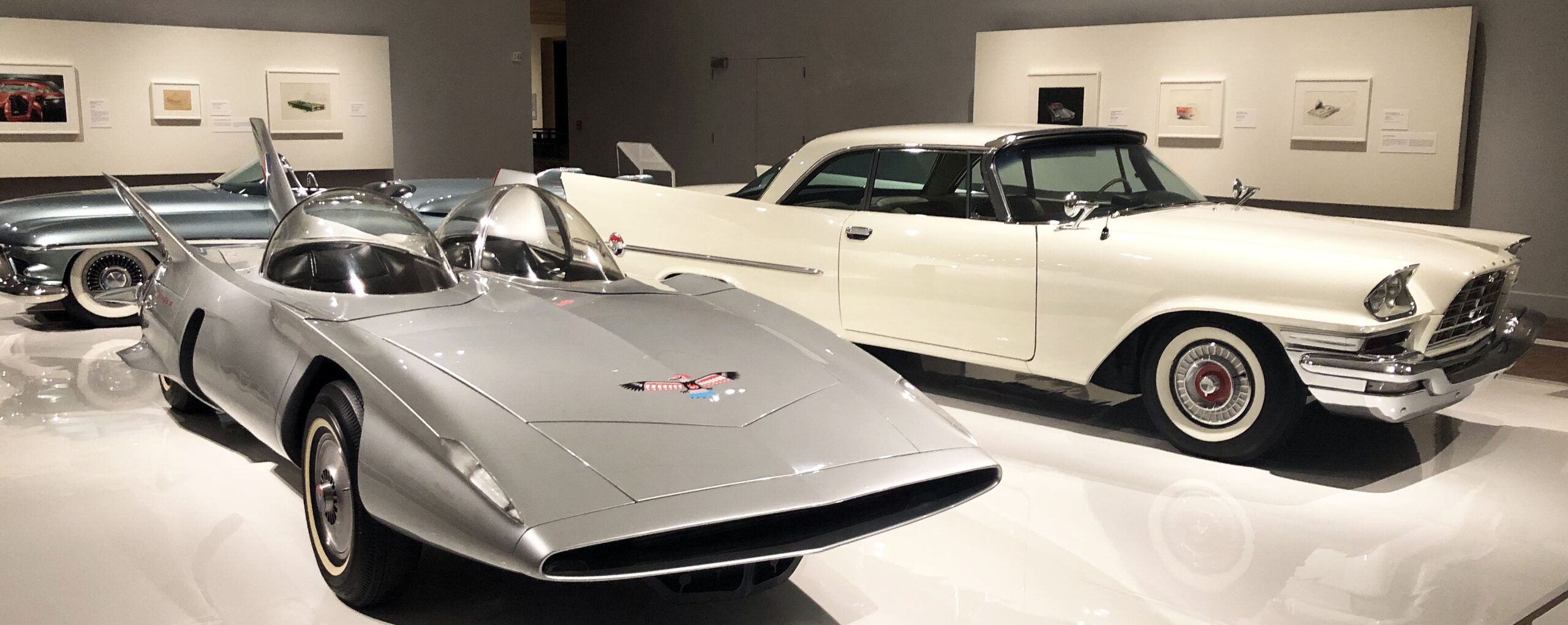
Installation: counterclockwise, Firebird III, General Motors, 1958; 300C, Chrysler Corporation, 1957; Le Sabre, General Motors, 1951

As a visitor arriving at the Farnsworth Street entrance of the Detroit Institute of Arts to take in “Detroit Style: Car Design in the Motor City, 1950 – 2020,” you’ve just begun your journey. After entering the Farnsworth doors of the South Wing of the building, one begins a colorful and eye-catching hike across the width of the museum. The tour passes through the hallowed halls and treasure laden galleries of the Institute until reaching the North Wing and the now deinstalled modern/contemporary galleries and the exhibition entrance. There, a wide doorway (definitely not a columned portal) leads into the first show-stopping gallery of “Detroit Style.” Unlike any other gallery in the DIA, arrayed before you is a breathtaking trio of sleek, shiny automobiles seemingly floating on an expansive white vinyl plinth: a silvery gray Firebird III (General Motors, 1958), a pristine white 300C (Chrysler Corporation, 1957), and a lush misty blue Le Sabre (General Motors,1951). Their elegantly understated hues allow the clean lines, crisp edges and creases, wings, fins, and upswept taillights to protrude and project into space. After all, as a curator once wittily claimed, “Automobiles are hollow, rolling sculptures.”

This, the first and largest gallery, focuses on the 1950s in an exhibition that unfolds chronologically decade by decade. Organized and overseen by DIA curator Benjamin Colman, twelve cars in all are displayed, four from each of the Big Three manufacturers. (And, tactfully, a different car graces three distinct covers of the indispensable catalog–in red, silver, or blue, your choice.) Each of the sequential galleries showcases one or more concept and/or production vehicles. In addition to automobiles, the show offers design drawings, archival photos, paintings, a sculpture, and short videos in which designers discuss their works. (Access the videos at end of this text.)

In the opening gallery, for instance, devoted to the 1950s and presenting the cars described above, a drawing by Art Miller, Rendering of Automobile Interior (1952), features a cutaway view of a gleaming red and black interior and the startling sight beyond the opposite window of a tiny, low flying jet zooming by in the distance, an apt reflection of the influence of aircraft forms on auto design then as well as of the au courant lingo of the 50s: “The Forward Look.”

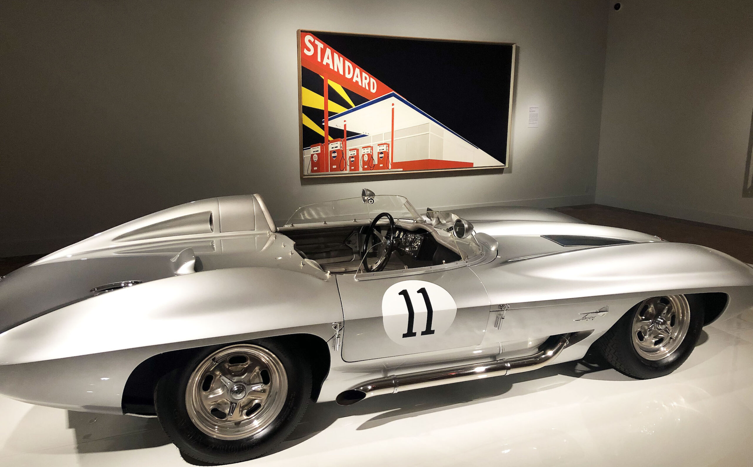
Installation: foreground, Corvette Stingray Racer, General Motors, 1959; background, Edward Ruscha, Standard Station, Amarillo, Texas, oil on canvas, 1963

In one of the subsequent galleries addressing the 1960s, a Corvette Stingray Racer (General Motors,1959) is backgrounded by Edward Ruscha’s Standard Station, Amarillo, Texas (1963). Sharp, crisp lines exaggerating length and emphasizing edges and creases earmark both objects. The iconic red, white, and blue gas station, defined by thrusting diagonals that recede into infinity, is silhouetted against a dark sky with criss crossing searchlights that highlight both the glowing filling station and silvery Stingray in the foreground.

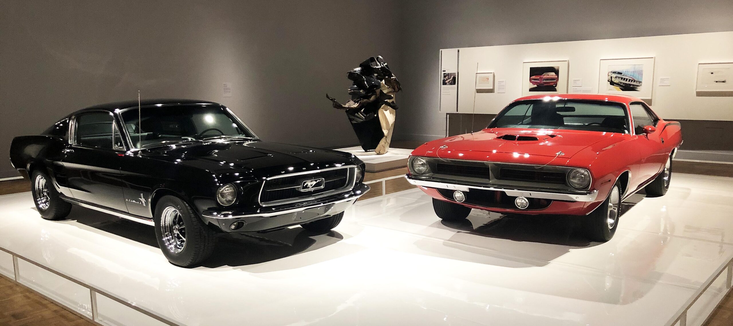
Installation: left, Mustang, Ford Motor Company, 1967; right, Plymouth Barracuda, Chrysler Corporation, 1970; middle, John Chamberlain, Coo Wha Zee, painted steel, 1962

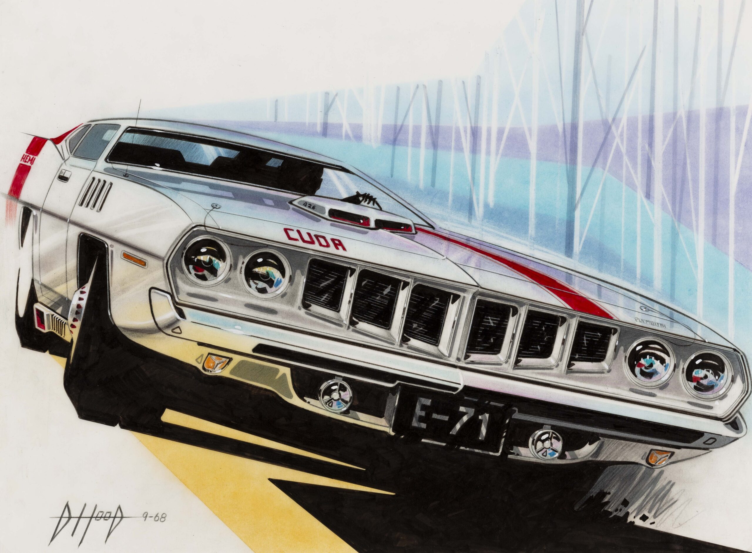
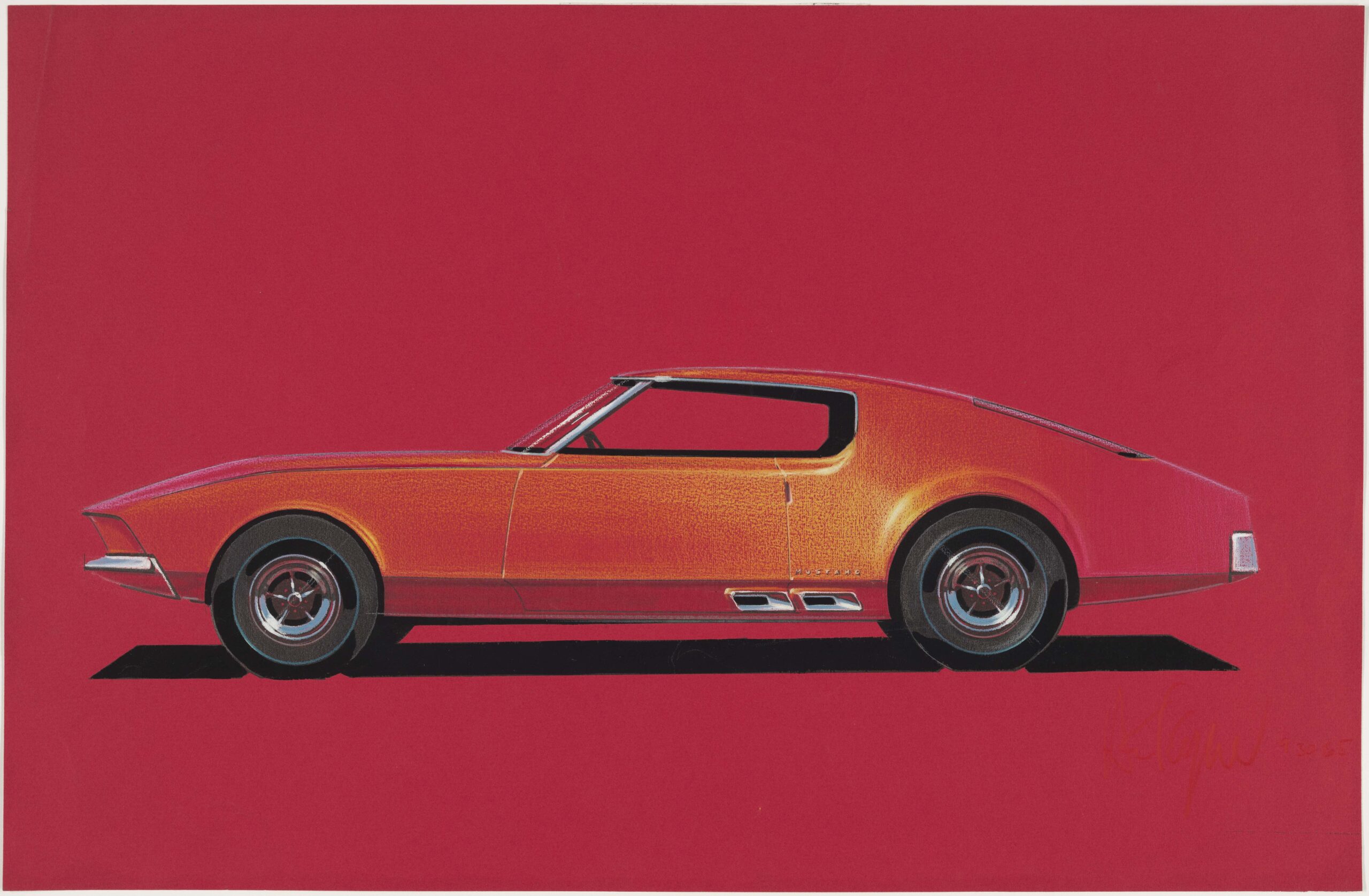
Moving further along into the 60s, two so-called pony cars, the Mustang ((Ford, 1967) and Plymouth Barracuda (Chrysler, 1970), enter the scene. Viewed head on, as here, these sporty, youthful, and spirited vehicles present contrasting hues, one gutsy black, the other flaming red, each with a broad, mouthy grille suggestive of a tense, one-on-one confrontation. Nestled between them is John Chamberlain’s brawny black and white sculpture, Coo Wah Zee (1963). Fabricated from discarded car parts bent and contorted into a tall, rough-edged abstraction, it is, as the title intimates, one “crazy” sculpture. Two drawings, the rakishly tilted 71 Barracuda Front End Facelift Concept (1968) by Donald Hood and Howard Payne’s smoldering Ford Mustang(1965)–a ripe orange body profiled on red paper–attest to the visceral appeal of these feisty, automative rivals.

Donald Hood, ’71 Barracuda Front End Facelift Concept, mixed media on vellum, 1968


Howard Payne, Ford Mustang, Prismacolor and gouache on red charcoal paper, 1965

Just beyond midpoint in the exhibition, rather like a palate refresher, the 4-door, aerodynamic Probe IV (Ford, 1983) comes into view. Its soft, pristine white hue, integrated forms, rounded corners, quiet, whispering demeanor, and four wheel covers minimizing the presence of tires and implicit speed, denote what one commentator described as a “wind cheating supercar.”  Accompanying its calm presence are a number of fluid, ovoid renderings by Howard “Buck” Mook, Maurice Chandler, Taru Lahti, and Ken Okuyama (c. 1982 -1991).

GT, Ford Motor Company, 2017


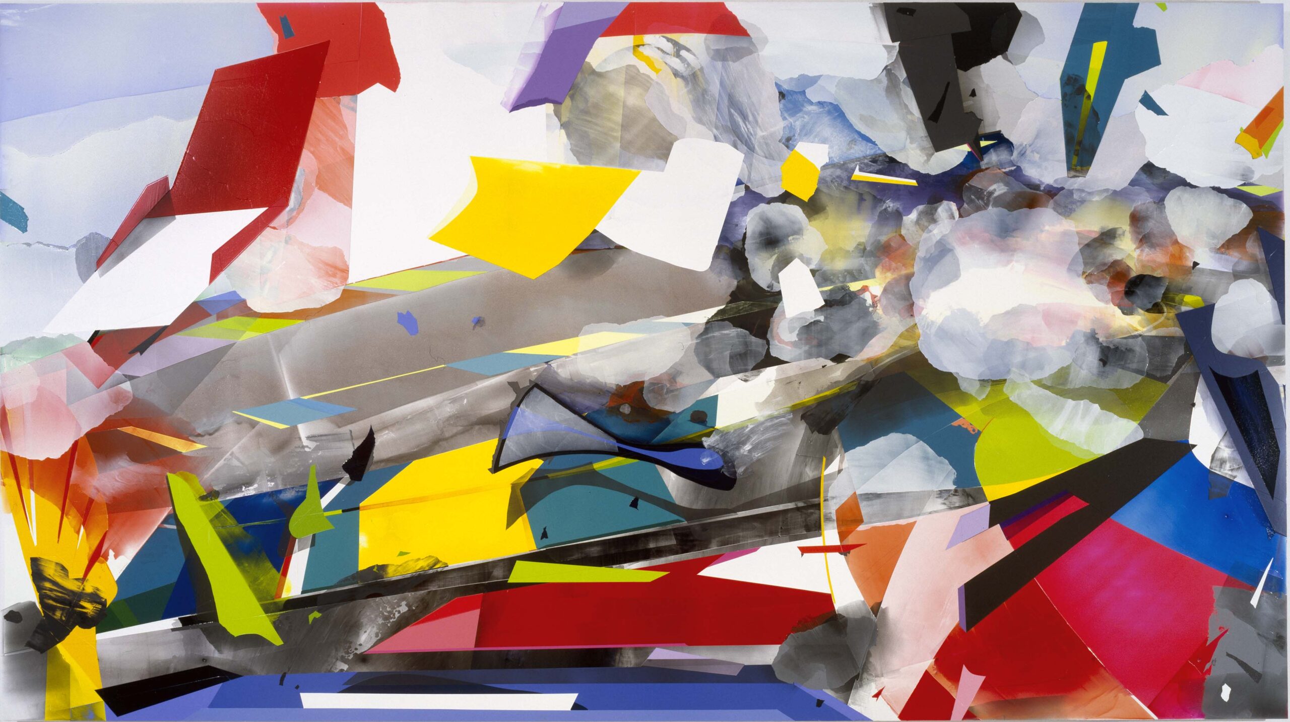
Kristin Baker, The Unfair Advantage, acrylic on PVC on board, 2003

The final gallery, sparely installed, is home to just two works: an electric blue, sinuous, teardrop shaped GT (Ford, 2017) and Kristin Baker’s large scale, mixed media composition The Unfair Advantage (2003). The swept-back lines of the low-slung GT, a reinterpretation of a racing car legend of 1966, telegraph power, speed, machismo. Baker, alternatively, presents a cautionary work, an updated Futurist scene (landscape, raceway?) that evokes jagged, colorful forms whizzing by AND, as a counterpoint, the blurred, roiling smoke and fire indicative of a catastrophic crash. Nothing like ending the show with a bang!

Videos, accessible here,  provide perspective on how Detroit’s iconic vehicles are created with this interview series featuring car designers Ralph Gilles, Emeline King, Craig Metros, and Ed Welburn.  The four designers share their insights on favorite cars, the use of materials, and the collaboration between designers and engineers.

“Detroit Style: Car Design in the Motor City, 1950 – 2020” is on display at the DIA through June 27, 2021. Keep in mind that to view the exhibition you will need to reserve in advance a specific day and time for your visit.

Moving Forward @ OUAG

Oakland University Art Gallery opens the fall season with a faculty exhibition

Installation image, Moving Forward, OUAG, 10.2020

Every fall since I can remember, the Oakland University Art Gallery, under the direction of Dick Goody, Professor of Art, Chair of the Department of Art & Art History and director of the Oakland University Art Gallery, has started off the fall season with a large curated show (supported with a four-color catalog) that would have required months in the planning and often brought in artwork from various parts of the United States and beyond.  Given the current situation under Covid 19 restrictions, Goody has opted to curate a faculty show, including his own work, supported with information on the web site to provide a venue for his faculty members. I suspect he is waiting until later in 2021 to present the public with something more in keeping with his previous tradition. Nevertheless, the gallery is open to the public, with Covid 19 restrictions in place,  noon – 5 pm, Tuesday through Sunday, closing November 22, 2020. It’s worth a visit.

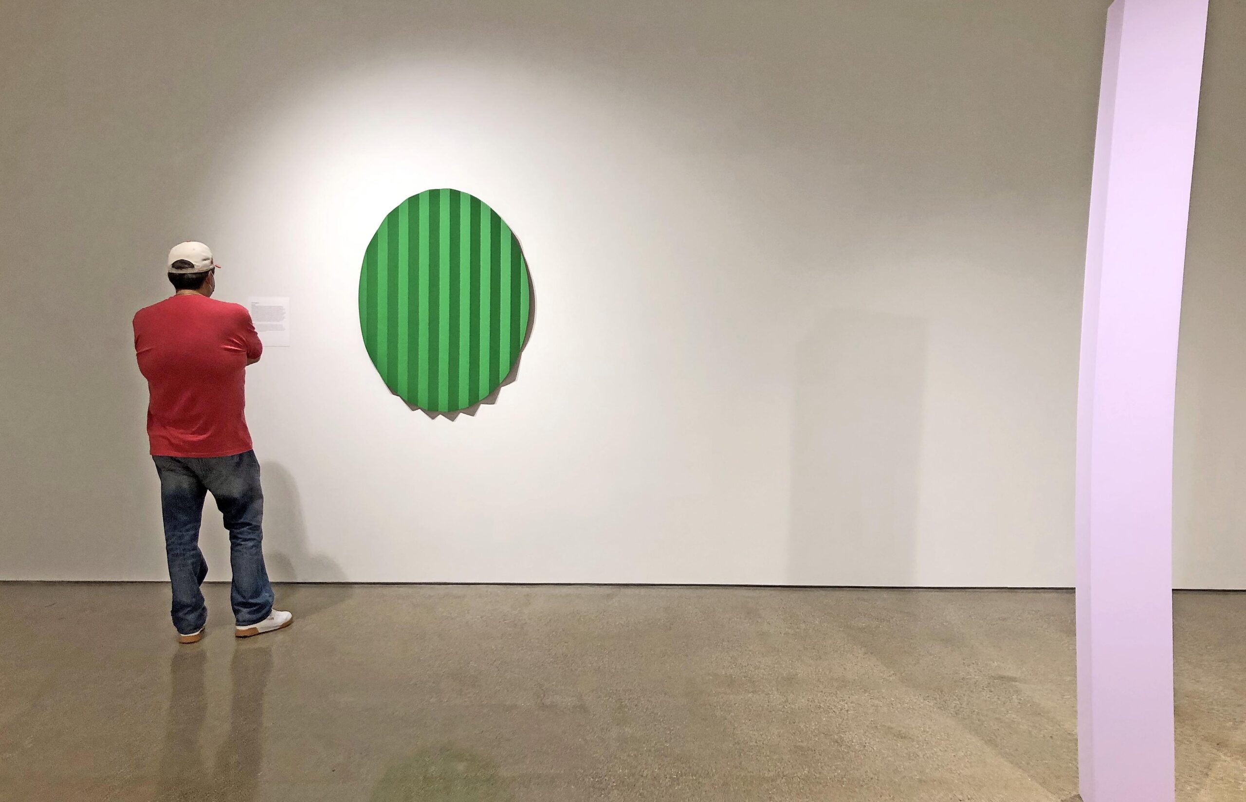
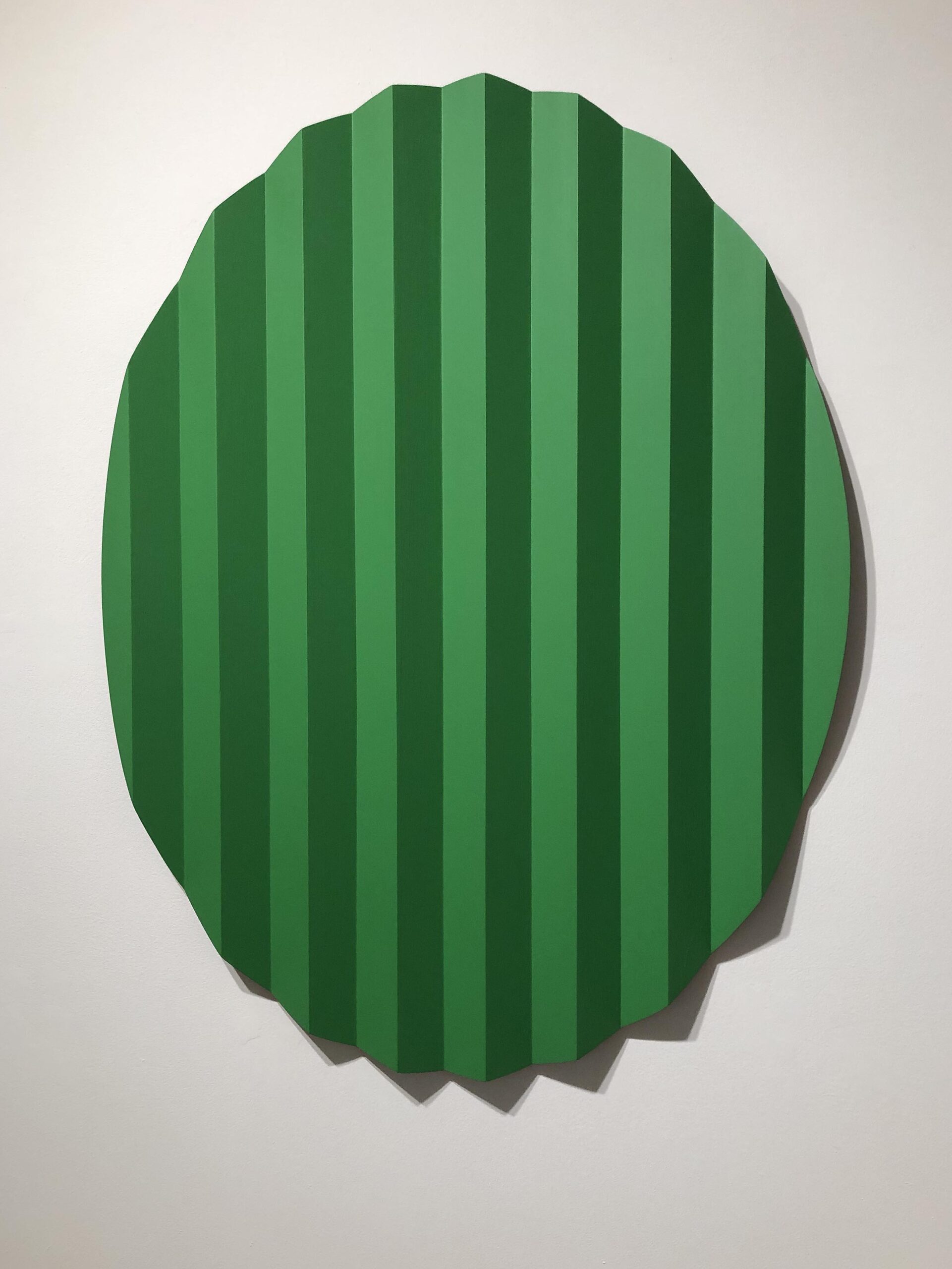
Cody VanderKay, Flattening, 32 X 43 X 3 20, PAINTED OAK, 2020


The work of art that jumped out at me was Backstage, by the artist Cody Vanderkaay, an eclipsed shape object with a highly constructed surface of vertical squared planes painted in progressive shades of green. It’s a new experience.  Not a figure, landscape, still life or photo image reference, but a newly experienced object.  In the surge of artist returning to painting the figure, Vanderkaay stays on course with his abstract imagery presenting a consistent path for his work to expand and enlighten.

He says in his statement, “The artworks explore and consider how individuals, objects and spaces interrelate, and how relationships between these entities develops over time. The sculptures displayed in this exhibit signify various states of change: A circular plane of wood appears pleated and compressed to produce a variegated effect; a vertical square column bends in diverging directions under invisible force; a small-scale architectural relief implies stories behind the scenes.”  Cody VanderKaay was born and raised in North Metro Detroit and graduated from Northern Michigan University with a B.F.A. in Sculpture and from the Lamar Dodd School of Art at the University of Georgia with an M.F.A. in Sculpture.

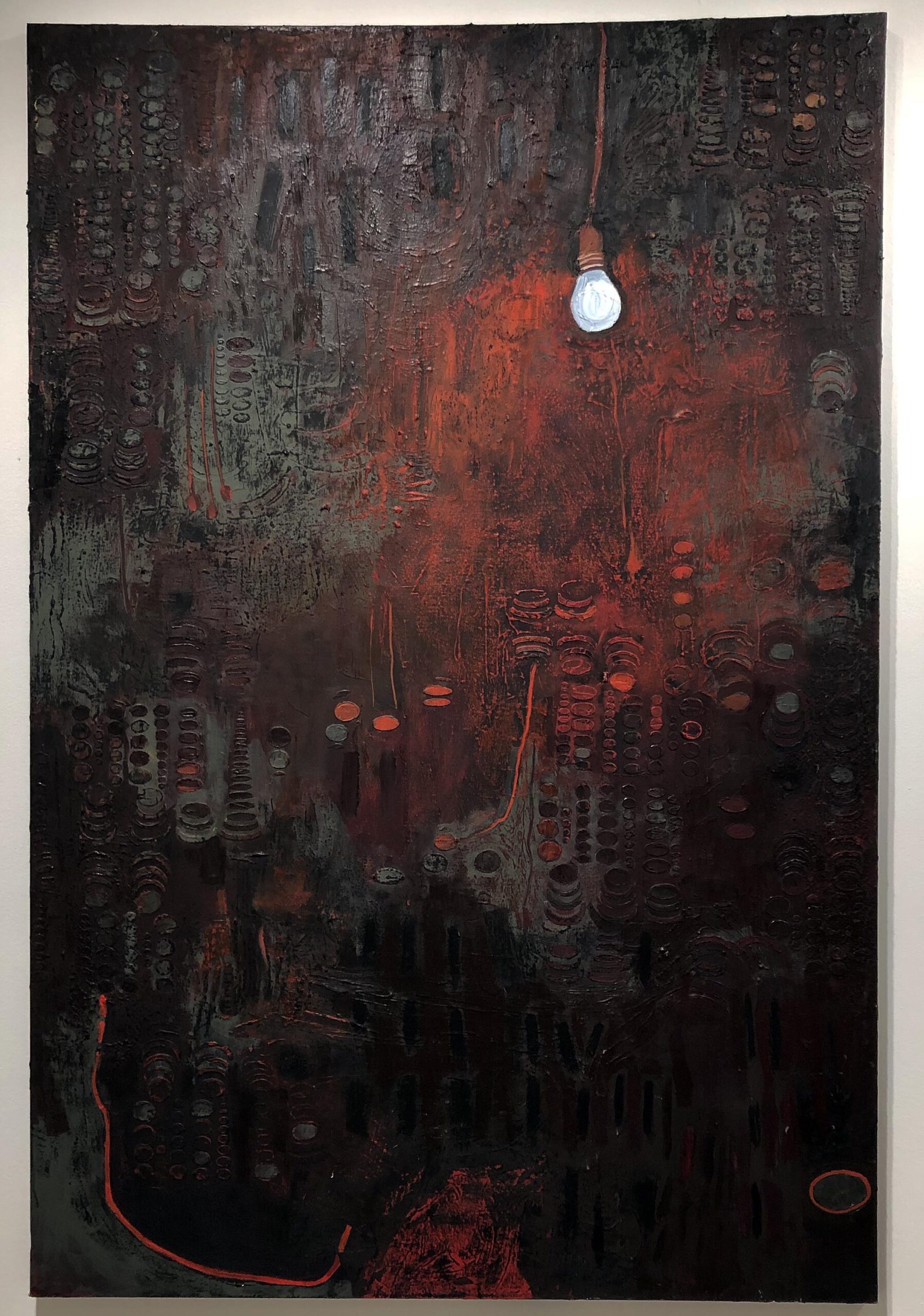
Sally Schluter Tardella, Bulb, Oil on Canvas, 72 x 48”, 2020

The work of Sally Schluter Tardella, Bulb, also attracted this writer, a sort of melancholy oil painting that revolves around a painter’s favorite subject, light.  This single bulb illuminates its surrounding  vertical space filled with tones of red, brown and grey and a repeating motif of ellipses, lines and small shapes creating a somewhat mysterious abstract space.  It is the idea that draws the viewer to the work of art highlighted by something we all recognize: a small domestic light bulb.

Tardella says in her statement, “A wall surrounds, encloses, immures. A barrier, it is a continuous surface that divides rooms, separates and retains elements. I see transparent and opaque layers of material from above and below, as I imagine cross sections of wood beam structures folding into new systems of wall. In Bulb the atmosphere is lit by the single light bulb, the space defined is both deep and blocked by surface texture, whereas in Light, the light source is transparent and the space is shallow. In Fan the screen is made of tactile architectural symbols.”  Sally Schluter Tardella uses architectural tropes as metaphor to explore personal ideas of body, gender, culture, and politics. Tardella moved from New Jersey to study Painting at Cranbrook Academy of Art.

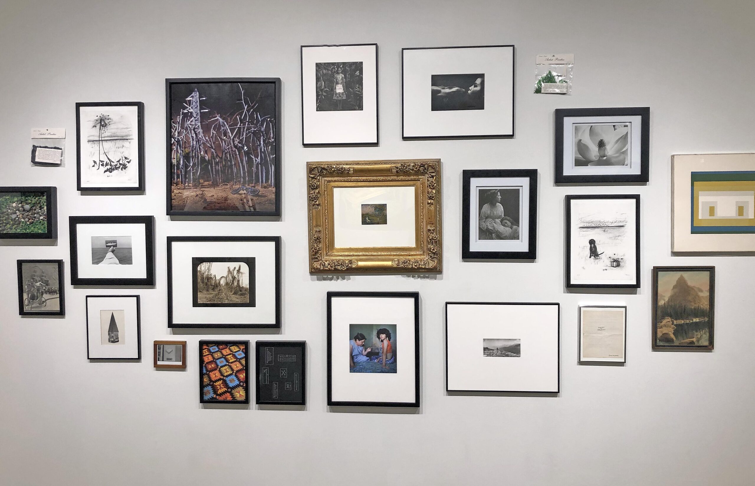
Susan Evans, Some Art From My House, Mixed Media, 2020

This eclectic collection of photo imagery, Some Art From My House, is exactly that, a mixture of small photographic images that vary in color size, format and subject, which is meant to demystify the taking of images and their content.  There are images I like and others not so much, but it is a window into her perception of what photography is, at least for her.

Evans says in her statement, “ What we look at everyday becomes familiar and generally, familiar things become preferences which define ideas, beliefs and experiences. Although I have not made any of these works as a group these pieces become an intimate self-portrait. The true meaning of the piece is not about each image individually, instead it is about the sum, juxtaposition and connection between the different elements. Who then is the true author of the artwork?”  Susan E. Evans received her B.F.A. in photography/holography from Goddard College, and an M.F.A. in photography from Cornell University.

The Moving Forward exhibition features the work of the full-time faculty of the Department of Art & Art History at Oakland University that includes the work of Aisha Bakde, Claude Baillargeon, Bruce Charlesworth, Susan E. Evans, Setareh Ghoreishi, Dick Goody, David Lambert, Lindsey Larsen, Colleen Ludwig, Kimmie Parker, Sally Schluter Tardella, Maria Smith Bohannon and Cody VanderKaay.

OUAG Hosts Faculty Exhibition Moving Forward closing November 22, 2020


Winter @ Cranbrook Art Museum: Craft Takes a Bow

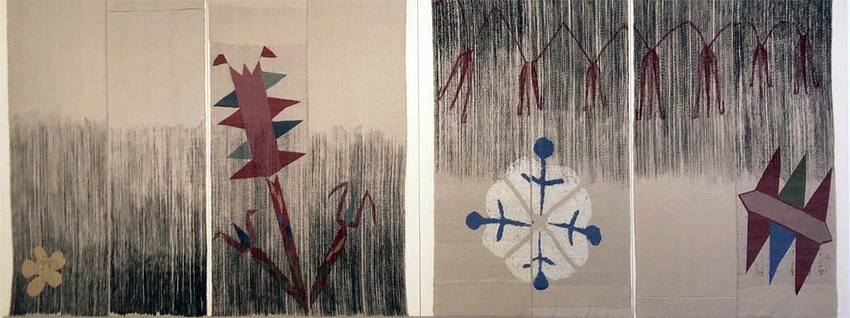
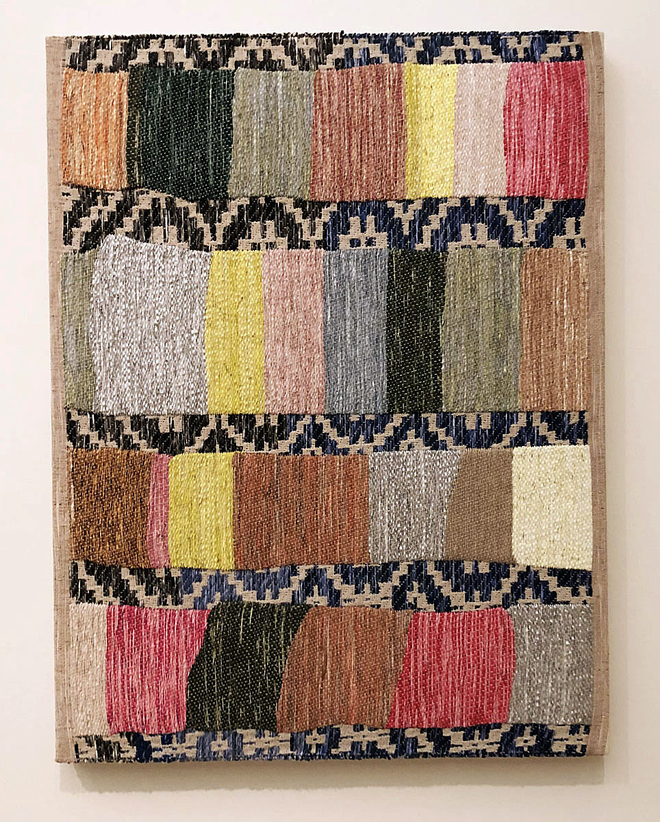
Untitled II (for Ashgebat) by Christy Matson, 2016-2019, hand-woven cotton, linen, wool, indigo dye and acrylic on stretched canvas.

Contemporary craft is having a moment. The Museum of Modern Art in New York City recently placed ceramics by George Ohr next to Van Gogh’s Starry Night in their re-installed galleries. Taking a Thread for a Walk, an exhibit that celebrates weaving and fiber art in all its forms, both ancient and modern, will be on view there until April, 2020. Meanwhile, over at the Whitney, there’s a comprehensive survey of modern and contemporary American craft from 1950-2019, called Making/Knowing: Craft in Art.

Members of the Cranbrook arts community might be forgiven for asking what took so long; since its founding in 1922, Cranbrook has been a champion for American craft traditions. The museum seems to be taking a victory lap for its prescience right now:  4 exhibits on view through March carry the vision of craft as art forward while also looking back at important moments of its history, in Detroit and beyond.

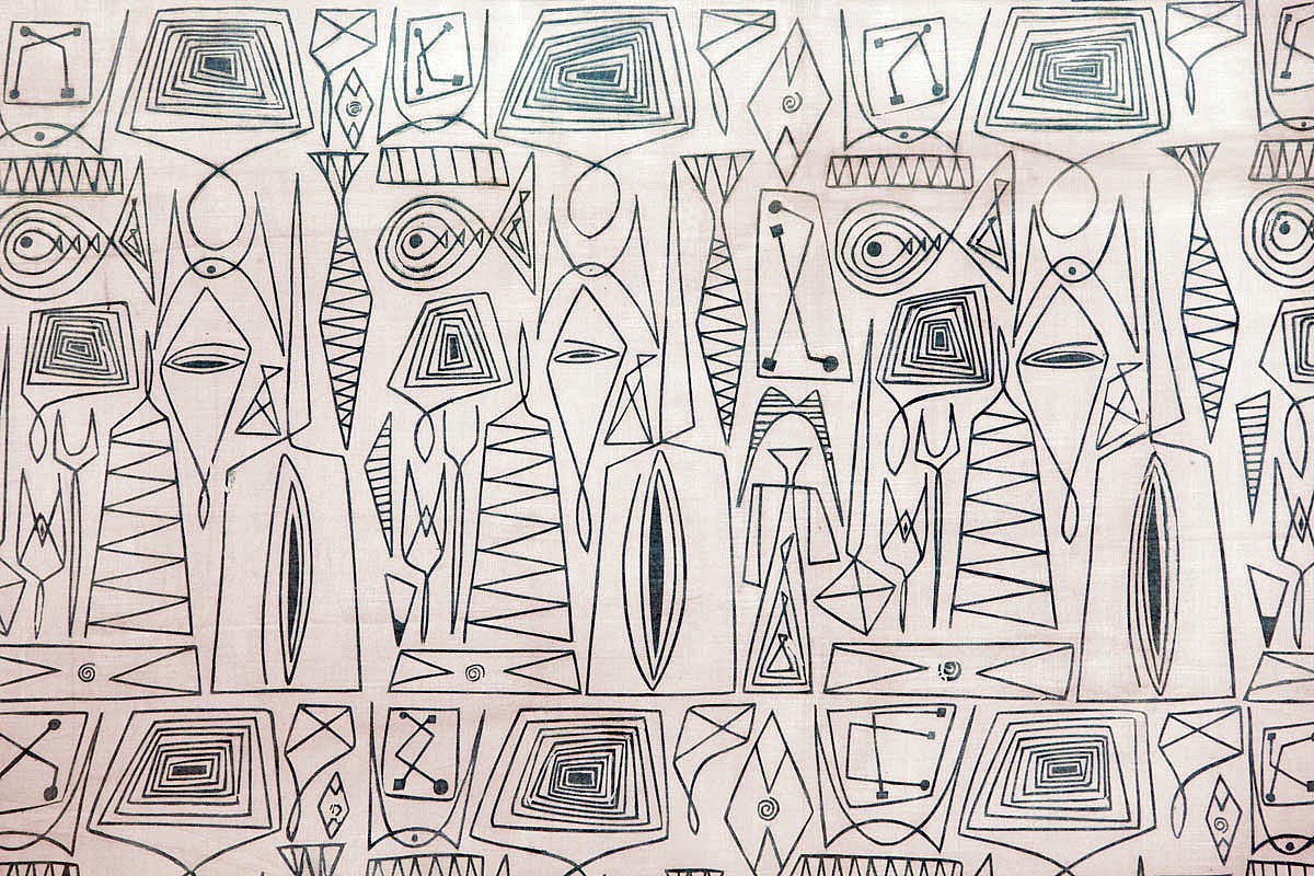
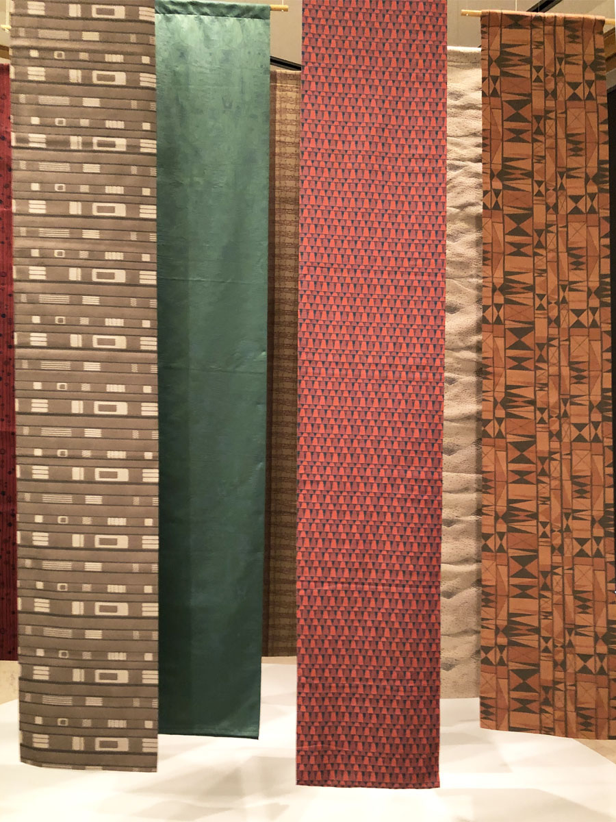
Wireworks by Ruth Adler Schnee, 1950, ink on white dreamspun batiste

Ruth Adler Schnee: Modern Designs for Living

A major retrospective (her first) of eminent Detroit textile and interior designer Ruth Adler Schnee occupies the museum’s front gallery. Adler Schnee’s family fled Nazi German in 1939, settling in Detroit, where she attended Cass Technical High School. After earning a degree in design at the Rhode Island School of Design, Adler Schnee returned to Detroit to study architecture with Eliel Saarinen at the Cranbrook Academy of Art, graduating in 1946. She faced obstacles as a woman to a career in the male-dominated field of architecture, but immediately found success in textile design. Her memorable modernist cotton prints are on display and will be immediately familiar to anyone who feels an affinity for the recently resurgent interest in midcentury modern design.

Ruth Adler Schnee made it her mission to democratize good design for the post-war mass American market. “We are living in a democracy. Our designs for living must have social implications,” she states in her Cranbrook master’s thesis.    She worked extensively as an interior designer and textile designer with architects like Minoru Yamasaki, Frank Lloyd Wright and Eero Saarinen, as well as operating (for 30 years with her husband Eddie) Adler Schnee Associates, a retail design business in Detroit. She also worked with American car companies; for an amusing look at their symbiotic relationship and a historic overview of the importance of Detroit as a driver of design in the 50’s and 60’s you can view American Look, a 1958 promotional film sponsored by Chevrolet.

At 96, Adler Schnee continues to be a relevant force in textile design today through adaptation of her classic printed textile designs into woven fabrics and carpet design. Examples of both are on display in the gallery.

Designs Worth Repeating, Woven Textiles by Ruth Adler Schnee. Woven fabrics based on Adler Schnee’s mid-century modern prints, re-introduced for the 21st century.

Christy Matson: Crossings

Contemporary L.A. fiber artist Christy Matson is a multi-disciplinary shape shifter whose work occupies an esthetic space at the intersection of painting, weaving and collage.  Employing digital technology and a jacquard loom, Matson expands the formal parameters of weaving. She creates tapestries that incorporate organic curving lines and shapes unavailable via more traditional techniques and employs novel fibers and pigments added to traditional yarns and threads. The results are fiber artworks that have been aptly described as “painterly.”

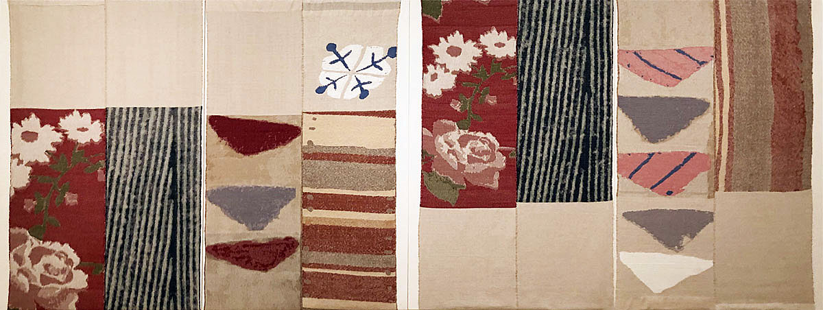
Crossings, a solo exhibit of her work currently on view at the museum, consists of two large tapestries realized as a commission for the U.S. Embassy in Ashgebat, Turkmenistan, as well as several smaller, more intimate pieces that allow a welcome closer look at Matson’s technical means.

Matson has an expressed interest in the symbolism and the technical realization of traditional Turkmen textiles, as well as a kinship with the women who make them. The traditional costumes of Turkmenistan are deeply symbolic and incorporate imagery specific to the gender, social position and age of the wearer. Varieties of technical decoration in local costume, such as patchwork and embroidery, make a richly colorful and tactile pastiche that relates formally to Matson’s work.  The rugs for which the region is justly famous are woven by women from a variety of fibers dyed with a combination of synthetic and natural dyes, another point of correspondence with the artist.

Untitled I (for Ashgebat) by Christy Matson, 2016-2019, hand-woven cotton, linen, wool, indigo dye and arcylic on stretched canvas.

The two colossal tapestries that anchor the exhibition incorporate abstract pattern and stylized images of plants using long narrow woven panels joined two by two.  Untitled 1 (for Ashgebat) consists of stripes and floral motifs that are repeated and occasionally reversed and tilted to yield a roughly symmetrical counterpoint. A central stylized blossom anchors the composition.  Untitled II (for Ashgebat) flirts with the illusion of pictorial space.  The hazy vertical stripes on the left suggest grasslands, while the same lines reversed and repeated on the right suggest the fringe of a rug.  The stylized seed heads and blossoms on each panel create a satisfying rhythm without precisely repeating themselves.

The smaller pieces in Crossings allow a closer look at Matson’s art practice. Particularly illuminating is her Overshot Variation 1 which incorporates bands of painted paper using the overshot technique often employed in Jacquard weaving.

Overshot Variation I by Christy Matson, 2018, deadstock overseen linen, acrylic and spray paint on paper, Einband Icelandic wood

In the Vanguard: Haystack Mountain School of Crafts, 1950-1969

For artists who dream of an idyllic creative space where collaboration, mutual support and disciplinary cross-pollination are the rule, the Haystack Mountain School of Crafts represents a dream come true. The 90 pieces that fill, and threaten to overflow, the museum’s middle galleries recount the history of this important creative community from 1950-1969 for the first time.  The objects in the exhibit range from textiles to printmaking, ceramics, metalwork and painting, and even to jewelry making and glass art. By discarding ideas regarding the primacy of fine art versus craft, the members of Haystack approached a non-hierarchical egalitarian ideal. Many of the artists represented in the exhibit also had ties to the Cranbrook arts community during a particularly fertile period for craftspeople who lived and worked and created in this uniquely supportive creative environment.

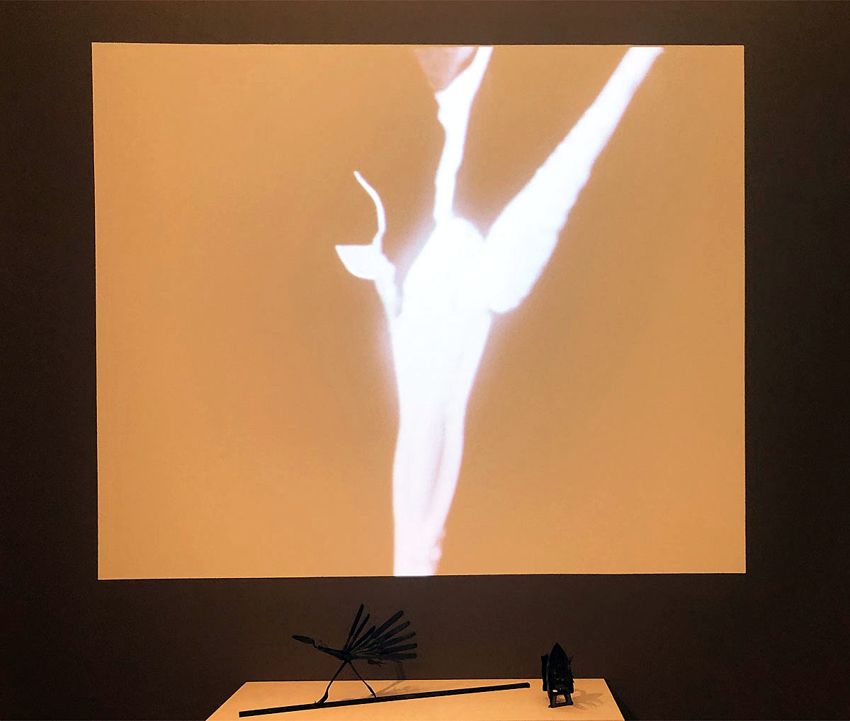
Video still, from Dance of the Looney Spoons, by Stan VanDerBeek with Johanna VanDerBeek, 1959-1965, 16 mm black and white film transferred to video with sound, 5:20 minutes (Haystack)

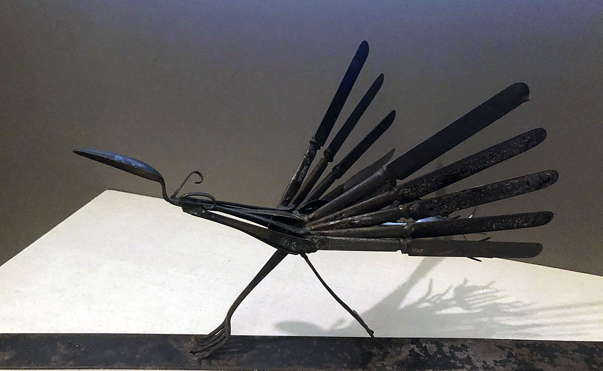
Silver Road Runner by Stan VanDerBeek, 1954, assorted metal silverware (Haysta


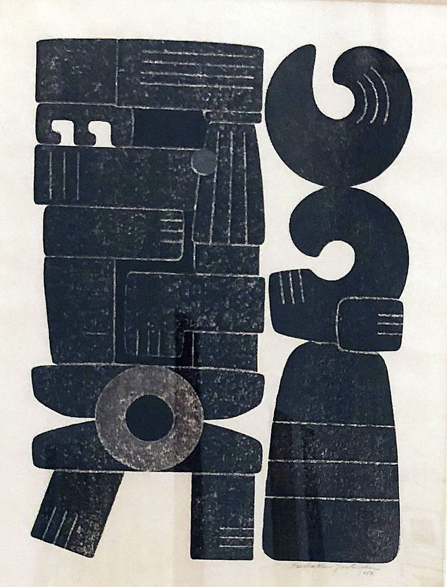
Ancient People by Hodaka Yoshida, 1956, relief print on paper (Haystack)

For the Record: Artists on Vinyl

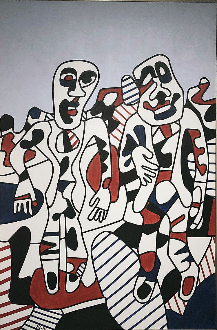
In the lower level gallery, you can experience the unexpected pleasure of 50 designs for vinyl records–some vintage, some recent– by a who’s who of artists comfortable working at the intersection of design and fine art:  Jean-Michel Basquiat, Yoko Ono, Andy Warhol, Banksy, Shephard Fairey and Keith Haring, Robert Rauschenberg and Robert Motherwell, to name only a few. The square parameters of the vinyl record cover seem to have offered the perfect creative space for artists to create bite-size versions of their more ambitious works. It’s worth a trip down the stairs just to see Jean Dubuffet’s painting Promenade a deux from the museum’s collection, installed next to his lithograph Musical Experiences.

Promenade a deux by Jean Dubuffet, 1974, vinyl on canvas, matt Cryla varnish

The exhibits at Cranbrook right now, particularly the Ruth Adler Schnee retrospective, demonstrate some of the diverse ways in which craft and design have historically influenced America’s aspirational culture. The built environment of the country, though, has changed–is changing.  As the past gives way to the future, the times will require creatives that bring the same level of creativity seen here to new challenges like technological innovation and environmental change.

Winter at Cranbrook Art Museum: Craft Takes a Bow  through March 15, 2020


Decade at the Center: Recent Gifts and Acquisitions @ GRAM 

The Grand Rapids Art Museum Showcases Five Years of Acquisitions

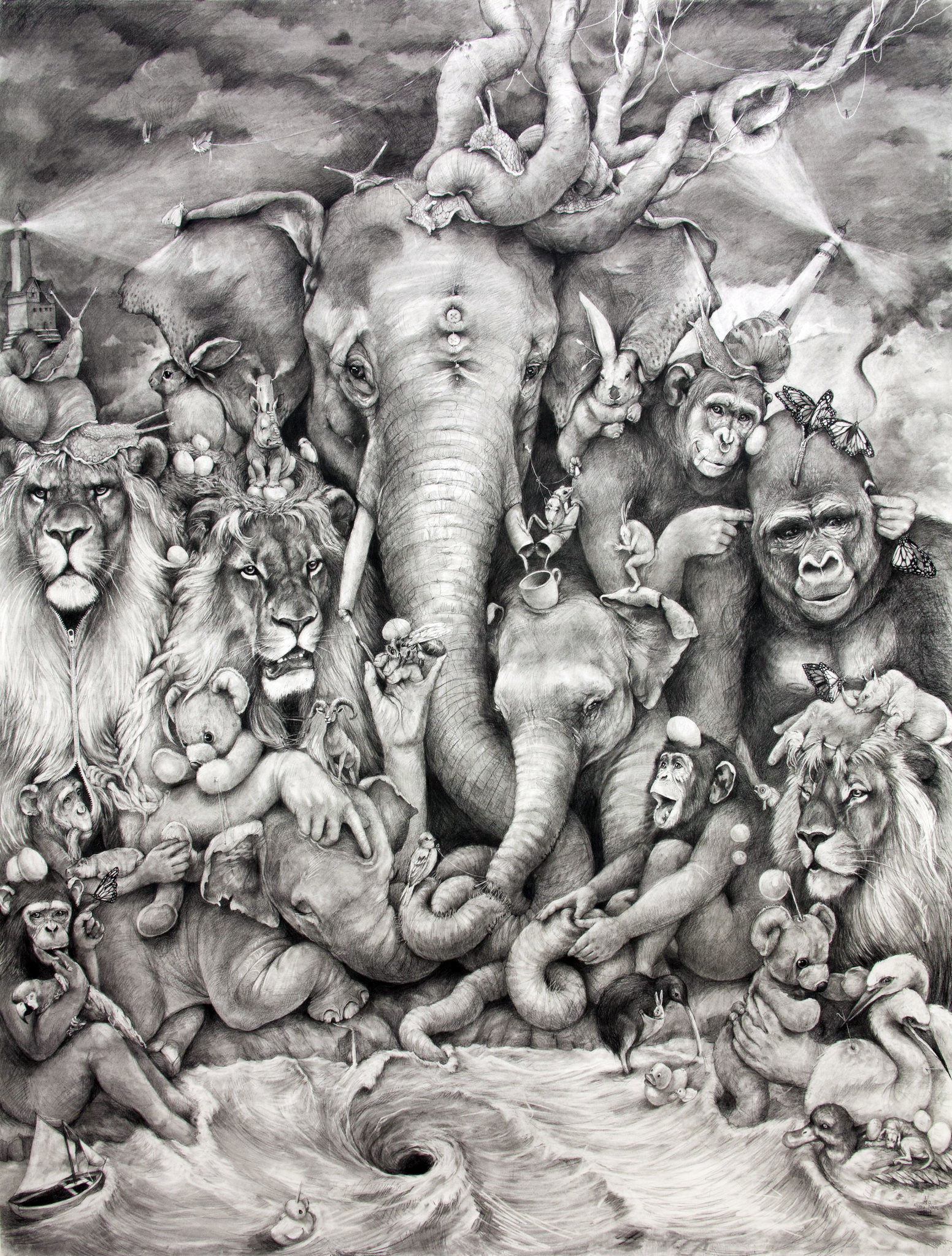
Adonna Khare (American, b. 1980) Elephant Whirlpool, 2014, carbon pencil on paper, 96 x 72 inches. Grand Rapids Art Museum, Museum Purchase, with funds from Bill and Marilyn Crawford and the Artist, 2014.10 copyright: Adonna Khare

In 2007, the Grand Rapids Art Museum opened the doors to its newly-completed, ultra-modern exhibition space in the heart of downtown Grand Rapids.  Rounding out a year of celebratory programming commemorating the GRAM’s first decade in its new location, the show A Decade at the Center: Recent Gifts and Acquisitions brought together over a hundred works acquired by the museum over the past five years.  It was an eclectic but strong ensemble of works spanning a diverse array of media across both the fine and applied arts.

As an introspective exhibition which took the GRAM’s collection itself as its subject matter, A Decade at the Center was necessarily a bit of a mish-mash—these works came from all over the world, and were created by artists ranging from Rembrandt to the Apple Design Team.  But the explanatory wall-text curated and structured the experience, lending insight into what exactly goes into building an art collection, helpfully addressing questions like “How does a collection grow,” “who decides what’s acquired?” and “how permanent is a permanent collection?”

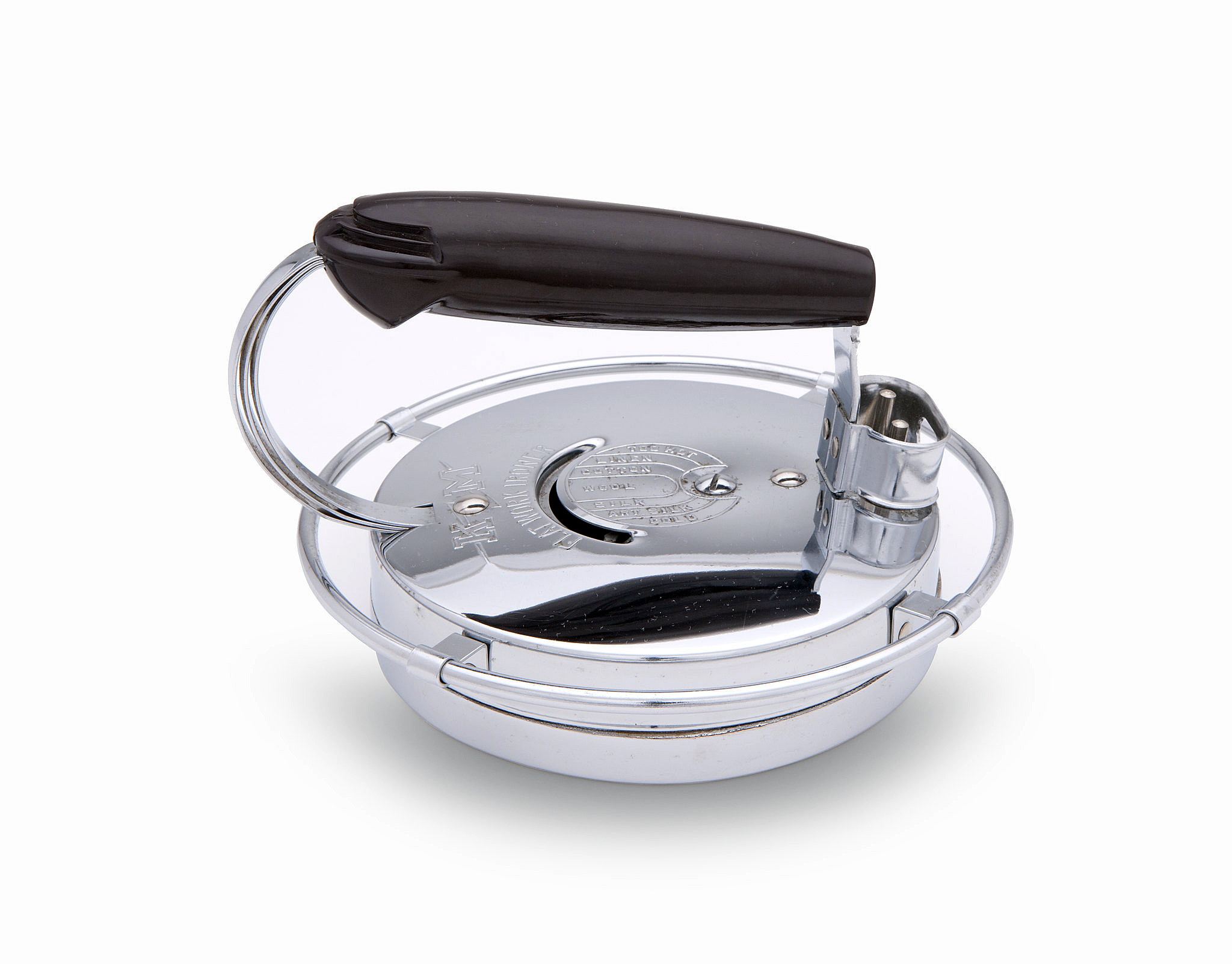
The significant presence of applied arts and design resonated nicely with Grand Rapids’ historic contribution to 20thcentury furniture manufacturing—the city is famously home to such design powerhouses as Hermon Miller and Steelcase.  Among the acquisitions on view included examples of design that fudge the porous boundary between functionality and art. A zany bench and table set designed by the Danish-born Nanna Ditzel seemed more like sculpture than interior design, as did the radiating  Metal Spokes Wall Clock by George Nelson and Associates, which helped define the American interior aesthetic of the 1950s.  While most of these examples of applied design pointed to the recent past, a set of dinner cutlery by Iraqi-born megastar architect Zaha Hadid seemed decidedly from the future—no surprise given the other-worldly appearance of her architectural output, which includes Michigan’s very own Broad Art Museum in Lansing.

Also on view were examples of design which illustrated the rapidly changing shape and form of technological devices, including an original Walkman cassette player, an early handheld Kodak camera, and a rotary telephone.   There’s even a first-generation iPod Shuffle, which, though not even fifteen years old, is a relic rendered just as archaic as the Walkman by the ubiquitous iPhone.  Given the rapidity of technological change, one can’t help but reflect that fifteen years from now the iPhone itself may very well be added to this pantheon of the obsolete.

William E. Gundelfinger (1900–1976) KM ‘Flatwork Ironern’ Iron, Model no 444, 1939. Chromium-plated steel, Bakelite. Made by Knapp-Monarch Co., 5 x 7 3/8 x 7 3/4 inches. Photo by Shane Culpepper, Tulsa OK.


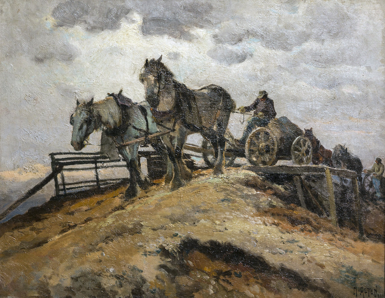
Some of the more traditional works on view also had regional significance, like the paintings of Carl Hoerman, Matthias Altan, and Reynold Weidenaar, the latter of whom was featured in a massive retrospective here in 2015, occasioned by the centennial of his birth.  All three artists lived and worked in West Michigan, and their work, which took Michigan’s landscape as its subject matter, reflects their affection for the natural beauty of the state.

Mathias J. Alten (American, 1871–1938) The Gravel Pit, 1909. Oil on canvas, 22 x 28 inches. Grand Rapids Art Museum, Gift of the Estate of Peter M. Wege, in memory of Peter and Louise Wege, 2016.14

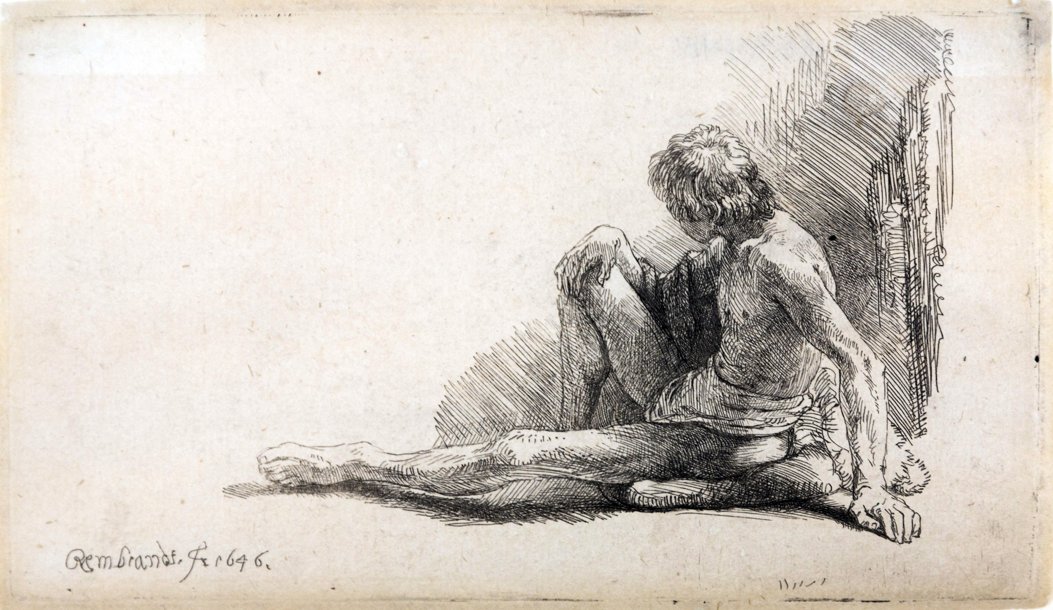
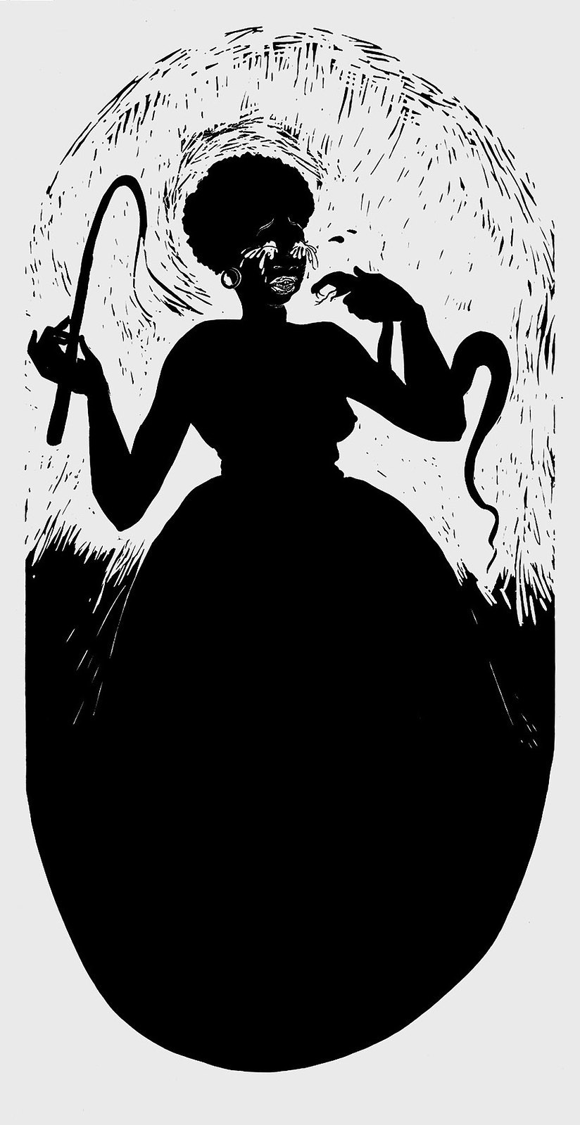
Historically, the strong suite of the GRAM’s permanent collection has always been its holdings of European and American art post-1800, and many works have been added to this number. These include offerings by such recognizable names as William Blake, Audubon, Picasso, Marsden Hartley, Emil Nolde, Warhol, Frank Stella, Ellsworth Kelly, Calder, de Kooning, Dubuffet, Chuck Close, Kara Walker, and Louise Bourgeois.  Among the oldest works acquired include a pair of 15thcentury engravings by Martin Schongaur and a small nude figure study by Rembrandt.

Rembrandt van Rijn (Dutch, 1606-1669). Nude Man Seated on the Ground with One Leg Extended, 1646. Etching on paper, 3.88 x 6.63 inches. Grand Raids Art Museum. Gift of Margaret Goebel, 2017.27.


Kara Walker (American, b. 1969), Boo-hoo, 2000, linocut, 40 x 20 ½ inches. Promised Gift of Martin and Enid Packard © Kara Walker and Parkett Publishers, courtesy of Sikkema Jenkins & Co., New York.

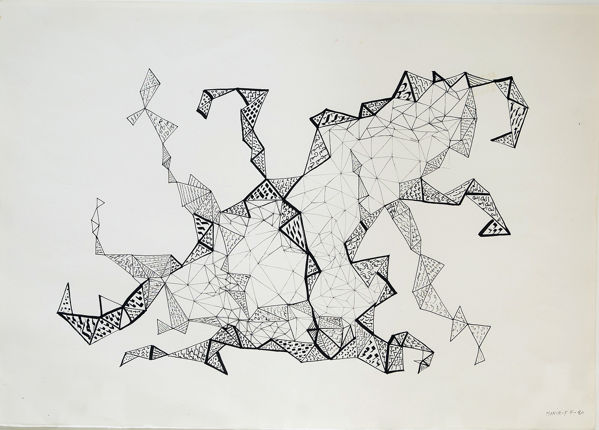
While European and American works make up the majority of the GRAM’s new acquisitions, there’s nevertheless a robust international presence, and these works hail from all six inhabited continents.  These include a large, reflective, geometric glass sculpture by Monir Farmanfarmaian, the Iranian superstar artist who enjoyed a handsome retrospective in this same gallery suite last summer.  Inspired by Sufi geometry, her composite sculpture throws reflected light across the floor of the gallery space like a stationary disco ball, and echoes the geometric tessellations of an untitled pen and ink drawing, also by Farmanfarmaian, included elsewhere in the show.

Monir Shahroudy Farmanfarmaian (Iranian, b. 1924) Untitled, 1980, ink and pen on paper, 18 x 25 inches. Grand Rapids Art Museum, Gift of the Artist and Haines Gallery, 2018.12 ©Monir Farmanfarmaian

This exhibition serves as a veritable who’s who in art and design– all the more impressive given that it comprised just five years’ worth of acquisitions and promised gifts.  Furthermore, in addition to established masters, the show included works by emerging talent, such as Elephant Whirlpoola massive graphite drawing by Addona Kharre, who in 2012 was the winner of Art Prize, the city’s celebrated annual art festival.  Recent Gifts and Acquisitions is an exhibition that will live on in perpetuity as these works join the 6,000 other artifacts that form the museum’s permanent collection, ever on rotating view in the GRAM’s gallery spaces. 

Grand Rapids Museum of Art 

Page 2 of 3

Powered by WordPress & Theme by Anders Norén