Critical art reviews of Detroit galleries and museums weekly

Category: Drawing Page 10 of 15

Elizabeth Youngblood @ Birmingham Bloomfield Art Center

Elizabeth Youngblood :: New Knowns :: New Work @ Birmingham Bloomfield Art Center

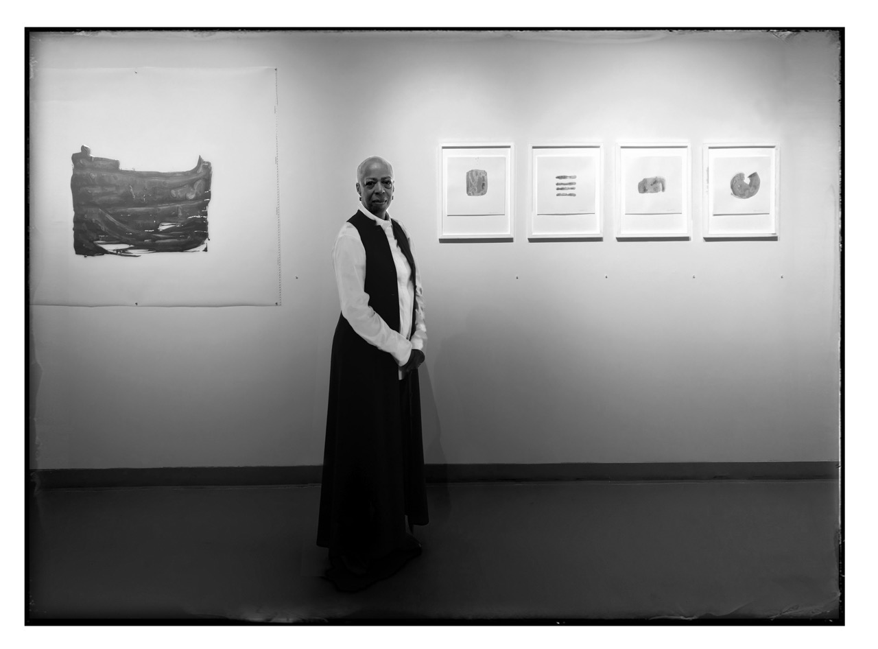
Elizabeth Youngblood at BBAC exhibition opening, photo courtesy of Stewart Shevin

Many years ago, Elizabeth Youngblood wrapped a tiny silver spoon in cotton swaddling. Perhaps it was exhibited in a show of her work but at the time I saw it in her studio at the vast complex now known as the Russell Industrial Center. Designed by Albert Kahn and John William Murray for J.W. Murray Mfg., his automotive sheet metal manufacturing company, the Russell Industrial Center now houses artist’s studios, small businesses and cottage industries and shops, but it was then known as “an apartment house for industry.” The irony of this tiny swaddled silver spoon having been created in an enormous automotive factory that stamped car bodies, did not escape me at the time. As a tiny conceptual sculpture, it was very moving to me. Youngblood’s mother had recently passed and we talked of her mother’s influence on her art, and I’ve often thought since then about the vulnerable swaddled teaspoon as an image of tenderness and delicate caring as well as protection against the monstrous, repetitive brutality of big industry.

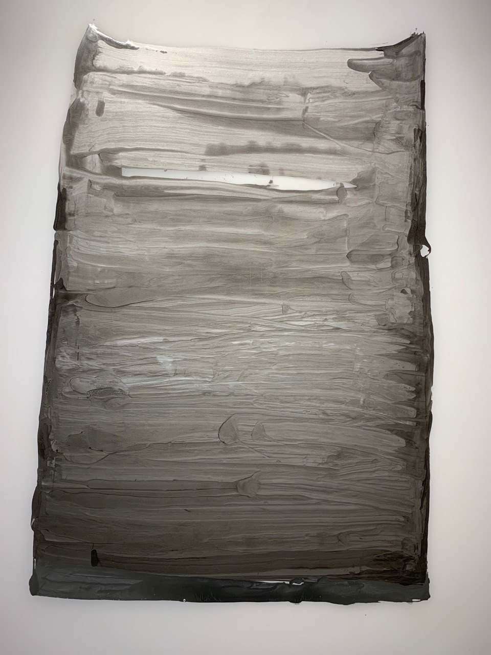
Elizabeth Youngblood, “Obelisk with Window,” Paint, Mylar. 43”x 55,” 2018  –   Remaining images courtesy of  Glen Mannisto

The current Birmingham Bloomfield Art Center’s exhibition, “New Knowns :: New Work :: Elizabeth Youngblood,” is a collection of over twenty-five paintings, drawings and small sculptures. The paintings are silver paint on Mylar or paper; the sculptures are small drawings made with wire and the drawings are ink on paper. The silver paintings hark back to Youngblood’s swaddled teaspoon. Each work in the show seems to turn on the idea of swaddling or wrapping. Thick, creamy silver paint, strangely sensuous, is applied in a gesture of wrapping, as if an object is being contained, or protected by swaths of paint. The gestural swaths accumulate and become images that are abstracted, slightly askew shapes, some almost container-like, others abbreviated marks as if a beginning of something. They are forms that are on the verge of meaning, and in their gestural immediacy they deny machine reproduction, asserting the enigma of individual identity.

The shape of “Obelisk” suggests a container, something as small as a cup or as large as a nuclear power plant such as Fermi in SE Michigan which it resembles. Appearing almost logo like, its lack of symmetry proclaims its disconnect from the world of branding and independence from the commercial graphic world in which Youngblood has worked and knows well. Throughout “New Knowns::New Work,” Youngblood is always asserting the individual hand, that character of the eccentric hand. The wabi sabi of personal gesture, the imperfect and anti-engineered or anti-corporate.

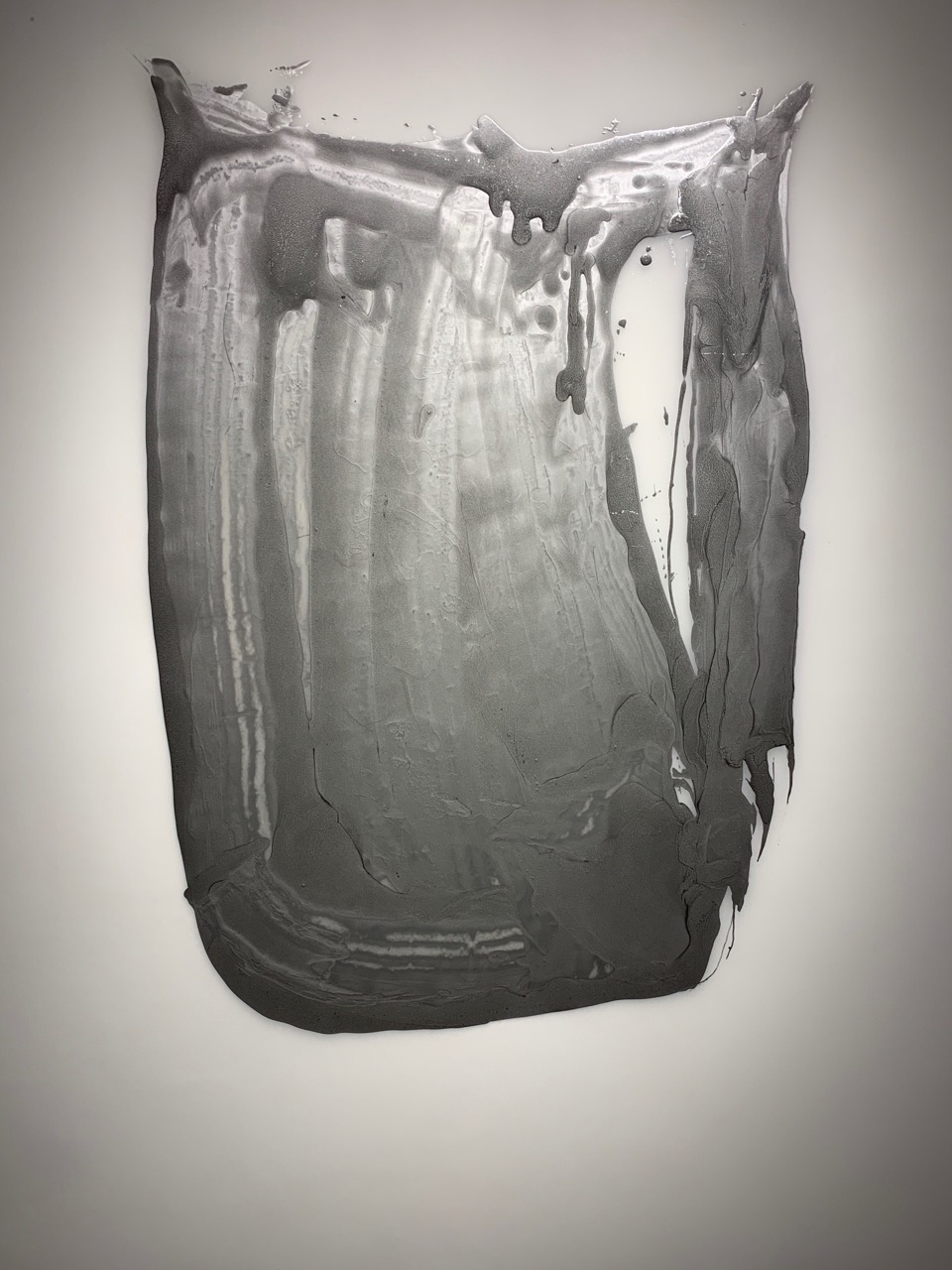
Elizabeth Youngblood, “Yet Untitled,” Paint, Mylar, 44”x 54”, 2018

The larger paintings reveal that imperfection best. “Yet Untitled,” the perfect title, because it is a thing in process of becoming, with drips and vertical wrapping brush strokes, draping the illusion of becoming a vessel or a contained identity. The metallic paint seems almost primal and molten, pre-industrial and pre-corporate. To assert the connection with the very early swaddled teaspoon is “Swaddle 1,” which also is in the process of becoming and containing, with swathes of reflective paint articulating its form suggesting a tail of wrapping swaddle loosely hanging.

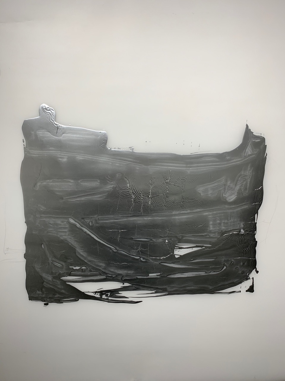
Many of the paintings suggest this sense of becoming or evolution, and even a sense of failure to become and an unraveling or failure of material. “Silver and Graphite 1,” beautiful in its chance patterns of curing and drying, is a composed of a mixture of graphite and metallic paint whose process of becoming has been arrested, the paint’s coagulating and dripping is remarkable in its incomplete state.

Elizabeth Youngblood, “Silver & Graphite 1,” Mixed Media, 55” x 45,” 2018

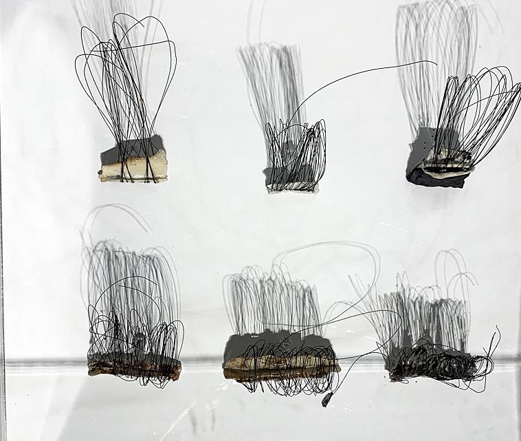
Both the “Wire Drawings” and ink drawings exhibit Youngblood’s considerable sensitivity and patient engagement, commitment and deliberate execution of line and form. The fragile wire drawings are coiled and anchored in a porcelain base and express a similar imperfection to the metallic paint paintings and are not machine coiled but seem scribbled and overlapping. While they might suggest figurative drawings, their intrigue is their specific wonky lack of balance. Yet each has a delicate presence and are read by their ever slight (animist?) difference. The same holds true for the ink drawings. Wrought like nerve endings, the inked lines almost quiver by proximity and some fail by some metaphorical disturbance of hand or mind and simply express the fragility of process.

Elizabeth Youngblood, “Six Wire Drawings,” Porcelain, wire, 2016

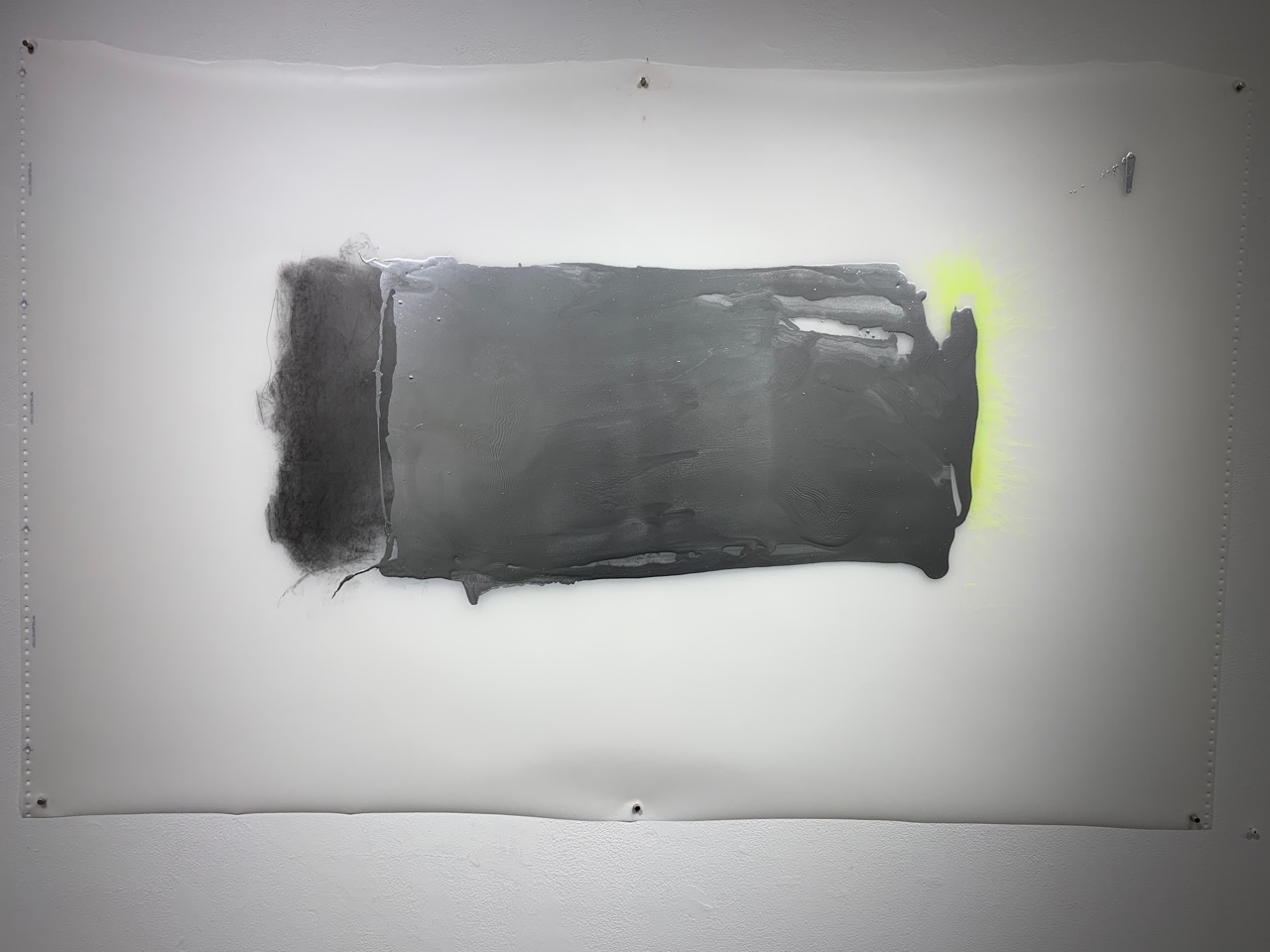
Some of the metallic paintings forgo the swaddling brushstrokes and simply allow the soft silvery glow of the molten-like paint to show itself by contrast. The beauty of a rough swatch of metallic paint bordered by a cloud of graphite and a line of chartreuse on the background of Mylar substrate is a wonderful invention by itself.

Elizabeth Youngblood, “+Graphite and Chartreuse,” Graphite, Mylar, 55” x 34.25,” 2019

The overall orbit of Youngblood’s “New Knowns :: New Works” describes her physical engagement with mark making, with being engaged, with touching materials and creating processes. In all of the works there is a palpable sense of her presence in the materials rather than with the spectacle. We read the visual results metaphorically but experience the work as a path, not a fully known, but “new known,” and realize that the process of seeing is a process and is continuous.

Elizabeth Youngblood, “Clare Gatto,” ink, paper, 20” x 15,” 2016

Elizabeth Youngblood, New Knowns :: New Works, Through June 6, 2019
Birmingham Bloomfield Art Center

Decade at the Center: Recent Gifts and Acquisitions @ GRAM 

The Grand Rapids Art Museum Showcases Five Years of Acquisitions

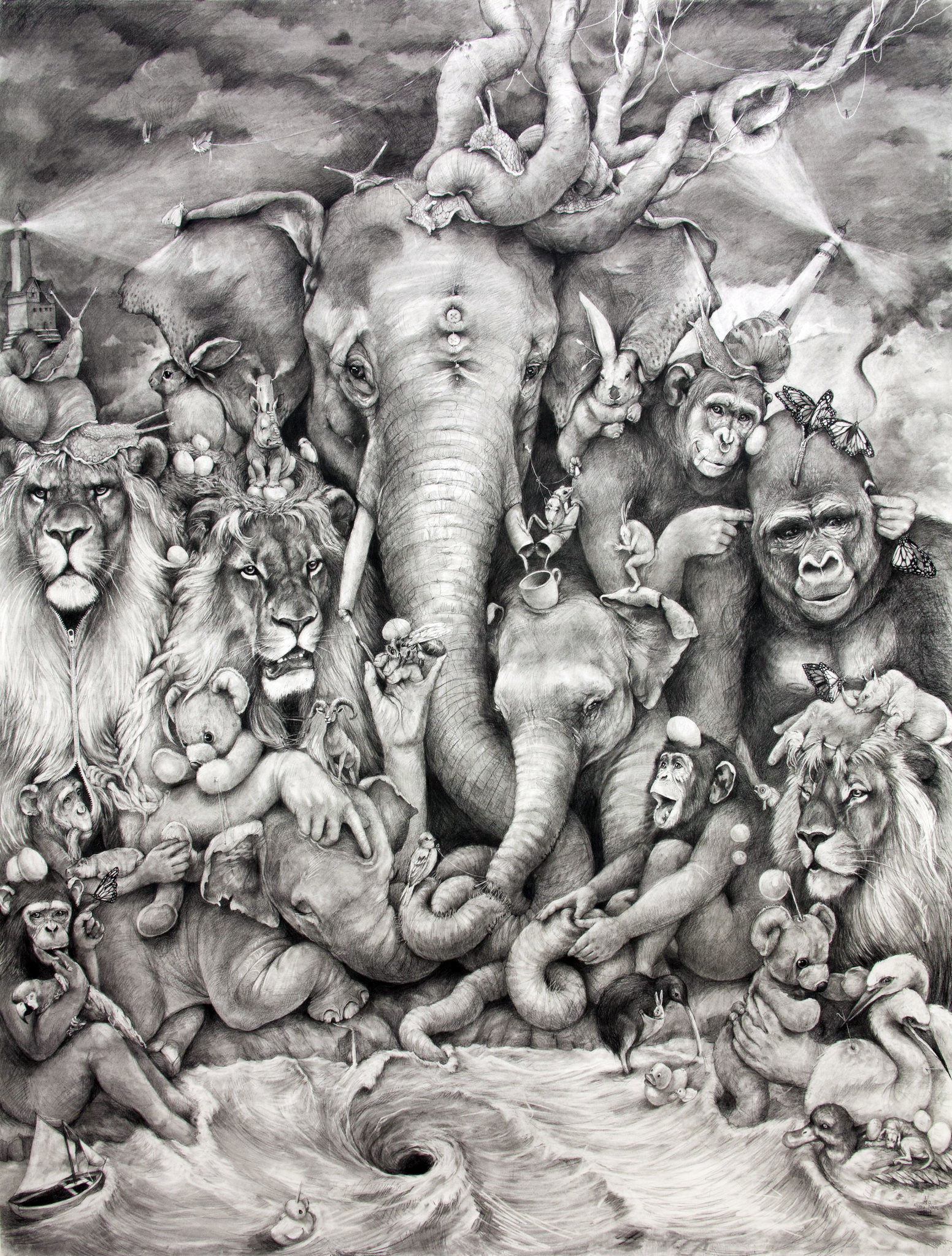
Adonna Khare (American, b. 1980) Elephant Whirlpool, 2014, carbon pencil on paper, 96 x 72 inches. Grand Rapids Art Museum, Museum Purchase, with funds from Bill and Marilyn Crawford and the Artist, 2014.10 copyright: Adonna Khare

In 2007, the Grand Rapids Art Museum opened the doors to its newly-completed, ultra-modern exhibition space in the heart of downtown Grand Rapids.  Rounding out a year of celebratory programming commemorating the GRAM’s first decade in its new location, the show A Decade at the Center: Recent Gifts and Acquisitions brought together over a hundred works acquired by the museum over the past five years.  It was an eclectic but strong ensemble of works spanning a diverse array of media across both the fine and applied arts.

As an introspective exhibition which took the GRAM’s collection itself as its subject matter, A Decade at the Center was necessarily a bit of a mish-mash—these works came from all over the world, and were created by artists ranging from Rembrandt to the Apple Design Team.  But the explanatory wall-text curated and structured the experience, lending insight into what exactly goes into building an art collection, helpfully addressing questions like “How does a collection grow,” “who decides what’s acquired?” and “how permanent is a permanent collection?”

The significant presence of applied arts and design resonated nicely with Grand Rapids’ historic contribution to 20thcentury furniture manufacturing—the city is famously home to such design powerhouses as Hermon Miller and Steelcase.  Among the acquisitions on view included examples of design that fudge the porous boundary between functionality and art. A zany bench and table set designed by the Danish-born Nanna Ditzel seemed more like sculpture than interior design, as did the radiating  Metal Spokes Wall Clock by George Nelson and Associates, which helped define the American interior aesthetic of the 1950s.  While most of these examples of applied design pointed to the recent past, a set of dinner cutlery by Iraqi-born megastar architect Zaha Hadid seemed decidedly from the future—no surprise given the other-worldly appearance of her architectural output, which includes Michigan’s very own Broad Art Museum in Lansing.

Also on view were examples of design which illustrated the rapidly changing shape and form of technological devices, including an original Walkman cassette player, an early handheld Kodak camera, and a rotary telephone.   There’s even a first-generation iPod Shuffle, which, though not even fifteen years old, is a relic rendered just as archaic as the Walkman by the ubiquitous iPhone.  Given the rapidity of technological change, one can’t help but reflect that fifteen years from now the iPhone itself may very well be added to this pantheon of the obsolete.

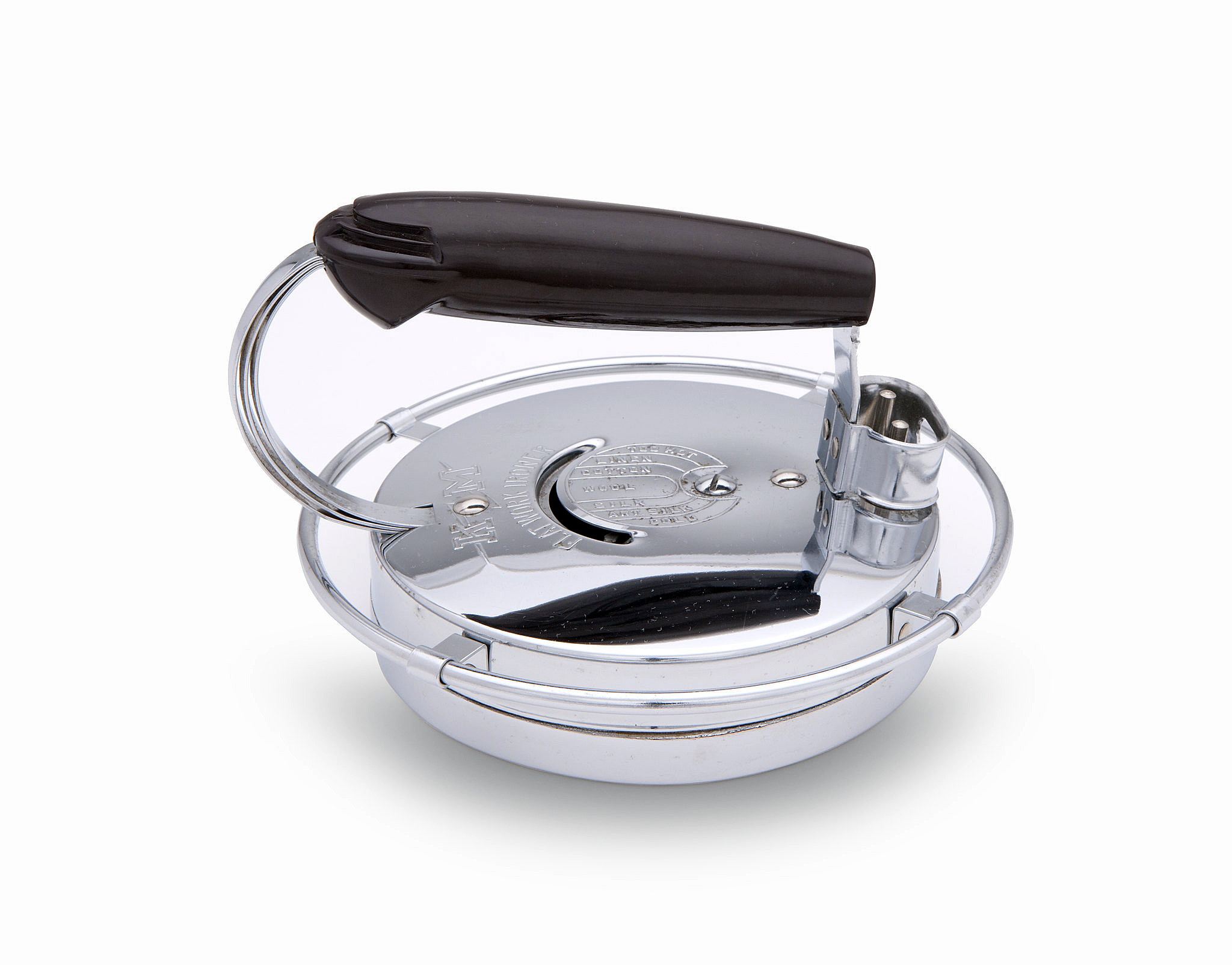
William E. Gundelfinger (1900–1976) KM ‘Flatwork Ironern’ Iron, Model no 444, 1939. Chromium-plated steel, Bakelite. Made by Knapp-Monarch Co., 5 x 7 3/8 x 7 3/4 inches. Photo by Shane Culpepper, Tulsa OK.


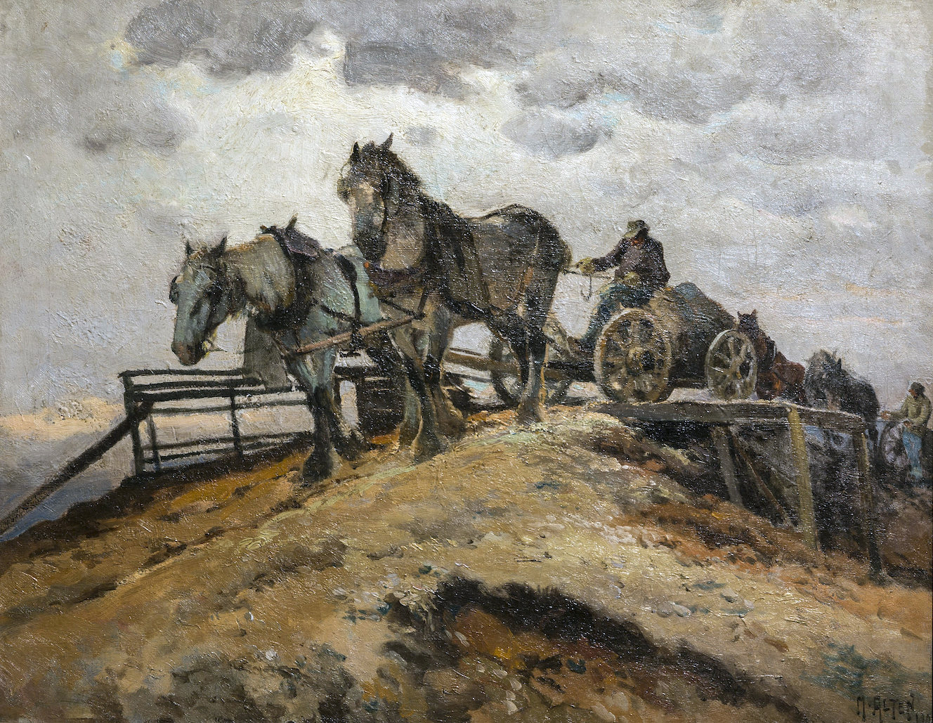
Some of the more traditional works on view also had regional significance, like the paintings of Carl Hoerman, Matthias Altan, and Reynold Weidenaar, the latter of whom was featured in a massive retrospective here in 2015, occasioned by the centennial of his birth.  All three artists lived and worked in West Michigan, and their work, which took Michigan’s landscape as its subject matter, reflects their affection for the natural beauty of the state.

Mathias J. Alten (American, 1871–1938) The Gravel Pit, 1909. Oil on canvas, 22 x 28 inches. Grand Rapids Art Museum, Gift of the Estate of Peter M. Wege, in memory of Peter and Louise Wege, 2016.14

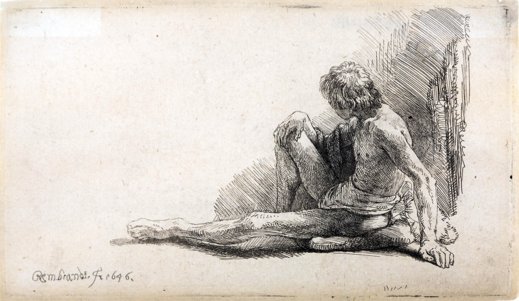
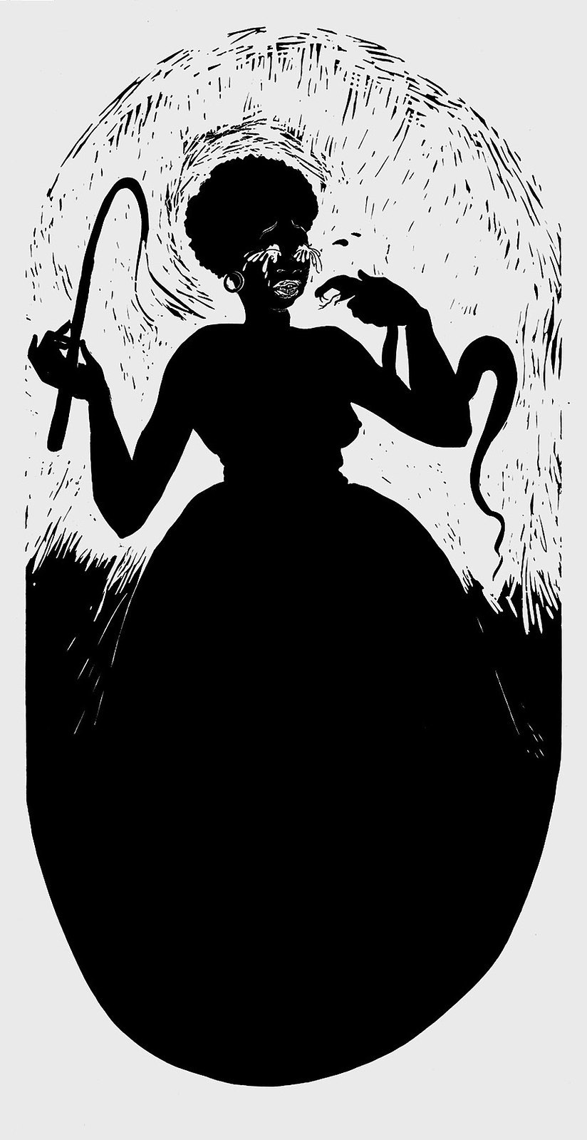
Historically, the strong suite of the GRAM’s permanent collection has always been its holdings of European and American art post-1800, and many works have been added to this number. These include offerings by such recognizable names as William Blake, Audubon, Picasso, Marsden Hartley, Emil Nolde, Warhol, Frank Stella, Ellsworth Kelly, Calder, de Kooning, Dubuffet, Chuck Close, Kara Walker, and Louise Bourgeois.  Among the oldest works acquired include a pair of 15thcentury engravings by Martin Schongaur and a small nude figure study by Rembrandt.

Rembrandt van Rijn (Dutch, 1606-1669). Nude Man Seated on the Ground with One Leg Extended, 1646. Etching on paper, 3.88 x 6.63 inches. Grand Raids Art Museum. Gift of Margaret Goebel, 2017.27.


Kara Walker (American, b. 1969), Boo-hoo, 2000, linocut, 40 x 20 ½ inches. Promised Gift of Martin and Enid Packard © Kara Walker and Parkett Publishers, courtesy of Sikkema Jenkins & Co., New York.

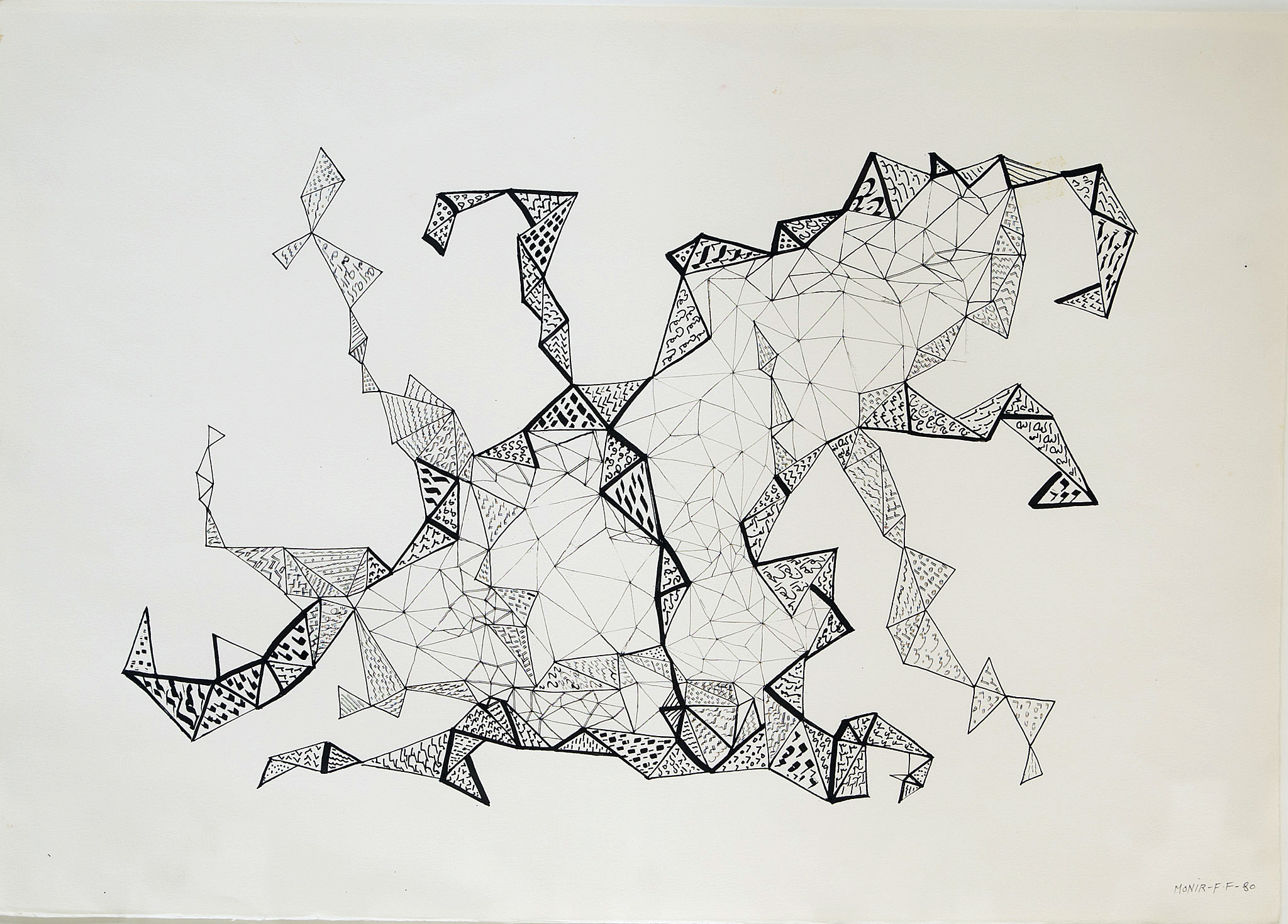
While European and American works make up the majority of the GRAM’s new acquisitions, there’s nevertheless a robust international presence, and these works hail from all six inhabited continents.  These include a large, reflective, geometric glass sculpture by Monir Farmanfarmaian, the Iranian superstar artist who enjoyed a handsome retrospective in this same gallery suite last summer.  Inspired by Sufi geometry, her composite sculpture throws reflected light across the floor of the gallery space like a stationary disco ball, and echoes the geometric tessellations of an untitled pen and ink drawing, also by Farmanfarmaian, included elsewhere in the show.

Monir Shahroudy Farmanfarmaian (Iranian, b. 1924) Untitled, 1980, ink and pen on paper, 18 x 25 inches. Grand Rapids Art Museum, Gift of the Artist and Haines Gallery, 2018.12 ©Monir Farmanfarmaian

This exhibition serves as a veritable who’s who in art and design– all the more impressive given that it comprised just five years’ worth of acquisitions and promised gifts.  Furthermore, in addition to established masters, the show included works by emerging talent, such as Elephant Whirlpoola massive graphite drawing by Addona Kharre, who in 2012 was the winner of Art Prize, the city’s celebrated annual art festival.  Recent Gifts and Acquisitions is an exhibition that will live on in perpetuity as these works join the 6,000 other artifacts that form the museum’s permanent collection, ever on rotating view in the GRAM’s gallery spaces. 

Grand Rapids Museum of Art 

From Camelot to Kent State: Pop Art, 1960-1975 @ Detroit Institute of Arts

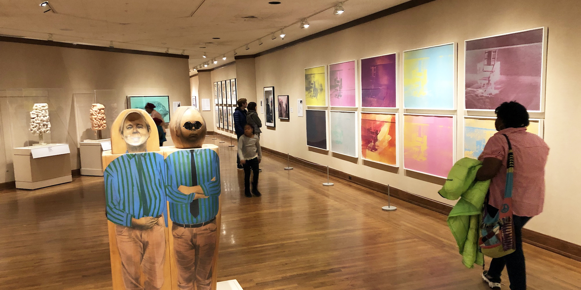
From Camelot to Kent State: Pop Art, 1960-1975, Detroit Institute of Art, Installation Image, Courtesy of DAR

Pop Art emerged in the mid to late 1950s and at its most potent was a high art version of what was being done in the low art pages of MAD magazine, being sold on newsstands at the same time. Its works were a challenge to and a satirical critique of cultural hierarchies, using the popular visual vocabulary of advertising, cinema, comic books and the superabundance of mass-produced banality. It was a reflexive attitude employing bland surfaces to disrupt culture with ironic precision. It was a movement that embraced emergent means of mechanical reproduction to comment on the Capitalist dream machine powered by the post-World War II assembly line.

But as the exhibition “From Camelot to Kent State: Pop Art, 1960-1975” at the Detroit Institute of Arts explores, a larger political project emerged from those artists associated with Pop Art to dismantle the machinery of Modernity as war and social injustice chipped away at the later half of the 20th century.

Works by a remarkable roster of artists including Jim Dine, Audrey Flack, Robert Indiana, Jasper Johns, Roy Lichtenstein, Marisol, Larry Rivers, Robert Rauschenberg, James Rosenquist, Ed Ruscha, May Stevens and Wayne Thiebaud fill out the exhibition, but there are a core group of works by Corita Kent, Claes Oldenburg, Eduardo Paolozzi, Richard Hamilton and Andy Warhol that serve as conceptual highlights to the Postmodern thrust of the Pop Art agenda.
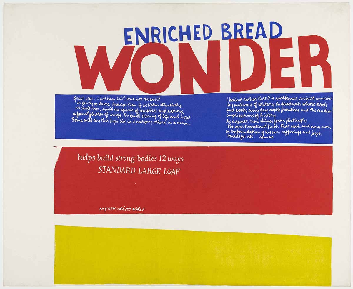
Corita Kent, “Enriched Bread” (1965), screen print printed in color on wove paper, 29 ¾ x 36 3/8 inches, All images and artwork courtesy of  the Detroit Institute of Arts 

The Heart

 Enriched Bread (1965) by Corita Kent (1918-1986) is a screen print composed with three horizontal bands of the trinity of primary colors (plus white) so often employed in the rigorous Modernist projects of the Bauhaus and De Stijl. But as it happens, these are also the colors that designer Drew Miller chose in 1921 to adorn the packaging for that all-American lunch staple Wonder Bread. As the story goes, when the vice president of the Taggart Baking Company found himself in a state of “wonder” at the sight of hundreds of red, yellow and blue balloons being released at the International Balloon Race at the Indianapolis Motor Speedway, an idea for sliced bread packaging was born.

“WONDER” appears in large bold red letters below “ENRICHED BREAD” in blue. Further below, in white script on a strip of blue, is the following:

“Great ideas, it has been said, come into the world as gently as doves. Perhaps then, if we listen attentively, we shall hear, amid the uproar of empires and nations, a faint flutter of wings, the gentle stirring of life and hope. Some will say this hope lies in a nation; others in a man. I believe rather that it is awakened, received, nourished by millions of solitary individuals whose deeds and works everyday negate frontiers and the crudest implications of history. As a result, there shines forth fleetingly the ever threatened truth that each and every man, on the foundation of his own sufferings and joys, builds for all.”

This text was the closing to Albert Camus’ lecture Create Dangerously, delivered December 14, 1957 at the University of Uppsala in Sweden, four days after accepting the Nobel Prize in Literature. Camus, the most optimistic of Existentialist thinkers, was pointing the way toward a more constructive future a mere three years prior to his death at the age of 46 in an automobile accident.

Below this, on a strip of red, is “helps build strong bodies 12 ways” and “STANDARD LARGE LOAF” and “no preservatives added”.

At the bottom of the composition is an empty band of pure yellow.

The text in Enriched Bread is not professionally set: letters appear hand-cut, handwritten and hand-painted. Nor are the stacked bands of primary colors presented with Modernism’s clean straight edges. The handmade character of the printed image, bold when viewed at a distance, envelops the viewer in an intimate and heartfelt space upon closer reading.

Wonder Bread had the distinction of being part of a government-sponsored initiative during World War II rationing. Known as the “Quiet Miracle,” loaves were enriched with vitamins that had long gone missing due to the industrialization of bread production. There is a little miracle achieved with this print, which feels like a beating heart in the middle of the exhibition. Corita Kent was an American Roman Catholic religious sister who returned to secular life in 1968. She referenced Wonder Bread packaging in a number of works as a means to add enrichment to the image itself, reclaiming the mass marketed industrialized products of Modernity as a vehicle for intimate and meaningful conversation. What she accomplished with the transformation of her source material through critical recontextualizing, is a transformation of essence that calls to mind the Transubstantiation of the Eucharistic elements. This is not a cynical undermining of production line goods, but a kind of hopeful artistic alchemy that reasserts the humane by way of wonder.
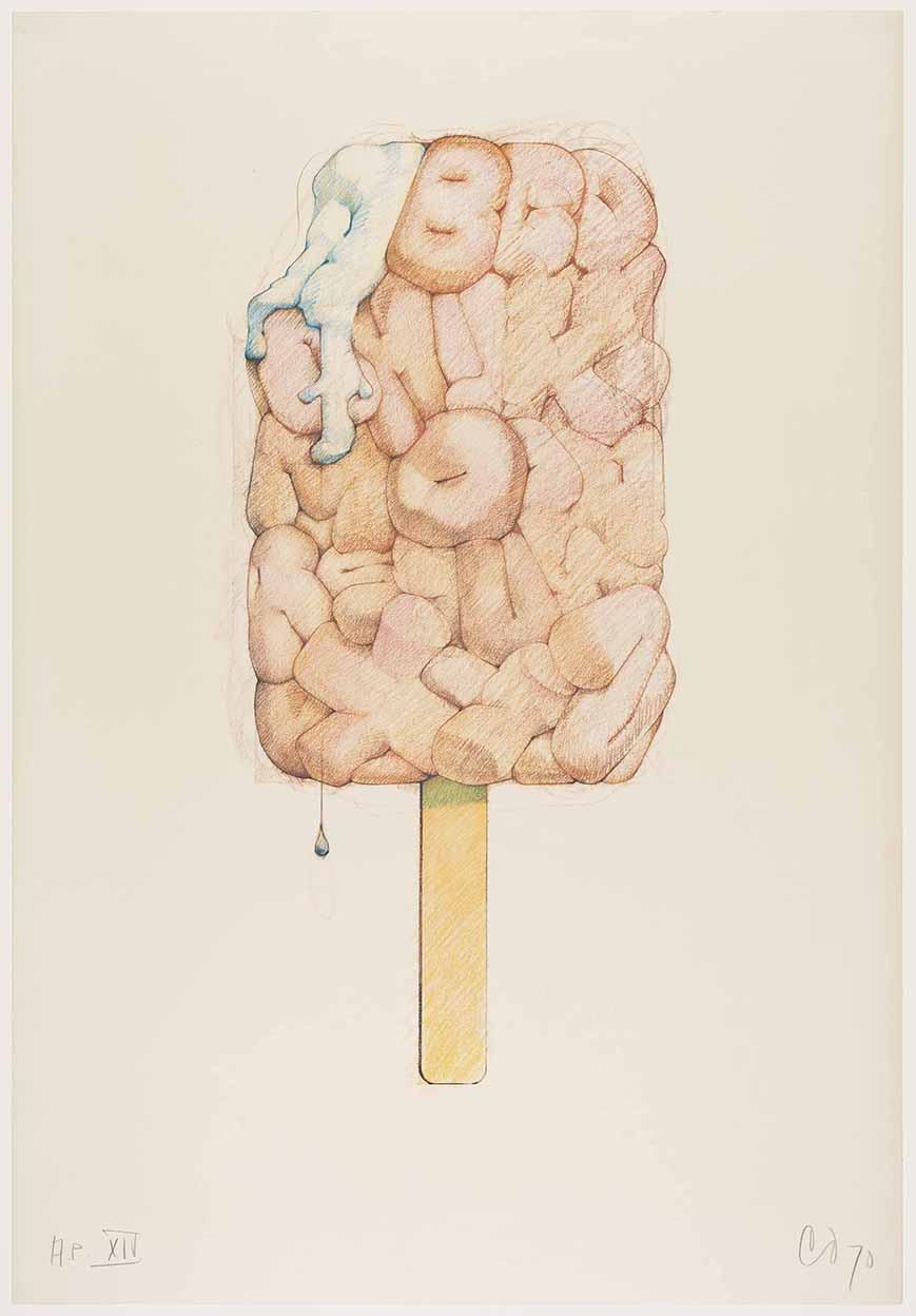
Claes Oldenburg, “Alphabet in the Form of a Good Humor Bar” (1970), offset photo-lithograph printed in color ink, 29 x 20 inches.

The Store

There are three iterations of a Good Humor brand ice cream bar on display in the exhibition, by Claes Oldenburg: Alphabet in the Form of a Good Humor Bar (1970) is an offset photo-lithograph from a colored pencil drawing, Alphabet/Good Humor—Cloth Study (1972-1973), a small standing cloth and wood sculpture, and Alphabet/Good Humor (1975), a cast resin and polyurethane enamel sculpture  on a bronze base. All three pieces present the ubiquitous ice cream bar, a bite taken out of its upper left corner, as a neat slab of puffy and stubby letters, the alphabet from A to Z, pressed together. On both the lithograph and the enameled sculpture, there is a single drip at the base. In the print, the bite manifests as a letter “A” oozing a thick white cream that cascades over the letter “G.” It should be noted that the letter “O” is situated in the middle of the bar, and appears as a donut with a pinched center made all the more suggestive by the Caucasian flesh coloring chosen by Oldenburg. This implied eroticism mingling with the absurd is present throughout much of Oldenburg’s work as he takes the desire for commodified objects to a new level, locating their latent seductiveness. This began with his artist studio/storefront The Store, which he opened in the Lower East Side of Manhattan in 1961, and stocked with painted plaster replicas of candy bars, pastries and undergarments among other things. The sloppy application of enamel on each object satirized the heavy-handed masculine impulses of action painting as a  mere advertisement of heavy breathing in the American consumerist landscape.

The Good Humor Bar was for Oldenberg, another in a collection of objects that symbolized commodity fetishism. There is a concern for economics running throughout his work. He has made use of the Good Humor Bar in many other works, dating as far back to 1963 with Soft Fur Good Humors, adorned with fake tiger and leopard skin. Then there is the 1965 Proposed Colossal Monument for Park Avenue, New York: Good Humor Bar, in which the enormous, slumped ice cream on a stick blocks traffic in the wealthiest of boulevards. In the 1971 print System of Iconography—Plug, Mouse, Good Humor, Lipstick, Switches, the ice cream bar sits alongside other iterations of the reimagined cultural commodity including his Geometric Mouse, a Constructivist variant on Mickey.
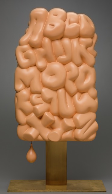
Claes Oldenburg, “Alphabet/Good Humor” (1975), cast resin plated with polyurethane enamel; bronze and wood,, 36 x 19 1/8 x 10  inches.

Alphabet/Good Humor is a uniquely absurd American object. It is both erotic and un-erotic, as its softness and fleshiness remains only a hardened illusion. There is the suggestion of this matrix for the English language eating itself or being eaten as letters pile up, crowding one another out in a suffocating orgy. It sells itself as something other than what it is. It is frozen in a state of forever melting away.

The Machine

Scottish artist Eduardo Paolozzi (1924-2005) was co-founder of the British proto-Pop project The Independent Group (1952-55), along with artist Richard Hamilton. He considered himself an “engineering artist,” approaching the act of image-making as industrial production. As early as 1954, the thematic thrust of Paolozzi’s prints involved the merging of machine and body, charting an assembly line wired with the human nervous system. In 1962 Paolozzi embraced the hitherto commercial process of screen printing to produce increasingly complex print imagery reflecting his concerns for humanity in the age of mechanical reproduction.

Included in the exhibition is Paolozzi’s ambitious portfolio of 12 screen prints from 1964, As Is When, which when first exhibited in 1965 was lauded by critics as “the first masterpiece in the medium.” Despite this acclaim, there were curators and print specialists who thought Paolozzi’s new print work was insufficiently handmade, as he had made use of appropriated imagery that was photographically reproduced. Unlike photography, which has long embraced a necessary technical progression, printmaking and printmakers have wrestled with issues of purity (hand-printing vs. machine printing), even though its very foundation was built upon notions of mass production and dissemination. Although Paolozzi’s embrace of commercial reproduction techniques placed him at odds with the fine art print establishment, As Is When did much to dismantle the hierarchy between “fine” and “applied” arts.

But the process by which As Is When was manufactured is necessarily a reflection of Paolozzi’s greater project. Repetition, seriality, mass production—terms that can describe printing but could also describe the media atmosphere from which the artist deconstructed and reconstructed imagery. In these prints we are presented with a dizzying mosaic of shifting information in the form of abstract patterns and the occasional incursion of representational elements. Each image contains fragments of text that develop a complex relationship between language and image. They are impossibly dense, but insistently engaging.

Drawn from the life and writings of Ludwig Wittgenstein (1889-1951), As Is When is an attempt by Paolozzi to represent the Austrian philosopher’s fragmentary construction of the experience of reality as a schism between language and the visible world. The complexity of Wittgenstein’s system of thinking, referenced from his text Tractatus Logico-Philosophicus (1921), posits the facts of Modernity as being what that are at any given moment. Stable meaning is illusory, merely a fragile geometry. As soon as Paolozzi’s images construct themselves, they break down. They are both stable and unstable
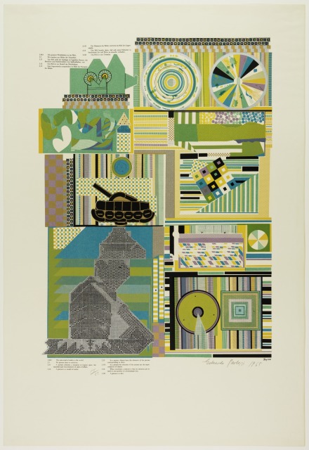
Eduardo Paolozzi, From the “As Is When” portfolio: “Experience” (1965), screen print printed in color ink on wove paper , 38 x 26 inches.
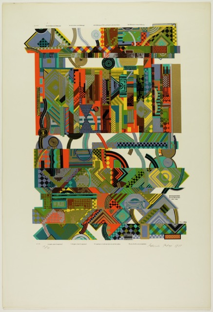
Eduardo Paolozzi, From the “As Is When” portfolio: “Reality” (1965), screen print printed in color ink on wove paper , 38 x 26 inches.

Appropriated from printed advertisements, technical manuals and newspapers, each of the twelve 38 x 26 inch prints presents a series of complex and abstract mappings in which the boldly colored and contrasted patterns keep the viewer in a state of perpetual collating, reorganizing that which appears to be already organized. As with Wittgenstein, Paolozzi begins with a logical structure only to lead his viewer to ever more perplexing states of irresolution. We are left with pure experience as Paolozzi reshuffles his text and image deck, disrupting the progression of narrative by jumbling meaning and creating new juxtapositions. This interest in appropriating material and then remixing and reengineering it is akin to the “cut-up technique” a collage approach to literary construction whereby a written text is cut up at random and rearranged to create a new text.

The new media landscape that Paolozzi was responding to, in which meaning was increasingly susceptible to dissolution, was chipping away at society’s ability to feel. Paolozzi’s close friend, the British novelist J.G. Ballard (1930-2009), described this in the preface to the 1974 French edition of his 1973 novel Crash, which concerns the sexual fetishization of automobile accidents as a metaphor for technological alienation and the death of feeling:

“The marriage of reason and nightmare which has dominated the 20th century has given birth to an ever more ambiguous world. Across the communications landscape move the spectres of sinister technologies and the dreams that money can buy. Thermo-nuclear weapons systems and soft-drink commercials coexist in an overlit realm ruled by advertising and pseudo-events, science and pornography. Over our lives preside the great tin leitmotifs of the 20thcentury—sex and paranoia. Despite McLuhan’s delight in high-speed information mosaics we are still reminded of Freud’s profound pessimism in Civilisation and Its Discontents. Voyeurism, self-disgust, the infantile basis of our dreams and longings—these diseases of the psyche have now culminated in the most terrifying casualty of the century: the death of affect.”
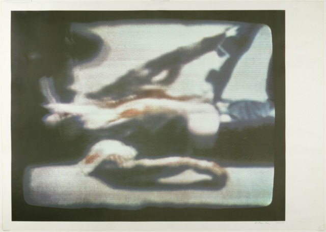
Richard Hamilton, “Kent State, 1970” (1970), screen print printed in color on wove paper , 53 x 67 1/2 inches, courtesy of the Detroit Institute of Arts

Kent State, 1970(1970), a screen print by British artist Richard Hamilton included in the exhibition, hints at this inability to feel: the print was produced using a photograph of a television news broadcast on the killing of four unarmed students demonstrating the Vietnam War on the campus of Kent State University, Ohio on May 4, 1970. Then President Nixon had suggested that the murdered students were to blame for their own deaths and various national polls indicated that the public supported this view. Hamilton, in strong opposition to the Vietnam War, produced his 13-color print in an edition of 5,000 so that “art could help to keep the shame in our minds; the wide distribution of a large edition print might be the strongest indictment I could make.”

The Factory

If Paolozzi commented on the machine, Andy Warhol wanted to become the machine.

Whereas Oldenburg had a Store that humanized the trivial object, Warhol had a Factory that magnified its triviality. The cultural numbness alluded to in Hamilton’s blurred television image of a murdered student at Kent State, finds it’s fullest expression in the works produced by Warhol known as the Disaster series, in which death is the great American commodity.
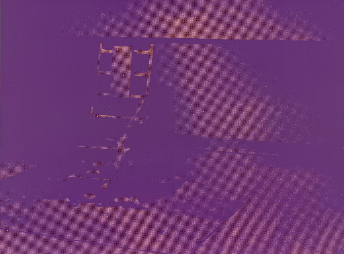
Andy Warhol, from the series “Electric Chairs” (1971), portfolio of ten screen prints , 35 x 47 ½ inches, lent by Marc Schwartz & Emily Camiener
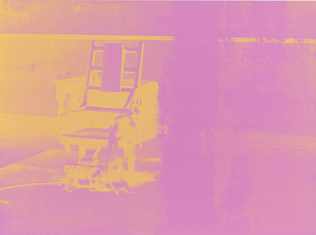
Andy Warhol, from the series “Electric Chairs” (1971), portfolio of ten screen prints , 35 x 47 ½ inches, lent by Marc Schwartz & Emily Camiener

Appropriating a press-release photograph of an electric chair used in the electrocution of convicted Cold War spies Ethel and Julius Rosenberg in 1953, at the Sing-Sing Penitentiary in New York State, Andy Warhol produced a number of paintings and prints of the chair from 1963-1967. A later variant in the form of ten screen prints each measuring 35 x 47 ½ inches and titled Electric Chairs (1971), is the non plus ultra of Pop Art’s darker vision in the exhibition.

Much like Paolozzi, in the 1960’s Andy Warhol repurposed the commercial method of screen printing, allowing for image repetition and the means to manipulate the “decay” of the picture. In addition to his iconic celebrity works, from 1962 to 1967 Warhol focused on reproducing images of suicides, car crashes, accidental deaths, race riots and the aforementioned electric chair. Taken from black and white photographs appearing in newspapers and tabloids of the day, the image quality was intentionally degraded, pointing toward Roland Barthes’ sentiment that the photographic image inherently speaks to the catastrophe of death. In these Disasterworks, as they’ve come to be known, Warhol is ultimately a black humorist. Beginning with his painting 129 Die In Jet (Plane Crash) from 1962 (his first “death” work), there was an ironic fatality present in all of Warhol’s output from this period. An inevitability of decay and death possesses subsequent works as well as a fundamental absurdity in repetition, scale, and use of color, all exhibited in the most deadpan manner. Warhol achieved a glib portrayal of the American zeitgeist in the 1960’s with this series. In Foot and Tire (1963-1964), depicting an absurdly outsized truck tire with a human foot beneath it, Orange Car Crash Fourteen Times (1963), Five Deaths Seventeen Times in Black and White (1963), and his numerous Electric Chair works, he revealed our cultural morbidity against the backdrop of an unstable era. His repeated reproduction of the already cheap newspaper printing quality is intentionally haphazard.
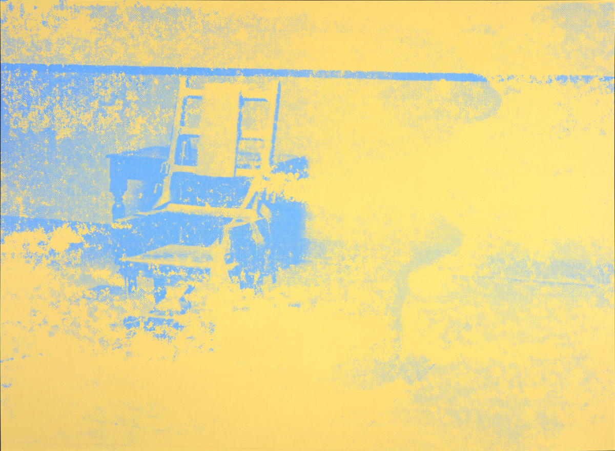
Andy Warhol, from the series “Electric Chairs” (1971), portfolio of ten screen prints , 35 x 47 ½ inches, lent by Marc Schwartz & Emily Camiener

When the image of the electric chair is enlarged and degraded, repeated ten times, each iteration given a palette of garish and vibrating color, there is an absurd banality on display in this work that strikes the distanced pose of the black humorist. Nothing is being clearly satirized. Instead the simple vulgarity of our cultural penchant for “death gawking” is put on display, to be neatly hung on a fashionable gallery wall, or perhaps in a living room not far from the television set.

Warhol’s Electric Chairs are intended to silence the room, to suck the air from it. We sit, we stare, we grow numb. And yet not far off in the exhibition space nourishment is close at hand in the form of Corita Kent’s Enriched Bread. Now would be a good time to revisit that work.

From Camelot to Kent State: Pop Art 1960-1975, on view at The Detroit Institute of Arts through August 25, 2019
Rosen & Binion @ Cranbrook Art Museum

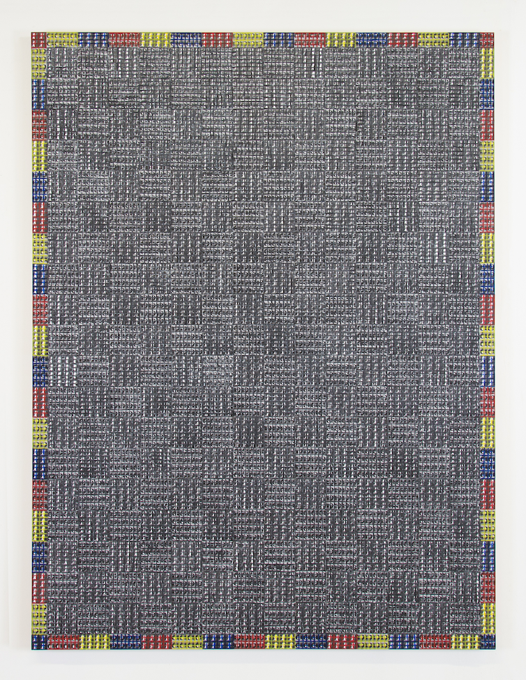
Annabeth Rosen: Fired, Broken, Gathered, Heaped and McArthur Binion: Binion/Saarinen, opens at the Cranbrook Art Museum

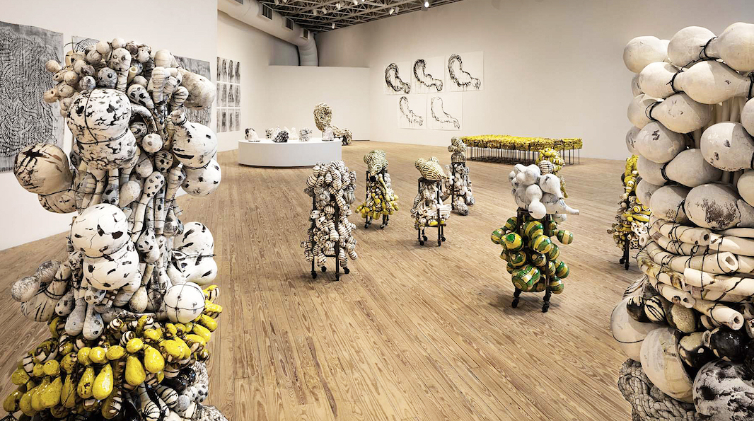
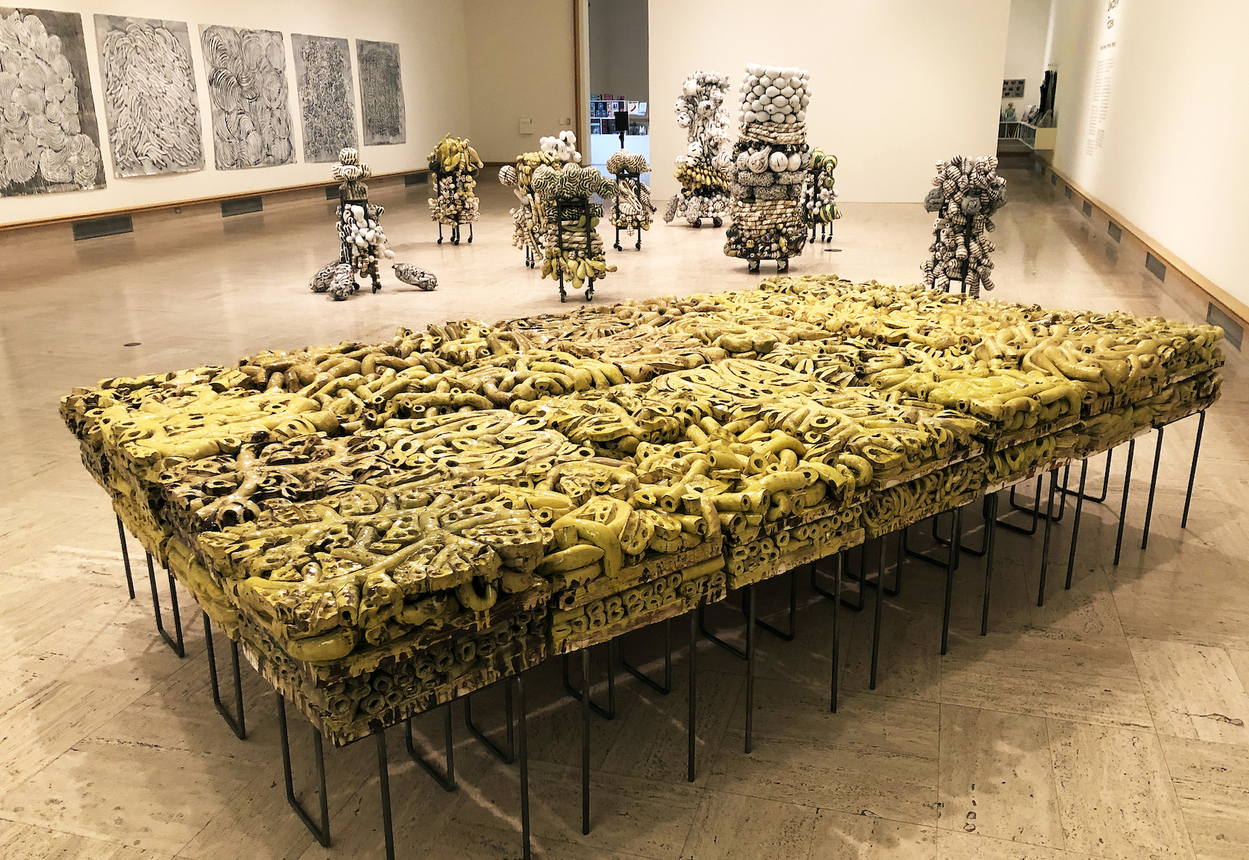
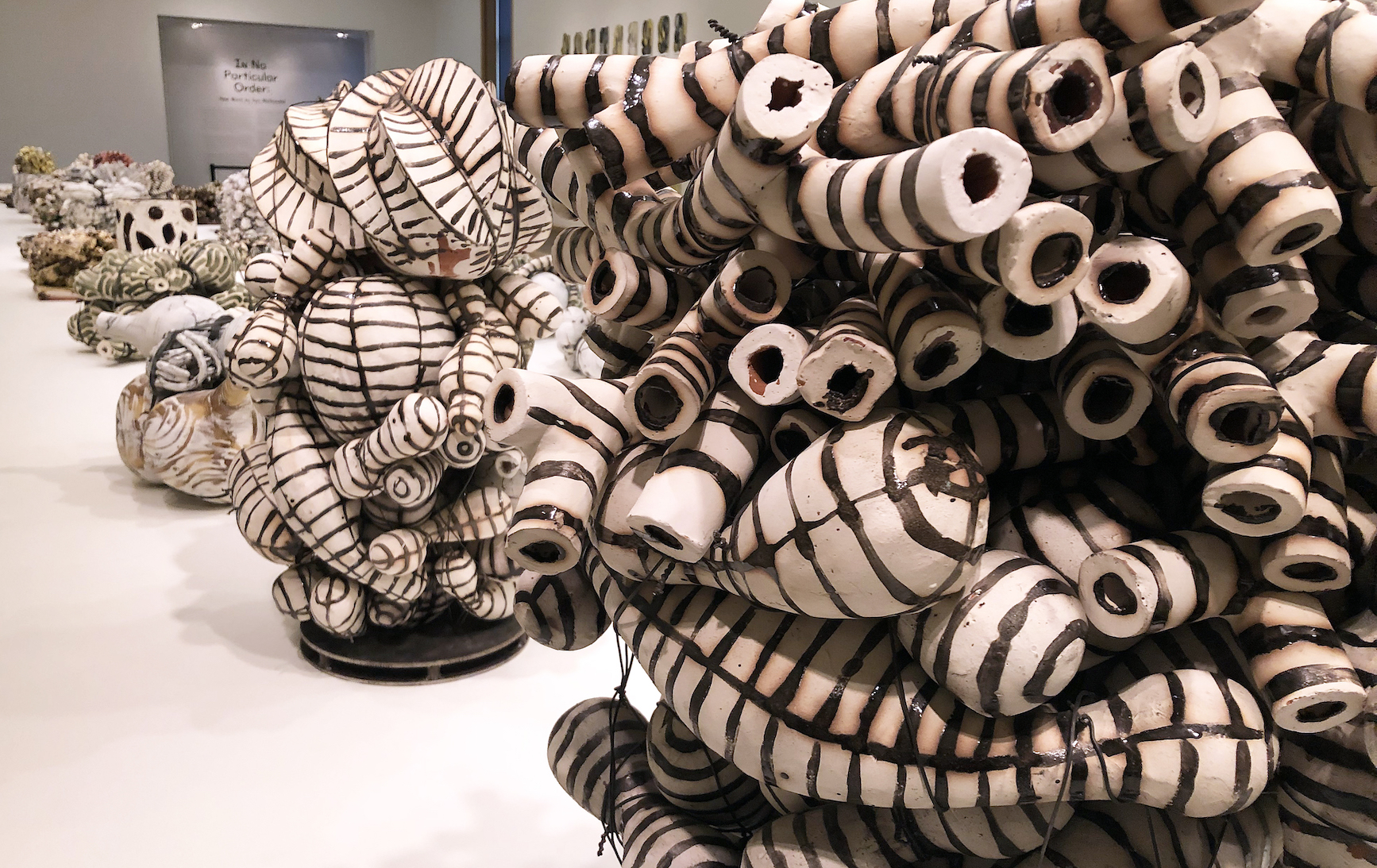
Annabeth Rosen: Fired, Broken, Gathered, Heaped (installation view), 2017. Photo by Gary Zvonkovic. Courtesy the artist and the Contemporary Arts Museum Houston.

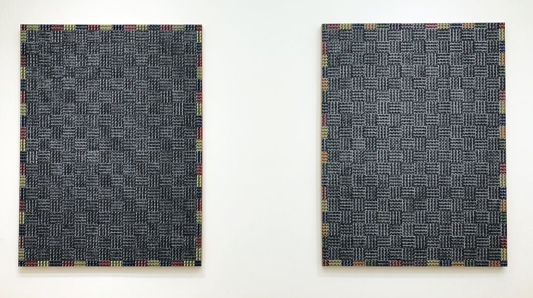
McArthur Binion, Binion/Saarinen: I, 2018, oil paint stick and paper on board, Courtesy Modern Ancient Brown

Two Cranbrook MFA graduates, Annabeth Rosen (81) and McArthur Binion (73), have returned to the Cranbrook campus at the Cranbrook Art Museum (CAM) as seasoned artists with exhibitions that provide a platform to exemplify their accomplishments. The exhibition opened November 17th, 2018 and runs to March 10, 2019, easily utilizing the spacious galleries, especially the Annabeth Rosen exhibit, which is nothing less than mammoth in its scope.

I’ve written about McArthur Binion before and seen his work representing the United States at the Venice Biennale in 2017, so when this exhibition first came to my attention, I assumed Binion would be my focus.  But the exhibition of his work here at CAM is modest in comparison to the work of Rosen in both the Main and the Larson galleries.  Her work is the artist’s first major museum survey that archives more than twenty years of work. A critically acclaimed pioneer in the field of ceramics, Rosen brings a deep knowledge of the material’s history and processes to the realm of contemporary art.

Annabeth Rosen: Fired, Broken, Gathered, Heaped (installation view), 2018. Photo by Detroit Art Review.

Rosen’s work is curated by Contemporary Arts Museum of Houston’s senior curator, Valerie Oliver, and surveys two decades of her ceramic additive work that has a derivative aspect found in abstract expressionistic art. Her studies at Cranbrook under Artist in Resident Jun Kaneko encouraged her to experiment with non-functional forms and separate her work from the traditional role of ceramics as functional craft. Much of Rosen’s work is assembled with already-fired broken parts which have been reassembled, re-glazed, and ultimately re-fired, adding wet clay to the process.

Rosen says, “I work with a hammer and chisel, and I think of the fired pieces as being as fluid and malleable as wet clay.”

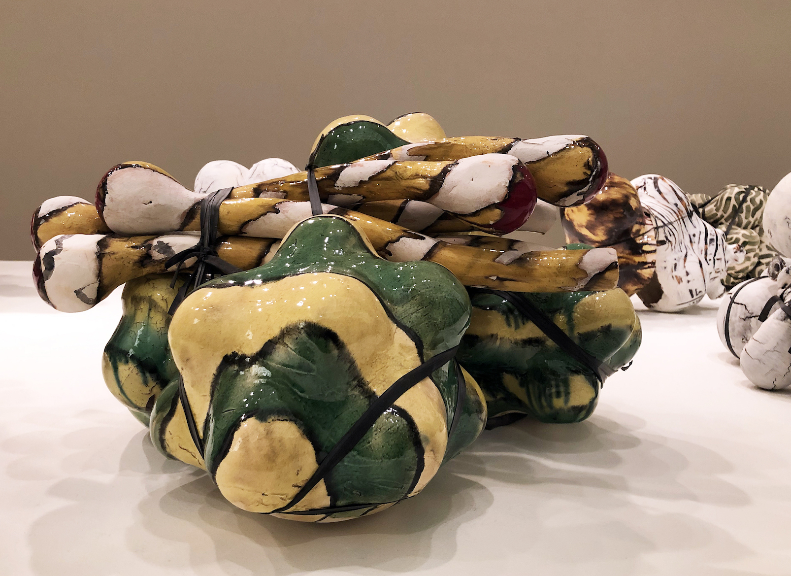
Annabeth Rosen, Fired and glazed ceramic, Bundle, and rubber ties.

The ceramic work is divided up into categories: Mash Ups, Bundles, Mounds and Drawings.  Some of the Mounds are bound together by wire, and others are smaller shapes (Bundles) that have been bound using rubber that might be made from a bicycle inner tube. Rosen began vertically stacking these bundles of ceramic and mounting them on a steel frame set on four wheels.  Rosen has developed an acute interest in non-functional ceramic forms as abstract expressionistic sculpture along with painterly compositions of paint on paper.

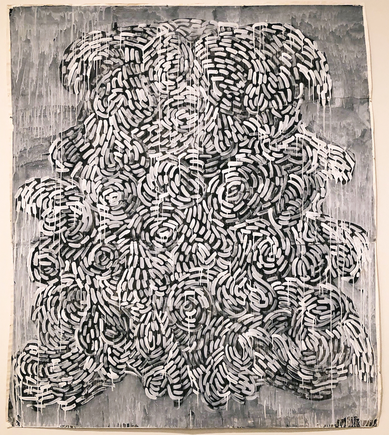
Annabeth Rosen, Paint on paper, 2014

It would be impossible to ignore the works on paper as a major force that directly relates to the ceramic work.  These compositions that are constructed with a gestural stroke are both studies and stand-alone work that underpins a philosophical and conceptual driven force behind her sense of creation.  The process in the drawing and ceramic work reveals her hand is symbiotic, where one influences the other.  Rosen seems to muster strength in her drawings as inspiration and influence for the ceramic sculpture work that follows. All the drawings, which could easily be considered paintings, are created without the consideration of color and this seems to this viewer to place the emphasis on the compositional creation of line, movement, shape and space. All the work, ceramic and on paper, is a bi-product of her internal meditations and illustrates a unique utilization and application of materials, techniques and concepts.

Annabeth Rosen, Installation view, Fired and glazed ceramic, and steel baling wire.

Annabeth Rosen studied at Alfred University (BFA) and the Cranbrook Academy of Art (MFA), and has gone on to teach at the Rhode Island School of Design, the University of the Arts in Philadelphia and the Art Institute of Chicago. Since 1997 she holds the Robert Arneson Endowed Chair at the University of California, Davis.


McArthur Binion, Binion/Saarinen: I, 2 – 2018, oil paint stick and paper on board, Courtesy Modern Ancient Brown

In Cranbrook Art Museum’s North Gallery, the Chicago-based artist McArthur Binion says that he had a note pinned to his wall for decades that read “Binion/Saarinen”,obviously something that came from his graduate studies at Cranbrook Academy of Art during the early 1970s. This idea is obviously generated from literally living on the campus and being surrounded by the Finnish architecture of Eliel Saarinen who immigrated to America in 1923 after the completion of the Chicago Tribune building in 1922 and who went on to be a visiting professor at the University of Michigan before developing the entire Cranbrook campus for George Booth. Perhaps it was the grids inherent in these architectural structures that made a deep impression on Binion, a Mississippi-born African American who developed his own visual language-based graphic elements, particularly circles and grids.

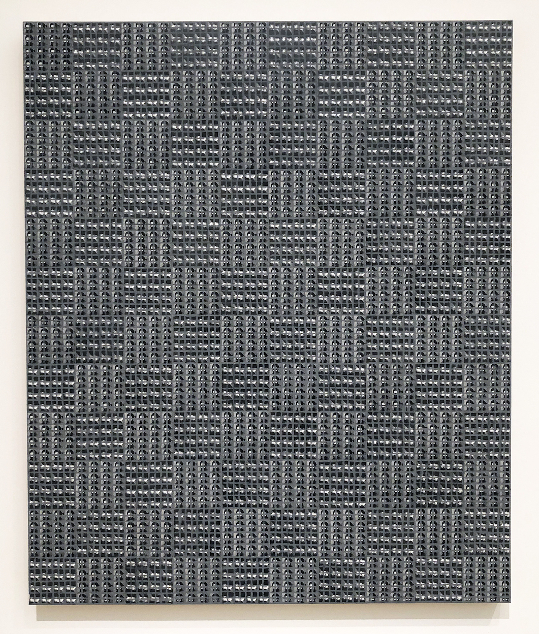
He says, “My work begins at the crossroads—at the intersection of bebop improvisation and Abstract Expressionism”, and at times he has described his work as rural Modernist.Binion uses oil stick, crayon and, more recently, laser-printed images to create his lushly textured and colored geometrically patterned works. The work in the Cranbrook exhibition is produced on board with small photo printed images as a background field for this tightly knit grid produced with hard pressed oil paint stick. These carefully measured grids and hand-done hatchings cover tiny images that usually have some personal meaning to the artist. In the past, the work often incorporated biographical documents, such as copies of his birth certificate or pages from his address book.

McArthur Binion, Binion/Saarinen: 2018, oil paint stick and paper on board, Courtesy Modern Ancient Brown

These new paintings use autobiographical photo imagery of both Saarinen and himself in their early thirties as a background for his delicate squared-off grid that could be easily described as minimalist abstraction from a distance.  Upon close examination, this personal element attempts to bond the two together, at least from Binion’s perspective.  In addition, the gallery space includes painting, drawings and furniture by Eliel Saarinen.

McArthur Binion’s paintings are largely symbolic and achieve an expressive resonance that defies the reductive materialism of minimalism. They are formed out of an unlikely confluence of influences, including such Modernist masters as  Piet Mondrian, and Wifredo Lam, as well as his own southern African-American heritage, reflected in his mother’s quilts and West African textiles. Persistence and discipline fortifies Binion’s practice and his succinct, richly personal compositions.

His work is included in the permanent collections of the Metropolitan Museum of Art, New York, and the Smithsonian National Museum of African American History and Culture, Washington, D.C.

Binion/Saarinen: A McArthur Binion Project is organized by Cranbrook Art Museum and curated by Laura Mott, Senior Curator of Contemporary Art and Design.

Annabeth Rosen: Fired, Broken, Gathered, Heaped and McArthur Binion: Binion/Saarinen, at the Cranbrook Art Museum runs through March 10, 2019.


W.C. Bevan @ Greenroom Gallery

W.C. Bevan, “Contrast” partial installation view, All images – Ryan Standfest

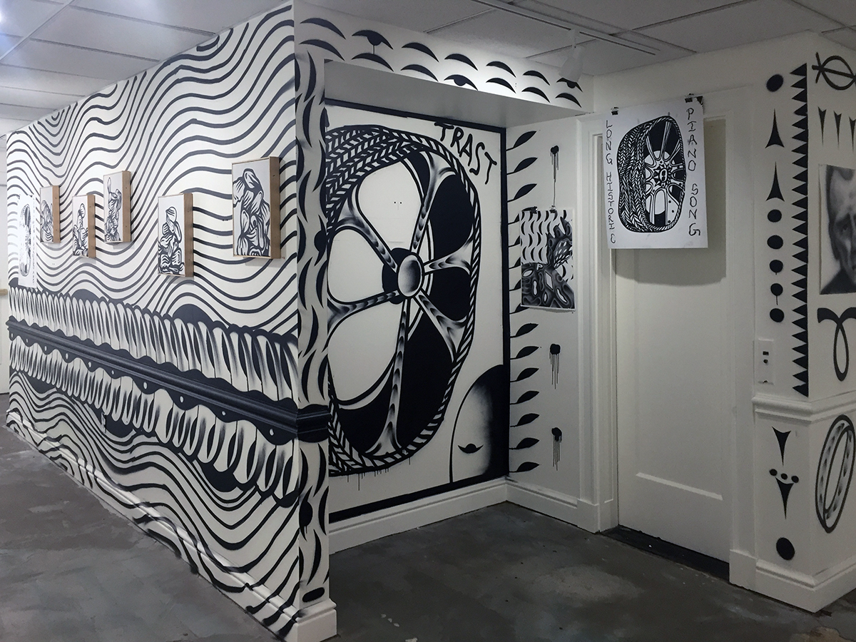
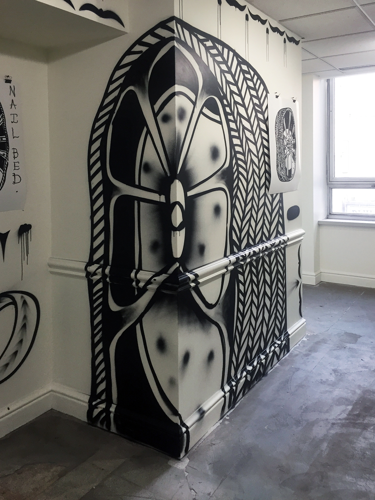
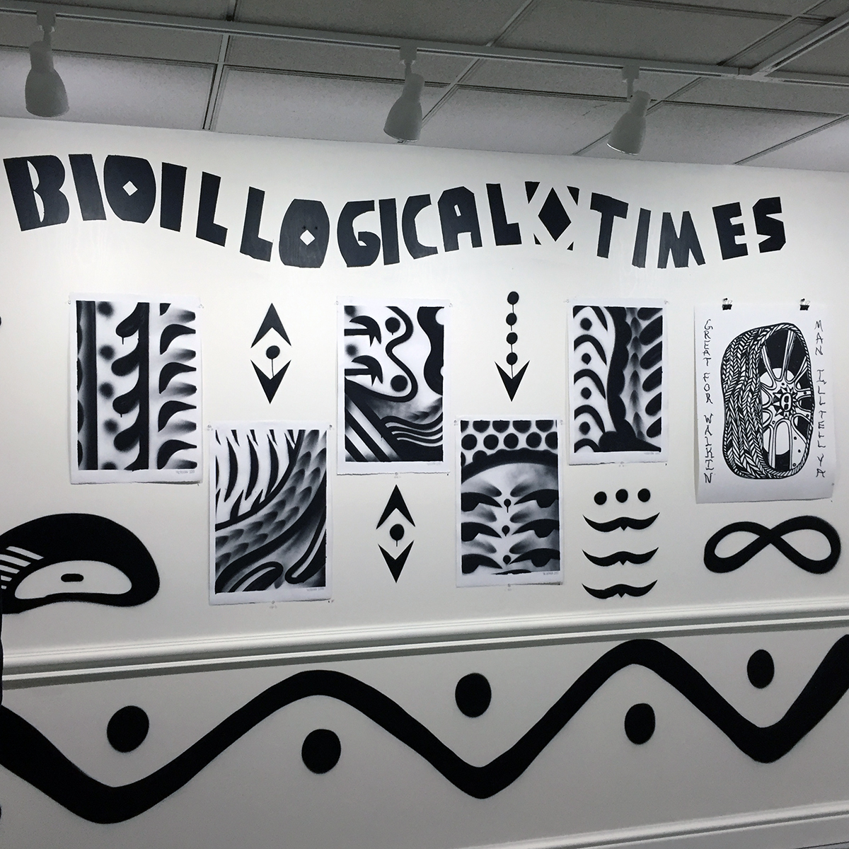
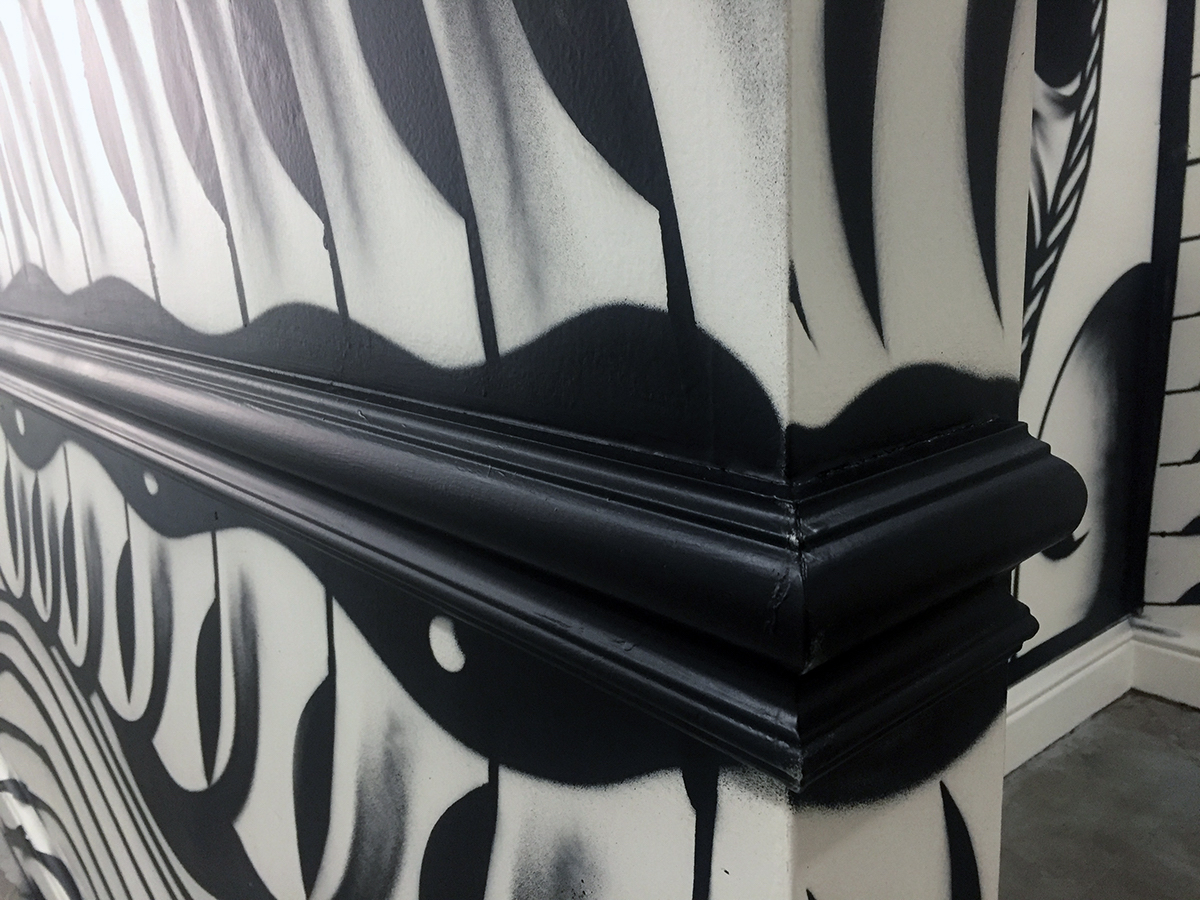
Entering into the space of the new Greenroom Gallery for its second exhibition, “Contrast”, a collection of 24 black and white painted, printed and drawn works by W.C. Bevan, muralist, graffiti artist, printmaker and painter, one comes upon a seamless environment in which wall surface and the individual works presented on it, augment one another to resemble a brightly-lit cave covered with symbols and representations both prehistoric and futurist, of our time and outside of our time, vague and precise. There is a timeless music issuing forth from this chamber.

BLACK & WHITE

W.C. Bevan states that black and white is his “preferred mode of transport.” It’s usage suggest basic black ink on white paper, the foundation of a D.I.Y. print aesthetic cultivated in an underground Punk culture of fast and cheap photocopied zines, handbills and posters. But economic necessity also gives way to meaningful form, as high contrast lends itself to the graphically impactful, the immediate read from whatever distance. Color can carry with it nuance, emotional shading, a reading that depends upon one’s preconceived connection to a color. Whereas the simple combination of black plus white has no hidden agenda up its sleeve.

However, there is the presence of grey. When Bevan utilizes a can of black spray paint to adorn the walls of his exhibition space, he makes skilled use of the resulting overspray as a gradient, softening the image. He likens this to the mis-registration of a printed image, in which a layer of color slips outside of its intended target, accidentally lending further dimension. Indeed, there are also an abundant number of drips allowed to remain, unedited, that keep the space active, reminding the viewer of the performance required to manufacture marks.

Bevan’s methodology is a balancing act between exerting control and embracing chance. Upon an initial encounter with a space, a wall, a surface, a scenario must be devised in reaction to circumstance. Visual anchors are established using large scale icons. Connective threads between these anchors take the form of repeated visual motifs, adornments that form a flowing space to be read. Entering the Greenroom Gallery space, flashes of prehistoric cave art abound. As with the Paeolithic paintings found in the Chauvet-Pont-d’Arc cave, Bevan’s spray-painted marks respond to the various openings, contours and edges of the wall’s surface, making use of spatial shifts as an opportunity to animate his shapes and lines.

W.C. Bevan, “Contrast” installation detail, acrylic spray paint on wall, 2018

These adornments comprise a lexicon, assembled from typographic symbols. Bevan’s walls have a strong hieroglyphic character, suggesting black and white pictographic texts. It is no surprise then, that his practice of black and white mural painting began with the 2015 project “True Meridian,” which adorns a large wall on the former Eastern Market location of the letterpress shop Salt & Cedar, on the East Fisher Service Drive. Proprietor Megan O’Connell and Bevan had envisioned the mural as a black and white “cathedral of type” in response to the idea of letterpress. The resulting image retained its ecclesiastical architectonics, but letterforms gave way to a dizzying pattern of abbreviated characters.

W.C. Bevan, “Contrast” installation detail, acrylic spray paint on wall, 2018

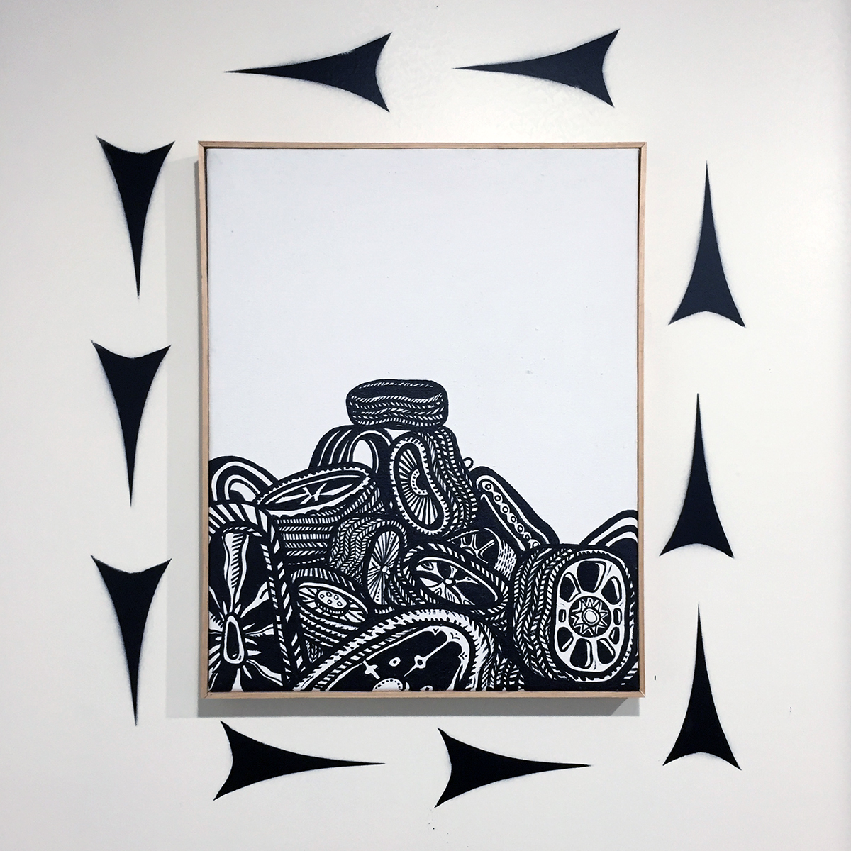
Growing up in Cleveland, surrounded by examples of opulent turn of the 20thcentury architecture, much of Bevan’s wall-marking practice has been defined by a relationship with architectural ornamentation; the decorative repetitions that activate the façade of a building through the rhythmic accretion of detail. This visual language is on view in “Contrast.”  The Classical ornamental device known as “egg and dart,” which consists of an egg-shaped object alternating with another element shaped like an arrow or a dart, is echoed in the spray-painted embellishments on Bevan’s walls.

W.C. Bevan, “Contrast” installation detail, acrylic spray paint on wall with “Untitled” drawings and “Tire Poem” print, 2018

TIRES

The “contrast” of the title is not just black and white, but also the organic and the inorganic. One prominent text adorning a wall states “BIOILLOGICAL TIMES” (a kind of subtitle to the show) as a reminder of the uneasy relationship between the natural and the industrial.

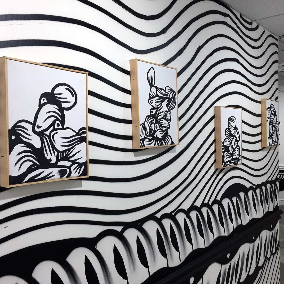
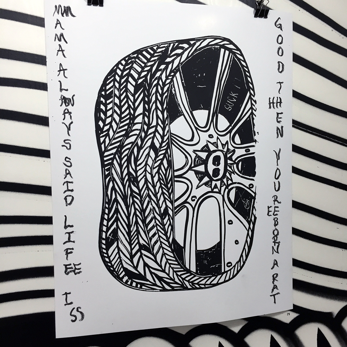
The recurring motif of the exhibition is the automobile tire. It appears in a series of oversized visual anchors, in a smaller series of screen prints with poems scrawled in black oilstick, as piles in smaller acrylic paintings on canvas, and deconstructed as tread marks that reframe and elaborate a new, more playful architecture within the exhibition space.

W.C. Bevan, “Tires”, acrylic on canvas, 22 x 17.5 inches, 2018

In the series of small acrylic paintings depicting tire piles, the subject becomes a surrogate for bodies—slumped, disposed of. Bevan speaks of the tire as a thing that has gone places, that has been worn down while carrying us places, therefore having a history itself. The very idea of the tread has multiple meanings: to walk along, to press down onto the ground, to crush or flatten. In “Contrast,” tires themselves have been crushed and flattened, having carried themselves too far. The piles he depicts morph into less recognizable heaps and mounds, as they go treadless. Throughout the exhibition space, there is an unraveling of the tire, a peeling away of the tread—unspooled to become architectural pattern.

W.C. Bevan, “Wall Peeps”, acrylic on canvas, each 15.5 x 12.5 inches, 2018

Ultimately, the tire is not the subject. In fact, the tires are not just tires. For Bevan, the urban experience of the discarded tire, tossed into a field, piled, stacked, becomes an absurd totem. A deflated tragicomic sign of what has passed. Bevan’s tires are droopy, flaccid, out of shape. Having spent some time painting commercial signs populated by “hamburgers, liquor bottles and tires” for quick cash, Bevan has spoken of a fondness for hand-painted tire shop signage around the city of Detroit, that often represents the tire and or wheel as something misshapen. Unmoored by the refined craft of a trained artist, there is an clumsy earnestness to most of these signs with their straightforward deformation of what Bevan calls “the thing that keeps America moving.”

STREET

On screen printed works each titled “Tire Poem,” Bevan scrawls variant texts with a black oil stick, at the sides of each repeated, centrally printed tire image. The texts have a touch of the street to them, rough fragments drifting into the image nudging them toward something resembling a hand-painted sign:

LONG HISTORIC PIANO SONG

PIRATES MADE OF YOGA

GREAT FOR WALKIN’ MAN I’LL TELL YA

SUDAFED NAIL BED

MMAMA ALWAYS SAID LIFEE ISS GOOD THHEN YOUREEBORN A RAT

YOU’RE A PONYTAIL WOW

W.C. Bevan, “Tire Poem”, screen print with oil stick, 28 x 22 inches, 2018

The majority of the work in “Contrast” makes use of vernacular visual street language.  In conversation, Bevan points out a series of paintings depicting tires by the artist Art Green, who was a member of the Chicago-based Hairy Who—a group of artists producing work in the late 1960s to early 1970s that was a potent mélange of high and low tendencies culled from comic books, Art Brut, commercial advertising and popular illustration, resulting in fragmented and highly fluid, often sexually-charged work that was a deliriously absurd response to the times it was made in. Similarly, Bevan’s work constructs a “Rustbelt Absurd” with its own pictorial elasticity, erasing notions of high and low with a language both refined and unrefined, and a practice that bridges the street and the studio with mural painting and graffiti, printmaking and painting.

W.C. Bevan, “Hamtramck Memory Drawing”, acrylic on paper, 22.5 x 15 inches, 2018

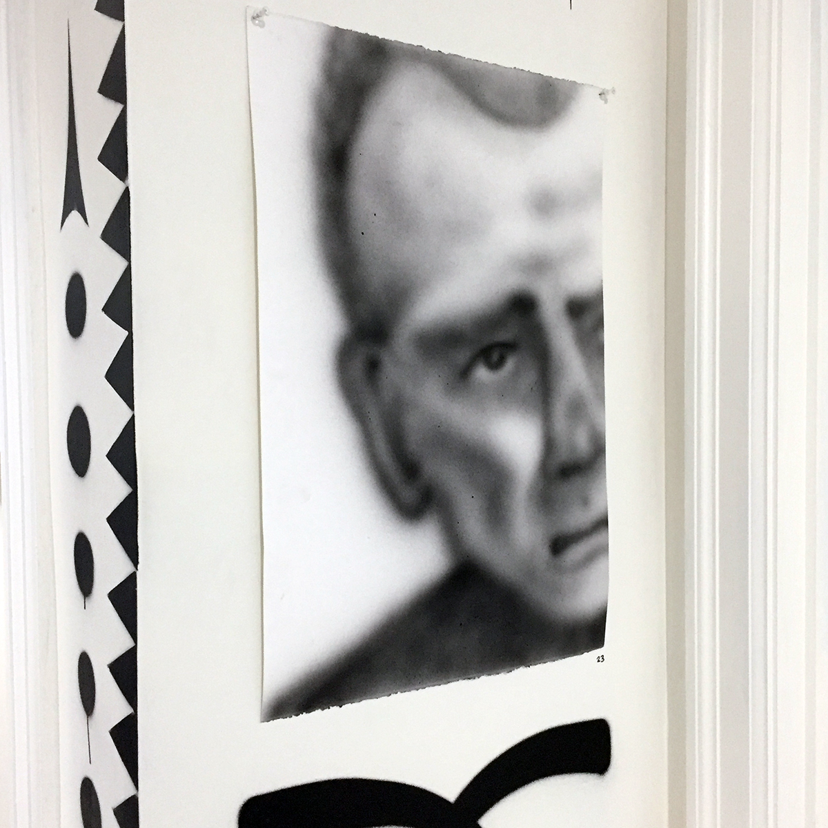
There is a portrait, seemingly out of place in the exhibition, titled “Hamtramck Memory Drawing,” of a man, possibly of Eastern European extraction, partially cropped. Possibly working class. Possibly from the Poletown neighborhood Bevan has lived in since March of 2018. The drawing, executed with sprayed acrylic on paper, is a soft grey. It feels distant and contrasts with much of the hard-edged graphic work in the exhibition. In its quietness, it asserts itself as a reminder of the human dimension of Bevan’s work, the psychological lifeblood of a black and white Rustbelt vision, placing the everyday of the studio into the street, and vice versa, while summoning the abundant wall-painted symbols as dispatches from a landscape tread upon.

“Contrast: Black and White works by W.C. Bevan”
November 30, 2018-February 1, 2019
Greenroom Gallery Detroit
located within Emerson’s Haberdashery, 1234 Washington Blvd., Detroit, MI 48226
Gallery Hours: Tuesday-Saturday, 10-6pm
FB and IG  @[email protected]
Closing reception on Feb. 1, 2019, 6-9pm


Page 10 of 15

Powered by WordPress & Theme by Anders Norén