Critical art reviews of Detroit galleries and museums weekly

Category: Drawing Page 12 of 15

“Evidence of Things Not Seen” @ College for Creative Studies Center Galleries

Installation image & Four Artists: Rashaun Rucker, Sabrina Nelson, Richard Lewis, Mario Moore, 2017

The hardest part about drawing connections between the pieces in Evidence of Things Not Seen—a four-person show featuring works on paper by Richard Lewis, Mario Moore, Sabrina Nelson, and Rashaun Rucker, on display at CCS Center Galleries—is not the lack of bridges between the work, but the abundance thereof.

In simplest and most general terms, this is a drawing show, so all the large, stand alone works, as well nearly two dozen small works in Nelson’s Baldwinning series, are aesthetically unified as hand-drawn, mostly in graphite and charcoal. These are also all artist of color, dealing with issues of Black representation, and presenting Black subjects. Despite each artist having radically different interests, influences, and approaches to the way they look at their subjects, the gallery is utterly harmonious and unified in its aesthetics. Black on black, in shades of grey.

Installation image, CCS Center Galleries, 2017

Then, too, there are an abundance of interpersonal connections underpinning this group of artists. Lewis and Nelson were studio mates during their undergraduate years at College for Creative Studies (where Nelson now teaches), and she and another close fellow, poet Jessica Care Moore, appear as characters in Lewis’s works. Nelson is also mother to Mario Moore, who looked up to Lewis, by way of his connection to Nelson, and followed his exact educational path, starting from Cass Technical High School, through undergraduate studies at CCS, and on to pursue an MFA at Yale. Just as Lewis and Nelson hang together in one generation, Moore and Rucker represent the next (literally, in fact, because Nelson is Moore’s mother), and it is fascinating to see the generational divisions and similarities between the two cohorts.

Richard Lewis, Rent Party, 48 x 60″ Charcoal, Pencil 2016

For example, one might highlight the magical realism present in the works of Lewis and Rucker, who both favor the fantastic and the uncanny, rather than the more directly representational portraiture of Nelson and Moore. Rucker presents a body of work around a single theme: the visual merging of portraits of young black men with the bodies of pigeons. With mug shots as his source material, Rucker is seeking to emphasize the correlation often made between young, urban, black male populations, and undesirable vermin, such as pigeons. Faces morph into beaks, a head springs from the body of a pigeon, or wings and beaked head emerge from the twisted legs of a fallen human body. Likewise, Lewis’s subjects occupy a time-compressed and surrealistic world, where Sabrina attends a rent party with James Baldwin and Frida Kahlo, or drives home at night with an nkisi figure in the passenger seat. These nkisi are a traditional African spiritual sculpture form, often covered with individually driven nails, and seen as protector spirits, both in terms of their cultural origins, and in terms of Lewis’s repurposing of them as subjects.

Mario Moore, Lucia, 2015, Graphite on Paper

Or perhaps one could draw another parallel between Nelson and Lewis’s tendency to make cultural references, while Moore and Rucker are making portraits from everyday figures. In addition to using his studio-mate as muse, Lewis’s tableaux are recast and reconstructed scenes from film noir features, such as Shipwrecked and Saints and Sinners. Nelson, of course, takes James Baldwin as her muse, and the corner of the gallery devoted to her work is papered with nearly two dozen examples of individual portraits she has drawn of the writer, in addition to filling four complete sketchbooks with nothing but drawn and stitched James Baldwin portraits.

Sabrina Nelson, Baldwinning, 2016-17, Sketchbook drawings, Glclee prints, micon ink, gold ink, silver ink, thread, and video

“One of the reasons I started drawing James Baldwin is because Jessica Care Moore invited me to the James Baldwin conference in Paris,” said Nelson, during a tour of the gallery. “She was doing a plenary there with three other artists, called “What Would James Baldwin Do?” It was about him being an artist, and as an artist, what is your responsibility in the world? What do you say, and what is your weaponry? For her it is her poems, and for me it is my hands and my drawing and my painting.”

Sabrina Nelson poses with her many images of James Baldwin.

One sees the love of reading and writers transferred from mother to son, as all of Moore’s hyper-realistic, large-scale portraits feature women in his life, taking a break from reading to look at the viewer. Despite Moore’s extremely straightforward and beautiful renderings of women—many of whom were classmates at Yale, as well as his girlfriend—contain their own sly cultural references, in the telling detail of the book they are reading. But more arresting in these works is the ease and comfort with which these women seem to meet the gaze of the artist and the viewer on entirely their own terms. Unlike Rucker’s pigeon-hybrids, who seem to search the viewer for evidence that they can be seen at all, Moore’s women let you know that they are not to be objectified.

Richard Lewis, They Drive by Night, 26 x 40″ Conte crayon on Rives BFK

One could weave connections through these powerful works for days—the energy fairly radiates between them—but there’s only just time to catch this show before it closes, so I’ll end with an admonition to take some time with it before the December 16th closing. One can hardly build a case for the connections within Evidence of Things Not Seen, after all, if you don’t go see it for yourself.

Evidence of Things Not Seen continues at CCS Center Galleries through December 16.

Jim Nawara @ WSU Art Department Gallery

PHENOMENA IN LANDSCAPE: Paintings, Prints, Drawings, & Photographs 1969-2017

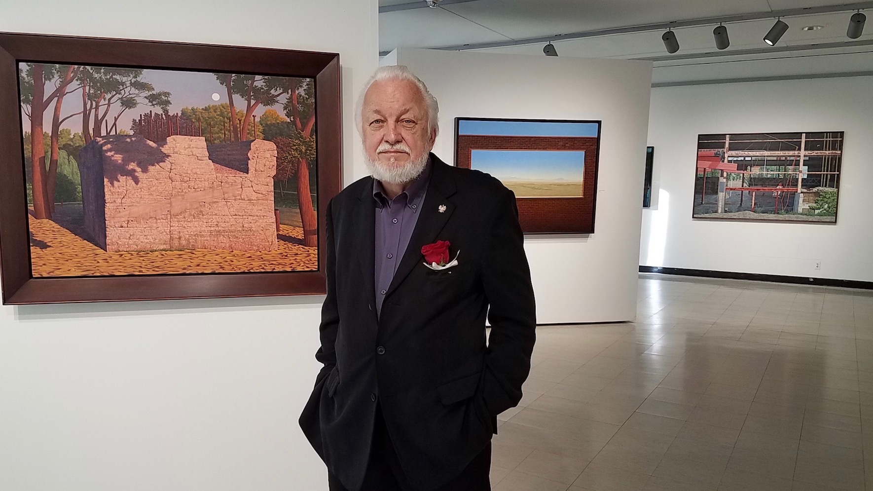
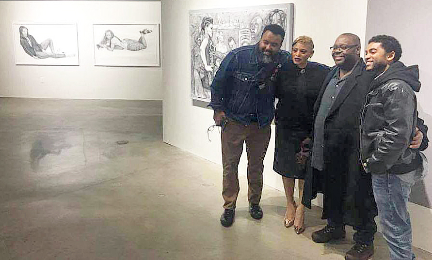
James Nawara, Professor Emeritus of Painting and Drawing at Wayne State University, PHENOMENA IN LANDSCAPE, Retrospective Exhibition, 2017 Image Courtesy of Lucille Nawara

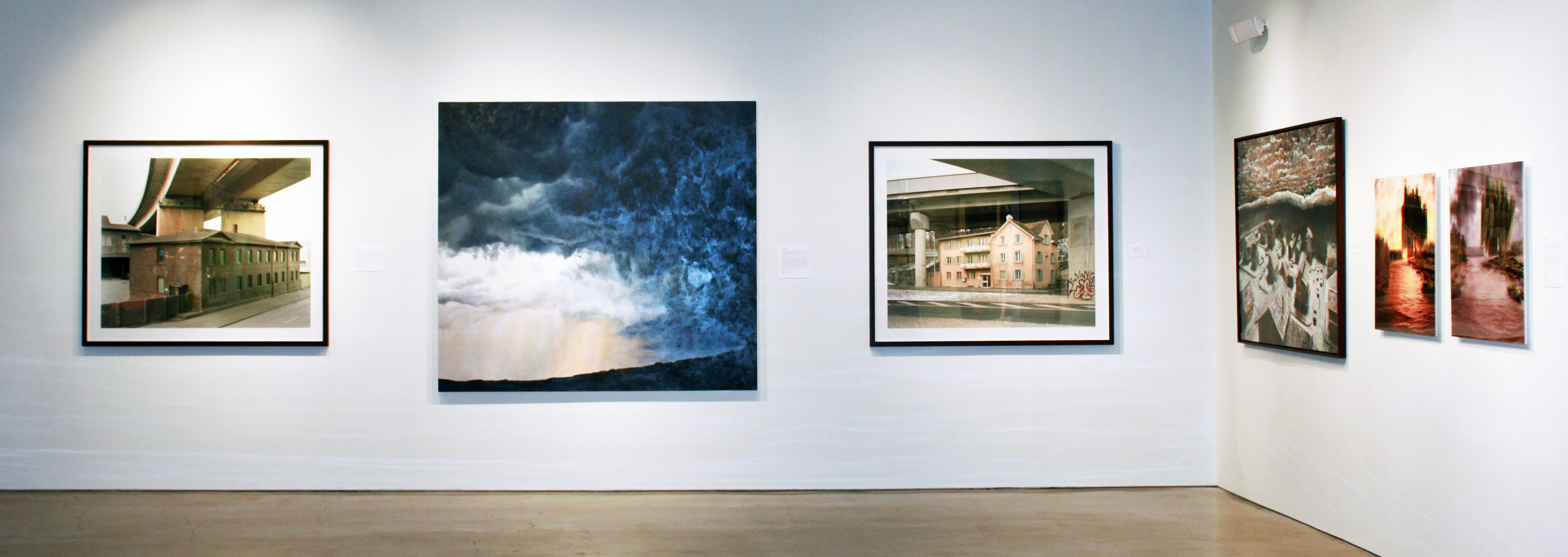
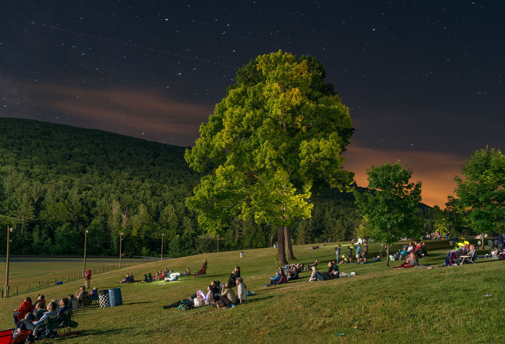
The exhibition by Jim Nawara, now Professor Emeritus of Painting and Drawing at Wayne State University, spans forty-eight years and includes more than one hundred paintings, prints, drawings, and photographs. The exhibition begins with Nawara’s imaginary landscapes seen from an aerial viewpoint that were made in the seventies and eighties. Next, an engaging series of thirty-two black and white photographs (1969-1989) presents sometimes quirky subjects selected mostly from Detroit area urban landscapes. Some these compositions were influential sources for subsequent oil paintings and large watercolor paintings that Nawara has produced from 1990 up to the present. No longer seen from an aerial viewpoint, these representational landscapes are based upon observation and interpretation of actual sites that are carefully selected.

Nawara has stated that he often prefers depopulated, nondescript, or non-picturesque sources, “The subject does not need to be obviously beautiful, grand, or pristine. I once found the foundation of an abandoned house more intriguing than an idyllic nearby waterfall. A large globe light set in a library lawn below a harvest moon, the geometric pattern of a partially demolished Detroit factory, and the stark, nighttime shadows on snow covering a backyard garden all became painting subjects.”

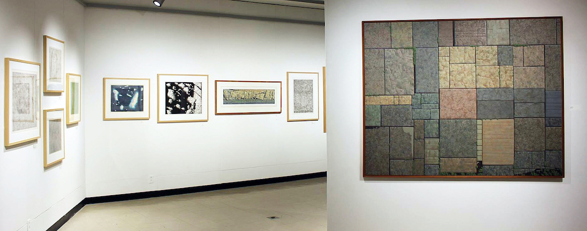
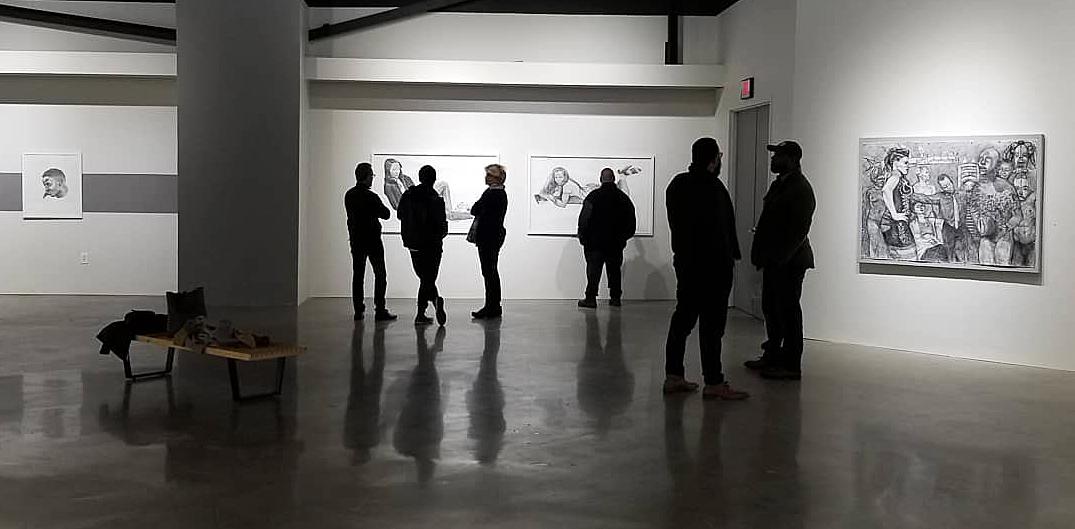
James Nawara, Installation image, Early work, Image Courtesy of DAR 2017

In the earlier imaginary landscape subjects, the terrain was seen from a low-altitude aerial viewpoint. Although invented, these compositions evolved from actual landscapes viewed from commercial flights, light aircraft, a helicopter and once a hot air balloon flight, as well as the artist’s interests in geology, optical phenomena, and prehistory. At a distance, the work might suggest abstract color field painting, exemplified by abstract color field painters like Jules Olitski in the 1980’s. Upon closer observation, the details reveal a plausible landscape that provides illusions of crop growth, archeological sites, subtle patterns, rock formations, long cast shadows, with both actual and illusionistic textures. These works have a feel for abstraction, something that would be carried through in Jim Nawara’s later work.

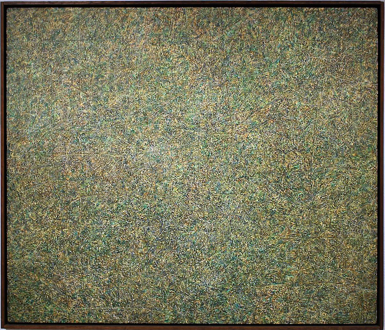
James Nawara, Trace, acrylic on linen, 1973

As an undergraduate at the School of the Art Institute of Chicago, Nawara studied under the mentor and famous photographer, Kenneth Josephson and also worked as a commercial photographer in Chicago. He went on to graduate school in painting at the University of Illinois, and studied photography there under another well-known photographer, Art Sinsabaugh.

James Nawara, Thirty- Two early Black & White 8 x 10″ Photographic Images

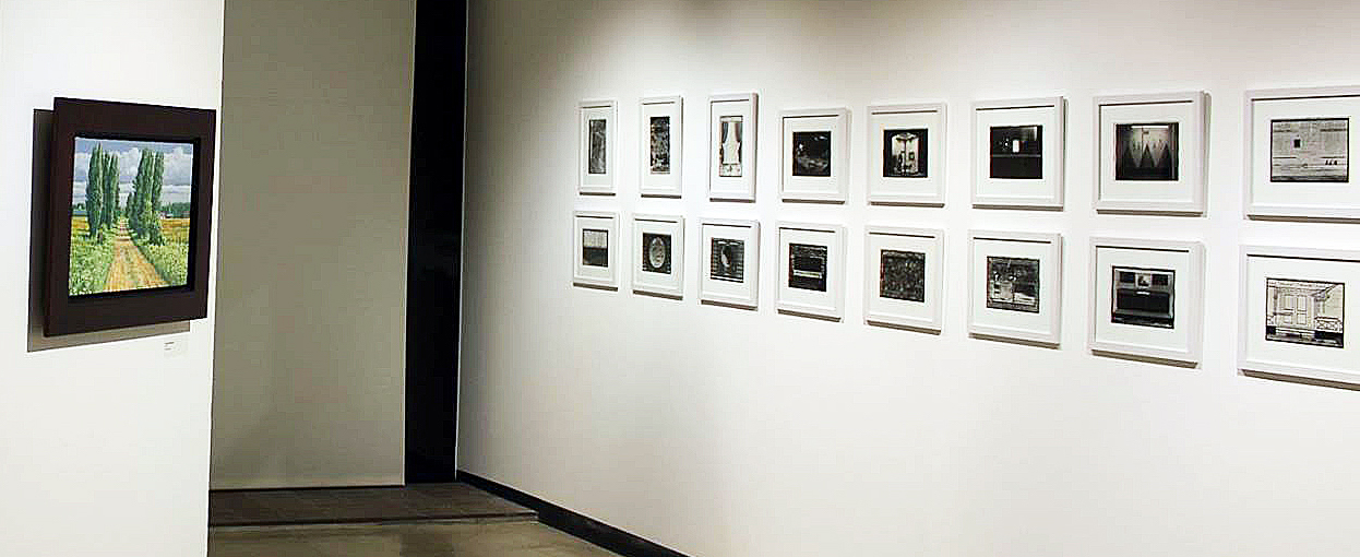
After completing his graduate degree in Illinois, Jim Nawara moved to Detroit to take a position as a drawing instructor at Wayne State University. His thirty-two photographs in this exhibition, most of which were taken in Detroit, have seldom been exhibited. He chose the rigor of always composing and printing the images full frame, un-cropped. The dates of these images overlap Nawara’s shift from aerial view subjects to landscapes based on ground-level views of actual sites. He was intrigued by the idea that an artist might be able to make art out of a “mundane” subject.

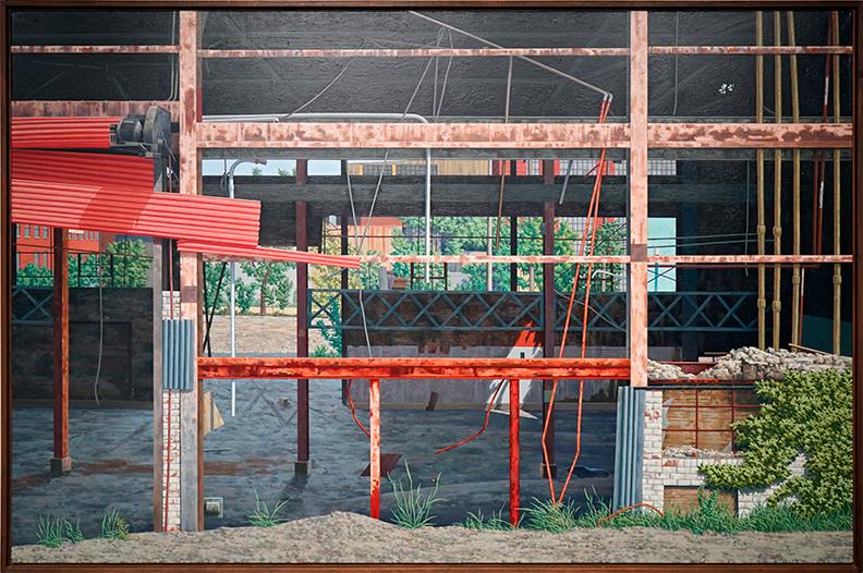
James Nawara, RESTEEL, oil on Linen, 1991

In the large industrial urban landscape, RESTEEL multiple layers of broken walls and windows of an abandoned factory draw the viewer into the painting. The foreground, mid-ground, and background all have their characteristics concerning light, shape, and color. It is an example of magical realism that presents an abstraction that is grounded in realism. In the foreground, the lower right brick structure plays off the left sheets of corrugated red metal, while the interior plays with a sliver of light. The imagery is divided into thirds both vertically and horizontally. It is a grid that provides us with a solitude that brings us back to multiple viewing. Each section of this oil painting is meticulously rendered, another reason viewers are compelled to take a long, hard look and become enveloped by this vestige of Detroit’s industry.

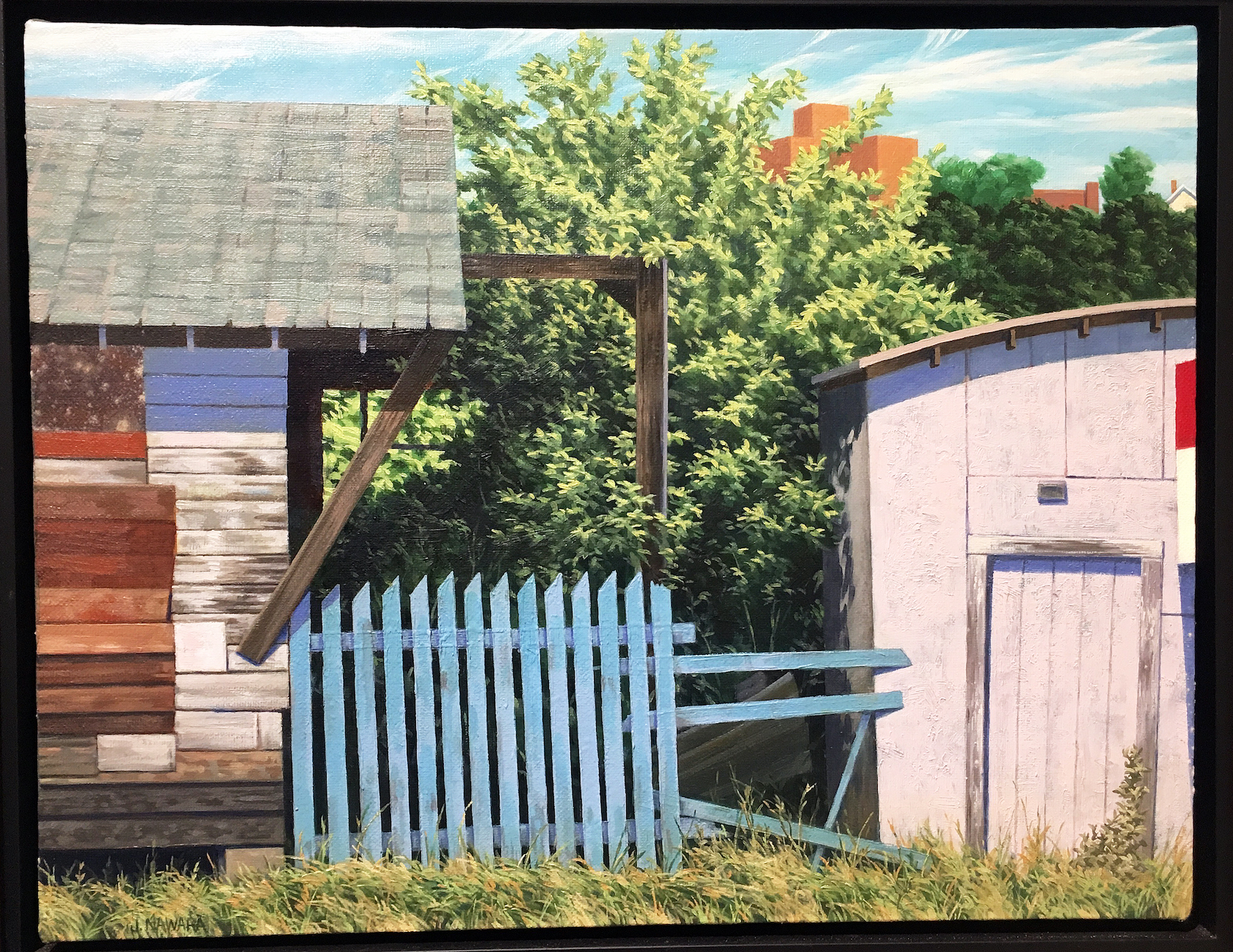
James Nawara, Blue Fence, oil on linen, 1999

In the small oil painting, Blue Fence, from 1999 is another example of Nawara’s strong composition, illusionistic space, and placement of color. He painted the blue fence, as well as a wedge of a red, white and blue sign on the far right in crisp detail. The fence, sign, shed walls, roof, and tree are carefully layered, like flats on a stage. It is evident that placement of these compositional elements is like an abstract collage.

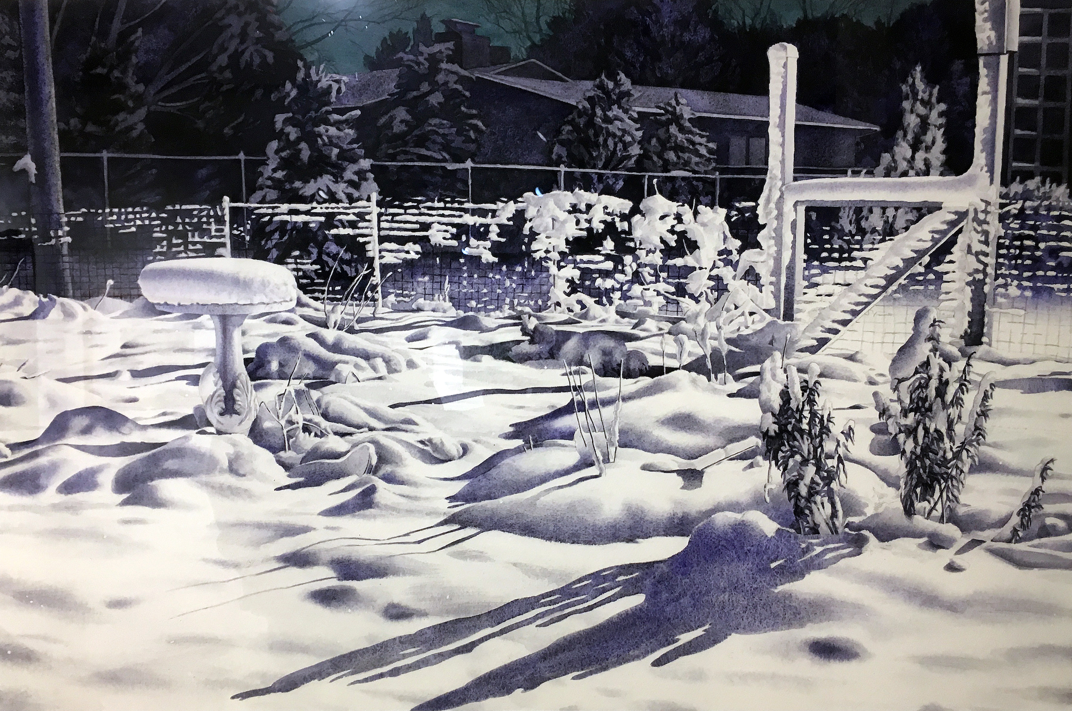
James Nawara, Night Garden, Watercolor, 2007

Nawara’s Night Garden demonstrates a high level of technical facility with the watercolor medium. He poetically creates the stillness of fallen snow in his wife’s vegetable garden, illuminated by a strong floodlight on the back of their studio.

Working from a photograph, Nawara translated the textured snow with granulated watercolor washes, particularly as seen in the snowdrifts and snow-covered birdbath. This was an ephemeral subject, as all the snow melted by dawn. The entire painting was done with just three granulating watercolors, Holbein Ultramarine Blue Deep, Daniel Smith Lunar Black, and Holbein Prussian Green.

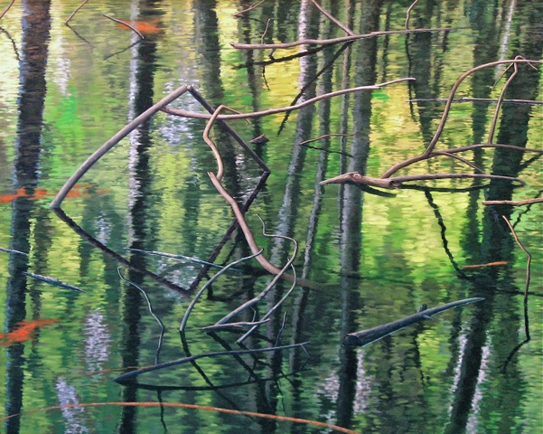
James Nawara, RHOMBUS, 40 x 50, oil on linen, 2008

Nawara’s 2008 40” x 50” oil painting RHOMBUS was used on the announcement for this exhibition. A rhombus is a geometric term for a parallelogram, like the shape of a diamond on playing cards. The rhombus in this painting is formed by a broken branch and its reflection in a flooded young woodland. Nawara was intrigued by the shimmering soft focus of the water surface, and the reflections of trees appear softly blurred by breezes, while the actual branches were rendered in sharp focus. Magic realism is in full play with this abstract composition, far from anything a traditional landscape painter would contemplate. Jim Nawara was pleased when a former student described his exhibition as “dreamlike”.

I had an opportunity to ask the artist a few questions:

Ron Scott: The title of your exhibition is PHENOMENA IN LANDSCAPE. What are some examples and what do you mean by Phenomenon?

Jim Nawara: Anything that may be of visual interest that is happening or that has happened in the landscape; also the evidence, or traces of natural and human activity in the landscape.

RS:  When did the move from aerial imagery to horizon-based landscape take place and why?

JN: Actually, I made my first real drawings when I was about six years old and these were graphite pencil aerial view landscapes! This was after my first airline flight from Chicago to Minneapolis. My dad worked for Northwest Airlines, and he took my brother and me on a round trip to give my mom a one-day break. I was blown away by the views out the window and made drawings of what I saw as soon as I got home. Many years later I started drawing and painting aerial views again as a graduate student at the University of Illinois. Then after about twenty years, I moved away from aerial view landscapes in the late eighties. I felt that I had plowed the aerial view field thoroughly, and I wanted to move to other aspects of landscape.

RS: How much of the work is plein-air and how important is that process to the work?

JN: I have started a few paintings outdoors; but being a slow painter, I have never completed one outside. I found it stimulating, and I just kept seeing more and more information that I wanted to put into the painting! I use quick graphite sketches and photographs to define the compositions. I worked outside for two consecutive days on RESTEEL, the six-foot painting in this exhibition. Each day within two hours of my arrival the wind increased moderately, and the six-foot canvas turned into an uncontrollable sail pulling itself and me down the street!

RS: What role has photography played in your artwork? How is it used?

JN: My photography experience in and out of school has given me a good understanding of the differences between human vision and the way a camera records an image. This is crucial in understanding how to use a source photograph effectively for another medium.

RS: How would you describe the difference in oil on canvas work, and the works on paper? Is it more than scale? Is there something inherent in the media?

JN: Yes, oil and watercolor are just inherently different mediums with their characteristics and qualities. I enjoy both and often alternate between the two. The major difference is the fact that transparent watercolor dries rapidly and allows you to move forward quickly in a painting. However, you are very limited in removing color that has dried into the paper. Therefore, I have to plan out each watercolor several steps ahead. Oil paint allows you to move forward and back more easily, but each has its particular, wonderful charms.

RS: Which (living or dead) artist’s work are you most attracted to, and why?

JN: There are many wonderful artists who made excellent work. The first three that I immediately think of are Edwin Dickinson, Georgio Morandi, and (always) Johannes Vermeer. Check them out in books or online, but better yet, try to see some actual work in museums.

RS: What attracted you to these abandoned Midwest locations?

JN: I never select a site to paint because it is abandoned, though some are.   I primarily consider my paintings abstract organizations of shape, color, light, and space. The paintings are always interpretations filtered through time, memory and imagination, as well as the physical process of painting. I often choose urban landscapes, but when I select a natural subject, I am interested in the effects of human activity great and small on the landscape. These events may be grand, unimportant, profound, or peculiar. I want to engage the viewer and to express something that is ineffable. My watercolor painting Lock shows a mosquito-ridden abandoned canal lock in Ohio that provided enough visual interest for me to make a painting.

The work in this exhibition spans Jim Nawara’s forty-six-year career as a professor of drawing and painting at Wayne State University. Artists and colleagues that know Jim kid him about his “brief” resume, a reflection of his record as an active exhibitor participating in solo and small group shows as well as more than 250 international, national and regional group exhibitions, not to mention the public and private collections that house his work. In 2007 Nawara had an exhibition at the Muskegon Museum of art, Overviews & Afterlands, that exhibited 22 works of art where the curator remarks say, “His landscapes are without figures, yet notated with marks of human activity and man-made forms. They are based on observation but driven by invention. They reflect the passage of time: changing light and shadow, remnants of man-made forms, the layering of a medium during the creative process.”

Jim Nawara earned a B.F.A from the School of the Art Institute of Chicago and an M.F.A from the University of Illinois, Champaign

The exhibition continues through Friday, December 8th, 2017

Wayne State University Art Department Gallery

Hours: Tuesday – Thursday 10 AM – 6 PM, Friday 10AM- 7PM

Art Department Gallery, 150 Art Building,  5400 Reuther Mall,  Detroit, Michigan 48202

Unpacking Frank Lloyd Wright @ MoMA

Installation view of Frank Lloyd Wright at 150: Unpacking the Archive. The Museum of Modern Art, New York, June 12–October 01, 2017. © 2017 The Museum of Modern Art. Photo: Jonathan Muzikar

The holdings of the Frank Lloyd Wright archive, jointly acquired by the Museum of Modern Art and the Avery Architectural & Fine Art Library at Columbia University in 2012, are vast—no surprise, since Wright’s career spanned a seventy-year trajectory. The archive’s holdings comprise 55,000 drawings, 125,000 photographs, and well over a quarter-million sheets of correspondence, not to mention models, architectural fragments, films, and other multimedia. If the celebrated 20th century architect were alive today, he’d be 150, and to commemorate his sesquicentennial the MoMA’s exhibition Unpacking the Archives presents over 400 works from the archives, offering an illuminating thematic and chronological survey of Wright’s career.

Installation view of Frank Lloyd Wright at 150: Unpacking the Archive. The Museum of Modern Art, New York, June 12–October 01, 2017. © 2017 The Museum of Modern Art. Photo: Jonathan Muzikar

The show’s title wittily puns on both the content of the exhibition, all gleaned from the newly-acquired archive, and on the show’s organization, for which twenty MoMA curators take an object of their choosing and explain (“unpack”) its relevance within the context of Wright’s career. This curatorial decision offers a refreshingly new approach to a survey of Wright, since some of his most iconic works (the Robie House, for example) are conspicuously absent, and viewers are introduced to some of Wright’s lesser known projects, such as his unrealized plans for Rosenwald School and his utopian Davidson Little Farms Unit.

Each of the exhibition’s fourteen galleries focuses either on a specific theme (ornament, ecology, circular geometries, and urbanism, to name a few) or an architectural structure (starting with the Imperial Hotel in Tokyo and culminating with the Guggenheim). Some gallery spaces reinforce some of Wright’s most characteristic attributes, such as his compulsive obsession with total design. Not content to merely design a structure, Wright famously maintained absolute control over all the interior furniture and furnishings, going so far as to show up uninvited on the doorsteps of prior clients to ensure sure that the totality of his interior design scheme remained unaltered.

Other galleries playfully stray from the conventional narrative arc of Wright’s career. One room, devoted to studio drawings, displays drawings by Wright’s own hand juxtaposed with drawings from studio assistants, making the point that the studio’s more refined and aesthetic “perspective drawings” were generally rendered by specialists, such as the manifestly talented Marion Mahony. Perhaps the most surprising and satisfying original drawings on view, simply because they burst with spontaneity, were the sketches Wright made on a napkin as he was working out some design problems posed by his mile-high skyscraper.

Frank Lloyd Wright (American, 1867–1959). Fallingwater (Kaufmann House), Mill Run, Pennsylvania. 1934–37. Perspective from the south. Pencil and colored pencil on paper, 15 3/8 × 25 1/4″ (39.1 × 64.1 cm). The Frank Lloyd Wright Foundation Archives (The Museum of Modern Art | Avery Architectural & Fine Arts Library, Columbia University, New York) © 2017 Frank Lloyd Wright Foundation, Scottsdale, AZ. All rights reserved

The exhibition is heavy on two-dimensional architectural layouts, floorplans, and perspective drawings, but there are also some examples of the furnishings Wright’s studio created, ranging from art-glass windows, furniture, tableware, rugs and drapery. Also on view are the elaborate sculptural models Wright produced to help pitch ideas to his clients. These include a model of his iconic Guggenheim, flanked by an early perspective-rendering of the building, reminding us that the structure was once to have been an alarmingly garish pink.

Frank Lloyd Wright (American, 1867–1959). Solomon R. Guggenheim Museum, New York. 1943–59. Model. Painted wood, plastic, glass beads, ink, and watercolor on paper, 28 x 62 x 44″ (71.1 x 157.5 x 111.8 cm). The Frank Lloyd Wright Foundation Archives (The Museum of Modern Art | Avery Architectural & Fine Arts Library, Columbia University, New York) © 2017 Frank Lloyd Wright Foundation, Scottsdale, AZ. All rights reserved.

Wright at 150 directly acknowledges Wright’s Michigan connection in its display of an elaborate layout Wright drafted for Kalamazoo’s Galesburg Community, known as “The Acres,” originally to contain a network of homes on twenty-one circular-shaped lots, though in the end only four were built. The exhibition also devotes significant space to his Usonian homes, the comparatively inexpensive do-it-yourself (in theory, anyway) home-kits Wright’s studio produced, intending to make quality architecture available to the middle class; the Detroit area boasts of three such homes: the Turkel House (Palmer Woods), the Smith House (Bloomfield township), and the Affleck House (Bloomfield Hills). And some of Wright’s textile patterns on view (such as his March Baloons, depicting an elaborate network of intersecting circles) have been adopted by Ann Arbor’s Motawi Tileworks, which produces a handsome line of Wright-inspired ceramic decorative tile.

Frank Lloyd Wright (American, 1867–1959). March Balloons. 1955. Drawing based on a c. 1926 design for Liberty magazine. Colored pencil on paper, 28 1/4 x 24 1/2 in. (71.8 x 62.2 cm). The Frank Lloyd Wright Foundation Archives (The Museum of Modern Art | Avery Architectural & Fine Arts Library, Columbia University, New York) © 2017 Frank Lloyd Wright Foundation, Scottsdale, AZ. All rights reserved.

Spread across a generous suite of galleries on the MoMA’s third floor, this exhibition at first glance seems perhaps austere (just one floor up, after all, are the reliably crowd-pleasing combines of Rauschenberg displayed alongside some of the zany 1970s kinetic works produced by the organization Experiments in Art and Technology). By contrast, Wright’s stately and geometric architectural plans on view in Unpacking the Archive seem emphatically cerebral, in some cases even displayed on mock-draft tables. But his ideas were revolutionary for his time, whether it be the need for sustainable architecture or for quality housing for all social classes, rather than just the proverbial 1%. And this cross-section of the Frank Lloyd Wright archive offers revealing and unprecedented access into the agile mind of an architect whose ideas remain uncannily relevant today.


Museum of Modern Art    Exhibition runs through October 1, 2017


Group Exhibition @ Oakland University Art Gallery

An exhibition, Ethics of Depiction: Landscape, Still Life, Human opens at Oakland University Art Gallery

Oakland University Art Gallery, Ethics of Depiction: Landscape, Still Life, Human, Installation Image Courtesy of OUAG, 2017

Rather than a Detroit-based solo artist or group show, Dick Goody, Chairman of the Department of Art and Art History, and Director Oakland University Art Gallery has curated an exhibition that draws on artists from various parts of world that provide an experience in imagery that questions fantasy, deception and truth. Fueled by contemporary image making, the exhibition is a collection of twenty-one artists ranging in gender, location, age, and location, providing artwork that includes photography, video, painting, and drawing. It could not be more diverse.

Goody says in a statement, “These works represent something just short of an inundation of content, and the presentation— “salon style” — affirms the idea that kaleidoscopic subject matter is enriching and arouses curiosity about the way in which contemporary artists use data and themes in their work to create a reflection of their lifespan on earth. The ethos of the exhibition sees parallels with the cabinets of curiosities from the past. Like the inquiring viewers of old encountering astonishing collections of objects, we today also experience a primary emotional connection to this type of work because its meaning is self-evident. Concurrently, the viewer’s entry point into these pictures is unclouded by unfamiliarity with Contemporary art. Anyone can find their way into these accessible depictions and explore the familiar, the strange, the formalistic and the conceptual stance of each image. But even using the phrase “conceptual stance” creates an unnecessary barrier between the viewer and the images. Perhaps it is much better to say “poetic stance.”

Richard Mosse, The Man Who Sold the World, 2015, digital c-print, 28 x 35″ Courtesy of the artist and Jack Shainman Gallery, New York

This image, The Man Who Sold the World, by Richard Mosse, an artist from Ireland, captured on infrared film, is shot in the Congo and feels like an ethnographic recording of workers, while moving away from a truthful depiction of the landscape. The reality of the image raises more questions than it answers.

Mosse says in a statement, “The subject of my work in Congo is the conflict’s intangibility, the irruption of the real beneath the generic conventions — it is a problem of representation. The word ‘infra’ means below, what is beneath. A dialogue about form and representation is one of the work’s objectives so I don’t think it’s a bad thing if people get hung up on the way Congo has been depicted, rather than what is being depicted.”

Jasper de Beijer, The Brazilian Suitcase (Part 2) #1, 2017, c-print 44.5 x 67 inches Courtesy of the artist and Asya Geisberg Gallery, New York

When I first experienced this image, I was taken back by my own thoughts of a place where a shrine was erected to the remnants of a Brazilian airplane. Again, this feels like an ethnographic image capturing a cultural act by what might be described as third world tribal individuals living in the jungle of Brazil. The images of Jasper de Beijer, an artist from the Netherlands, seem to want to break the perception of what we see as real, juxtaposed and complimented by our own experience and memory.

He says in a statement, “We experience reality through interpretation. For me, the most interesting feature of this process is that the interpretation of reality gains a new actuality, forming a corpus of imagery that becomes more and more disconnected from what actually took place. This is where images start to lead their own life — becoming more or less autonomous.”

Becky Suss, Hallway, 2017, oil on canvas, 84 x 180 inches Courtesy of The West Collection

The very large oil on canvas painting, Hallway, 84 x 180, by the artist Becky Suss from Philadelphia, dominates the entrance to the exhibition. This flat, neutral depiction of an empty house captures the mundane. If it were 6 x 12” on board it might pass as a postcard. The scale plays a major role in requiring the viewer to stop and study the contents, calling on our own memories and perceptions. In this work and for that matter all artwork, we bring our own experience to the moment and that is what can make all the difference. This idea works in the same fashion for all artwork.

Suss says in her statement, “In terms of the painting world, I do feel like sometimes there’s a dismissal of subject matter: “What is it? It’s just a room. It’s just a domestic interior. What does it mean?” There’s this idea that somehow it’s not terribly meaningful. But so much of our time is spent in these domestic spaces; they are where the scenes of our lives play out. Again, it’s something that’s undervalued. It’s taken for granted in some ways, like it’s an undeserving thing for a big painting to be made about.”

David S. Allee, Fireworks, 2016, dye sublimation metal print, 48 x 72 inches Courtesy of the artist and Morgan Lehman Gallery, New York

The photographic image, Fireworks, by David S. Allee, made me stop and study the large work, 48 x 72”, a dye sublimation on metal. I was first drawn to the image by the even lighting in the foreground and the sky, which led me to the question of exposure. Upon close examination, the viewer can observe movement in the detail of people, disclosing a long exposure time for the image. From the title one can assume we are viewing a group of people viewing fireworks, but the light source is intriguing and a mystery.

He says in a statement, “Structure, environments, spaces interest me for the stories they tell and layers of meanings they can describe. Photos of these forms usually require people to look closely, study, interpret and infer. If a viewer is drawn into an image of a built environment, they’re forced to use their imagination to understand it, make sense of it and in effect complete the image. The more an image has this relationship with people who view it the more successful I see my artistic process. I also have great interests in architecture and planning and a desire to build and create. Photographing these forms and framing them probably also helps to fulfill some of these desires.” After seeing the image, one can reimagine the landscape romantically, and change your perception of an experience. David S. Allee earned his MFA in Photography from the School of Visual Arts in New York City.

For this writer, this exhibition clarifies the role of a university gallery, especially with respect to their freedom to explore new ideas without the concerns of commerce. Goody at OAUG, focuses in his curatorial work, on educating his university students and raises the bar on exploration, dialogue, and meaning, not just for the students, but also for the Detroit Metro area at large.

Oakland University Art Gallery

Ethics of Depiction: Landscape, Still Life, Human runs through November 19, 2017


Fall Exhibitions 2017 @ BBAC

The Birmingham Bloomfield Art Center kicked off its 2017 fall season with exhibitions in all of its galleries, highlighting painting, sculpture, photography and ceramic work.

Birmingham Bloomfield Art Center, exterior, 2017

For a non-profit that was established in 1957, the BBAC continues to connect people of all ages with art from every part of the Detroit Metro Area.  These new exhibitions in all the galleries are good examples of how they provide venues for a large variety of artists.

The current exhibition in the large central gallery is an exhibition titled Simultaneous Contrast and illustrates how differently two artists approach figure painting. It is interesting that both artists came from the L’Anse Creuse High School program under the instruction of Ken Hoover during the early 1970’s and then went on to pursue their different paths in visual art. 

Christine A. Ritchie, Primary Passage VI, Oil on Canvas, 36 x 60″

In her painting Primary Passage VI, Ritche demonstrates her interest in process and the intrinsic qualities in oil paint where she delivers a loose abstract expressionistic interpretation of the figure(s). The surface, the brush-stroke action, and the moment, characterizes the way she renders the human form. Supported by strong gestural drawing the painting successfully communicates movement.  She says in her statement, “My work with the figure has been ongoing and is related to my interest in the qualities of figurative movement and the idea that there is a “shared” sense of the human figure moving through space that creates a “felt” or identifiable rhythm that belongs to and is uniquely recognized.” 

For this writer, the artist came along at a time when influences from the 1960’s, artists like Arshile Gorky and Willem de Kooning, were taking the art world by storm, supported by New York critics, Clement Greenburg and Harold Rosenberg.  But the language of painting the human figure as been with us since the art work done in the prehistoric caves of Dordogne, France and will be with us for some time to come. Christine A. Richie holds a MFA in Painting from Pratt Institute in Brooklyn, NY where she lived and worked for 23 years before returning to a studio in Detroit.

Kip Kowalski, IGGNOIRANTS, Oil on Canvas, 30 x 38″

The contrast to Richie’s work is the Picassoesque figurative paintings by Kip Kowalski is dramatic, hence the title of the show, Simultaneous Contrast.  These satirical figure paintings incorporate a kind of surrealistic still life component. In the oil on canvas, IGGNOIRANTS, Kowalski dishes up a surreal one-eared female figure, a pear and a dead bird on a string with abstract elements in the wand and background.  He says in his statement, “My work is an audacious and blasphemous satire of human ignorance and apathy that confronts the absurdities I find in contemporary religious beliefs.  I tackle the biblical lore that is celebrated as fact over the findings of empirical science, such as the denial that evolution is real. My work is also a reaction to the pervasive attitude in many secular and non-secular societies, including our own, that women are the lesser gender.”  

Kowalski’s paintings are grotesque at times as he admits, in that it may cause uneasiness to the viewer.  Are these visual distortions metaphors for the imperfections in our anatomy?  In the end, most people have a visceral reaction to viewing a work of art as opposed to the intellect, directing them to say either I like that, or not for me.  I find myself going back to Picasso in this work, whose painting from the mid-1930’s, especially the women seated series, remind me that he was the most prodigally gifted artist of the twentieth century. So when viewing Kowalski’s work, I make an effort to see his measure of detachment, perhaps even skepticism that results in a form of intrigue.  Kip Kowalski graduated from The Center for Creative Studies with a BFA and maintains a studio in the Detroit area.

Russ Orlando, Modifiers, B&W Photographic image

In the Robinson Gallery, the work of Russ Orlando combines sculptures, collages, totems and a row of photographic self-portraits that portrays this artist as having a variety of interest in media and execution. The row of black and white photographs are self-portraits that stand together as one piece and seems to this writer to be theatrical in nature and not part of a body of photographical work. 

He says in his statement, “When I start a work, I tend to gather materials that I find may be useful to me. When combining the materials, I try not to make much sense out of my choices for fear of being too rational.  In the end, the work should serve as only a stopping point, prompting many questions but leaving them unanswered.”  

Russ Orlando, Untitled, Slip Cast Porcelain, Gold Leaf, and metal stand.

The Untitled work of these three birds, slip cast porcelain, with the interior of gold leaf is interesting, assuming they are not commercially made and altered, which would make them found objects. The base height seems right, but I would prefer more attention is made to the base’s top material: not plywood, but stone, or glass. Perhaps these works are like the artist says, stopping points, prompting many questions, but leaving them unanswered.  Born in Detroit in 1964, Russ Orlando received his Bachelor of Fine Arts from Wayne State University, Detroit and his Master of Fine Arts from Cranbrook Academy of Art, Bloomfield Hills, MI.  As part of his Kresge recipient statement he says his work is informed by the lure of the sell, shaped from his many years as an advertising agency art director. His sculptures and performances-which he calls experiences-often employ his body as a flash point for social criticism and a viewer’s self-examination.

Rosemarie Hughes, House of Homage, Encaustic, Photo Transfer on Wood Panel

The BBAC has a Ramp Gallery that currently has the work of Rosemarie Hughes.  The smaller and more intimate work is base on a theme, The Home. In her statement she says, “My art is based on the idea of a home. I strive to create work that draws the viewer to take a closer look.”   Originally from the Detroit area, Rosemarie has lived and studied in Austin, San Francisco and London. She received a BFA and MA in photography but her passion for working with textures and a variety of materials ultimately led to her identifying as a mixed media artist.  She currently resides in the Detroit area where she divides her time between her studio and working as a licensed massage therapist.

The Birmingham Bloomfield Art Center is a model for communities through out the region to visit and learn how a non-profit can enrich their citizenry by offering classes, workshops, and exhibitions.

Birmingham Bloomfield Art Center 

Page 12 of 15

Powered by WordPress & Theme by Anders Norén