Rick Vian, Installation image Courtesy of Glen Mannisto
“Keeping a Wet Edge: A Retrospective of the Abstract Work by Rick Vian” & “Detroit Abstraction: Featuring 41 of the Most Noted Abstract Artist with ties to Detroit”.
The experience of being alone in the bush, as we call it in the far north of Michigan’s Upper Peninsula, deep in the thicket of the woods, is a tricky business. From immobilizing awe over its beauty to a vertigo over its map-less chaos, a walk in the bush can wreak psychic havoc. The current retrospective of Rick Vian’s painting at the Janice Charach Gallery offers a marvelous mirror of Vian’s engagement with the painting of trees in the bush over the past fifteen years. But first before finding himself in the bush of the Upper Peninsula, Vian was a worker, an industrial painter (it’s probably where his no-nonsense work ethic comes from) literally painting factories—the infrastructure of gas, water and electrical lines, the dangerous machinery of industrial production, — and living the inherent design and experiencing the drama of industry.
Rick Vian, “If You Only New” Oil on Canvas, 40 X 68, 2004
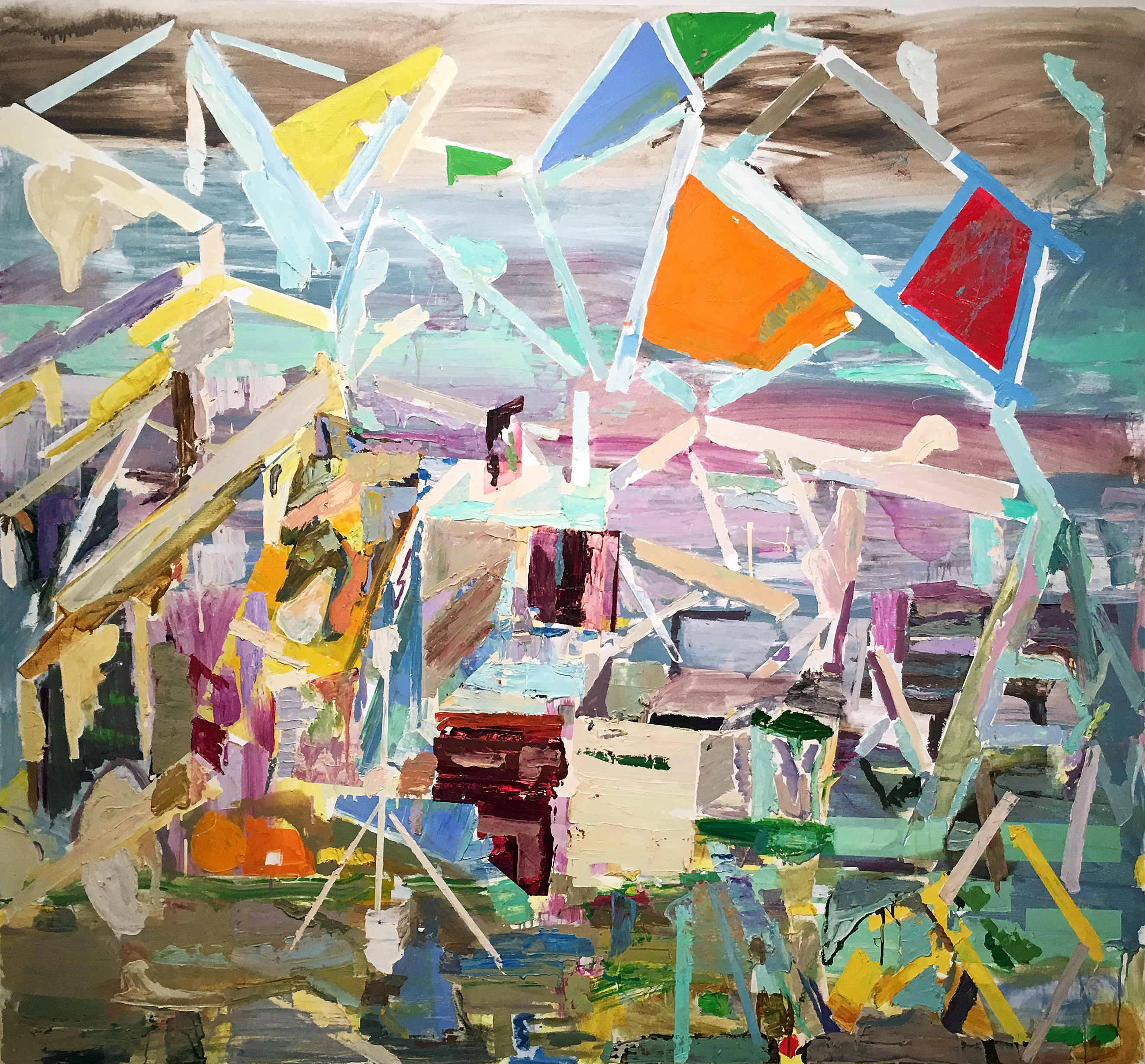
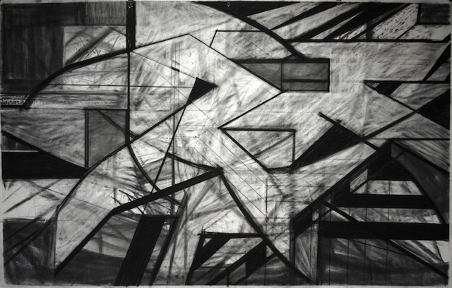
There are a few paintings in the current exhibition that took inspiration from that time and they explore with dramatic shading and coloring, with scumbled surfaces and jagged lines, the interconnected and interlocked spaces of a unique and almost cartooned or animated geometric abstraction. They don’t much look like any geometric abstraction from art history though they might suggest kinship with the Russian Constructivists. “If You Only New,” 2004, a charcoal drawing, dramatized with smears and layered palimpsests and composed with the triangular stencils of drafting tools, looks gothic in its theatrical play of prime geometric shapes. “Nice Condition,” 1999, carves figurative contours out of classic blade shapes such as intersecting ellipses and truncated spheres, dramatizing the edginess of the industrial landscape.
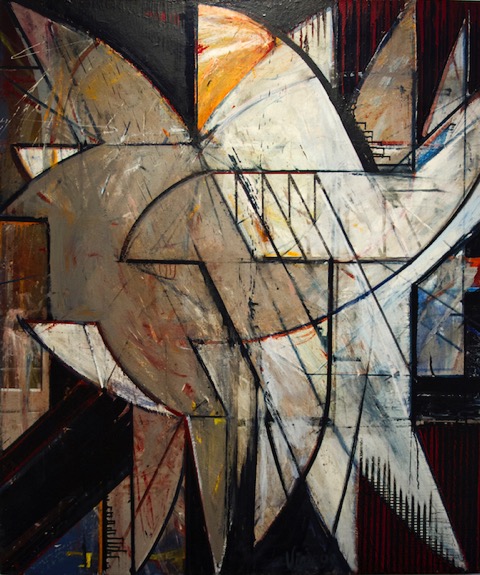
Rick Vian, “Nice Condition”, Oil on Canvas, 48 x 40″, 1999 All images Courtesy of Glen Mannisto, and the Artists.
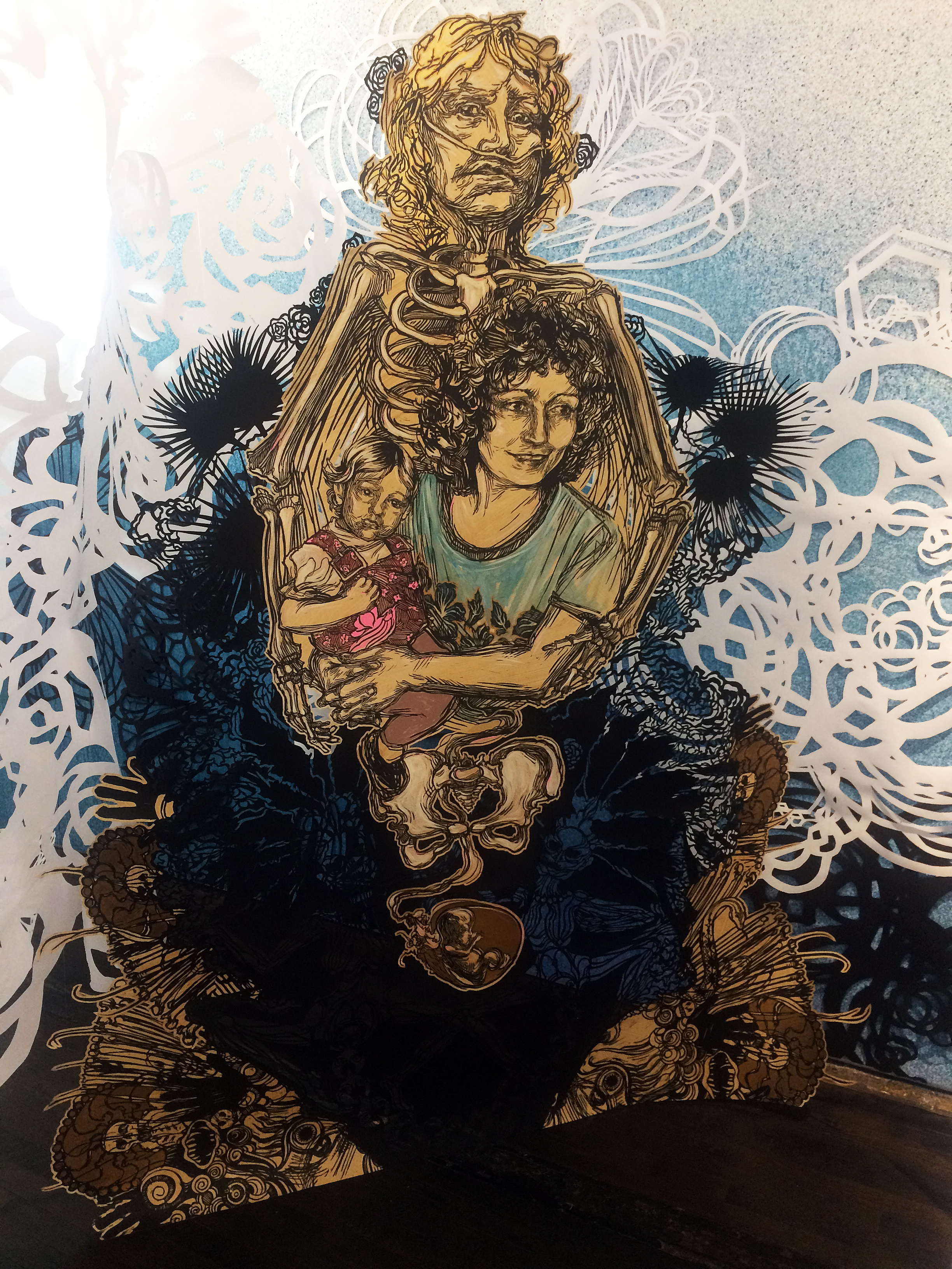
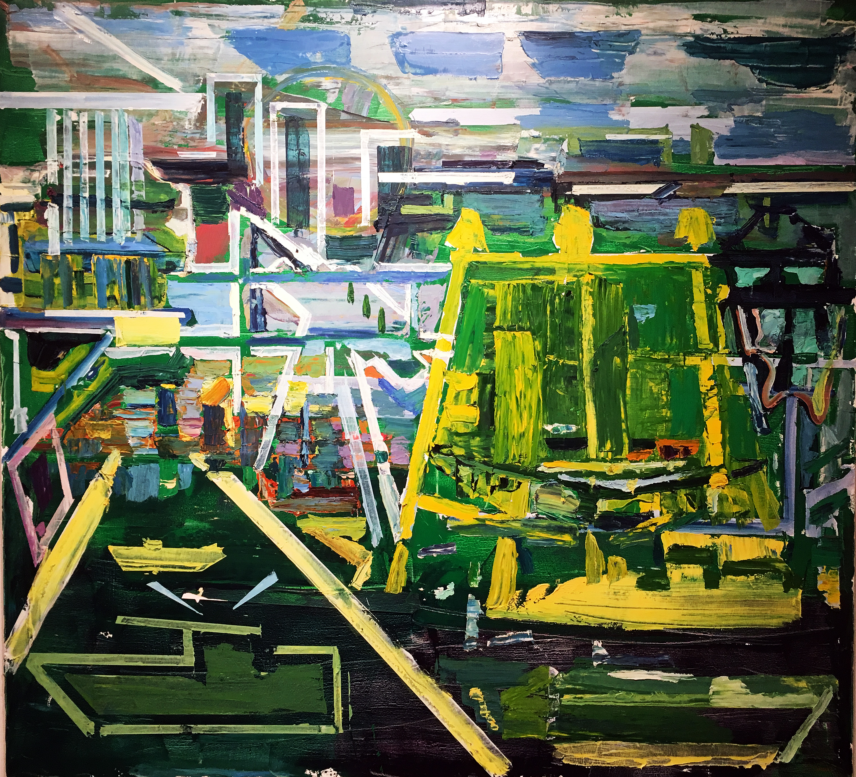
These earlier geometric abstractions set us up for the big hit of the retrospective and his latest project which is the push/pull relationship between Vian’s figurative and abstract painting of nature. He seems to have turned away from his industrial abstraction and industrial life (he quit the commercial/industrial painting gig) to paint nature. Exploring the wilderness of Northern Michigan’s upper peninsula, where he built a rustic camp in the woods, Vian has engaged the forest and its parts, the tree. Translating his early explorations of the grid, that classic modernist notion, and the physics of sight, Vian has alternated between strictly realist renderings of the forest and a fervently energetic expression. His paintings have become a moment of conscious realization of both the forest and the painting as a signing of that relationship.
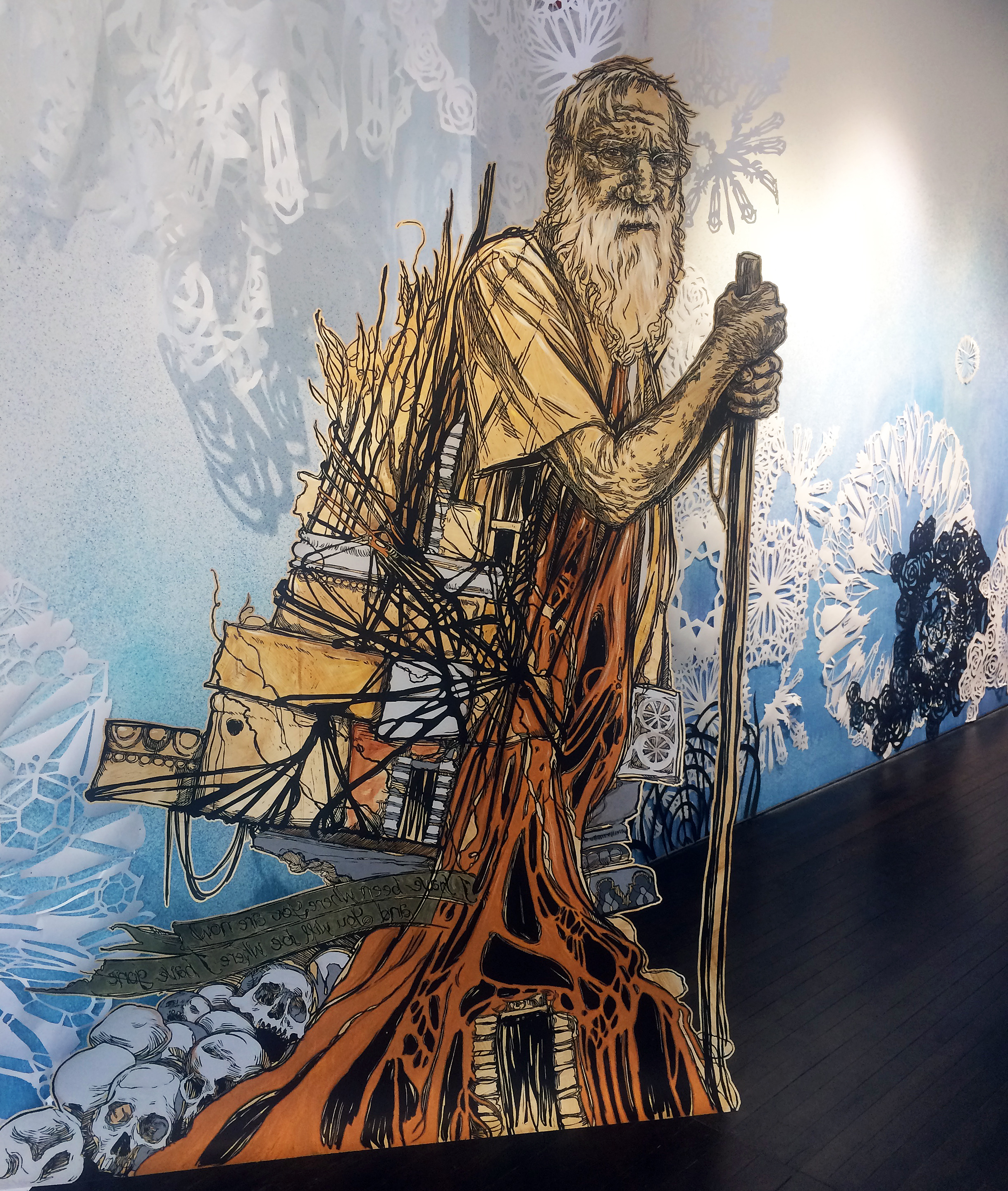
Rick Vian, “Stormbreak”, Oil on Canvas, 59”x 84”, 2005
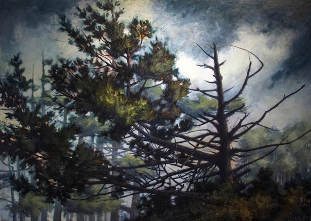
“Stormbreak,” 2005, a dramatic and acutely stark representation of the existential state of a skeleton of a tree is a haunting and certainly metaphoric description of the vulnerability of that tree. In a conversation, he said “I have painted it many times. Its right off Lake Superior’s Keweenaw Bay just past Baraga.” Lest we say Vian has painted it so often that he has almost become its biographer and in that there is the best characterization of a regional artist as a partner and caretaker of the local. One senses a devout relationship with that tree and in the radical shift back, again, to his abstracting of the bush, there seems to lead to a reading of the forest as an emancipating energy and scripted choreography of the forest.
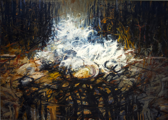
This dramatic relationship infects and determines most of the remainder the current work typified by “The Gathering Pool,” 2010, which “gathers” the surrounding forest or audience of dark shapes, of abstracted squiggles, smears and vertical black shadow-like slashes (figures?) into a focus of brilliant light or frothy foam. In contrast to the surrounding darkness, this brilliant moment is a crescendo of light, perhaps a symbol of spiritual transcendence gleaned from the dark bush. Vian pays homage frequently to his interest in both Italian Renaissance painting, which employed color and brilliant light to dramatize Christian scripture, and to Buddhist, Hindu and Islamic disciplines which use the mandala to diagram the cosmos or in Jungian psychology the unity of the self or personal identity. At the same time, he has kept an eye out for a deep, perhaps objective structure, a former preoccupation of his painting, and found a three-dimensional grid suggested in the “The Gathering Pool” by a faint network intersecting lines.
As a disciplined and investigative sojourner, Vian’s bushwhacking has even led him to study the language of the native Ojibway people entitling some of the painting in the Ojibway language which one senses gives a sympathy to the surrounding landscape and to its original inhabitants and interpretors.
Rick Vian, “Stormbreak,” Oil on Canvas, 59”x84”, 2005
DETROIT ABSTRACTION Group Exhibition
As an extraordinary compliment to his own paintings Vian curated “Detroit Abstraction: Featuring 41 of the Most Noted Abstract Artists with ties to Detroit,” a remarkable collection of painting, sculpture, ceramics, and fiber works revealing the profound depth and width of the Detroit’s artistic landscape and of course another testimony to the sincerity and fidelity of Vian’s overall artistic project.
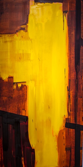
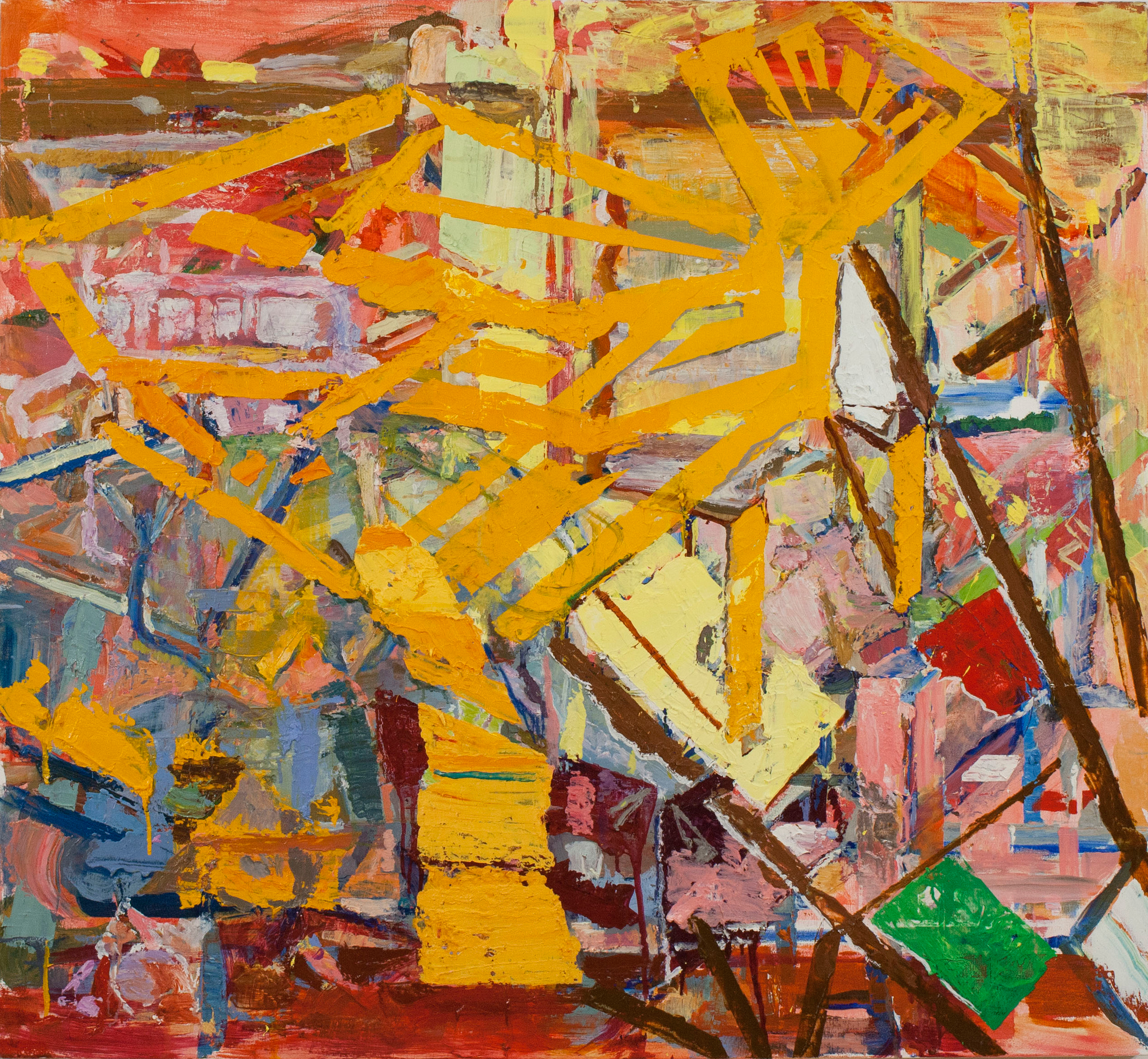
Holly Branster, “Bracket,” 72”x36”
There is too much to say about the phenomena of abstract art especially in this post-digital age, but quite simply one is overwhelmed with the diversity of ways of seeing and of the use of materials and processes that are represented in Detroit. The stereotyped mainstay of abstract art is painting and the standouts in Detroit Abstraction don’t surprise: Holly Branstner’s stunning “Bracket” is composed of an elongated rectangle with a monolithic, effortless stroke of brilliant yellow with strokes and drips of dark bloody reds. At the other end of psychic spectrum is Janet Hamrick’s smaller oil on canvas, “Undulating Drift,” a subtle reckoning of three panels of alternating stripes in a quiet pallet of taupe and mauve overlaying a series of diamond shaped rectangles. It is excruciatingly subtle and beautifully nuanced and impossible to describe. That’s why it’s a painting. It goes like that: from explosive abstract expressionism to minimalistic painting strategies, from biomorphic and surrealist automatism, to action painting, and the whole wonderful gamut of assemblage wall reliefs composed of cement, wood, metal, glass to cubist formalist sculptures, kinetic whirly gigs and textile hangings, ceramic vessels and Japanese inspired altar-like constructions.
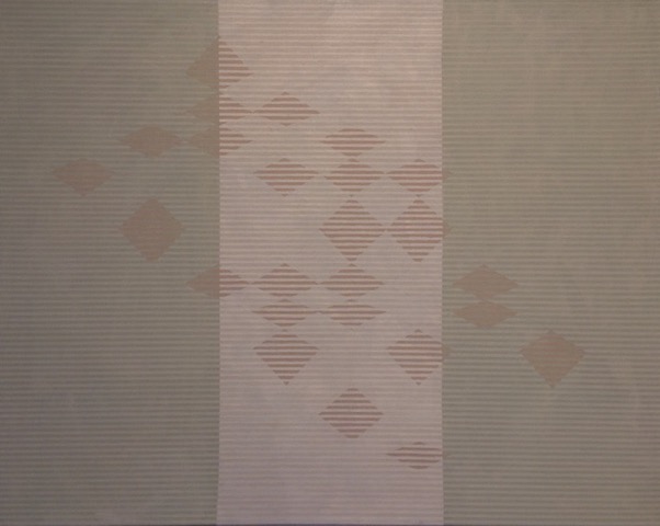
Janice Hamrick, Undulating Drift, 24 x 30
The explosion that was/is Detroit’s art scene is beautifully realized in Vian’ s deft selection of artists. The diversity of materials and processes speaks of the battle against encrusted formalism that has been a preoccupation of Detroit artists and is a fulsome reminder of the tremendous will and passion of this place-in-the-straits to give shape to the world.
Vian’s paintings occupy the first floor of the spectacular Janice Charach Gallery and the Detroit Abstraction exhibition occupies the second floor. Both are stunningly installed in this amazing space that is part of the Jewish Community Center campus. It is a revelation even to the most experienced art appreciator to see the quality, complexity and integrity of the Detroit’s scene.
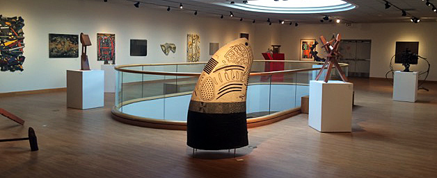
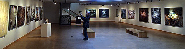
Group Abstract Exhibition, Installation image, Courtesy of Glen Mannisto
The artists included (and Vian bemoaned that there wasn’t room for others he had selected) in the Detroit Abstraction exhibition include: Diana Alva, Anita Bates, Robert Bielat, Holly Branstner, Coco Bruner, Jim Chatelain, Terry Lee Dill, Barbara Dorchen, John Egner, Gary Eleinko, Todd Erickson, Marcia Freedman, Brenda Goodman, Dennis Guastella, Carole Harris, Janet Hamrick, Al Hebert, Meighen Jackson, Lester Johnson, Dennis Jones, Ray Katz, Brian Lacey, Addie Langford, Charles McGee, Allie McGhee, Robert Mirek, Erin Parish, John Piet, Tom Phardel, Sharon Que, Curtis Rhodes, John Rowland, Douglas Semivan, Gilda Snowden, Robert Sestok, Dayton Spence, Ron Teachworth, Nancy Thayer, Russell Thayer, Lois Teicher, Albert Young.
Rick Vian will talk about his work and the Detroit Abstraction exhibition in the Janice Charach Gallery December 4th at 1:00PM. The two exhibitions close Thursday December 8th at 8:00PM.