Critical art reviews of Detroit galleries and museums weekly

Category: Paintings Page 43 of 49

Hippie Modernism: The Struggle for Utopia @ Cranbrook Art Museum


Two exhibitions offer a preponderance of material objects to make sense of the past

HM9

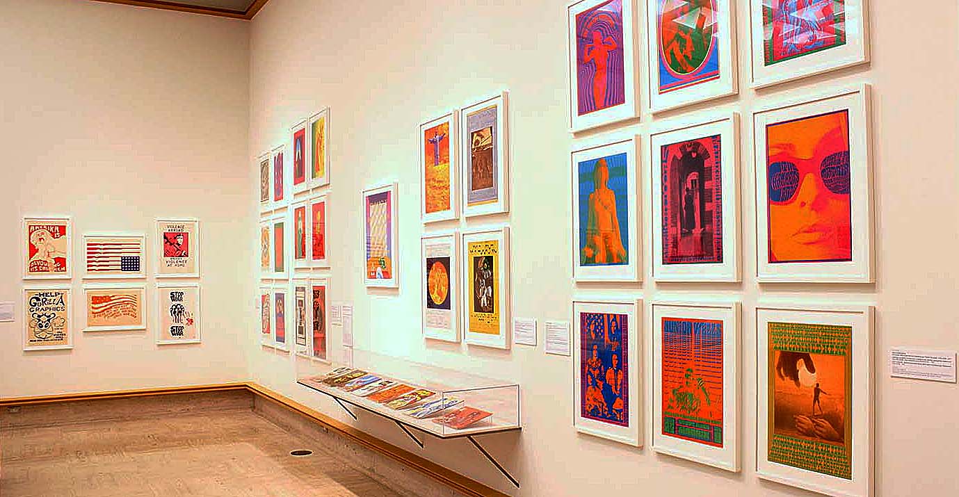
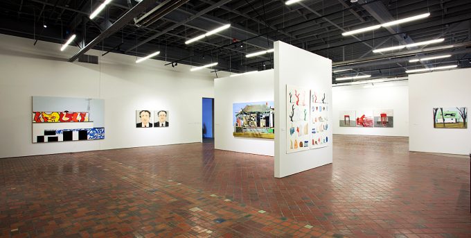
Psychedelic posters and printed matter, installation view

These days, the San Francisco Bay Area is neatly divided into two camps: you either are a tech bro, or you hate them. Back in my day as an errant Bay Area youth, there was a different kind of division: you either were a hippie, or you hated them. I, my friends, was certainly no hippie. Of course, in my time they weren’t even real hippies—although there were still a healthy number of Summer-of-Love burnouts quietly resisting the rising tide of capitalism. They were proto-hippies, the spawn of Baby Boomers, appropriating the fashion or rediscovering the music as it made its 20-year orbit in retrograde. Whether the die-hard originals or the new school posers, hippies were not, by any metrics, modern.

HM18

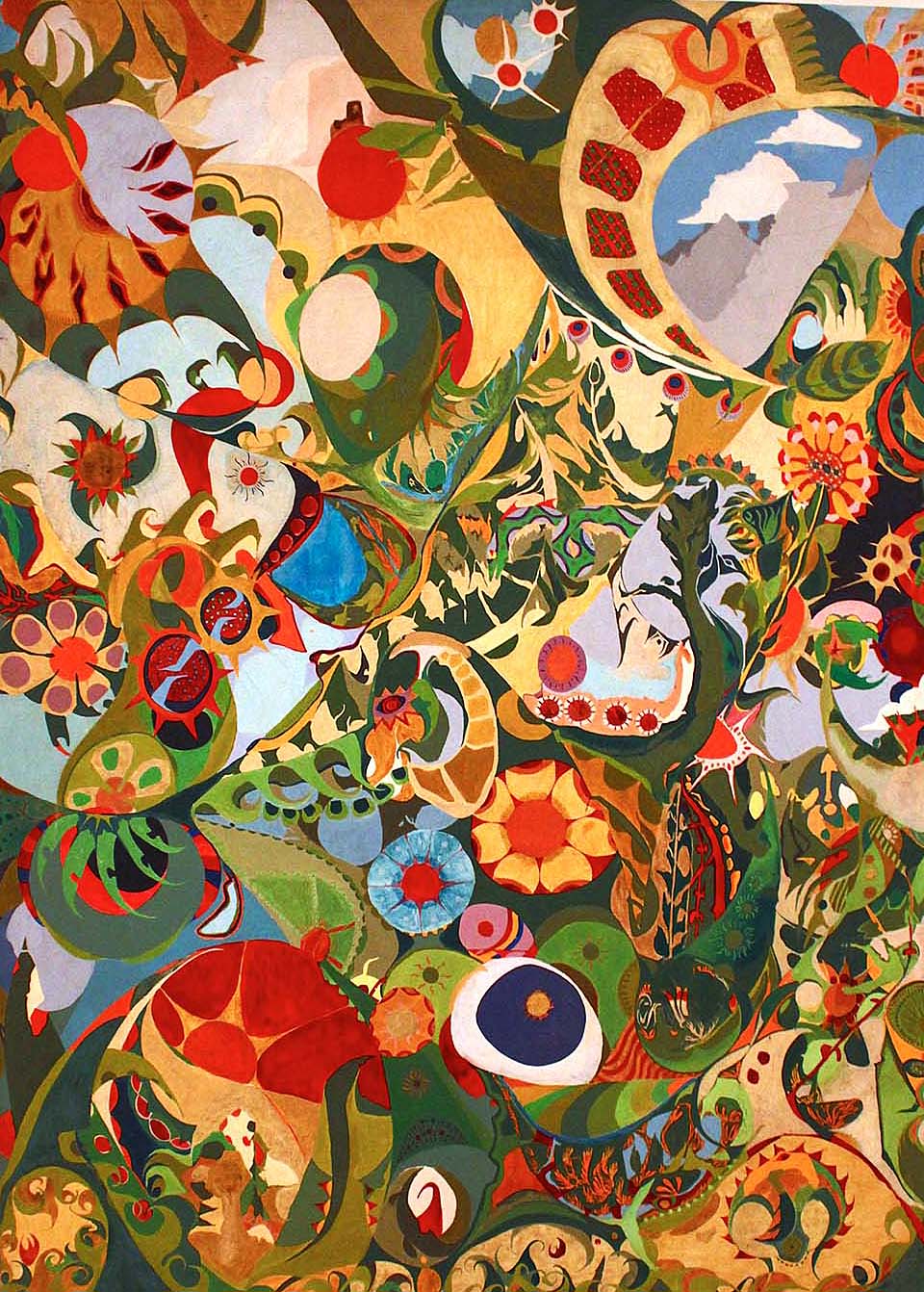
Isaac Abrams, Hello Dali (1965)

In fact, the seeming paradox between hippie and modern sensibilities provides the immediate tension of Hippie Modernism: The Struggle for Utopia—a sprawling exhibition initially organized by Andrew Blauvelt during his tenure at the Walker Art Center, which has subsequently followed him to be presented at the Cranbrook Art Museum, where he took up the mantle of Director last year. Hippies are commonly associated with back-to-the-land movements, eco-sustainability, and the timeless human yearning for peace and simplicity. Modernism is more concerned with technology, rapid progress and development, clean, modular design, and spare, white spaces.


HM8

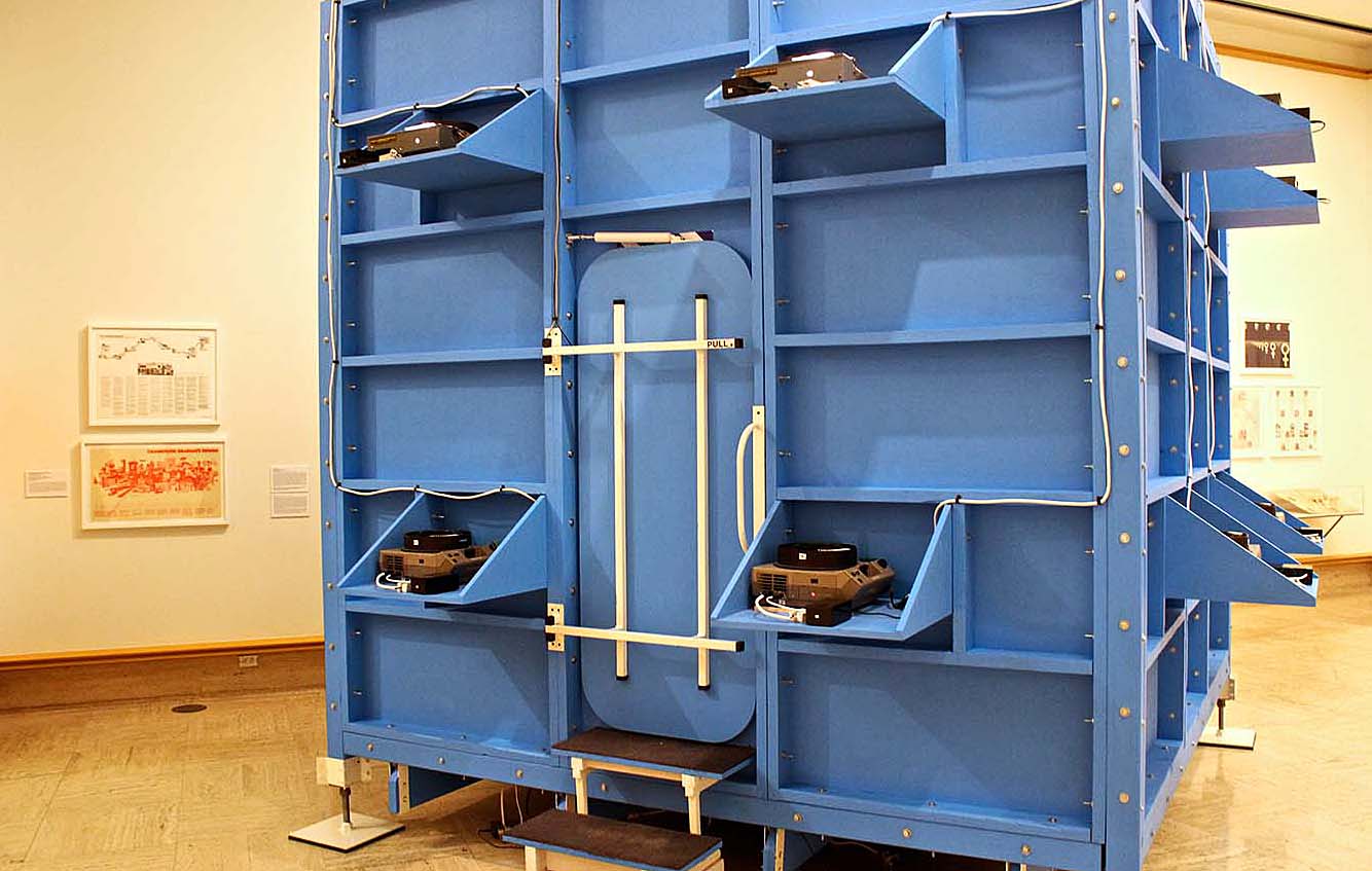
Ken Isaacs, The Knowledge Box (1962-2009)

But, as Hippie Modernism proves, these odd bedfellows forged a powerful connection indeed (who wouldn’t hippies jump into bed with, really?), fused in a social pressure-cooker of late-60s radicalism and wartime unrest. This extremely dense exhibition is not so much an art show as it is a walk through time with an art-historical lens—one which captures facets of hippie culture that have been elided by a typical focus on the flashier and more simplistic culture of drugs, fashion, rock-and-roll, and sex.

HM13

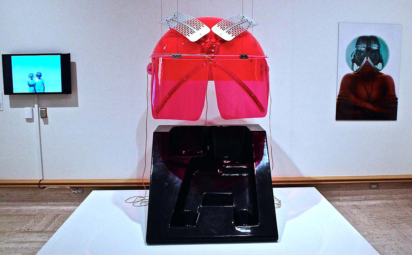
Works by Haus-Rucker-Co, (installation view)

These facets are loosely divided into three galleries: Turn On, Tune In, and Drop Out. Each of these examines a dominant theme of the time period, roughly the mid-1960s through the early 1970s—that of consciousness-raising on an individual level, social awareness on a geo-political level, and active rejection of certain cultural pressure of normativity and technological progress (to name a few). The objects and information on display demonstrate a deep interest in modern design not as an aesthetic exercise but a practical one, as applied to communal and off-the-grid living, mobile housing, and sustainable infrastructure; technology, not at as means of warfare but as a means for more direct powers of computing and personal representation; and tool use as a mechanism for exploring the inner workings of the mind. The exhibition, which occupies the entire main floor of Cranbrook is veritably papered in schematics of ergonomic living solutions, imagined vehicles, and visions of bio-domes (not to mention an actual geodesic dome that features an interactive and highly trance-inducing installation, The Ultimate Painting, by Clark Richert, Richard Kallweit, Gene Bernofsky, JoAnn Bernofsky, and Charles DiJulio.

HM2

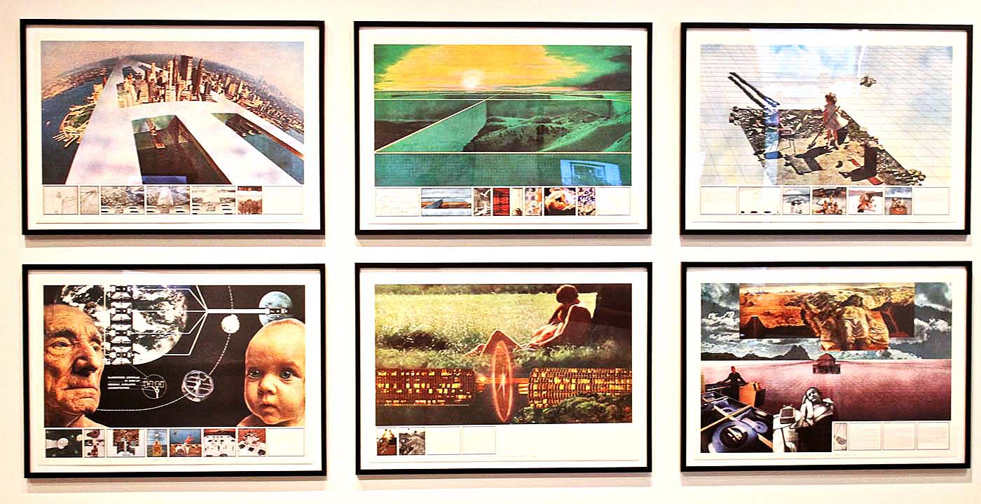
Superstudio, Prints from the Superstudio Series (1969-1973)

Many of the works bear collective credits, the products of communal discussion and creative efforts; many have the earmarks of what today would be considered “social practice art,” but at the time was considered radical politics—leaving the viewer to marvel at the subsequent commoditization of art in the 1970s and 1980s to defang its inherent power as a social catalyst! There are, as one might imagine, a room splashed with dozens of examples of psychedelic poster art—but the collection is not limited to the vivid band promo materials that probably still line the halls of the Fillmore (if they haven’t turned it into a vape bar or something). Rather, there is a kind of radical parallel to the Madison Avenue advertising culture that was taking hold of the market—a conscious and deliberate exploration of type, color, and imagery as a mechanism to promulgate messaging. There are, undeniably, quite a number of chill spaces distributed around the exhibition, and a good thing, too—with so much going on, the opportunities to stop, drop, and contemplate are welcome interruptions. These include a handful of audio/video screening rooms, a Relaxation Cube from Nomadic Furniture 1 (1973) with floor cushions and a soothing slide show, and a full-gallery installation of a work by Hélio Oiticica and Neville D’Almeida, CC5 Hendrixwar/Cosmococa Programa-in-Progress, complete with hammocks.

JG1

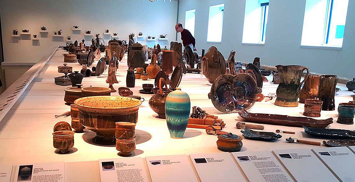
John Glick: A Legacy in Clay, installation view

John Glick: A Legacy in Clay @ Cranbrook Art Museum

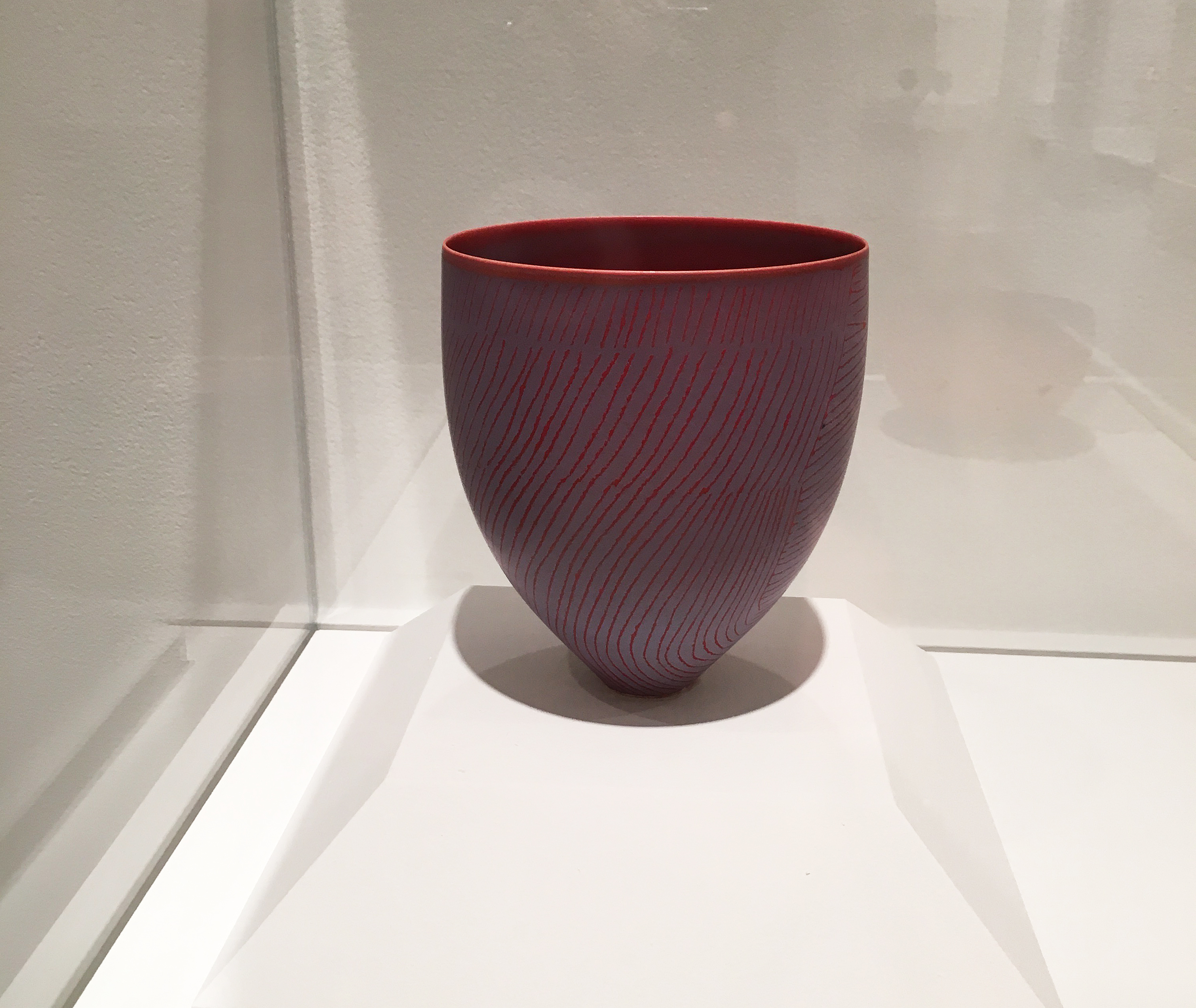
It bears mentioning that Hippie Modernism is not the only spectacular exhibition currently on display at Cranbrook Art Museum, though it certainly warrants a visit all on its own. A career survey of ceramic artist John Glick—John Glick: A Legacy in Clay—is a dazzling walk through the life work of a virtuosic artist who managed to find fresh takes on vessels and forms as old as human society. From the wall of teapots, to the hanging friezes, to the physical timeline of Glick’s singular and beautiful ceramic forms, laid out in an engaging and accessible 360-degree display that mimics the sort of tables where they might otherwise be found, the Glick retrospective offers eye candy at every turn.

Food for thought, vessels for food, and much to take in at Cranbrook Art Museum!

Michigan Fine Arts Competition @ BBAC

Birmingham Bloomfield Art Center Hosts the 35th MFCA

BBAC Install

BBAC / MFAC Installation Image – Courtesy of DAR

The Michigan Fine Arts Competition (MFAC) exhibition opened June 24, 2016, and is one of the best they have had in their long existence, beginning in 1982. Not many know that the competition was previously held by the Detroit Institute of Arts, but with their demise of leadership in contemporary art, they were pleased to find a home at the Birmingham Bloomfield Art Center (BBAC). The key to this year’s success is Terence Hammonds; the juror selected to make this year picks. Originally from Cincinnati, Ohio, he attended the School of the Museum of Fine Arts, Boston for his BFA, and Tufts University for his MA. One of the factors that make this exhibition so exceptional is that it draws on a mid-west region, where more than 500 artists compete from Michigan, Ohio, Indiana, Illinois and Wisconsin.

G.Moore

Gerald Moore, Late September Field, Oil on Canvas

Gerald Moore is an expressive landscape painter who holds an MA in painting from Central Michigan University. He says “I work opposite the Oriental painting philosophy that ‘less is more.’ ‘More’ is the engine of my work; ‘more’ is more.” His large landscape painting seems to draw on the landscape as a subject, but flirts with abstract field painting and gives us a little of both. Color field painting, championed by Clement Greenburg in the 1950’s characterized this expression as solid color creating an unbroken surface and flat picture plane. One might view the Wheat Fields of Van Gogh to see early examples.

Woodcut

Mary Brodbeck, Blanket, Woodblock Print

Maybe it’s because we don’t see a lot of artists working with wood-cut printmaking, that this landscape with rings and melting snow is so attractive. She says in her statement “ Affected by my travel and study in Japan, notably by visiting traditional Japanese gardens, my landscape prints are carefully designed in abstract and stylized ways that are intended for viewers to have a contemplative experience. “ These Zen-like impressions made by the woodblock can transport the viewer to a place that blends design, craft and a spiritual aesthetic. Ms. Brodbeck holds a BFA from Michigan State University, and an MFA from Western Michigan University.

Photo

Mario Inchaustegui, Into the Unknown, Digital Print

Mario Inchaustegui’s digital print “Into the Unknown” draws purely on composition for its power and interest. The geometry along with perspective leads us to four figures on the edge of some type of a concrete pier. This middle school teacher at West Bloomfield Schools has been part of photo exhibitions in Metro Detroit, most recently at the Scarab Club.

Clay Hydrant

Susan O’Connor, Can I Get Some Water, Clay

Susan O’Connor, who teaches hand-built ceramics at the BBAC, grabs the audience with a pop art object, that also carries a current social message. So, she got me with this Fire Hydrant from Flint, Michigan where the water has been contaminated by a decision leading to elements of lead in the water supply.

This exhibition has many generous prizes totaling $5800 and goes a long way to showcase artists in the Midwest. I will mention here that I usually stay away from covering these large competitive exhibitions, largely because they jury the work from jpegs, which makes the process more of a challenge. In this particular case, I give Mr. Hammonds a lot of credit for getting most of his decisions right. I have heard it many times, that it is the only practical way to conduct such a large undertaking, however when only viewing an image of an artwork, mistakes are made.

The 35th Annual Michigan Fine Arts Competition – June 24 – August 26

Birmingham Bloomfield Art Center

John Corbin @ Susanne Hilberry Gallery

 John Corbin’s exhibition: Level and Plumb

“In the last several years the Monarch’s (butterflies) population has decreased for some known (logging in Mexico) and some unknown reasons. It might be that the Monarch has been rendered obsolete. I haven’t found the app that replaced it yet.”  – John Corbin, Some Thoughts about My Work and Becoming Obsolete

John Corbin’s solo exhibition Level and Plumb, which opened at Susanne Hilberry Gallery on June 10, is a deconstructed, re-assembled encyclopedia of romantic obsolescence. The visually discordant pairings of Corbin’s sculptures, composed of found clocks and carpenter’s levels, and his collages of dissected atlas maps, instantly provoke curiosity and invite closer analysis. These parallel bodies of work gradually break down into a bizarre, insightful history of the chronology of both time and space. The objects Corbin uses to explore this history- clocks, carpenter’s levels, printed maps, and globe-trotting migrant birds and butterflies- eulogize the laborious, beautiful process of gaining understanding of the workings of the universe through trial and error, meticulous inch-by-inch progress, and miraculous leaps of logic.

Corbin installation shot

John Corbin, Installation shot – All images courtesy of Angela Pham and Susanne Hilberry

Corbin’s deconstructed map collages, both intimately and massively scaled, are beautiful objects in and of themselves- the honeycomb-like patterns and delicate tonal grades that deconstruct atlas maps into swirling, undulating atmospheric studies traversed by iconic migratory creatures- cranes, monarch butterflies- speak both to the original function of these objects- to cast sublime amounts of space into understandable terms for people- and to their total functional obsolescence now- an abundant natural resource for repurposing into studio practice.

Image 2 Two if by Sea 2012-16 Acrylic Map collage 68in x 88in

John Corbin, Two if by Sea, 2012-16 Acrylic Map collage – 68in x 88in

The same feeling comes through in Corbin’s sculpture- the assemblages of levels and clocks begin to communicate their quaint insistence on the perfect right angle, the perfect orb, hard-wired to the wall, veiled in white. They’re no longer tactile tools, but studies in contemplation of the universal truths that they are indexical to.

 3 Spirit Level III 2016 Levels and Hourglasses 11.5in x 20in x 1 and one quarter inch

John Corbin, 3 Spirit Level III 2016 Levels and Hourglasses 11.5in x 20in x 1 and one quarter inch

One word that comes repeatedly to mind while exploring Corbin’s show is ephemera. The masses of printed information and measuring, calibrating objects that, not so long ago, were as essential to us as our thumbs. As one delves deeper into Level and Plumb, the realization gradually dawns that the source materials that make up all of the works in the show bear an uncannily simultaneous familiarity and distance. Where have these tactile measuring tools- clocks, levels, puzzles, maps- disappeared to? When did they leave us? Why are they simply no longer a part of our lives? Seen in this light, Corbin’s sculptures and collages begin to read like effigies, and in his statement for Level and Plumb he places the blame for the vanishing of these miraculous objects squarely upon Apple Inc. The huge scale of this leap- timepieces, maps, measuring tools, means of communication, means of documentation, all pouring into one handheld electronic device, bears the same sublime quality as a bound atlas that lays the whole world out before your eyes. It captures the frisson that accompanied one’s first realization that a clock that measured the hours in a day was also documenting the movements of the sun and stars. The compression and deconstruction Corbin subjects his source materials to echoes, as well, the bizarre compression of millennia of human development into ever smaller and more disposable projections of our most inspired leaps of understanding. There’s a tragedy whispering alongside the uncanniness of Corbin’s work- is it not a little sad that these tools, once so essential to our navigation of our world, now take up residence in the stillness of gallery space, as functionally ambiguous to culture as any other work of fine art?

Image 4

John Corbin, Installation image

Are the gallery and the museum now the storehouses for the dictation from the stars that once sparked our highest aspirations that we’re not sure what to do with anymore? What is the relationship of those aspirations to the objects we hold in our hands today? Though conspicuously absent visually, the iPhone is a constant, silent presence in Level and Plumb, appearing in ironic relief in your own hands every few seconds to check the time or take a picture, insisting on its appropriation of the delicate structures of time and space that Corbin’s materials used to hold the keys to. Level and Plumb is an important, and timely show, in the way it quietly and beautifully reveals the evolution (or possibly devolution) of human mastery of the discernable world to us. The ephemeral tools we used to rely on to gauge the world around us may seem unwieldy and quaint now, but Corbin’s reworking of them remind us that they were beautiful. They sang of the universe. And, even removed from practical use and deconstructed, they still carry insights that make the most user-friendly smartphone suddenly feel blunter than a flint hand-axe.

Level and Plumb is on display at Susanne Hilberry Gallery June 10 through August 6, 2016.


Ceramics and Watercolor @ Flint Institute of Arts

Flint Institute of Arts Exhibition: Function, Form, Fantasy: Ceramics from the Robert and Deanna Harris Burger Collection

Ceramic work is one of the most ancient arts in the world, but in the United States and many parts of the world, has evolved over the last hundred years from what was once traditional functional craftwork to a high form of creative art that competes with painting and sculpture. This current diversity of ceramics has evolved dramatically as illustrated by the Burger Collection, now on display at Flint Institute of the Arts. Function, Form, Fantasy is currently on exhibit in three jointing galleries. The Function section has ceramic work that is traditional as it relates to its use: bowls, vases, plates, etc., Form moves away from being utilitarian, and experiments with shape, clay properties, and glaze, where as Fantasy uses a new freedom to create a narrative that could be comic, industrial, surreal, futuristic; You name it.

Function

Pippin Drysdale

Pippin Drysdale, b. 1943, Horizon Traces, 2010, Stoneware

Horizon Traces, was created by Pippin Drysdale, a ceramicist from Australia that creates the perfect shaped vessel while revealing fine lines of multiple colors. She says in her statement she is inspired by the desert sands.

Form

Adrian Arleo

Adrian Arleo, b. 1960, Dreaming of Rama Teapot, 2001, Stoneware

The titled Rama, refers to an Indian king of lore, where the American artist Adrian Arleo, creates two human forms contrasting in size and glaze selection. Rama, the blue-tinted man, represents the perfect form of man, full of virtue, justice, and peace. The highly created textures assist in creating dimension and contrast to the forms.

Fantasy

Andy Nasisse

Andy Nasisse, b. 1946, Untitled, 2006, Stoneware

The American, Andy Naisise, creates Untitled, 2006 where he incorporates male and female, good and evil as opposites in this figurative piece of stoneware. In his statement, he says, “I think of figures as “part of a family of images that find their way through my hands and into the outer world.”

This exhibition offers the audience a view of recent ceramic work, beginning in the 1060’s to present day. Dr. Robert Burger and his wife have been collecting works of art since the 1970’s and have donated nearly 250 works of art to the FIA. Mrs. Burger has ties to Flint, having enjoyed ceramic classes at Flint Institute of Arts in her youth. You will find large and small works, simple and complex, by well-known artists that are elegant while thought-provoking works of clay that go a long way to blur the line between craft and fine art.

Moving Toward the Light

New Cycle

Joseph Raffael, American, b. 1933 New Cycle, 2009–10 Watercolor on paper 73 1/2 x 89 x inches Courtesy of Nancy Hoffman Gallery, New York, NY

On exhibition in the Graphics Gallery during these summer months, the artist Joseph Raffael has an exhibition of unusually large watercolor paintings, courtesy of the Nancy Hoffman Gallery, NYC, NY. This collection of eleven large watercolor paintings celebrates flora and fauna where Raffael captures a deep view of floral life, both in and out of focus. Growing up in Brooklyn, Raffael helped his mother with the fruits, vegetables, and flowers in her garden, where he came to regard the changing of seasons as a form of magic. He says “Seeing blossoms come alive is the same as watching a painting come forth out of the white space of a page or a canvas. The garden is another example of how one begins with nothing but seeds and the brown-colored space of the earth from which, little by little, the garden emerges.”

Orchids Dream

Joseph Raffael, American, b. 1933 Orchids Dream, 2013 Watercolor on paper 55 x 78 x inches Courtesy of Nancy Hoffman Gallery, New York, NY

The scale and intensity of these paintings provide the viewer with a combination of the representational subject matter set in a personal world of abstraction. His backgrounds and borders bring compositional strength to the composition and heighten the vision of watercolor. These large-scale works depict flowers, water, and fish swimming in in ornamental ponds. The artists say, “I don’t paint flowers; I paint energy.”

Those traveling north from Detroit this summer will find pleasure in stopping by for both exhibitions at Flint Institute of Arts, just a few blocks off I-475.

The Flint Institute of Arts is located in the Cultural Center Park just two blocks off I-475 between UM-Flint and Mott Community College. Hours are Mon-Wed & Fri, 12p-5p; Thu, 12p-9p; Sat, 10a-5p and Sun, 1p-5p. Admission to the exhibition is free to members and children under 12; Adults $7.00; Senior Citizens and Students $5.00. Saturdays are free thanks to First Merit Bank. For more information call (810) 234-1695 or visit www.flintarts.org.

Nancy Mitchnick: “Uncalibrated” @ MOCAD

Install NM MOCAD 2016

Nancy Mitchnick, Installation at MOCAD, 2016 – Courtesy of MOCAD

Nancy Mitchnick has had a spate of exhibitions this past year. She had a great show at Hamtramck’s Public Pool, showed a few earlier works in a cool three-man exhibit at the iconic Detroit gallery, Alley Culture, and really opened some eyes with new paintings at Wasserman Project. The exhibitions signify a return to and embrace of her hometown after she escaped from the Cass Corridor art community in 1973, and lived and worked as a painting professor and artist for years in New York (Bard College), California (CalArts), and Massachusetts (Harvard). She was also honored as a Kresge Fellow in 2015, and most recently was selected by the prestigious American Academy of Arts and Letters as a recipient of the organization’s 2016 art awards. Quite a homecoming!

The most recent iteration of her work is in the big room of the Museum of Contemporary Art Detroit (MOCAD). The huge gallery of MOCAD seems like it was made for Mitchnick and she comfortably fills the space with what at first seems a most curious selection of paintings—ranging from two portraits of a friend and three portraits from her “Wonder Women” series, to a work in progress recovered from what she herself calls a “bad” painting (about which she recently lectured at MOCAD), a couple of expressionistic still lifes, two landscapes and nine houses from her old neighborhood, and two new “narrative paintings.” In a sense the show constitutes a mini-retrospective of the range of Mitchnick’s work over the past thirty years—portraiture, still life, landscape—and two new, auspicious paintings that signify a leap into her future. But much more poignantly, “Uncalibrated” (the title of the exhibition) seems to explore Mitchnick’s quest over the years to mine the vast rhizoid root system of painting, to find out what being an artist is and what it can do, and what it will come to be. (In mock despair she exclaimed, “Sometime my studio looks like a group show.”) “Uncalibrated” is fundamentally a self-portrait, or perhaps a memoir, of Mitchnick as painter.

Virginia Woolf 48 X 48

Nancy Mitchnick, Oil Painting 48 x 48, “Virginia Woolf”, 1990-91        All following Images Courtesy of Glen Mannisto


At the entrance of MOCAD are three early portraits, from the Wonder Women series, of Virginia Woolf, George Eliot, and Frida Kahlo. Painted in grisaille-like, gray shades that produce a classical sculptural effect, the heads of these three great, prototypical, feminist artists have a heroic scale and echo both Renaissance sculpture and certainly Enlightenment ideals. That they are outside of the main gallery, at the entrance, provides a hint of what part these heroic women might play in Mitchnick’s life as a painter. All three were experimental, independent, rational and investigative, secular beings and certainly, like Mitchnick, lived large lives. They also suggest a classical meta-literacy—to challenge the status quo, to invent, hybridize, psychoanalyze, to utilize—that is certainly part of Mitchnick’s own strategy as an artist. In her conversation with Jens Hoffmann,
 MOCAD’S Susanne Feld Hilberry Senior Curator at Large, she admits to being a voracious reader, which somehow parallels and infiltrates her work as an artist.

rough eye

Nancy Mitchnick, Eye Detail, Oil Painting, 1992 -” Davy Butler First Hit”

eye 1 with red in corner

Nancy Mitchnick, Detail of Eye Painting, 36 x 36 “Davy Butler  Finished” – 1992


Her two portraits of a friend and patron, “Davy Butler: First Hit,” and “Davy Butler: Finished,” are elegant illustrations of Mitchnick’s carpentry skills in building these paintings, readily apparent throughout all of her work since. (“My father was a cabinet maker, but sometimes had to frame houses to make money.”) In “First Hit,” eyebrows and eyes are a dozen or so quick brush strokes—they are elegant and deft, making a sketchy, speculative architecture. “First Hit” is more mysteriously suggestive than descriptive, framing the first marks of the physiognomy of identity. Then in “Davy Butler: Finished,” the painting confidently assembles itself around the subject’s eyes. The head is smaller, more contained, and from each part of the facial landscape—the nose, the lips and mouth, and the eyebrows are precise—a commanding, almost Roman presence emerges. While making portraits to earn money, Mitchnick disavows a preoccupation with likeness, with making a painting that looks like the subject: “”Making likeness is not good painting, I’m making great paintings.” Her process, she says, is “all trial and error,” sometimes “losing whole beautiful passages to erasure, to get it right, to make a good painting.” In an offhanded aside she adds, “you writers just keep a record in your computers of every version of what you do. I lost a beautiful turtle here,” she muses pointing to a spot on the recent painting “Night Heron.” However not surprisingly, “Davy Butler: Finished” (the portrait of the friend who attended her recent MOCAD conversation with Hoffman), is not only an extraordinarily articulate painting, but an ennobling likeness as well.

IMG_2277

Nancy Mitchnick, Two Portraits, “Davy Butler First Hit” , “Davy Butler Finished “, 1992, both 36 x 36


The heroic scale that she is given to (“I didn’t realize at first that I was a heroic scale painter”), necessitates a physicality and energy apparent in most of these recent works (as well as in her person). Fortunately disregarding all of the foreboding claptrap about “Ruin Porn,” Mitchnick took scores of photos of her old neighborhood near and around Hamtramck and began working from them during her first return to Detroit after losing her Harvard position to a “Conceptual artist.” (“I wanted to do something with Detroit.”)

First House

Nancy Mitchnick, “First House”, 34 x 45 Oil Painting, 2006

The centerpieces then of “Uncalibrated” are the nine flat, elevation portraits of Detroit houses in various states of devolution. Depicting mostly the homes of working class people and perhaps middle-class families who ran small businesses or auto industry management, these are not memorials nor documentation of the state of derelict Detroit, but exquisite paintings that celebrate a presence of people who built and inhabited this place. Even the smallest painting, “First House,” exudes a very particular ethos and an aesthetic filled with a humanizing spirit.

Torn Orange 59 X 99

Nancy Mitchnick, “Torn Orange”, Oil Painting, 59 x 99, 2009

In reminiscing about her Cass Corridor days, Mitchnick talked about wanting to be an abstract painter but was never able to escape narratives but perhaps, ironically, that has finally (almost) been achieved in two of the most monumental paintings in the exhibit. “Torn Orange” is the painting of a surgically exposed side of a store. Composed of modulated tones of orange colliding with a diagonal green and yellow slash, it features the typical markings of a classic abstract expressionist work, but Mitchnick keeps the context of the building by depicting the surrounding light and air of the city. “Big Burn” is a triumphant exploration of the remains of a home that, in its abandoned state, is slowly rotting and returning to the earth. Exposed rafters, plaster lath and crumbling foundation are astonishingly caressed into a derelict geometry that made Mitchnick blurt, “I felt like I was composing a symphony!” It is triumphant painting that in itself is a marvelous history lesson.

FullSizeRender

Nancy Mitchnick,” Big Burn”, Oil Painting, 129 x 59, 2006-20016

Each of the house paintings has a complexly charged presence. “Buffalo Street” is of the house in which Mitchnick grew up, and while it was in its last stages of devolution, Mitchnick’s painting still captures what seems a classical bearing, with its gabled roof and three-windowed dormer still erect and proud, and still evincing the colors that it once wore. It is difficult to imagine Mitchnick’s mindset when revisiting and painting this moment of her life and prompts the question of whether this is an elegy for the Buffalo Street house or an objective portrait.


Buffalo Street 99 X 88

Nancy Mitchnick, “Buffalo Street”, Oil Painting, 99 x 88, 2008-09

One of the most interesting aspects of Mitchnick’s work is the lesson that she teaches with each composition, which is that it takes a long look to realize a painting. Her latest pieces, “Night Heron” and “White Front,” seem almost recklessly whimsical compared to the disciplined, graphic painting of the abandoned houses. Populated with strange bits of ocean coral, odd mythic creatures (snakes, birds, turtles), and a Persian Princess, they are a gargantuan leap into another mind space. However, after one spends time with them, they gain traction, and their amazing palette of colors (throughout “Uncalibrated” her palette is symphonic) begins to tantalize, and an almost fairytale narrative gathers. It might be the story of a new Hamtramck or not, but it certainly signifies another trajectory for Nancy Mitchnick’s painting to mine.

Night Heron 77 X 111

Nancy Mitchnick,”Night Heron”, Oil Painting 77 x 111 – 2016


“Uncalibrated” will be at MOCAD until Sunday, July 31, 2016.


Page 43 of 49

Powered by WordPress & Theme by Anders Norén