Critical art reviews of Detroit galleries and museums weekly

Category: Sculpture Page 14 of 28

Katherine Gray: (Being) in a Hotshop @ Toledo Museum of Art

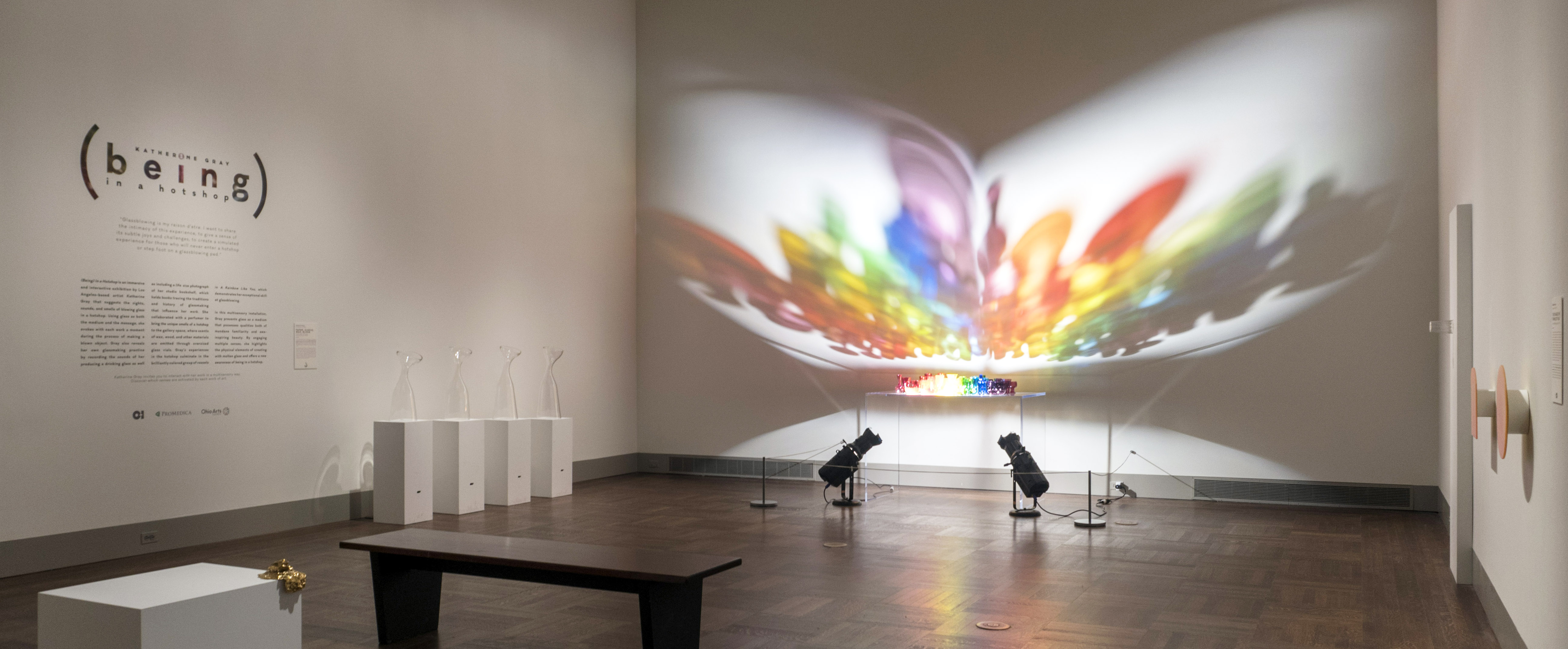
Katherine Gray, Installation image, Toledo Museum of Art, 2019, all images courtesy of TMA

There’s more than meets the eye in the exhibition Katherine Gray: (Being) in a Hot Shop, hosted by the Toledo Museum of Art.  This intimate exhibition of glass art and glass-inspired art by Canadian-born artist Katherine Gray is a conceptual and immersive show that aspires to give visitors a sense of what it’s like to be in a glass studio, and it does this through touch, sight, sound, and smell.  It’s a multimedia show, but most of the works are glass, and for this exhibition the medium is the message.

Glassblowing is a multisensory experience for both artists and spectators alike, so this exhibition incorporates nearly all the senses.  Upon entering the space, viewers are welcome to touch the various glassblowing tools used by Joseph Rosenberger, a longtime veteran of Toledo’s iconic Libby Glass Company back in the 19thcentury when it was in its first iteration as New England Glass.

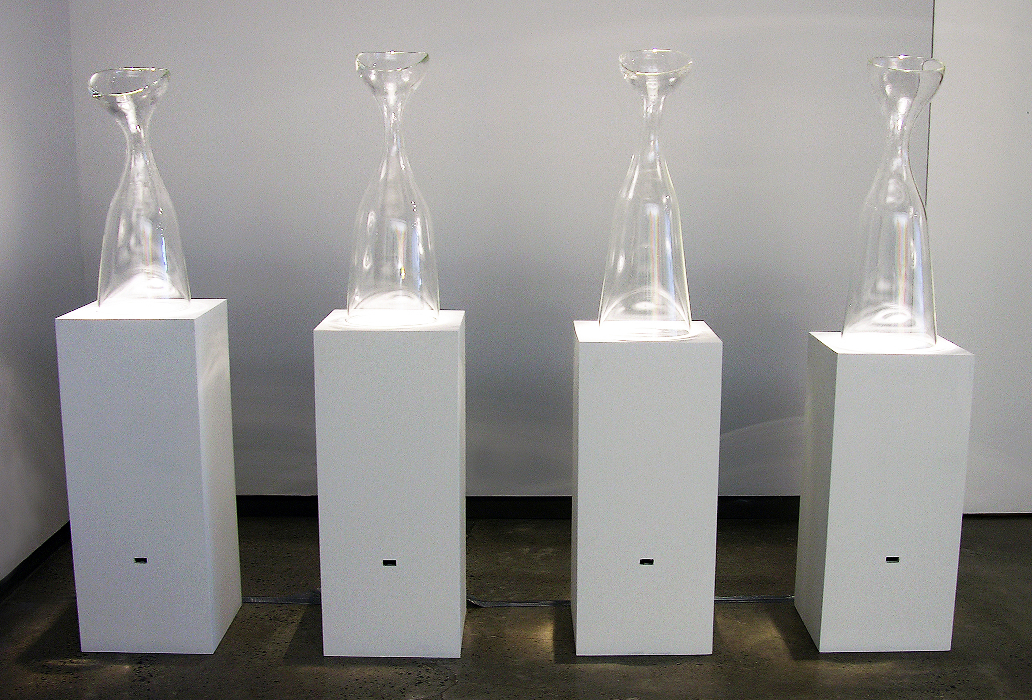
Nancy Callan, Paper, Sleeve, Wax, Block. Blown glass, diffusers, motion sensors, 2015. Courtesy of the Heller Gallery.

Nearby, a sculptural ensemble of four monumental glass vessels playfully subvert the nature of the bottle as a vessel of containment, and they disperse the distinct hotshop smells of steaming wood, beeswax, wet newspaper, and Kevlar, each material of which plays a small but essential role in the glassblowing process—for example, Kevlar gloves are used to transfer the completed work from the blowpipe to a special oven, which safely allows the glass to gradually cool to room temperature over the course of many days (or, depending on the size of the form, sometimes weeks and even months).  For this work, Gray collaborated with master-perfumer Kendra Hart.

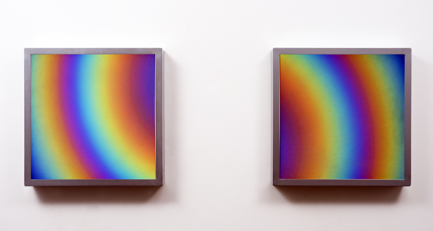
Katherine Gray (Canadian, born 1965), Irridescent Aura Diptych. Iridized blown glass, 2017. Courtesy of the Heller Gallery.

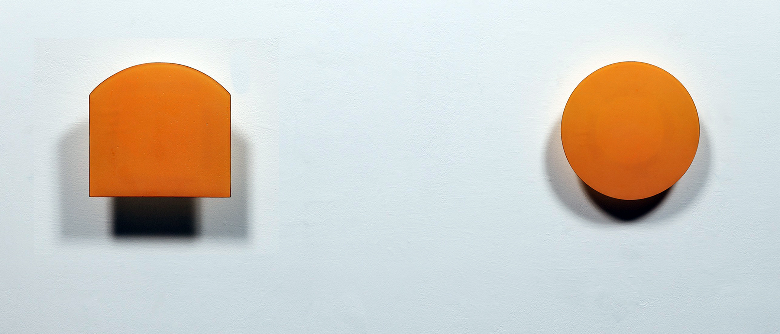
Central to the glassblowing process of course is the furnace, which Gray represents in several minimalist sculptures mounted on the wall. Her Iridescent Aura Diptych comprises two squares of iridized blown glass in which viewers see a radiating sunburst of color.  The colors subtly change and pulsate as we move around the diptych, and in this work Gray abstractly visualizes the tactile sensation of working so close to blinding heat.  Similarly, the two works which comprise the ensemble This Makes Me Think of That also subtly change color when we approach.  Here, Gray takes the furnace and the glory hole (from which glassblowers collect molten glass onto their blowpipes) and reduces them into the elemental shapes of the circle and the square.

Katherine Gray, This Makes Me Think of That. Iridized blown glass, steel, 2015. Courtesy of the Heller Gallery.

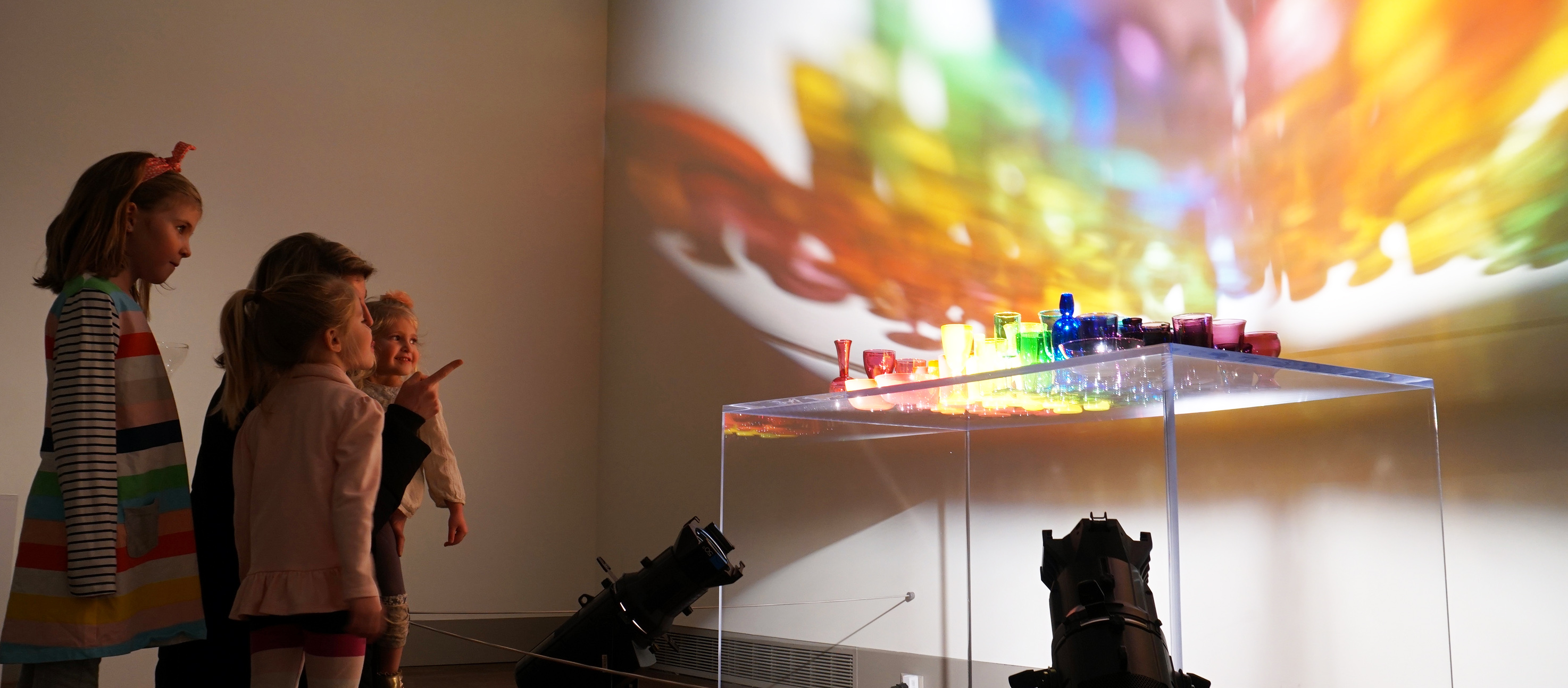
This exhibition’s pièce de résistance is Gray’s glass and light installation A Rainbow Like You.  Here, Gray illuminates a glass table from below, upon which rest a veritable rainbow of glass goblets, cups, and saucers.  Their luminous reflections are cast onto the wall, where the colors merge and mingle in surprising ways, creating a brilliant and immensely satisfying symphony of color.  The glass vessels themselves are created in various historical styles, so the work is a kind of introduction to the history of glassmaking.  The magic of the installation is in Gray’s ability to take common, domestic glass forms and with them create a work of arresting beauty which even evokes the shafts of light and color we might expect to see in grand spaces like Chartres Cathedral.

Kathrine Grey, Installation image, 2019, image courtesy of TMA

After viewing this exhibit, viewers should complete the experience by wandering over to the TMA’s Glass Pavilion to actually watch glassblowers at work.  (Being) in a Hotshop can ultimately only go so far to convey the sights and smells of the real thing, after all. But Gray’s intention was certainly not to replicate hotshop in the first place, and we should be glad—the  glass furnaces blaze at about 2,000 degrees Fahrenheit, after all.  In this exhibition, Gray celebrates glassmaking itself with palpable affection, and it’s abundantly clear that for her the glassmaking process is a labor of love.

Katherine Gray: (Being) in a Hotshop is on view at the Toledo Art Museum through May 12


UNFURLED @ Museum of Contemporary Art Detroit  

MOCAD presents Unfurled: Supports/Surfaces 1966-1976

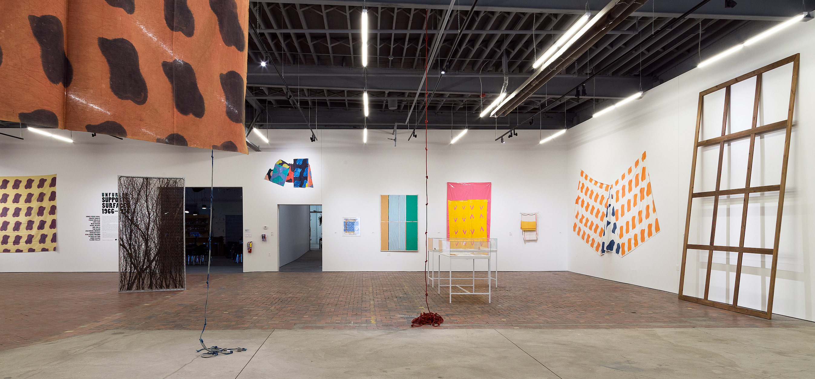
To enter “Unfurled: Supports/Surfaces 1966-1976” is to discover a wellspring brimming with treasures and pleasures for all seasons. Filling the four walls of a cavernous, big box space, objects large and small, modest and theatrical, plain and comely, are prosaically lined up in tight formation around the perimeter of the space. In the center, jaunty banners, dyed fishing nets (one multicolored, another shaped like a portal), scrims of patterned fabric, and lengths of rope (one red, one blue) hang and dangle from the rafters.

“Unfurled: Supports/Surfaces, 1966-1976,” Installation view, Museum of Contemporary Art Detroit, 2019 (All images courtesy of MOCAD and Ceysson & Benetiere; photography by Tim Johnson)

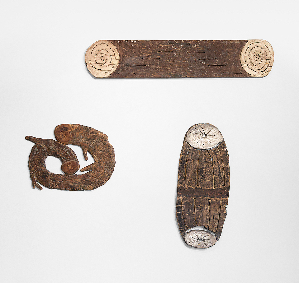
Nothing feels heavy or portentous; rather, an osmotic “lightness of being” builds as the eye and spirit bounce and rocket from object to object: a tall, naked stretcher listing against one wall, irregularly shaped fabrics and bedsheets rudely tacked to walls with nails or pushpins, constricting frames and stretched canvases nowhere in sight, a wooden pole tilted into a corner, dyed dishrags suspended from a drying rack, a crisscross arrangement of stubby logs skittering across the floor, and so on…

In a word, the art on view, in one way or another sheds de rigueur formalities of content and presentation. Fusty aesthetic tropes are deconstructed and dematerialized as bespoke ideals rip and split with invigorating impact. Such radical upheavals both in art and society at large in the mid-to-late 60s occurred not only among the loose federation of French artists who dubbed their experiments “Supports/Surfaces” but also among Arte Povera practitioners in Italy, the Mono-ha cohort in Japan, and the anti-form post-minimalists in the United States.

Of all the loose congeries of rebellious unfurlers the French cadre is perhaps the least well known, although the Mono-ha rebels also fly pretty much under the radar. Hence, the value and high voltage appeal of the “Supports/Surfaces” exhibition organized by MOCAD and curated by Wallace Whitney. Refreshingly, this survey brings to the fore fourteen countercultural artists of the far-flung 60s youthquake whose fertile experiments continue to inform the dynamics of contemporary art practice.

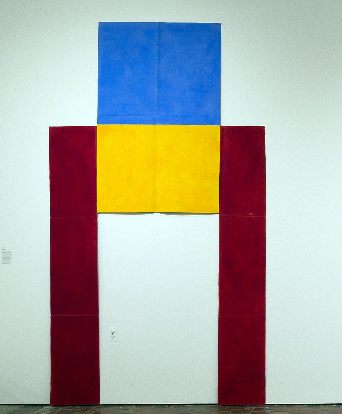
Louis Cane, “Cut-out Canvas,” 133 x 74 ½ in., Oil on canvas, 1974

One of the prime examples exhibited in this 2019 iteration of “Supports/Surfaces” is Louis Cane’s Cut-out Canvas of 1972. Here the color blocks of primary hues resemble an upright apparatus. The blue “legs” not only flank blocks of yellow and red, but also suggest overtones of anthropomorphic hoisting and supporting. Close up, one notes that the creases visible in the canvas reveal where the unstretched yardage is folded, unfolded, and subsequently refolded into a compact parcel for storage, transport, and reinstallation. In effect, a formal Mondrian has been nimbly informalized.

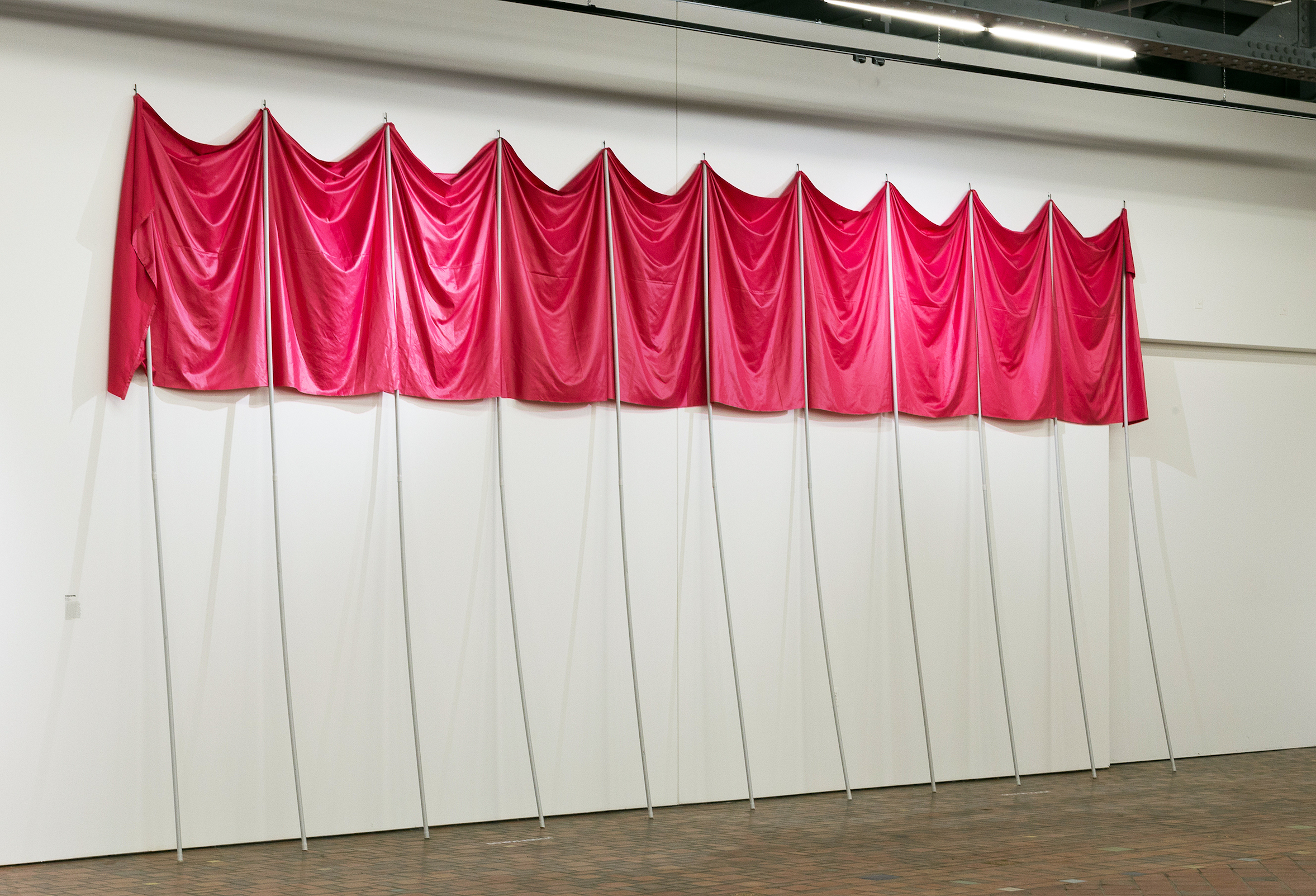
Patrick Saytour, “Deployed,” 157 ½ x 315 in., Fabric and PVC pipes, 1972

Patrick Saytour’s festive Deployed (1970), in contrast, exudes barely suppressed mobility and incipient celebration. It all but dares observers (a family, gaggle of friends, school tour group) to liberate the PVC poles, merrily dipping and swaying the brazen pink swags as they process through the museum. When not in motion Deployed, like a number of other works on displayis simply propped against the wall, and accommodatingly expands or shrinks in width depending on space available.

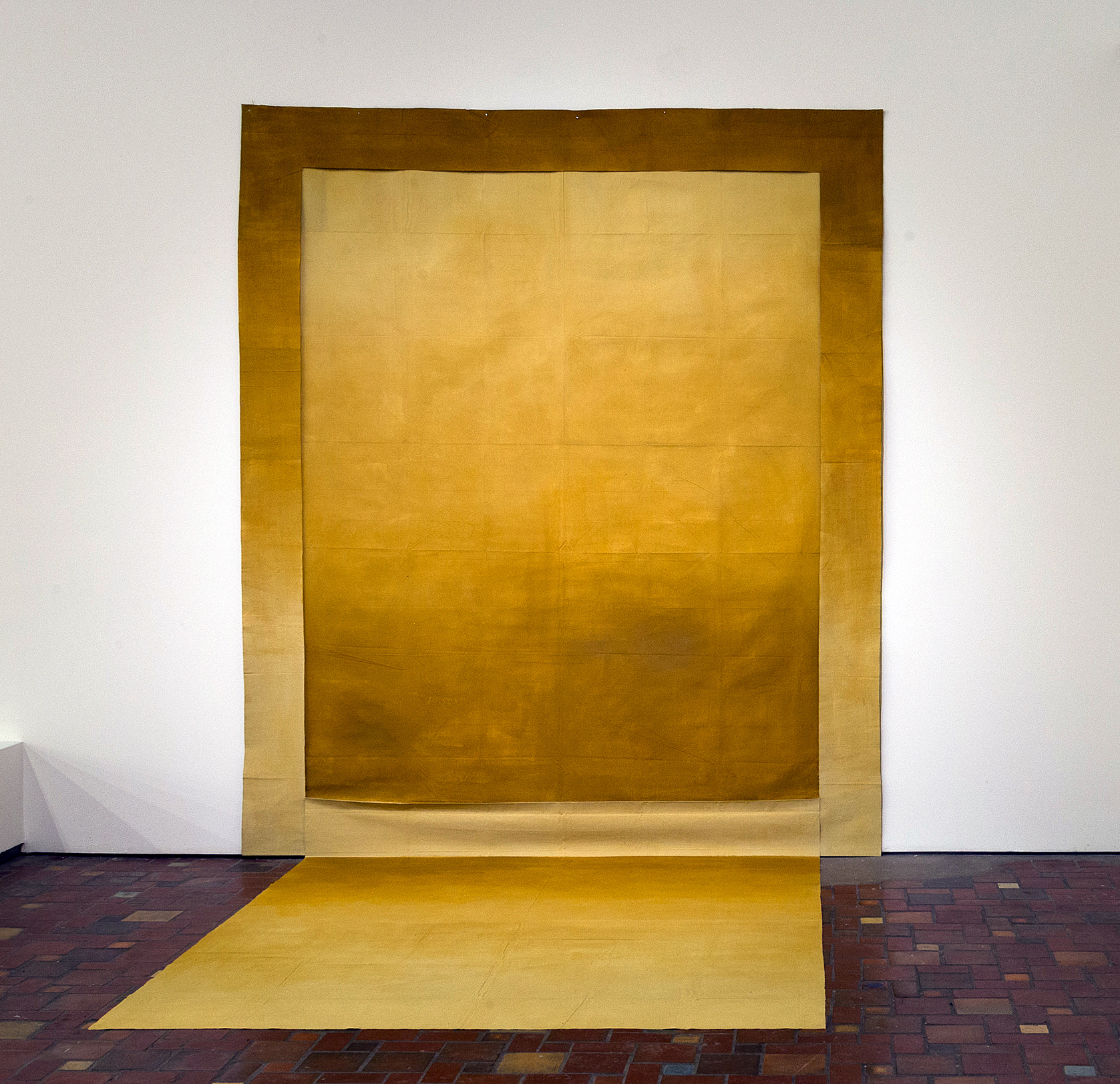
Louis Cane, “Wall/Floor,” 112 x 94 ½ x 84 ½ in., Oil on cut fabric, 1974

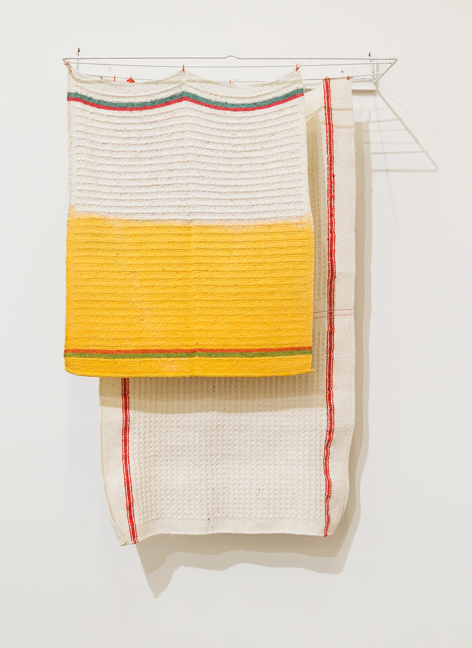
More delights, veering from transcendent to quotidian, await the spectator.  At a far remove from the entrance to the exhibition, a plush yellow installation by Cane beckons from an awkward corner.  As its title, Wall/Floor (1974) intimates, it radiates warmth from wall to floor, projecting its sun-splashed chroma across the viewer’s territory. The wall element, simply cut and left unhemmed, is almost invisibly framed by a matching length of dyed fabric, a sly play on a traditional frame. For the ultimate quotidian encounter, one discovers, in the corner opposite Cane’s luminous install, Noel Dolla’s cheeky Dyed Dishrags and Metal Drying Rack (1968). Distinction is conferred upon the humble ensemble by the realization that the process of drying kitchen rags on metal bars is not unlike hanging art on a wall.

Noel Dolla, “Dyed Dishrags and Metal Drying Rack,” 34 ½ x 25 x 11 ½ in., Dyed dishrags and metal structure, 1968

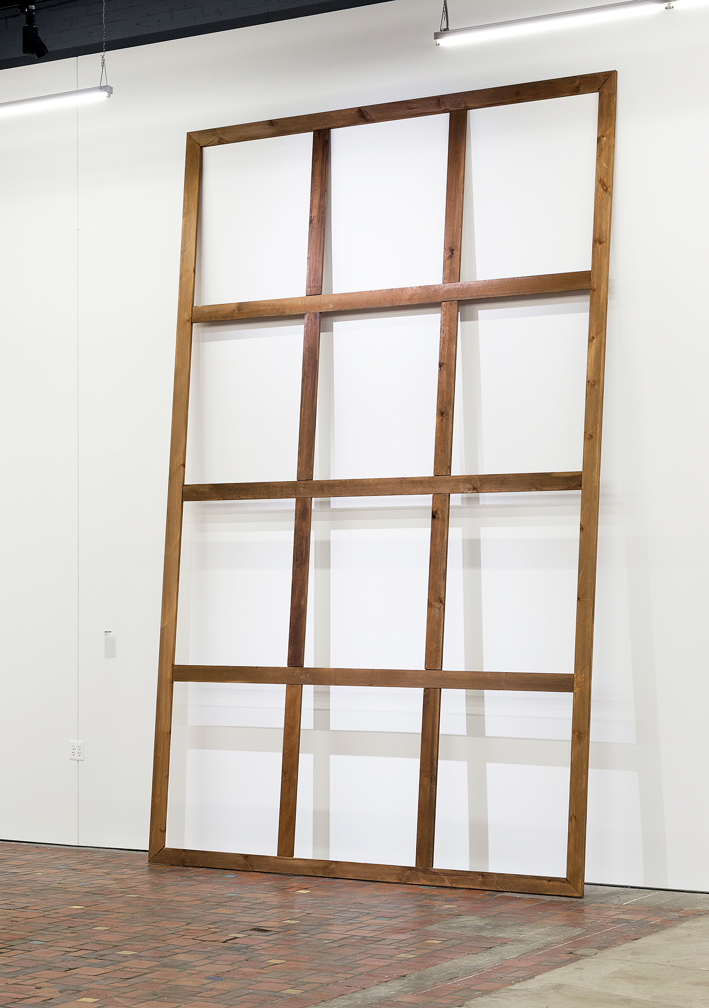
The iconic Grand Stretcher (1967) by Daniel Dezeuze, towering high above many other pieces in MOCAD’s central gallery, signals the structure/support dichotomy at the heart of the movement with terse, succinct economy. Stripped of its canvas, the bare, leaning stretcher, bereft of a painterly surface, nonetheless looms lofty and unbowed. Its stark grid, absolutely foundational to the age-old enterprise of painting, is both passe and grandiose.

Daniel Dezeuze, “Grand Stretcher,” 172 x 106 in., Wood stain on stretcher, 1967

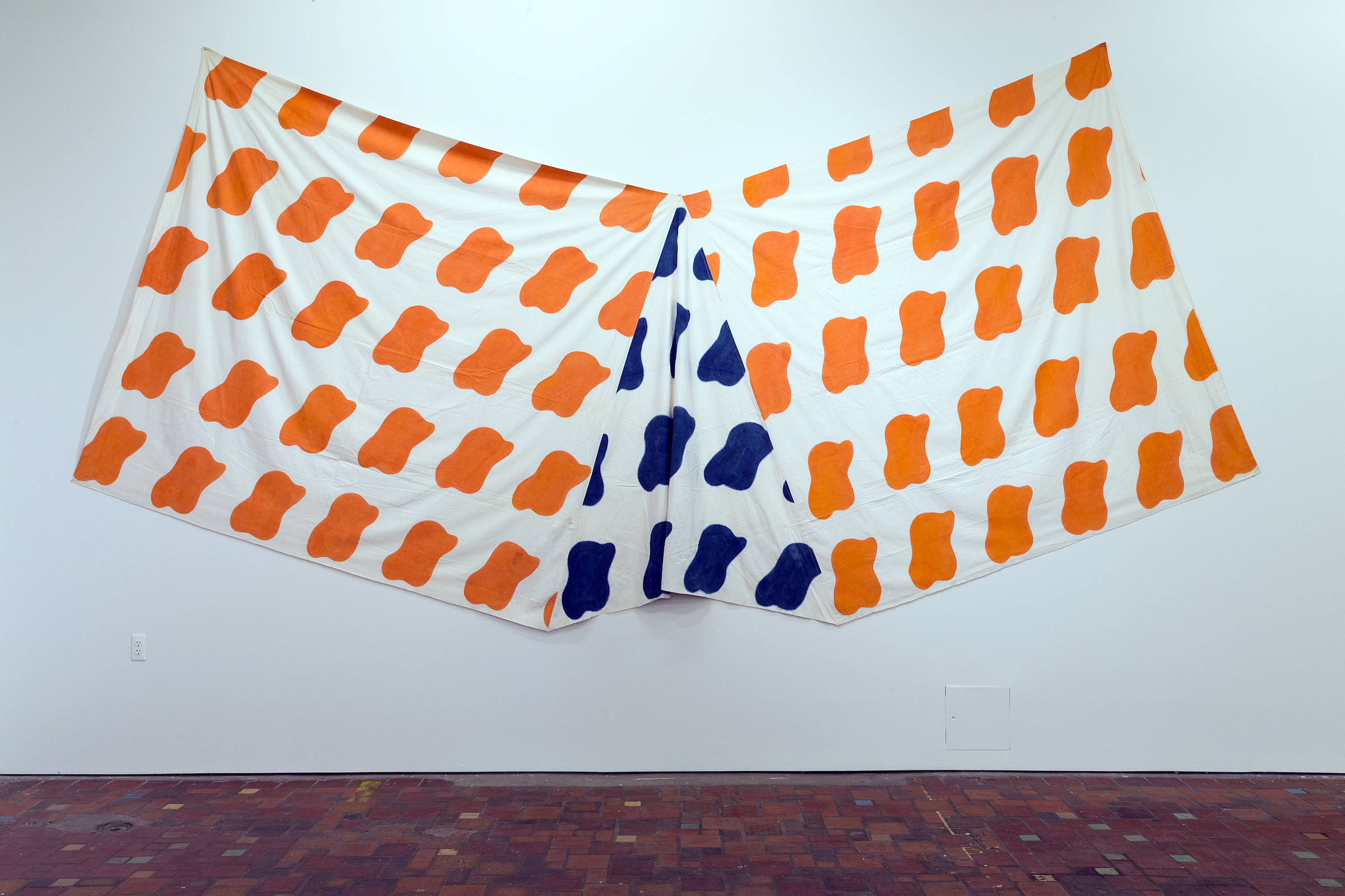
Claude Viallat, “1970/056,” 85 ½ x 234 in., Methylene blue and acrylic on fabrics, 1970

Hanging nearby is Claude Viallat’s airborne 1970/056 from 1970. Bold in shape and broad in contour, its 19 ½ ft. width resembles the unfurled wingspan of a super-entity that is perhaps talismanic: Imagination Incarnate. Unstretched and unframed, its gusset of ruffly fabric at midpoint wittily violates the sacrosanct flatness of two dimensional art.  Shorn of the familiar trappings of pre-1970 aesthetic practice, Viallat’s 1970/056 epitomizes the unbridled freedom and irresistible laissez-faire of the art and artists in this spirited, revelatory exhibition.

“Unfurled: Supports/Surfaces 1966-1976” remains on view at MOCAD through April 21, 2019

From Camelot to Kent State: Pop Art, 1960-1975 @ Detroit Institute of Arts

From Camelot to Kent State: Pop Art, 1960-1975, Detroit Institute of Art, Installation Image, Courtesy of DAR

Pop Art emerged in the mid to late 1950s and at its most potent was a high art version of what was being done in the low art pages of MAD magazine, being sold on newsstands at the same time. Its works were a challenge to and a satirical critique of cultural hierarchies, using the popular visual vocabulary of advertising, cinema, comic books and the superabundance of mass-produced banality. It was a reflexive attitude employing bland surfaces to disrupt culture with ironic precision. It was a movement that embraced emergent means of mechanical reproduction to comment on the Capitalist dream machine powered by the post-World War II assembly line.

But as the exhibition “From Camelot to Kent State: Pop Art, 1960-1975” at the Detroit Institute of Arts explores, a larger political project emerged from those artists associated with Pop Art to dismantle the machinery of Modernity as war and social injustice chipped away at the later half of the 20th century.

Works by a remarkable roster of artists including Jim Dine, Audrey Flack, Robert Indiana, Jasper Johns, Roy Lichtenstein, Marisol, Larry Rivers, Robert Rauschenberg, James Rosenquist, Ed Ruscha, May Stevens and Wayne Thiebaud fill out the exhibition, but there are a core group of works by Corita Kent, Claes Oldenburg, Eduardo Paolozzi, Richard Hamilton and Andy Warhol that serve as conceptual highlights to the Postmodern thrust of the Pop Art agenda.

Corita Kent, “Enriched Bread” (1965), screen print printed in color on wove paper, 29 ¾ x 36 3/8 inches, All images and artwork courtesy of  the Detroit Institute of Arts 

The Heart

 Enriched Bread (1965) by Corita Kent (1918-1986) is a screen print composed with three horizontal bands of the trinity of primary colors (plus white) so often employed in the rigorous Modernist projects of the Bauhaus and De Stijl. But as it happens, these are also the colors that designer Drew Miller chose in 1921 to adorn the packaging for that all-American lunch staple Wonder Bread. As the story goes, when the vice president of the Taggart Baking Company found himself in a state of “wonder” at the sight of hundreds of red, yellow and blue balloons being released at the International Balloon Race at the Indianapolis Motor Speedway, an idea for sliced bread packaging was born.

“WONDER” appears in large bold red letters below “ENRICHED BREAD” in blue. Further below, in white script on a strip of blue, is the following:

“Great ideas, it has been said, come into the world as gently as doves. Perhaps then, if we listen attentively, we shall hear, amid the uproar of empires and nations, a faint flutter of wings, the gentle stirring of life and hope. Some will say this hope lies in a nation; others in a man. I believe rather that it is awakened, received, nourished by millions of solitary individuals whose deeds and works everyday negate frontiers and the crudest implications of history. As a result, there shines forth fleetingly the ever threatened truth that each and every man, on the foundation of his own sufferings and joys, builds for all.”

This text was the closing to Albert Camus’ lecture Create Dangerously, delivered December 14, 1957 at the University of Uppsala in Sweden, four days after accepting the Nobel Prize in Literature. Camus, the most optimistic of Existentialist thinkers, was pointing the way toward a more constructive future a mere three years prior to his death at the age of 46 in an automobile accident.

Below this, on a strip of red, is “helps build strong bodies 12 ways” and “STANDARD LARGE LOAF” and “no preservatives added”.

At the bottom of the composition is an empty band of pure yellow.

The text in Enriched Bread is not professionally set: letters appear hand-cut, handwritten and hand-painted. Nor are the stacked bands of primary colors presented with Modernism’s clean straight edges. The handmade character of the printed image, bold when viewed at a distance, envelops the viewer in an intimate and heartfelt space upon closer reading.

Wonder Bread had the distinction of being part of a government-sponsored initiative during World War II rationing. Known as the “Quiet Miracle,” loaves were enriched with vitamins that had long gone missing due to the industrialization of bread production. There is a little miracle achieved with this print, which feels like a beating heart in the middle of the exhibition. Corita Kent was an American Roman Catholic religious sister who returned to secular life in 1968. She referenced Wonder Bread packaging in a number of works as a means to add enrichment to the image itself, reclaiming the mass marketed industrialized products of Modernity as a vehicle for intimate and meaningful conversation. What she accomplished with the transformation of her source material through critical recontextualizing, is a transformation of essence that calls to mind the Transubstantiation of the Eucharistic elements. This is not a cynical undermining of production line goods, but a kind of hopeful artistic alchemy that reasserts the humane by way of wonder.

Claes Oldenburg, “Alphabet in the Form of a Good Humor Bar” (1970), offset photo-lithograph printed in color ink, 29 x 20 inches.

The Store

There are three iterations of a Good Humor brand ice cream bar on display in the exhibition, by Claes Oldenburg: Alphabet in the Form of a Good Humor Bar (1970) is an offset photo-lithograph from a colored pencil drawing, Alphabet/Good Humor—Cloth Study (1972-1973), a small standing cloth and wood sculpture, and Alphabet/Good Humor (1975), a cast resin and polyurethane enamel sculpture  on a bronze base. All three pieces present the ubiquitous ice cream bar, a bite taken out of its upper left corner, as a neat slab of puffy and stubby letters, the alphabet from A to Z, pressed together. On both the lithograph and the enameled sculpture, there is a single drip at the base. In the print, the bite manifests as a letter “A” oozing a thick white cream that cascades over the letter “G.” It should be noted that the letter “O” is situated in the middle of the bar, and appears as a donut with a pinched center made all the more suggestive by the Caucasian flesh coloring chosen by Oldenburg. This implied eroticism mingling with the absurd is present throughout much of Oldenburg’s work as he takes the desire for commodified objects to a new level, locating their latent seductiveness. This began with his artist studio/storefront The Store, which he opened in the Lower East Side of Manhattan in 1961, and stocked with painted plaster replicas of candy bars, pastries and undergarments among other things. The sloppy application of enamel on each object satirized the heavy-handed masculine impulses of action painting as a  mere advertisement of heavy breathing in the American consumerist landscape.

The Good Humor Bar was for Oldenberg, another in a collection of objects that symbolized commodity fetishism. There is a concern for economics running throughout his work. He has made use of the Good Humor Bar in many other works, dating as far back to 1963 with Soft Fur Good Humors, adorned with fake tiger and leopard skin. Then there is the 1965 Proposed Colossal Monument for Park Avenue, New York: Good Humor Bar, in which the enormous, slumped ice cream on a stick blocks traffic in the wealthiest of boulevards. In the 1971 print System of Iconography—Plug, Mouse, Good Humor, Lipstick, Switches, the ice cream bar sits alongside other iterations of the reimagined cultural commodity including his Geometric Mouse, a Constructivist variant on Mickey.

Claes Oldenburg, “Alphabet/Good Humor” (1975), cast resin plated with polyurethane enamel; bronze and wood,, 36 x 19 1/8 x 10  inches.

Alphabet/Good Humor is a uniquely absurd American object. It is both erotic and un-erotic, as its softness and fleshiness remains only a hardened illusion. There is the suggestion of this matrix for the English language eating itself or being eaten as letters pile up, crowding one another out in a suffocating orgy. It sells itself as something other than what it is. It is frozen in a state of forever melting away.

The Machine

Scottish artist Eduardo Paolozzi (1924-2005) was co-founder of the British proto-Pop project The Independent Group (1952-55), along with artist Richard Hamilton. He considered himself an “engineering artist,” approaching the act of image-making as industrial production. As early as 1954, the thematic thrust of Paolozzi’s prints involved the merging of machine and body, charting an assembly line wired with the human nervous system. In 1962 Paolozzi embraced the hitherto commercial process of screen printing to produce increasingly complex print imagery reflecting his concerns for humanity in the age of mechanical reproduction.

Included in the exhibition is Paolozzi’s ambitious portfolio of 12 screen prints from 1964, As Is When, which when first exhibited in 1965 was lauded by critics as “the first masterpiece in the medium.” Despite this acclaim, there were curators and print specialists who thought Paolozzi’s new print work was insufficiently handmade, as he had made use of appropriated imagery that was photographically reproduced. Unlike photography, which has long embraced a necessary technical progression, printmaking and printmakers have wrestled with issues of purity (hand-printing vs. machine printing), even though its very foundation was built upon notions of mass production and dissemination. Although Paolozzi’s embrace of commercial reproduction techniques placed him at odds with the fine art print establishment, As Is When did much to dismantle the hierarchy between “fine” and “applied” arts.

But the process by which As Is When was manufactured is necessarily a reflection of Paolozzi’s greater project. Repetition, seriality, mass production—terms that can describe printing but could also describe the media atmosphere from which the artist deconstructed and reconstructed imagery. In these prints we are presented with a dizzying mosaic of shifting information in the form of abstract patterns and the occasional incursion of representational elements. Each image contains fragments of text that develop a complex relationship between language and image. They are impossibly dense, but insistently engaging.

Drawn from the life and writings of Ludwig Wittgenstein (1889-1951), As Is When is an attempt by Paolozzi to represent the Austrian philosopher’s fragmentary construction of the experience of reality as a schism between language and the visible world. The complexity of Wittgenstein’s system of thinking, referenced from his text Tractatus Logico-Philosophicus (1921), posits the facts of Modernity as being what that are at any given moment. Stable meaning is illusory, merely a fragile geometry. As soon as Paolozzi’s images construct themselves, they break down. They are both stable and unstable

Eduardo Paolozzi, From the “As Is When” portfolio: “Experience” (1965), screen print printed in color ink on wove paper , 38 x 26 inches.

Eduardo Paolozzi, From the “As Is When” portfolio: “Reality” (1965), screen print printed in color ink on wove paper , 38 x 26 inches.

Appropriated from printed advertisements, technical manuals and newspapers, each of the twelve 38 x 26 inch prints presents a series of complex and abstract mappings in which the boldly colored and contrasted patterns keep the viewer in a state of perpetual collating, reorganizing that which appears to be already organized. As with Wittgenstein, Paolozzi begins with a logical structure only to lead his viewer to ever more perplexing states of irresolution. We are left with pure experience as Paolozzi reshuffles his text and image deck, disrupting the progression of narrative by jumbling meaning and creating new juxtapositions. This interest in appropriating material and then remixing and reengineering it is akin to the “cut-up technique” a collage approach to literary construction whereby a written text is cut up at random and rearranged to create a new text.

The new media landscape that Paolozzi was responding to, in which meaning was increasingly susceptible to dissolution, was chipping away at society’s ability to feel. Paolozzi’s close friend, the British novelist J.G. Ballard (1930-2009), described this in the preface to the 1974 French edition of his 1973 novel Crash, which concerns the sexual fetishization of automobile accidents as a metaphor for technological alienation and the death of feeling:

“The marriage of reason and nightmare which has dominated the 20th century has given birth to an ever more ambiguous world. Across the communications landscape move the spectres of sinister technologies and the dreams that money can buy. Thermo-nuclear weapons systems and soft-drink commercials coexist in an overlit realm ruled by advertising and pseudo-events, science and pornography. Over our lives preside the great tin leitmotifs of the 20thcentury—sex and paranoia. Despite McLuhan’s delight in high-speed information mosaics we are still reminded of Freud’s profound pessimism in Civilisation and Its Discontents. Voyeurism, self-disgust, the infantile basis of our dreams and longings—these diseases of the psyche have now culminated in the most terrifying casualty of the century: the death of affect.”

Richard Hamilton, “Kent State, 1970” (1970), screen print printed in color on wove paper , 53 x 67 1/2 inches, courtesy of the Detroit Institute of Arts

Kent State, 1970(1970), a screen print by British artist Richard Hamilton included in the exhibition, hints at this inability to feel: the print was produced using a photograph of a television news broadcast on the killing of four unarmed students demonstrating the Vietnam War on the campus of Kent State University, Ohio on May 4, 1970. Then President Nixon had suggested that the murdered students were to blame for their own deaths and various national polls indicated that the public supported this view. Hamilton, in strong opposition to the Vietnam War, produced his 13-color print in an edition of 5,000 so that “art could help to keep the shame in our minds; the wide distribution of a large edition print might be the strongest indictment I could make.”

The Factory

If Paolozzi commented on the machine, Andy Warhol wanted to become the machine.

Whereas Oldenburg had a Store that humanized the trivial object, Warhol had a Factory that magnified its triviality. The cultural numbness alluded to in Hamilton’s blurred television image of a murdered student at Kent State, finds it’s fullest expression in the works produced by Warhol known as the Disaster series, in which death is the great American commodity.

Andy Warhol, from the series “Electric Chairs” (1971), portfolio of ten screen prints , 35 x 47 ½ inches, lent by Marc Schwartz & Emily Camiener

Andy Warhol, from the series “Electric Chairs” (1971), portfolio of ten screen prints , 35 x 47 ½ inches, lent by Marc Schwartz & Emily Camiener

Appropriating a press-release photograph of an electric chair used in the electrocution of convicted Cold War spies Ethel and Julius Rosenberg in 1953, at the Sing-Sing Penitentiary in New York State, Andy Warhol produced a number of paintings and prints of the chair from 1963-1967. A later variant in the form of ten screen prints each measuring 35 x 47 ½ inches and titled Electric Chairs (1971), is the non plus ultra of Pop Art’s darker vision in the exhibition.

Much like Paolozzi, in the 1960’s Andy Warhol repurposed the commercial method of screen printing, allowing for image repetition and the means to manipulate the “decay” of the picture. In addition to his iconic celebrity works, from 1962 to 1967 Warhol focused on reproducing images of suicides, car crashes, accidental deaths, race riots and the aforementioned electric chair. Taken from black and white photographs appearing in newspapers and tabloids of the day, the image quality was intentionally degraded, pointing toward Roland Barthes’ sentiment that the photographic image inherently speaks to the catastrophe of death. In these Disasterworks, as they’ve come to be known, Warhol is ultimately a black humorist. Beginning with his painting 129 Die In Jet (Plane Crash) from 1962 (his first “death” work), there was an ironic fatality present in all of Warhol’s output from this period. An inevitability of decay and death possesses subsequent works as well as a fundamental absurdity in repetition, scale, and use of color, all exhibited in the most deadpan manner. Warhol achieved a glib portrayal of the American zeitgeist in the 1960’s with this series. In Foot and Tire (1963-1964), depicting an absurdly outsized truck tire with a human foot beneath it, Orange Car Crash Fourteen Times (1963), Five Deaths Seventeen Times in Black and White (1963), and his numerous Electric Chair works, he revealed our cultural morbidity against the backdrop of an unstable era. His repeated reproduction of the already cheap newspaper printing quality is intentionally haphazard.

Andy Warhol, from the series “Electric Chairs” (1971), portfolio of ten screen prints , 35 x 47 ½ inches, lent by Marc Schwartz & Emily Camiener

When the image of the electric chair is enlarged and degraded, repeated ten times, each iteration given a palette of garish and vibrating color, there is an absurd banality on display in this work that strikes the distanced pose of the black humorist. Nothing is being clearly satirized. Instead the simple vulgarity of our cultural penchant for “death gawking” is put on display, to be neatly hung on a fashionable gallery wall, or perhaps in a living room not far from the television set.

Warhol’s Electric Chairs are intended to silence the room, to suck the air from it. We sit, we stare, we grow numb. And yet not far off in the exhibition space nourishment is close at hand in the form of Corita Kent’s Enriched Bread. Now would be a good time to revisit that work.

From Camelot to Kent State: Pop Art 1960-1975, on view at The Detroit Institute of Arts through August 25, 2019

Fractured Beauty: Alisa Henriquez, Andrew Krieger, Brad Howe @ David Klein Gallery

Gallery Installation and Andrew Krieger photos by R.H. Hensleigh – All others courtesy of Klein Gallery

It was an ironic surprise to discover an exhibition with such seemingly disconnected and ho-hum interests—and so painfully arty—that, at the same time, ran so deep and held up to sustained investigation. While Alisa Henriquez’s assemblages are spectacular “coats of wonder” in their amalgam of artistic gestures (cubist fragmentation, nouveau arabesques, abstract expressionistic slashes), and skillful making, yet their formal arrangement of stacked pill or capsule shapes seemed architecturally random and off-puttingly glitzy. And Andy Krieger’s cast ceramic and wood carved reliefs seemed over worked and Brad Howe’s immaculate metal sculptures seemed antiseptically inconsequential.

Brad Howe, 1 of 2 views of “The Planet is a Wild Place,”2018, Stainless steel, urethane, 13” x 19” x 7”

However, during a second visit, one of Brad Howe’s small, table-top sized sculptures emerged from the arty landscape. In the gallery window, a black semi-circle with rectangular sidebar leaned back and away, and appeared to float independently in the air. It was a visual mystery. It shouldn’t be able to do that without falling. Changing viewpoint slightly, the back side of the sculpture revealed itself slightly showing a supporting back element with a bright red edge and mocha brown triangle floating behind. Changing viewpoint even more, the black semi-circle disappeared and a red semi-circle appeared with a celadon green panel supporting it as well as the mocha brown triangle. Changing positions more and the whole sculpture flattened out into a red, black and green geometric abstraction, somewhat Ellsworth Kelley-like. Titled “The Planet is a Wild Place,” the sculpture is a tutorial in how to see with the unstated lesson to never jump to conclusions. What was nothing became something and challenging.

Brad Howe, 2 of 2 views of “The Planet is a Wild Place,”2018, Stainless steel, urethane, 13” x 19” x 7”

Each of Howe’s four small sculptures and the one large sculpture do similar work. Composed of either stainless steel or aluminum and coated in a brilliant, mixed pastel palette of flat urethane, the geometric volumes are complex puzzles, that tease perception and delight the senses. Simple geometric puzzles, Howe’s sculpture perform a complex task that challenge how and what we see.

Andrew Krieger, “Writing Wrongs: The Snake River Canyon Jump, September 8, 1974,” 2019, oil on wood form, 23 1/2” x 18” x 9”

And similarly, Andy Krieger’s, beautifully constructed, folk-art-like reliefs and dioramas, constructed of either laminated plywood or molded stoneware, slowly unfold personal or historical moments. What seemed like “over worked” craft was part of the process of remembering or memorializing. Like unknown images found in a “collectibles” booth, Krieger’s nostalgically familiar, but really unknown images, celebrate the lost part of ourselves. Sometime they appear as faded color photos that places them historically, probably to Krieger’s own youth or even to the public memory, found somewhere. They suggest archetypal memories, even primal dreams (flying, views from the sky), fantasies that never happened or things that did happen that suggest even deeper levels of meaning.

His painting “Writing Wrongs: The Snake River Canyon Jump, September 8th, 1974,” is a momentous public memory of Evel Knievel’s famed effort to “jump” the quarter mile wide canyon on his “skycycle.” Krieger seems to have internalized the popular event and recast it. The image has been slightly altered (Writing Wrongs) to show Evel Knievel on a Harley Davison, rather than the rocket-like contraption he actually used, to fit Krieger’s own fantasy “memory” of the event. It is also a wonderful aerial view of the landscape that only could be seen from a high-flying plane. In another vicarious version of the Evel Knievel’s jump, “Plywood Bike Jump,” a boy flies over a makeshift slanted plywood jump to get airborne enough to ascend over two playmates lying on the ground, like the deep canyon, beneath him. Krieger’s images are dredged from the public pool of pop culture and recast as to fit memory. It’s what we do.

Andrew Krieger, “A Brief History of Transportation,” 2019, Pressed molded stoneware with sgrafitto, black lava glaze, oil paint, 16 1/2” x 21 ½” x 6 ½”

In the main gallery, there’s four of Krieger’s stoneware reliefs on platter-like forms, with etched images, (sgraffito Italian for scratched) a classical European ceramic process of drawing on pottery or even on building walls. Each is etched with an uncanny image that confounds easy reading. In two of them a horse gallops through a working-class neighborhood (a boy hood fantasy?). In another, four rather rough looking men standing at an intersection, stare down the camera (viewer). Each of these looms out as a fragment of memory combined with fantasy. The scratched drawing and painting is elegant, and the process suggests s kind of tinkering with memory and desire. The fourth piece, “A Brief History of Transportation,” is a magnificent image of the Detroit River seen from high above the Ambassador Bridge with a thousand-foot freighter traversing the river, a huge jet going by (Air Force One?) and the Renaissance Center and Belle Isle in the distance. Beside a kind of folk elegance, the sgrafitti process suggest a tramp art-like perspective on the world, positioning the artist in a nomadic kind of relationship with history.

Alisa Henrique, “Makeover Culture Disfigured No.3,” Mixed media on wood panel, 2016, 52” x 68”

One of the most remarkable features of Alisa Henriquez’s assemblages is their complete, all over, optical assault. Her sure handed cut and paste gathering of peekaboo glimpses of everything from parts of women from media advertising—eyelashes, hands, eyes (iris and pupil), flowing images of hair and actual hair, little girls faces, breast cleavage and nipples, eyebrows, lips, body crevices, elbows, feet, toes, navels, breasts, nostril openings— to glossed advertising styling–all arranged within capsule and erotic body shapes and seamlessly inlaid amidst an array of cosmetic colors and materials, mascara and rouges and sprays, licks, sparkles and hard edges of every pretty thing–amazes. Like everyday life in America’s all over blitz on curating the female surface, Henriquez’s critical assault on that industry is relentless. Images of her work don’t do them justice. Her hand cut inlays seem laser cut and her syrupy, glistening surfaces, frightening. Interestingly there is only one male eye and a male hand (with a wedding ring), that I can find, gazing out at the empty landscape.

Alisa Henriquez, “Makeover Culture Disfigured No. 4,” 2016, Mixed media on wood panel, 39” x 19 ¾”


Fractured Beauty: Andrew Krieger, Alisa Henriquez, Brad Howe, David Klein Gallery,  Through March 23, 2019

Mirror, Mirror @ College for Creative Studies Center Galleries

The Dresner Foundation Soul Studio artists occupy the College for Creative Studies Center Galleries in the Manoogian Visual Resource Center until March 30.

Installation View, Mirror, Mirror

The works fill the space but are not cramped. Sufficient wall space between the pieces allows individual focus. However, upon entering the gallery one is struck by how the pieces speak to each other across the large room. The artists of Soul Studio collaborate, consciously and/or unconsciously, and their works seem to be enriched for it.

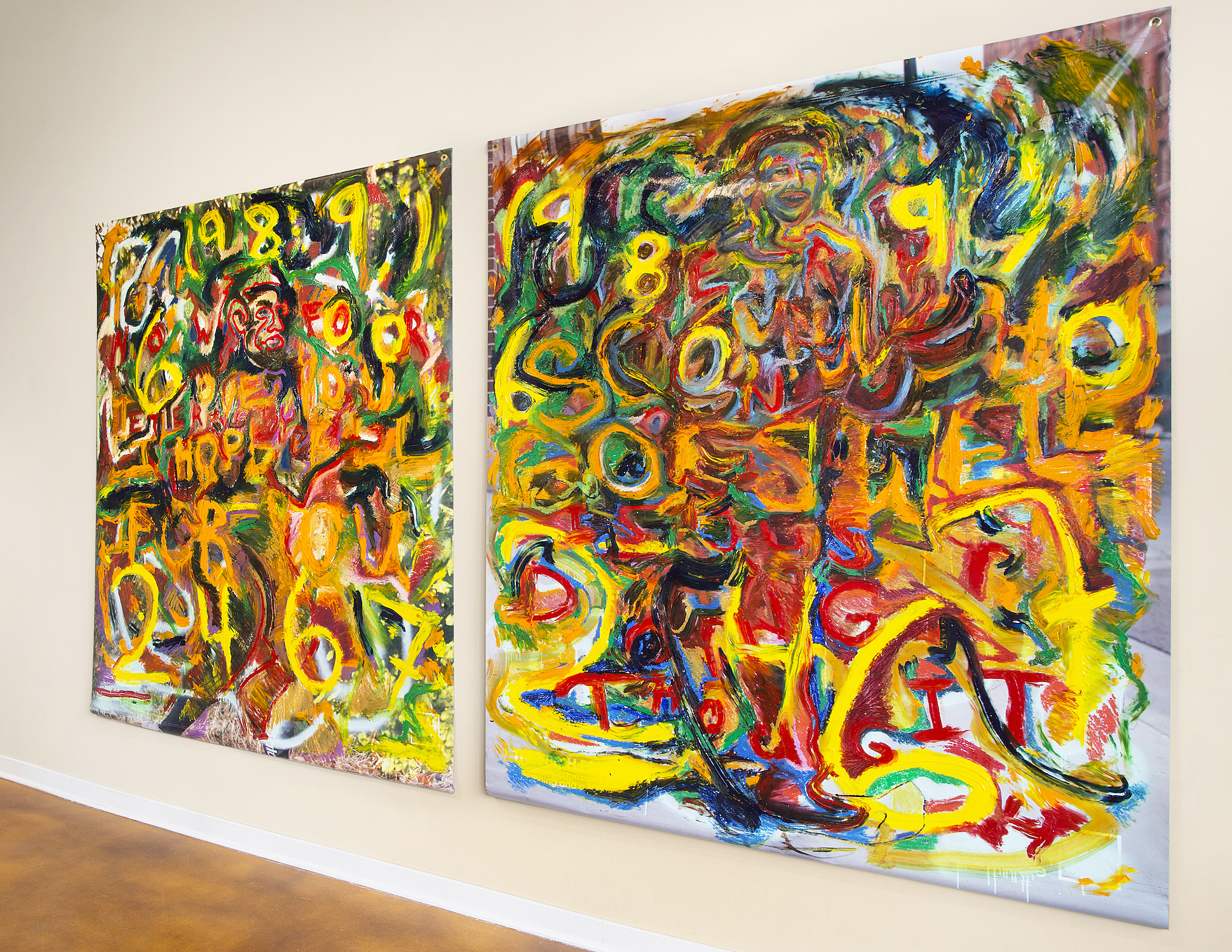
A primary example of this collaboration, “Celebration of Chaos” is credited to all the Soul Studio Artists. It is one of 3 pieces which hang from the ceiling trusses, casting shadows of additional dimensions to the subject piece. On the wall, the “Celebration of Chaos” shadow looks like a crown of thorns – perhaps representing the sometimes buffeting trials of life? On the floor, the shadow is interspersed with bright highlights – are they lumens of joy and hope in the middle of chaos?

Soul Studio Artists, Celebration of Chaos, yarn, wire, bamboo

These are expressive works, make no mistake. They hang together as a cohesive unit, yet each piece calls for attention and inspection on its own terms. The eponymous “Mirror, Mirror” by Aislinn Wendrow, is an actual antique dresser-case mirror with carefully crafted, curved wood sides. It has all been painted over in bold strokes, obliterating the reflective and frame surfaces with colors juxtaposed and contrasted. It is as though the time for reflection has gone – this is the time for expression. “I recognize myself. Take me for who I am!”

Aislinn Wendrow, Mirror, Mirror, acrylic on mirror

Pretense is shunned here, as evidenced even in the titles. The first piece in the show is: “Untitled (9 Squares with Spaghetti) by Jonathan Barrett, with painted yarn arranged in knots like spaghetti, or “This is Sew Abstract” also by Wendrow, which features handstitched details. The work is sometimes playful, sometimes mischievous, such as the handmade book “Prankbook” by Andy Feinberg. They are large format canvases, hanging pieces, or entire series. The viewer should expect edgy and challenging work that is ultimately a delight to see.

The show is held together by the vision of Anthony Marcellini. He is the director of Soul Studio in West Bloomfield, a project of the Dresner Foundation through the Friendship Circle, providing studio space and artistic direction to artists with special needs. Creative opportunities are offered in a wide variety of media, from fine art to design of all types, both 2D and 3D: http://www.friendshipcircle.org/soul/

Page 14 of 28

Powered by WordPress & Theme by Anders Norén