The Marshall M. Fredericks Sculpture Museum Hosts Gerhardt Knodel’s “Minglings: A Journey Across Time”
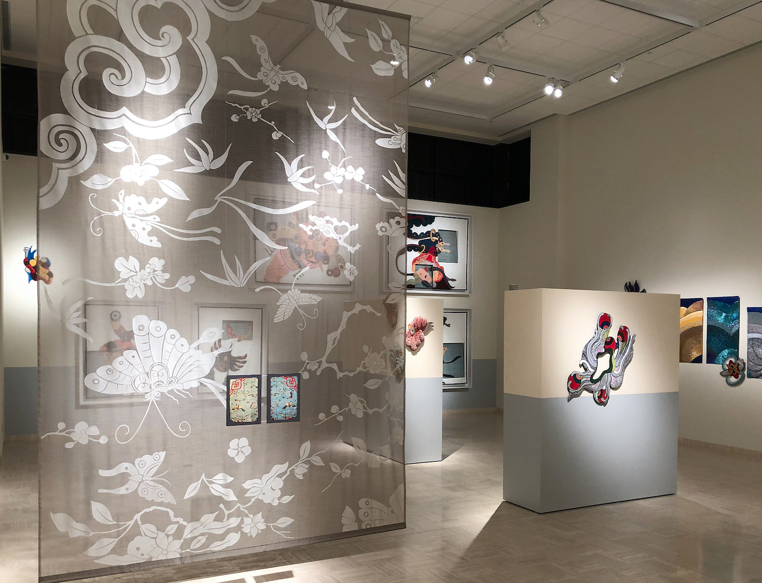
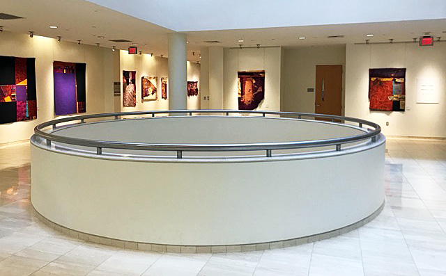
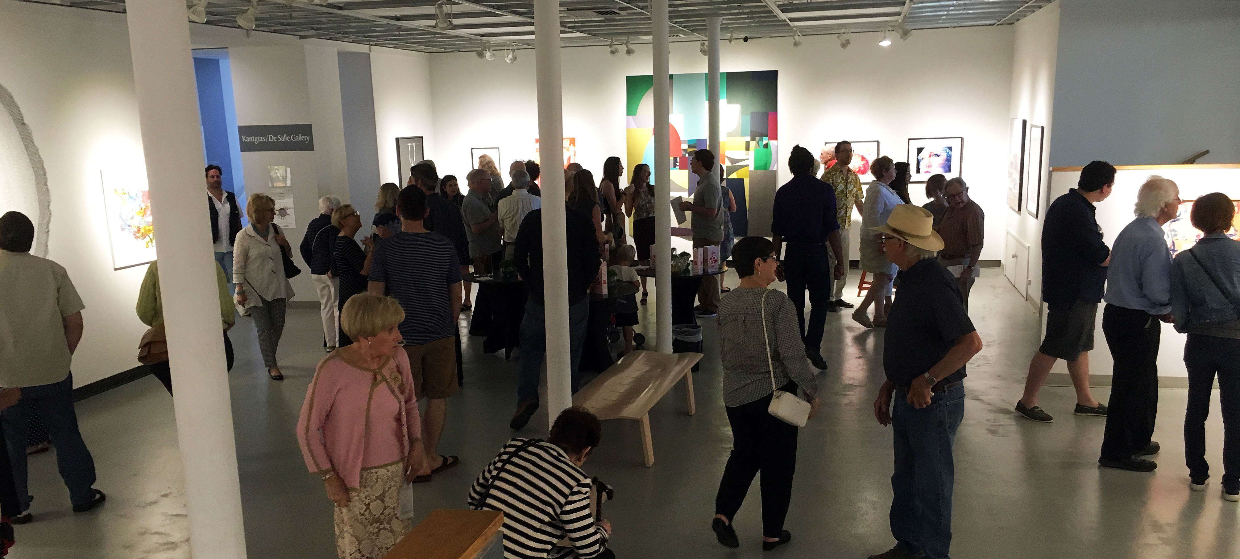
Gerhardt Knodel, Installation View of Gallery, All images provided by Robert Hensleigh
Imagine, while still in high school, walking into a Hollywood costume design studio with your art teacher when, maybe, you’re working on the school play and its set design. Imagine the industry there, the flurry of energetic creativity. You’re behind the scenes where all the magic happens: where the costumes are made, where the bolts and bolts of fabric are transformed into costumes and furnishings for the imaginary world of movies.(Think “Spartacus” or “Ben-Hur” or “Gone with the Wind”). That happened to textile artist Gerhardt Knodel when he was in high school and it seems it was a transformative experience that Knodel took to heart and inspired him to dream very big dreams. From set designs with painted curtain drops for a high school Christmas play to a seventy-foot-high, textile sculpture that adorned the atrium of John Portman’s Renaissance Center in Detroit, Knodel has been involved in creating and transforming space. “Free Fall” was a series of brilliant, looping, arabesques of color that enlivened Portman’s brutal geometric concrete space into veritable waterfall of color. For years it was on the must-see list for anyone visiting Detroit. He did the same for the new south entrance atrium to William Beaumont Hospital as well, with a multistoried, multilayered tribute to doctors and scientists famed for healing others.
Considering he was head of the fiber department and ultimately Director of Cranbrook Academy of Art for 35 years, it is astonishing how many large-scale public art commissions he completed, how much his personal work evolved, while at the same time, as current Cranbrook Fibers artist-in–residence Mark Newport recently said, how instrumental Knodel was in making the Fiber Arts “more challenging and more attuned to the fine arts dialog than it had been before.”
His recent project, “Minglings: A Journey Across Time,” beautifully installed in Saginaw’s Marshall M. Fredericks Sculpture Museum, is no less ambitious or compelling. Rather than transforming a space or constructing an environment as he often has, Knodel turned to the other half of the classic philosophical Space/Time conundrum: Knodel explored time by composing a visual historical narrative.
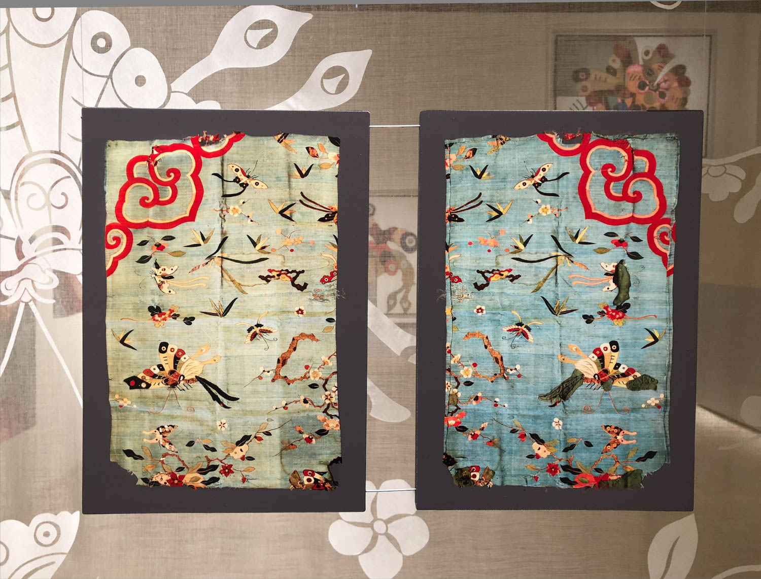
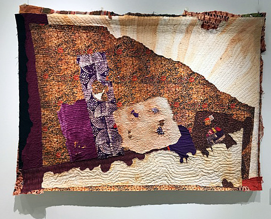
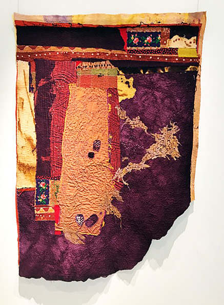
Gerhardt Knodel, Front and back of original silk tapestry (Kesi), China, Ming Dynasty, 17th Century
After finishing a large commission and while reorganizing and sorting through his extensive collection of historical textiles in search of a new project, Knodel rediscovered a Chinese silk tapestry. He mused over its beautiful but fragile, deteriorating state. Composed of stylized butterflies, insects, plant leaves and flowers, all floating in a pale blue sky-like background, Knodel realized its possibility. He rescued the deteriorating material by cutting small swatches out of the tapestry that still had physical integrity and contained the essence of its design. In short he played a version of the game of Exquisite Corpse with them, using the swatches as triggers or seeds, as in the game, to draw, as if growing, extensions of them evolving his own inventive forms.
Ultimately Knodel drew five different interconnected series that bloomed into a spectacular textile tour de force: along the way he discovered that what he thought were nineteenth century, were (valuable) seventeenth century Ming Dynasty tapestries created for the home of a probably very wealthy Portuguese family. The mistake probably inspired Knodel to dedicate a great deal of creative energy and time in exploring their uncanny charms. Ultimately he composed this engaging, over-the-top, imaginary visual travel log of the tapestry’s voyage from Ming China, by Spanish trade vessels via Manila, to Acapulco, Mexico, then over land to another trade ship and off to Portugal. A gallery guide and superb video accompanies the exhibition to help us on the journey.
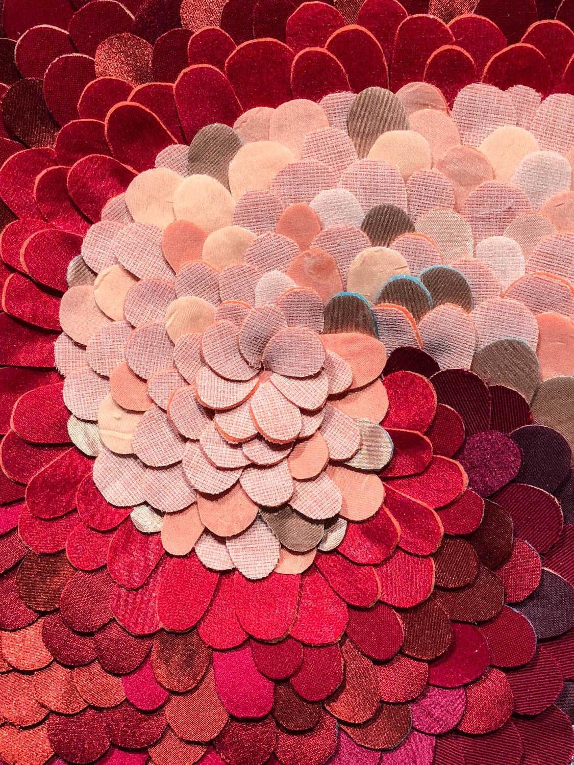
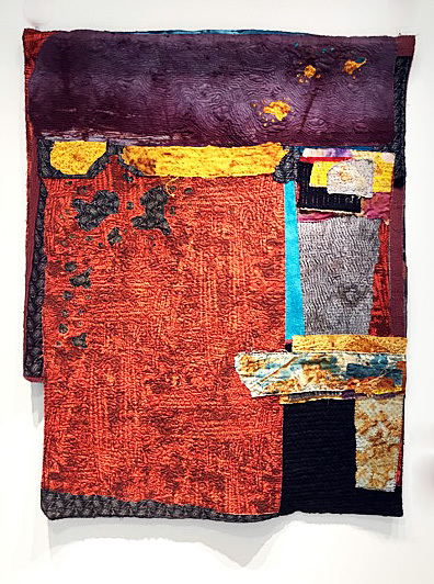
Gerhardt Knodel, detail of “Regeneration Series, #4,” mixed textiles
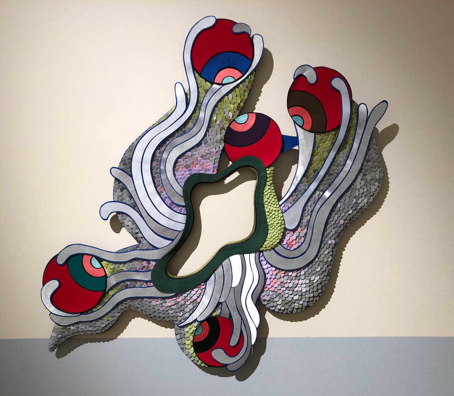
Translating the drawings into textile form involved inventing a medium that would hold up under the artist’s manipulation and give a degree of dimensionality as well as range of nuanced color to his drawings. Knodel laminated multiple colors of mixed textiles to foam backing and cut, by hand, tens of thousands, of what he refers to as tabs, which he then blended into a pointillist-like surface (to mix artistic metaphor) or as pixels, to color them. The result of his invention is a breathtaking range of color and exploration of possible forms.
There are 58 works in the exhibition that explore the theme of the delicate, weirdness of forms of nature (strange butterflies, insects, vegetation, flowers) suggested by the original tapestry. Knodel’s extension of their forms then are what his poetic vision gave birth to and they represent wonderful explosion of storytelling and delightful imagery.
In the initial series, entitled “It Had to Be You,” segmented tendrils with eyes at the end of each of them, explore the world around them. Some of the figures appear like hybrid of sea creatures and insects. The series, “Things That Get Caught in Trees After a Storm,” inspired by one of those uncanny plastic bags trapped in a tree’s limbs, reveal colorful, bulbous, ever-changing forms tangled in branches, blowing in the wind. They are at once exotic and even capture some of the comic extremes of nature.
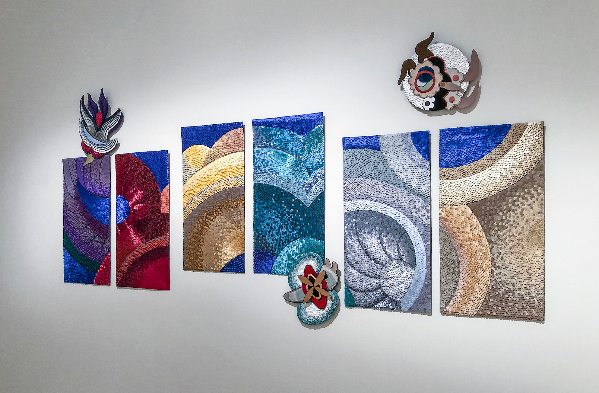
Gerhardt Knodel, “Homecoming: Series #1-6, with “Minglings” #13. Shui, #2.Hui, #5.Mu, mixed textiles.
Knodel was revved up, it seems, when he began to realize that his creatures were beginning to have life of their own. Among the “Minglings” are a group of twenty-two, insect-like/sea-like/flowerlike and cartoon-like, creatures that were inspired by the Ming tapestries (so Minglings are spawn of Ming tapestries) and, speculating, of Knodel’s Hollywood upbringing in the cartoon land of Disney. Ranging in size from 24”x24” to 48”x48,” each has its own personality, they all have Chinese names and, in Knodel’s description of his fairy-like tale, make the journey from China, to Portugal to the New World. There are two works that establish a feeling of triumph. “Flower Powered” is a nine paneled work that celebrates the passage across the multiple seas that the tapestry would have seen. It’s really the abstract center piece of the exhibition and suggests the spectacular landscape of the earth while connecting to the original colors and design motifs of the tapestry. To provide a context, Knodel created a landing site for their arrival in Portugal, entitled “Homecoming,” (pictured with Minglings attached) and to complete their journey until someone else is inspired by his Minglings to continue it and connect with history and extend them even further into the future.
There is magic in Gerhardt Knodel’s Minglings project: in his extension and poetic elaboration of the original, in the execution of drawings and the invention of a medium give life to them and fantasizing their journey for his cut up Ming tapestries into a visionary spectacle. He captured something envisioned during one of greatest civilizations ever, the 17th century Ming Dynasty and continued the vision in his studio in Pontiac, Michigan, providing elegant evidence of the timelessness and value of human imagination and labor. It is ultimately a collective victory accumulated over time.
Gerhardt Knodel, “Minglings: Night Flyers (Wei),” 40”x38,” mixed textiles.
Gerhardt Knodel’s “Minglings: A Journey Across Time,” continues at the Marshall M. Fredericks Sculpture Museum, Saginaw Valley State University, through May 19, 2018
Also at the Marshall M. Fredericks Sculpture Museum see: “Chinese Folk Pottery: The Art of the Everyday” curated by Marie Woo.