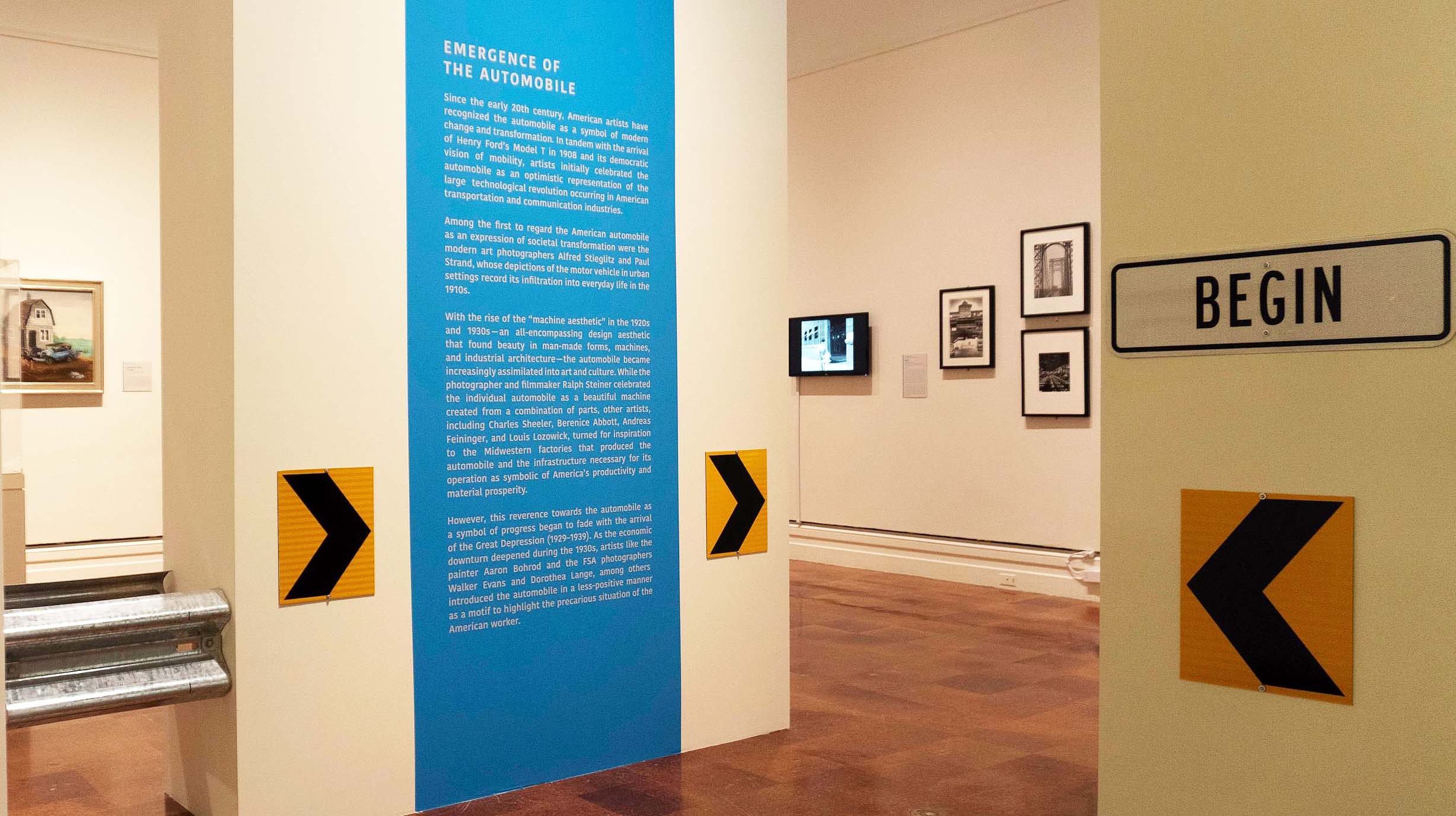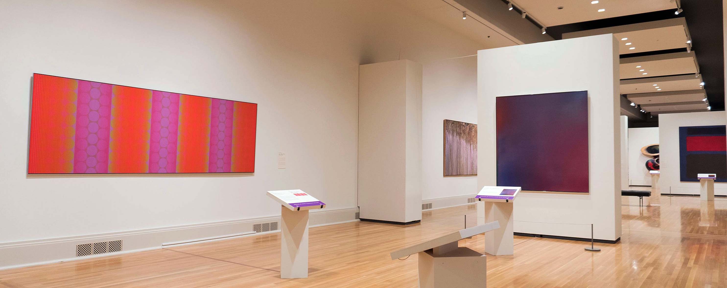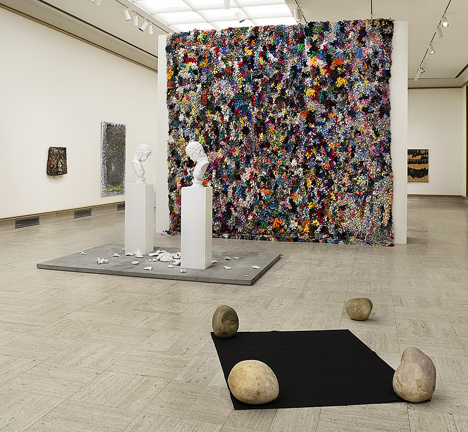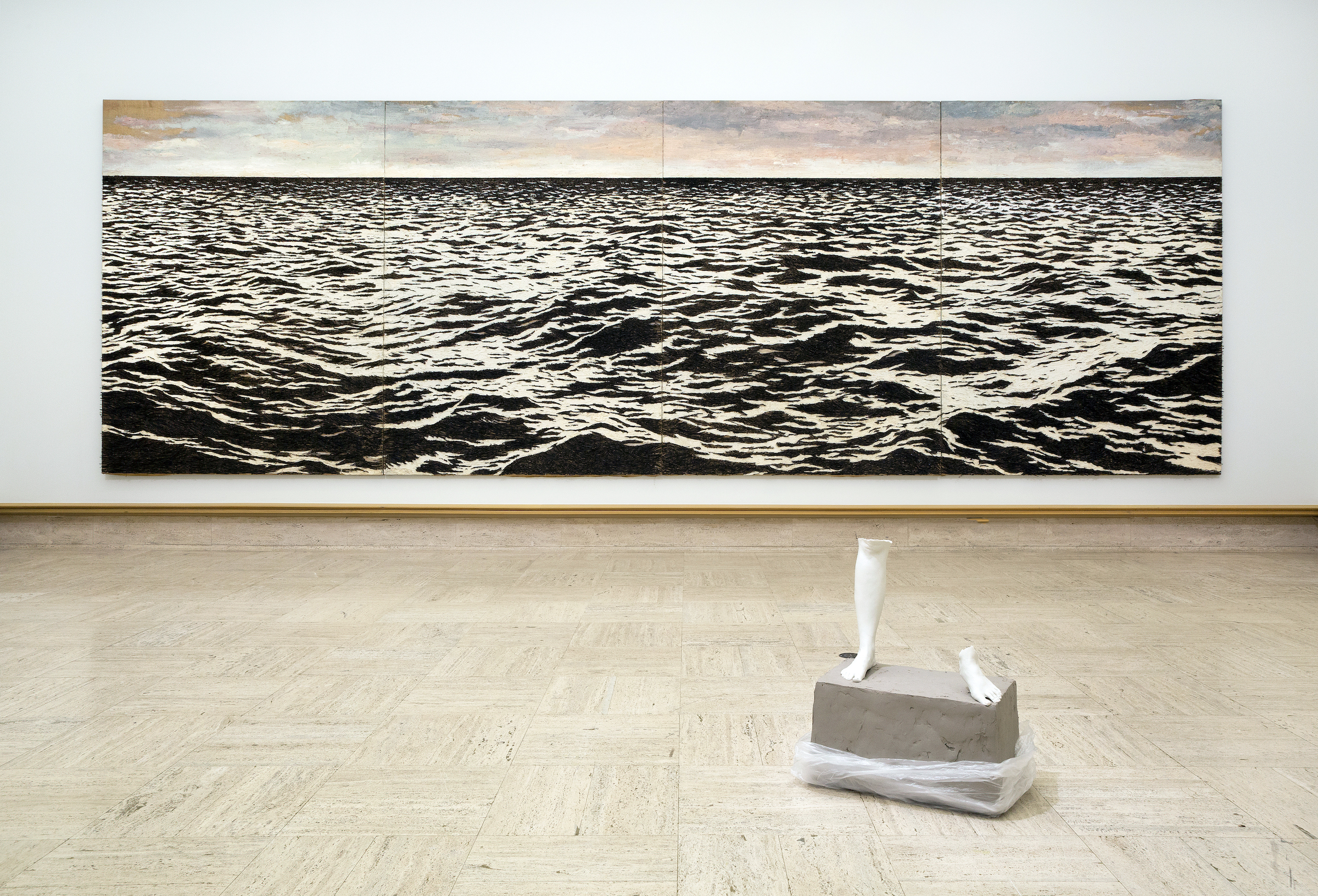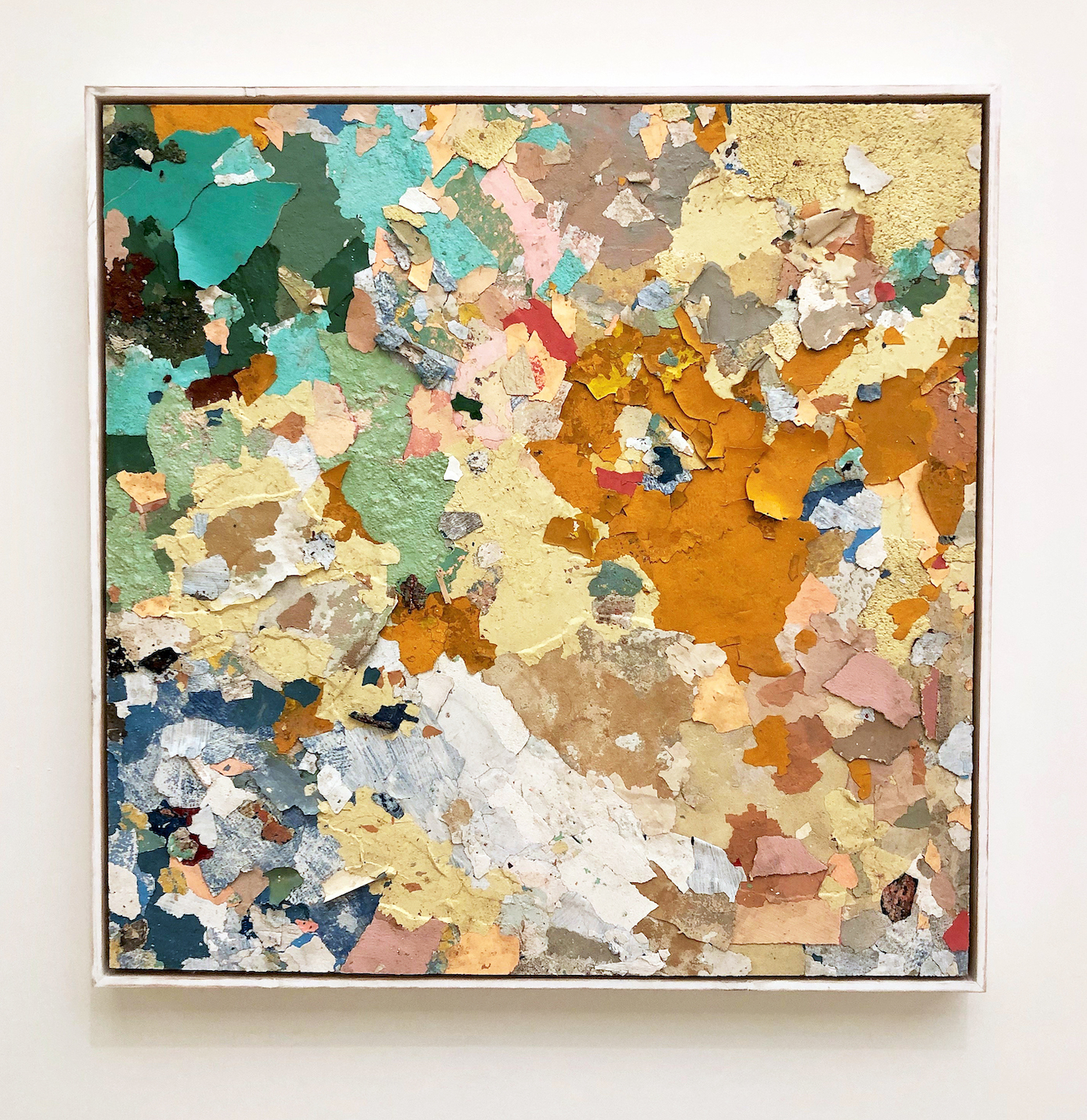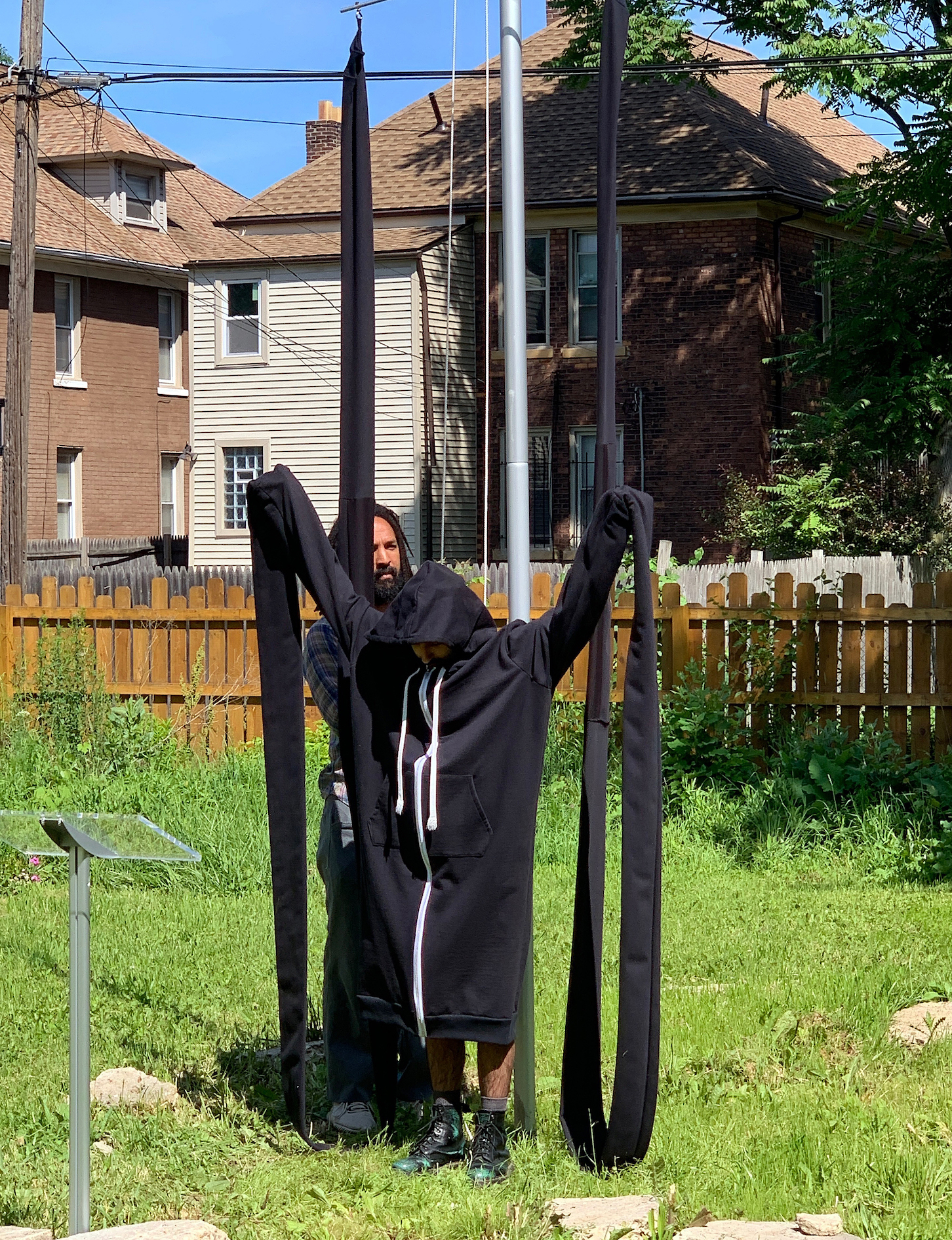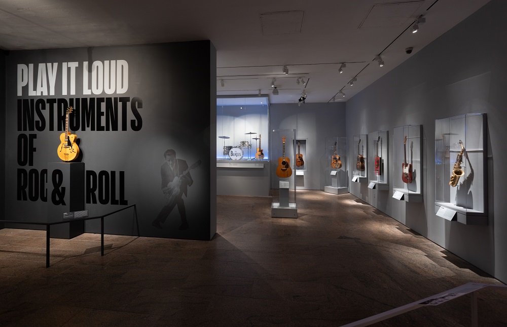
Installation image, Say It Loud, Image courtesy of Metropolitan Museum of Art, NYC, 2019
When I experienced the Say It Loud: Instruments of Rock & Roll exhibition at the Metropolitan Museum of Art in New York City it reminded me of the Art of the Motorcycle exhibition at the Guggenheim Museum in 1998 and more recently at the Detroit Institute of Arts with the Star Wars and the Power of Costume exhibition 2018. These exhibitions speak to a broad interpretation of what belongs in an institutional art museum and I think the broader, the better. The ever expanding role of our art museums provides the viewers with opportunities never before possible. The Say it Loud exhibition was literally packed on a hot weekday afternoon, with young people of all ages (notably young men) and included families of all sizes.
This exhibition was the first dedicated to the iconic instruments of rock and roll that opened April 8, 2019. Play It Loud: Instruments of Rock & Roll is co-organized by Jayson Kerr Dobney, Frederick P. Rose, Curator in Charge of the Department of Musical Instruments at The Met, and Craig J. Inciardi, Curator and Director of Acquisitions of the Rock & Roll Hall of Fame.
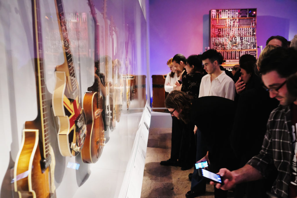
General atmosphere at the opening reception for “Play It Loud: Instruments Of Rock & Roll” exhibition at The Metropolitan Museum of Art on April 01, 2019 in New York City. (Photo by Nicholas Hunt/Getty Images)
Through more than 130 instruments dating from 1939 to 2017—played by artists such as Chuck Berry, Eric Clapton, Sheryl Crow, Bob Dylan, Don Felder, Lady Gaga, Kim Gordon, George Harrison, Jimi Hendrix, James Hetfield, Wanda Jackson, Joan Jett, John Lennon, Paul McCartney, Steve Miller, Joni Mitchell, Jimmy Page, Kate Pierson, Elvis Presley, Prince, Keith Richards, Patti Smith, Bruce Springsteen, Ringo Starr, Eddie Van Halen, St. Vincent, Tina Weymouth, Nancy Wilson, and others—Play It Loud: Instruments of Rock & Roll explores one of the most influential artistic movements of the 20th century and the objects that made the music possible.
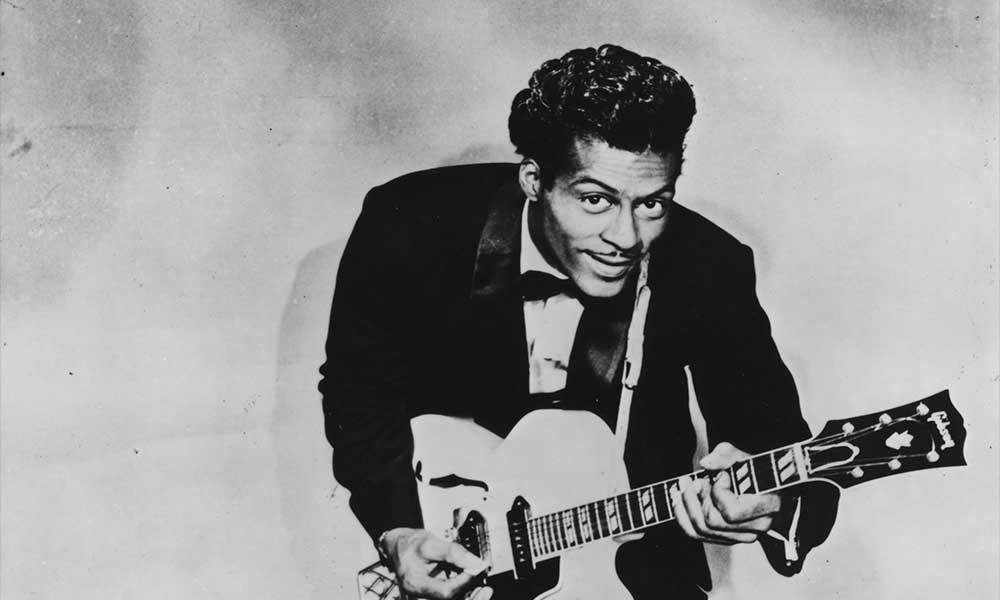
Chuck Berry, Musician, B&W Image, courtesy of the Metropolitan Museum of Art
The exhibition includes an array of videos where famous artists talk to the audience and perform popular sections of hit songs from the 60s, 70s, and 90s where Chuck Berry’s electric guitar ES-35OT (1957) his primary guitar from 1957 was used to record “Johnny B. Goode.” Jayson Kerr Dobney and Frederick P. Rose, Curators in Charge of the Department of Musical Instruments, commented: “Instruments are some of the most personal objects connected to musicians, but as audience members we are primarily used to seeing them from far away, up on a stage in performance. This exhibition will provide a rare opportunity to examine some of rock and roll’s most iconic objects up close.”
Up close is Lady Gaga’s custom-designed piano, which she used in her performance of “ARTPOP” on The Tonight Show with Jimmy Fallon in 2014; Steve Miller’s electric guitar that was painted with psychedelic designs by artist Bob Cantrell by 1973; Stevie Ray Vaughan’s “Number One” composite Stratocaster, which was his main instrument throughout his career;
Keith Richards’s guitar known to have been used when the Rolling Stones appeared on The Ed Sullivan Show in 1966 and later hand-painted by Richards; and Jimmy Page’s dragon-embroidered costume (Los Angeles, 1975)—the elaborately hand-embroidered suit took over a year to complete and Page wore it during Led Zeppelin’s live performances from 1975 to 1977.
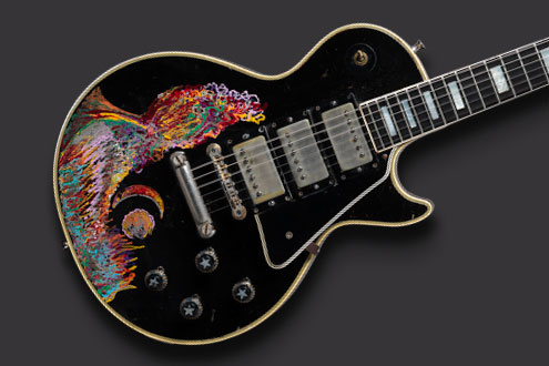
Keith Richards’s guitar known to have been used when the Rolling Stones appeared on The Ed Sullivan Show in 1966 and later hand-painted
In case you did not know, the Gibson Guitar Corporation has its home in Kalamazoo, Michigan and shown here, painted by Keith Richards. Les Paul Custom electric guitar, 1957; painted 1968.
The Metropolitan Museum of Art is home to one of the world’s most diverse and important collections of musical instruments. With over 5,000 examples from six continents, it is unsurpassed in its scope and includes instruments from nearly all cultures and eras. This exhibition will travel to the Rock & Roll Hall of Fame in November, 2019.
The exhibition is made possible by the John Pritzker Family Fund, the Estate of Ralph L. Riehle, the William Randolph Hearst Foundation, Diane Carol Brandt, the Paul L. Wattis Foundation, Kenneth and Anna Zankel, and the National Endowment for the Arts.
The Whitney Biennial 2019
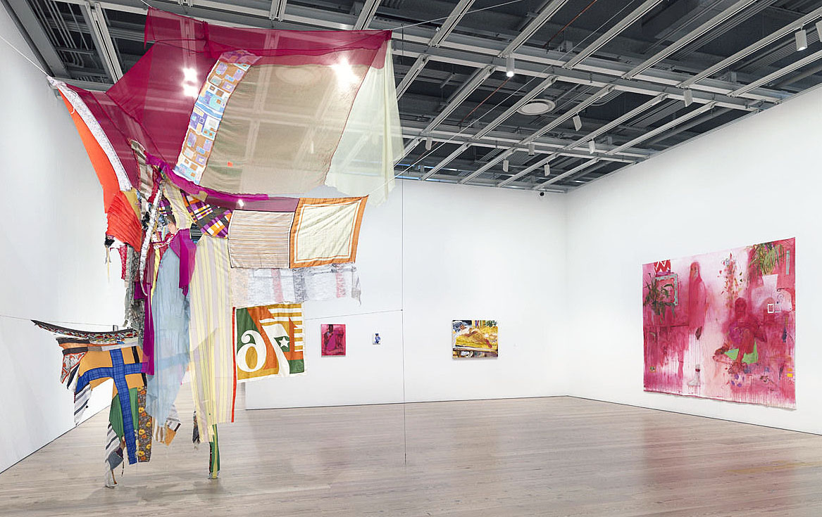
Installation image, Eric Mack, Proposition for Wet Gee’s Bend & Quilts fo replace the American Flag. Whitney Biennal 2019
Time flies, as it was just two years ago I wrote about four Detroit artists in the 2017 Whitney Biennial, and here we are two years later with Sam Green and his live documentary who now lives in NYC, and Matthew Angelo Harrison and his grouping of spear-like objects made of resin, who currently lives and has a studio in Detroit. One can’t help notice the differences. This year the content reflects an undeniably intense and polarized time in the country, as demonstrated in Eric Mack’s version of a replacement of the American Flag in this installation image.
https://www.youtube.com/watch?v=wCxSwDWJ8_Y
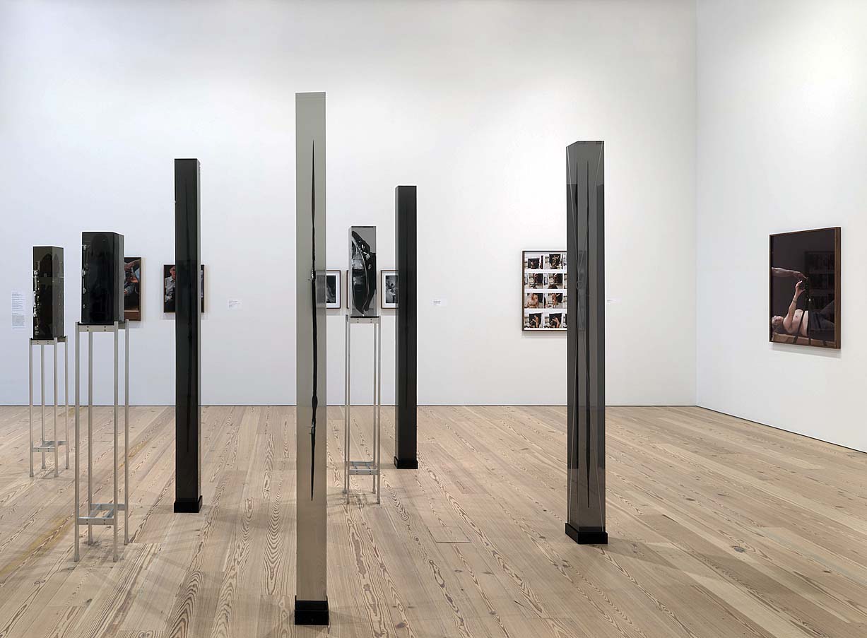
Matthew Angelo Harrison and his grouping of spear-like objects made of resin, Whitney Biennal 2019
The Whitney Biennial is an unmissable event for anyone interested in finding out what’s happening in art today. Curators Jane Panetta and Rujeko Hockley have been visiting artists over the past year in search of the most important and relevant work. Featuring seventy-five artists and collectives working in painting, sculpture, installation, film and video, photography, performance, and sound, the 2019 Biennial takes the pulse of the contemporary artistic moment. Introduced by the Museum’s founder Gertrude Vanderbilt Whitney in 1932, the Biennial is the longest-running exhibition in the country to chart the latest developments in American art. Here are a few picks from the show comprised of 75 artists.
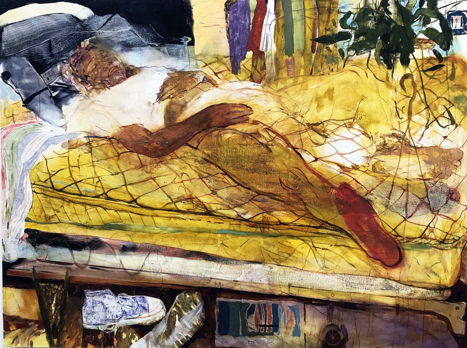
Jennifer Packer, Untitled, Oil on Canvas, 2019 Whitney Biennal 2019
Jennifer Packer creates expressionist portraits, interior scenes, and still lifes that suggest a casual intimacy. Packer views her works as the result of an authentic encounter and exchange. The models for her portraits—commonly friends or family members—are relaxed and seemingly unaware of the artist’s or viewer’s gaze.
Packer’s paintings are rendered in loose line and brush stroke using a limited color palette, often to the extent that her subject merges with or retreats into the background. Suggesting an emotional and psychological depth, her work is enigmatic, avoiding a straightforward reading. “I think about images that resist, that attempt to retain their secrets or maintain their composure, that put you to work,” she explains. “I hope to make works that suggest how dynamic and complex our lives and relationships really are.”
Born in 1984 in Philadelphia, Jennifer Packer earned her BFA from the Tyler University School of Art at Temple University in 2007, and her MFA from Yale University School of Art in 2012. She was the 2012-2013 Artist-in-Residence at the Studio Museum in Harlem, and a Visual Arts Fellow at the Fine Arts Work Center in Provincetown, MA. Packer currently lives and works in New York and is an assistant professor in the painting department at Rhode Island School of Design..
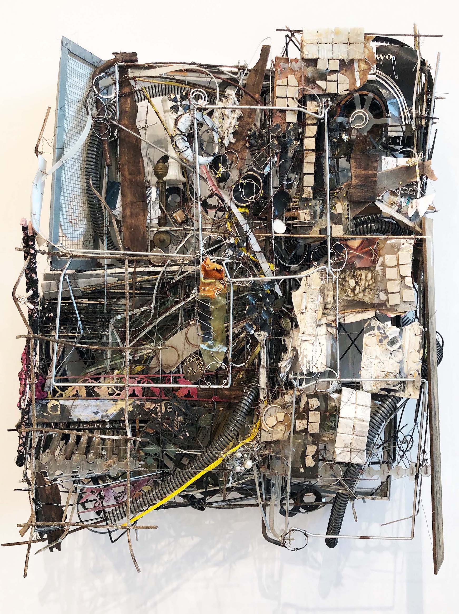
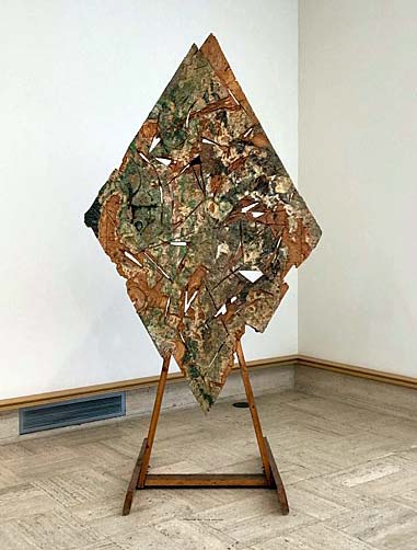
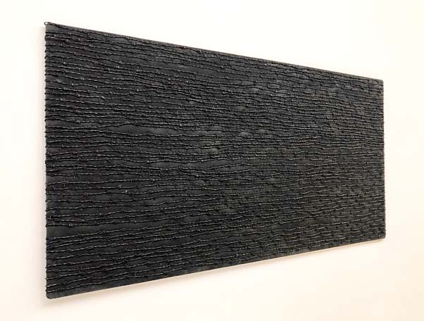
Robert Bittenbender, Sister Carrie, Steel, wire, glass, wood, miscellaneous hardware, 2017
Robert Bittenbender constructs dense reliefs using traditional art materials such as paint and graphite, but also includes cheap found objects. Each individual element has been meticulously incorporated into the whole. The overall effect is one of improvisation. Bittenbender treats everything as a potential source of inspiration, so that a wire hanger carries as much potential as paint. His assemblage aesthetic suggests the influence of an artist who came to prominence in the 1960s, including Bruce Conner and Lee Bontecou, both of whom used refuse and rubbish in three-dimensional works that hang on the wall and protrude; not so different from the Detroit Artist, Gordon Newton in 1971. Bittenbender earned his BFA from Cooper Union.
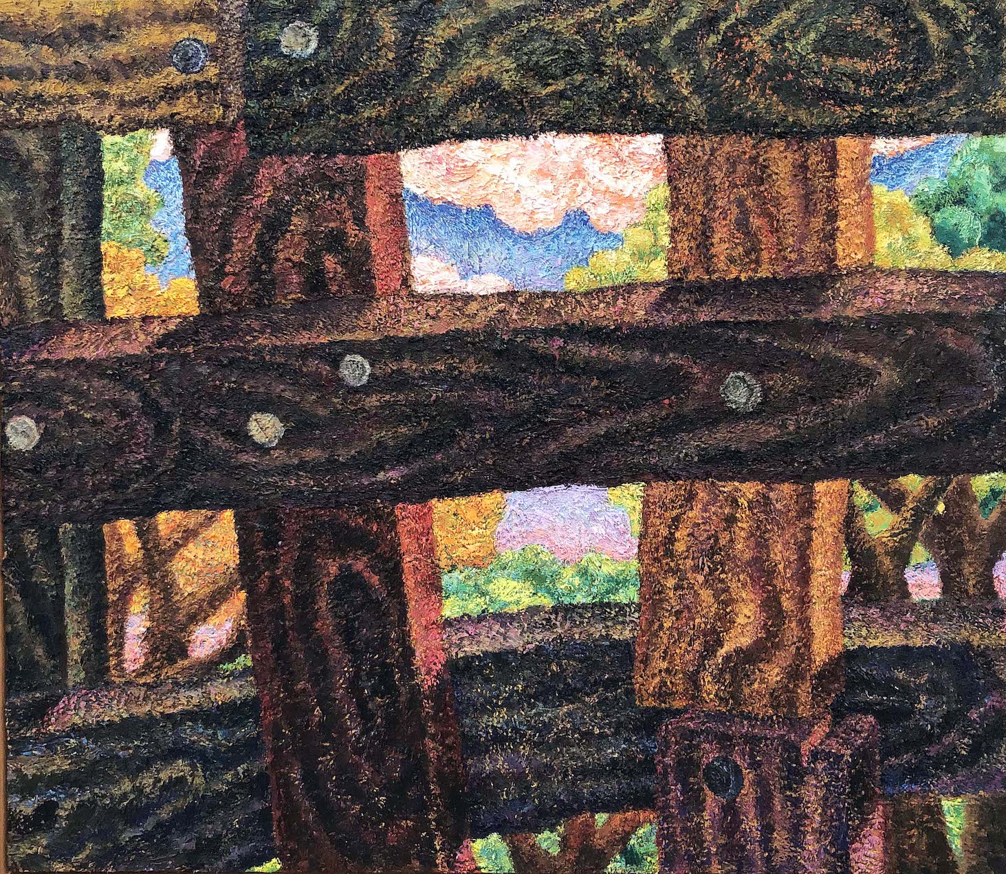
Keegan Monaghan, Outside, Oil on Canvas, 2019 Image courtesy of DAR
With his tactile, heavily worked surfaces and emphasis on subjective points of view, this painting by Monaghan delivers an aspect of Impressionist painting. Monaghan employs visual tricks to make small items appear disproportionately large, skewing the perspective. Keegan Monaghan is a young artist who was born in 1986. His work plays on a sense of inclusion and exclusion, positioning the viewer as a voyeur peering at a scene through a peephole. It is not always clear in Monaghan’s work whether the viewer is looking out or looking in, excluded or implicated. The work was featured in several exhibitions at key galleries and museums, including the Whitney Museum of American Art and the James Fuentes.
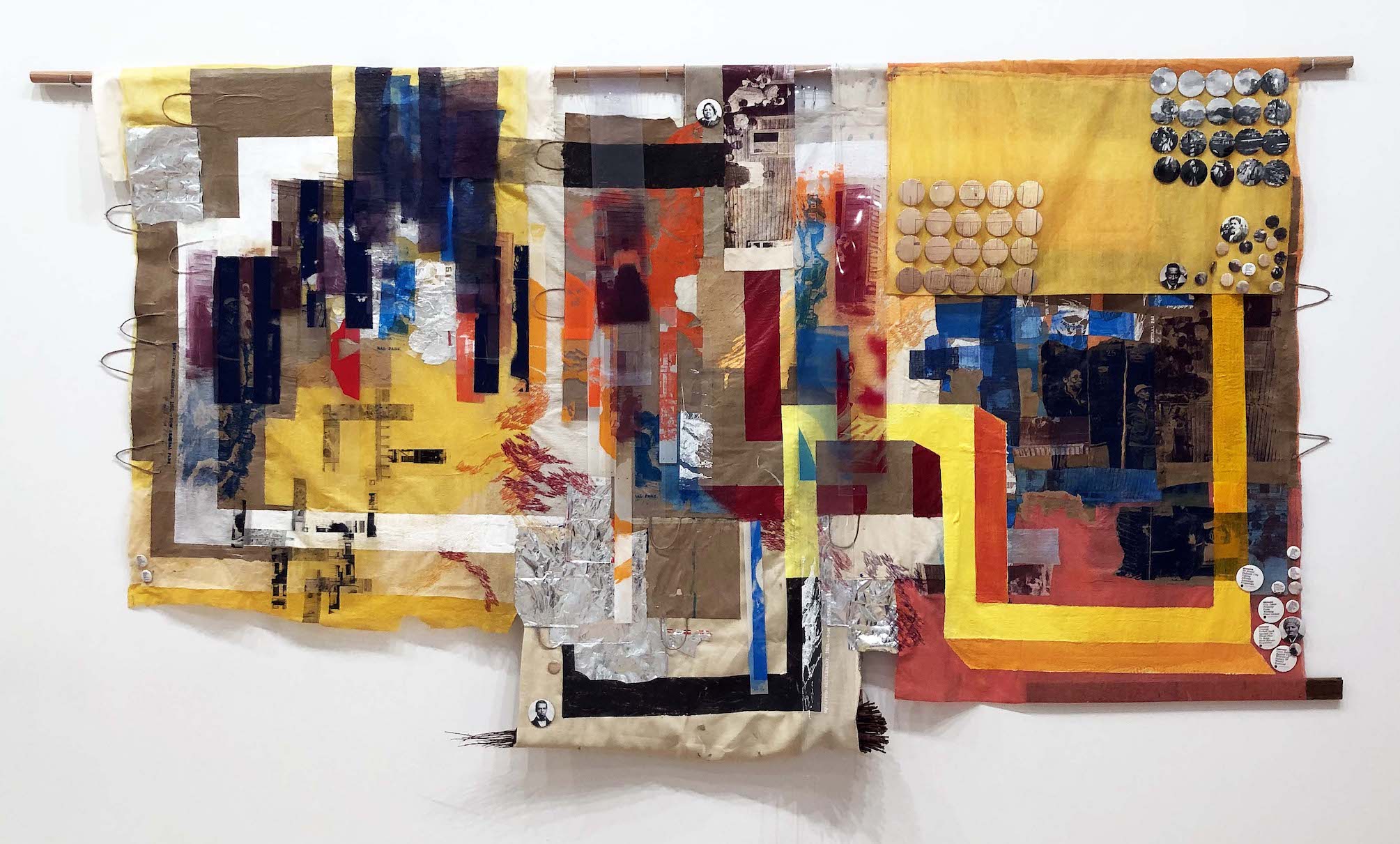
Tomashi Jackson, Hometown Buffet – Two Blues, 2019
Tomashi Jackson’s deeply layered abstractions feature found materials, paper bags, food wrappers, vinyl insulation strips, and storefront awnings – many of them with specific autobiographical references. Jackson’ wide-raging sources also intersect with art-historical, legal and social histories, often using color materially to encourage meditations on painful subjects. Her three paintings on view focus on housing displacement in New York City by exploring parallels between the history of Seneca Village – which was founded in Manhattan in 1825 by free Black laborers and razed in 1857 to make way for Central Park. The city’s current government program designed to seize paid-for properties in rapidly gentrifying communities across the city, regardless of mortgage status. Jackson creates dynamic passages of clashing complementary hues and lights her surfaces to resemble stained glass. Tomashi Jackson was born in Houston, TX, and lives and works in New York City. She earned her MFA from Yale School of Art in 2016 and is an adjunct professor at The Cooper Union. http://tomashijackson.com/
There was an unusual event that occurred at the Whitney Biennal this year when eight artists asked the Whitney Museum of American Art to remove their works from this year’s Biennial, citing what they describe as the museum’s lack of response to calls for the resignation of a board member with ties to the sale of military supplies, including tear gas. Warren B. Kanders, the vice chair of the Whitney Museum in New York, said that he will resign from his position after more than half a year of protests against his ownership of Safariland, a company that produces tear-gas canisters and other supplies used by the military and law enforcement. The news was first reported by the New York Times.
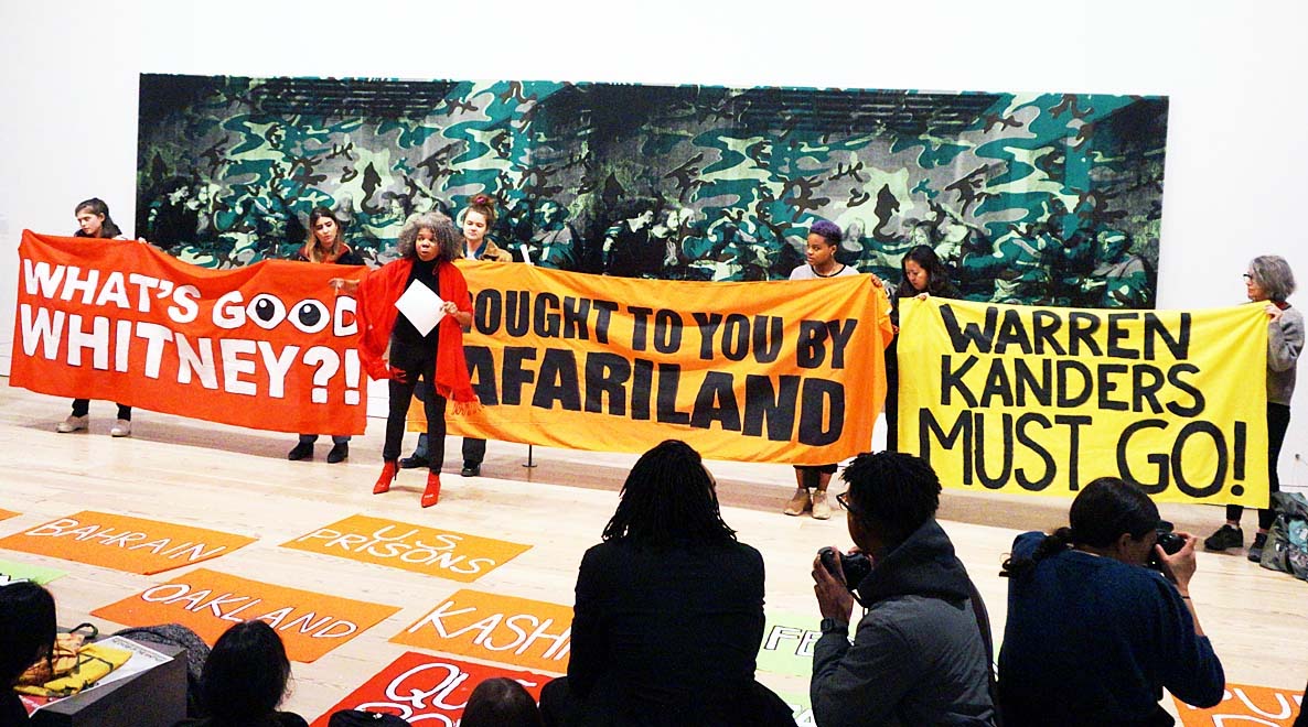
A protest at the Whitney in May over a trustee, Warren B. Kanders, the owner of a company that produces military supplies, including tear gas. Credit: Jeenah Moon for The New York Times
There is an old saying; “There is no such thing as bad publicity.”
The 2019 Whitney Biennial is organized by Jane Panetta, associate curator, and Rujeko Hockley, assistant curator, with Ramsay Kolber, curatorial project assistant.
NYC, The Shed @ Brooklyn Yards
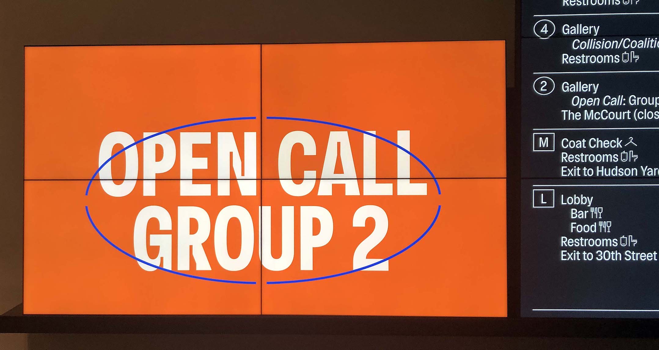
Installation, The Shed, Open Call 2 signage, 2019
In New York City, Hudson Yards’ the new museum, The Shed, has dedicated a portion of its space and energy to supporting emerging artists in NYC through its Open Call program. More than 900 artists submitted proposals to be included, and 52 from various disciplines have been selected for the Open Call inaugural season. The artists represented receive funding, resources and support to exhibit their works in one of The Shed’s spaces. The Shed convened six different panels of outside experts to find the talent for “Open Call.” According to Tamara McCaw, the chief civic program officer, “We’re always thinking about what it means to be a civic institution, and located on city-owned land”—in other words, The Shed has taken on the responsibility of representing all of New York.

Early concept illustration of The Shed at Brooklyn Yards, 2018
Construction on The Shed started in 2015, using a design from lead architect Diller Scofidio + Renfro and collaborating architect Rockwell Group. The Shed features several architectural features, including a retractable shell that creates a space, named The McCourt, for large-scale performances, installations and events. Senior curator Emma Enderby points out that the exhibition will be a noteworthy complement to the concurrent Biennial, with its more established artists. “Our approach is completely grassroots,” she says, noting that they did everything from post on LinkedIn to contacting the Asian American Arts Alliance to tap into unheralded talent.

Hugh Hayden, Hedges, 2019. Sculpted wood, lumber, hardware, mirror, carpet. Photo: Stan Narten.
Hayden’s sculptural installation Hedges is situated inside three mirrored walls to create the illusion of an infinite row of houses. Hayden says in his statement, “I conflate an idyllic suburban house with a bird’s nest and challenges the illusion of social and economic inclusivity in the context of the American Dream.” Hayden lives in Harlem and works in the Bronx. He creates sculptures primarily in wood in addition to hosting culinary installations. His work explores ideas of belonging to a social landscape through a lens of camouflage and natural materials.
Hugh Hayden was born in Dallas, Texas in 1983 and lives and works in New York City. He earned an MFA from Columbia University and a Bachelor of Architecture from Cornell University. https://hughhayden.com/
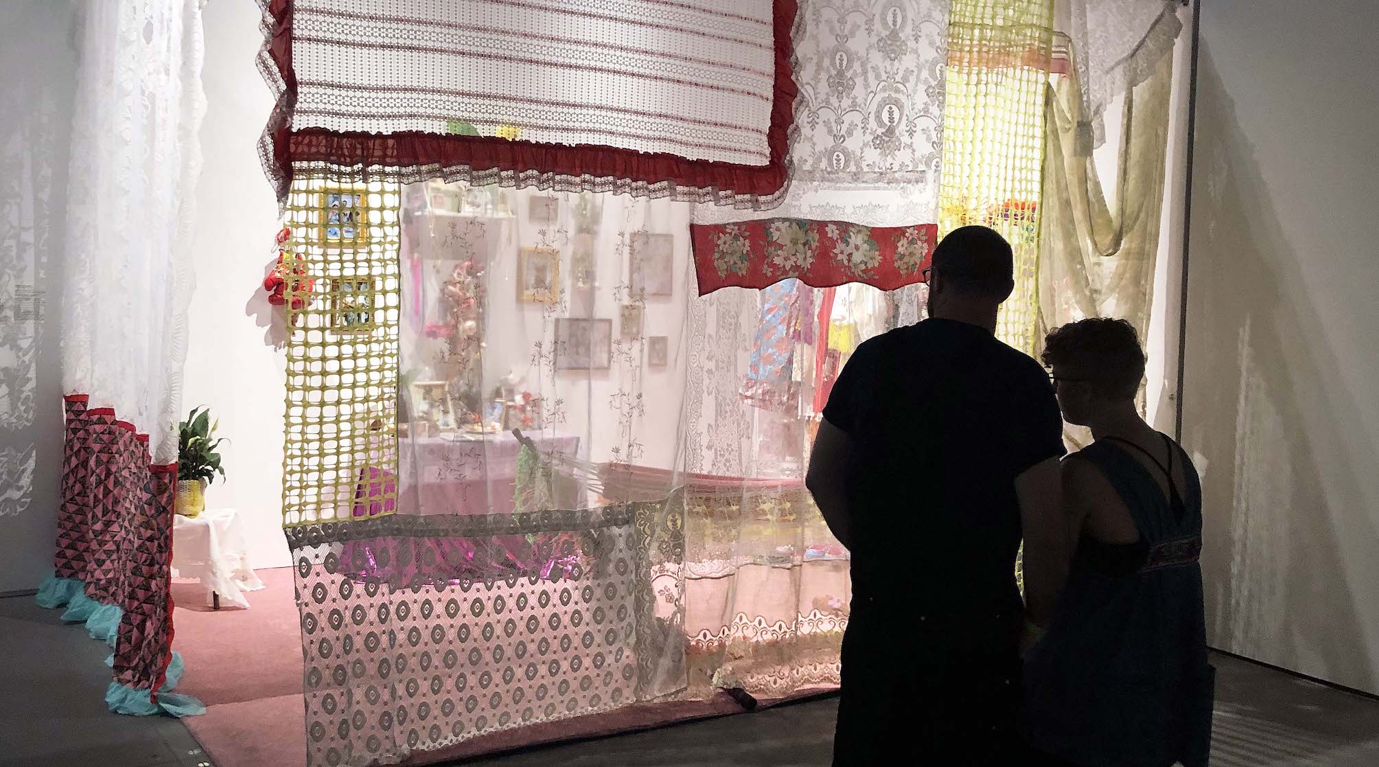
Gabriela Corretjer-Contreras, Llevatelo To’ No Me Deje Na, 2019. Mixed media: textiles, fabric, fiber, found objects. Photo: Courtesy of DAR
Llevatelo To’ No Me Deje Na is an interactive installation set in the bedroom of Nena Corretjer-Contreras’s alter ego. In her statement the artist says, “By juxtaposing the various personal experiences of performing to colonial expectations of Puerto Rican identity while living in the diaspora, the installation explores the history of invasion and exploitation of Puerto Rico. Participants can perform the role of both colonized and colonizer by trying on clothes and masks. In wearing Nena’s clothes and occupying Nena’s space, participants invade both Nena’s bedroom and identity. Through the use of clothing in the installation, memories are used to reconstruct an absent history and identity.”
Gabriela María Corretjer-Contreras is an artist living in Washington Heights, Manhattan, who works in clothing, textiles, installation and performance. Gabriela María Corretjer-Contreras was born 1995 in Puerto Rico and now is a New York-based artist who utilizes textiles and performance as a way of imagining a future for a society with an “identity crisis.” She recently earned her BFA at Parsons The New School for Design, and has begun a comprehensive body of work that encompasses different aspects of the same imaginary universe through bold colors and vibrant clashing prints. INSTAGRAM:GABBAHABBLABABBA
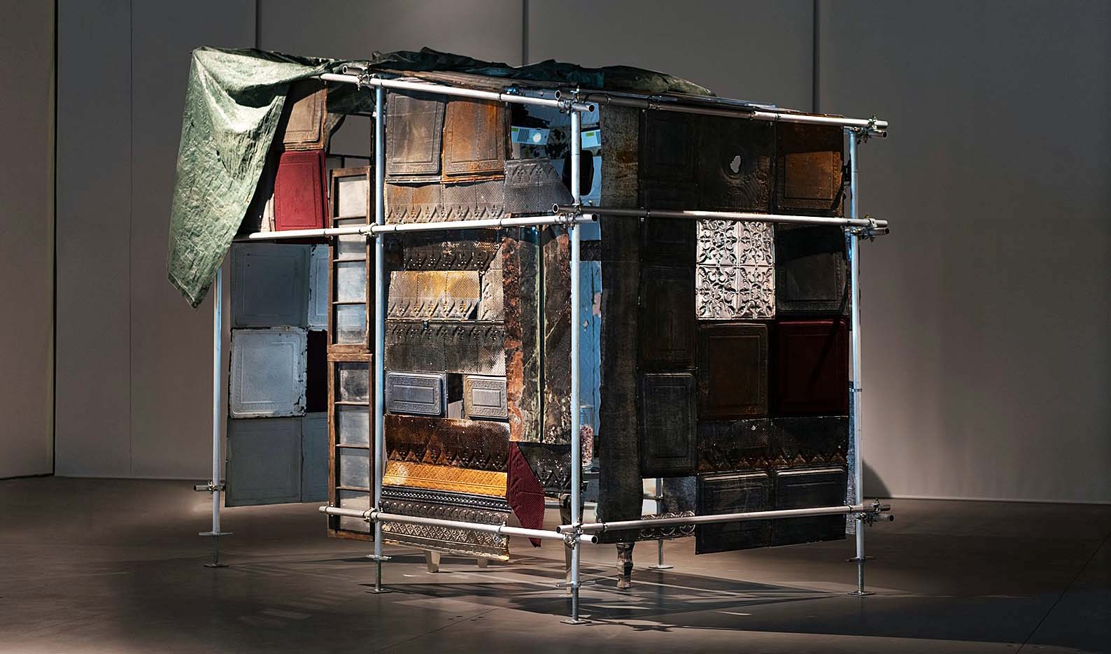
Analisa Bien Teachworth, The Tribute Pallet, shack-like scaffolding construction made of metal, wood, plastic and glass. 2019
Analisa Bien Teachworth (full disclosure, my daughter) is a digital media and installation artist from Detroit Metro, living and working in New York City whose practice encompasses a wide range of digital and physical mediums. In her statement the artist says, “The Tribute Pallet is a multimedia installation that invites the audience into a shack-like scaffolding construction made of metal, wood, plastic and glass. At the center of the space on a table, glass jars hold candy for the audience’s consumption. This free offering of candy evokes sugar’s history as one of the most valuable commodities over past centuries, as well as its connections to the transatlantic slave trade which supported its cultivation. Three animated figures representing the ancestors are projected in the space on the interior walls and recite a hymn over a musical score. The multisensory installation explores histories and possible futures of work and labor.”
Teachworth earned her BFA from School of the Art Institute of Chicago, is part owner of 4Real, http://4real.io and works out of her studio in The Clemente, http://www.theclementecenter.org on the lower east side of Manhattan. http://analisateachworth.net
Open Call is The Shed’s large-scale commissioning program dedicated to developing and presenting new works from artists based in New York City who have not yet received major institutional support. Panels of leaders in a wide range of disciplines—from the visual arts to digital media to theater and dance—reviewed more than 900 proposals for Open Call. They selected 52 emerging artists and collectives to receive support, space, and resources to develop their trailblazing projects at The Shed.
Organized by Tamara McCaw, Chief Civic Program Officer, Emma Enderby, Senior Curator, and Solana Chehtman, Director of Civic Programs, with Jesse Firestone, Open Call Assistant, and Alessandra Gomez, Curatorial and Program Assistant. Audiences can view these works free of charge throughout the program through August 25, 2019.
If you are traveling to New York City this summer, these exhibitions would be good to see at these museums. The MET has other exhibitions, the Whitney Biennial 2019 has 75 artists from all parts of the United States, and The Shed is a new museum that is innovative in its design and multidisciplinary mission.

