Critical art reviews of Detroit galleries and museums weekly

Category: Mixed Media Page 4 of 7

Susan Goethel Campbell:  Second Nature @ David Klein Gallery

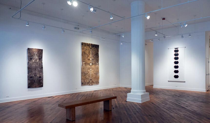
Susan Goethel Campbell, Installation Image, Second Nature, David Klein Gallery, photo by DAR.

“This exhibition is a marker of transitions, not permanence,” says multimedia artist Susan Goethel Campbell. In her solo show Second Nature, on view from March 12 – April 30 at David Klein Gallery in Detroit, the artist continues her collaboration with the environment, creating elegiac artworks that speak of impermanence and transition, loss and rebirth. In this latest, process-driven iteration of her ongoing art practice, she collects fugitive elements of the world around her—blossoms, fallen leaves, the shadowy stains of walnuts–and transforms them into potent meditative objects.

Although a printmaker by training, Campbell’s art practice has expanded over time to include video, installation, and environmental and community-based art. Second Nature builds upon her established art practice but adds an element of spirituality, a creative development in her work that she describes as “a reminder of the bridge between life, death, and reformation.” She has produced two separate but related bodies of work for this exhibition that complement and reinforce each other.

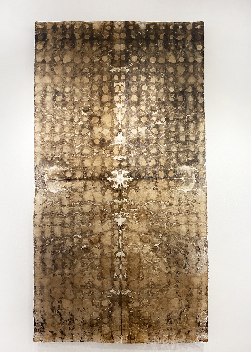
Susan Goethel Campbell, Seasonal No. 4, 2022, walnut stains with hand perforation and hand-sewing on Japanese paper, 108” x 59.” Photo: Samantha Bankle Schefman.

Seasonal Series

In Seasonal, a series of five large new works on paper, Campbell has made shadowy dye from walnuts and arranges the resulting translucent, circular brown blotches in loosely symmetrical compositions on sheets of Japanese rice paper. This repetitive dripping process is followed by folding the sheets onto each other and yields a tapestry-like image that seems both random and intentional. The artist employs the resulting dorsiventral symmetry, found throughout nature in most animals and many plants, to imply an adumbral presence. The artworks also immediately call to mind projective psychological Rorschach tests. Tiny, meticulously placed perforations that punctuate the ad hoc stains give emphasis and a kind of ceremonial dignity to the work. The sheets of paper are sutured together by the artist’s hand, creating the effect of subtle scarring, an implication of remembered pain.  The assembled layers have been mounted several inches away from the wall and cast shadows of the perforations on the wall behind the paper, forming a fugitive second artwork behind the foreground image. The resulting pattern drains away from the random quality of the staining in favor of the purely intentional punched design.

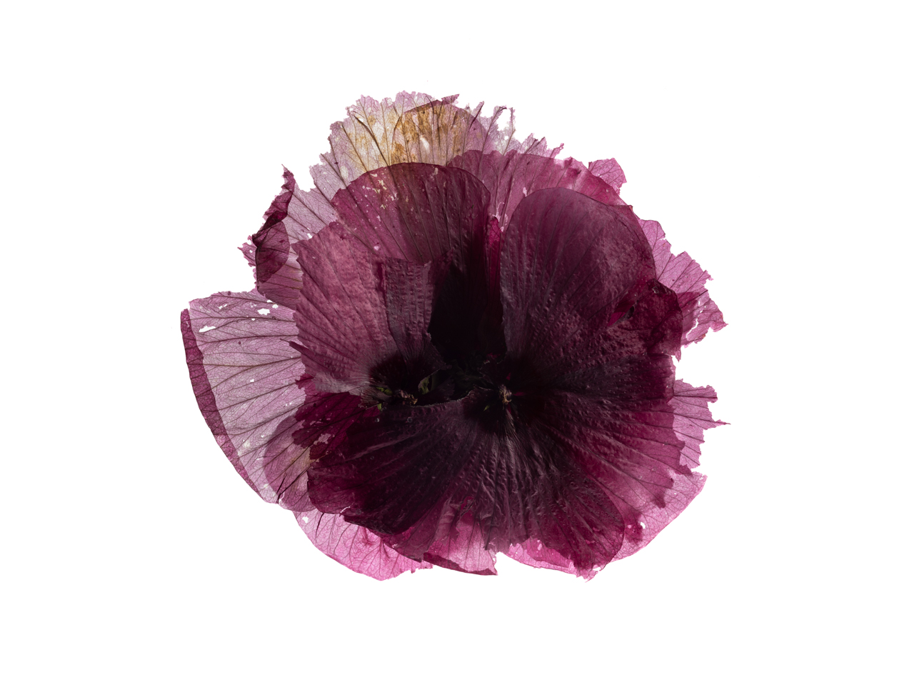
Susan Goethel Cambell, Hibiscus Years No. 3, 2022, archival inkjet print, 19” x 25.” Photo: Tim Thayer.

Hibiscus Years

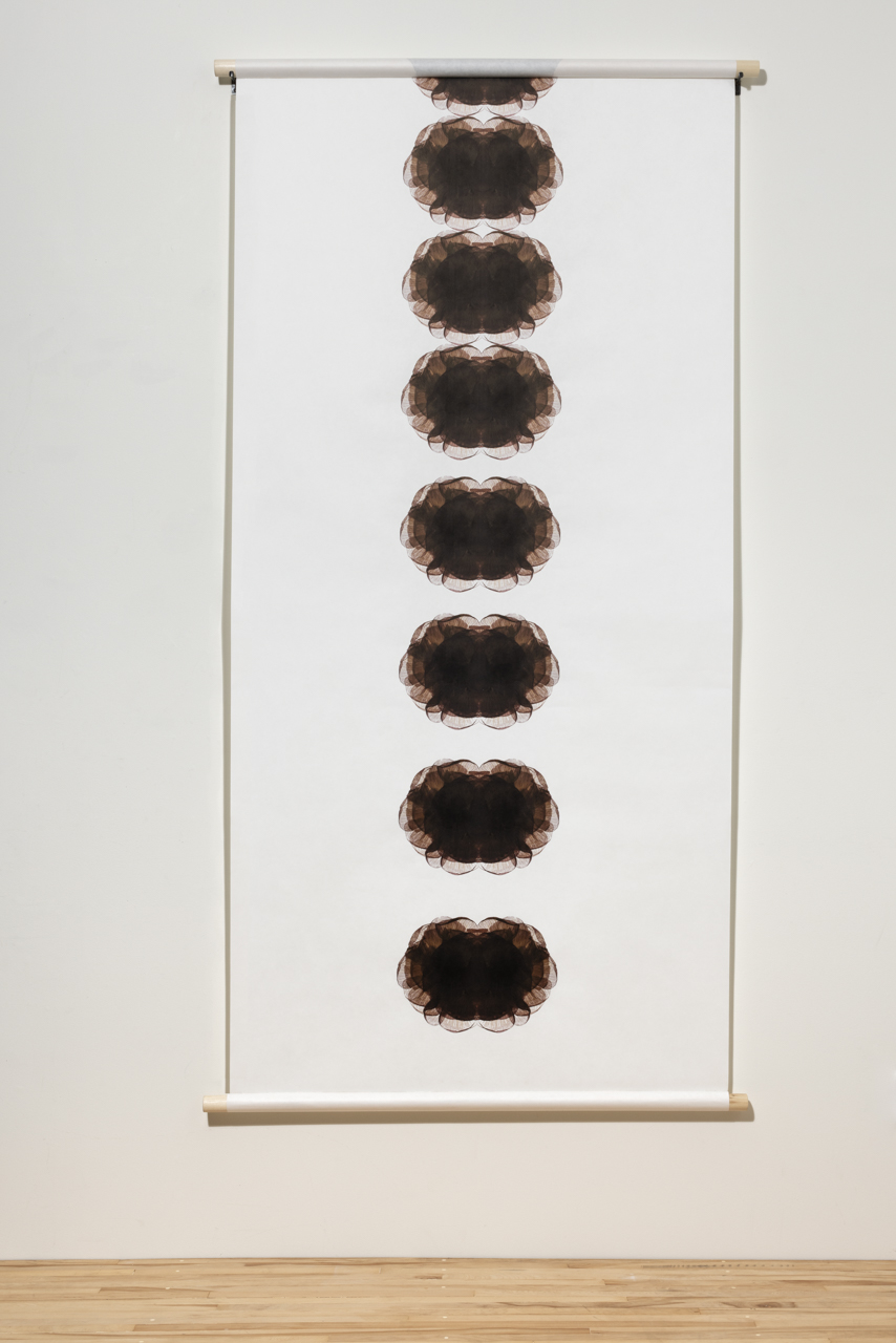
The simple image of a hibiscus blossom, magnified to many times its original size, is the subject—or a pretext for–the digital photography series Hibiscus Years. The routine nature of the flower as a subject in art conceals the true preoccupation of this work: time, beauty, impermanence, and their relation to each other. Each hibiscus blossom, which lasts for only a day, has been fixed in time through digital photography, and the blooms are layered one on top of the other. The resulting composite images in Hibiscus 1-4 are simple re-iterations of the blossom shape; the layers create densely dark centers that transition at the edges to delicate chiffon-like veils of plum, mauve and buff. The torn edges and slightly faded colors undermine the natural prettiness of the image and give them psychological depth. Campbell adds a sense of linear time in Hibiscus Years No. 5 Scroll, with the symmetrical image repeated in a vertical format that calls to mind a roll of film.

Susan Goethel Campbell, Hibiscus Years No. 5, Scroll, 2022, archival inkjet print on Japanese paper, 92 ¼” x 48.” (scrolled) edition of 3. Photo: Tim Thayer.

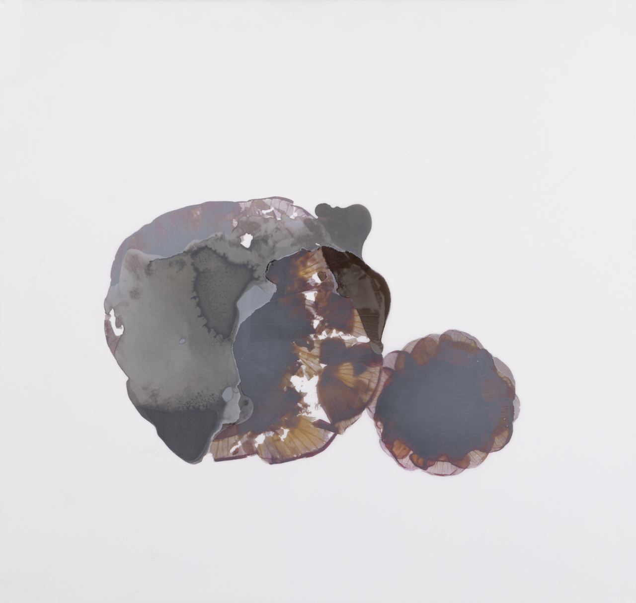
Perhaps the most mysterious works in the exhibition, both in process and intent, are Hibiscus Years 6 and 7. The images seem both allusive and elusive while being the most purely abstract images in the series. These circular shapes invite and frustrate perceptions; they are both evocative but indistinct, circumventing an easy reading of the image. They withhold meaning that we reach for but can’t touch.  The flat gray of shadows against the milky whiteness of the paper hint at a transcendent reality just outside our field of vision.

Susan Goethel Campbell, Hibiscus Years No. 6, 2022, altered archival digital print, walnut stains, 38” x 12.” Photo: Tim Thayer.

In Second Nature, Susan Goethel Campbell has created a collection of fragile yet resilient poetic images that express the spirit of this moment, a visible and resonant record of the calamitous years we have just experienced.  It has been a time of the pandemic, climate change, political unrest–and now, war. But rather than suggesting that we dwell upon our losses, the artist has found us some solid ground to stand on. She tentatively proposes a spring of renewal, when death is followed by rebirth, growth proceeds from decay and hope wins over sorrow.

Susan Goethel Campbell – Hibiscus Years No. 7, 2022, altered archival digital print, walnut stains, 31” x 29.” Photo: Tim Thayer.

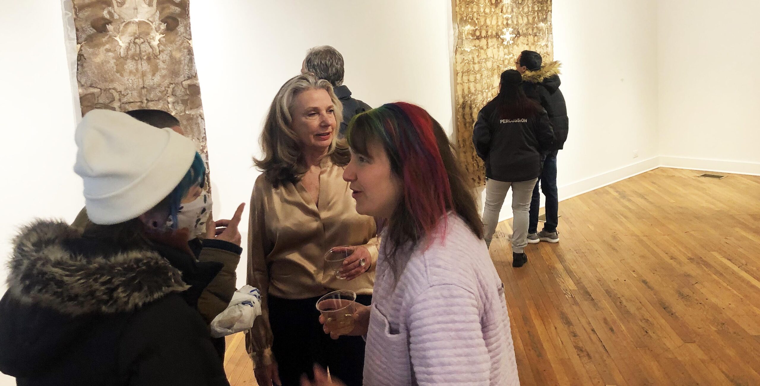
Installation image. Photo by Samantha Bankle Schefman.

Susan Goethel Campbell:  Second Nature @ David Klein Gallery is on view through April 30, 2022.

Northwest Michigan Regional Juried Exhibition @ The Dennos

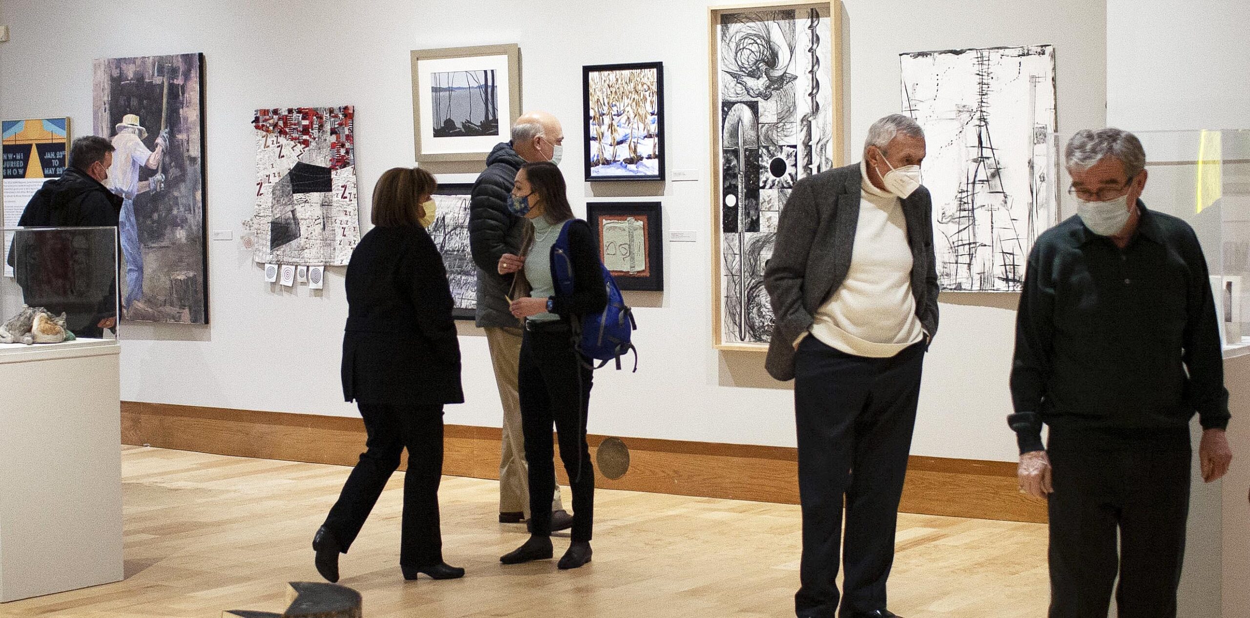
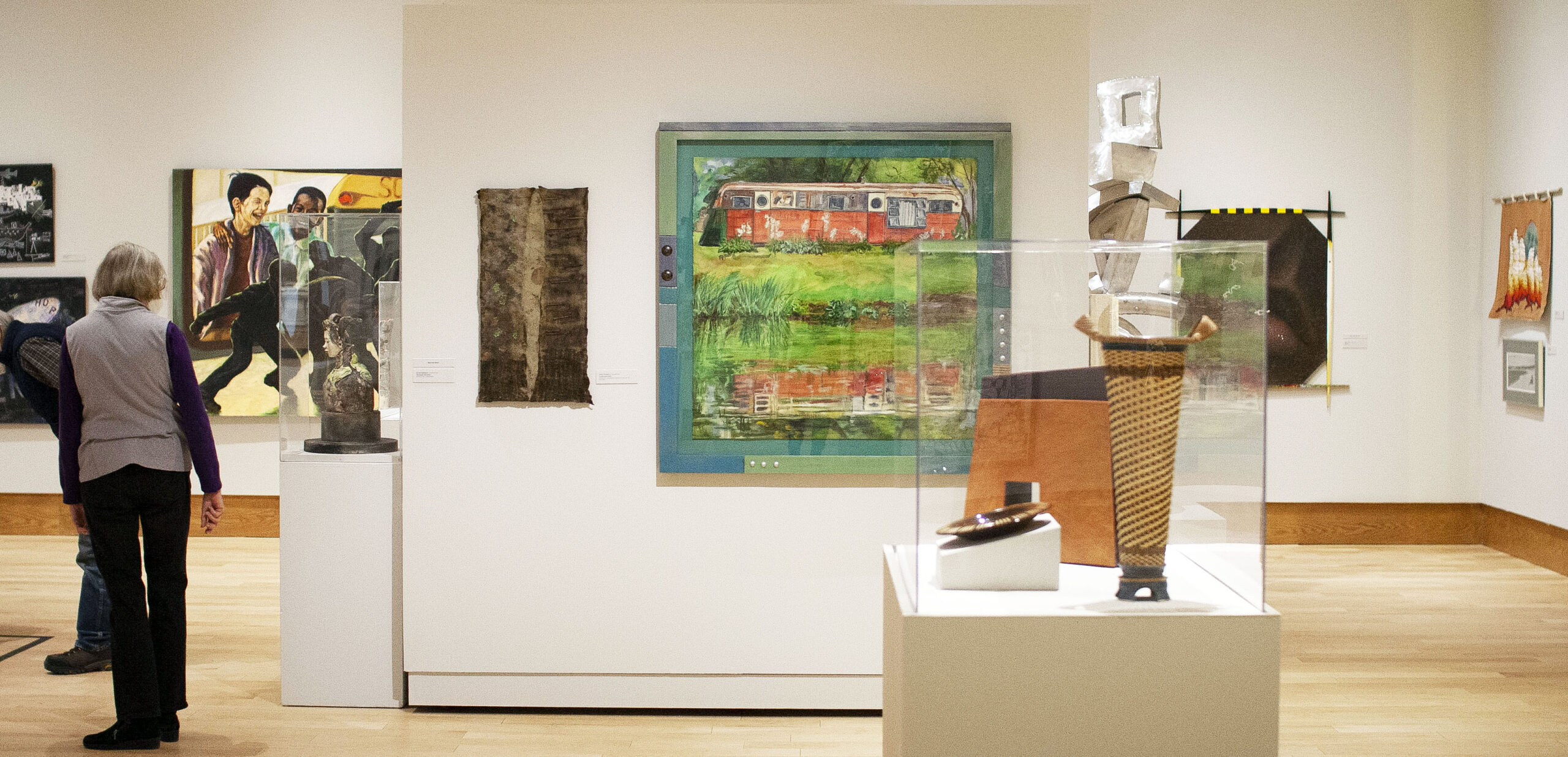
Installation image. All photos courtesy of the Dennos Museum Center

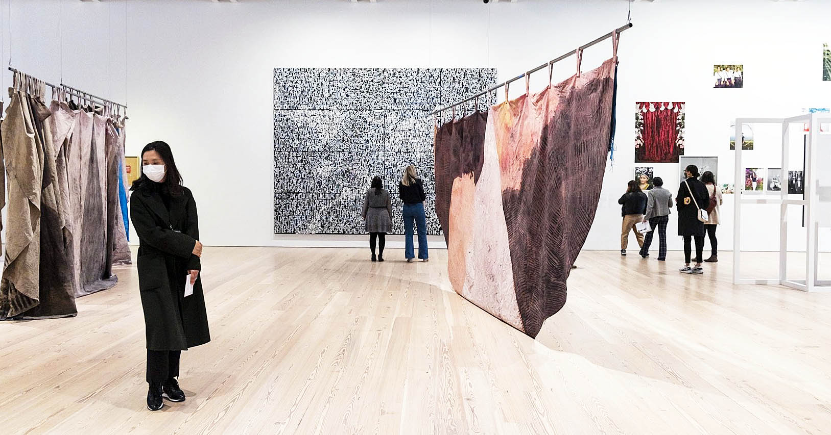
Visiting the Dennos Museum Center in Traverse City is an experience unique to Northern Michigan. Situated at the base of Old Mission Peninsula, since 1991 the Dennos served as a multipurpose art and science museum, and it houses one of the finest collections of Inuit art you’ll ever see. In 2018 it underwent a major expansion, and an impressively large suite of chic gallery spaces now allows the Dennos to show off much more of its permanent collection, and it really does have some good holdings. The museum has even just been awarded status as a Smithsonian affiliate. But while the focus of the museum is on the art within, the floor-to-ceiling windows of many of its exterior galleries offer visitors a commanding view of the pleasantly forested campus of Northwestern Michigan College.  Through May 29, this emphatically northern space is the appropriate home to the annual Northwest Michigan Regional Juried Exhibition.

The show amply fills the museum’s spacious temporary exhibition space. It presents multimedia work by artists from 37 Michigan counties, including the entirety of the Upper Peninsula and much of the Lower Peninsula’s Northwest.  Submissions were open to anyone, providing that the work was created during 2021.  Juried by Vera Ingrid Grant, a curator and writer based in Ann Arbor and whose accomplishments include fellowships at Harvard and Columbia universities, the 90 works on view represent highlights from the show’s nearly 400 submissions.

Dennos Museum Center in Traverse City Installation image.

Any juried show is destined to be varied in scope and media, and these works are certainly diverse– there are 83 artists represented, after all. Painting, sculpture, photography, and illustration join forces with quilting, fabric art, wood art, and pottery, blurring boundaries between fine art, folk art, and handcraft. Nevertheless, some themes do emerge, such as our shared experience of Covid-19, here directly addressed in about half a dozen works. Several works offer social commentary on timely subjects like media saturation and information overload.

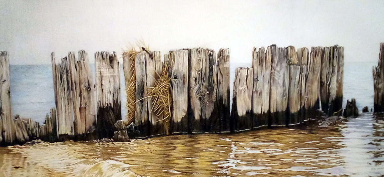
Many of these works take the landscapes, waterscapes, and textures of Northern Michigan itself as their subject. Ample views of Grand Traverse Bay and Lake Michigan’s sand-dunes firmly locate this show in Northern Michigan. Thomas Guback’s Northport Sailboat Race is a photograph that beautifully transposes the lucid diamond-tipped ripples of Lake Michigan’s waters into black and white, applying some of Ansel Adams’ magic to demonstrate that color isn’t necessary to give the viewer an arresting image. And Lynn Stephenson’s tightly rendered pencil drawing of a row of weathered, neglected dock pilings captures a sight common at any marina on Lake Michigan’s shoreline; Stephenson renders the texture of the mostly rotted wood and the ripples of the water with impressively photographic, illustrative detail.

Lynn Stephenson, Still Standing [detail]. 2021, Colored pencil on Paper.

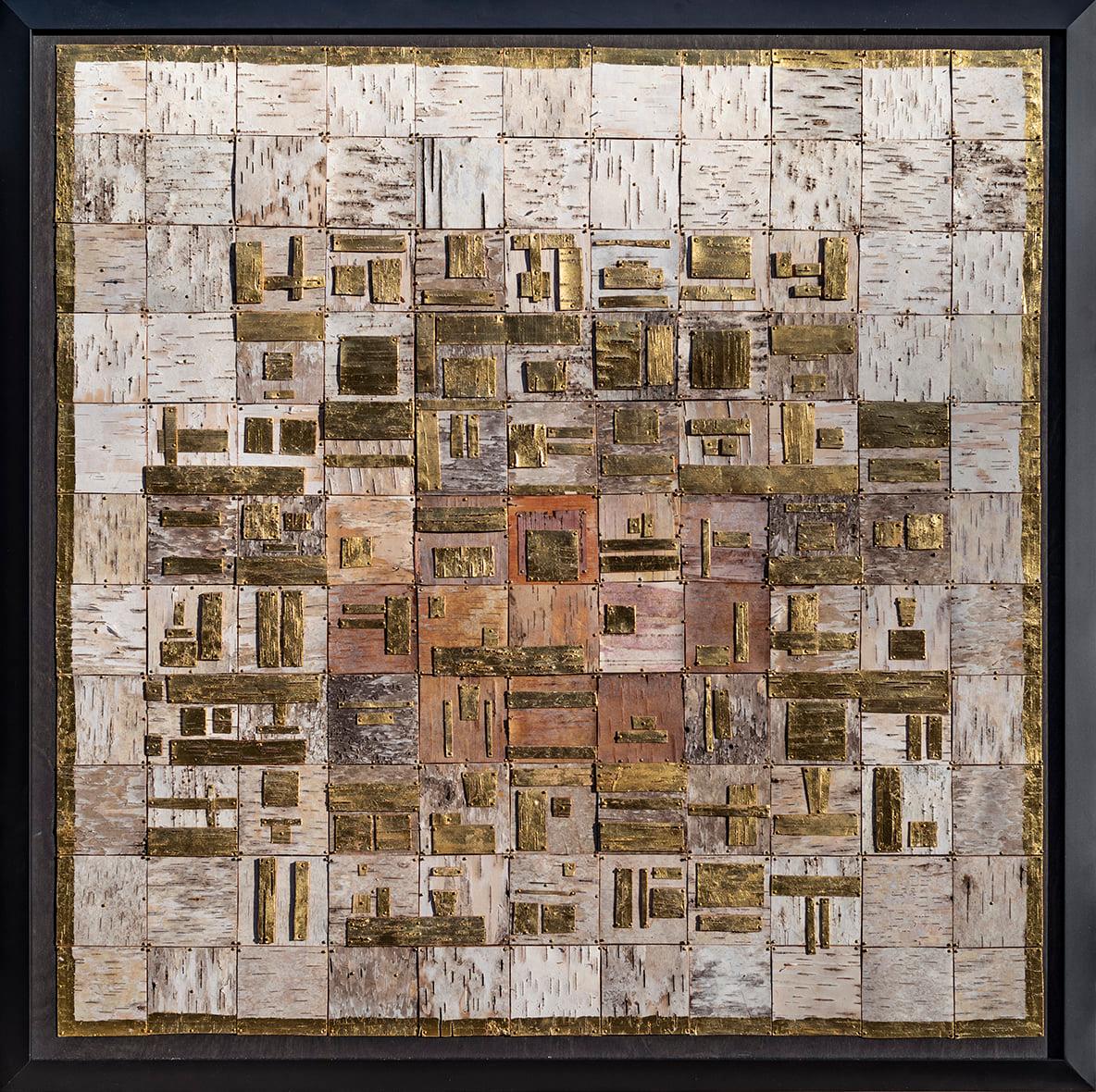
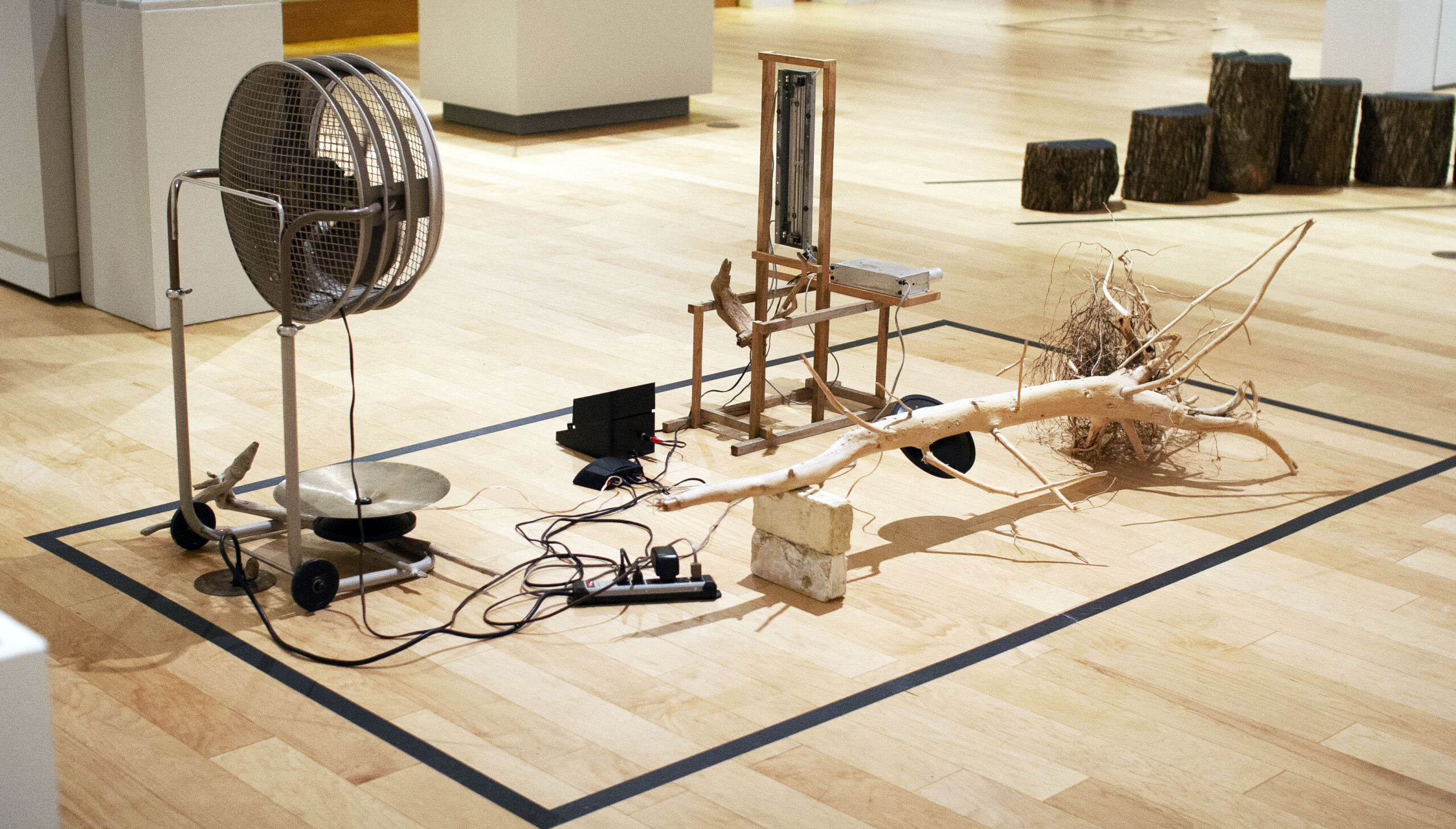
Other artists engaged Northern Michigan’s geography in more playfully abstract terms.  Susan Yamasaki’s Hieroglyphs applies perpendicular, geometric sections of birch bark and mixed media to create what could pass as Northern Michigan’s answer to Mondrian’s Broadway Boogie Woogie. And the Best of Show award went to Kevin Summers, a multimedia artist whose Michigan Shoreline is a conceptual installation comprising driftwood, electronic fans, and sound.

Susan Yamasaki, Hieroglyphs. 2021, Birchbark and mixed media on birch panel.


Kevin Summers, Michigan Shoreline. 2021, Driftwood, fans, and electronics.

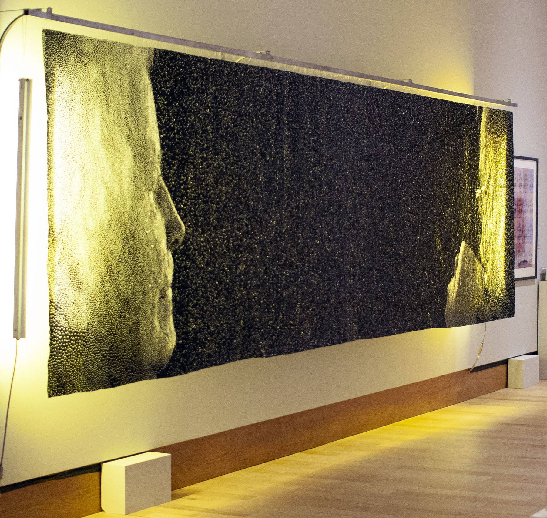
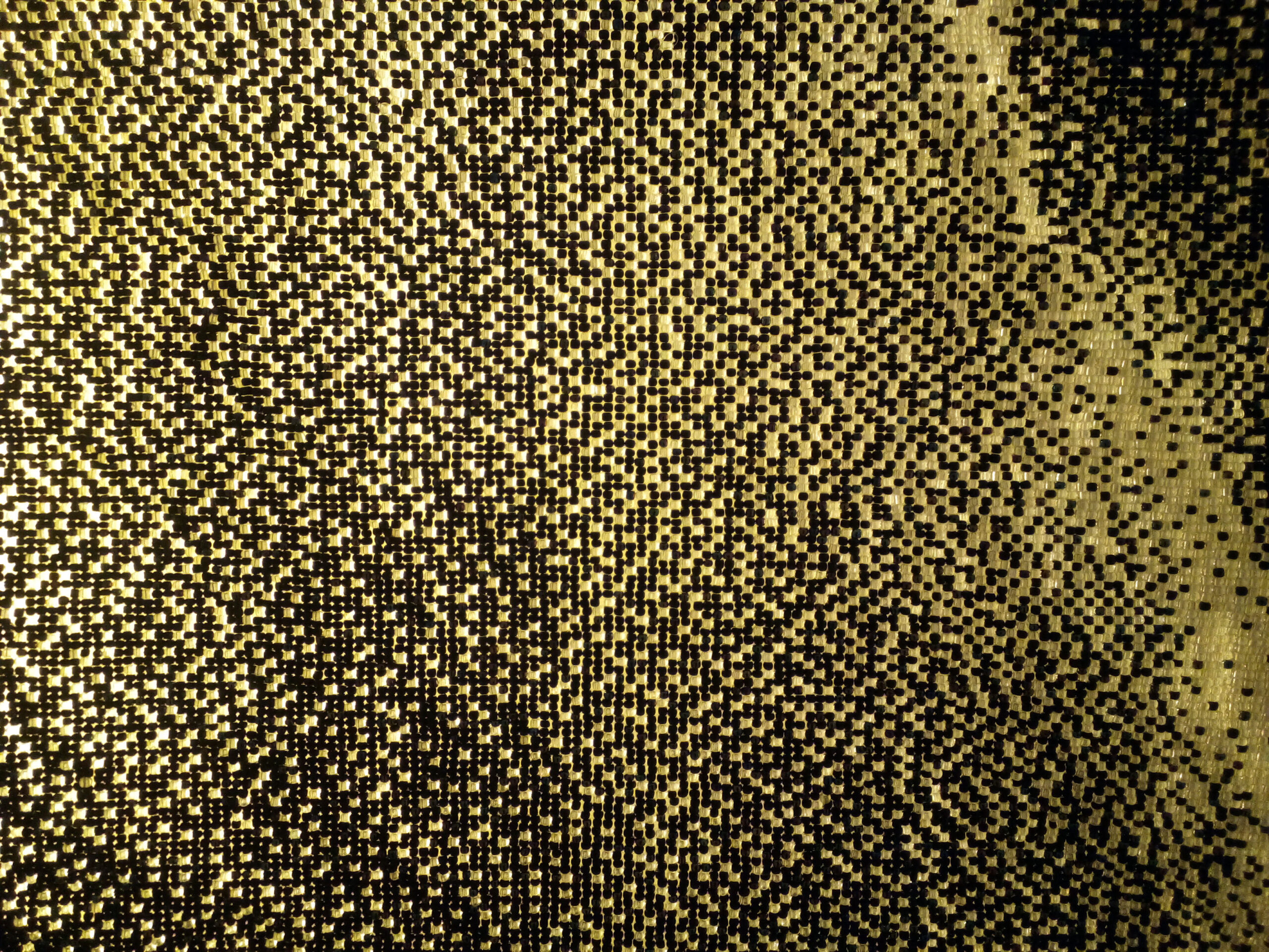
Certain to be a highlight among visitors is the mural-sized bead tapestry by Marie Wohadlo, 10:23. Gently backlit, this work comprises nearly a million individual luminous glass beads. It’s a work that invites viewers to play the same game as one might play with a pointillist work by Seurat. Step up close, and the individual beads create a pixelated, abstract void. Step back, and they materialize into a photographic rendering of two distant faces. The planning and execution of a work on this scale is impressive, even allowing for photographic and technological assistance.

Marie Wohadlo, 10:23 [detail]. 2021, Glass bead tapestry.

Marie Wohadlo, 10:23 [detail]. 2021, Glass bead tapestry.

Shows like this have a leveling, democratizing effect on art. There’s nothing to differentiate the skilled amateurs from the seasoned professionals.  And in the absence of any descriptive didactic panels, viewers are left to interpret these works entirely on their own. Perhaps this is a good thing; too often I find myself relying on an exhibition’s expository text to do much of the thinking for me.  But here, viewers are given the opportunity to approach the work on their own terms, and the works on view are given the chance to speak for themselves.

The 2022 Northwest Michigan Regional Juried Exhibition runs through May 29, 2022. Views of the evergreens on the NMC campus are available all year round.


Allie McGhee @ Cranbrook

Detroit Artist Allie McGhee exhibits a Retrospective, Banana Moon Horn, at Cranbrook Art Museum

Installation image, Allie McGhee, Retrospective, Banana Moon Horn, at Cranbrook Art Museum, all images courtesy CAM

Cranbrook Art Museum (CAM) opened a retrospective exhibition of artwork by artist Allie McGhee on October 30, 2021, which spans five decades of work produced at McGhee’s Jefferson Avenue studio in Detroit.

Laura Mott, the chief curator of contemporary art and design at Cranbrook Art Museum, curated the exhibition. She says, “My interest in Allie McGhee’s work came from seeing his paintings at local galleries in Detroit, but when I did my first studio visit with him, it was a revelation.  In his studio, I saw decades of work and an incredible arc of his artistic practice since the 1960s.  There is also a richness of ideas in his methods of production and research into history and science. When one encounters an incredible mind like Allie’s, it becomes a necessity to tell his story.  Furthermore, his work needed to be contextualized in art history, which is why it was important to have both an exhibition and publication.”

The exhibition brings together artwork that demonstrates the evolution of McGhee’s work back to the 1960’s, beginning with early representational work that quickly evolved to abstraction. McGhee’s work was heavily influenced by trends in the abstract expression movement and influenced by jazz musicians in the Black community.

Andrew Blauvelt, director of Cranbrook Art Museum, said of some of McGhee’s work, “Learning of McGhee’s interest in astronomy, their crumpled and twisted forms have taken on a new resonance, one that recalls the spatial complexities of Catastrophe theory and, in particular, the relative notion of the fold.”

This exhibition takes on more than forty years of paintings and drawings and documents the growth of one of Detroit’s most important artists. The museum produced this short 6-minute video as an introduction to Allie McGhee and his work.

From his recent talk at Cranbrook, the story goes that McGhee came upon an object in the street that reminded him of a KKK hood.  The object was an icing cone used in a bakery.  This occurred in a time period just a year or so after the 1967 Detroit Rebellion and caused McGhee to harness that energy and create an object that hung on the wall alongside a petrified banana, foreshadowing what would repeat itself for years to come.

Allie McGhee, The Ku Klux Klown, Mixed Media on found object, petrified banana, 1961.  All images courtesy of CAM

Ku Klux Klown coincided with his association with a black artist cooperative founded by Charles McGee. Charles organized the landmark 1969 exhibition Seven Black Artists at the Detroit Artists Market and founded Gallery 7. Along with Allie McGhee, members included Lester Johnson, Robert Murray, James Lee, Harold Neal, and Robert J. Stull.  For years, Allie McGhee pursued abstract expressionism using a variety of sizes, shapes, and materials on a flat canvas that hung on the wall. The object and the banana became the center of what was to be called Banana Moon Horn, the title of this exhibition and the Cranbrook publication.

Allie McGhee, TWA Light on Washburn, Mixed Media on canvas, 1989

One of the strongest compositions in the exhibition was from 1989. TWA Light on Washburn, repeats the reoccurring banana symbol that follows him over time. One of the trademarks of McGhee’s work is that he leaves behind the use of traditional brushes for flat sticks of varying sizes to move paint across the surface. In addition, he has a variety of tools to remove paint from a given area, be it cloth, wood or plastic.  This could easily have been when he preferred placing the canvas on the floor instead of using an easel to hold the stretched canvas on a frame. Gravity is his friend on the floor, not an obstacle, where mixing paint worked to his advantage.  In TWA Light on Washburn, we see the primary colors dominating the composition while using the spacing of thirds on the grid, both vertical and horizontal.  There is no evidence of brushwork on the canvas, only the stroke of a long stick he used to create geometric lines, shapes, and sometimes texture. Various values of red, blue, and yellow assist in holding everything together.

Allie McGhee, Apartheid, Mixed Media on Masonite, 48 x 120″, 1984

Most recently viewed in 2017 at the Detroit Institute of Arts as part of a large exhibition, McGhee’s Apartheid was on display in the Art of the Rebellion and Say It Loud, commemorating 50 years since July 23, 1967, when African Americans took to the streets of Detroit to express their anger and frustration with the injustice of law enforcement. It would come to be called the Detroit Rebellion.  McGhee’s work was then being shown by the N’Namdi Center for Contemporary Art. This painting highlights his use of angular shapes and splatters of paint to evoke and represent the tension of the time. The title Apartheid refers to the oppressive political system that existed in South Africa. The Civil Rights and Black Power movements inspired many African American artists to internalize the fight for civil rights in Detroit.

Allie McGhee, Fall Rush, Acrylic on enamel paper, 2013

Throughout his talk at Cranbrook Art Museum, McGhee continued to stress and talk about his approach. “ The process is more important than the subject.” Thanks to his diligent years of daily work, we see the artwork on the floor begin to evolve and ultimately create something very new. The work Fall Rush (2013) is acrylic and enamel on paper where McGhee has applied his sensibility to both sides of this heavy-duty paper and then worked on producing a crushed and folded object that would present itself on the wall. When I first viewed the work, my only context was the artwork by sculptor John Chamberlain who did something similar with scrap metal, usually mounted on a base as in Homer, 1960.  Chamberlain didn’t paint the metal, instead, he would find parts from scrap car lots where he discovered his colors in the parts of fenders and related shapes of metal. Here, McGhee, the painter, created his own material by painting both sides of the paper, canvas or vinyl, and inventing his shape using his well-developed sensibility. He puts his trust in the process.

Allie McGhee, Flip Side, Acrylic on enameled vinyl, 2015

In the piece Flip Side (2015), we see the evolution of this work where he adds elements after the object is created and on the wall. During the artist talk, he mentioned his interest in science and the various visual aspects of the universe, either through a telescope or a microscope.  McGhee mentioned participating in an Art & Science program that paired artists with scientists from the University of Michigan. The artists then made an artwork that was auctioned off to support scientific research. McGhee was seeking information based on scientific discovery where he sought truth and imagery in the cosmos.

And Allie McGhee talked briefly about the role of music in creating art with an emphasis on the Black jazz musicians John Coltrane, Thelonious Monk, and Charles Mingus. They all co-mingled with his process.

Russian abstract artist Wassily Kandinsky has said he was deeply inspired by music. He played the violin from an early age and even gave his works of art musical titles: ‘Improvisations’, Compositions’ and ‘Fugue.

I know I carefully select what I play in my studio. I always select instrumental-only by a variety of musicians like Dave Brubeck, Mozart, or Arvo Part.

Richard Dorment, the art historian, said of Paul Klee, “He started every picture with an abstract mark—a square, a triangle, a circle, a line or a dot—and then allowed that motif to evolve or grow, almost like a living organism.” Whether it is from subconscious dreams or Eric Dolphy on the Saxophone, Allie McGhee worked daily to the sound of jazz. The improvisational riffs provided support for the creation of rich abstraction in the studio, experimenting with materials, making the same mistakes over and over until something emerges and falls into place or rises to the top. What resonates in my thoughts is McGhee’s emphatic statement, “It’s the process, not the subject.”

In the Cranbrook publication, McGhee says, “A really good picture looks as if it’s happened at once. It is an immediate image. For my own work, when a picture looks labored and overworked, and you can’t read in it…there is something in there that has not got to do with beautiful art.  And I usually throw these out, though I think very often it takes ten of those over labored efforts to produce one really beautiful wrist motion that is synchronized with your head and heart, and you have it and therefore it looks as if it were born in a minute.”

Allie McGhee, Bloom, Acrylic, and enamel on fiberglass, 2019

In the acrylic and enamel on fiberglass Bloom, McGhee gives the viewer some insight with the title and adds details to the piece after its painted and folded creation. Who knows? The inspiration may have come from a memory of sitting at his mother’s kitchen table where some flowers were blooming in a vase. We see the surface where the artist draped and dragged the stick over the fiberglass on the floor, then the folding produced fluidity and pattern.

Laura Mott quoted McGhee in her writing about him as saying, “I can tell stories in my paintings about these significant contributions made through our history. To me, that’s a lot more exciting scientifically, spiritually, and visually to feed off of. It’s never-ending. The only limitation is the entire cosmos…I don’t think I will be able to use that up in my lifetime.”

Allie McGhee, Long Look, Acrylic and enamel on vinyl on wood. 2021

Right when you think these folded and crushed colorful objects art are the beneficiaries of a life’s work and might be his last body of new work, he comes back with new flatwork on the wall, like the painting, Long Look, an acrylic and enamel paint on vinyl attached to wood. Is he looking through a microscope or a telescope? Or is he reading The Elegant Universe by Brian Greene about how artists look to science for inspiration?  From the Cranbrook publication, McGhee writes, “I will see the Science section of The New York Times where there will be a photograph that is almost identical to something I painted years ago, like a picture from the Hubble telescope.”

There is something to be said about McGhee’s longevity with respect to being able to continue his process and reap the success of this later work. He is still exploring his evolutionary process, a painter of extraordinary ability who continues to contribute to the art record of Western civilization.

Allie McGhee exhibits a Retrospective, Banana Moon Horn, at Cranbrook Art Museum, through February 13, 2022.


Zenax @ Library Street Collective

Untitled (high blood pressure, depression, antipsychotic, depression, anxiety) by Beverly Fishman, 2021, urethane on wood panel, 48” x 113” photo: K.A. Letts

Zenax, an exhibit featuring thought-provoking work by two creative voices in dialog, is on view at the Library Street Collective until January 6. Detroit artist Beverly Fishman and California painter Gary Lang have combined the words Zen and Xanax in the exhibit’s title, creating a neologism that deftly names each artist’s thematic intent. The work of both bears a passing resemblance to the self-referential minimalist paintings and constructions of Frank Stella and Kenneth Noland, but Fishman and Lang appropriate and subvert the memes and tropes of 1960’s and 70’s minimalism to achieve their very different–and quite specific–goals.

Beverly Fishman

Fishman’s wall constructions speak the language of manufactured consumer products, of blister packs and digital devices. But most especially they speak the language of pharmaceuticals. As part of her ongoing studio practice, she explores the implications, both good and not-so-good, of pharmacological self-modification in emotion and behavior.

Fishman has researched, online, the seductive shapes, colors, and surface sheen of pills and drug packaging to develop her idiosyncratic visual vocabulary. Using these found shapes as source material, she begins her creative process with collages in a variety of materials and in colors that range from the fleshy pink tints of makeup to paint sample colors from the hardware store. Specialists then fabricate the slightly convex trapezoids, rounded polygons and bisected sections of circles. They are finished with smooth, featureless surfaces in consumerist colors, which are assembled into the final artworks. Fishman links the slickly constructed components based on her intuitive sense of how the shapes and colors interact. Her compositional intention is tore-configure and re-arrange them “until they finally surprise me.”

Untitled (depression, depression, adhd) by Beverly Fishman, 2021, urethane on wood panel, 42´x 43” photo: K.A. Letts

Fishman’s 5-piece wall construction, Untitled (high blood pressure, depression, antipsychotic, depression, anxiety), is the largest of the four pieces she has contributed to Zenax, and showcases her creative strategy. The color palette is an aggressively pleasant combination of pastel and neon hues that are at once both attractive and slightly ominous. The consumer-friendly colors—pinks, aquas and burgundies—are bordered by neon reds, greens and oranges that both unify the composition and militantly guard the boundaries of the constituent shapes.

Perhaps more than most artists, Fishman uses the titles of her wall constructions to guide the viewer toward her underlying theme. She both praises and condemns modern medicine for giving us the dubious capacity to deliver social control on a molecular level–scientific advances with unexpected side effects. Her somber observation:  pharmacology has advanced to the point that drugs can control not only how we behave, but what we are allowed to feel.


Gary Lang

After the chilly perfection of Fishman’s shaped artworks, the three paintings by Gary Lang in Zenax seem almost lyrical. While subtle, the sweep of his brush and its interaction with the surface of the painting is palpable and ever-present. Lang works within the same visual language of geometry and optics as Fishman, but his aim is transcendence. His meditative use of repetition and a highly organized, yet intuitive compositional methodology results in paintings that seem to vibrate with silent energy.

Maverick 2 by Gary Lang, 2021, acrylic on canvas, 53” x 53” photo: K.A. Letts

Lang skillfully wields the optical properties of his colors to manipulate the perception of the space within his paintings. Maverick 2, shows this strategy at work. A black square-framed in white marks the outer boundary of the painting. A thinner black and white frame repeats the outer boundary and seems to invite entrance. Two flat bands of green and orange mark the surface of the inner picture plane, with a gray shadow seeming to raise them slightly off the surface. Lang leads the eye into the fictive space behind the surface with carefully calibrated, concentric veils of translucent yellow-green. Yet another double band of flat color delivers us–finally–to the glowing inner core of the painting.

His painting ROR bears a passing resemblance to the Ojo de Dios, a native American votive object, and provides another clue to the meditative aims of the artist. The repeated black diamonds alternating with flat primary bands and the graded yellow-green layers fading into white light once again beckon the viewer toward a higher state of being.

ROR by Gary Lang, 2021, acrylic on canvas, 91” x 103” photo: K.A. Letts

While the alternating and telescoping colors within the paintings appear calculated, for Lang they are intuitive. In a 2015 interview with Eric Fischl, he describes his method: “I juggle colors and spatial ratios compulsively prior to painting in order to get a mutable footprint, and adjust and articulate my notations spontaneously once [I am] painting.” The result is a body of work that invites comparison to sacred objects and altered states.

The artworks in Zenax share a common formal vocabulary that allows an interesting dialog between two artists who wield similar means toward contrasting ends. Fishman flatly rejects the purely formal; her work is specifically referential and represents a kind of socially engaged abstraction. Lang’s aims are specific as well but refer to the life of the spirit. Consciousness is the subject at hand for both artists though: its nature, its susceptibility to alteration by means pharmacological or spiritual. It’s a conversation worth having.

Zenax @ Library Street Collective install image courtesy LSC.

Zenax @ Library Street Collective through January 6, 2022


Rosalind Tallmadge @ David Klein Gallery

David Klein Gallery Hosts Rosalind Tallmadge Exhibition: Terrain

The lion’s share of Rosalind Tallmadge’s large, luminous paintings in “Terrain” at Detroit’s David Klein Gallery call to mind relief maps, drone’s-eye views of alien, metallic worlds with surfaces both beautiful and hard, and utterly inhospitable to human life. The show, which features work all completed in 2021, is up through Dec. 18, 2021.

But these light-filled, fraught surfaces are actually more earth-bound than you might initially guess because, in addition to piling up natural elements in rich, stratified layers, Tallmadge pulls in a range of man-made materials that evoke both fashion and femininity, whether sequins, glass beads, or glitter. And who doesn’t like glitter?

Installation image of “Rosalind Tallmadge, Terrain,” which is up at Detroit’s David Klein Gallery through Dec. 18. Images courtesy of David Klein Gallery

Several of the most striking pieces on display, including “Ember,” “Dusk Lightning” and “Cross Section X” are so highly reflective, despite their variegated texture, you’d swear they were giving off heat. This is particularly the case with the appropriately named “Ember,” which is covered in a rose-toned gold leaf that resembles polished copper and hooks you with seductive warmth and the lure of the sparkle.

These are paintings with a visceral physical presence, products of a creative synthesis Tallmadge, a 2015 Cranbrook Academy of Art graduate now living in Brooklyn, N.Y., terms “disco alchemy.” For all their brightness, these works ideally call for consideration over the long term, an unhurried process of getting to know the idiosyncratic geography on each sequin-fabric canvas. They’re not cheap dates. They’ll reveal even more of themselves over time.

The rewards associated with this work, it must be noted, are not of the chirpy sort. The paintings exude an almost Cassandra-like vibe, glimpses of an out-of-control future, however glittering. Some pieces are utterly beautiful – there’s no other word. But they’re all grave in aspect as if they sprang from worlds where the zeitgeist is grim.

Rosalind Tallmadge, “Cross Section XII,” Pewter leaf, mica flakes & powdered glass on sequin fabric, 20 x 16 inches, 2021.

Unspooling the cosmic metaphor a bit further, Tallmadge has invested these works with a certain timelessness, geologic in breadth, that seems to span millennia by the hundreds. There’s something ancient and fire-blasted about them. Indeed, some look very much like metallic lava of impossible purity, somehow produced in the igneous cataclysm of a volcanic eruption. Or perhaps they’re the product not of catastrophe but unending, unyielding metamorphic heat and pressure, like gemstones. In any case, time hangs heavy on them. Little wonder, perhaps, that a 2018 exhibition Tallmadge had at Marquee Projects in Bellport, N.Y. was titled “Deep Time.” For its part, Brooklyn’s Carvalho Park gallery, where Tallmadge had a show in 2019, termed the Cincinnati native’s work “nebulous and spectral.”

This is what you hope for when you’re a serious art student. Shortly after Tallmadge got out of grad school, David Klein mounted a solo show for her in 2016. Her work has also been exhibited in New York City, Seattle, and Chicago. Prestigious residences she’s snagged include ones at the Oxbow School of Art and the Yale Summer School of Art.

For her part, Tallmadge says in her artist’s statement that she wants to create “elusive, experiential paintings that activate the viewer’s body through their seductive light-based surfaces.” They’re meant to evoke, she adds, “degraded urban surfaces or worn rocks you would happen upon in nature.”

The online, French-language mezzanine notes that Tallmadge “does not paint canvases. She creates atmosphere.” The journal added, “With her, the celestial immensity becomes tangible, though always remains mysterious.” For her part, the artist responds to a question by noting that her paintings “are also a reflection of my daily life in New York. The asphalt surfaces, the worn-out sidewalks, and subway walls furnish my subconscious.”

Rosalind Tallmadge, “Ember,” 22K rose gold leaf, mica flakes & glass beads on sequin fabric, 64 x 60 inches, 2021. An oblique angle highlights Tallmadge’s remarkably textured surfaces.

The natural material that Tallmadge employs most, jammed up against her beads, glitter, and sequins, is mica. There’s an intriguing balancing act going on here between, to use the terms very loosely, the feminine and the masculine. Falling into the latter category are surely the chunks of glittering mica – a shiny form of silica that breaks into wafer-thin, translucent layers—that Tallmadge employs all over her thickly textured canvases. There’s something in mica’s very instability, always threatening to fracture, that plays a role here as if to say, “I glitter, but beware – I’m also brittle. I shatter.”

Rosalind Tallmadge, “Omen,” Mica stone, liquid glass concentrate & pumice on birch panel, 30 x 30 inches, 2021.

 These qualities are on full display with “Omen” and “Estuary,” both crafted from larger pieces of mica stone and pumice. They’ve got smoother surfaces, a break from Tallmadge’s rich impasto elsewhere, and are less raked and eroded than many of the other works on display. “Omen” almost looks like one sheet of black-brown glass that’s been violently shattered but still miraculously holds together. “Estuary,” despite its riverine name, when viewed up-close, looks a bit like the inside of an astonishing geode when you’ve sawed a rock in half and polished the surface.

By contrast, “Cross Section XII,” fabricated with powdered glass and pewter leaf – Who knew?— is blistered and brooding. To return once again to the planetary metaphor, it looks a bit like a silvery moon that’s been battered and scoured by solar winds and remorseless radiation.

Rosalind Tallmadge, “Ember” (detail), 22K rose gold leaf, mica flakes & glass beads on sequin fabric, 64 x 60 inches, 2021.

Particularly with the most heavily textured canvases, it’s fun to examine the surface off to one side and at an acute angle to maximize your appreciation of just how 3-D and stratified these meticulous constructions really are. It’s also gratifying that this is a spaciously hung show, with no cramming works together in unnatural, close proximity. This is important in part because of the glow most of these give off, a nimbus you wouldn’t want competing with radiance from another work right next door.

Rosalind Tallmadge, Terrain” will be up at the David Klein Gallery in Detroit through Dec. 18, 2021


Page 4 of 7

Powered by WordPress & Theme by Anders Norén