Wayne Thiebaud 100: Paintings, Prints, and Drawings @TMA
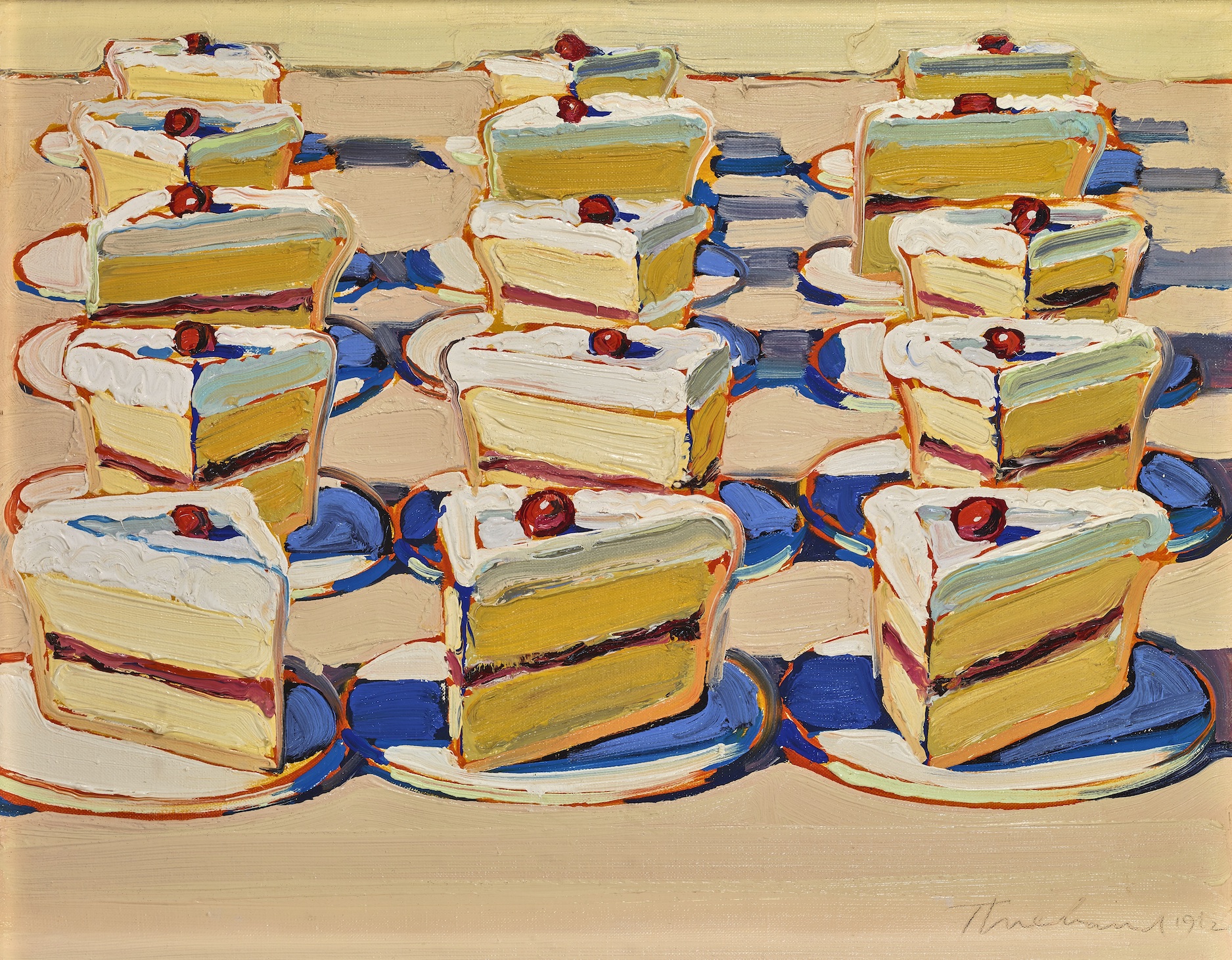
Wayne Thiebaud, Boston Cremes, 1962. Oil on canvas, 14 x 18 in. Crocker Art Museum Purchase, 1964.22. © 2020 Wayne Thiebaud / Licensed by VAGA at Artists Rights Society (ARS), NY.
Prior to the Toledo Museum of Art’s exhibition Wayne Thiebaud 100: Paintings, Prints and Drawings, all my knowledge of the artist came from a handful of images from 20th Century art history books, which mostly featured his paintings of slices of cake behind glass which, like the repetitive Campbell’s Soup cans of Andy Warhol, offered subtle commentary on postwar commercialism and mass-production. But here we’re exposed to the full breadth of his artistic career, which also encompassed still life painting, portraiture, landscapes, cityscapes, and more, and all in a broad array of media. While Thiebaud may have initially made his mark as a staple of Pop-art, this exhibition reveals that his work is surprisingly diverse and rooted in art-historical tradition, and that he had an uncanny ability to translate centuries-old genres into the artistic vocabulary of the 20th and 21st Centuries.
Born in 1920, Wayne Thiebaud’s panoramic career has taken many trajectories, and it isn’t over yet. When he was just sixteen, he took a job at Walt Disney Studios, working as an animator for Pinocchio and a variety of film shorts. During the Second World War he joined the airforce intending to become a pilot, but was transferred to the Special Services Department where he worked as a map, mural, and poster designer. After the war, he both studied and taught at Sacramento City College, and fell under the influence of the New York School of postwar abstract expressionists, such as Pollock, Kline, and DeKooning, whose gestural abstract style he conscientiously began to quote in his own work, as in his very abstract painting The Sea Rolls In (on view in this exhibition). But Thiebaud ultimately preferred representational art, and in his serialized paintings of frosting-rich plates of cake, he found a way to synthesize the gestural impasto of DeKooning with the illustrative nature of traditional still-life painting.
Filling the entirety of the TMA’s spacious Levis Gallery (and even spilling over into a large adjacent gallery) are chronologically arranged works which span the breadth of Thiebaud’s career, some on view for the first time. Trucker’s Supper, a work in the TMA’s permanent collection, sets the tone of much of the subsequent work on view; a plate with a slab of roast beef and some french fries inhabits a stark-white indeterminate background space, all the paint rendered in rich imposto (an effect which mostly gets lost in translation when these works are reproduced in books or online). Thiebaud was a figurative and illustrative artist, but if you step in close, you’ll see passages of brushwork that reveal his admiration for his abstract expressionist counterparts. While his paintings are certainly not hyperrealistic, in applying the paint so thickly some of his paintings of cakes become almost sculptural, and the paint mimics the texture of frosting with a surprising realism bordering on trompe l’oeil trickery.
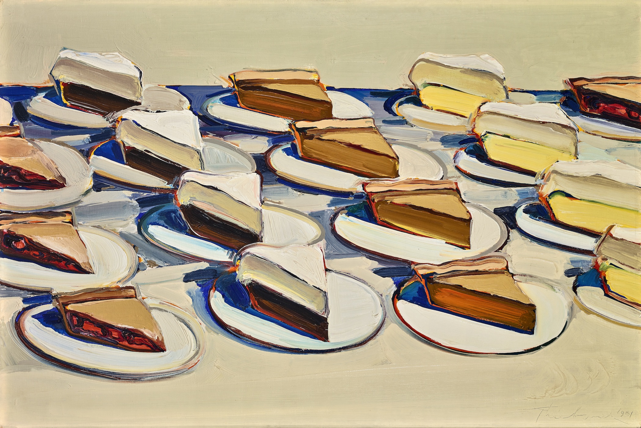
Wayne Thiebaud, Pies, Pies, Pies, 1961. Oil on canvas, 20 x 30 in. Crocker Art Museum, gift of Philip L. Ehlert in memory of Dorothy Evelyn Ehlert, 1974.12. © 2020 Wayne Thiebaud / Licensed by VAGA at Artists Rights Society (ARS), NY.
After firmly (and perhaps unwittingly) establishing his reputation as the painter of cakes and pies, Thiebaud explored figure painting so as not to be defined by a single subject. Like his still lifes, his figures generally inhabit empty white spaces, recalling the portraits of Manet, who often placed his figures against grey, uninhabited space (as he did with his portrait of the French journalist Antonin Proust, a work in the TMA’s collection just a few galleries away).
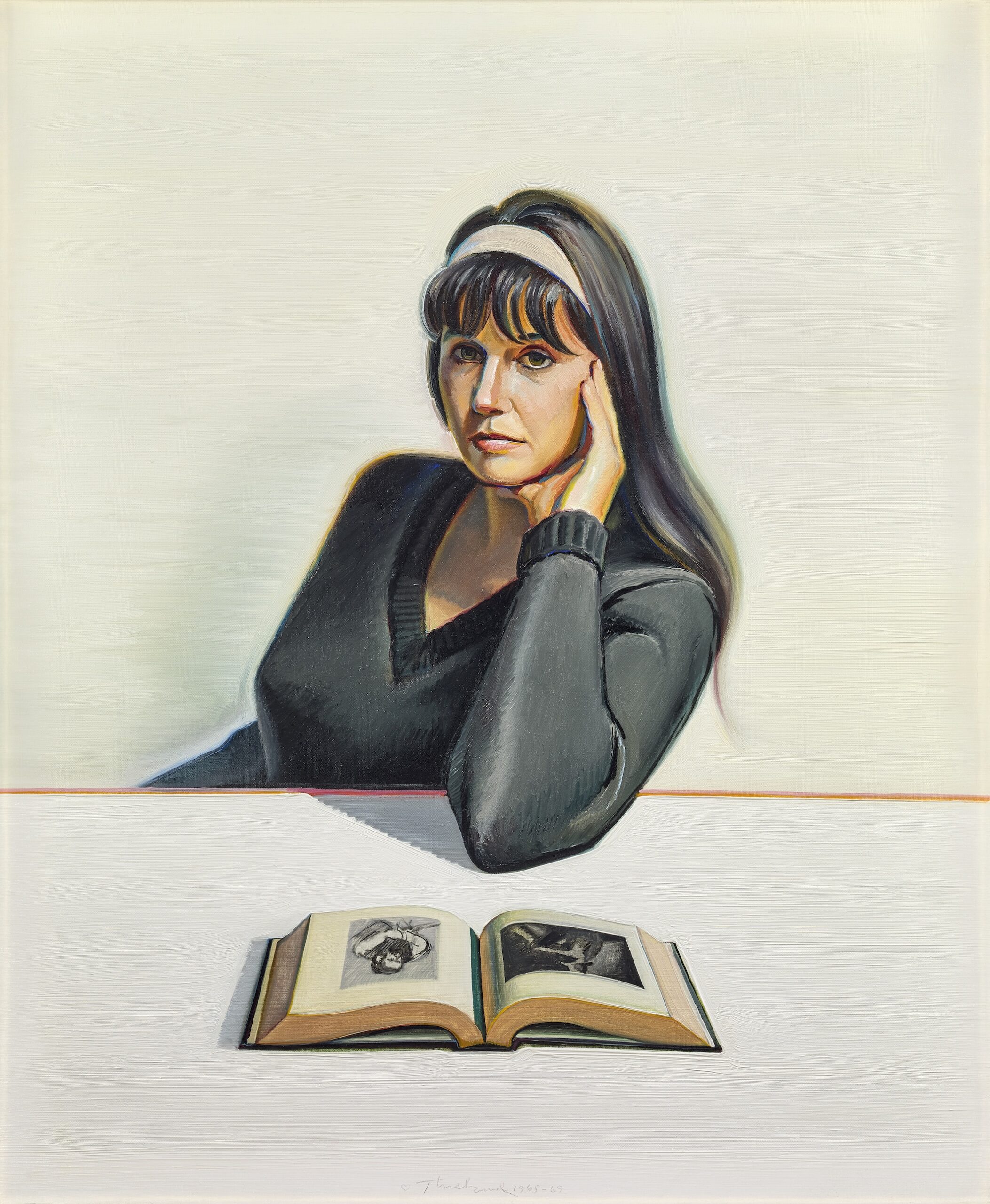
Wayne Thiebaud, Betty Jean Thiebaud and Book, 1965–1969. Oil on canvas, 36 x 30 in. Crocker Art Museum, gift of Mr. and Mrs. Wayne Thiebaud, 1969.21. © 2020 Wayne Thiebaud / Licensed by VAGA at Artists Rights Society (ARS), NY.
Thiebaud was largely unsatisfied with his early attempts at portraiture, however, and in the 1960s he turned toward landscapes and cityscapes, genres he would continue to explore in subsequent decades. But his treatment of the subject is joyously whimsical. Thiebaud’s improbably vertical cityscapes and landscapes heave and buckle in a visual parody of the streets of San Francisco and the mountainous terrain surrounding the San Fernando Valley. Some of these stylized landscapes feature parabola-shaped hills, and seem like playful, almost cartoon-like caricatures of the land (in the 1940s, Thiebaud indeed worked for a while as a cartoonist).
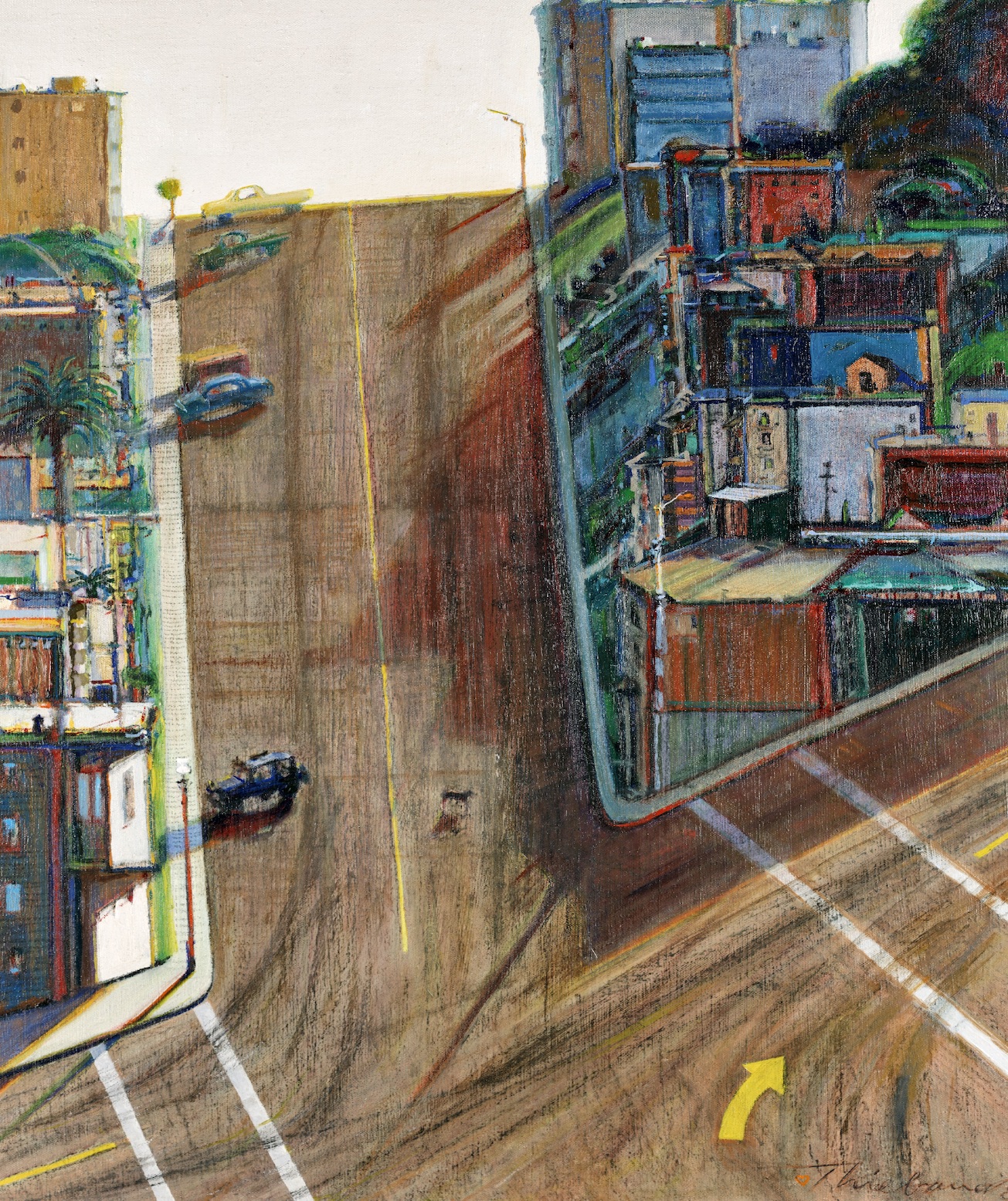
Wayne Thiebaud, Street and Shadow, 1982–1983/1996. Oil on linen, 35 3/4 x 23 3/4 in. Crocker Art Museum, gift of the Artist’s family, 1996.3. © 2020 Wayne Thiebaud / Licensed by VAGA at Artists Rights Society (ARS), NY.
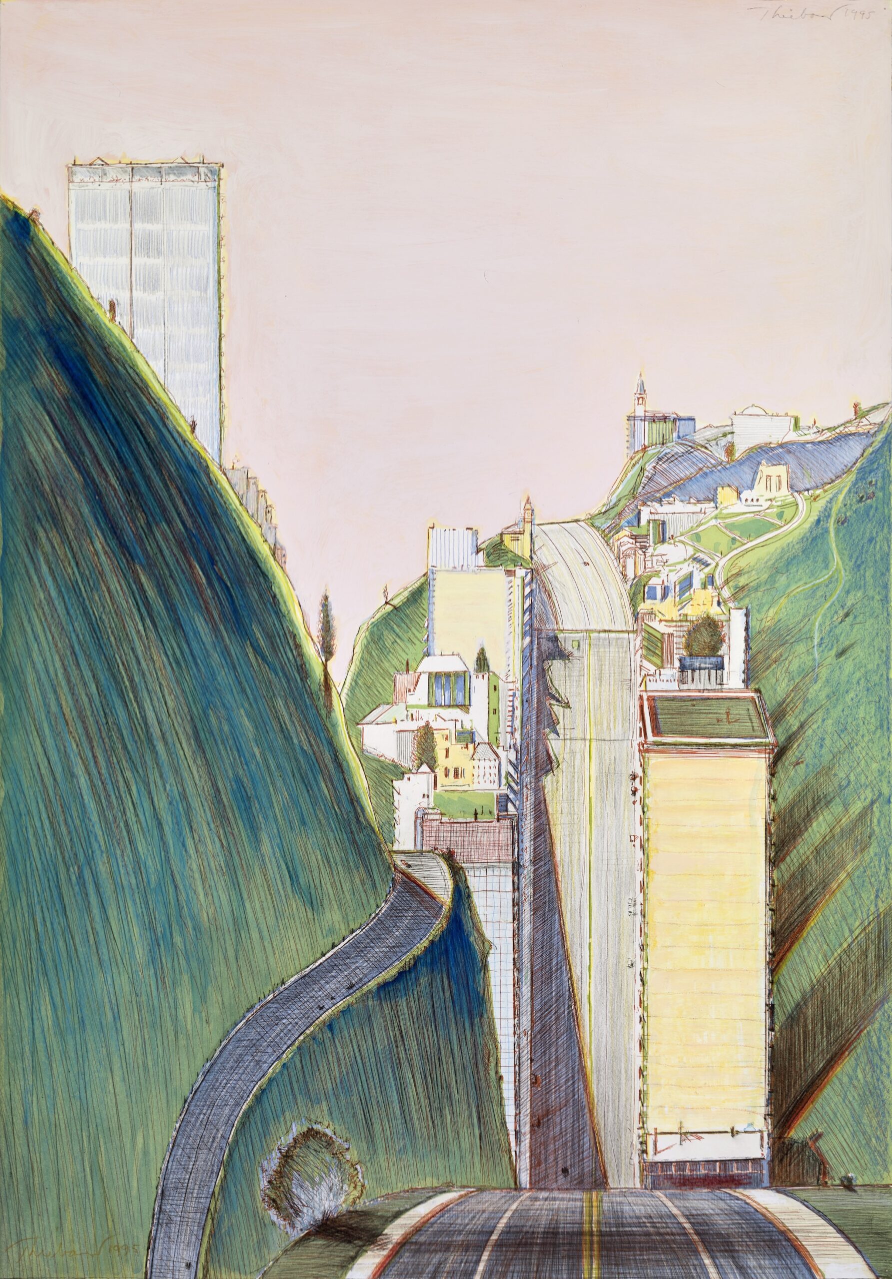
Wayne Thiebaud, Park Place, 1995. Color etching hand-worked with watercolor, gouache, colored pencil, graphite, and pastel, 29 9/16 x 20 3/4 in. (sheet/image). Crocker Art Museum, gift of the Artist’s family, 1995.9.50. © 2020 Wayne Thiebaud / Licensed by VAGA at Artists Rights Society (ARS), NY.
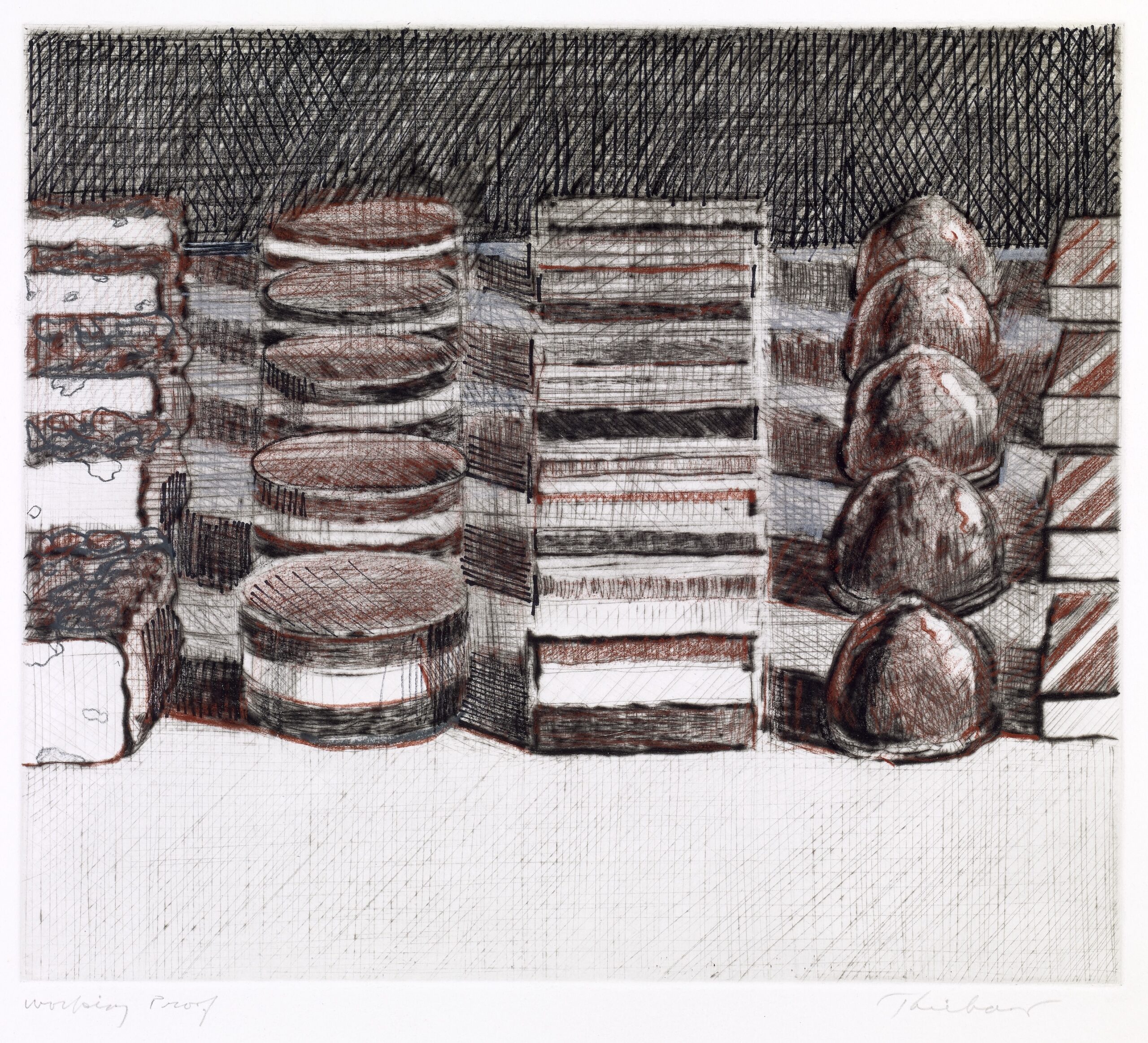
A generous selection of prints and drawings makes the point that Thiebaud was also a consummate draftsman. He was interested in printmaking for the entirety of his career, and in Delights (a series of seventeen aquatints), Thiebaud applied the visual textures of hatching and cross-hatching to replicate in a different media the tactile textures we find in all his previous still lifes. Featuring reductive, scribbled-in illustrations of cakes, pies, and ice-cream cones, these small prints have the stylized polish we might expect of a New Yorker cartoon (a publication for which Thiebaud illustrated many covers, and subscribers to the magazine will have recently seen his painting Double Scoop grace the August 17, 2020 issue).
Wayne Thiebaud, Dark Chocolates, n.d. Etching hand-worked with colored pencil, 8 7/8 x 10 1/4 in. (plate), 14 3/8 x 15 1/4 in. (sheet). Crocker Art Museum, gift of the Artist’s family, 1995.9.36. © 2020 Wayne Thiebaud / Licensed by VAGA at Artists Rights Society (ARS), NY.
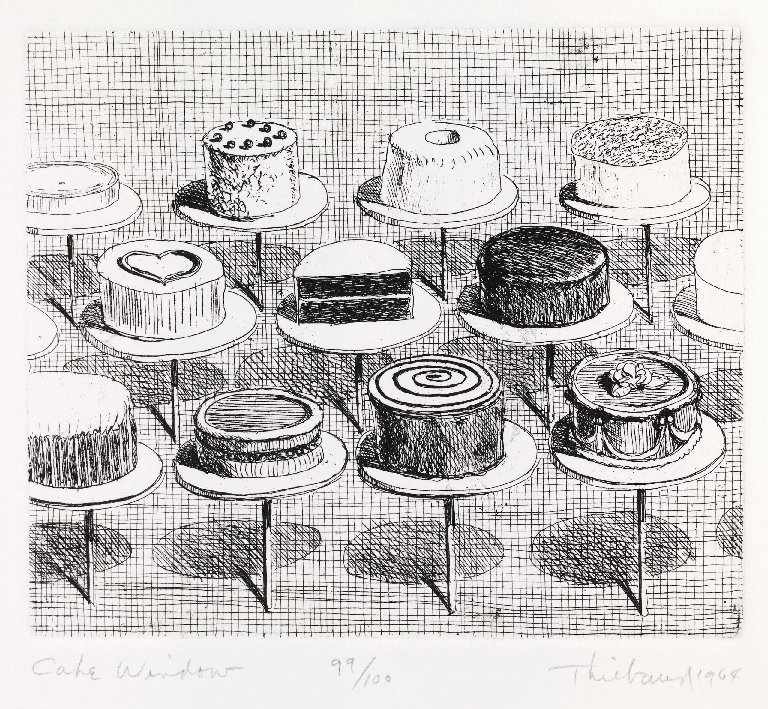
Wayne Thiebaud, Cake Window, from Delights series, 1964. Etching, 4 15/16 x 5 7/8 in. (plate), 12 3/4 x 10 3/4 in. (sheet). Crocker Art Museum, gift of the Artist’s family, 1995.9.1.13. © 2020 Wayne Thiebaud / Licensed by VAGA at Artists Rights Society (ARS), NY
The show concludes in an adjacent gallery space which showcases some of his recent work, which is largely a continued exploration of earlier themes and genres. But here we also find an ensemble of paintings that feature clowns, a new subject in his work. Stylistically, these subtly parallel his paintings of cake and pies, and much as Thiebaud used paint to replicate the thick frosting on a cake, here it replicates impastoed clown makeup.
Wayne Thiebaud 100: Paintings, Prints, and Drawings is a diverse and sprawling exhibition, which is exactly the sort of retrospective the artist deserves given the breadth and depth of his oeuvre. While Thiebaud developed a distinctly recognizable style of his own, he was never bound to a specific theme or genre, and this exhibition triumphantly gives the lie to any notion that Thiebaud was simply the Pop-era painter of cakes and pies.
Wayne Thiebaud 100: Paintings, Prints, and Drawings is on view at the TMA until May 2, 2021