“Cynthia Greig: Sans Souci”
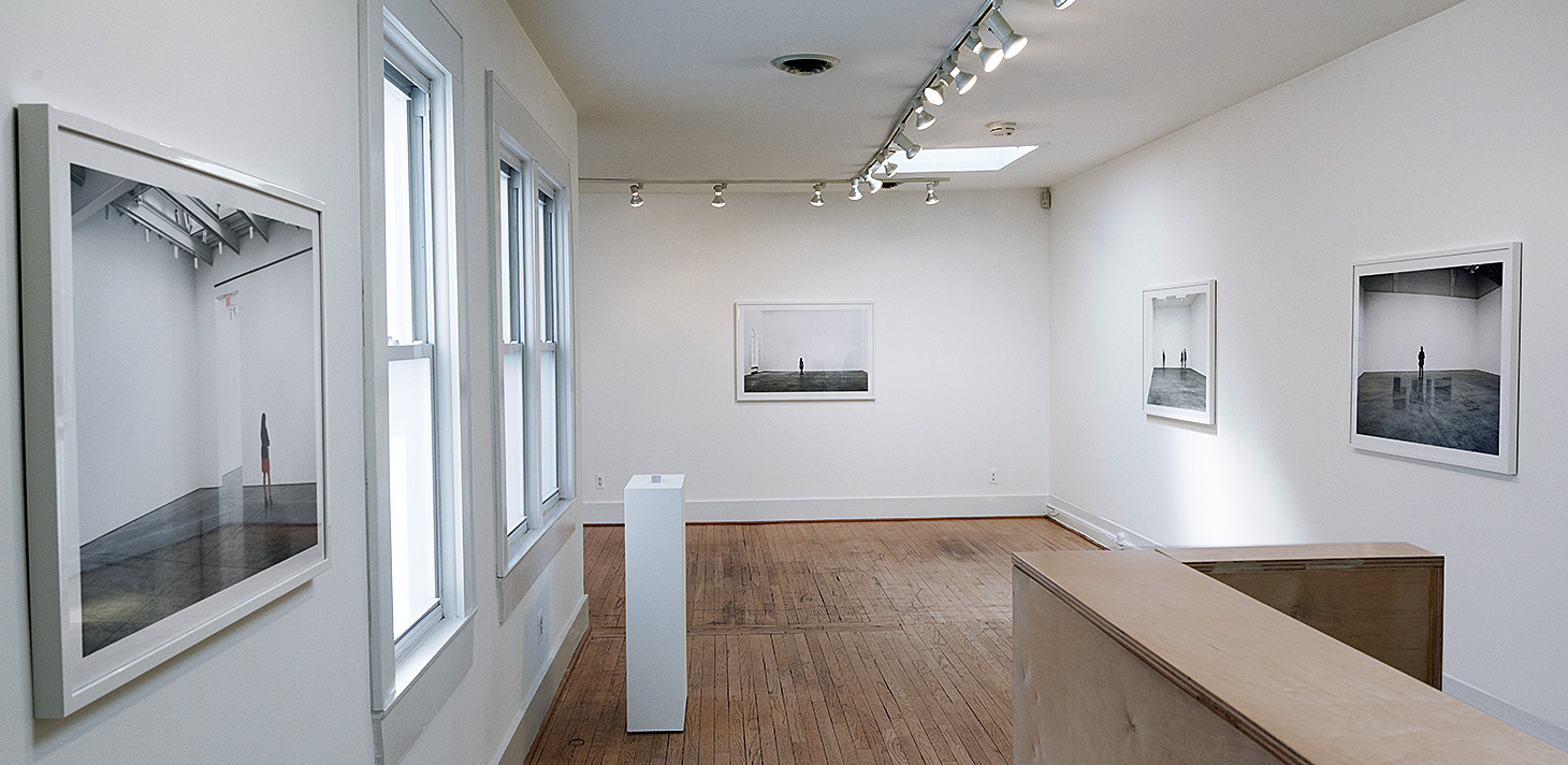
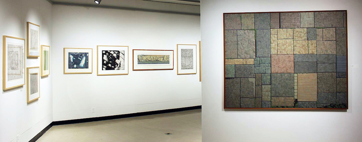
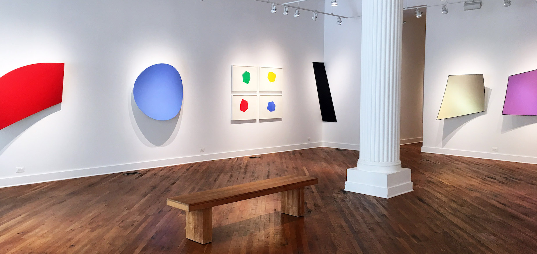
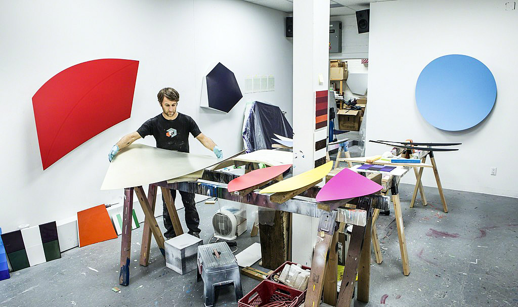
Installation view of “Cynthia Greig: San Souci,” Paul Kotula Project, all images courtesy of Cynthia Greig
We have been looking at Cynthia Greig’s elemental photographs for years now. We look at them for their elegant and deceptive simplicity and uncanny calm. She has choreographed complex, intriguing photographic projects that engage art history and manipulated narratives that parody the representation of gender construction and sexuality. Both her “Representation” and “Nature Morte” (Still Life) series, with their ghostly picturing of common objects (household fan, globe, coffee cups) and traditional still lifes (with fruit, wine glasses, books, flowers) befuddle our definition of painting and photography, while exuding a formal sensuality and intriguing beauty.
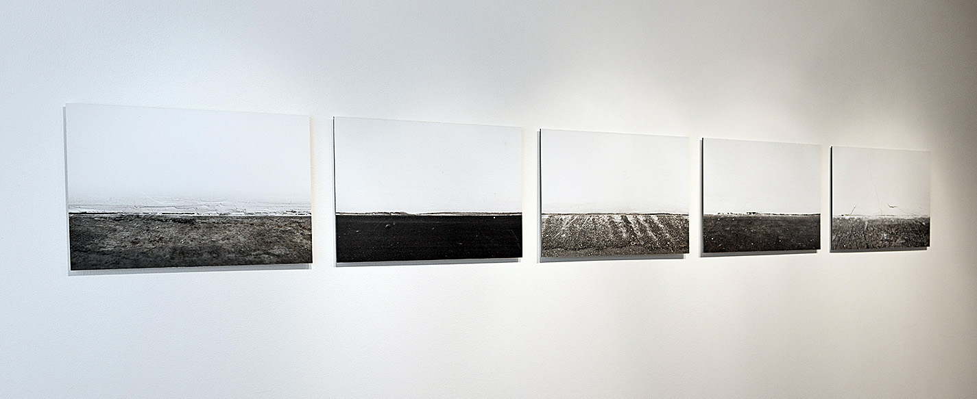
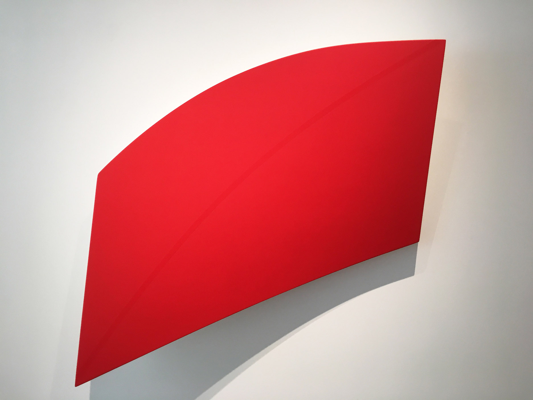
Cynthia Greig, “Gallery Horizons,” archival pigment prints, 14.5”X 22,” 2013
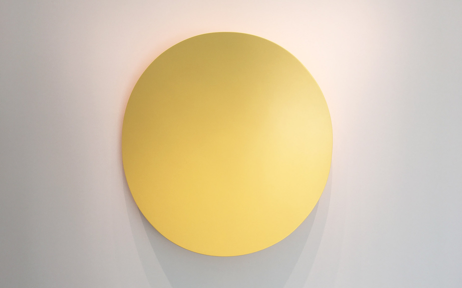
Her current project, “Cynthia Greig: Sans Souci,” at Paul Kotula Project, continues her interrogation of the institution of art, with images of the interiors of well-known art galleries. A series she refers to as “Gallery Horizons,” features five pictures of the intersecting seam of where the floor of the gallery meets the wall. One of the iconic features of contemporary galleries is their characteristic flat gray cement or shiny, polyurethane floors. The best background color for exhibiting art is commonly thought to be white, so art gallery’s walls are almost always white with gray or wooden floors. The museum or gallery is an idealized space for showing art that has evolved since the mid 19thcentury into the proverbial “white cube.” Since Alfred Barr curated the famous 1936 Museum of Modern Art exhibition, “Cubism and Abstract Art,” the white cube has been the model for the ritualized exhibition of art and the ritualized social space of art patrons. However, in Greig’s “Gallery Horizons,” photographed in many galleries the United States and Europe, the art has been erased. Invariably, the intersection of drywall or plaster and the cement floor is left unfinished, resulting in a jagged seam at the bottom of the wall. With only a portion of floor and wall shown the image becomes something else and, remarkably, the image appears to be like a horizon line of where the sky meets the earth or sea.
Exploring her Gallery Horizons, you look at a jagged fissure bordered by shades of gray and white, at figure-ground ambiguity. A photo is incomplete until the viewer engages and with Greig’s images the viewer is even more complicit because of the uncertainty of what is pictured. Ultimately a white wall meeting a floor is identified but each of the five photos suggest other readings specifically. They become enigmatic images of open spaces which evoke emotions contrary to the social construct of art galleries: rolling ocean wave beneath icy sky, jagged coastlines along the sea, barren farm fields with lonely village in the distance. The viewer has an option to either enter the fiction or resist.
There is in Greig’s photographic practice a subversive action to question the role of the gallery by looking elsewhere, at the other, instead of the subject, which in a gallery is art. Each of the Horizons is photographed in a specific gallery, with the name of the artists who are being exhibited identified, which creates a conceptual context. In this hyperbolic space where nuanced perception of images–artistic as well as the vanity of curating ourselves—are almost solely the issue, the absence is rupture. “The horizons” themselves are something else, not only do they become something other than floors with walls they are the thing that shouldn’t be looked at. The floor meets the wall beneath the subject that hangs on the wall. There is an aspect of surveillance and appropriation in her project. These are main stays of contemporary photographic practice and of course all of them challenge concepts of beauty but Greig accomplishes both a critique and sublime representations of the white cube simultaneously.
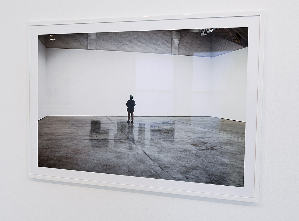
Cynthia Greig, “David Novros/Paula Cooper/ New York, 30.5”X44,” 2017
A related and more recent series is entitled “Threshold,” which are large scale prints of gallery interiors. An edition of five is included in the exhibition, and again, the “white cube” is depicted with people looking at blank, white walls. Greig has erased the art. Like the “Horizons,” the galleries in “Threshold” create an austere, existential landscape, with the inhabitants– real people looking at art– becoming like characters in a Samuel Becket, Theater of the Absurd play. They stand in quizzical postures, performing nonsensical actions and, one imagines, articulating one artistic “cliché” after another. The Paula Cooper print is particularly evocative of this existential script with a figure, wearing trousers that seem too short, standing in an epic sized space with images of art surrounding him in reflections on the floor. The idea that all photographs are unanswered questions is even more doubly true with Cynthia Greig’s “Gallery Horizons” and “Threshold,” because they pose the riddle of “what’s going on here?”
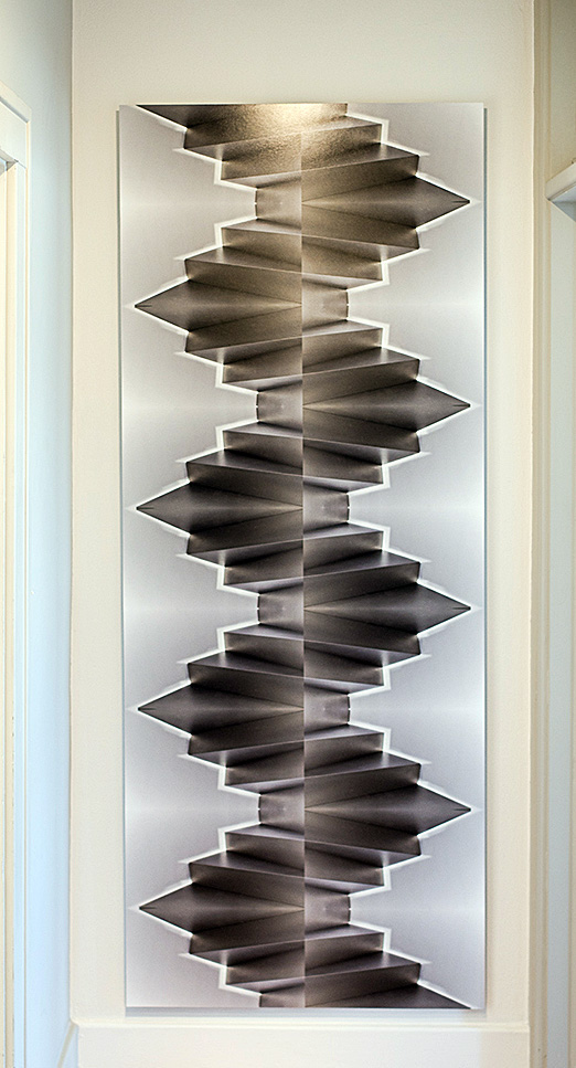
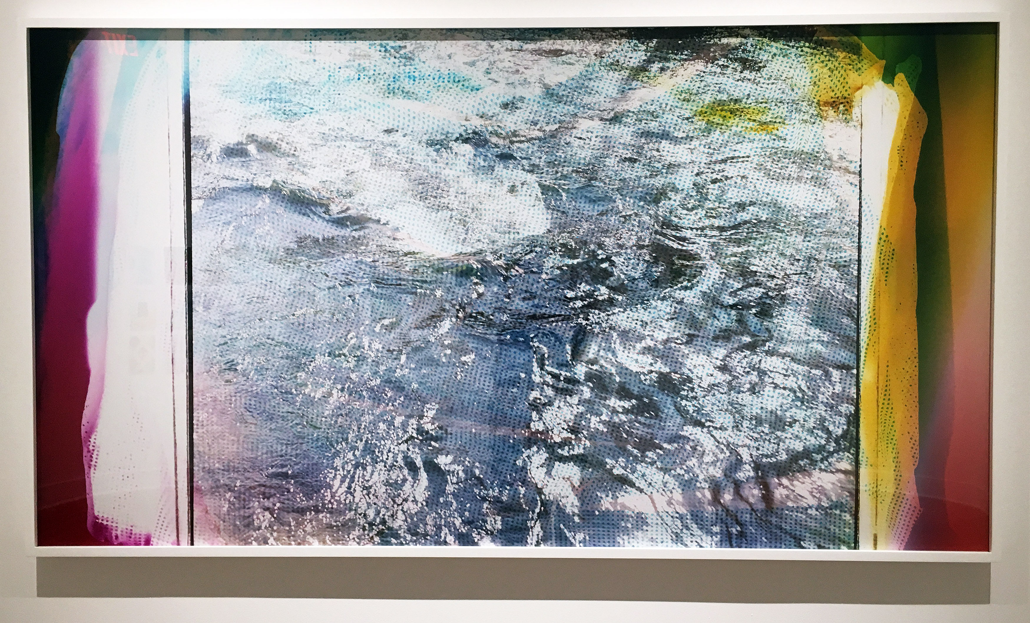
Cynthia Greig, “Replication (Galerie Thaddeus Ropac/Paris), 80.5”X32,” 2014/2018
To emphasize the discursive eye that Greig has on the art world she has included two actual sized replicas of a doorstop that she has appropriated from an art gallery. One is composed acrylic resin and the other of plaster, graphite and wax. She also had one fabricated out of crystal but it was not shiny enough so she went with plastic one instead. They sit on classic gallery pedestals and, like the “Gallery Horizons” and “Thresholds,” perform an enigmatic subversion of the ideals of most art galleries by celebrating a derelict object found behind a door of a gallery. And perhaps the most decorative intervention is “Replication (Galerie Thaddeus Ropac/Paris),” a manipulated image of a gallery staircase in Paris. Both the doorstop and the replication of the stunning backlit metal staircase function, as all of her incisive but brilliantly maneuvered work does, as startling and ironic components of the structure of the art world.
In addition to her photographic practice Greig has also experimented with videos. In “Sans Souci” she has included, “Museum Mandala/Detroit Institute of Arts 2017/2018,” a video that she made of visitor’s legs and feet ascending and descending a stairway at Detroit Institute of Arts. It is edited in a fast moving, almost musical, kaleidoscopic fashion and extends her intervention into the art world as material for her own art practice.
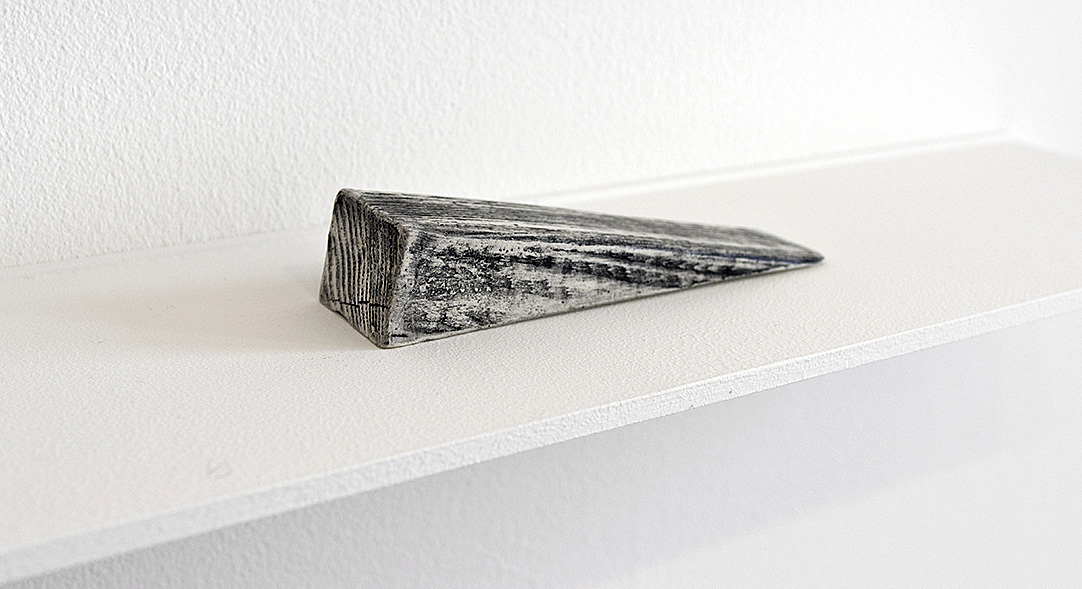
Cynthia Greig, “A.W.E./B.P. Los Angeles, 2015/2016, 1.25X6X1.25 inches
“Cynthia Greig: San Souci,” @ Paul Kotula Projects
April 14-June 2, 2018