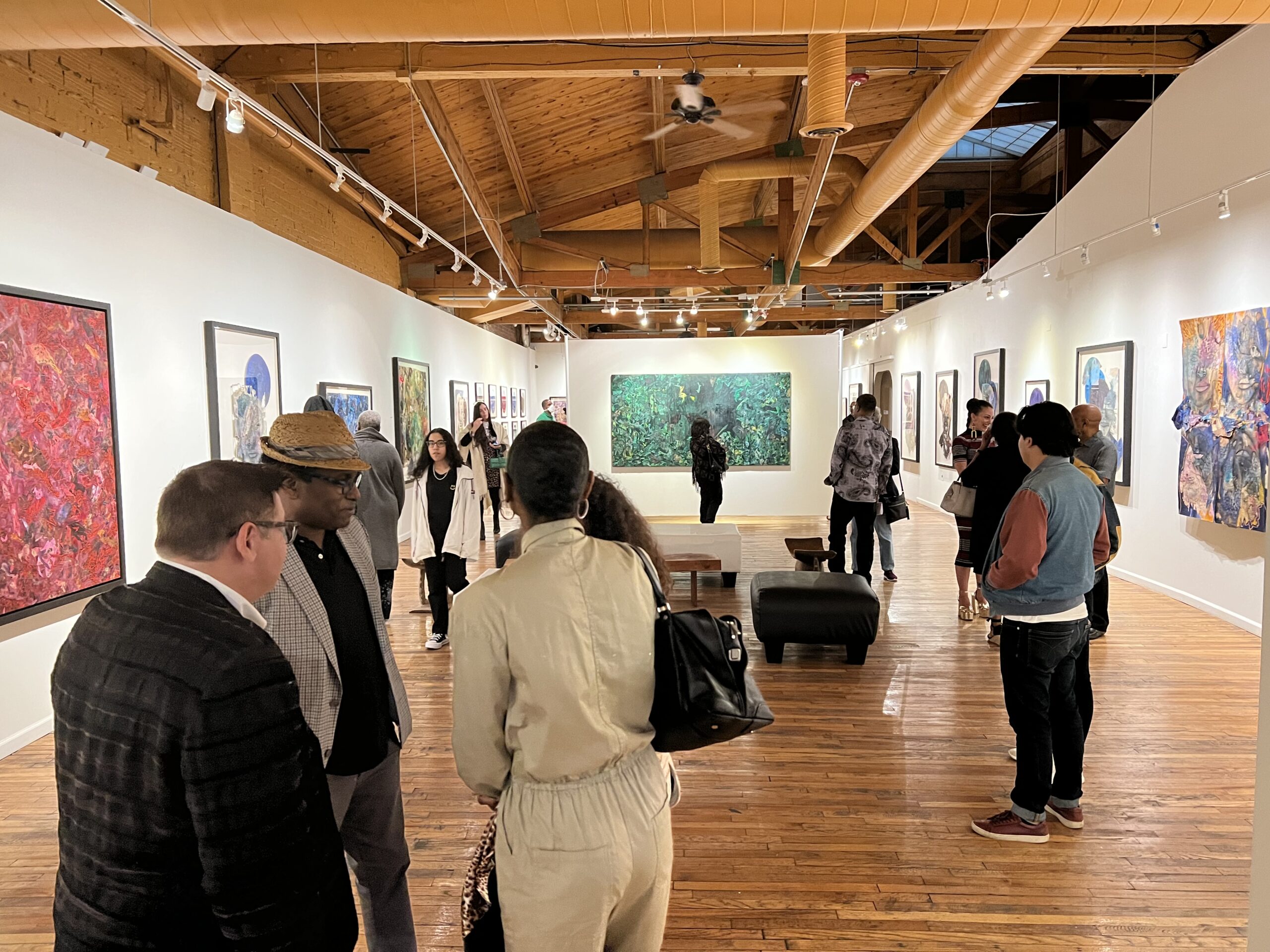
Stephen Abolite, Installation image, N’Namdi Center for the Arts, 2022
N’Namdi Center for the Arts opened a solo exhibition on September 22, 2022, by the multidisciplinary artist Stephen Arboite born in Haiti, grew up in New York City, and now resides in Miami. Curated by George N’Namdi, he says, “ The spiritual work is dominated by a greater sense of self. Arboite asks the viewer to immerse themselves in an examination of understanding of self through a psycho-spiritual lens, hopefully generating awareness of emotional and mental well-being, and a path to a potentially reconstructed journey.”
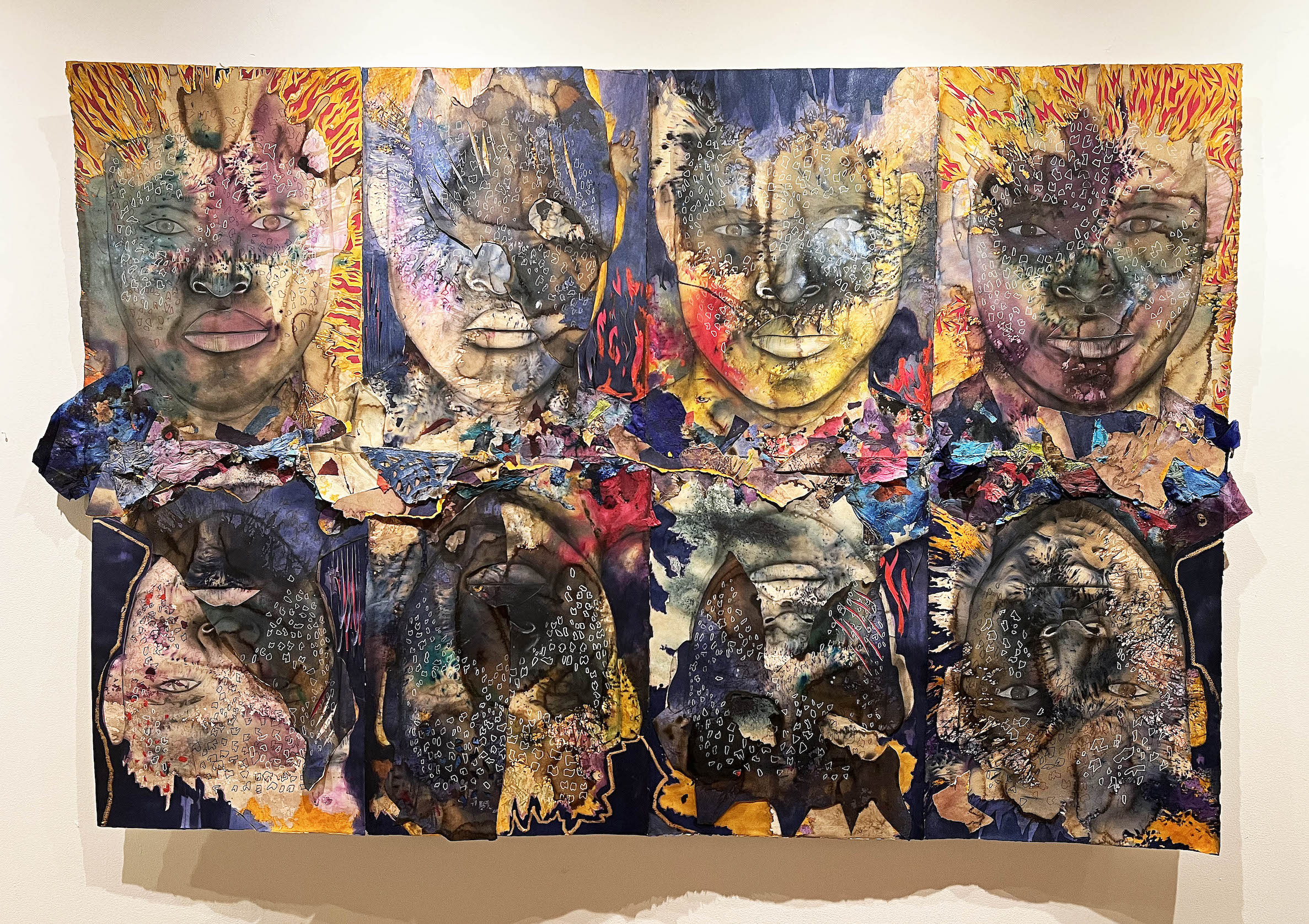
These multimedia collage self-portraits are obviously influenced by his Haitian heritage, which portrays the spiritual essence essentially manipulated by African spiritual practices. The mixture of human imagery with abstract elements engages the viewer with a combination of skill and ritual.
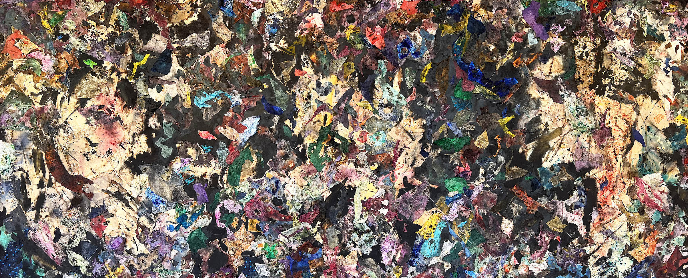
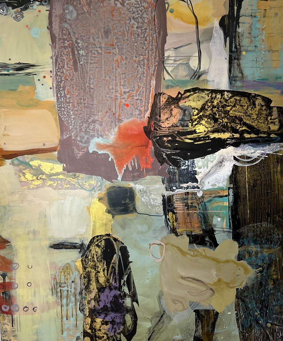
Stephan Aborite, Reflection Series #2, Acrylic, Coffee, Graphite, Collage Mixed Media on paper. 78″ x 31″ 2022
The artist refers to himself as multidisciplinary because some of the work is abstract fields of shape and color. As demonstrated in Reflection Series 2 there is a complex composition material set against a black background. He says in a statement, “Throughout that process, I found that the material itself, and how it dried, had a really intuitive quality,” says Arboite. “The same intuition that drew me to that led me to this current path. All these materials I use yield a certain weight, power, and energy. I think it is deeper than what is on the surface.”
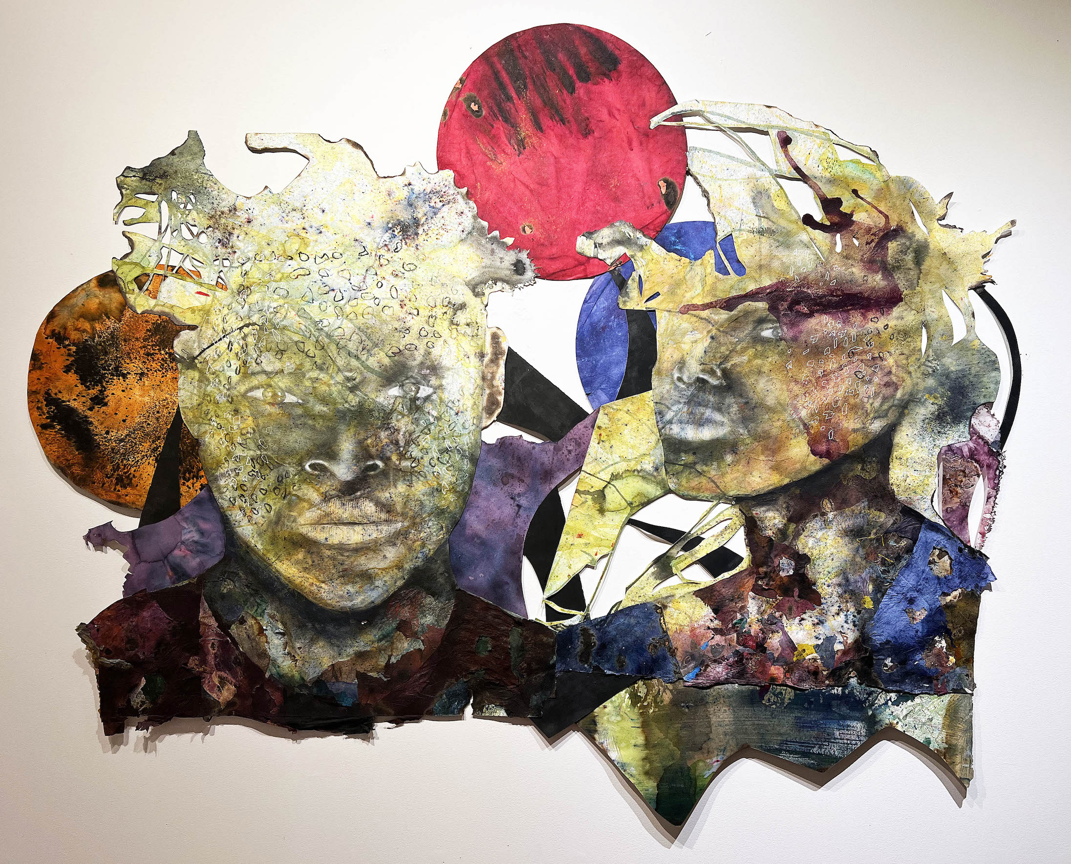
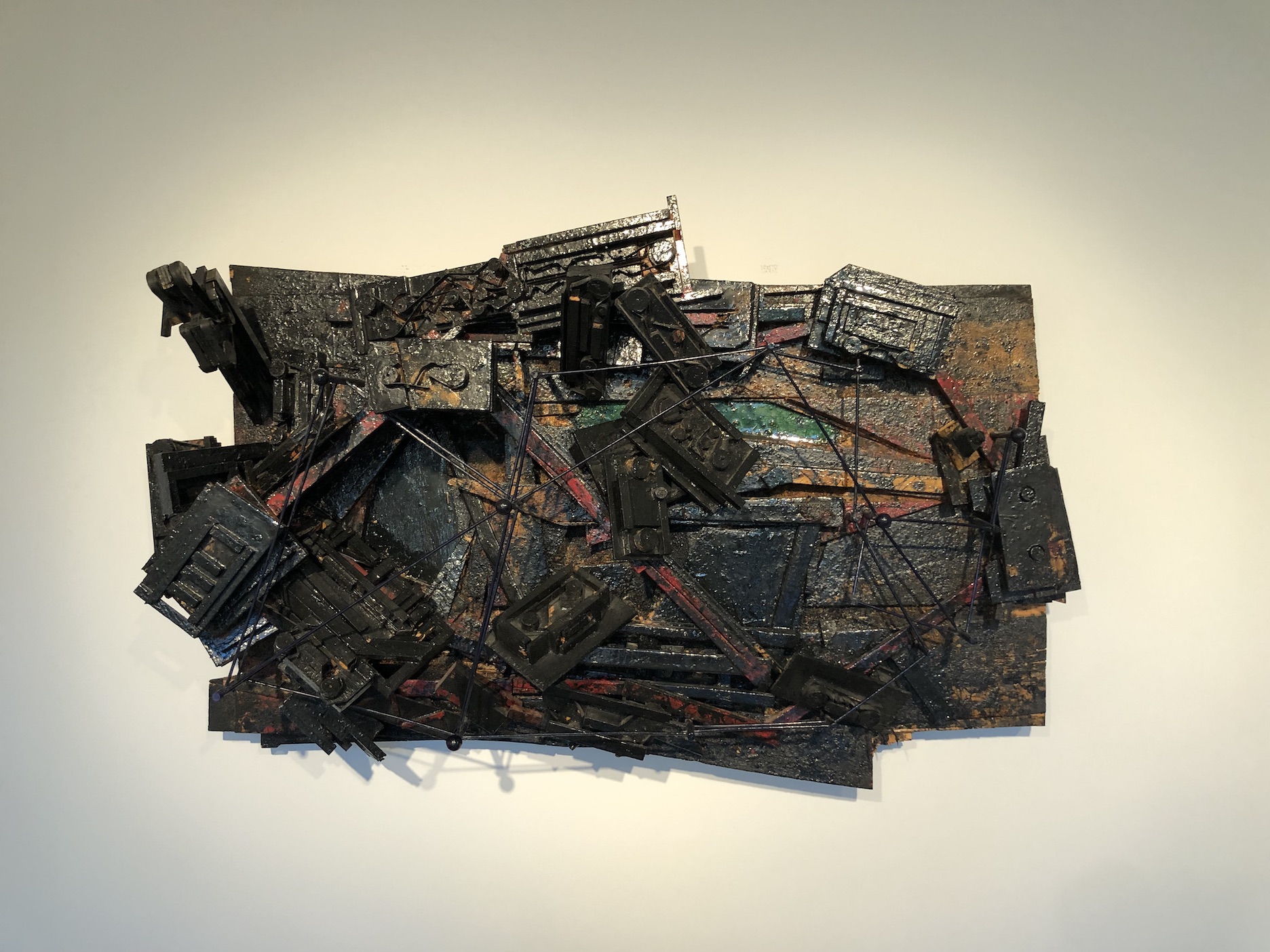
Stephen Arboite, Bwa Kayıma, Acrylic, Coffee, Collage Mix Media, 50″ x 96″ 2022
This image is a combination of large shapes and small motifs that contrast with large solid areas in the composition soon led the artist on a powerful journey to explore his Haitian heritage and various discourses on the Caribbean diaspora. Many, if not most, of these collages use an overlapping outline of the artist’s face to make the point that all of these are self-portraits. Using a staining technique that includes ground coffee, metallic powders, and organic pigment, Arboite portrays the spiritual essence of his subjects. Whereas the spirit is primarily manipulated in African spiritual practices, his artworks perform a ritual that allows the aura to be seen up front and center.
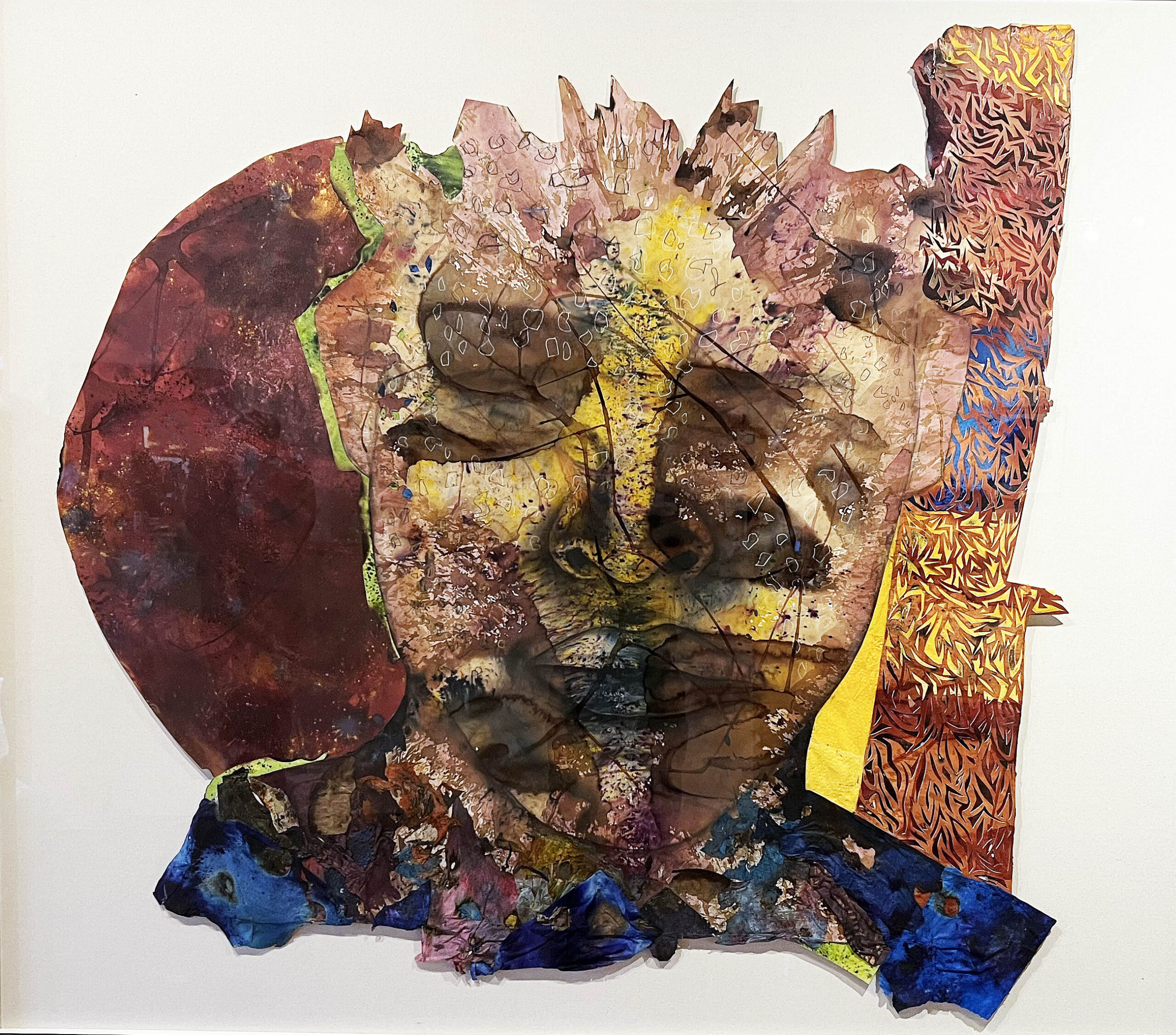
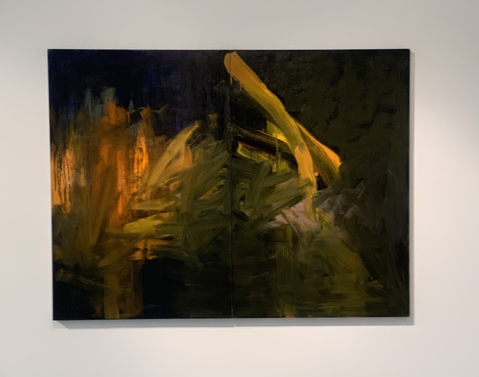
Stephan Abolite, Reflection Series #3, Acrylic, Charcoal, Collage Mixed Media, 60 x 72″, 2022
Stephan Aboite is a multidisciplinary artist of Haitian descent who was born and raised in New York City and now resides in Miami. Arboite’s work considers beauty outside of classical aesthetic paradigms, emphasizing spiritual transformation and the evolution of human consciousness. Arboite considers himself primarily a self-taught artist with a foundation in drawing and painting from the State University of New York, Purchase College. His works have been exhibited nationally at the Museum of Contemporary Art in North Miami, N’Namdi Contemporary in Detroit and Miami, Prizm Art Fair, and the Urban Institute for Contemporary Arts in Michigan, amongst others. Some notable collections include the Jorge M. Pérez Art Museum of Miami, the Eric and Donna Johnson Collection, and the Arthur Primas Collection of African American Art.
The exhibition Big Good Angel is on display at the N’NAMDI Contemporary now through January 16th, 2023.
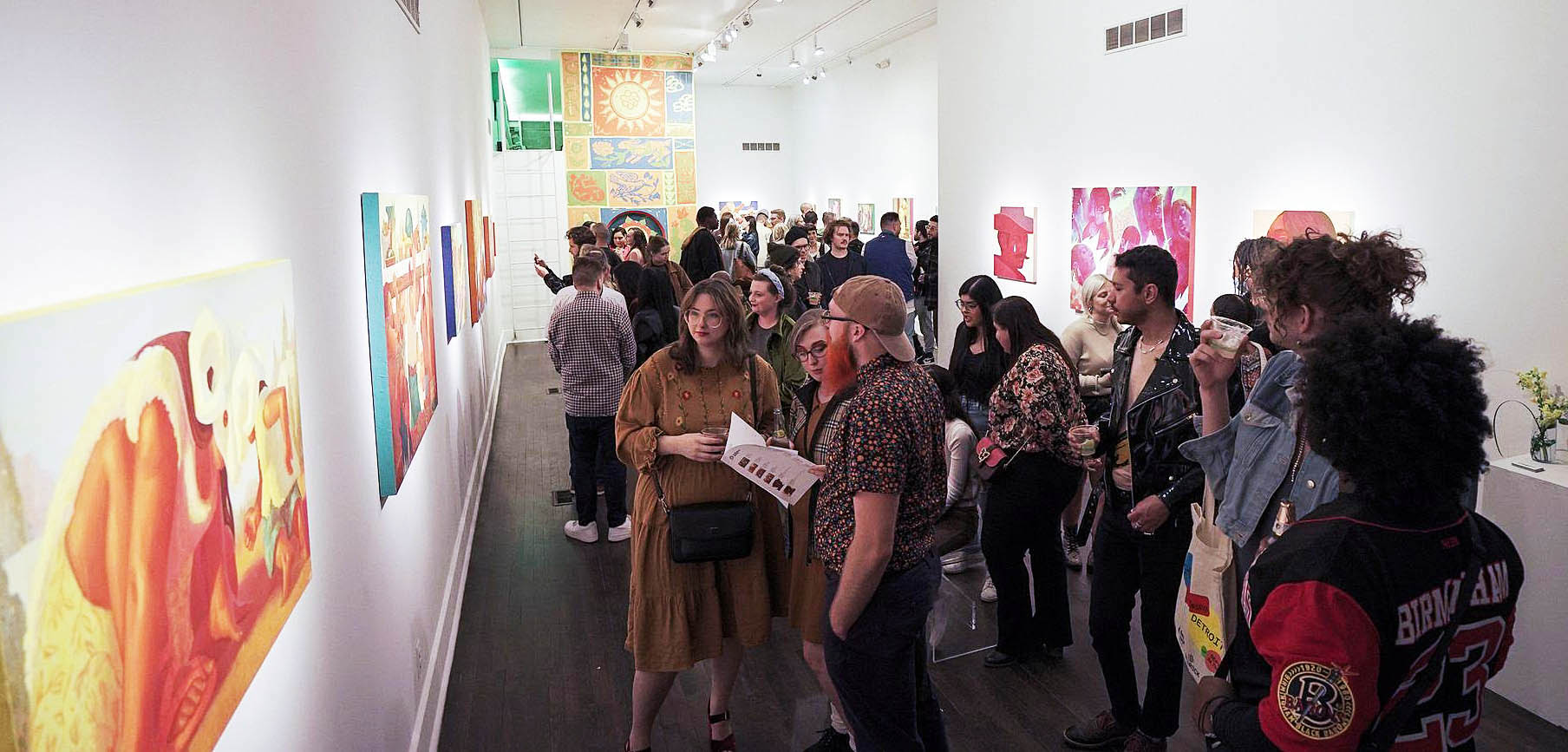
Opening night reception for “Semillas” at Playground Detroit, October 22, 2023. Photo by John Sippel
Human beings are a storytelling species–it’s how we make sense of the world. In his solo exhibition “Semillas,” now at Playground Detroit until November 19, Ivan Montoya has painted an idealized origin story as he tries to make sense of his adopted country while also preserving ties to his Hispanic cultural heritage. Based on early memories of his birthplace in Chihuahua, Mexico, and his immigrant childhood in the U.S., the paintings in “Semillas” tell a story of transition and displacement, loss and possibility.
The exhibition title is inspired by the Spanish proverb “hoy semillas, mañana flores,” which can be translated “seeds today, flowers tomorrow.”
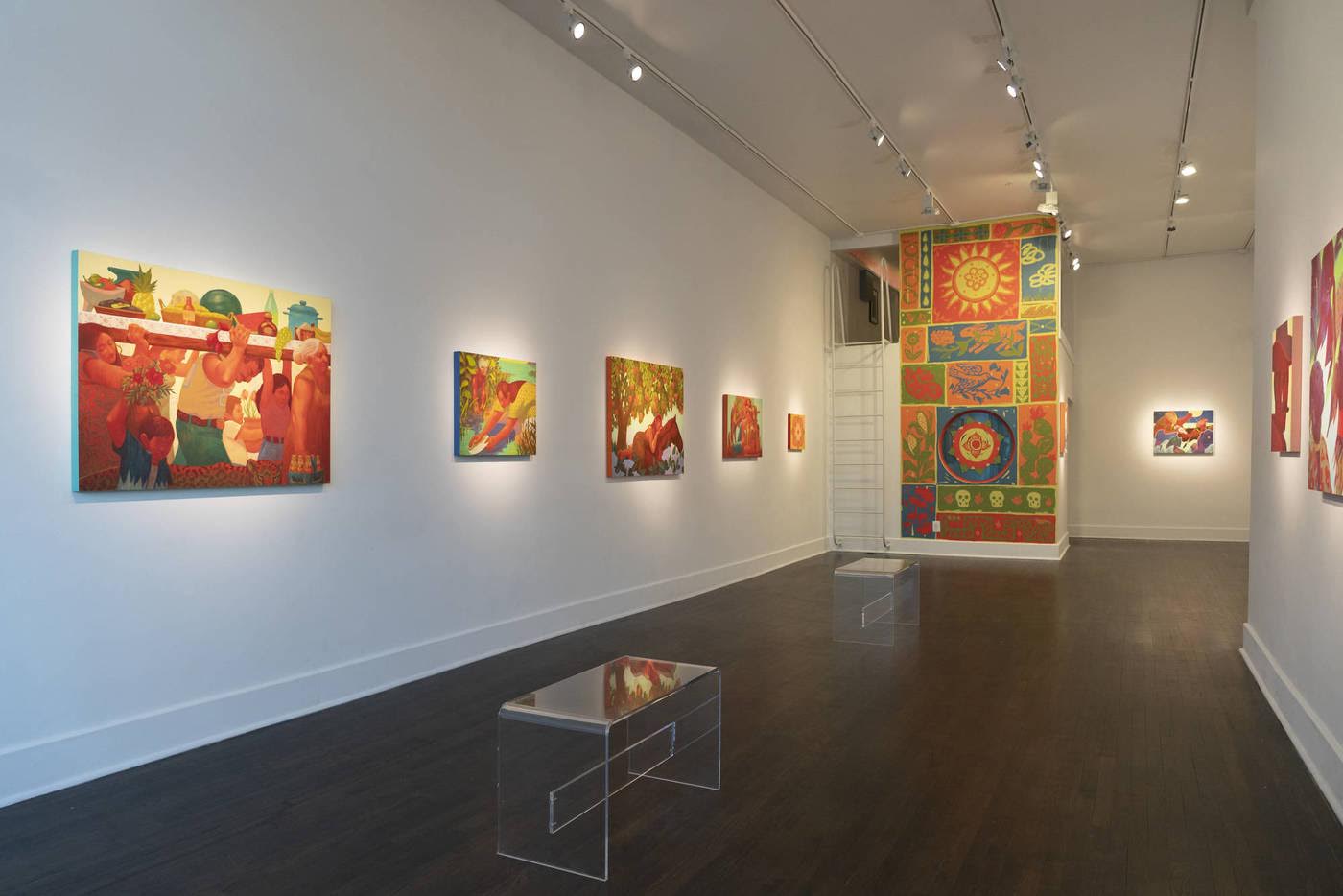
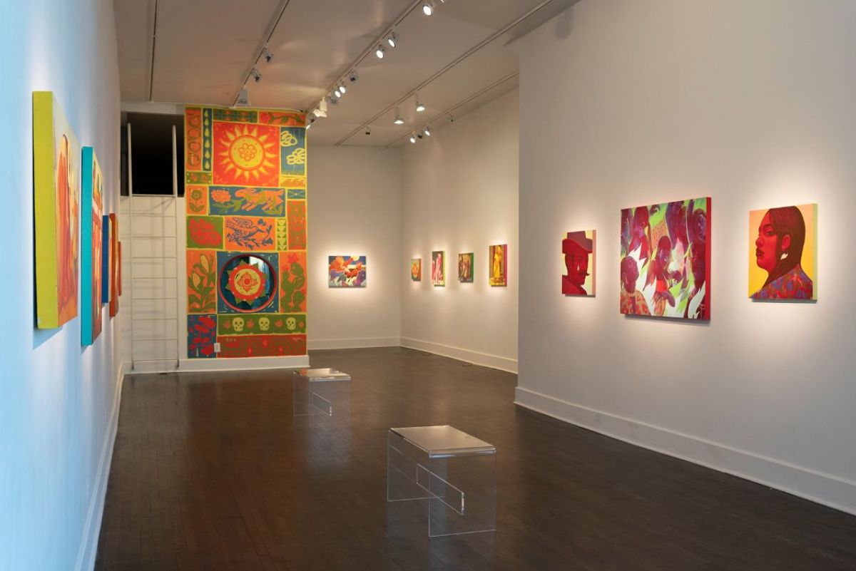
That Montoya is aware of the provisional nature of the story he is telling is evident in the storybook quality of the 17 paintings in the exhibition. Along two walls of the gallery, he has strung together several of his artworks in an implied narrative, each sequence bookended by decorative floral panels as if they are the covers of some mysterious folk tale. The paintings, while presented in a line that suggests a series of events, are stand-alone images that might be disjointed childhood memories or mythical scenarios drawn from dreams.
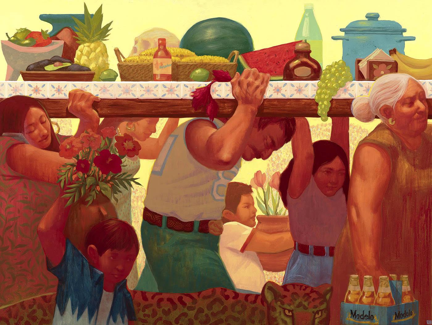
Ivan Montoya, Setting of the Altar, 2022, acrylic on birch panel, 24” x 36” photo courtesy of the artist and Playground Detroit
One row of paintings includes Setting of the Altar, among others, and seems to center on scenes of more-or-less harmonious community life. The compositions are bathed in warm colors that give an idyllic air to the timeless Edenic visions. Montoya avoids placing the scenes within a recognizable time and place—they are once-upon-a-time visions that are no place and every place, but they exist in the artist’s imagination most of all.
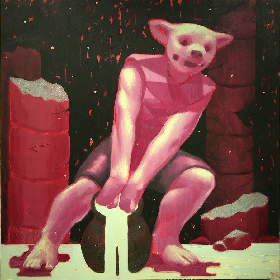
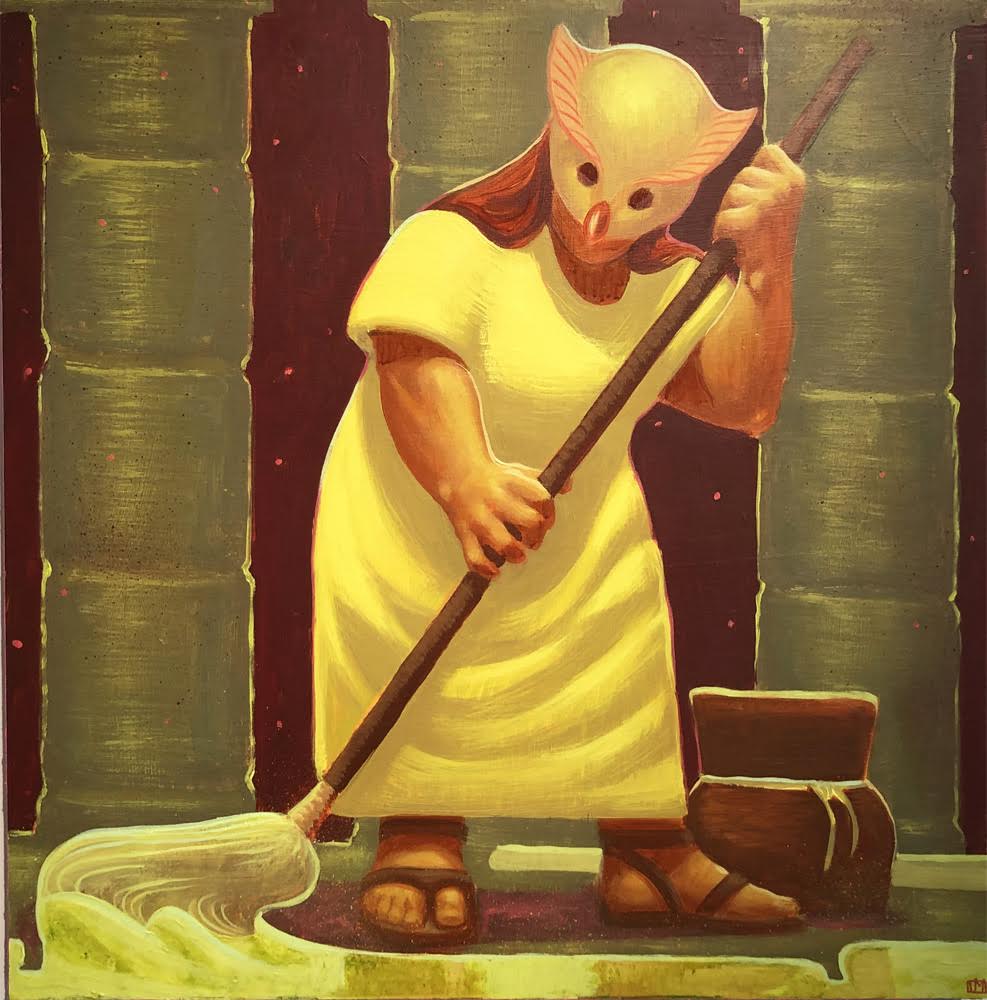
Ivan Montoya, Inciter, 2022, acrylic on birch panel, 24” x 24” photo by K.A. Letts
The warm, late afternoon light of Montoya’s family-centered paintings gives way to mysterious nocturnal illumination in another loosely narrative series on the opposite wall of the gallery. Once again framed by floral panels, this line of images takes us in a different, more archetypal direction. Inciter and Guardian, a pair of paintings that depict two single but related figures set among the pillars of what appears to be a monumental temple structure at night, imply–but don’t insist–on a story. The Inciter is an impish trickster character, caught in the act of spilling and breaking, all energy and mischief. The companion painting, Guardian, is occupied by a tired-looking maternal figure wearily cleaning up Inciter’s mess. Like the two paintings flanking it, the central painting, Latchkey, features two masked, child-like figures that convey an air of playful mystery.
Ivan Montoya, Guardian, 2022, acrylic on birch panel, 24” x 24” photo by K.A. Letts
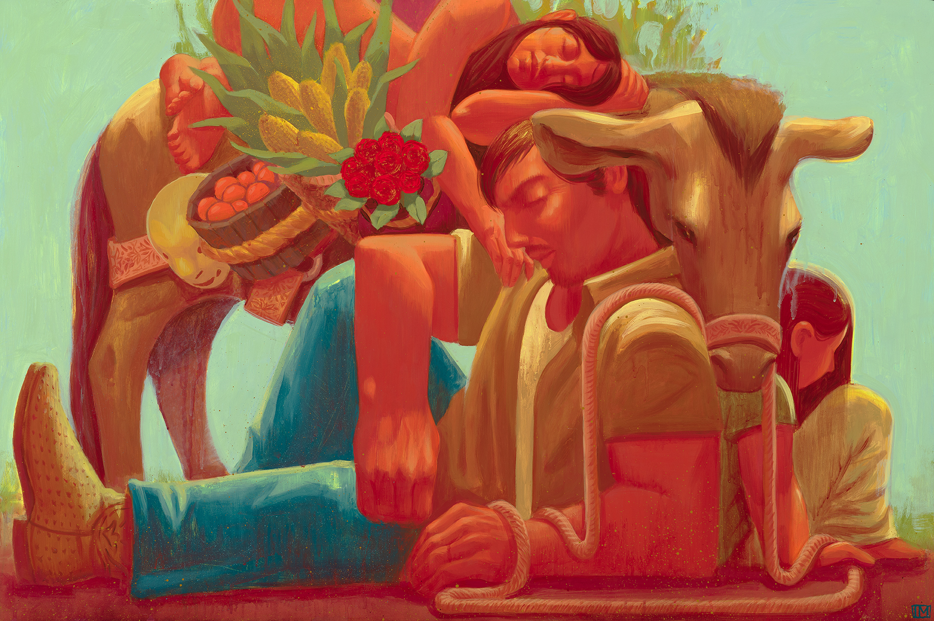
The painting that most clearly references the immigrant experience is found in Paladarium, where a man and woman carry a large glass vessel through a snowy landscape. Two axolotls are contained within. The axolotl is a species of salamander native to Mexico, but which these days is mostly native to research labs, its native habitat having been degraded by urban development and climate change. The species is known for its almost miraculous ability to regenerate damaged limbs, as well as for the fact that it has both lungs and gills. Legend has it that the salamander represents the Aztec god of fire and lightning, and clearly it (along with the jaguar) has significance for Montoya as a metaphor for his dual identity as an immigrant and an American. He explains, “My immigration definitely is something I drew from for this [painting], but more specifically I intend to shed light on the hope behind relocating or changing environments. Paladarium refers to a tank that replicates the biome in which reptiles and amphibians live. This piece references the fact that some creatures only grow as large as the environment that they live in allows them to. Which is essentially many immigrants’ purpose for emigrating.”
Ivan Montoya, Descanso (Rest), 2022 acrylic on birch panel, 24” x 36” photo courtesy of the artist and Playground Detroit
Montoya paints in a straightforward figurative style, with surfaces that are signboard matte on wood panels. No obvious painterly flourishes mediate our experience of the light-filled compositions rendered in saturated colors. The pictorial space of each painting is often filled and activated by two or more stocky figures drawn in a manner reminiscent of mid-twentieth-century Mexican painters like Diego Rivera or Jose Clemente Orozco. Like these artists, Montoya delivers a strong sense of the 3-dimensionality of the figures in his compositions, and there is often an underlying archetypal subtext. But where Montoya’s artistic forebears draw inspiration from the political upheavals of their time, Montoya’s preoccupation is with a more personal journey.
“Semillas” gallery installation, photo courtesy of the artist and Playground Detroit
The artist credits an eclectic group of Mexican artists as further influences in the development of his style. The surrealist painter Rufino Tamayo, the expressionist Jorge Gonzalez Camarena and the academically trained Saturnino Herràn have all influenced his work in subtle ways. He pays particular attention to Rufino Tamayo’s surreal, earthy humanist themes and the idiosyncratic style that sets him apart from the more political work of his contemporaries. Montoya has studied, too, the pre-Hispanic motifs and reliefs found in Mayan or Aztec culture, combining all these influences in pursuit of an authentic Mexican-American cultural identity.
In his debut solo show at Playground Detroit, Ivan Montoya has clearly mapped out his path toward a worldview and an art practice that makes space for mystery and spirituality while allowing scope for both his American experience and his Hispanic heritage. Whether he is rendering the warm light of a late afternoon in an orchard or moonlight shining on a luminous sea, this hybrid way of being becomes ever more clear in the artist’s work. Perhaps Montoya says it best:
“My cultural identity is the core of what I am trying to understand and make peace with. I’ve grown up in two worlds and I don’t always feel like I belong to one or the other too firmly. So to me, understanding how I’ve been molded by both is super important to how I communicate and create especially because of how many other people feel like I do.”
“Semillas,” gallery installation, preview dinner, photo courtesy of the artist and Playground Detroit
Playground Detroit presents Ivan Montoya’s solo exhibition “Semillas,” now on display until November 19, 2022.
Todd Weinstein’s Stories of Influence: In Search of One’s Own Voice is at the Janice Charach Gallery in West Bloomfield, Michigan through Dec. 7.
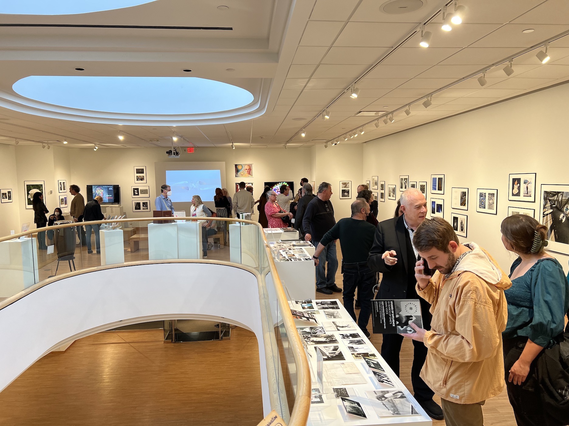
Install image, Stories of Influence: In Search of One’s Own Voice is at the Janice Charach Gallery in West Bloomfield, Michigan. 2022
Photographer Todd Weinstein’s Stories of Influence: In Search of One’s Own Voice is a high-concept show that employs a delightful gimmick – Weinstein pairs 68 of his photos with a corresponding image from one of his numerous mentors, teachers and friends, and then mats and frames the two together. It’s a career retrospective with punch, and will be up at the Janice Charach Gallery in West Bloomfield’s Jewish Community Center of Metropolitan Detroit through Dec. 7, 2022.
A commercial and artistic shutterbug who grew up in Oak Park, Weinstein had a gift as a youngster for talking his way into jobs with great photographers, some of whose influence he honors with this exhibition. He got an early start after dropping out of the old School of the Detroit Society of Arts and Crafts (now the College for Creative Studies), and approaching legendary auto photographer Dick James to ask if he needed an assistant. “How about third-assistant?” James responded. No fool he, Weinstein grabbed the chance.
Like so many young artists in the 1970s, he ultimately left Detroit in the 1970s to make his way in New York’s hurly-burly, and, as it happens, thoroughly succeeded. Weinstein’s got a thriving photography and multi-visual practice, and lives in one of Brooklyn’s handsomest old rowhouse neighborhoods, Boerum Hill.
Among other virtues, Weinstein appears to have an admirable gift for gratitude. The idea of pairing one of his photos with that of an esteemed teacher, mentor or friend as a way of paying tribute struck him when he was in Paris several years ago. Weinstein brought it up with Charach director Natalie Balazovich, and she was immediately enthusiastic, finding it refreshing and new. “Todd’s essentially saying ‘This is why I’m where I’m at,” she said, “’because of these people.’” She added, “I like that the show dives into almost a taboo subject – sharing the things that pushed him to become who he is, and showcasing them.”
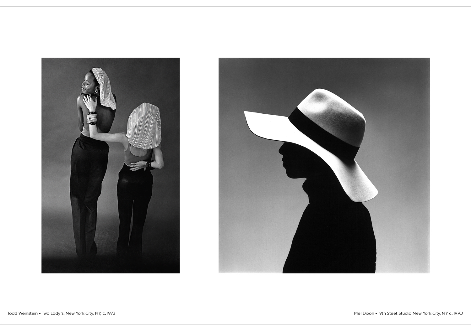
Todd Weinstein, Two Lady’s, New York City, NY, c. 1973; Mel Dixon, 19th Street Studio, New York City, NY, c. 1970.
A professional who helped Weinstein in his early New York days, when he was sleeping on a friend’s floor for eight months, was commercial photographer Mel Dixon. One of the first Black fashion photographers to go out on his own some 50 years ago, Dixon had a glittering background – he’d worked with photo greats Avedon and Hero. He offered Weinstein his first job in the big city, working in the studio on commercial and advertising projects.
“Mel gave me the chance,” Weinstein said. “We shot luggage, brides. All that kind of stuff.” He wasn’t really that interested in studio work, but it gave him the opportunity to earn a living while exploring other paths for his future.
The image Dixon contributed to the show is a black-and-white study of a girl. Her shoulders and face are completely dark, while her broad, white hat catches all the light in the frame. It’s elegant, high-class, high-fashion photography.
In his artist’s statement, Weinstein notes that in pairing images he relied on the structures of jazz – employing a sort of visual syncopation, as it were. You clearly see that in his rejoinder, the 1973 Two Lady’s, New York City, NY. It, too, is a fashion study — this time of two models facing away from us, one lithe and Black, the other short and white. Both are wearing headdresses that fall like curtains down to their shoulders. The white girl has a hand on the other’s back, which prompts her to twist her head around in apparent rapture.
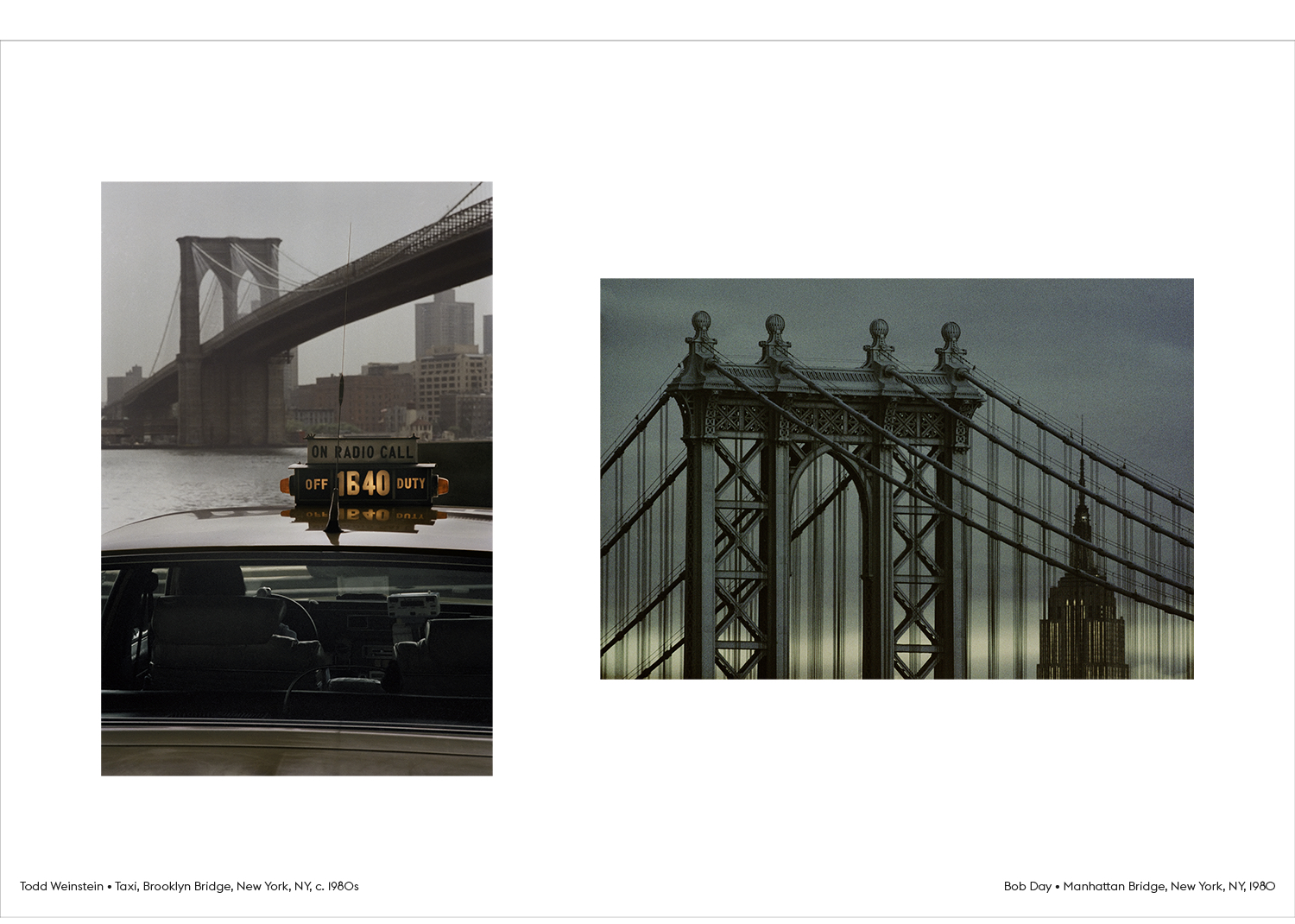
Todd Weinstein, Brooklyn Bridge, New York, NY, c. 1980s; Bob Day, Manhattan Bridge, New York, NY, 1980.
Another significant mentor was painter and photographer Bob Day. The two went into business together on Manhattan’s East 17th Street half a century ago, “back when you could get a 6,000-square-foot studio for like $300 a month,” Weinstein said. Day’s 1980 image, Manhattan Bridge, NY, NY, is a powerfully compressed telephoto shot. Day frames the very top of the Manhattan Bridge, a lush blue-green, sharply etched essay in cross-bracing around a central gothic arch. Looming in the near distance – unrealistically large, thanks to the powerful lens — is a gray and gold Empire State Building seen through the bridge’s vertical suspension wires. It lends immensely satisfying balance to the drama of the bridge crown in both shape and color.
By contrast, Weinstein’s Brooklyn Bridge, NY, NY is grittier. A close shot of a taxicab takes up most of the frame, the vehicle’s “Off Duty” crown lit and glowing. The aesthetic is ordinary and everyday — even the Brooklyn Bridge rising in the distance looks a little dull. All the print’s visual power, which is considerable, comes from the illuminated “Off Duty” sign that, alone out of the entire shot, glows with a warm light, and whose shape echoes the tops of the two bridges.
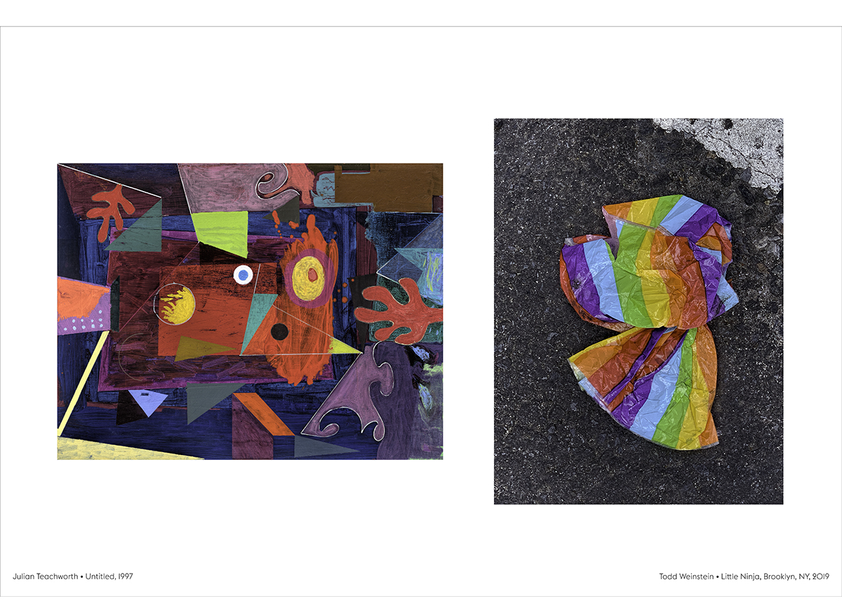
Not all of the images contributed by mentors are photos. In one, Weinstein pairs his picture of what looks like a collapsed, rainbow-striped mylar balloon on the street with painter Julian Teachworth’s amusing and gorgeous abstract of many colors, an untitled work from 1997. Here Weinstein riffs on the similarity in colors and the loopy geometry present in both. “I photographed all of Julian’s paintings,” Weinstein said. “He’s an incredible painter, mentor and spirit.”
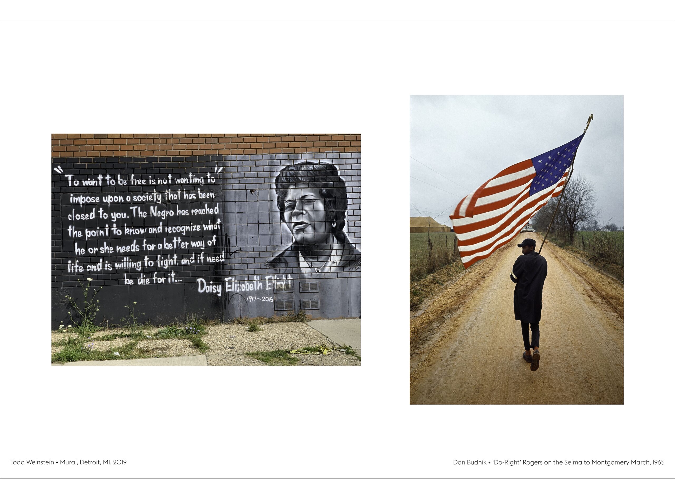
There’s something undeniably spiritual about the twinned images by Weinstein and the great photographer of the Civil Rights movement, Dan Budnik. The latter’s photo, ‘Do-Right Rogers’ on the Selma to Montgomery March, March, 1965 is a classic of the genre, and one that Weinstein says he recalls from childhood. A skinny, African-American youngster marches down an endless dirt road, carrying a pole with a large American flag that’s unfurled in all its red, white and blue glory. The association of deep patriotism with individuals who still had to fight a for their rights is palpably moving.
Todd Weinstein, Mural, Detroit, 2019; Dan Budnik, ‘Do-Right Rogers’ on the Selma to Montgomery March, March 1965.
For his part, Weinstein gives us a black-and-white mural in Detroit on a brick wall honoring the late Daisy Elizabeth Elliott, a champion of Black rights who died in 2015. The quote next to her portrait, in which she cites her willingness to die in the fight for civil rights, is powerful and unexpected – a bit like this show.
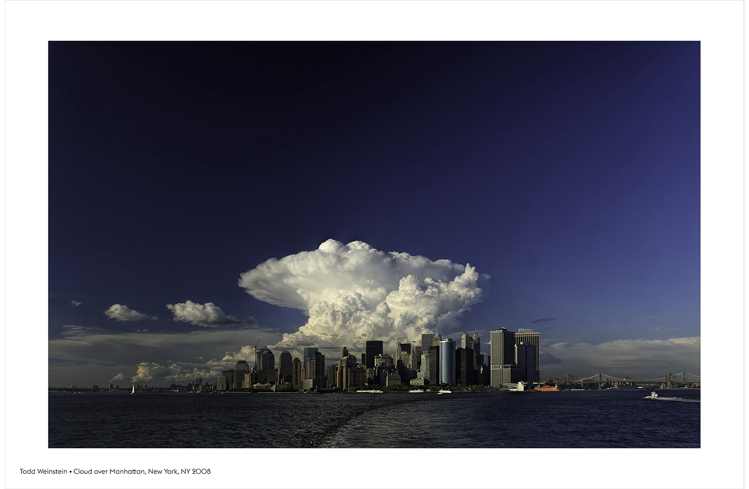
Todd Weinstein, Cloud over Manhattan, New York, NY, 2008.
Stories of Influence: In Search of One’s Own Voice is at the Janice Charach Gallery in West Bloomfield through Dec. 7.
The Detroit Institute of Arts presents Van Gogh in America
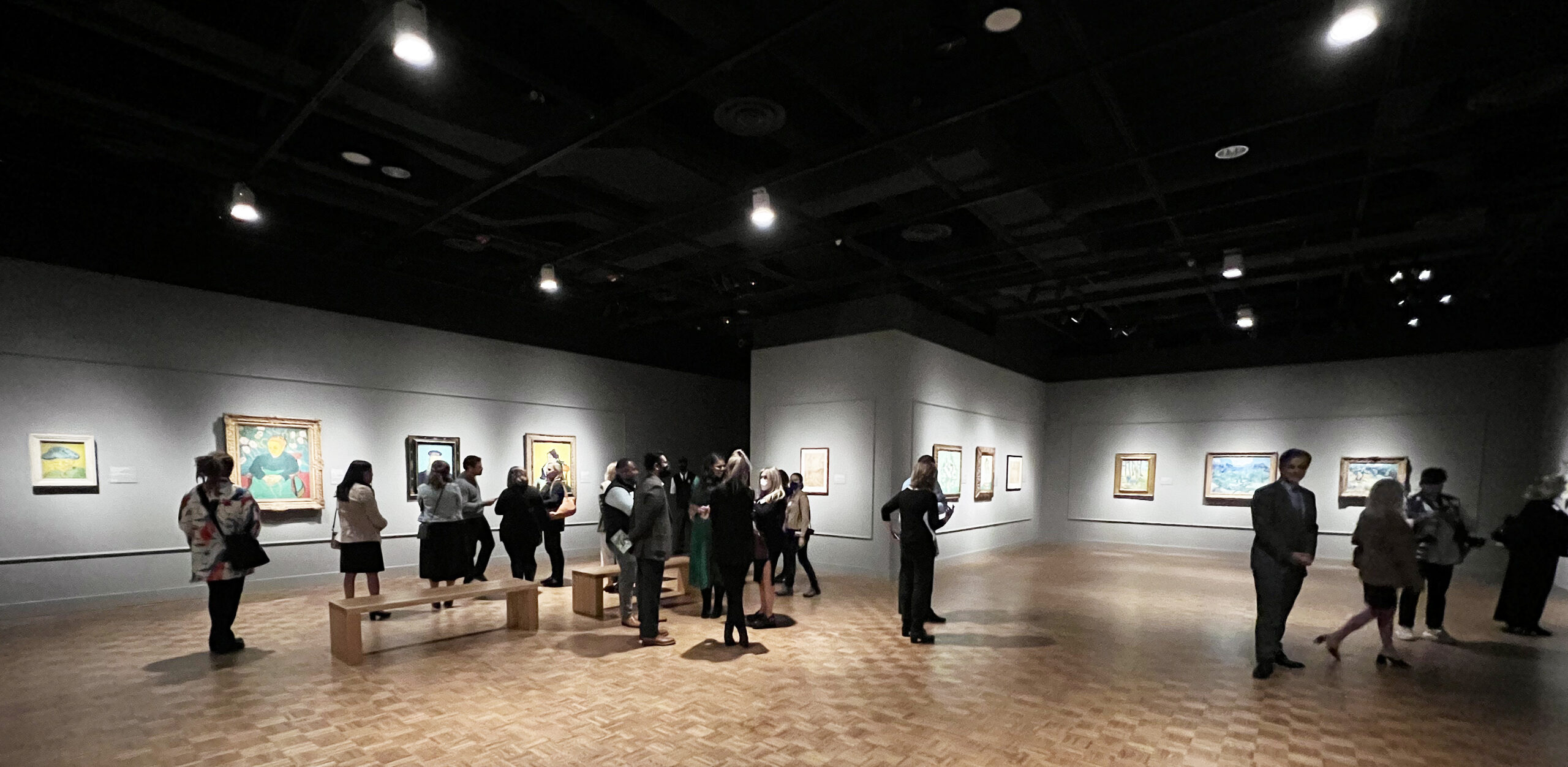
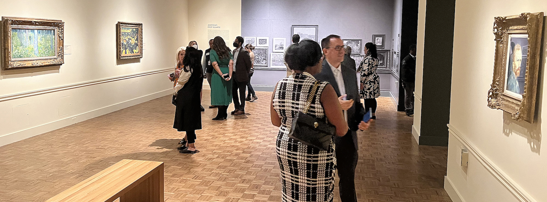
Installation image, Van Gogh in America, Detroit Institute of Arts, 2022
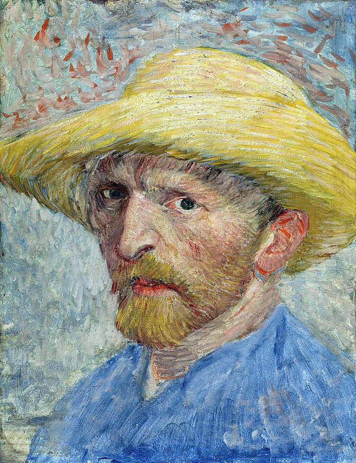
The Detroit Institute of Arts (DIA) presents a landmark exhibition, Van Gogh in America, that features 74 works of art that opened on October 2, 2022, and will run through January 22, 2023. The DIA celebrates being the first museum in the country to purchase a painting by Vincent van Gogh in 1921. The work, Self-Portrait (1887), was purchased at a New York auction by Ralph Booth, then the President of the City of Detroit Art Commission. There are nine galleries of artwork, and the exhibition includes a section of Van Gogh’s contemporaries, including Paul Cezanne, Paul Gauguin, Henri Matisse, Raoul Dufy, Georges Ribemont-Dessaignes, and Joseph Stella.
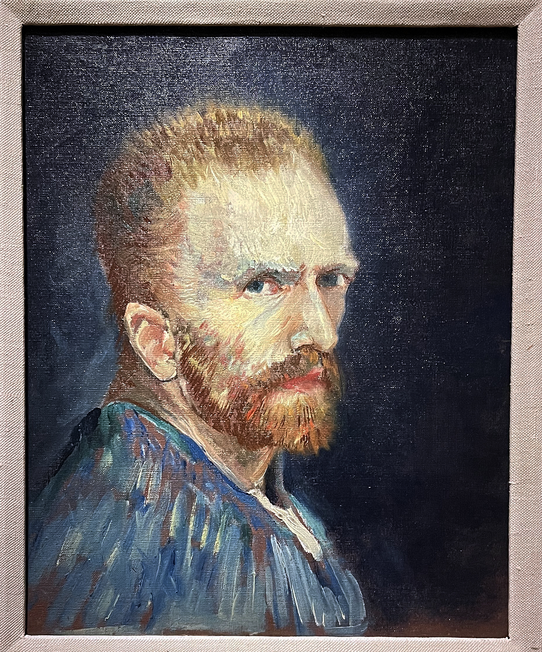
Self-Portrait, Oil on board mounted to wood, 13 x 10″ Detroit Institute of Arts, 1887
Van Gogh painted more than forty self-portraits and loved to scrutinize his features which, unlike those of the 17th century, might be considered disturbing or unattractive. That, in itself, could not be more introspective. Van Gogh could not find or pay for models, so he used his image reflected in a mirror to create an extensive collection of variations of himself: An indication of his introverted nature.
Self-Portrait, Oil on Canvas, 16 x 13″, Wadsworth Atheneum Museum, 1887
The director of the DIA, Salvador Salort-Pons, says, “One hundred years after the DIA made the bold decision to purchase a van Gogh painting, we are honored to present Van Gogh in America. This unique exhibition includes numerous works that are rarely on public view in the United States and tells the story – for the first time – of how Van Gogh took shape in the hearts and minds of Americans during the last century.”
The works of Van Gogh and his images are ubiquitous in the United States, the Western world, and beyond. There was the novel by Irving Stone, Lust for Life (1934), followed by Vincente Minnelli’s film adaptation, starring Kirk Douglas, which shaped the artist’s popularity. In the mid-1970s, Leonard Nimoy starred in a one-person play called Vincent that he’d adapted from the play Van Gogh by Phillip Stephens. That set the stage for the songs by Don McClean’s Vincent and Starry, Starry Night, and numerous films and theater presentations like Loving Vincent, the world’s first hand-painted, animated feature film, in 2017. Recently there has been the Immersive Van Gogh, a light show based on his imagery, and I would be remiss if I did not mention the book cover of Gardner’s Art Through the Ages was printed from the image of the painting Starry, Starry Night. And these mentions are only a few of the different ways Van Gogh’s work has been used artistically in our culture.
For readers of this review, an easy way to explore the life of Vincent van Gogh is this video produced by the Van Gogh Museum. It may set the stage.
Courtesy of the Van Gogh Museum – 4:50 Minutes
When Van Gogh lived and worked in Paris for two years, he made friends with many artists who were part of the new impressionism that differed from the highly respected artists of the Hague School, sometimes known as the Barbizon School, working exclusively in the tradition of realism.
One of his favorite painters was the French artist Jean-Francois Millet (1814-1875), who featured peasants and rural settings in the countryside. The common themes were waterways, seascapes with boats, windmills, and canals. Millet’s work may have lingered in his mind, but along came this small stroke of paint with variations of color that would come to dominate many of the spaces in his compositions. Clearly, Van Gogh wanted to use color for its expressive value rather than make faithful replicas of the images received by the eye in realism.
It took six years and a team of professionals to create this exhibition. Scheduled to open earlier in 2020, that opening was delayed by the COVID-19 pandemic. This exhibition is part of the Bonnie Ann Larson Modern European Artist Series. The curatorial effort was led by Dr. Jill Shaw, Head of the James Duffy Department of Modern and Contemporary Art, and Rebecca A. Boylan and Thomas W. Sidlik of European Art, 1850–1970 at the DIA. In her statement, Dr. Shaw says, “Van Gogh in America examines the landmark moments and trajectory of the artist becoming fully integrated within the American collective imagination, even though he never set foot in the United States.”
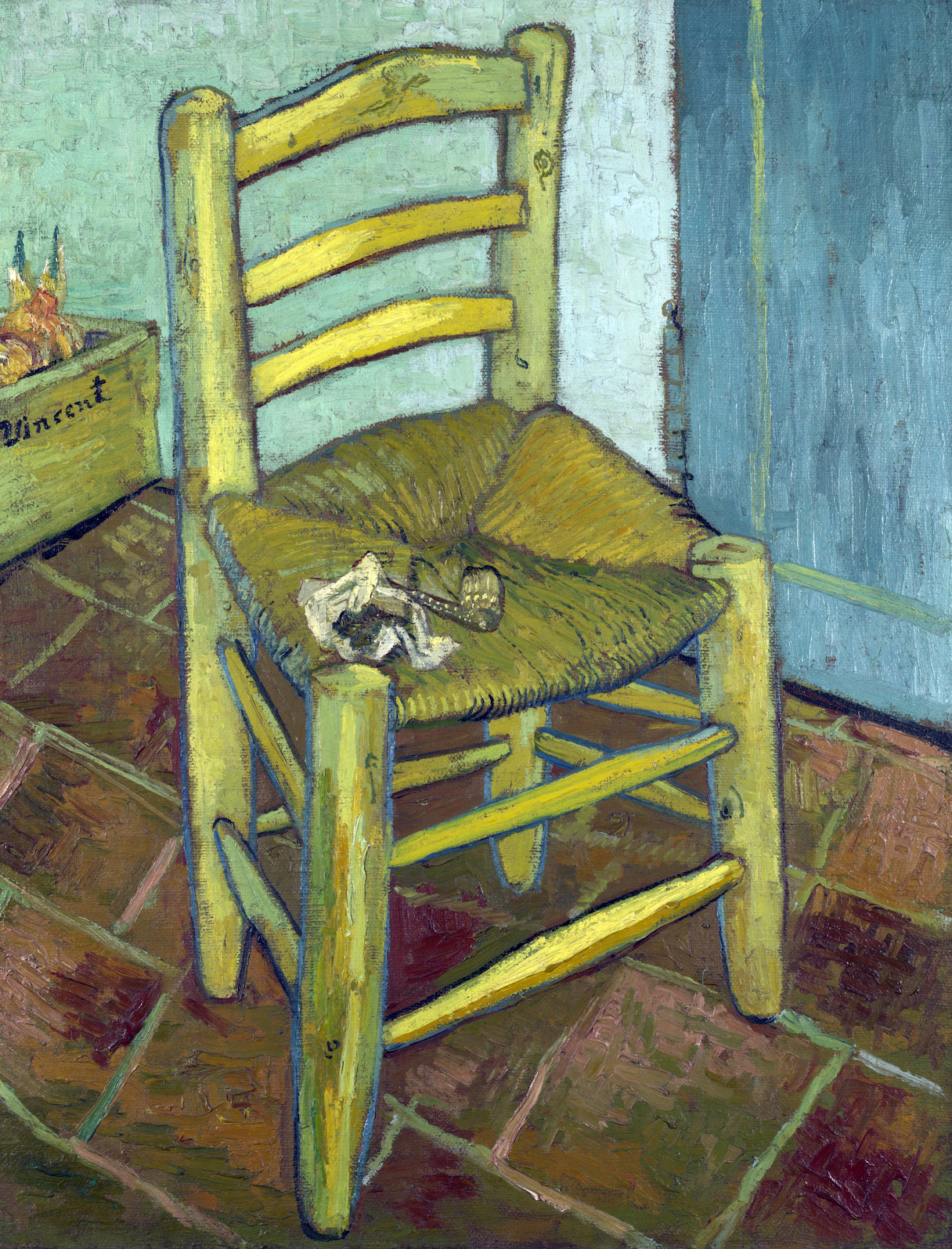
Van Gogh’s Chair, Oil on Canvas, 36 x 28″, The National Gallery London, 1888.
The DIA exhibition of these 74 works of art opens with The Chair as a welcoming image to the show’s first gallery. Painted in December of 1888, when the relationship between Gauguin and Van Gogh had become strained, Van Gogh paints two chairs, the second being Gauguin’s, as his dream of sharing a studio with his close friend was rapidly disintegrating. Van Gogh’s simple chair sits empty, absent of its owner, and is an infinitely lonely image. It is an extraordinary instance of propelling a most familiar object beyond the realm of still life so that it comes to represent the artist himself.
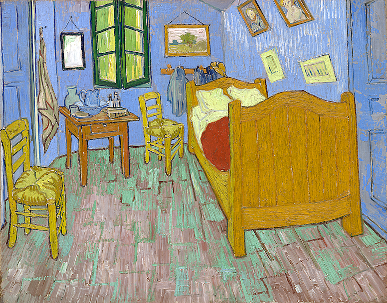
The Bedroom, Oil on Canvas, 29 x 36″, Art Institute of Chicago, 1889.
Van Gogh painted this interior three times while he stayed in the Yellow House in Arles, France, as he was particularly pleased with the bedroom where he had a bed, a small table, and two chairs. This moment marked the first time the artist had a home of his own.
He wrote to his brother, Theo, “It amused me enormously doing this bare interior. With a simplicity à la Seurat. In flat tints, but coarsely brushed in full impasto, the walls pale lilac, the floor in a broken and faded red, the chairs and the bed chrome yellow, the pillows and the sheet very pale lemon green, the bedspread blood-red, the dressing-table orange, the washbasin blue, the window green. I had wished to express utter repose with all these very different tones.”
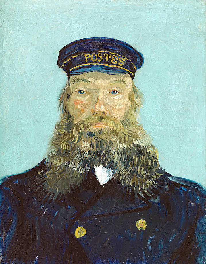
Portrait of Postman Roulin, 32 x 25”, Oil on Canvas, Detroit Institute of Arts, 1888.
Van Gogh painted Joseph Roulin and his family several times each, and the painting here is the second version painted in early August 1888. There were at least seven portraits of Roulin, as he befriended not only the man but his entire family. He found affordability in the work of the Roulin family, for which he made several images of each person. In exchange, Van Gogh gave the Roulins one painting for each family member. One cannot imagine how the strokes of color in his beard appealed to van Gogh and this relatively new application of oil paint. The painting was acquired in 1935 by Edsel and Eleanor Ford as a gift to the DIA.
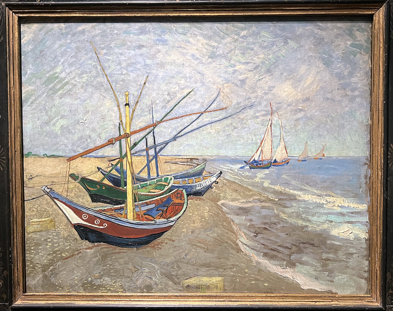
Fishing Boats on the Beach at les Saintes-Maries-de-la-Mer, Oil on Canvas, 25 x 32, Van Gogh Museum.
It was in February of 1888 that Van Gogh was living in Arles and would take excursions to Provence and the village of Les Saintes-Marie-de-la-Mer. Van Gogh would have liked to have made this painting on the beach, but the fishermen would put out to sea every morning, so he would make his drawings early and finish the painting in his apartment studio. In doing so, he could control his choice of color to his liking, using primary color juxtaposed with secondary color in the boat composition.
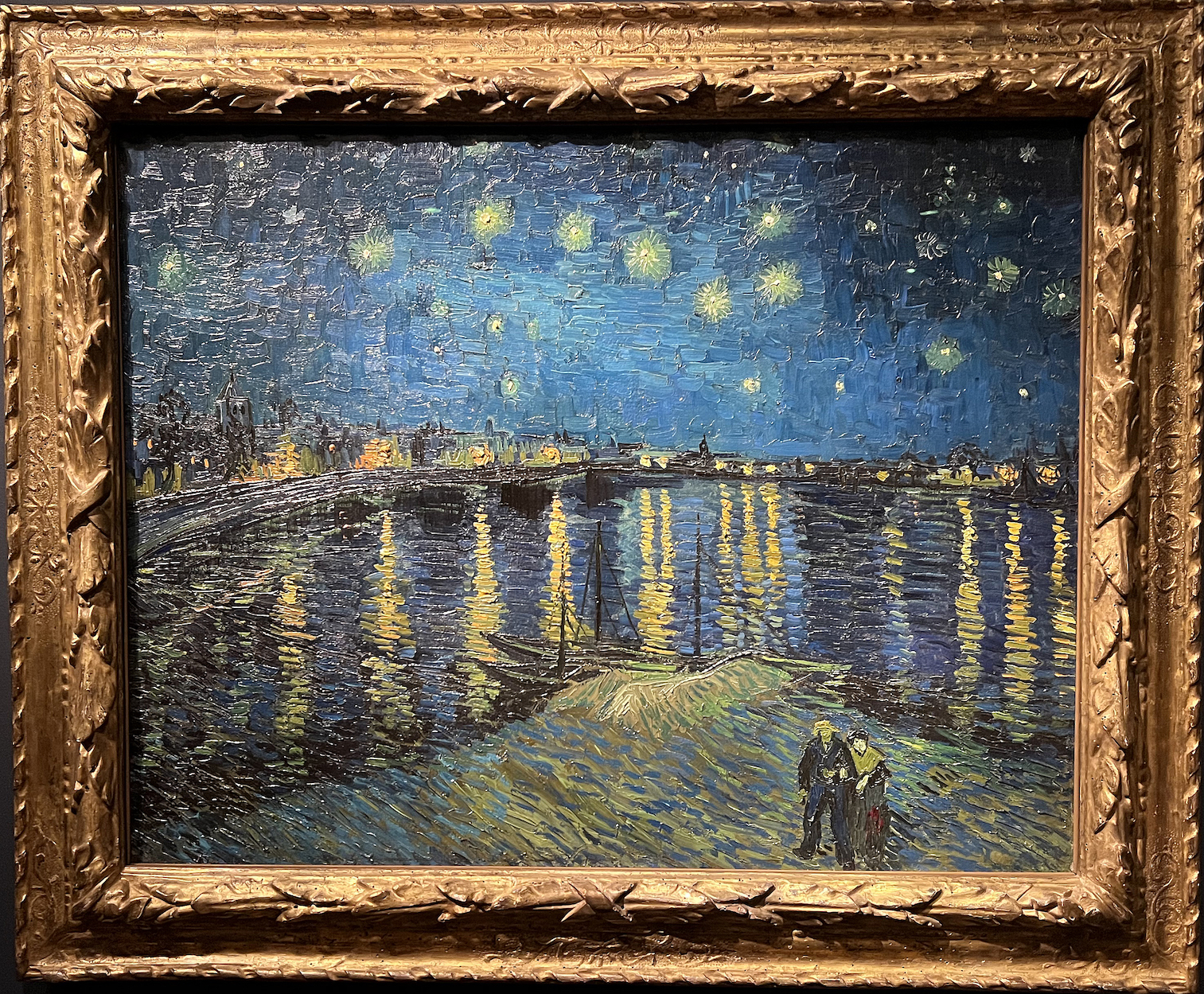
Starry Night (Starry Night Over the Rhone), Oil on Canvas, 28 x 36″, Musee d’ Orsay, 1888.
The DIA takes the visitor out of the exhibition with Starry Night Over the Rhone, which is just what this review will do. Just a two-minute walk from the Yellow House, painted in 1988, the subject is the night light and its effects on the river Rhone. The view from the east turn in the river towards the western shore of rocks is where Arles was built. After spending his days in the sunny fields of flowers and crops, the idea of painting at night must have intrigued Van Gogh. Here the gas lights from the town are complemented by the formation of the stars. Van Gogh writes to his brother Theo, “This morning I saw the countryside from my window a long time before sunrise with nothing but the morning star, which looked very big.” As it turns out, The Starry Night is one of the most recognizable paintings in western art.
On March 17, 1901, 71 of Van Gogh’s paintings were displayed at a show in Paris, and his fame grew enormously. Van Gogh’s sister-in-law, Johanna, had collected as many of Van Gogh’s paintings as she could but discovered that many had been destroyed or lost as Van Gogh’s mother had thrown away crates full of his art. His mother lived long enough to see her son hailed as an artistic genius.
Today, Vincent van Gogh is considered one of the greatest artists in human history.
I would like to distinguish between experiencing all the places one sees the remnants of Van Gogh’s artwork versus observing the original artwork up close in the DIA. That is one of the purposes of the museum. Educators and researchers refer to this experience as being in the presence of a “primary source.” Primary sources are what remains from the past. Aside from human memory and the unrecorded passing down of information from generation to generation, experiencing original paintings are the only way current generations can hope to understand what an authentic Van Gogh painting looks and, more importantly, feels like. In my later years, and over time, I have seen Vincent van Gogh paintings in various museums, but I never saw 74 artworks in one place. From so much that was written about him, Vincent van Gogh was a fragile and sensitive man burdened with poor health. As an artist, he became an instant soul mate to many. He was dependent and vulnerable but always willing to make himself available to his audience.
Take advantage of this opportunity to spend quality time at the Detroit Institute of Arts and join family and friends to view this extraordinary exhibition Van Gogh in America.
Installation image Van Gogh in America, Detroit Institute of Arts
Van Gogh in America celebrates the DIA’s status as the first public museum in the United States to purchase a painting by Vincent van Gogh, his Self-Portrait (1887). On the 100th anniversary of its acquisition, experience 74 authentic Van Gogh works from around the world and discover the fascinating story of America’s introduction to this iconic artist in an exhibition only at the DIA.
A full-length, illustrated catalog with essays by the exhibition curator and Van Gogh scholars will accompany the exhibition. The Detroit Institute of Arts is the exclusive venue for this exhibition.
Tickets are $7-$29 for adults; discounted prices are for residents in Wayne, Oakland, and Macomb counties. The DIA exhibition Van Gogh in America will run through January 22, 2022
The exhibition Confluent, now at the Elaine L. Jacobs Gallery until December 9, combines pieces from the Wayne State University Art Collection with artists creating work in Detroit now, many of whom have current or historical relationships with the university. It’s a reunion of sorts, and quite a party.
Over the past 50 years, Wayne State has been the repository of the University Art Collection, an ever- growing assortment of works by many significant artists who have lived and worked in Detroit. Some were here for a time and left, often going on to success in art scenes on the east and west coasts. Others have stayed put, finding in the frayed edges and vacant spaces of the city a congenial home for their talent. Confluent re-unites artists working here now with a Detroit diaspora.
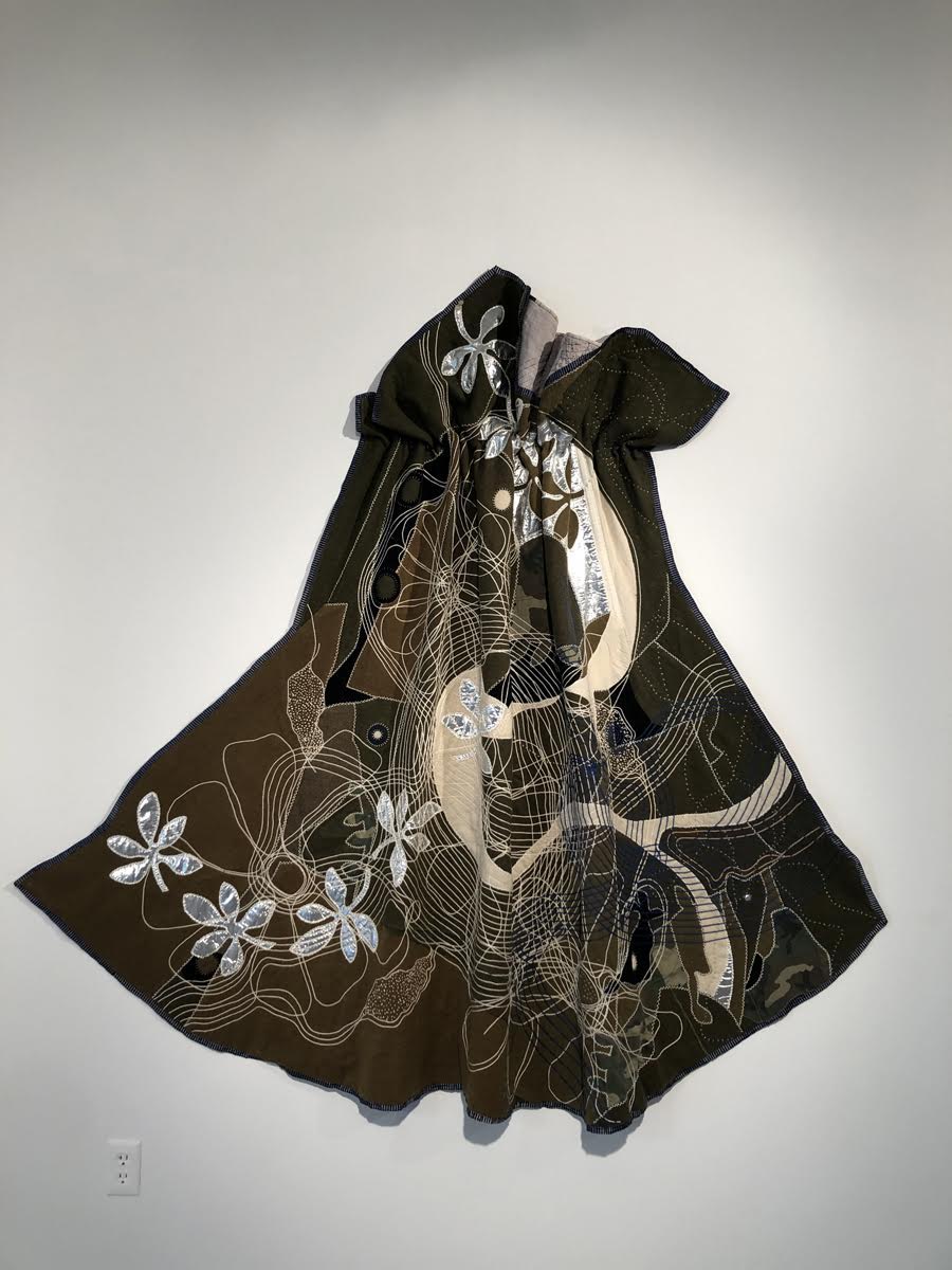
Jeanne Bieri, The Dance, 2022, army blanket, silver lame’, rayon, wool silk, cotton, army suture cotton from Korean police action lined with repurposed dyed quilt.
Ellen Phelan, Untitled (Shield) 1971, acrylic on cut canvas, photos: K.A. Letts
For the purposes of Confluent, an eclectic group of artists chosen by the collection’s curator, Grace Serra, has been invited to select a work—or several–from the collection that corresponds in some way to their own art practice. Three of the artists, Darryl DeAngelo Terrel, Mary Fortuna and John Rizzo, have chosen to make work specifically for this exhibition. Part of the fun of a visit to the gallery now is to be found in tracing the similarities and contrasts among the artists and their chosen pairings and in making connections of our own.
Upon entering the gallery’s main floor, we find Sandra Osip’s colorful vegetal constructions. She has chosen to pair her work with two pieces from the collection, Douglas James’s decorous oil paintings, both from 1973, Stalked Tomatoes and Untitled (Stalked Tomatoes). While the thematic connection is apparent, Osip’s three-dimensional, shocking pink and aggressively feminine Pop-Pop seems also to be engaged in a little side flirtation with Tom Pyrzewski’s nearby louche and bulbous wall-mounted Birth, Re-birth and Moving Parts (2021). Pyrzewski has partnered himself with a beautiful and dignified mixed media wall relief Copernican Communication-Molecular Systems (1983) by Gordon Newton (1948-2019.)
Tom Pyrzewski, Birth, Rebirth and Moving Parts, 2021, mixed media, photo courtesy of the artist.
Gordon Newton Copernican Communications- Molecular Systems, 1983, wood construction, photo: K.A. Letts
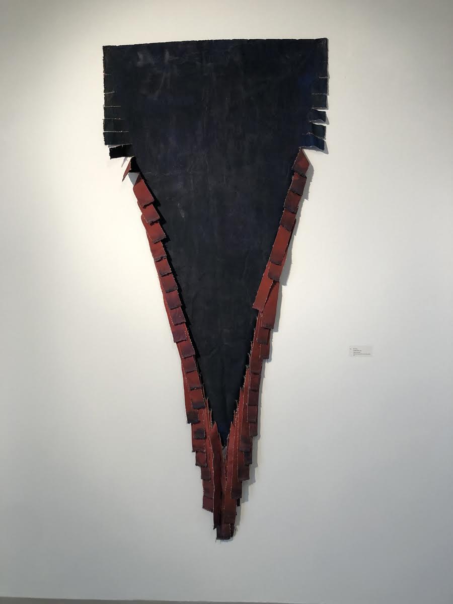
Across the gallery, Jeanne Bieri’s improbably beautiful mashup of silver lame’ and old army blankets, The Dance (2022), fits comfortably on the wall with Ellen Phelan’s 1971 Untitled (Shield), a triangular, fringed canvas tapestry.
John Rizzo’s tall, skinny Jenga-like wooden obelisk Ascending (2022) points the way to the upper gallery where more discoveries await. At the top of the stairs, Rizzo–there he is again—modestly frames a tiny piece by Judy Pfaff, Al’s(1974) with his nicely crafted and subtly colored hoop sculpture Contemplative View (2022.)
John Rizzo, Contemplative View, 2022, maple, poplar, paint, lacquer. And Judy Pfaff, Al’s, 1974, wood, tin, oil paint on wood, photo courtesy of John Rizzo
Donita Simpson’s intimate portraits of Detroit’s artists and other cultural figures sit side-by-side with Kurt Novak’s (1945-2019) prankish scanner photographs. The contrast in the bodies of work by these two artists is a reminder of the infinite variety within the medium of photography. Simpson’s dignified portrait of arts writer and Wayne State educator Dennis Nawrocki, backed by his collection of vintage ceramics, Literary Artist Dennis Nawrocki (2017), is a foil to Novak’s comic image of the same writer’s (much younger) face smashed up against the glass of a scanner, Dennis Nawrocki (Detroit Portrait Series, 2003-2005). Both say something true, though different, about the subject.
Donita Simpson, Literary Artist Dennis Nawrocki, 2017, courtesy of artist.
Kurt Novak, Dennis Nawrocki (Detroit Portrait Series), 2003-2005, archival pigment print on cotton.
Abstract painters Anita Bates and Marcia Freedman have paired their work with Ron Weill (1945-2019) and Don Willett (1928-1985) respectively, but there is a case to be made that their similarly scaled artworks, installed opposite each other, make for interesting gallery companions on another level. Bates’s painting From Way Up High (2022) is all surface and translucence, shimmering metallics and dense blacks that seem to have arrived on the painting’s surface by some kind of alchemy rather than through the prosaic application of paint. By contrast, Freeman’s painting Cuz(2022) sets up a dark and mysterious fictive space within which a glow like that of a blast furnace pulses.
Anita Bates, From Way Up High, 2022, mixed media, photo courtesy Elaine L Jacob Gallery
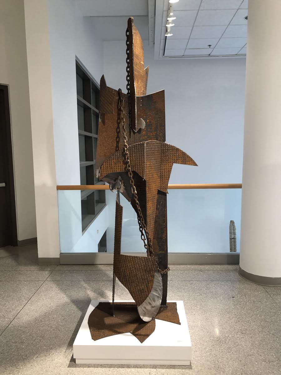
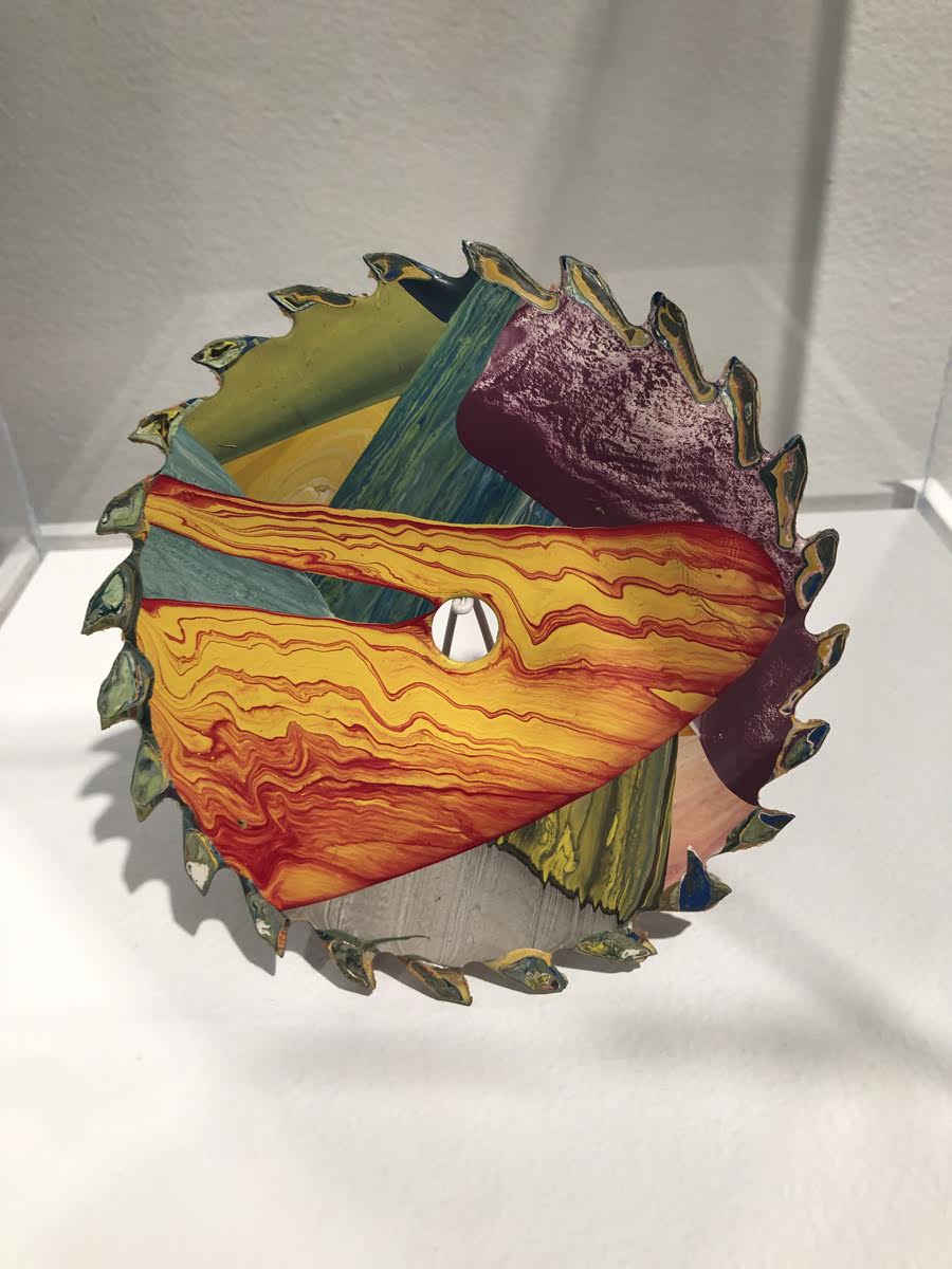
Around the corner, a monumental, welded steel sculpture Sentinel for Martin (2022) by M. Saffell Gardner, is paired with a small painted steel saw blade Untitled: Happy Birthday Jim (1973) by John Egner (1940-2021). Egner was a teacher and mentor to Gardner and in spite of the disparity in scale, the two pieces share a sense of connection with the larger community that resonates.
Marcia Freedman, Cuz, 2012, oil on canvas, photo: K.A. Letts
Three humorously improvisational assemblages by Mariam Ezzat, Nothing Lasts Forever, Saint Sophia; Nothing Lasts forever Except you: Animus Possession and Nothing Lasts Forever Except You: Earth Angel (2022) play well with The Offering (1983) an arresting early painting of comic menace by Brenda Goodman. The work of these two artists, though created 40 years apart, expresses a spirit of irreverence and experimentation—an attitude of what-the-hell and why not?–that is very Detroit.
Brenda Goodman, The Offering, 1983, oil on canvas, courtesy of Elaine L. Jacob Galley.
The artworks from the University Collection, shown alongside the recent output of Detroit artists, begins to bring the unique creative spirit of the city into focus–improvisational and often cheeky, but serious and hard-working too. As Curator Grace Serra says in her exhibition statement, “The collection is special and unique; I believe it is the only collection that directly mirrors the diverse styles and artists of the community, capturing the depth and breadth of the cultural landscape.” Her bold claim is backed up by the diversity and quality of the work in Confluent and it’s a powerful argument for keeping the collection on permanent public display to provide context and inspiration for artists working in Detroit now, while honoring and preserving the city’s shared art history.
Saffell Gardner, Sentinel for Martin, 2022, welded steel.
John Egner, Untitled (Happy Birthday Jim) 1973, oil on the circular saw blade, photos: K.A. Letts
Artists in Confluent:
Anita Bates, Jeanne Bieri, Darryl Deangelo Terrell, Sergio De Giusti, Mariam Ezzat, Mary Fortuna, Marcia Freedman, M. Saffell Gardner, Laura Makar, Sandra Osip, Tom Pyrzewski, John Rizzo, Donita Simpson, Diane Carr, John Egner, Brenda Goodman, Susan Hauptman, Douglas James, Gordon Newton, Kurt Novak, Judy Pfaff, Ellen Phelan, Robert Quigley, Ron Weil, Robert Wilbert, Don Willett
The exhibition Confluent, now at the WSU’s Elaine L. Jacobs Gallery until December 9, 2022