
Critical art reviews of Detroit galleries and museums weekly

Author: Ron Scott Page 22 of 36

NAIAS @ Cobo Hall, Detroit, Michigan, USA

Floor View of NAIAS

So last year, I wandered out onto the farthest fringe of the fine art community and made a decision to write about the 2017 North American International Auto Show (NAIAS). At the time I declared it to be an exhibition in the Detroit metro area worthy of our time and effort. Now, the new 2018 review comes on the heels of writing a review of Monet: Framing Life, an exhibition now at the Detroit Institute of Arts.

In my 2017 Auto Show review, I gave recognition to the Eyes on Design competition and to the College for Creative Studies for their exemplary Transportation Design Program. In addition, I acknowledged all the fine artists who worked in the automotive design process by day, and do their own personal and private fine art work in their home studios on weekends and by night. I did this review based on attending the 2017 public viewing of the auto show, packed with a widely diverse audience of families and individuals from all walks of life. When the review was published, I did get positive feedback from NAIAS officials as they recommended that in 2018, I should apply for a press credential. For the 2017 Detroit Art Review, I went about my business and selected a luxury production car, the 2017 Lincoln Continental, as having the highest level of overall aesthetic appeal, followed up by my reasons for the selection and why.

There were critics, of course, both writers and artists who thought I had lost my mind by comparing the design elements of a car to the exhibition of paintings by Van Gogh or Edward Hopper, but many more could easily see the connection between the artisans who work in the automobile design departments and their personal artistic talent, of which many men and women exhibit in galleries, museums, and fine art competitions right here in Detroit.

But that was last year. In December of 2017, I contemplated a new review of 2018 NAIAS. Should I do another?  I began by applying for a press credential and was rejected and then rejected again on appeal. Then I approached the Chairman of the CCS Transportation Design program by email and asked for his input. He said he supported the idea whole-heartedly, but soon his emails stopped and he could not be reached. After the rejection by NAIAS for press access, they suggested that I should simply attend one of the Industry Preview Days. I did that and paid dearly for the, um, privilege. $110 for the ticket, $15 for parking and $4 to hang up my coat, all in a good effort to provide publicity and good will to the auto industry. (I am happy to report that using the men’s room is still free.)

Audi V-10 R8 Coupe convertible

The first thing I bumped into on the showroom floor was the new Audi R8 V-10 sports coupe powered by a 10-cylinder gas guzzling engine with a 14mpg (they may have fudged on the mileage). Considering the price tag of $175,000, that seemed like enough money and cylinders for four cars.

I moseyed up to a high platform where the view consisted of thousands of white men, aged 30-60 years old, in dull slacks, dress shirts, short hair, and glasses. Many were clustered in groups and held an itemized pad for notes and iPhones for taking pictures.

Several times I asked those working the show what was meant by Industry Preview Day. Their responses varied greatly. “Mostly engineers…looking at the competition,” or “VIPs from headquarters” or “today is for the auto designers and their teams,” or “it’s mostly a perk for suppliers or dealers.” My guess is they all were provided with a free ticket.

Bluntly, it was a sea of Caucasian men as far as I could see. I did see an African American security guard in a red coat, and an African American cleaning lady, in that same red coat. To be fair, there might have been one or two women there, probably VIP spouses, and a few Asian engineers. Notable were several undercover police officers with sniffer dogs, and at each entrance, African American security guards (in their red coats) doing body scans with an electronic wand. Well, good. I felt safe, but there was a new experience ahead.

As you might recall or imagine, the Cobo exhibition hall is a large, circular space filled, in this case, with very expensive sets are individually designed and assigned to each automobile manufacturer. What I didn’t expect to see was a section devoted to automotive suppliers. I guess that means more revenue for NAIAS and Cobo Hall.

The first supplier exhibit I came across was Aramco Transport Technologies, which provides technology that improves mileage, emissions, and efficiency. I asked a representative where their headquarters were, and they said, Novi, Michigan. Apparently, they are also located in other parts of the world, like Paris, France. When pressed, they said they were a division of Saudi Aramco in Dhahran, Saudi Arabia, the state-owned oil company that is the world’s top exporter of oil and natural gas.

To be fair, Aramco has developed a Mobile Carbon Capture technology that captures the Co2 before it leaves the car, which is then stored and unloaded for reuse. Although there were electric cars, like Volkswagen’s concept car, in most of the displays, but I did not see a supplier of passive energy sources for automotive use.

There was Denso North America, leaders in corrosion prevention and sealant technology, headquartered in Kariya, Japan. There was a large display by Aisin Group that specialized in powertrain components, also head quartered in Japan, but I asked myself; who is coming to NAIAS to look into the technical parts of a car or cross-sections of a transmission? Are they lobbyists? I would be remiss if I did not mention the Michelin Tire Display, fudge from Kyba’s Mackinaw Island and the candied almond vendor.

2018 Lincoln Continental

But back to my mission to find a car that has the highest level of overall aesthetic appeal, which leads me to another revelation: The design of production cars changes very slowly, as this year’s models demonstrated. I was drawn back inexorably to the Lincoln Continental. The understatement of line, shape, and proportion still provides the viewer with a feeling of strength and security. The lines curve down and inward, an aesthetic sometimes seen in European sports cars. The repetition of roundness is soothing. Stylish elements abound, like the way the E-latch door handles provide a graceful inset in the side door, and five LED lamps create a slender design to what used to be a larger headlamp.

2018 Lincoln Continental Grill Detail

The front grill is refined, delicate and proportionate to the front profile, while the small openings in the grill repeat a similar shape of the car logo. A sleek console serves to open up the cabin, while the sophisticated push-button gearshift integrates seamlessly with classic knobs and buttons. The leather-wrapped, hand-stitched steering wheel is mounted ahead of a 12.3-inch fully configurable digital instrument cluster that displays easy-to-read driver information clearly. Sitting in the car, looking closely at its design elements, I was left with what I experienced last year, which is that the Lincoln Motor Company, the luxury automotive brand of Ford Motor Company, is committed to creating an exquisitely designed vehicle that places itself above their competitors.

2018 Lincoln Continental fron interior


Everything I experienced with the cars themselves remains the same, particularly when it came to recognizing the designers who work hard at deserving their much-earned success around the world. As I mentioned, NAIAS has its own Eyes on Design program, and this year they gave the KIA Stinger their choice for Best Production Car award. (South Korea is hosting this years Winter Olympics) If you’re curious, the awards are decided on by four chief judges, and thirty-two regular judges who must work together on a process that I cannot imagine, but it is their official program, highly honored and celebrated. Congratulations! But as for my experience with NAIAS 2018 Industry Preview Day, it was enlightening and disappointing. The cars were sleek and shiny, the crowd was bland, and the diversity of people packed into Cobo Hall on this day…was racially offensive.

NAIAS 2018 @ Cobo Hall, Detroit
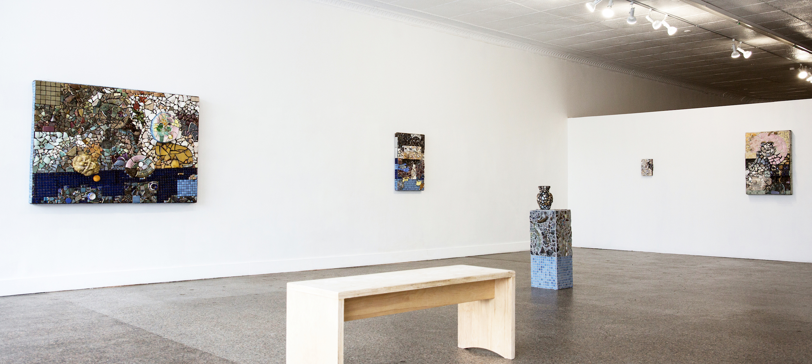


Virginia Rose Torrence @ Trinosophes Gallery

Virginia Rose Torrence, Ceramic, Installation image courtesy of Ali Lapetina.

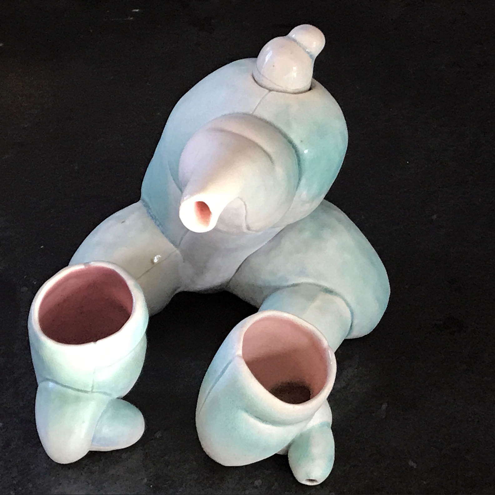
Wandering through Professor Tom Phardel’s department studio at the College for Creative Studies several years ago, I noticed an enigmatic shaped tea set— two small cups and tea pot—sitting on a shelf waiting to be fired in the kiln, that could as well have been made by an artist from the early 20th century. Seductive, biomorphic shapes bulging with curves and openings, lip-shaped edges, and resting in feline-like posture, it was nevertheless restrained, unassuming and, quite simple and strangely beautiful. A few weeks later at the annual CCS student show, I discovered it once again on a display shelf, but now it had a slightly glistening, pinkish, and minty skin like pigmentation; they were now complete and transcendent.

Virginia Rose Torrence, “Untitled (teapot),” 6”x6”x7,” ceramic, 2011  Archive photo.

I only mention these earlier works of Virginia Torrence because of the radical change in the new work exhibiting at Trinosophes Gallery in the market area of Detroit. Since her precocious student work, Torrence has shifted perspectives. Moving from celebrating the palpable and bodily in remarkable forms, the new work’s focus is on the act of assembling parts, to picture, in a painterly-like space, in mosaic, a collage of fragments. It was not just a case of a need for change of artistic strategy but it seems a philosophical and psychological relocation. The time-honored tradition of Detroit artists mining the local landscape for materials to make art seems to have grafted on to her new art process. With her husband, artist Henry Crissman, Torrence has become a tenant of the city, living in an iconic Hamtramck neighborhood and working in Cass Corridor gallery and like all the artists who have lived there before, scouring the landscape for pieces of history. Instead of a focus on an inward awareness and desire (in her writing she speaks of “desire” as the emotional engine that drives artists to make art) her perspective is from the center outward.

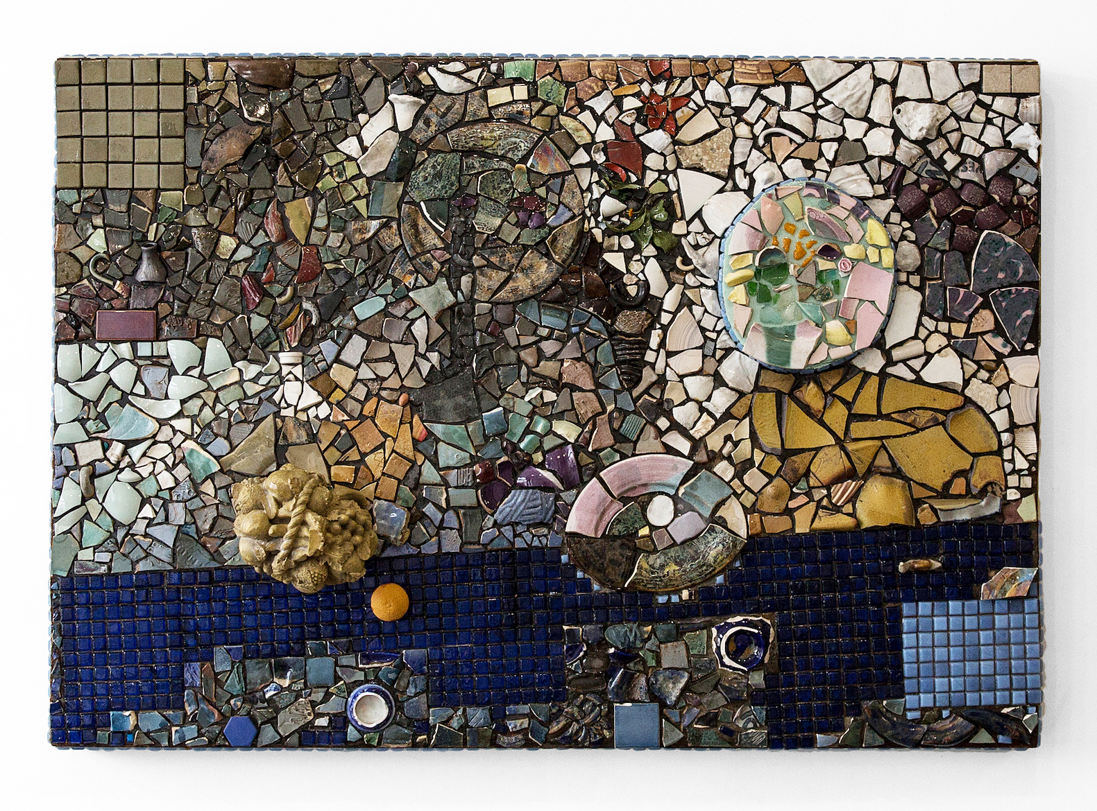
Virginia Rose Torrence, “Untitled,” 48”x69,” ceramics, glass, orange peel, foam, leaves, resin on wood, 2017. Image courtesy of Ali Lapetina

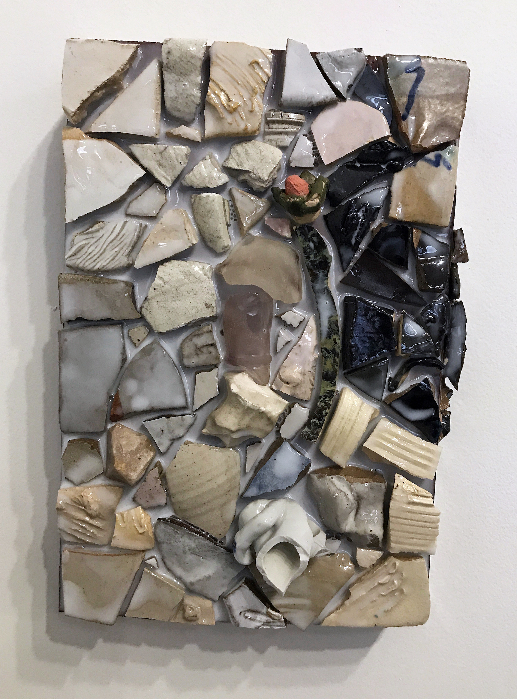
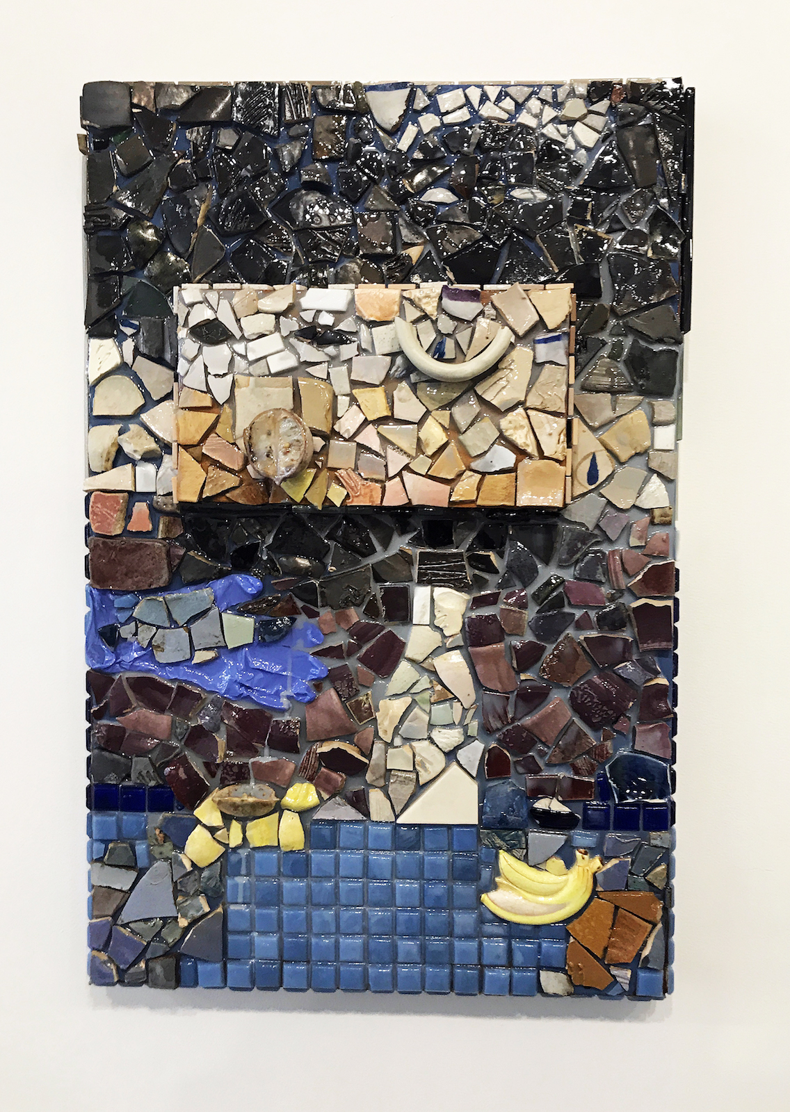
Assembled from gathered ceramic shards and kitschy objects from all over the place—from the shore of Detroit’s Belle Isle, to distant suburban thrift shops, Dollar stores and Craig’s list and remnant shards from other artist’s studios—Torrence has embedded the city in her mosaics. And like her biomorphic tea set her mosaics exhibit a brilliant sensibility. Arranged in a less than a planned scenario, each mosaic suggests an intuitive series of gestures, not unlike the operation of an abstract expressionist painting, that suggest fragments of images and ideas, but not composed narratives. The eye behind the assemblage of shards is fascinating. At once like making a puzzle—finding which shard “fits” where—while composing the spaces between at the same time. It merits a long look, suggesting the honored life of byzantine religious mosaics while revealing the kitschy and derelict simultaneously: a discarded, periwinkle-blue latex glove, an exploding banana, a vase. Torrence’s is a charged poetic strategy.

One can find these “pictures” in the mosaics–references to eating, plastic and real fruit, like sections of an orange or banana, flowers and engaged figures and maybe even self-portraiture and still-lives, even to biblical stories (there’s even a serpent and pear in one mosaic) — but the overall impact of Torrence’s mosaics is celebratory. Each tesserae and object of the eight mosaics is embedded in either a plastic (resin) medium or cement-like grout. The use of plastic resin as a grout gives a glistening, “juicy” (to use Torrence’s word) sensuous vitality to the surface. The mosaics seem to be alive with an inner light and activity and, due to their impeccable positioning, each tesserae seems to vibrate like a molecule. A close-up of one mosaic suggests an ocean tide pool teeming with foamy life, or an erotic flower spreading its seeds.

Virginia Rose Torrence, “Untitled,” 11”x8,” ceramics, glass plastic, resin on wood, 2017. Archive image.

This change, from voluptuous, animal forms to flat, chance driven arrangements, is similar to the shift in the work of the great French-German artist Jean Arp who went from sculpted torsos early in the century, to colorful, flat abstract amoebic shapes by midcentury. In Torrence’s shift, and it seems in Arp’s as well, it is a change from the individual, body-personal to the collective, body-politic, from the sensuousness of smooth sculptural forms to the tantalizing arrangements of objects found in her new space and arranged by the energy of one shape encountering the Other, of Torrence encountering new elements in a new landscape. In a short text about the new work, Torrence said, “I am searching for the piece as I make it. The process is a collaboration between myself and the materials, vestiges of time, that I am piecing together onto a singular plane.” The hybrid mosaic form and expressionistic strategy she employs is an ideal fit in reviving an ancient art for a modern cause.

Virginia Rose Torrence,”Untitled,” 33”x22,” ceramics,glass,rubber glove, lemon, resin on wood, 2017. Archive image.

Trinosophes Gallery – Virginia Rose Torrence’s work through end of January, 2018

1464 Gratiot Avenue, Detroit, MI. 48207     313-737-6606

Basquiat @ Cranbrook Art Museum

BASQUIAT BEFORE BASQUIAT: East 12th Street, 1979-1980

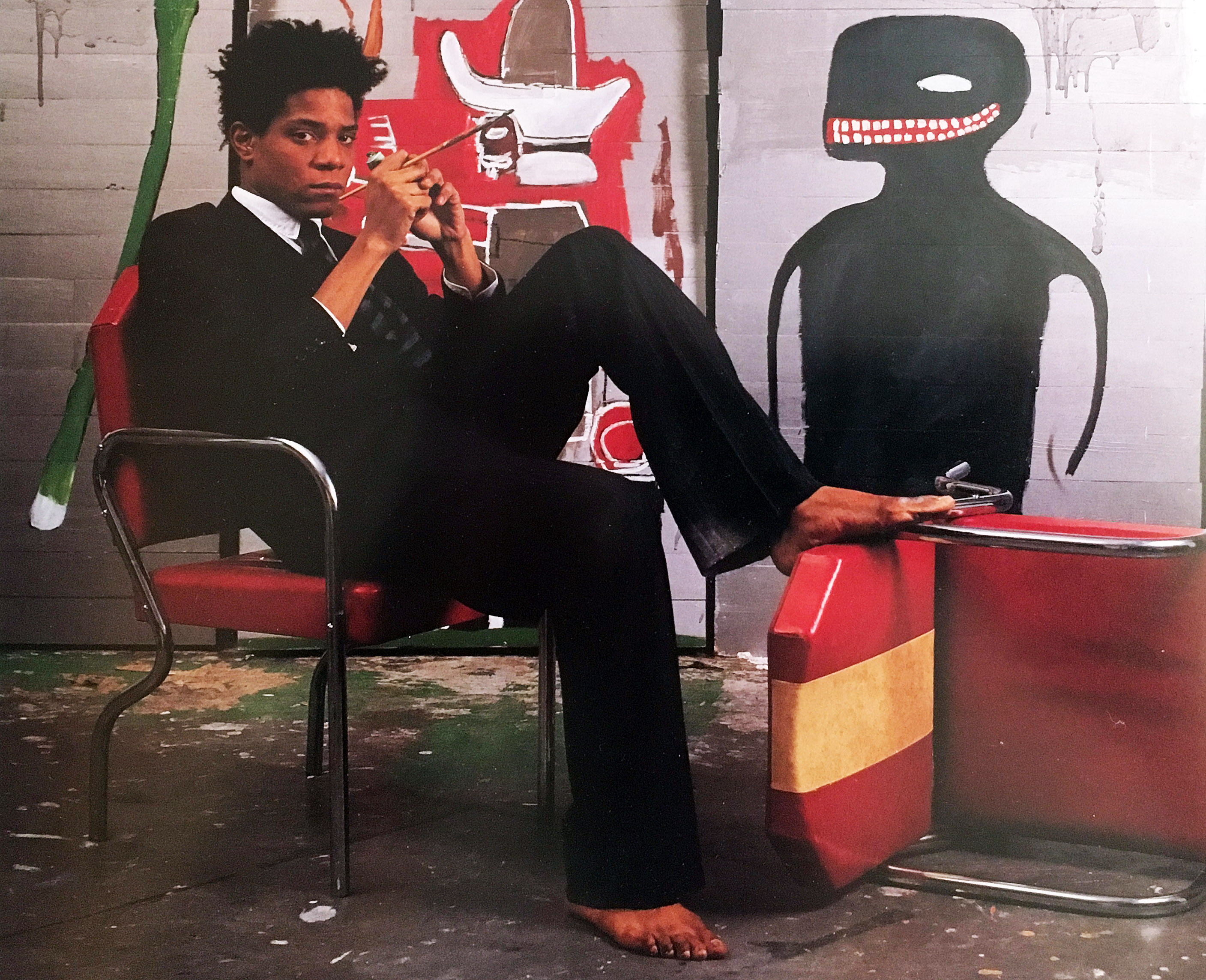
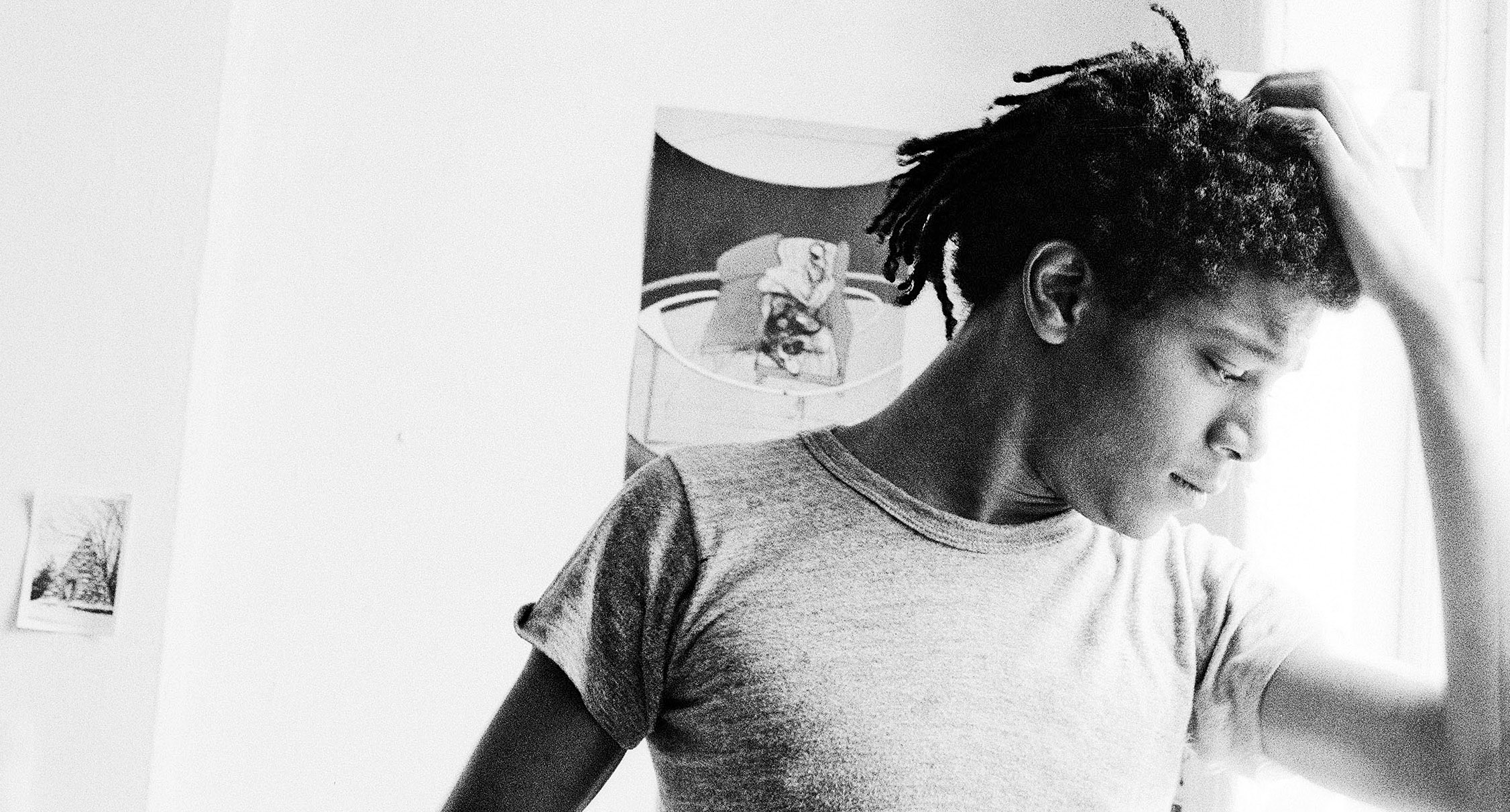
Jean-Michael Basquiat at Great Jones Studio, 1985

In the spring of 1971 when I had just graduated from Wayne State University with an M.A. in painting, I was making surreal landscape paintings. I had not heard of Jean-Michel Basquiat, of course, because he was only ten years old and attending St. Ann’s Catholic school in New York City. Soon after that he was bound for San Juan, Puerto Rico with his father and family for three years, before returning to Brooklyn and finishing high school.

And it wasn’t until the late 1990s when my son Julian Teachworth was finishing his senior year at The Cooper Union in NYC that he told me Basquiat’s work had influenced his painting. It was only then that I became familiar with his work, and that was ten years after his tragic death from a heroin overdose at the age of twenty-seven in 1988.

Andrew Blauvelt, Director of the Cranbrook Art Museum, said, “The exhibition and accompanying catalogue presents New York City in the late 1970s and early 1980s through the prism of Jean-Michel Basquiat’s art and provides a window into the art-rich time that he inhabited and impacted so profoundly. Ultimately, this exhibition will attest to Basquiat’s virtuosity in formation–the creative impulses that yielded a distinctive voice, but also the many diversions or paths he explored as he was developing a signature style.”

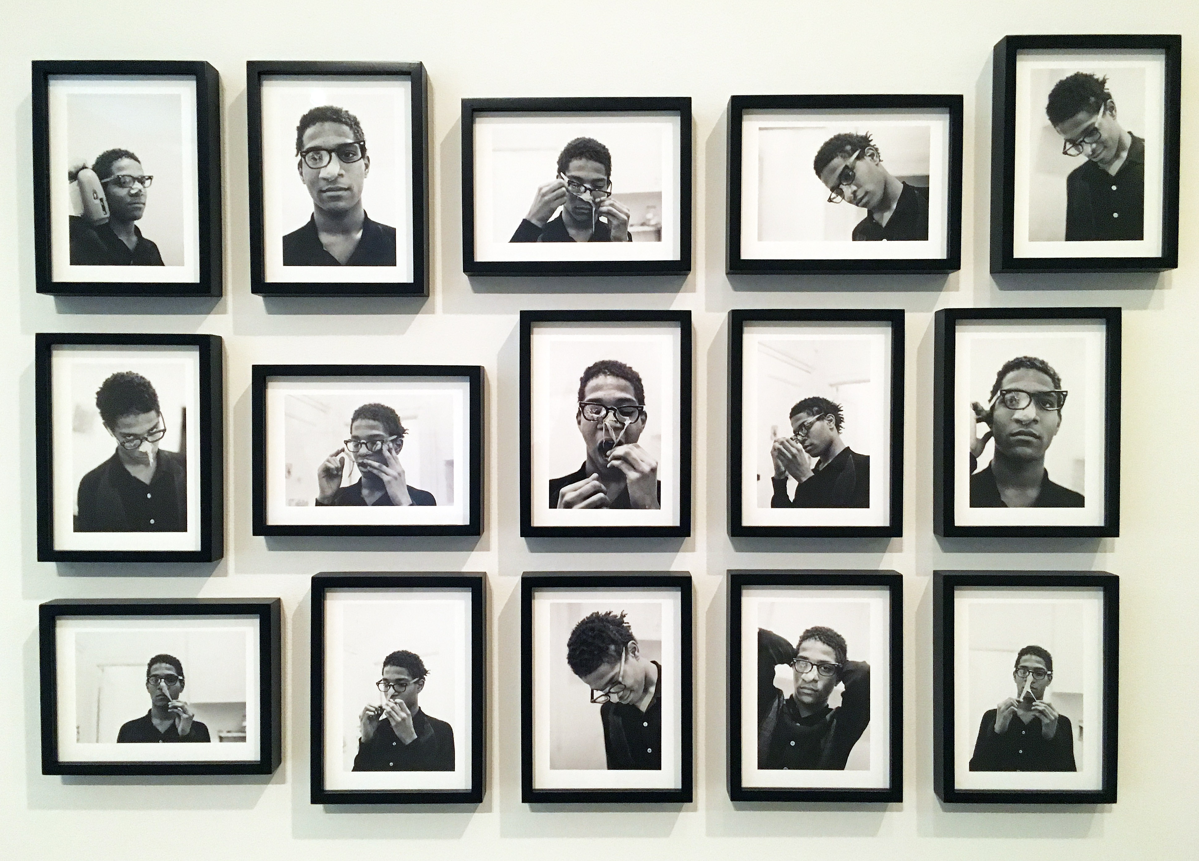
Alexis Adler, B&W photographic images of Basquiat performing in the apartment, 1979

Jean-Michel Basquiat first appeared in New York City in 1980 depicting street graffiti using neat block letters and his SAMO© tags on the surrounding streets of lower Manhattan. It was these early years when Basquiat started dating Alexis Adler and living with a close friend, Felice Ralster, that is the subject for this new exhibition at Cranbrook Art Museum: BASQUIAT BEFORE BASQUIAT: East 12th Street, 1979-1980 that opened November 17, 2017. Basquiat and Adler moved into a small apartment at 527 East 12 Street, commonly referred to as the East Village, and became part of the punk culture largely based around musicians and artists at the Mudd Club scene.

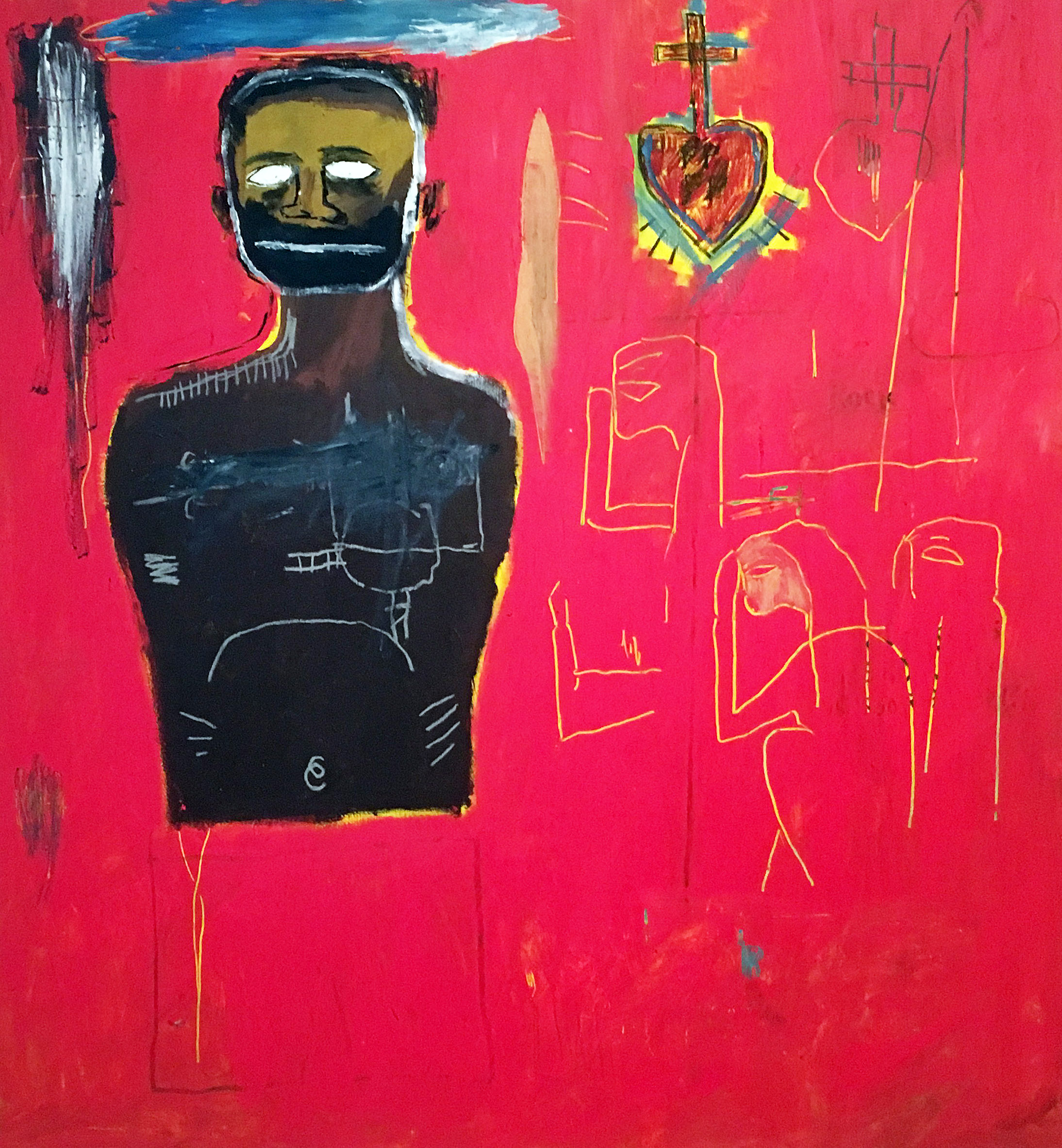
Jean-Michel Basquiat, Untitled, Acrylic and Oil Stick on canvas. 1984

It was at P.S. 1 in a group survey show, New York / New Wave where his work was a step above graffiti street art, as illustrated by his ability for putting things together: masks, words, marks and disconnected phrases. The exhibition included Keith Haring, Robert Maplethorpe, and Andy Warhol. The day after the opening he returned home to Brooklyn around 6:00 in the morning to proclaim to his father, “Papa, I’ve made it!”

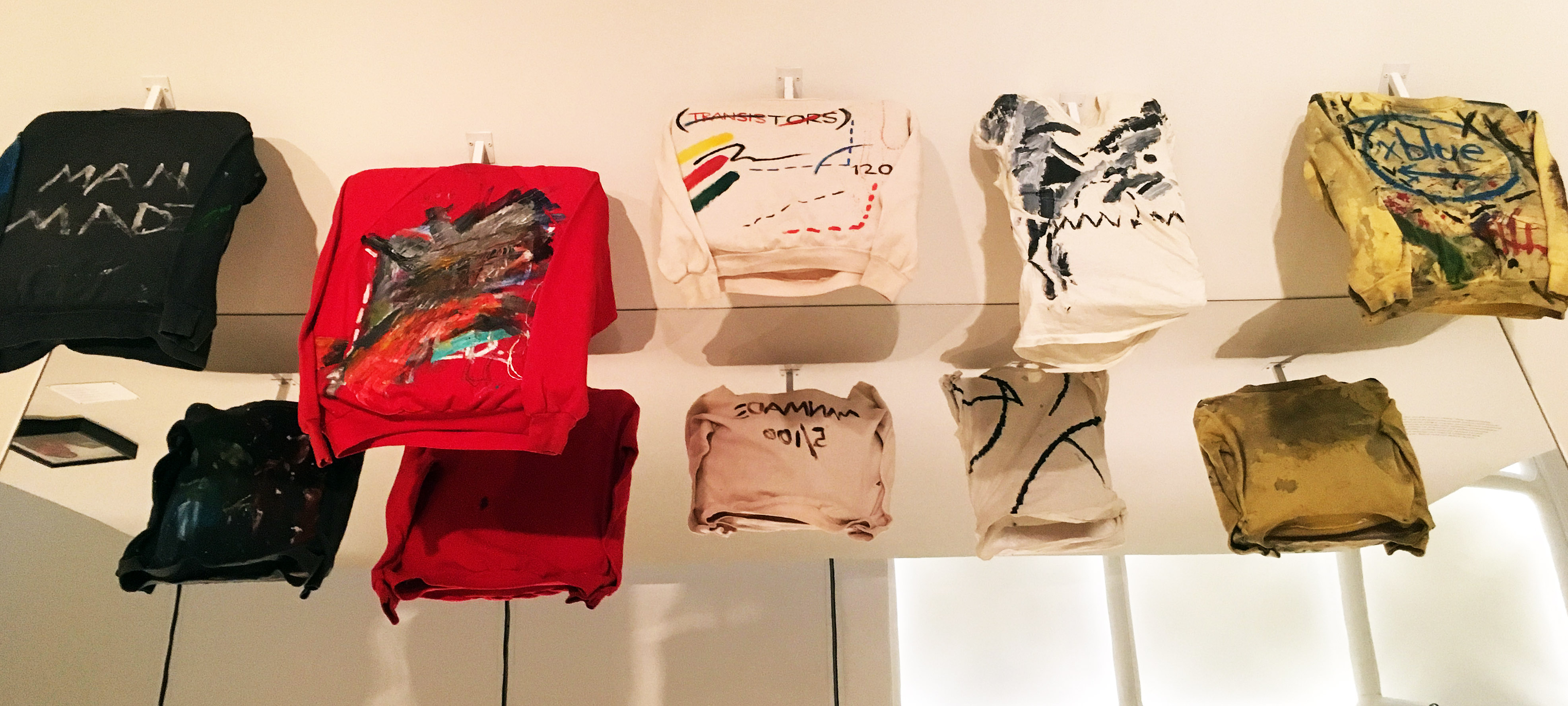
Basquiat made money for paint and his share of the rent by selling T-Shirts on the street. 1979

Basquiat’s riff with his father and his association with Keith Haring and Kenny Scharf, led him to Club 57 and a strong and close relationship with who would become his mentor, Andy Warhol. Back then, Basquiat made his living by selling clothing on the street. On display at the Cranbrook exhibition are T-Shirts he transformed into living works of art to be worn and celebrated as part of his artistic practice.

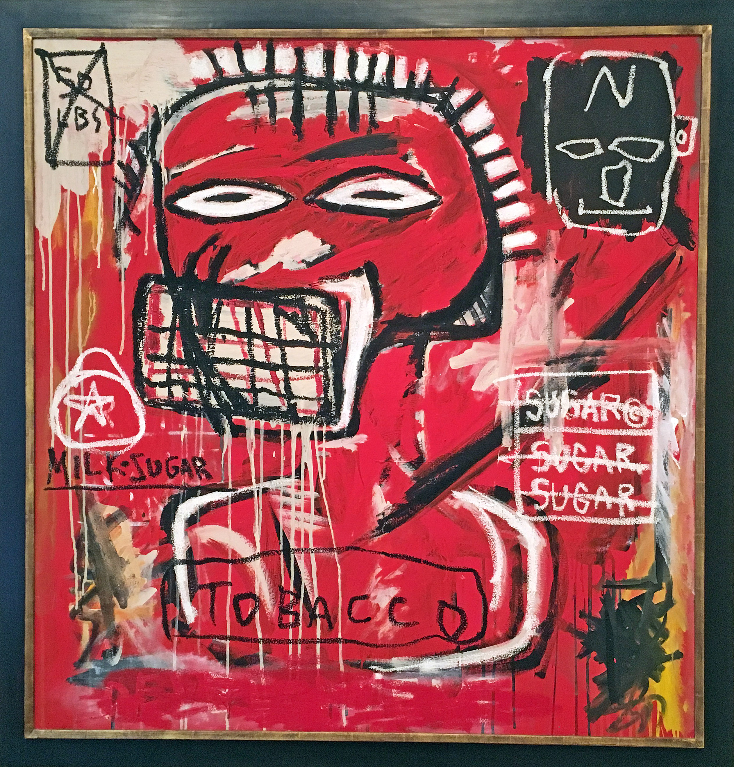
Jean-Michel Basquiat, Untitled (Cadmium) Oil, oil stick, acrylic on canvas 1984

Looking back, I think we see Jean-Michel Basquiat as an artist who emerged from being a graffiti artist during the “punk scene” era, and then ended up as a celebrated artistic phenomenon. Skillfully, he brought together disparate traditions, practices and unconventional styles that established a baseline for artists to come. He was an African-Caribbean artist, who came along at a time when the art world was dominated by exhibitions of Minimal and Conceptual art.

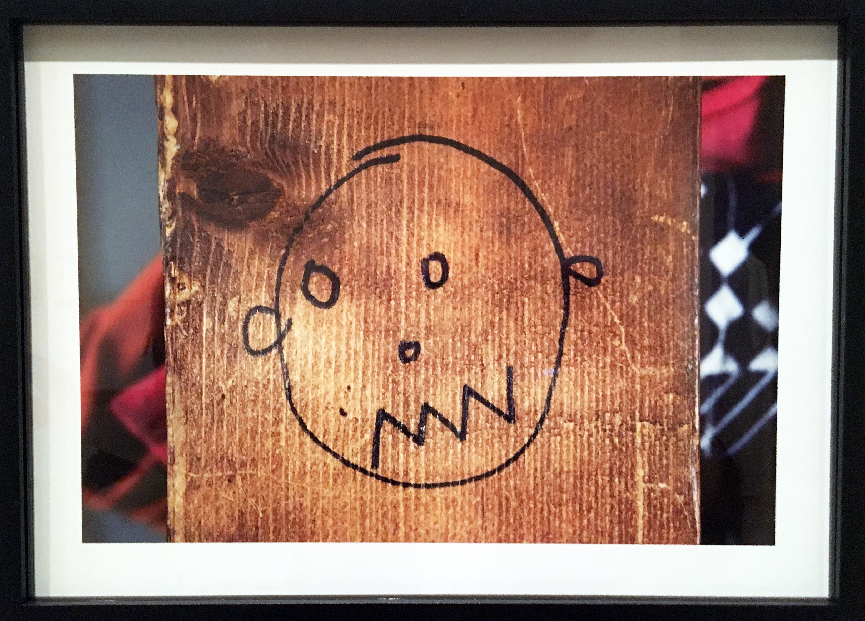
Alexis Adler, Drawing by Basquiat on wall of apartment, Archival pigment print, 1980

Using an archival approach, much of this exhibition comes from the collection of Alexis Adler, and a visit to the exhibition Basquiat Before Basquiat deepens your understanding of this artist while simultaneously providing the viewer with a context of his early work in 1980s New York City. Concurrently, the museum is hosting exhibitions by Keith Haring, Maya Stovall and Ryan McGinness.

Alexis Adler, B&W photograph of Baquiat in the apartment, 1981

BASQUIAT BEFORE BASQUIAT: East 12th Street, 1979-1980, organized by the Museum of Contemporary Art Denver.

Cranbrook Art Museum

Through March 11, 2018


Susan Goethel Campbell @ David Klein Gallery

Susan Goethel Campbell: Faulty Vision, David Klein Gallery

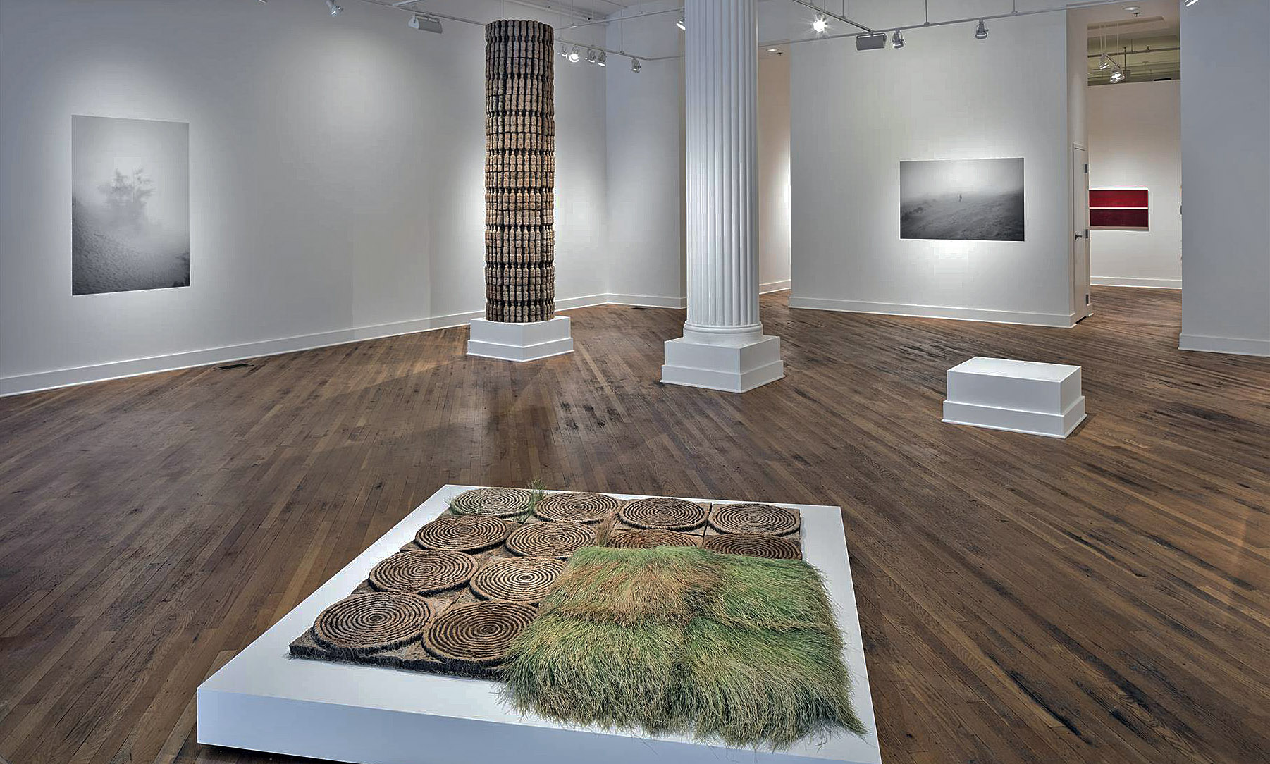
Installation image of front gallery.   All images courtesy of David Klein Gallery 2017

Susan Goethel Campbell’s installation “Faulty Vision” currently showing at the David Klein Gallery has all of the ingredients of the mise-en-scene of a surreal film. Like a Japanese garden it is challengingly eye-opening while meditative. In keeping with Campbell’s engagement with both architectural and “natural” space, “Faulty Vision” is designed as a response to the Beaux-Arts architecture of the Klein Gallery itself. The Grand Entrance, to use Beaux-Arts terminology, of the gallery, entering off of Washington Boulevard, Detroit’s premier Beaux-Art avenue, is activated by Campbell’s large, atmospheric black and white dune-scape photos seamlessly embedded into the walls; her uncanny, actual sized, cast earth and grass column echoes the classical Doric column next to it; magically engineered grassy, target-like images float in the middle of the gallery space; and black and white photos of planet-like orbs float around the space, all suggesting a strange landscape indeed. Each of the objects and images has evolved from the trajectory of recent related, but separate, projects that collectively comprise Campbell’s hybrid artistic practice. It is an elegant albeit enigmatic installation to contemplate.

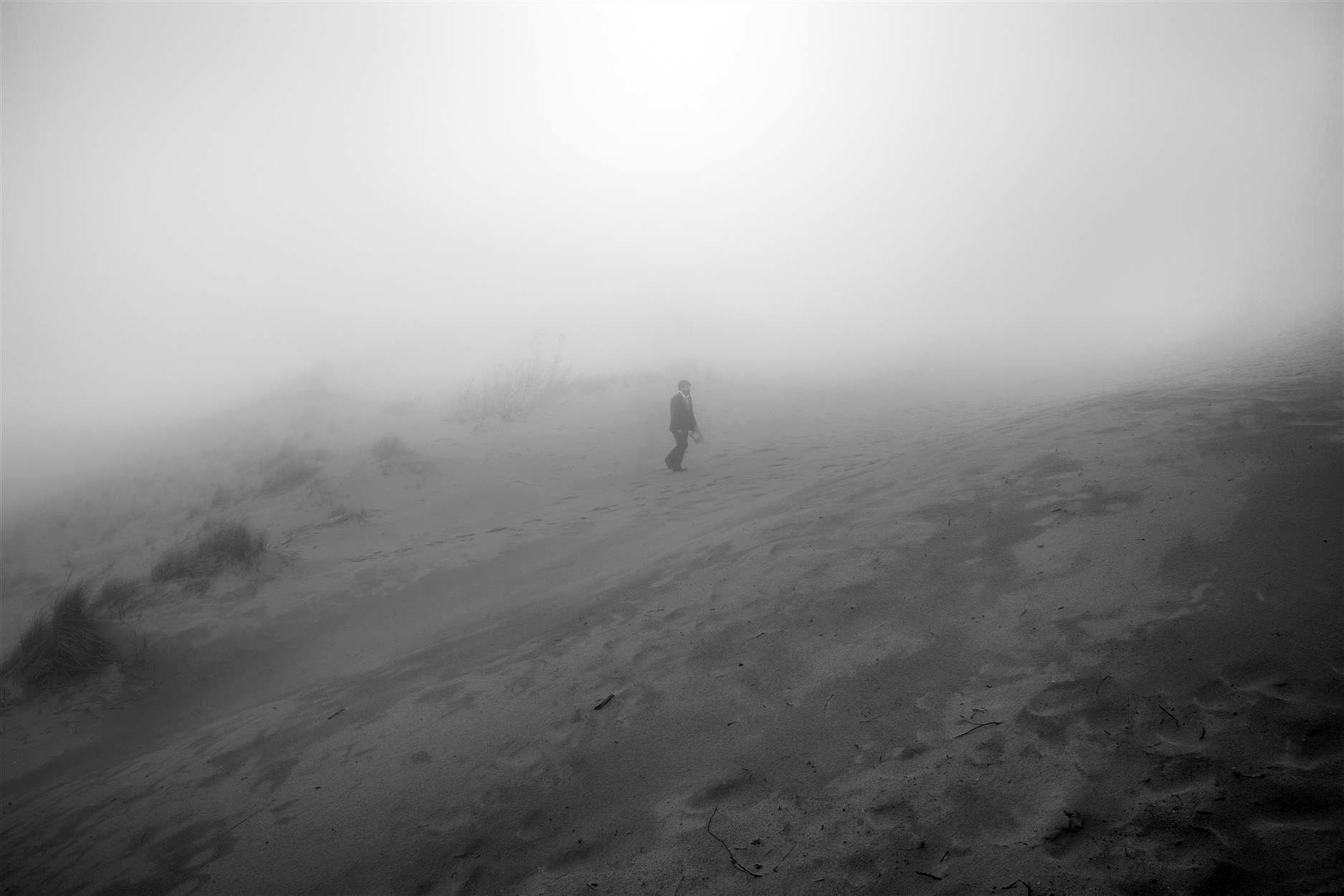
Susan G. Campbell, “Dune No. 2,” 2017, Black and white digital print, 40” x 60”

Trained as a printmaker, it has become a method and process of her practice to see and think in multiple images and variations of those accumulations, as well to consider the processes of the “natural” world (germinating seeds and growth) and of the engineering processes of industrial manufacturing itself that compete with nature. For years now Campbell herself has become a kind of research and development factory, experimenting with organic materials such as seeds, plants, leaves, and even more ephemeral conditions like light, night sky and air itself. The overarching gesture then of “Faulty Vision” is to, it seems, if not challenge, then assay and respond to the symbolic permanence of that Beaux-Arts designed gallery space. Early in the twentieth century, Detroit and most American cities adopted a pared down version of Classical Greek and Roman architectural models, that have historically symbolized the enduring strength and permanence of European culture.

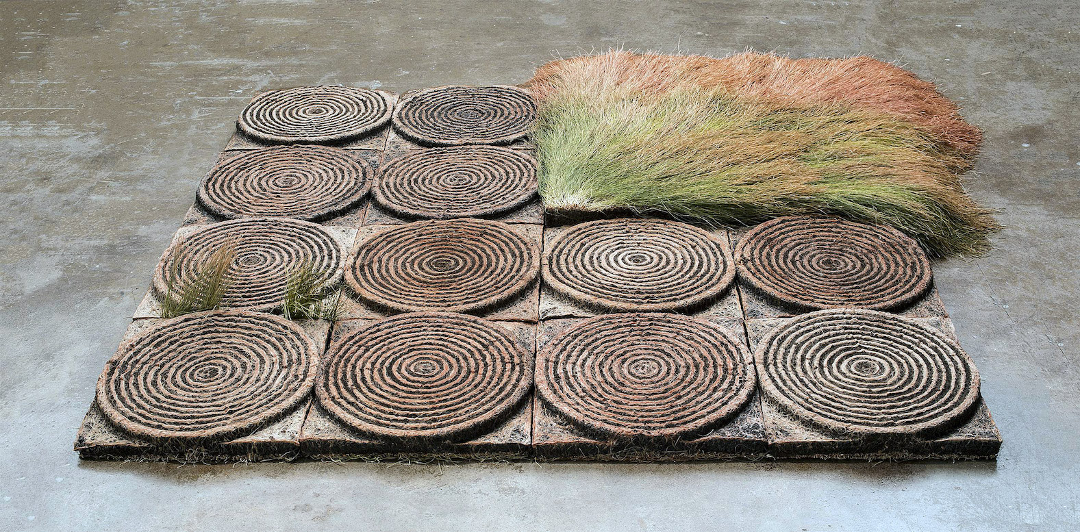
Susan G. Campbell, 4“ Ground no.6 (floor installation), 2017, 51”x51”

When closely examined the stunning earth work sculptures that are installed in the main gallery are all ironically modeled on what were once called “disposable” objects. Campbell’s column is made of hundreds of cast-earth and grass water bottles, grown in molds of the plastic bottles, to form a simulated, fluted Doric column. It is an over-the-top critique of the bombast of classicism and at the same-time beguilingly baroque.  Situated in the gallery’s windows facing Washington Blvd., as if window-displays of consumer goods, are stacks of cast-earth and grass cell phones modeled on the evolving i-Phone, 4, 5, and 6 series. (As in nature phones evolve too). And echoing larger engineered earthworks (such as center pivot watering circles in contemporary agribusiness) as in “Ground No.6 (floor installation),” suggesting also ancient Native American Mound-Builder’s “ruins,” as well as many ancient, rammed earth and mud constructions. All of the materials of Campbell’s sculptures are made of natural, decomposable materials and are serious parodies of the plastic and aluminum models.

At one point in a recent talk at the gallery, Campbell alluded to the earth work of artist James Turrell and fantasized an installation of an enormous field of her own cast-earth concentric rings. “I love multiple images of the same thing…like seeing a shelf of the same product in a grocery store.” Repeating any image, such as the cell phone shape or her concentric rings, is one of the basic tropes of modern art (Warhol) and architecture (Mies van der Rohe) and belongs in any discussion of printmaking as well as mechanical reproduction. Repetition seems to insure coherence and a sense of consistency and security, versus the chaos and uncertainty of the of fickleness of nature. Repetition also is the beginning of making a pattern that creates structure and strength.

Susan G. Campbell, “Dune No.1,” 2017, Black and white digital print, 40”x62”

In the smaller rear gallery, there is a large B&W photo of a sand dune with two human figures seeming to lean into a struggled walk across the horizon. In the grand scheme of things, of the world around them, with enormous emotional sky overhead and menacing mounds of sand dune and dune grass underfoot, they seem remarkably inconsequential and existentially without destination. In a sense this image is a key to the whole exhibition in projecting a heroic, man against nature, Romantically Sublime, vision, in contrast to the constructed space of the gallery. While this photographed landscape captures the same organic materials as her engineered works—earth and grass, such as in Ground No.6– it is chaotic and foreboding, the exact opposite of Campbell’s built organic world. Three other dune photos, with haunting fog and solitary figures, also suggest a counter to the controlled order of Campbell’s engineered pieces and create a narrative tension to the whole exhibition: nature versus the built world.

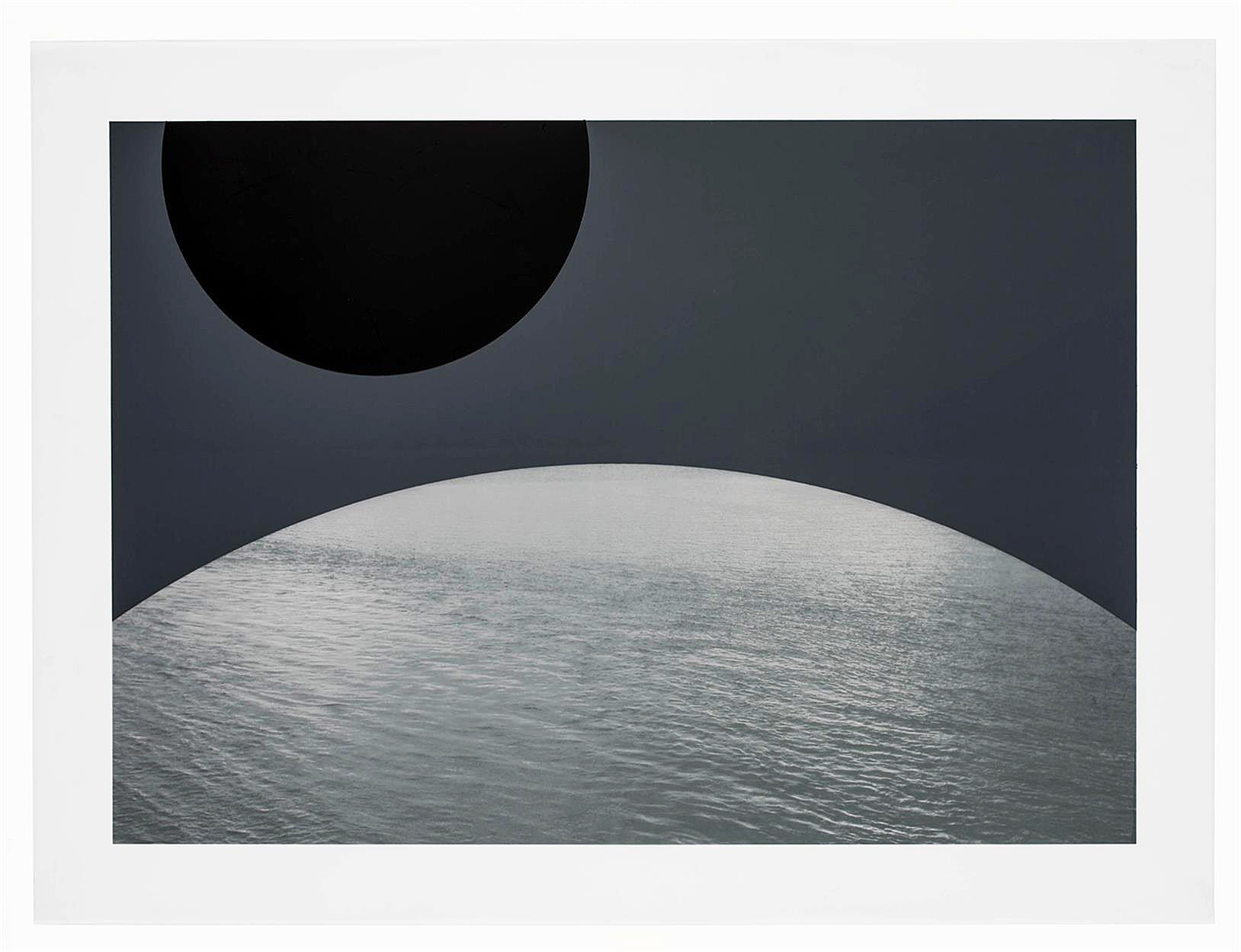
Susan G. Campbell, “Water Planet No. 5,” 2017, Digital print on polyester, spray paint 22 3/4 x 30 5/8″

A third group of images triangulate Campbell’s vision and offer a surreal contrast to the architectural and natural conditions of landscape or environment that determine the rest of Campbell’s projects. The “Water Planets” are a series of images of planet-like orbs pictured as composed of water, floating in a hauntingly empty space. “Water Planet No.5” has two truncated orbs, one eclipsed in shadow and one of water, situated in a matte gray ethereal space. Each “planet” exists in ultimate isolation and, one imagines, can virtually never touch another or conjoin with the other. The “Water Planets” are an uncanny and stunning invention and throw all of “Faulty Vision” into another realm of thought and are superior evidence of Campbell’s considered world.

In “Faulty Vision,” Campbell is responding to an architectural space with its own specific, highly evolved Classical ideology. The David Klein Gallery is not simply white walls upon which to hang her work. The Beaux-Arts history, of which the Klein gallery is a part, is virtually the result of the fantasy of authority and permanence that is western culture. It is the result of a weird evolution and Campbell’s fragile, water bottle, grass and dirt column, circles and i-Phones are a remarkable response to that history. There is an umbrella of ambiguity that protects the complicated equation of “Faulty Vision,” that allows for many readings and wonderings, and Campbell plays on that.

Susan Goethel Campbell: Faulty Vision, David Klein Gallery  Through December 16, 2017

Monet: Framing Life @ Detroit Institute of Arts

Detroit Art Review: Monet at Detroit Institute of Art

The Early Work of Claude Monet While living in the Paris suburb Argenteuil

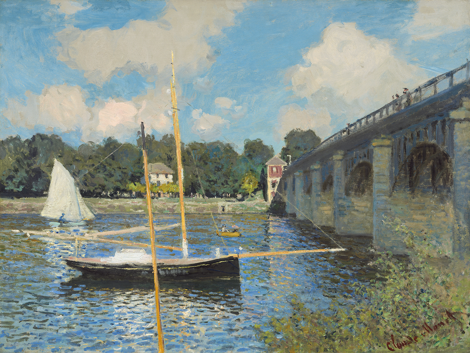
Claude Monet (French, 1840 – 1926 ), The Bridge at Argenteuil, 1874, oil on canvas, Collection of Mr. and Mrs. Paul Mellon

The Detroit Institute of Arts opened a new exhibition, Monet: Framing Life, on September 22, 2017, with the work of impressionist Claude Monet(1840-1926), an early key figure in the Impressionist movement that transformed French painting in the second half of the nineteenth century.

This exhibition depicts Monet’s leisure activity in and around Paris from 1871-78. While at the Paris studio studying with Charles Gleyre, Monet met several other artists, including Alfred Sisley, Frederic Bazille, and Pierre-Auguste Renoir. Monet found his subjects in his immediate surroundings of Argenteuil, just fifteen minutes from Paris by train.

His asymmetrical arrangement of forms emphasized the two-dimensional surfaces by eliminating linear perspective and abandoning three-dimensional modeling. Much of this work was started plein air, where Monet would set up his easel and work directly in a natural outdoor setting, then return to the studio for completion. His vibrant brightness of color in preparing his canvas with light-colored primers, instead of dark ground under-painting, broke with traditional landscape painting.

Raised in Normandy, Monet spent his youth in LeHavre and had been exposed to the work of Eugene Boudin, known for his paintings in the open areas along the Channel coast. Boudin befriended the young Monet, then only 18, and persuaded him to give up his teenage caricature drawings and to become a landscape painter, helping to instill in him a love of bright hues and the play of light on water later evident in Monet’s work.

Monet’s paintings of poplar trees and stacks of wheat, mustard colored water off cliffs off the coast of Normandy, of women strolling with children suggest that life is inherently serene, a series of warm sunny afternoons where parasols protect a woman’s delicate skin from overexposure to the sun. His quests to capture nature also prompted him to break down space and eventually merge color and subject into an atmosphere. The end result is a feeling we absorb, much more mysterious than an intellectual or logical observation.

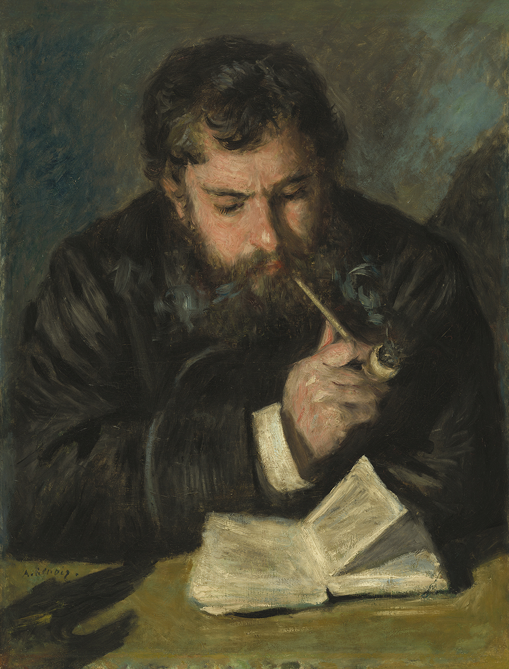
Auguste Renoir, Claude Monet, French, 1841 – 1919, 1872, oil on canvas, Collection of Mr. and Mrs. Paul Mellon

The art scene in Paris was alive and well during these years for a group of artists who wanted to change the traditional approach to painting. Pierre-Auguste Renoir had become a close friend to Monet and here in this portrait, he captures him wearing a blue jacket and smoking a pipe. Renoir had a brilliant eye for both intimate human features and the day’s fashions. His images of common families and well-dressed Parisian pleasure seekers created a bridge from Impressionism’s more experimental aims to a modern depiction of the French middle-class.

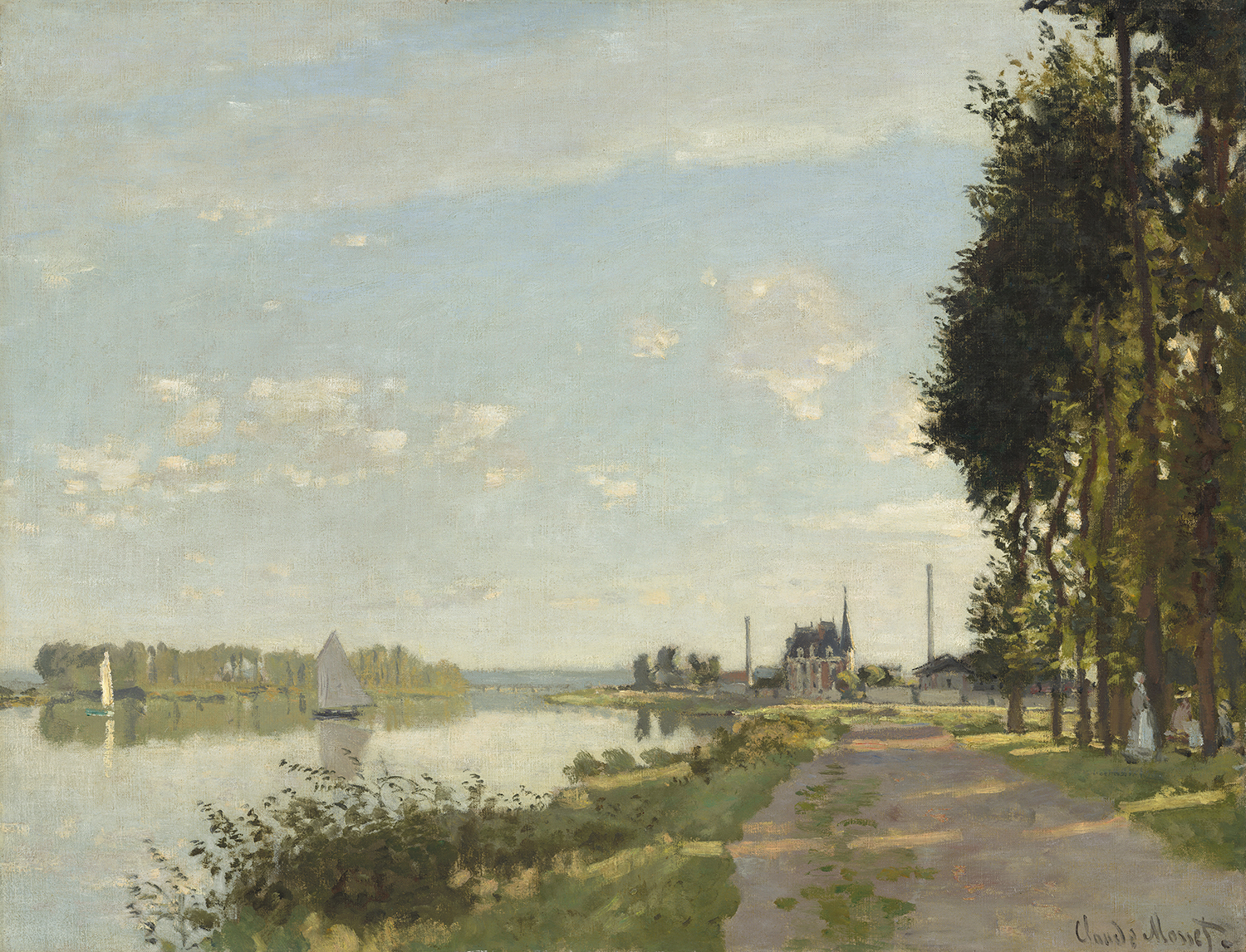
Claude Monet (French, 1840 – 1926 ), Argenteuil, c. 1872, oil on canvas, Ailsa Mellon Bruce Collection 1970.17.42

The promenade along the River Seine was a popular subject for Claude Monet. The compositional structure in Argenteuil around 1872 would shape landscape painters for years to come. He divides the canvas by threes on both the lateral and longitudinal axis while capturing low light casting shadows across this old dirt river road. The stillness here is captivating, without a person in sight or smoke bellowing from the distant factories stacks. Monet’s work lays down a foundation for artists like Childe Hassam, the American Impressionist, in his watercolor, The Beach at Dunkirk or his oil on canvas, Winter Midnight, where he has absorbed the plein air approach of Monet and the ability to offer up tranquility to people from all walks of life.

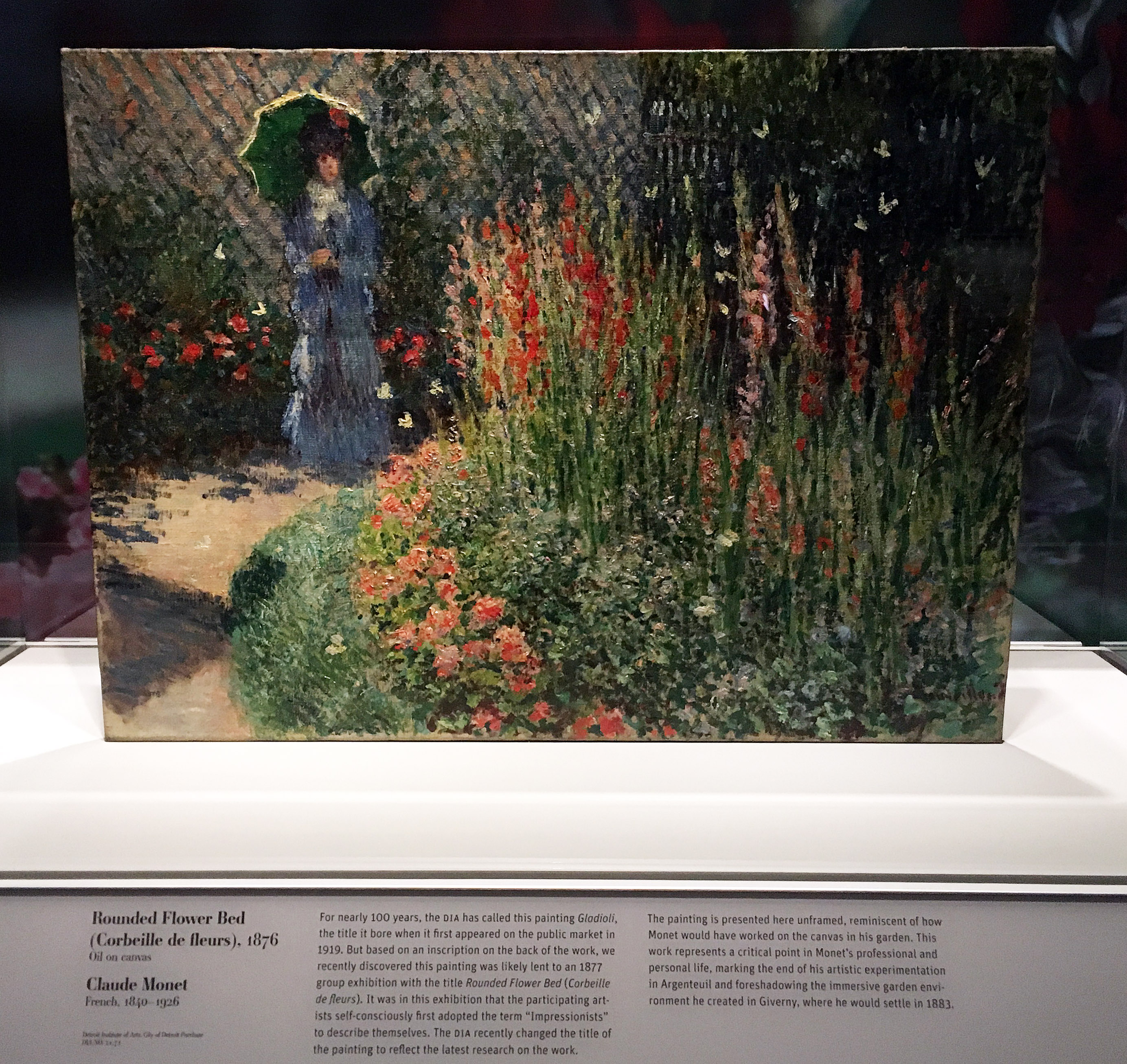
Claude Monet, Rounded Flower Bed, Corbeille de Fleurs, Oil on Canvas, 1872 Courtesy of the DIA

The painting at the center of the exhibition is the work of art formerly referred to as Gladioli and now renamed Rounded Flower Bed (Corbeille de fleurs). The renaming is the result of new research recently done for this exhibition. For nearly one hundred years, the DIA has called this painting Gladioli, the title given when it first appeared on the public market in 1919. After closer inspection, the painting was lent to an 1877 group exhibition with the title, Corbeille de fleurs or Rounded Flower Bed. It was at this exhibition that the participating artists first adopted the term Impressionists to describe themselves. In the DIA exhibition, the painting sits under glass without its frame and provides the viewer with a detailed explanation of the markings on the back of the painting. The painting is reminiscent of how Monet would have worked on canvas in his garden, and foreshadows the immersive garden environment he later created at Giverny.

The Monet exhibition, which concentrates on the late 1870’s, is where Impressionism arrives and gradually begins to mature.

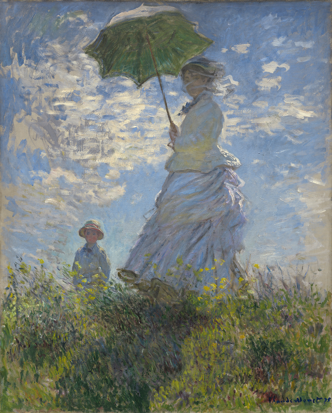
Claude Monet (French, 1840 – 1926 ), Woman with a Parasol – Madame Monet and Her Son, 1875, oil on canvas, Collection of Mr. and Mrs. Paul Mellon

It is inherent in the paintings of the early 1870s, as in Woman with a Parasol, the imposing canvas of Camille and Jean Monet, the artist’s wife and young son, where the artist starts to abstract the clouds simply using marks of paint and the white dress becomes blue. Monet’s compositions were based on zones of light and shade. Two years later, in the open fields near Argenteuil, the figures are seen from a distance, and everything disintegrates into a blur of minced color.

The work of Claude Monet is so instilled into our lexicon of artwork, we tend to forget how new the work was to the art world. Cezanne has been quoted as saying, “Monet is only an eye, but good God, what an eye.” The art of impressionism conjures up a world of magical charm filled with light and color. More than anyone else, Claude Monet recognized that his garden, rather than his words, presented the path to understanding his art.

Monet: Framing Life is on exhibition at the Detroit Institute of Arts, through March 4, 2018. Wayne, Oakland and Macomb counties: $10 for adults, $5 for ages 6-17, $8 per person for groups of 15 or more.

This exhibition has been organized by the Detroit Institute of Arts and made possible by the Bonnie Ann Larson Modern European Master Series. Generous corporate support has been provided by Park West Foundation, JPMorgan Chase, Altair, English Gardens, and Grand Hotel—Mackinac Island. Major support has been provided by Lois and Avern Cohn. Additional funding is contributed by Dr. Mark and Amy Haimann, Dr. Theodore and Diana Golden, anonymous donors, Eleanore and Dick Gabrys, and Andrew L. and Gayle Shaw Camden.


Page 22 of 36

Powered by WordPress & Theme by Anders Norén