Detroit Art Review

Critical art reviews of Detroit galleries and museums weekly

Adeshola Makinde: Relevant @ Playground Detroit

The insertion of a work of art into the public sphere through mass media means is a dictum of Chicago-based Nigerian American visual artist Adeshola Makinde, who began his career as a self-taught practitioner three years. Having established the framework of a photomontage artist, “collage commissions” such as “the beauty is…FEEL STRONGER TOGETHER!,” 2020, executed for Nike, or “A year on from George Floyd: how laws allow police to use fatal force,” an illustration for a news report by the Guardian, recombine text and images from various print and media outlets into an art of political messaging that lacks ambiguity.

Designing work for reproducibility in the urban sphere, Makinde garnered public attention in Detroit in 2019 with a text-only black and white highway advertisement on W. Warren Avenue and Wesson Street. The rented billboard featured a found political slogan from the Civil Rights era, “We demand an end to police brutality now!,” writ large in white capital letters on a solid black backdrop, situated opposite a Coca-Cola bottling warehouse on the other side of the street.
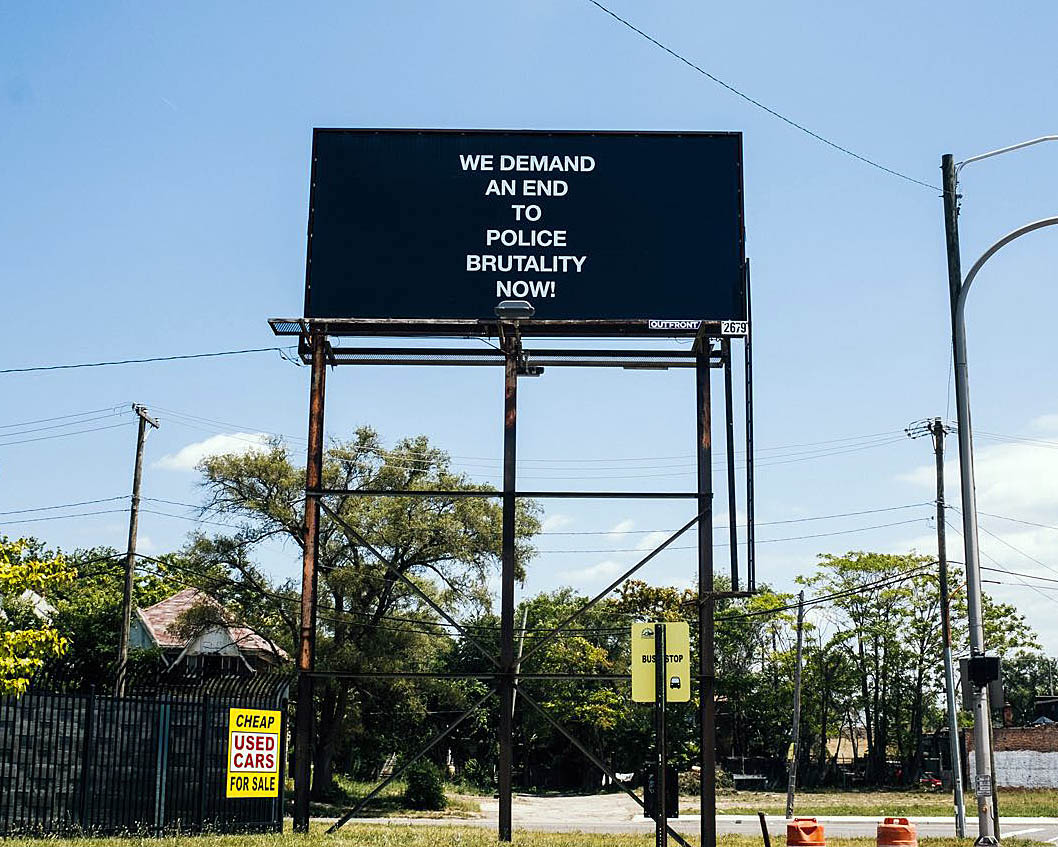
Adeshola Makinde, “WE DEMAND AN END TO POLICE BRUTALITY NOW!,” 2019 22” x 11” feet, W. Warren Ave & Wesson St, Detroit, Michigan

As is well known, during the mid-to-late 1960s conceptual artists began to respond critically to how institutions shape our daily lives by incorporating language into art. Makinde’s practice extends some of conceptual art’s presuppositions, namely that art as text can be distributed anywhere: in fashion magazines, on walls, like advertising, in bus stops, or in social media contexts, in attempts to reach a wider non-art and art audience alike. A turn to language in visual art challenged the very nature of art, altered its appearance, often accompanied by a strategic insertion of text into commercial circuits of distribution. As part of a nationwide campaign with 29 billboards in 22 cities, “We demand an end to police brutality!” was accompanied by additional political slogans such as “We protest school segregation,” “Black power,” and “Free all political prisoners.” In this series, Makinde shifts a personal expression of street protest into a commercial context to broadcast messages of discontent even louder. To bring found Civil Rights era slogans into the context of art also pays attention to the work we do with words when we protest.

This becomes particularly evident in his recent solo show at Playground Detroit which shifts the premise of the billboard project into the space of an art gallery by working with text silkscreened onto canvas. Aptly titled RELEVANT by local curator Juana Williams, the exhibition makes a strong case for the continued relevance of a fight for social justice. As racial oppression has deep roots in U.S. history, the struggle for civil rights and racial equality began decades before the 1960s and it continues to this day. The timely exhibition incorporates the sentences from the billboard campaign into a plethora of twenty-eight political slogans, all of which stem from the Civil Rights era transcribed by Makinde off banners and hand-held placard signs seen in historical photographs of street demonstrations from the 1960s.
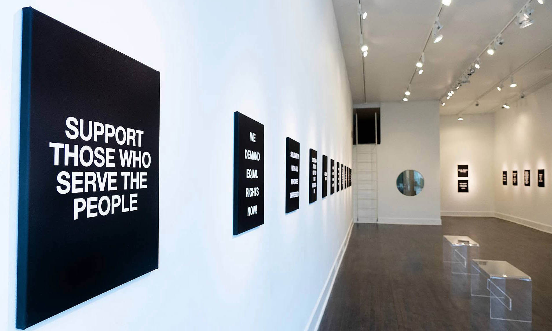
Installation shot, Adeshola Makinde, RELEVANT, Playground Detroit, Photography credit@samanthaslist

Upon entry into the long rectangular exhibition space on Gratiot Avenue near Eastern Market, on the left wall one can read “Support those who serve the people” and “We demand equal rights now!”. Text in white, sans serif capital lettering, is printed onto identically sized 16 x 20-inch black canvases. As an expression of protest and discontent, often without the backing of powerful institutions, letting your voice be heard is most effective in simple, concise, bold, and repeatable words. Makinde’s design choice echoes that typefaces in protest signs are often without a serif at the end of a stroke, set in capital letters, and feature a mono weight letter style without thick and thin line transitions as they ought to compete for attention in a crowded street or media space. The canvas fabric is neatly pulled around the edges of the stretcher so that the pictorial work takes on an object dimension. The wall on the opposite side of the room features the phrases “All power to the people,” “We shall overcome,” and “Equal opportunity and human dignity.”
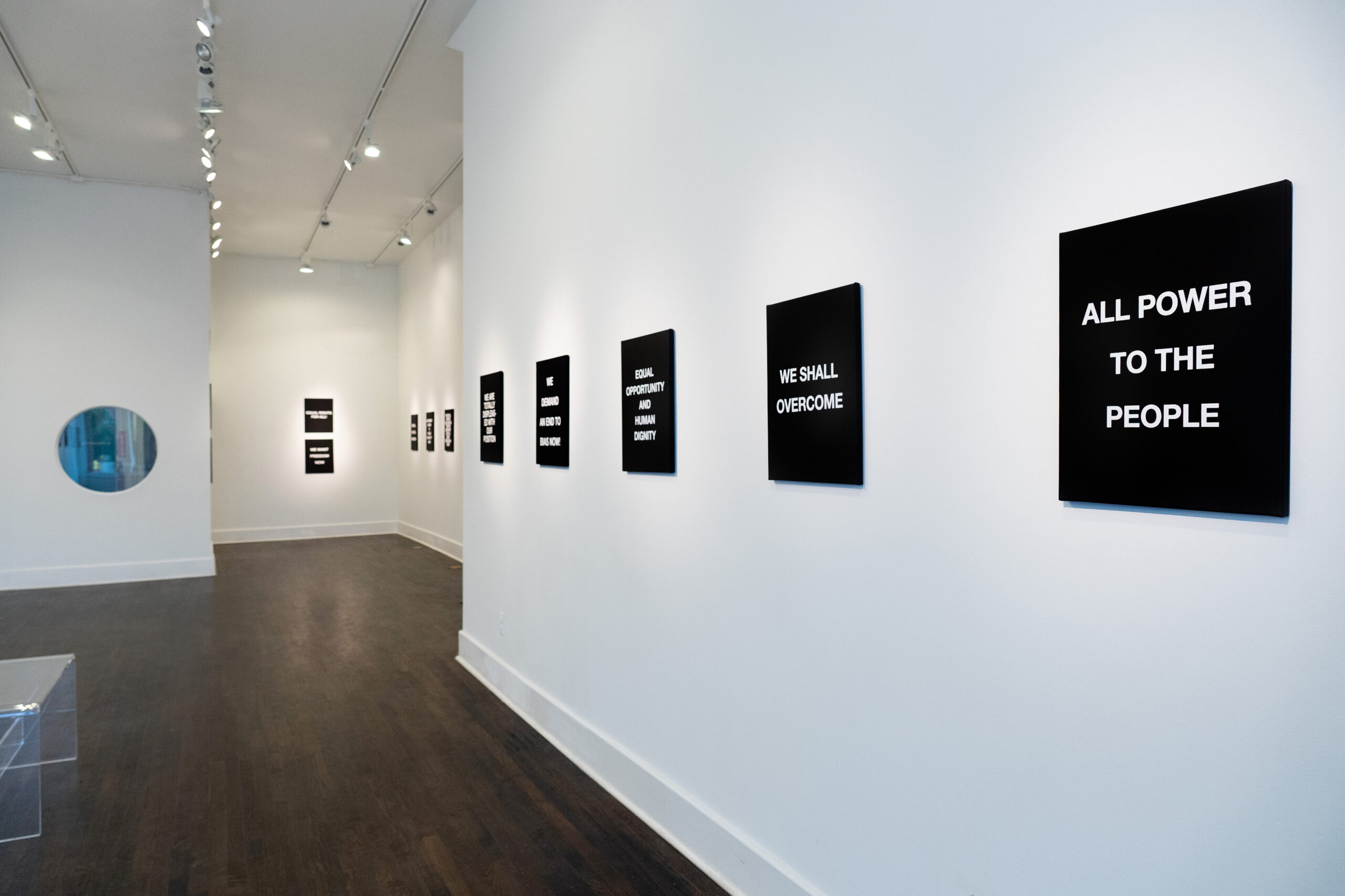
Installation shot, RELEVANT, Playground Detroit, Photo credit @samanthaslist

Merriam Webster dictionary defines “people” as “human beings making up a group or assembly linked by a common interest” and “the mass of a community as distinguished from a special class.” While a linguistic message such as “All Power to the people” does not diminish in emotional force or urgency of appeal over time, “the people” as the entity that is addressed is a fluid category up for change. In addition, by using instructional verbs that issue a command (“support,” “honor,” or “free all”) and by employing the personal pronoun “we,” Civil Rights era messaging was both direct and inclusive.

Makinde’s citations are exact quotations without alterations to the language. However, the 1960s aesthetic of placards tended to be in black on white, often collapsing two messages onto a single hand-made sign. We might read the artist’s choice of white on black, instead of black on white, as an allegory on his own experience of being Nigerian in a mostly white suburban Chicago neighborhood where discourse, education, and history were written by white people. He refers to his practice as “a journey into Black consciousness” which is the result of a missed encounter: “My upbringing is precisely why I approach art the way I do. I was raised in the Chicagoland suburbs and in my younger years attended predominantly white schools. This is something that shapes my work today, due to the fact that it was such a stark difference from the life I led at home with my immigrant parents from Nigeria. By going to schools with this sort of racial makeup, I didn’t learn a great deal of Black history, if at all.”

One of the canvases in the exhibition, “HONOR KING: END RACISM!,” is accompanied by a T-Shirt and yard sign limited-edition with the same slogan.
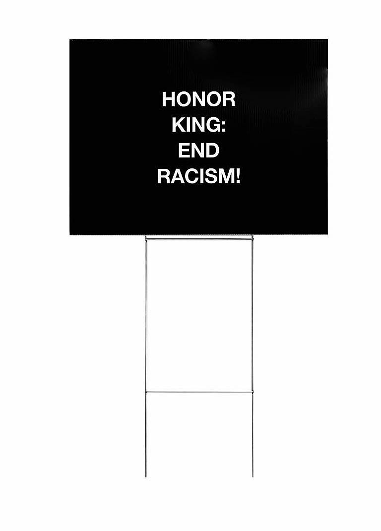
Adeshola Makinde, “HONOR KING: END RACISM!,” Limited Edition yard sign, 2020

We can wear the shirt in our daily lives and plant the sign in our front yard. This allows us to participate directly in the performance of dissent, and it cleverly appropriates techniques from political campaigning for the purpose of protest art.

The exhibition has additional reach beyond the gallery space in a poster campaign. The slogan “Free all political prisoners,” alongside the announcement for the exhibition, is pasted onto twenty abandoned street facades in Detroit.
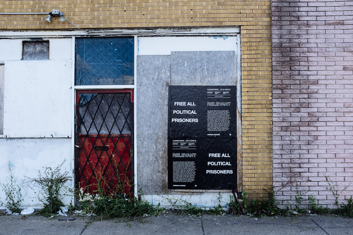
Adeshola Makinde, “FREE ALL POLITICAL PRISONERS,” 2021, 24 x 36 inches, Wheatpaste posters, various locations, Detroit. Photo credit Adeshola Makinde

Most of the locations are placed along the historic Grand River Avenue which radiates out from downtown into the suburbs. As one of the city’s main traffic arteries, it is a busy thoroughfare that connects the inner city to outer residential areas, reaching as far as Lake Michigan. Abandoned spaces and derelict facades along the Grand River corridor stand in stark contrast to the urban revivalism of Detroit midtown or downtown where abandoned storefronts with decaying commercial lettering are mostly an image of the past. The RELEVANT posters blend the political with the commercial, the artistic with the political, and the contemporary with the historical.

RELEVANT pays homage to how Detroit was a city where black people embraced black power activism much earlier than in most other cities, and it isolates those slogans that have the most timeless ramifications for a cultural movement that has its historical roots in African American activism but is by no means limited to it. Famously in Detroit slogans such as “We demand equal rights now,” “Vote for freedom,” and “We demand an end to bias,” were visible during the Walk to Freedom in Detroit on June 23, 1963, after which Martin Luther King Jr. delivered an impassioned precursor speech to “I Have a Dream,” advocating against civil rights inequalities, police brutality, housing segregation, unfair wages, and gender imbalances. Makinde’s sorting out of popular slogans with dated historical references (such as “Stop Jim Crow” or “Join the N.A.A.C.”) makes a strong argument for the continued relevance of a fight for social justice today.

Lastly, looking into the history of individual slogans, the Civil Rights era emerges as a movement with a plurality of voices. “All Power to the people” is a popular anti-establishment slogan employed since the 1960s in a variety of contexts by pro-democracy movements, youth anti-war protests, or other social movements. Initially used by young people to protest oppression by older people, the so-called establishment, it was appropriated by the Black Panthers to protest the rich ruling class domination of society by white people. The famous slogan “Black Power” is directly attributed to the Panthers whose radical ideology of self-determinism is not synonymous with King’s more inclusive dictum of “All the power to the people.”
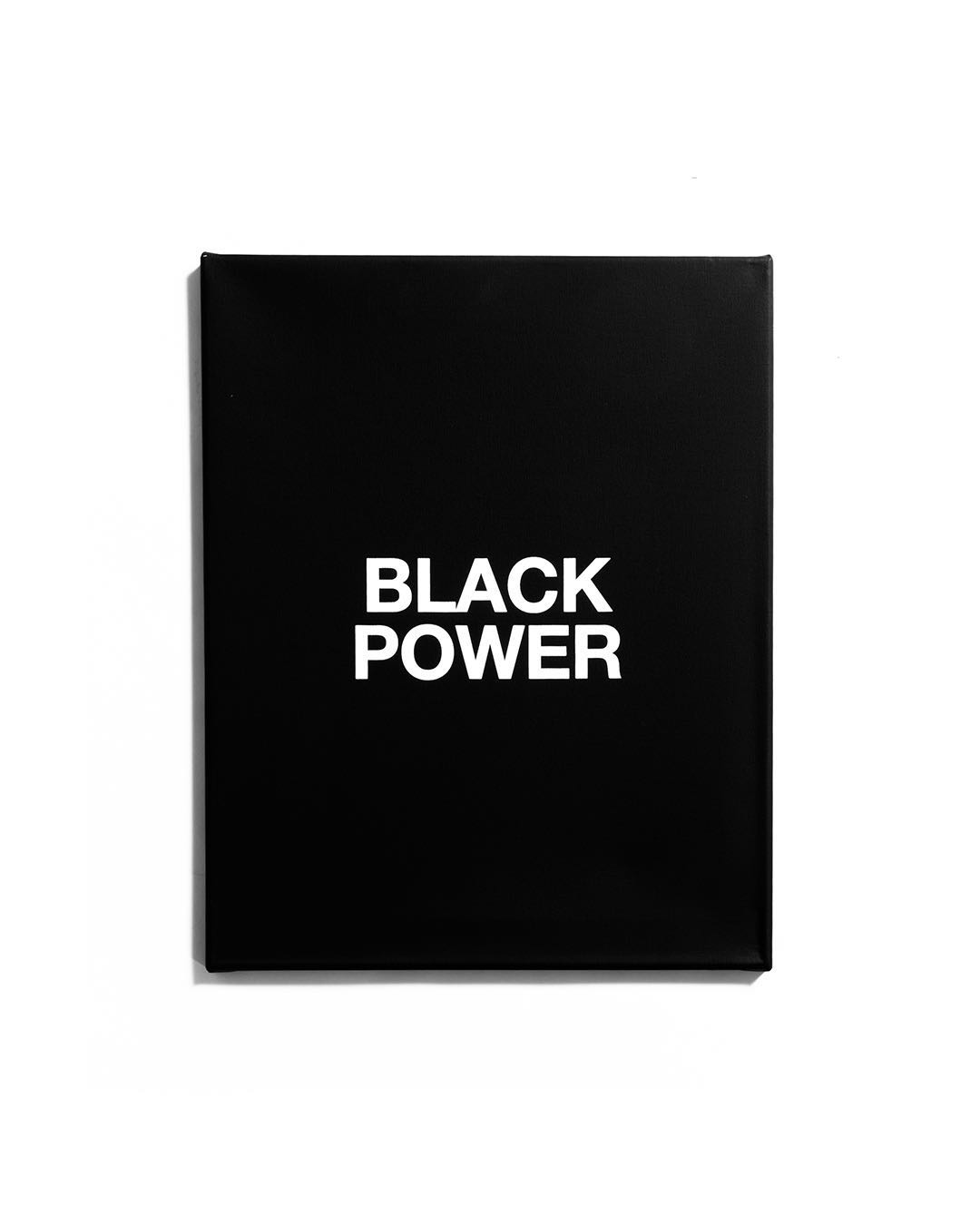
Adeshola Makinde, “BLACK POWER,” Silkscreen on canvas, 16 x 20 inches, 2020

Over the past year, the language of protest has been in high demand and Makinde’s prescient show offers much food for thought. Who are the people, then and today? Who is fighting the good fight today? Are you part of the people? RELEVANT also offers up valuable insights into the history and the aesthetic of protest. Commentators have likened the recent political strife to that of the 1960s and expressed disbelief that the country has arrived at such a divided and volatile state. It is time for disbelief to make way for analysis. RELEVANT reminds us of the complexities of the historical moment generally referred to as the Civil Rights era and it shows the need to better understand the performative dynamics of protest and the rules of the language of dissent that fuel it.

Adeshola Makinde, Relevant, Playground Detroit, July 30-August 28, 2021
2021 All Media Exhibition @ Detroit Artist Market

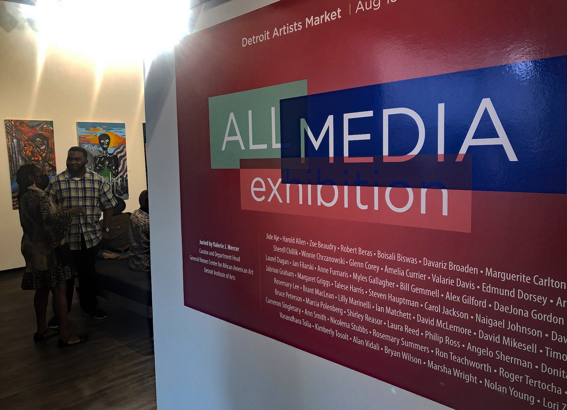
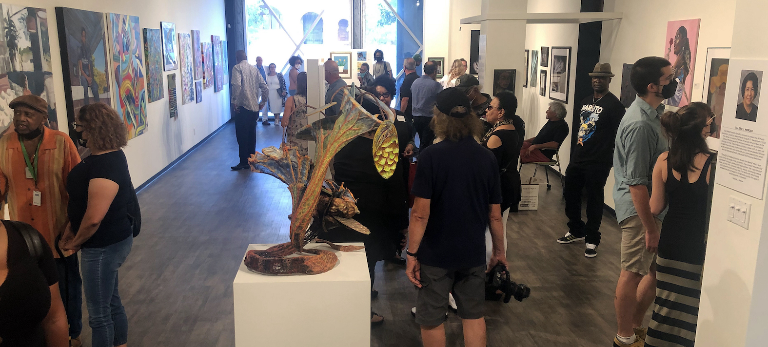
Detroit Artist Market: All Media Exhibition, 2021, All images courtesy of DAR

The Detroit Artist Market has been mounting this All Media Biennial Exhibition for many years and getting a wide range of work based on the juror and their particular persuasion.  This exhibition’s juror, Valerie Mercer, DIA curator of African American Art, has significant experience in this market between her time at the Detroit Institute of Arts and the Detroit Artists Market. She says, “The 2021 All Media Exhibition reveals how Detroit artists kept busy during the surge of the pandemic. They created artworks that expressed, through varied artistic approaches, the importance of hope, survival, love, humanity, identity, beauty, community, nature, and culture for their and our lives.”

The exhibition includes nearly seventy artists reflecting a large variety of media. Here are works of art that might give the reader a feel for the variety of work in the exhibition.

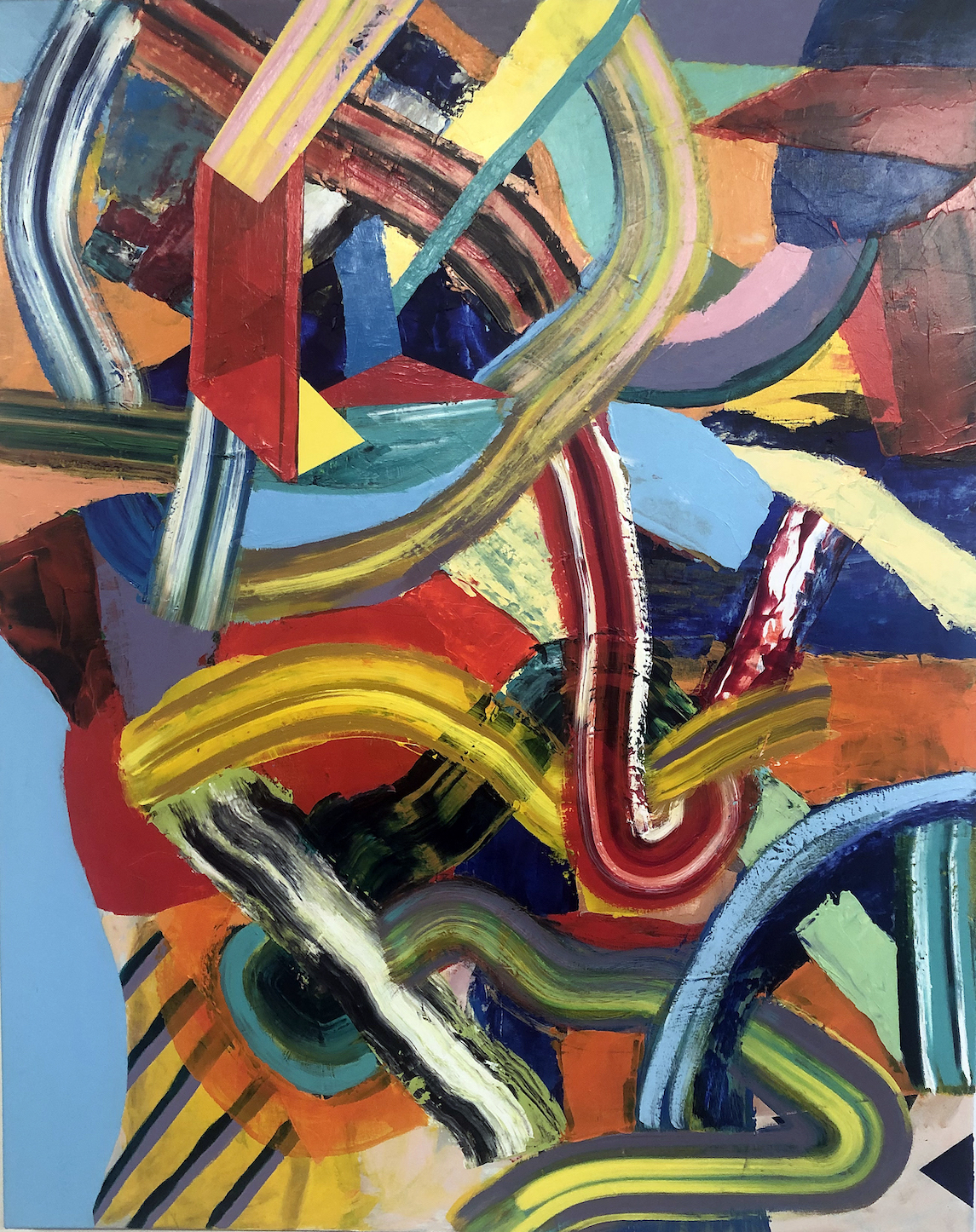
Harold Allen, Laocoon, Acrylic on Canvas, 2020

The painting Laocoon by Harold Allen jumps out at the viewer with this abstract expressionistic non-objective action painting that piles these five-inch brush strokes up on top of each other, working from dark tones in the background to bright primary colors in the foreground. He says, “What I want is for the viewer to have is the concept that the shapes and color have a narrative sense about the interaction, activity, and relationship with each other.” Harold Allen earned his BFA from the College of Creative Studies and an MFA from Wayne State University.

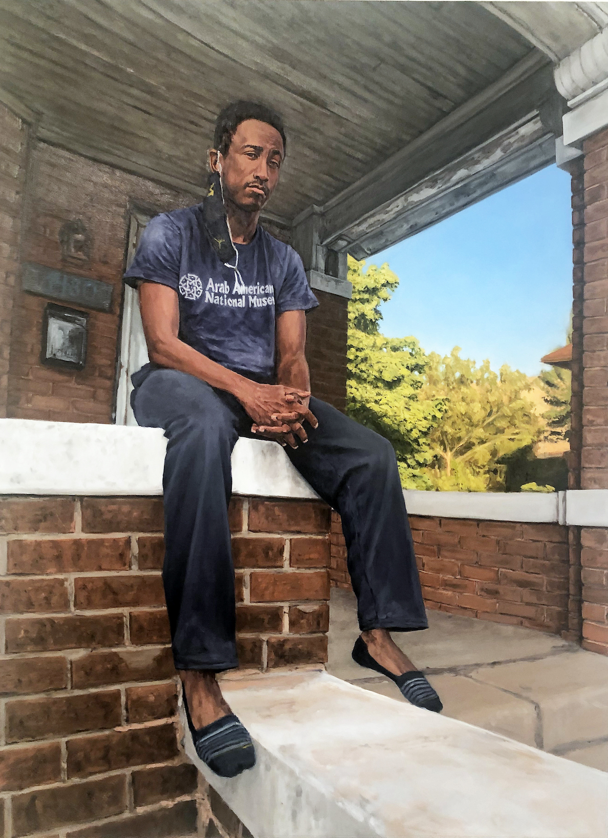
Ian Matchett, Jazz, Oil on Canvas, 2021

The painter Ian Matchett captured the sizeable realistic oil portrait from a low angle, as his subject sits on a porch edge with a Covid mask hanging off his ear. The painting Jazz was selected Best in Show and sends a message that figure painting still has some life left in this century-old mainstay of expression.  He says in his statement, “I use a mixture of processes to compose my paintings including reference images, sketches, and when possible collaboration with the subjects. When depicting living people, I prioritize meeting with the subjects of my paintings. We discuss what drives their work, what keeps them going, what I see, what they want to share, and ultimately how I could build all of this into a painting.” Matchett is a graduate of UofM in fine art and social studies, which he continues as a part-time social organizer living and working in Detroit. Most of his work focuses on the connections and continuities between revolutionary movements of the past and present.

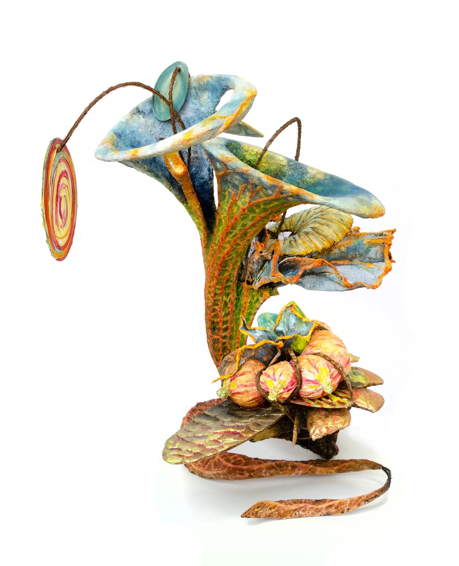
Ann Smith, America the Beautiful, Steel, Paper Mash, Wood, Bark, Paint products, 2020

The sculpture located on a base, Ann Smith’s America The Beautiful, is a large free-standing organic plant-like work constructed on a steel armature, shaped with paper mâché and painted colorfully with paint products. She says, “These sculptural accretions are visual artifacts of the thoughts and experiences of one contemporary organism, and investigate my place in the system.” Ann Smith has an art studio in the 333 Midland studio in Highland Park where she is one of twenty-five resident artists, collectively known for their BIG shows. Ann Smith is a graduate of the College for Creative Studies.

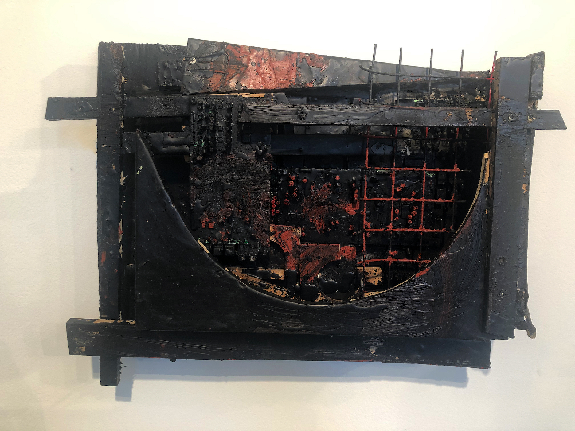
Nolan Young, Untitled Relief, Encaustic, Mixed Media, 2021

This young artist, Nolan Young, presents a relief that reminds this writer of Cass Corridor’s work from the 1970s.  It could be described as “Newton-esque.” He says in his statement, “Reconstruction through destruction is a key element to my work.  I use found objects, often discarded and forgotten objects to represent observations I have made about post-industrial Detroit. As a product of this environment, I cut and vandalize these objects to create scenes in which the events of deconstruction is a process for Reconstruction.”

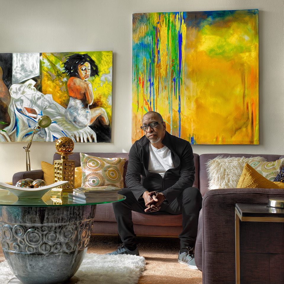
Donita Simpson, Portrait of Carl Wilson, Photograph, 2017

The image Portrait of Carl Wilson demonstrates the photographic quality in this well-known Detroit photographer, Donita Simpson. Best known for her portrait of Gilda Snowden (2014), she has captured the larger-than-life quality in her image of the famous abstract Detroit artist. In the Portrait of Carl Wilson, Simpson frames her subject surrounded by contemporary art, just right off-center, capturing this relaxed expression of Mr. Wilson. For years, Simpson has been documenting Detroit artists in their work and where they live. Donita Simpson earned her BFA and MFA from Wayne State University.

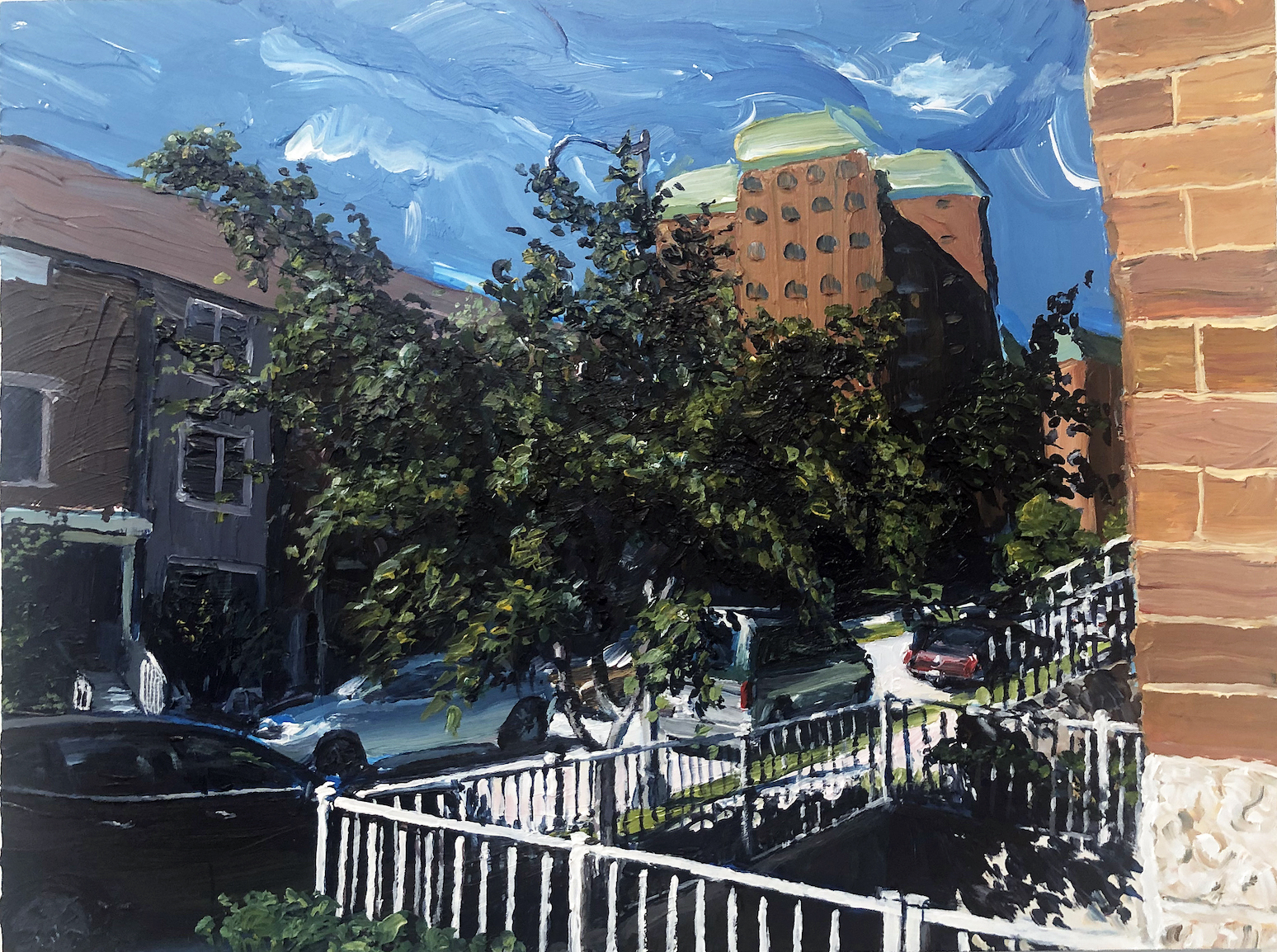
Woodbridge Estates, Acrylic on Panel, 2021

This small oil painting, Woodbridge Estates, is representative of the urban landscape painting by the artist Bryant Tillman. Streets, parked cars, neighborhoods, and low light casting high contrast shadows across these subjects with a fluid palette of paint. Bryant Tillman was a 2013 Kresge Visual Arts Fellow.  https://www.kresgeartsindetroit.org/portfolio-posts/bryant-tillman  The Detroit artist has painted in the City of Detroit for thirty-five years and has given his audiences his indelible style of impressionism, exemplified by the painting of a Honda Accord with his own shadow cast on the car’s body.  Bryant Tillman was awarded the Pollock-Krasner Foundation Grant, New York, NY, in 2017.

Participating Artists:

Jide Aje, Harold Allen, Zoe Beaudry, Robert Beras, Boisali Biswas, Davariz Broaden, Marguerite Carlton, Chris Charron, Sherell Chillik, Winnie Chrzanowski, Glenn Corey, Amelia Currier, Valarie Davis, Edmund Dorsey, Artina Dozier, Laurel Dugan, Jan Filarski, Anne Furnaris, Myles Gallagher, Bill Gemmell, Alex Gilford, Dae Jona Gordon, Albert Gordon, Jabrion Graham, Margaret Griggs, Talese Harris, Steven Hauptman, Carol Jackson, Naigael Johnson, Dawnice Kerchaert, Rosemary Lee, Brant MacLean, Lilly Marinelli, Ian Matchett, David McLemore, David Mikesell, Timothy O’Neill, Bruce Peterson, Marcia Polenberg, Shirley Reasor, Laura Reed, Philip Ross, Angelo Sherman, Donita Simpson, Cameron Singletary, Ann Smith, Nicolena Stubbs, Rosemary Summers, Ron Teachworth, Roger Tertocha, Bryant Tillman, Vasundhara Tolia, Kimberly Tosolt, Alan Vidali, Bryan Wilson, Marsha Wright, Nolan Young, Lori Zurvalec.

Detroit Artist Market: All Media Exhibition, 2021

Detroit Artist Market: All Media Exhibition, through September 11, 2021


Richard Lewis @ Galerie Camille

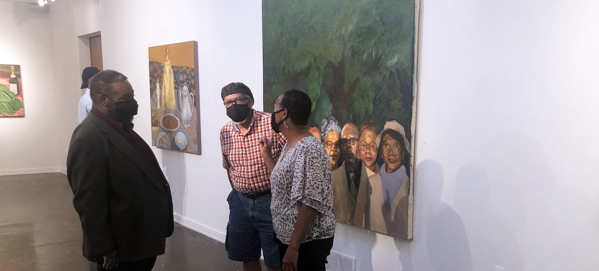
Installation image, Richard Lewis at Gallerie Camile, 8.2021

My first impression of artist Richard Lewis came from an exhibition at CCS Center Galleries in 2017. Evidence of Things Not Seen was written by Sarah Rose Sharp and consisted of a collection of drawings, featuring works on paper by Richard Lewis, Mario Moore, Sabrina Nelson and Rashaun Rucker and, let’s not forget, was curated by Michelle Perron. It was the drawing, Rent Party, 48 x 60” where Richard Lewis demonstrated his incredible ability to imagine and draw. For Richard Lewis, it was something that he began at age four.

Fast forward to the opening of his solo exhibition on August 13, 2021, at Galerie Camille and a collection of eleven oil paintings, a combination of figure and still life paintings that are both bold and traditional representational artwork. “These are mostly friends and family.” He said in a modest, hushed voice.

Lewis grew up in Detroit, attended Cass Technical High School, and after college and graduate school, returned to live his life where it began, among his family and friends in the city.


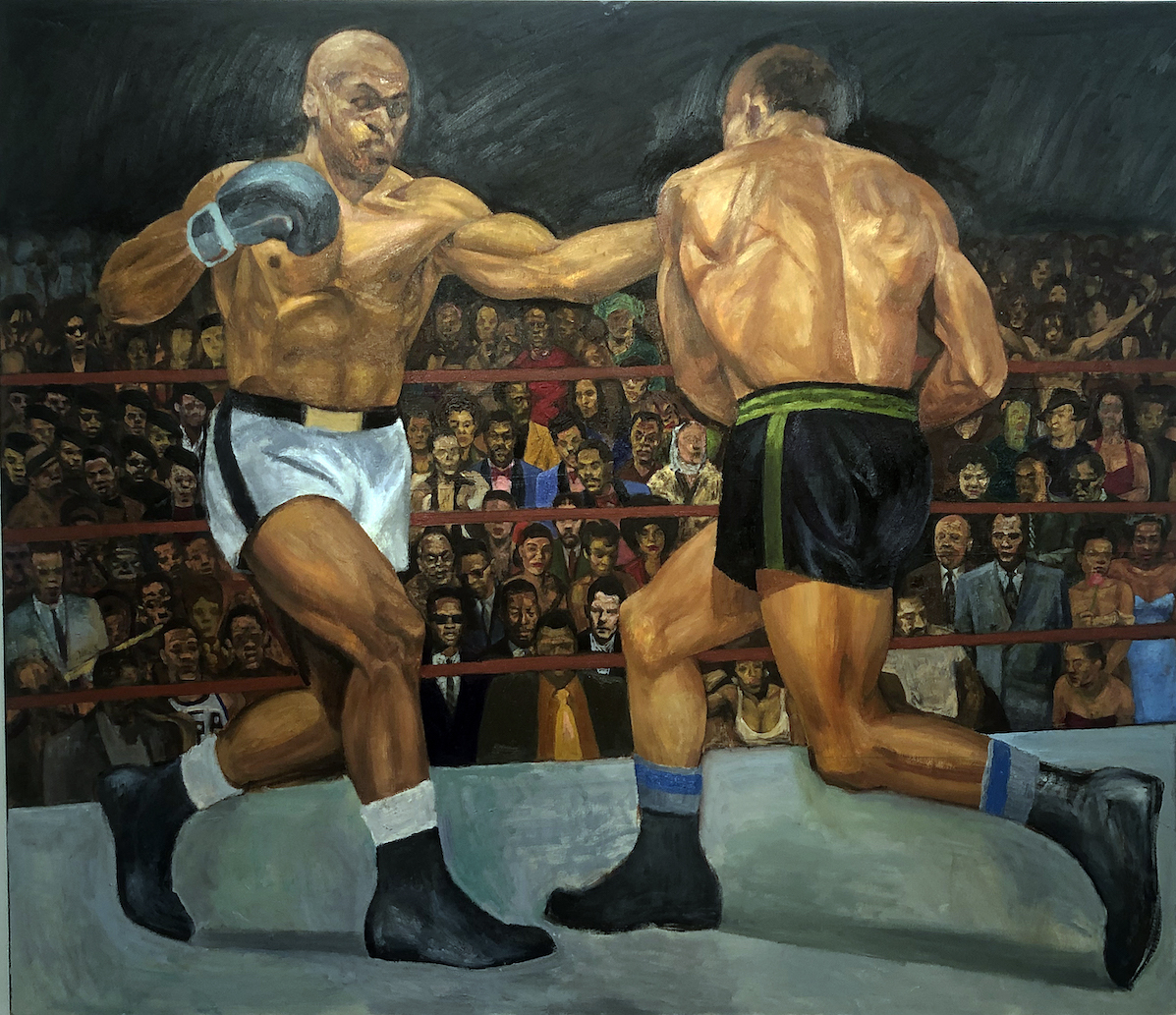
Richard Lewis, Tokyi The Boxer, Oil on Canvas on Plywood, 48 x 44″

From ancient times to the present, the visual and emotional drama that is inherent in the sport of boxing has always attracted and inspired artists. What leads the show is this large oil painting, Takyi the Boxer, which draws on George Bellows, Club Night in 1907, where realism is on view from a point placing the viewer close to the action and looking beyond into a large audience of dark-skinned people. The painting Club Night was followed by The Brown Bomber by Robert Riggs, 1938, and here Lewis is drawn to the Ghanaian Boxer Samuel Takyi, where he won the Bronze medal in the Olympic games. It is a nostalgic painting, paying homage to the famous boxer of color.

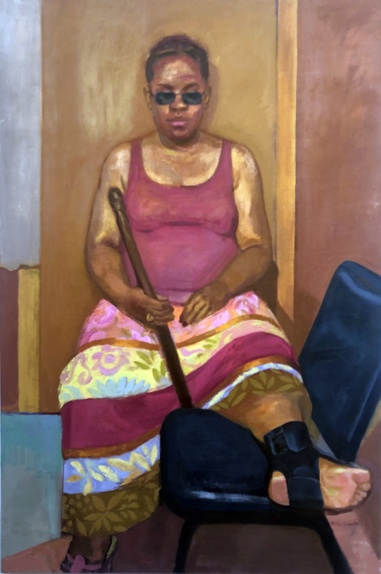
Richard Lewis, Tracey with an Ankle Brace, Oil on Linen on Plywood, 72 x 48″

Richard Lewis conveyed to me that he is using family and friends as models for these somewhat casual figure paintings that capture a pose quickly and go so far as to say they are works in progress. “The show is called ’Works in Progress’ because I usually consider my paintings ongoing.  I never have drastic changes in my work, but a deepening understanding, or simply a different perspective, that comes from working on something over time.”

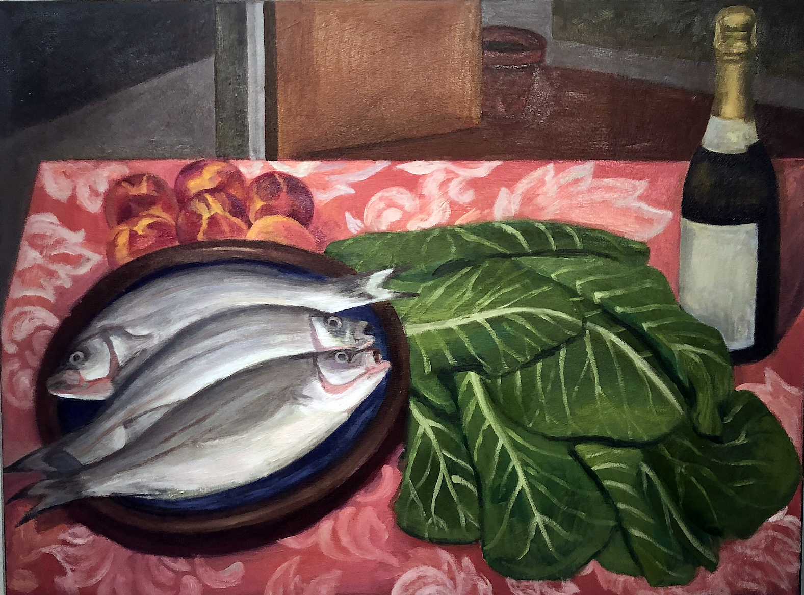
Richard Lewis, Still Life with Fish and Greens, Oil on Canvas, on Playwood, 36 x 48″

The still life painting, Still Life with Fish, flattens out the space and leans on the work of Paul Cezanne in this depiction of a plate of three fish and some lettuce, peaches and a bottle of Champagne using primary and secondary color, and the print missing from the bottle label. The artwork in this exhibition is simple, traditional, straightforward and personal.

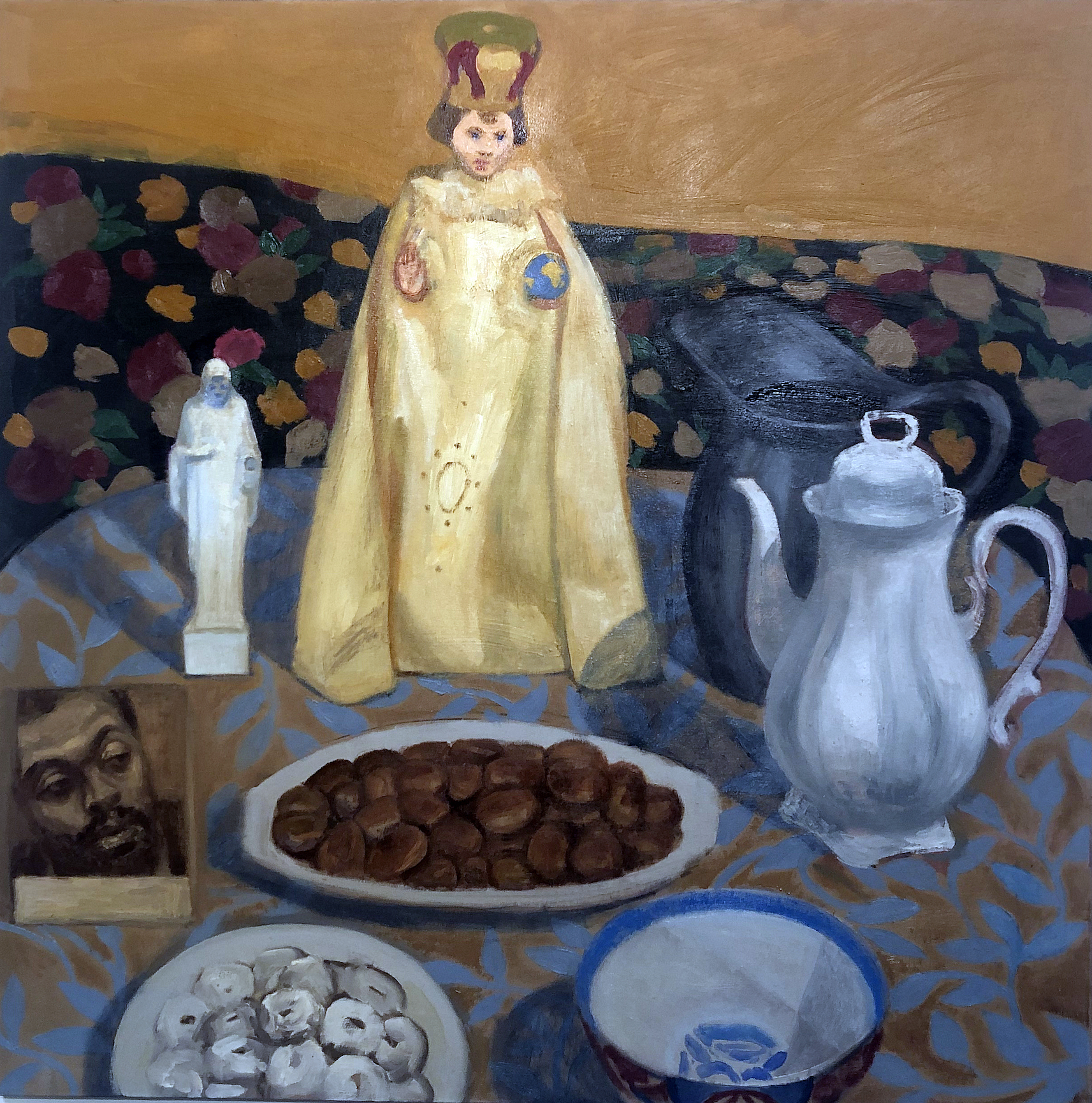
Richard Lewis, Still Life / Alter, Oil on Plywood on Canvas, 48 x 48″

Spatially and equally flattened out, the still life, Still Life with Alter, has its light source coming from the right across the table cloth and combines pitchers, a bowl, a plate of chocolates, a small picture of a friend, and two religious statues. The larger statue dominates the entire composition.  I am drawn to the sacred statues, but that may just be a personal preference. I also like the addition of the small photo and the print pattern on the floor.

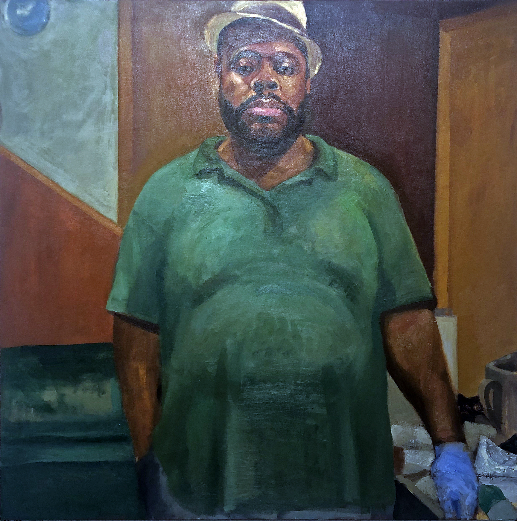
Richard Lewis, Noir, Self-Portrait, Oil on Linen on Plywood, 48 x 48″

The large self-portrait he titles Noir Self-Portrait is a big close-up of the artist wearing a BIG green shirt, hat, and a blue glove. One of its strengths is that it is simple enough. Noir is French for black, a type of fiction with tough characters, cynical, bleak, and pessimistic nature. It is good to always have some self-portraits, and Lewis delivers here by keeping his eyes on the viewer.

Richard Lewis was born in Detroit in 1966. He graduated from Cass Technical High School in 1985. He earned his B.F.A. from College for Creative Studies and his M.F.A. from the Yale School of Art. He was awarded the Kresge Foundation Fellowship in 2011, which was well deserved.

The Galerie Camille presents A Work in Progress, August 13, and runs through September  11, 2021


Best Times @ David Klein Gallery

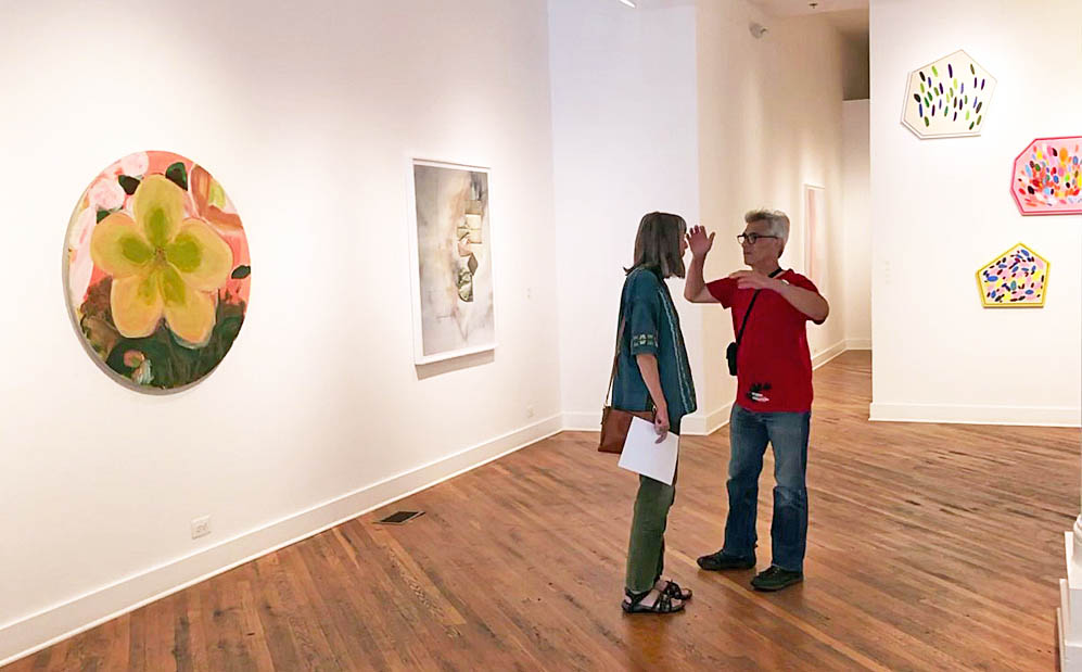
Best Times Installation at David Klein Gallery, photo: K.A. Letts

“They were the best of times, they were the worst of times…”     

As Charles Dickens begins his 1859 novel, A Tale of Two Cities, he describes a historical period of political and social turbulence that is, in some ways, similar to our own.  To those disposed to pessimism, 2021 might seem like a time to despair, but the artists now showing work in Best Times at David Klein Gallery beg to differ. They celebrate beauty–in the natural world, in art, in everyday objects–while remaining clear-eyed observers of contemporary life and its discontents. Color is the star of the show here; its emotional impact ranges from the giddy pastel polygons of Sylvain Malfroy-Camine to the contemplative gray formalism of Matthew Hawtin, with quite a lot in between.

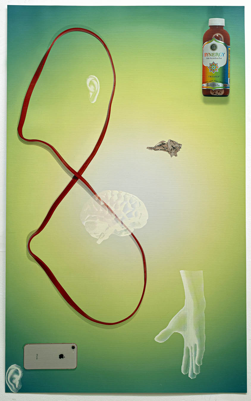
Late Stage, New Age (red exercise band infinity, sage, Kombucha, green aura) by Cooper Holoweski, 2020, mixed media, 40 x 24.75 inches, photo courtesy of David Klein Gallery

Cooper Holoweski sets the tone for the exhibit with conceptually and procedurally complex works on paper from his Late Stage, New Age series of works on paper.  He seems both enamored by and critical of the technological ecosystem’s marvels. Each piece is a demonstration of complex digital processes such as inkjet printing and laser cutting in dialog with the images of technology that their use makes possible. The cheerful consumerist palette of these mixed media artworks sets up an uneasy resonance with ghostly, truncated human anatomy. Juxtaposed with mundane food and household products, digital devices intrude–a new, added component to daily life that alters the human experience of the self and the environment.

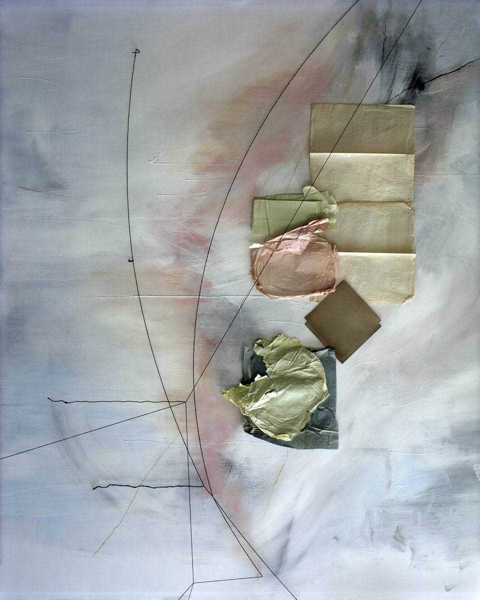
Untitled (January 15) by Lauren Semivan, 2021, archival pigment print, 50 x 40 inches, photo courtesy of David Klein Gallery

Similarly-sized archival pigment prints by Lauren Semivan make an interesting point of comparison to Holoweski’s work. Her lyrical photo collages are composed of humble detritus–fairly anonymous, slightly used paper napkins, net tulle fabric, and the like. Those diaphanous and often translucent elements are bisected with thin lines of color, transforming the shallow fictive space into elegant compositions that fool the eye. The artist describes color in her work as an “emotional descriptor.”  Up close, the marks and scratches on the surface suggest imagined topographies and the physical records of human presence. Step back though, and the picture begins to pulse with the luminosity of a cloudy sky.

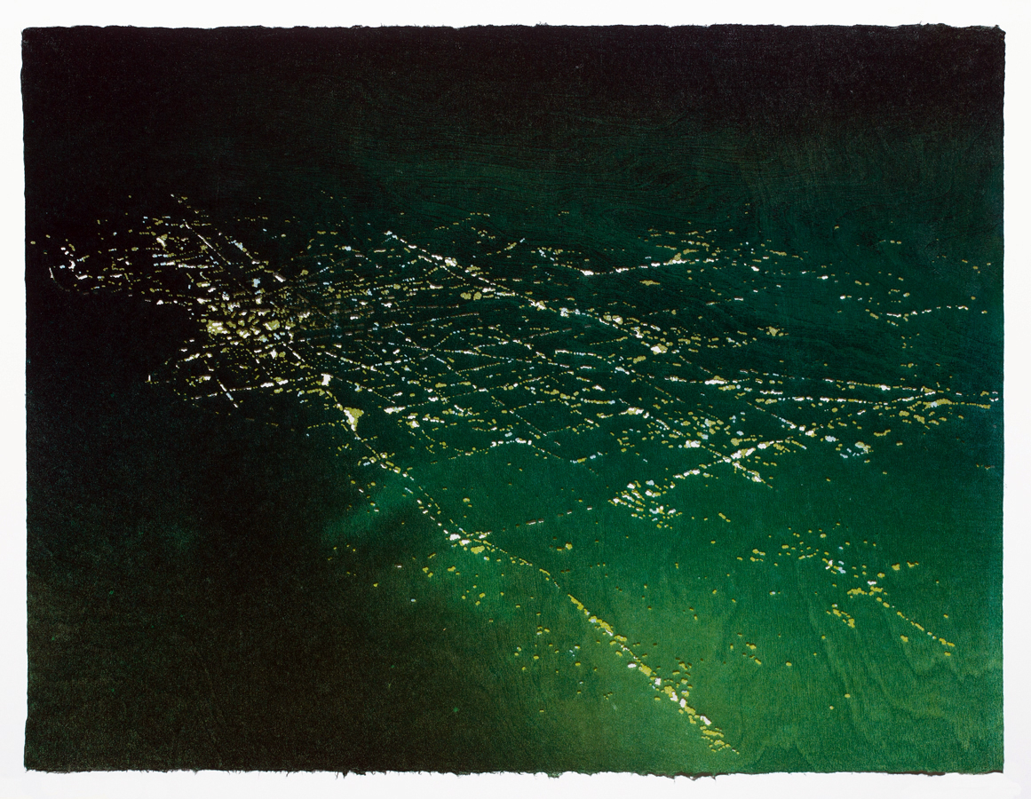
Lost City #2 by Susan Goethel Campbell, 2020, two-layered perforated woodblock print on Goyu paper, edition of 5, 23.5 x 31 inches, photo courtesy of David Klein Gallery

Susan Goethel Campbell’s color-saturated and heavily pierced works on paper describe tropical landscapes seen from above.  From a distance their source in aerial photography is evident, but as we draw nearer, the subtle striations of the wood block printing plates she uses to apply color and the tiny pin pricks that admit hues from the layer beneath begin to make the landscape dissolve into a dreamy abstract matrix of lines and shapes. Goethel Campbell’s choice of colors–acid-y greens, deep blues and aquatic turquoise–are evocative of equatorial environments but avoid the picture postcard aesthetic of tourist destinations.  The artist’s title for the series, Lost Cities, obliquely hints at the ephemeral nature of island ecosystems.

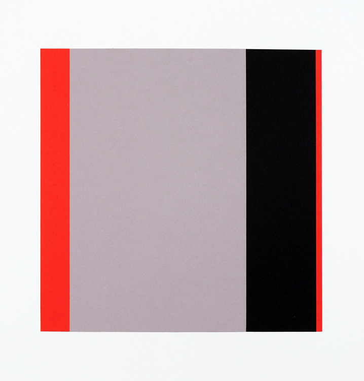
Sedition by Matthew Hawtin, 2020, collage on paper, 22 x 22 inches, photo courtesy of David Klein Gallery

In the middle gallery, Matthew Hawtin’s small, austere collages remain in the world of the handmade, but just barely.  His specialty is the subtle variation of textures and lines within a minimalist esthetic. These intimate artworks force us into closer examination, where we begin to discern the tiny differences in each severely cut rectilinear line and shape. There is something restful about contemplating the warm grays juxtaposed with clear bright reds and yellows.

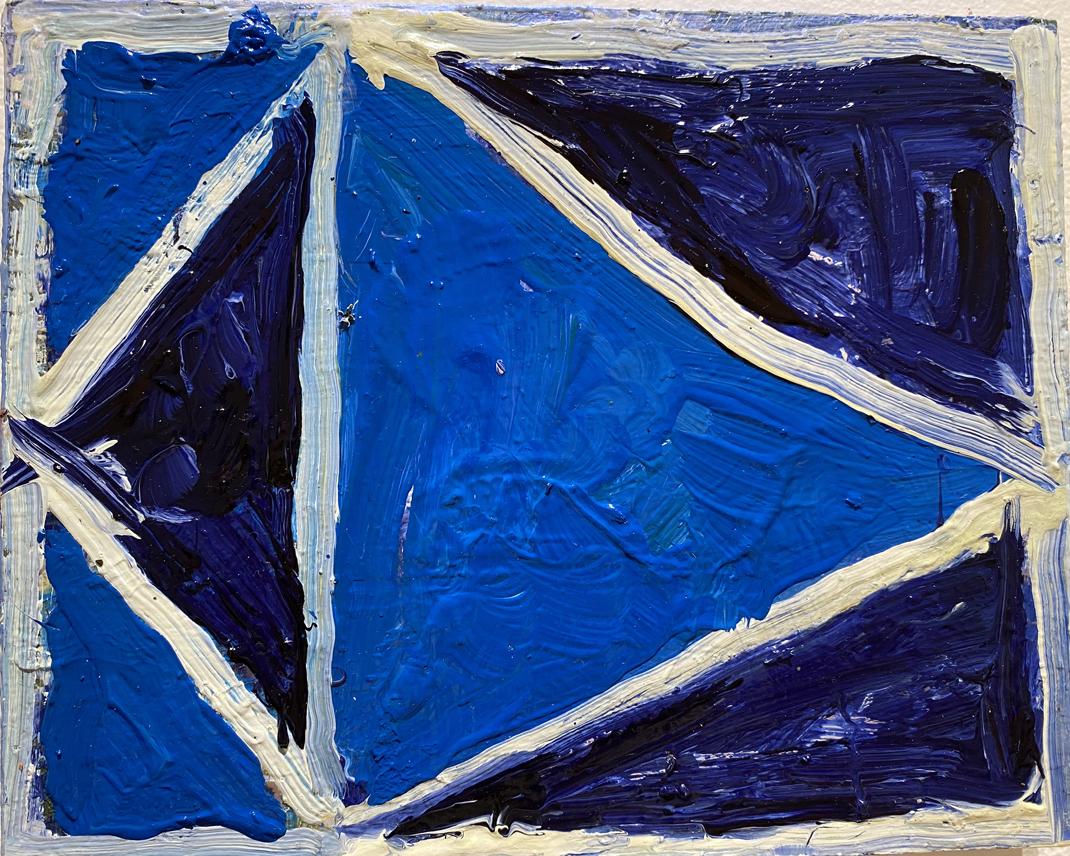
A Specificity by Ben Pritchard, 2021, oil on panel, 8 x 10 inches, photo courtesy of David Klein Gallery

For gallery visitors who hunger for something a little more visceral than Hawtin’s cerebral formalism, a collection of heavily textured, richly colored abstractions by Ben Pritchard occupies the opposite wall and might be just the thing. These lush, impasto-ed paintings in robust blues, greens, oranges and browns bring to mind the idiosyncratic paintings of the early modernist Arthur Dove. Pritchard is a painter of signs and symbols–cryptic shapes that might be stylized animals or kites or moons, but remain just outside the realm of the known. They are objects of meditation, nonspecifically directing the range of our thoughts and emotions.

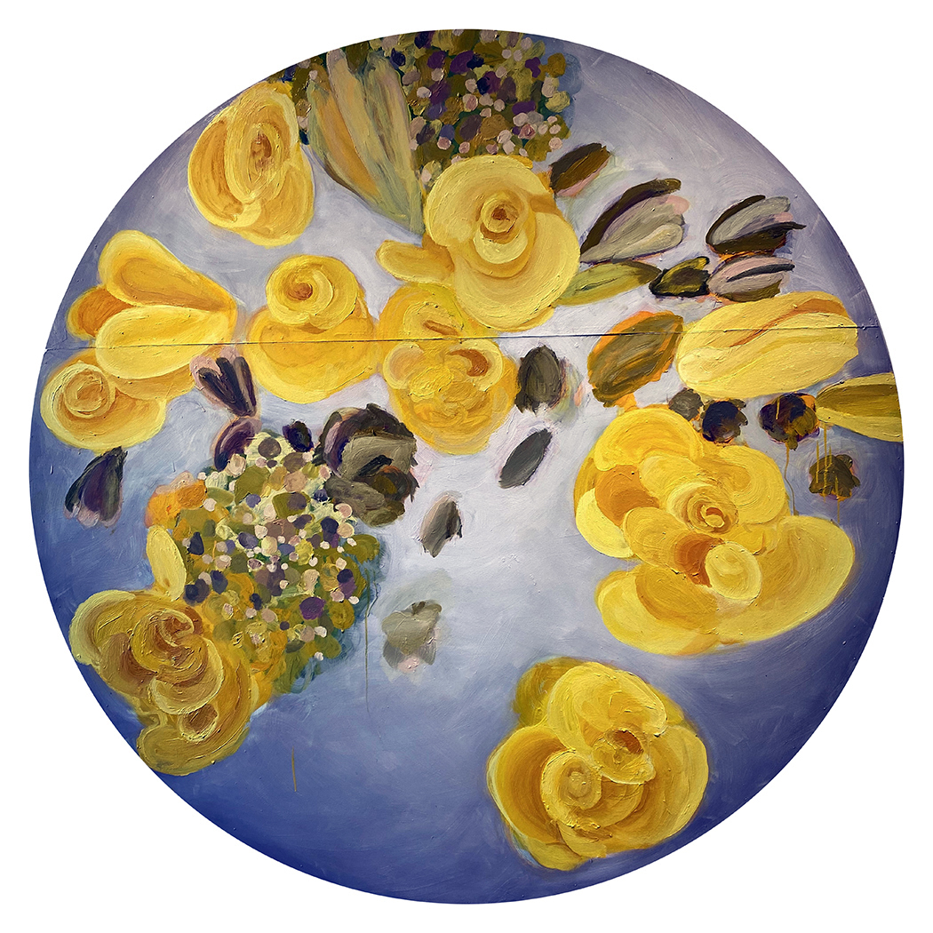
Yellow Rose Moon by Mitch Cope, 2021, oil on Masonite panel, 73 x 73 inches, photo courtesy of David Klein Gallery

From the two loosely painted floral tondos on view, Mitch Cope, who is best known for large-scale installations exploring the Detroit landscape and the objects within it, is taking a little vacation from all that. He seems to be having a great time. The frowsy, slightly retro painted blossoms on Masonite retain a kind of subtle urban surface that suggests found objects and undercuts the prettiness of the subject matter.

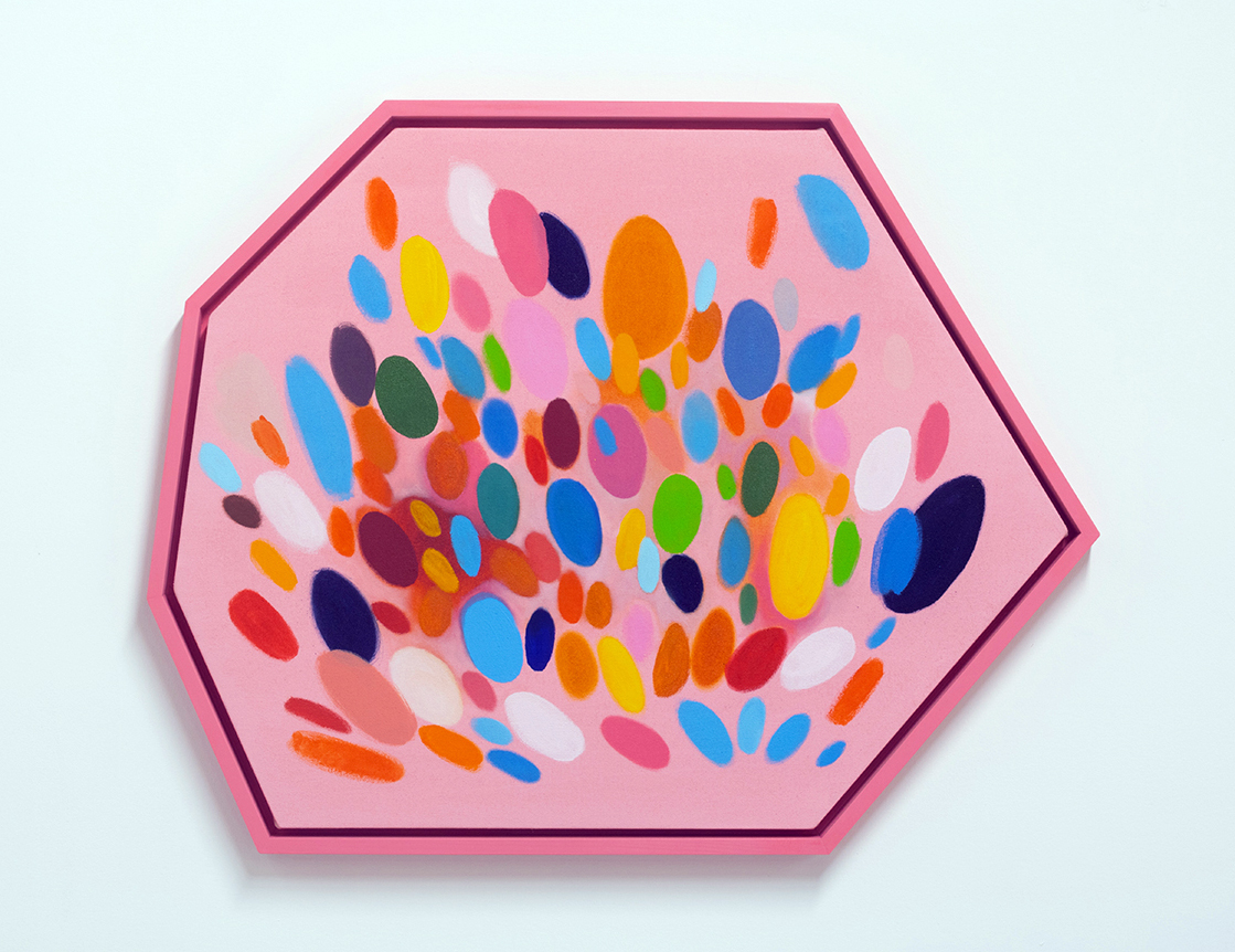
Rome by Sylvain Malfroy-Camine, 2021, oil and acrylic on canvas, 25 x 30.75 inches, photo courtesy of David Klein Gallery

Sylvain Malfroy-Camine’s many-sided paintings perhaps best describe the euphoric mood that pervades Best Times. Fenced within their polygonal pens, multi-colored ovals and swatches have escaped the earth’s gravity and float or explode inside the pictorial space. In addition to his studio practice, Malfroy-Camine is a musician, and the discrete spots of color in each artwork suggest musical notes in a jubilant symphony.

The artists in Best Times aren’t starry-eyed optimists. There are ample references to contemporary unease, from Cooper Holoweski’s cheerily ominous digital devices to Susan Goethal Campbell’s lush depictions of fugitive coastlines. But hope is a choice, and for right now, the joyful ambience of this summer collection seems right.

Best of Times, Group Exhibition, through August 28th, 2021 at the David Klein Gallery

Design Highlights and American Perspectives @ GRAM

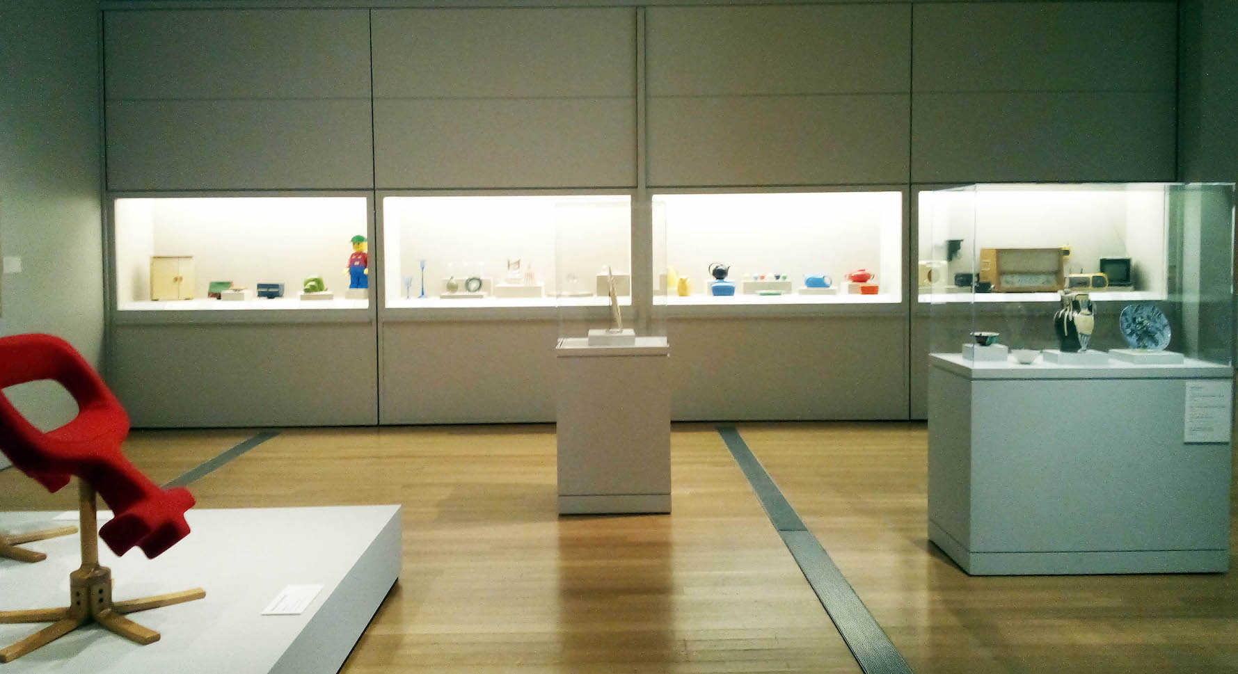
Design Highlights from the Permanent Collection, installation photo.

Grand Rapids is home to some of the Midwest’s finest contributions to applied art and design, particularly in the furniture industry, and the Grand Rapids Art Museum holds a muscular collection of applied arts, much of which comprises the exhibition Design Highlights from the Permanent Collection. This is a show which brings together work from 20th Century megastars, but also artists and designers who remain completely unknown. Filling the GRAM’s first-floor gallery suite, all these works stand as examples of how artists have sought to bring beauty into everyday life.

The works in this show represent a synthesis of decoration and function, and the distinction between the two is frequently blurred.  It’s a point emphatically made by the inclusion of a ceramic plate, some vases, and a set of cups designed by Picasso for Madoura Pottery in France, all adorned with whimsical vignettes rendered in the artist’s abstract style.

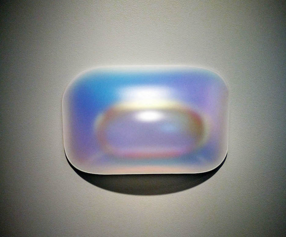
Some of these works explore design for its own sake. There are several lithographs in which Alexander Calder simply plays with basic abstract arrangements of shape, form, and color.  And an iridescent, blow-molded acrylic wall-hanging by Gisela Colon is similarly non-functional, but in its luminescence and simplicity speaks to the potentiality of design alone to capture the viewer’s interest even in the absence of conventional subject matter.

Ovoid Glo-Pod (Iridescent Lilac), Gisela Colon, 2016.  Design Highlights from the Permanent Collection, installation photo

But the overwhelming majority of works here exemplify functional design, ranging from furniture, cutlery, advertising, household appliances, and electronics. A display case housing personal electronic devices underscore the rapidity of the evolution of technological design.  An ensemble comprising several 1950s-era radios, an AM/FM Walkman, a cassette player, a TV, and some cameras is now collectively obsolete, rendered so by the advent of the smartphone.

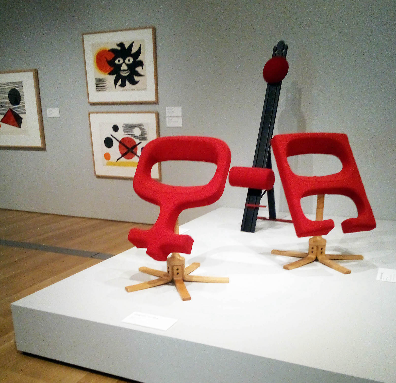
Grand Rapids is famous in the Midwest for its contributions to furniture design, and visitors to the GRAM can count on several iconic examples of 20th-century furniture always being on display. These often articulate the point that, like technology, furniture design can also substantially shift and evolve over a relatively short time. Here, there are some pieces by Gustav Stickley, Ray Eames, and Charles Eames.  Certainly, the most visually striking pieces are the zainy, sculptural chairs produced by the Westnofa Workshop which manage to re-define the notion of what a chair even is.

Design Highlights from the Permanent Collection, installation photo.

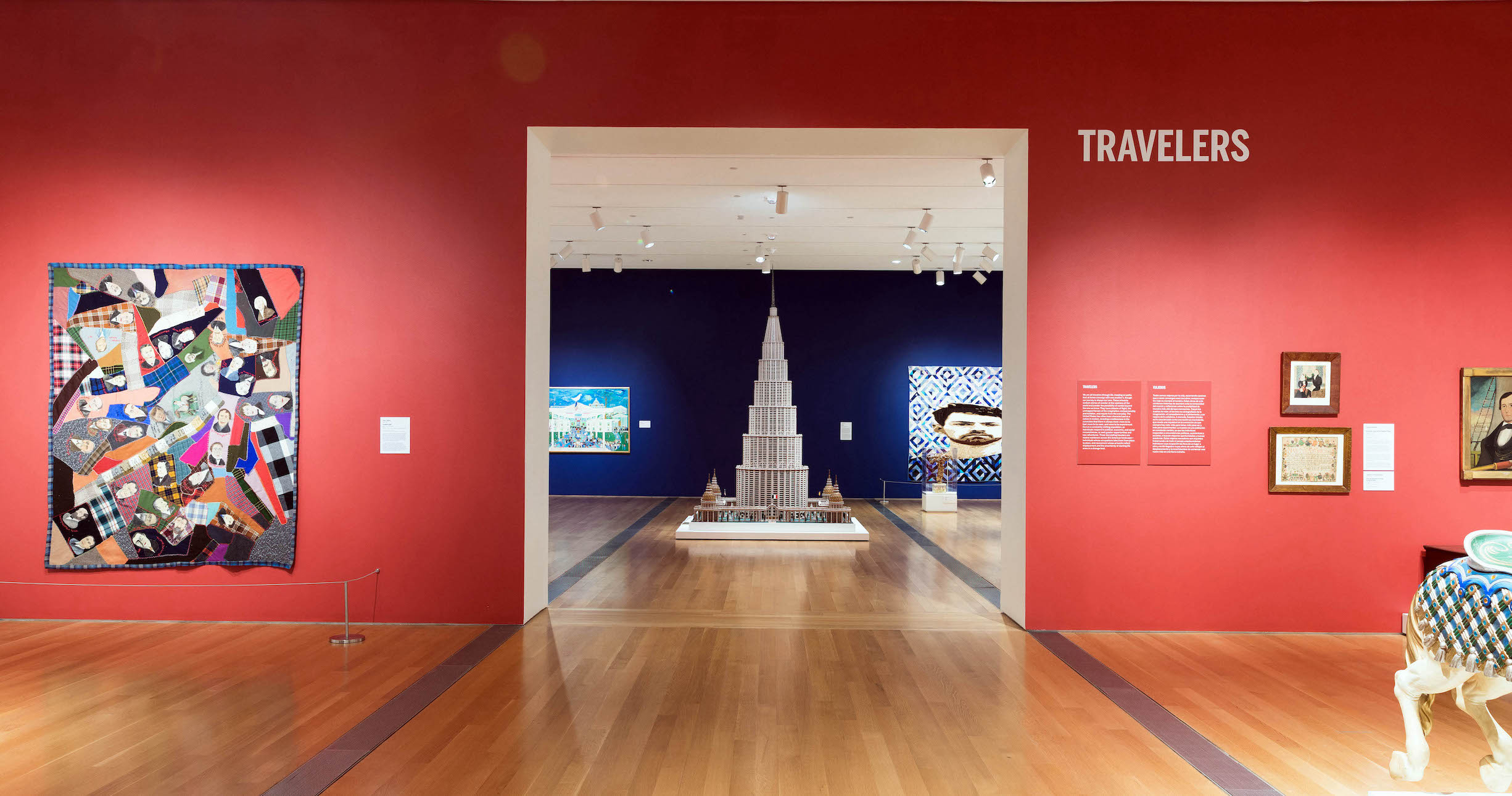
Similarly blurring the distinction between the beautiful and the functional, a concurrent exhibition features 80 works on loan from the collection of the American Folk Art Museum. This large exhibit fills most of the GRAM’s spacious second-floor gallery suite. By its nature, folk art is eclectic and perhaps hard to define, but these works collectively make the point that folk art has the capacity to be punchy, pertinent, and socially engaged.

American Perspectives: Stories from the American Folk Art Museum Collection, installation image courtesy of the Grand Rapids Art Museum.

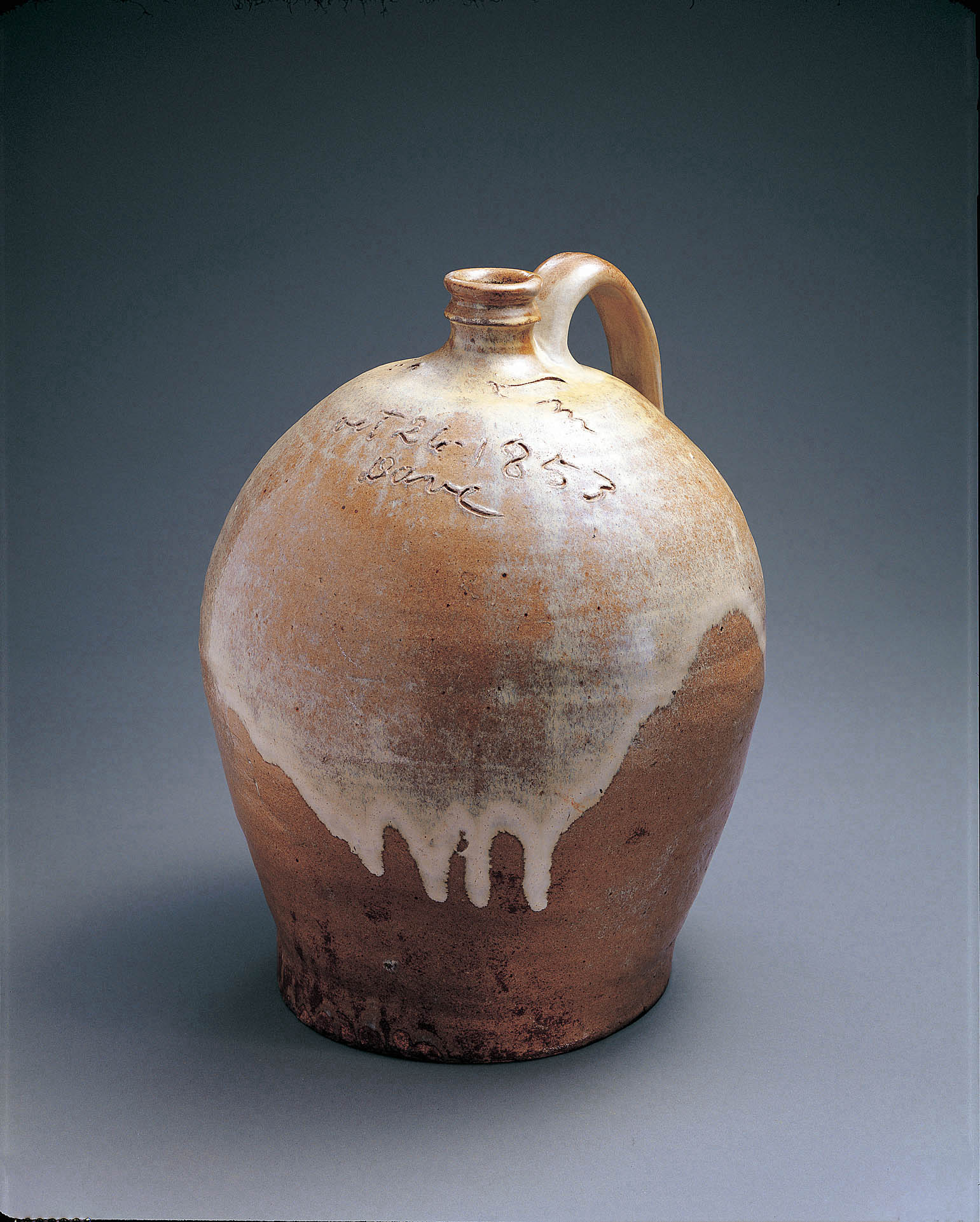
American Perspectives: Stories from the American Folk Art Museum comprises a varied assortment of media, and amplifies voices that have been traditionally absent from museum spaces. One of the most moving examples is a ceramic vase by David Drake, an enslaved African American who created an estimated 40,000 works of pottery in his lifetime, invariably signing them “Dave” and often inscribing  witty rhyming couplets on their surfaces.  His signature features prominently on the side of the vase, asserting his personhood and creative agency in triumphant defiance of the dehumanizing institution of slavery.

David Drake (c.1800–c. 1870).Jug,1853.Alkaline-glazed stoneware,14 1/2 x 12 x 11 1/2 inches.CollectionAmerican Folk Art Museum, New York, Gift of Sally and Paul Hawkins, 1999.18.1.Photo by JohnParnell.

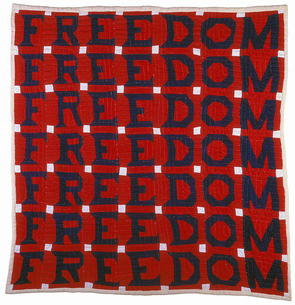
Harnessing an entirely different media, the Grover Cleveland Quilt similarly amplifies a disenfranchised voice, the patches of the quilt declaring its anonymous creator’s support for Grover Cleveland’s candidacy approximately forty years before the vote was extended to women. Created almost exactly a century later, Jessie Telfair’s Freedom Quilt is a monument to the hard-fought rights secured during the Civil Rights Movement.

Jessie B. Telfair (1913–1986)Freedom Quilt,1983.Cotton,with pencil,74 x 68inches.CollectionofAmerican Folk ArtMuseum, New York,Gift of Judith Alexander in loving memory of her sister, Rebecca Alexander, 2004.9.1.Photo by Gavin Ashworth, New York.

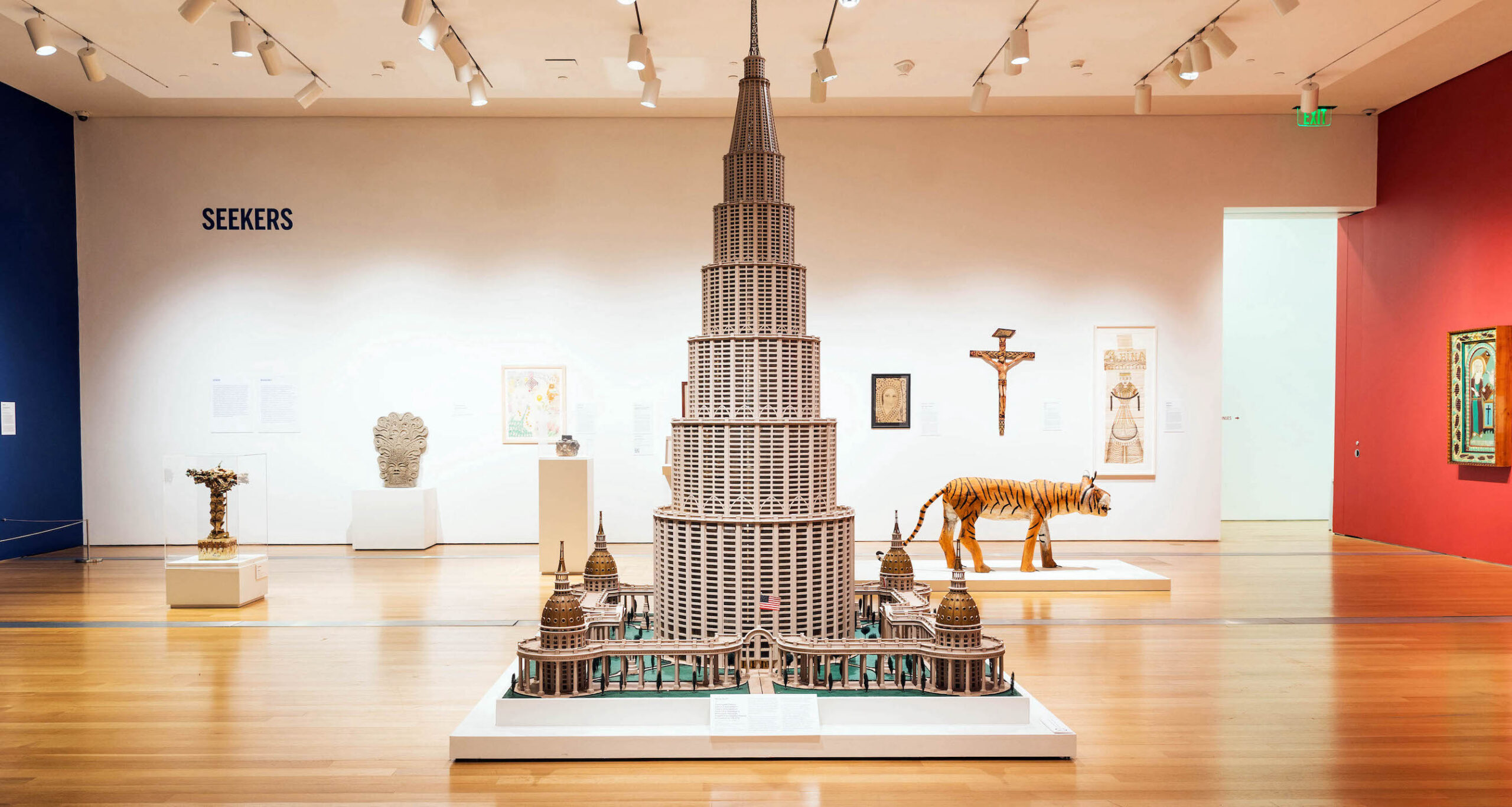
Work by immigrants to America features prominently in the show. A visual centerpiece of the exhibit is Mariano Ariti’sArchitectural Palace, a model for a hypothetical museum celebrating human innovation. An Italian immigrant to the United States, he envisioned this colossal structure to stand in Washington D.C., and if realized, the building would have been as tall as Dubai’s Burj Khalifa.  Its ambitious scale speaks to the artist’s optimistic vision of the nation’s capabilities.  

American Perspectives: Stories from the American Folk Art Museum Collection, installation image courtesy of the Grand Rapids Art Museum.

Born to a family of immigrants in the Bronx, Ralph Fasanella’s Workers Holiday portrays the city’s working-class masses headed to Coney Island as a momentary escape from the daily grind, and indirectly speaks to his impassioned interest in worker’s rights.  Not incidentally, just a few feet away from Fasanella’s painting is an original wooden carousel horse, itself a form of handcrafted folk-art, from the merry-go-round at Coney Island amusement park.

This is an ambitious pair of exhibitions, given that they bring together an eclectic assortment of art and design which we might not conventionally think of as museum art.  As different in form and content as both of these exhibits are, together they bring together non-traditional media which assertively makes the point that visual culture isn’t simply the stuff of sterile and hushed museums and galleries, but that craft and design can frequently burst into real-world, real-life spaces.

Design Highlights from the Permanent Collection runs through August 14, 2021, and American Perspectives: Stories from the American Folk Art Museum runs through August 28, 2021.

Page 26 of 79

Powered by WordPress & Theme by Anders Norén