The young African American Detroit artist Mario Moore has landed an exhibition, Enshrined: Presence + Preservation, at the Charles H. Wright Museum of African American History.
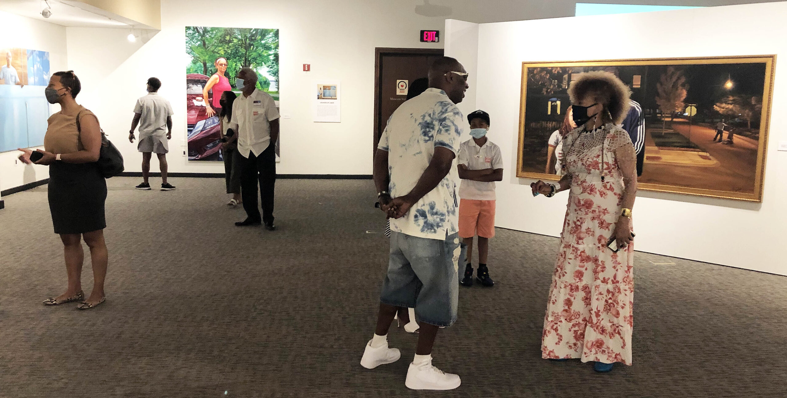
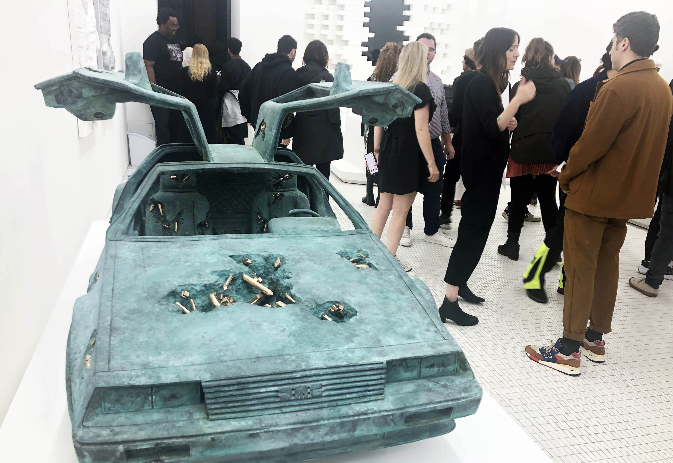
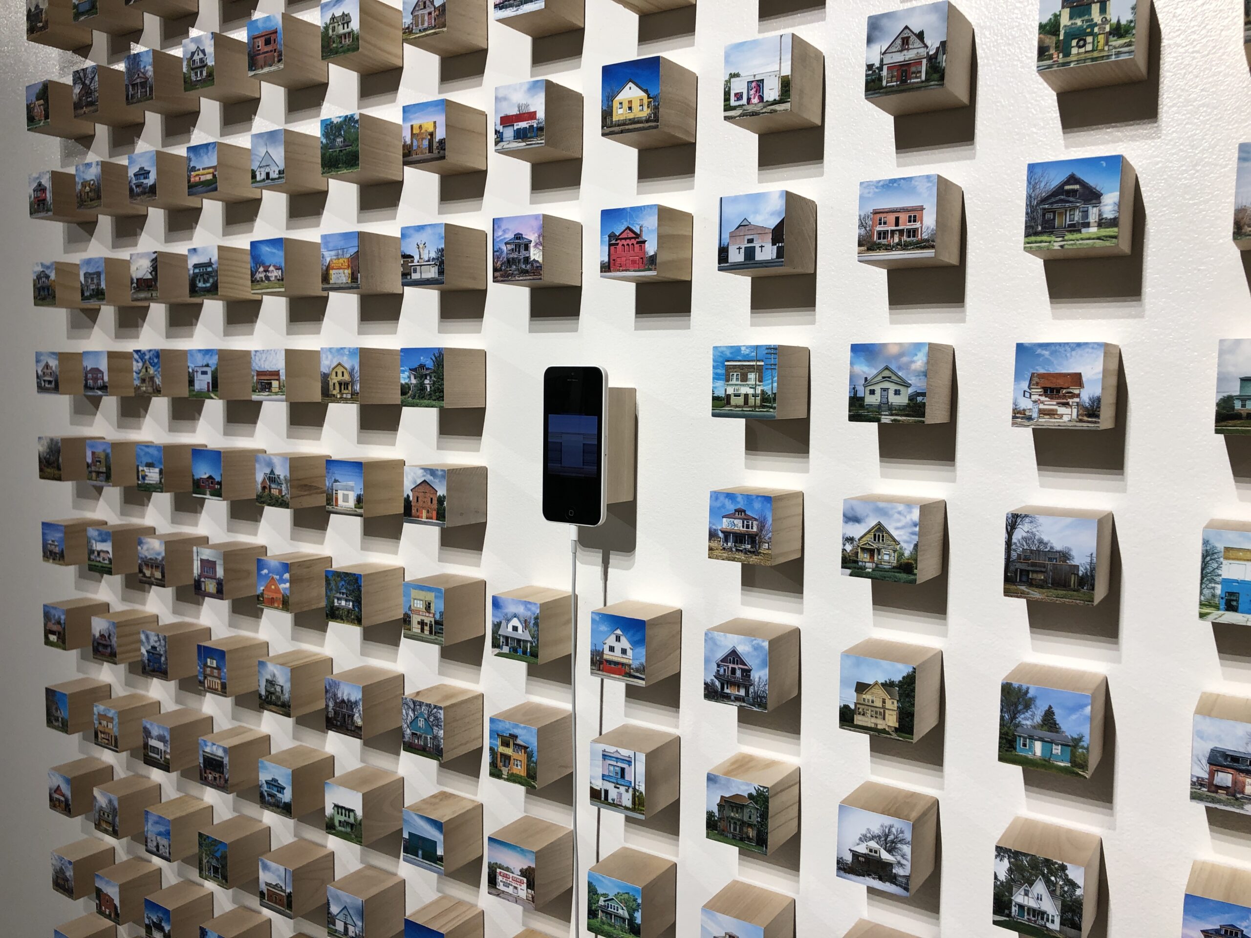
Installation image, Enshrined: Presence + Preservation, at the Charles H. Wright Museum of African American History.
Mario Moore addressed the large crowd that had gathered at the Charles H. Wright Museum for the opening of his first museum exhibition. There was plenty to be thankful for, as many people helped Moore on his path from a young Detroit art student at Cass Technical High School to attending College for Creative Studies and then earning his MFA at Yale University. All of these educational experiences are coupled with his recovery from brain surgery, coverage on CBS News, and his representation at the David Klein Gallery. It was clear from his remarks that he wanted this exhibition to be at the Charles H. Wright Museum in Detroit, a reflection of how the museum and the city shaped his life.
Taylor Renee Aldridge the curator for the exhibition had been in the planning since 2019 and presented the audience with these buckets of themes ( listed here in bold) that chronologically track Moore’s early work to the present. The Detroiter, Aldridge, worked for a short time at the Detroit Institute of Arts, where she assisted in curating the exhibition Making Home, a collection of fifty works by artists with diverse perspectives and backgrounds. In a variety of media, the DIA exhibition focused on Home as a symbol of belonging. That and many other curatorial efforts prepared her for what she does best, and it is fitting that she would team up with Mario Moore for a museum exhibition at the Charles Wright in Detroit. She is currently living in Los Angles, where she works as the visual arts curator and program manager at the California African American Museum.
The artwork of Mario Moore from an early age is centered on drawing the figure as part of a personal and realistic narrative. Whether it is family or friends posing for portraits, or ideas from his own ideations, the artwork reflects his experience filtered through the Black culture growing up in Detroit.
He says in his statement for this exhibition, “I continue to be interested in the concept of space. A physical and mental space. One that directly engages with the human body and how to make a two-dimensional surface interact with three-dimensional ideas. I hope that my work challenges, confronts, and disrupts perceptions of humanity, the human figure, and more specifically, Black life.”
The Matriarch
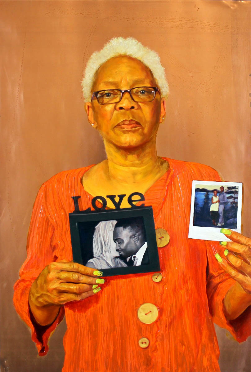
Mario Moore, Mom Says I’m Her Sun, Oil on Copper, 2015
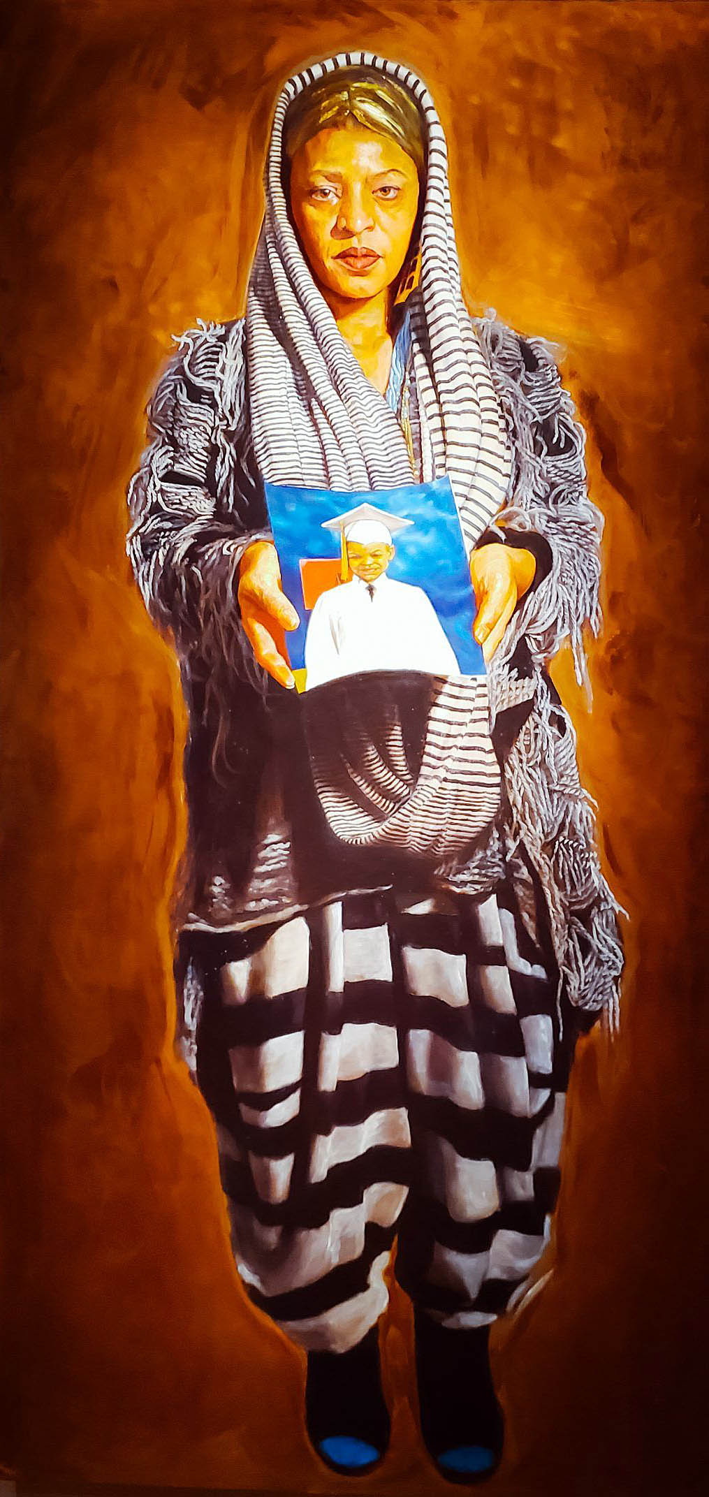
It’s not unusual for a young person in the Black culture to be raised by their single mother, including a supportive grandmother. Black Americans’ social standing in the United States has been shaped by a long history of racism in laws, policies and practices that have built racist institutions and exacerbated inequality. Moore pays tribute to both his mother, Sabrina Nelson, and his grandmother, Yvette Ivie, by painting portraits, each displaying a photograph of family members in their hands where the image becomes enshrined. Not a new medium, rather an old medium, Moore often paints on copper. Unlike canvas, the smooth, rigid surface of copper lends itself particularly well to finely detailed brushwork. In the 16th and 17th centuries, many artists painting on copper applied a coating of tin to the copper surface before painting which imbued their works with great luminosity.
Mario Moore, “Yeah G-Ma Don’t Play”, 24 x 36, Oil on Copper, 2015
All About Love
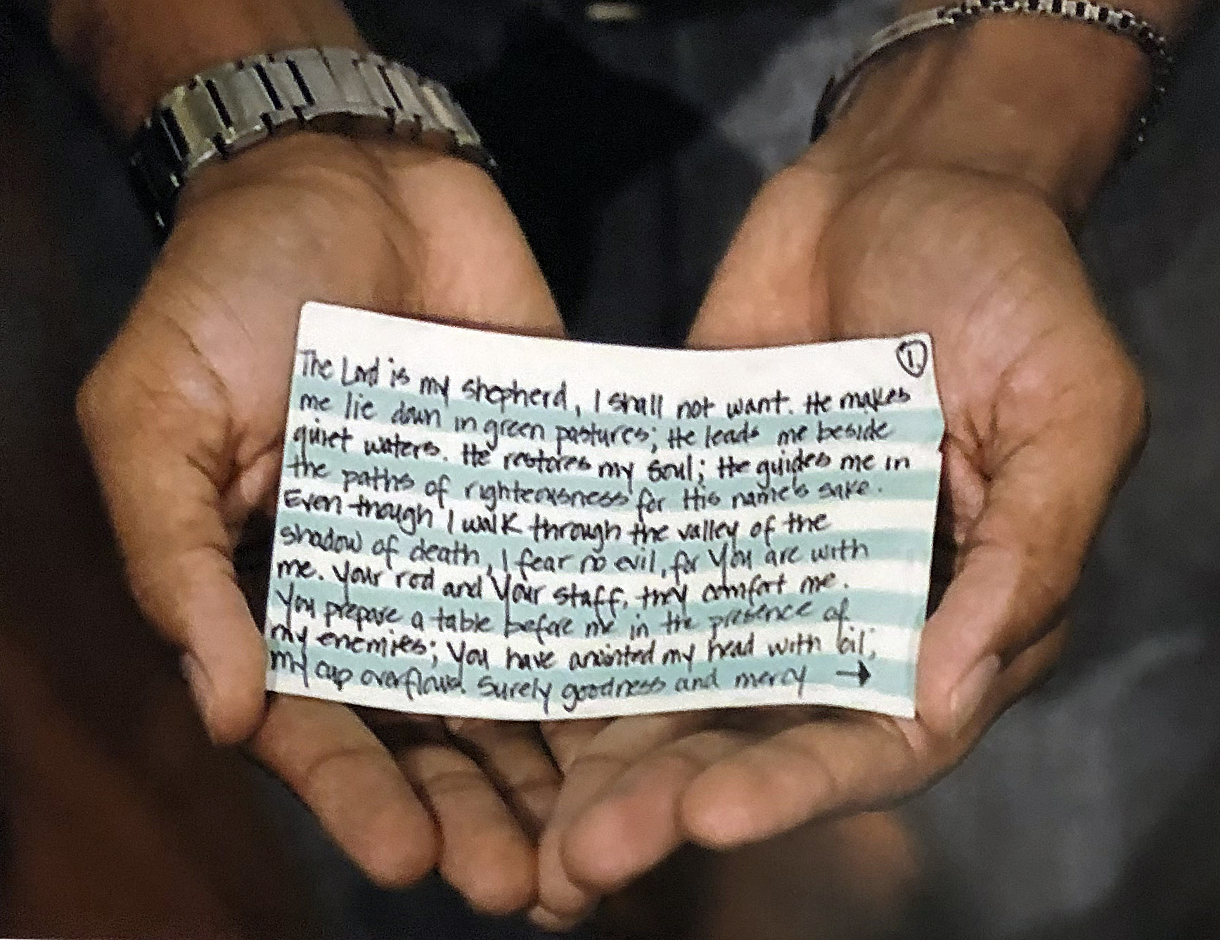
A photograph used as part of the informational curation, where Mario Moore’s wife, Danielle, leaves him this note the night before he had his craniotomy surgery. Photo image by Jeff Cancelosi, 2018
This group of works explores a variety of ways Moore touches on examples of love for people and ideas. One of the informational items in the show has this photograph where the audience sees an image of Mario Moore’s hands holding a card with the 23rd psalm handwritten by his wife Danielle and given to him right before he had craniotomy surgery.
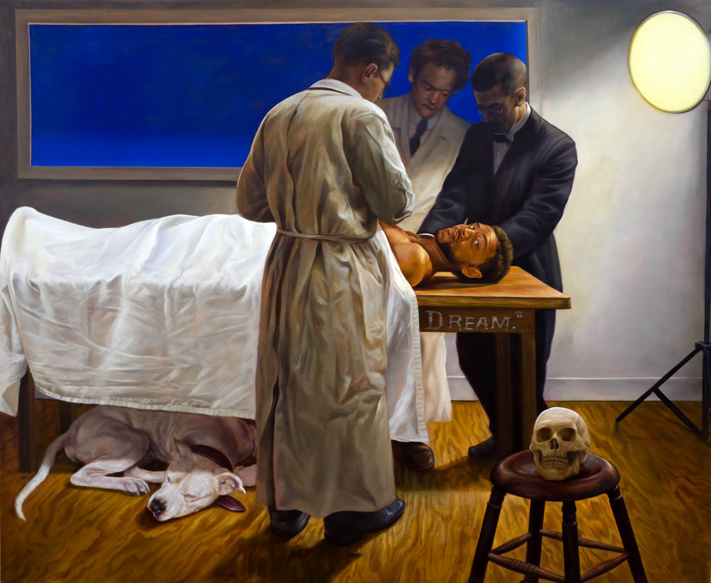
Mario Moore, A Student Dream, Oil on Canvas, 2017
Moore’s brain surgery became the subject of his painting, Dream, where the artist creates this dream image in a surreal-like setting of the past. He paints himself on a plain wooden table, looking out directly at the viewer while placing an African American male, with two diminished assistants in deep observation. The American Bulldog (that appears symbolically in other work) is sleeping while the skull rests on a footstool. The skull might present the fact that many slave cadavers were dug up for study in the past and the dog represents an American culture fast asleep, ignoring equality and justice for all people. This painting and others demonstrate Mario Moore’s ability to invent a new and unique way of creating subject matter from a deeply personal experience. Suppose one steps back and views the work of many African American artists working today. In that case, we see the human figure dominate the artwork: Charles White, Kerry James Marshall, Kara Walker, Faith Ringgold, Romare Bearden, Claude Clark, Elizabeth Catlett, Jacob Lawrence, Kehinde Wiley, Amy Sherald, Basquiat, and Mickalene Thomas to name only a few.
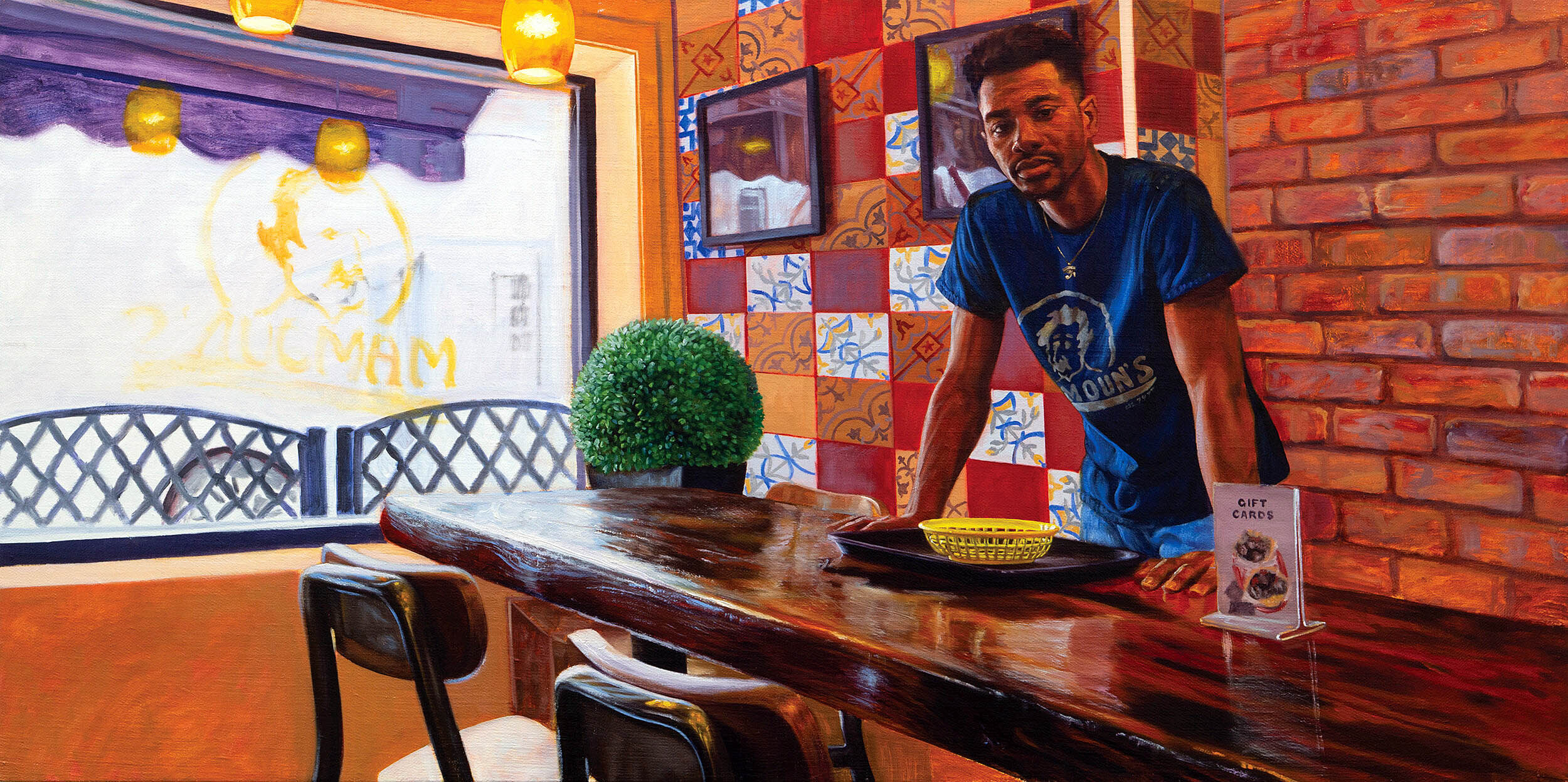
Mario Moore, Light on Brother (Jalen), Oil on Linen, 2017
The painting Jalen (brother) from 2019 is my most-liked painting in the exhibition because it seems to encompass all I have learned about Moore’s life and artwork. For instance, it is the strength of the composition where the young man stands relaxed at the table looking into the audience’s eyes (in this case the artist) and is placed one-third into the rectangle. The large window provides the overexposed lighting that helps the color modeling, especially the blue shirt worn by his friend and relies on the influence of using primary color to do the heavy lifting. The secondary color is there, both orange and green, but nothing can compete with the placement of the yellow plastic basket centered below the figure in the composition. These elements make a work of art transcend our own experience, successfully capture a moment in time and leave us wanting more. This painting will still grab our attention in a hundred years, even if some viewers do not quite know why.
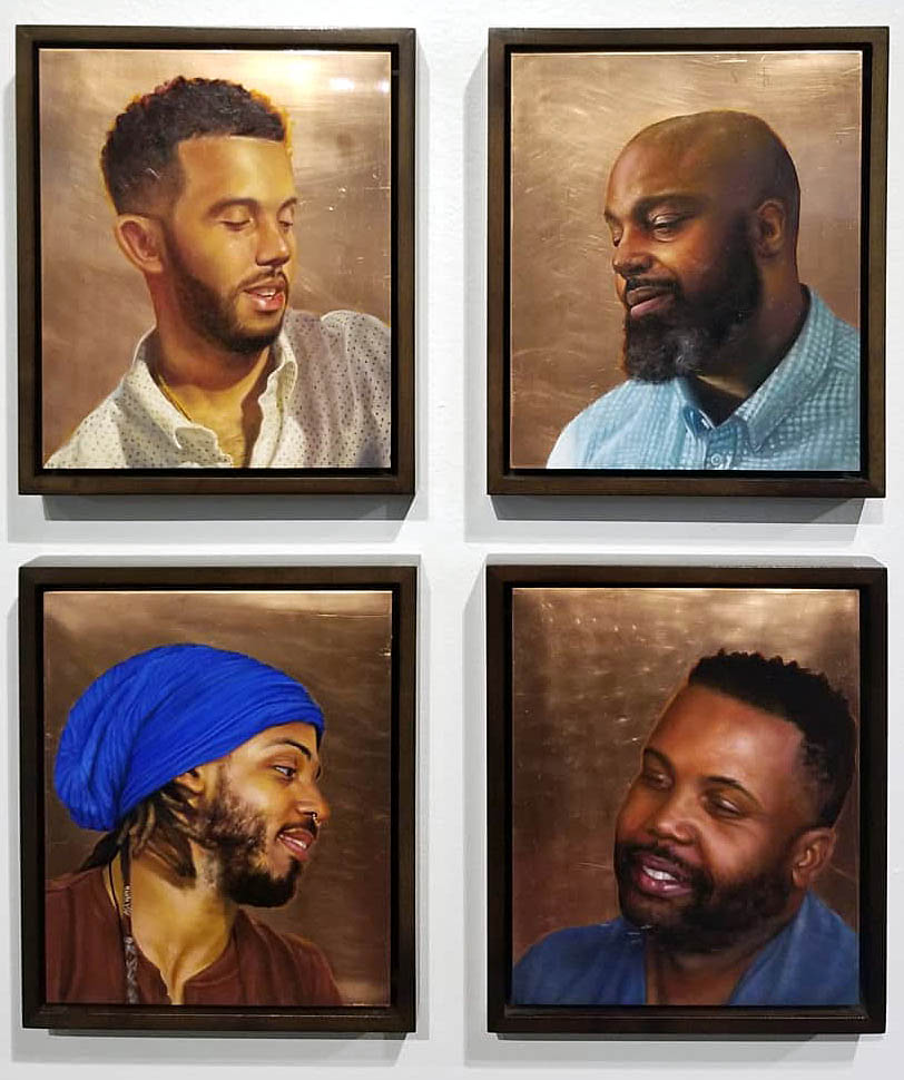
Mario Moore, Four Portraits of male friends, Mesha Cherie, Toria Turner, Bruce Israel, and Tannisha Reid. Oil on Copper. 2018
These four portraits of either friends or family are painted using oil paint on copper, which is usually far better preserved than those on other substrates. All four are looking off to the side, and not at the viewer. They are purposefully making pleasant gestures that capture kindness. It is not an accident that Moore enshrines these four men as a statement of affection and share the commonality of age, gender, and race.
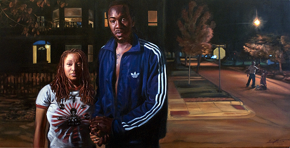
Mario Moore, The American Dream, Oil on Canvas, 2011
This double portrait of American Dream of Moore’s sister Denise and her husband Bomani Diop has this romantic light at night from the left juxtaposed to a violent act just a couple of hundred yards away. Light sources in the houses behind the two figures add to the drama in the street. It is as if at times the vibe is normal and serene, but violence lurks in the street.
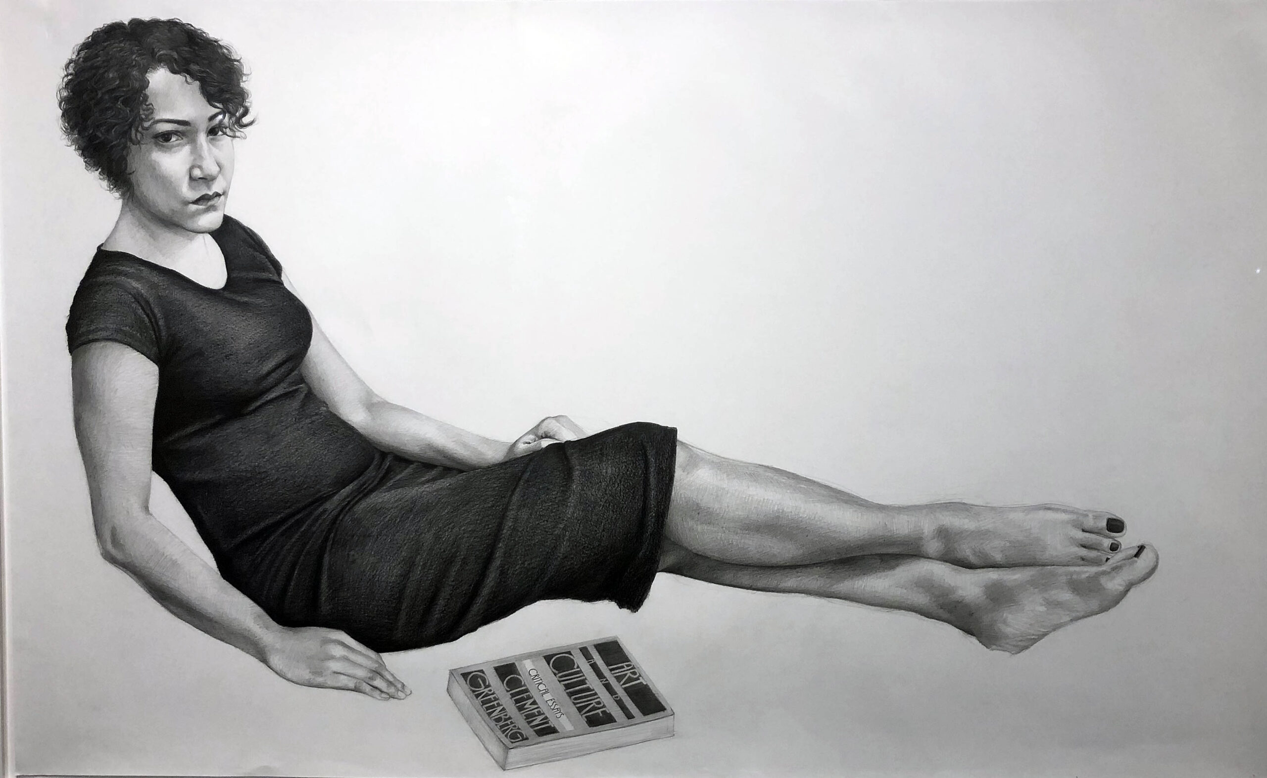
Mario Moore, Lucia, Drawing with Graphite on Paper, 2015
Lucia, graphite on paper, is a large drawing using conventional rendering where the sitting figure has a full range of black, white and gray. Many of Moore’s drawings are in silverpoint, but any artist willing to place the book Art and Culture by Clement Greenberg in a piece of artwork gets special attention from a writer of art criticism. I am drawn to this full-length portrait where the subject directs the gaze into the viewer’s eyes. What is she trying to say? “Study your Art History?”
Fabricating Oneself
Mario Moore, Red, Black, and Green. Oil on Canvas, 2017
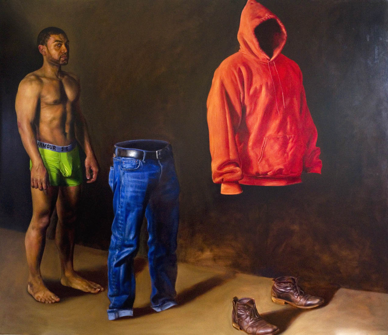
Just as in the painting Dream, and for some people, just as history has provided the art world with a figurative narrative for the past 2000 years, Moore gives us a new experience with his self-portrait, Red, Black, and Green Armor. Think of the armor we cover ourselves in, our skin (black), our trousers, underwear (Green), and a (Red) hoody with shoes. He pulls them spatially apart while confronting the viewer with his gaze. It is laying yourself open to the world through this kind of realism that is rendered realistically with light casting shadow from the left. As in much of Moore’s work, it is a new experience in delivering our humanity to the viewing public.
Mario Moore, Not Your Landscape Oil on Canvas, 2018
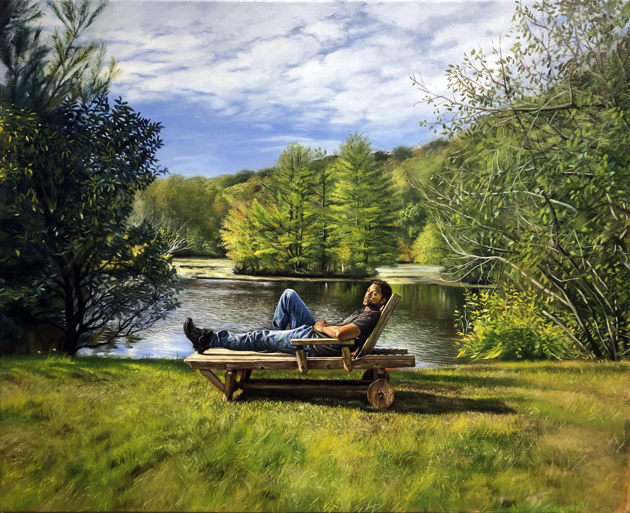
Mario Moore did a series of silverpoint drawings of men at rest that was the subject of an exhibition at the David Klein Gallery. Some of that must have come from the recuperation time he needed after his surgery. Through interviews, he expresses this idea that black men were constantly working to keep ahead and survive the massive discrimination that was part of the white Anglo-Saxon culture. The painting Not Your Landscape accomplishes a couple of things. It is a biographical documentary of the artist resting during his recuperation time but also allows him to flex his muscles as a painter, trained to render the landscape in its splendor realistically. The image is of himself sitting in a lounge chair centered in the lower third of the composition, with low sunlight coming from the left which helps define the figure, and the texture of the grass and surrounding foliage supported with reflections from the background lake. It’s his landscape, not yours.
Legacies of Labor
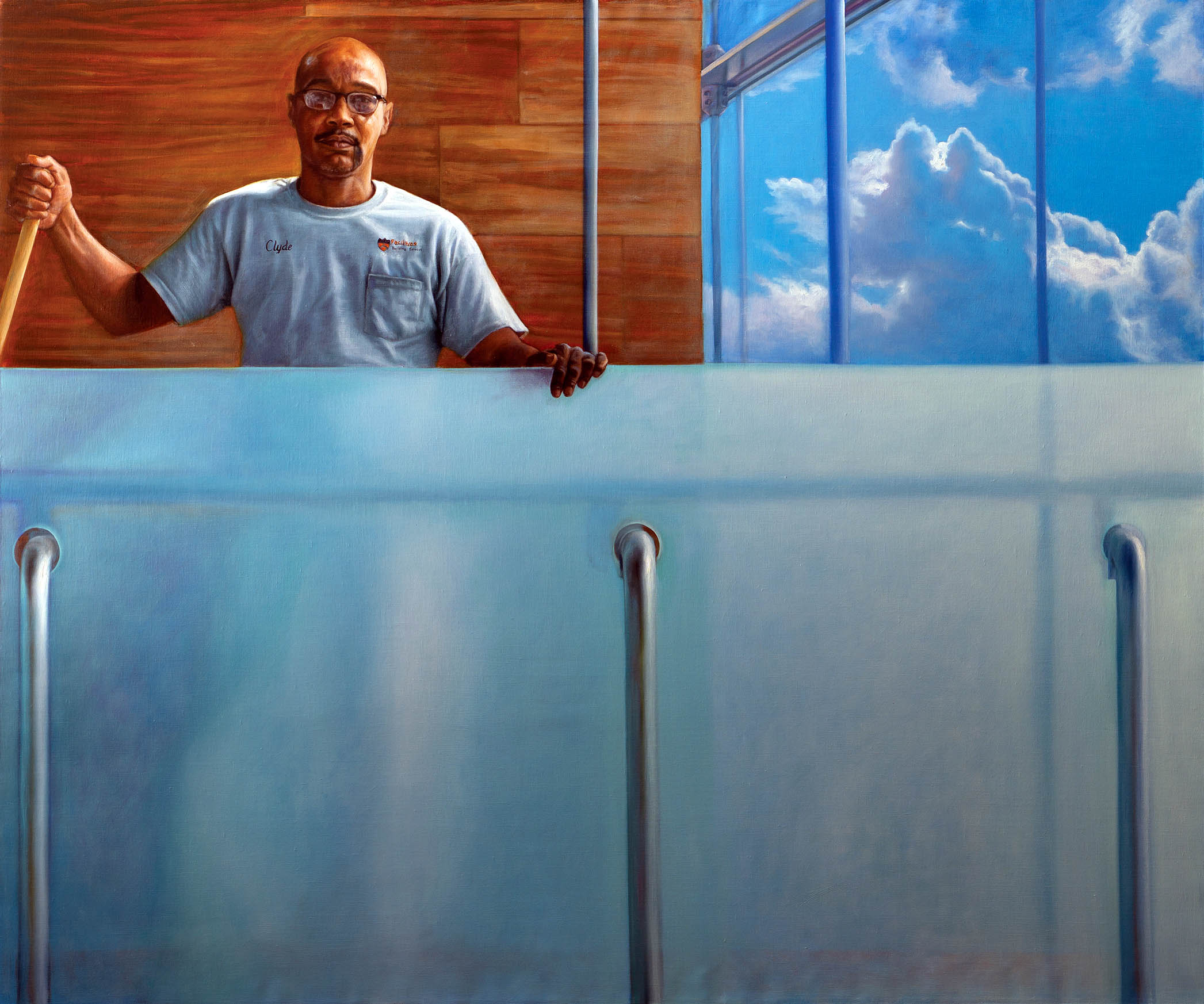
Mario Moore, Clyde Sky High, Oil on Linen, 2018
After Moore’s graduate school experience at Yale University, he was offered a residency at Princeton University’s Museum, and it seemed like the concept he would use to create a series just fell into his thought process as he arrived in 2018. In addition, he has said he was inspired by his father, a former security guard at the Detroit Institute of Arts when he first encountered aged white men’s portraits, deans, donors, and alumni, all hanging on the museum walls. This painting Clyde Sky High was Moore’s first painting in a series documenting the cleaning staff, cooks, and security guards. In December 2019, I closed my review of the exhibition, Detroit Collects, at the DIA with this remark, “Recently Moore has spent his time as a Hodder Fellow at Princeton University, depicting large-scale paintings of black men and women who work around the campus in blue-collar jobs. When I think about the work of Mario Moore, there is a message of social justice that reminds me of Kehinde Wiley, who addresses the issue of inequality in the selection of the figurative subjects in paintings of the past. This early review was the beginning of my exposure to Mario Moore’s artwork, and I now have seen Moore’s artwork, Black & Blue is a painting that expresses his feelings around social justice.
Grand Uprising
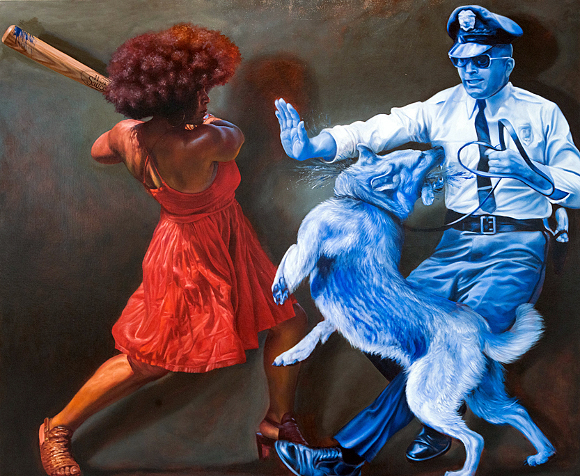
Mario Moore, Black and Blue, Oil on Canvas, 2016
With all the violence perpetrated on Black Americans for three hundred years, the trauma and anxiety layered into their daily lives, it should not surprise anyone that many artists are drawn to ideas that express imagery that reflects those events. The painting Black & Blue is a painting that represents the frustration and anger when the police arrive with their attack dogs. The woman is depicted in full realistic color as she strikes a powerful blow to the dog depicted in a solid monotone blue that characterizes the police and his riot dog. How many people would like to feel the success of this moment as the bat comes around from contact with the police? Not enough.
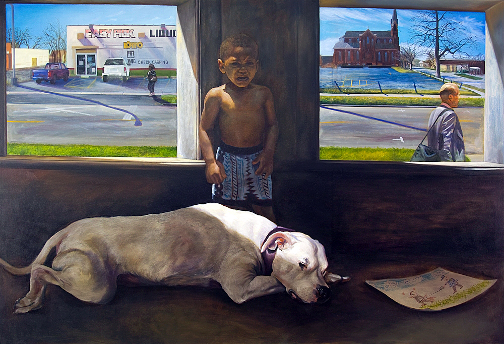
Mario Moore, PTSD for a Lifetime it seems. Oil on Canvas, 2015
Ask yourself why this young boy is afraid, upset, and crying? The children’s illustration lying on the floor is that of a policeman shooting a Black American. Who is caring for this very young boy as the American Bulldog sleeps? This could easily be a vivid memory of a young Mario Moore where the background is made up of the two symbols present in a vacant urban landscape: A Liquor Store and a Church. These are the only tools left when justice fails Black Americans. If this depicts the interior of a parking structure, why isn’t the male passerby within earshot of a crying boy? The visual art tools are vital in this formal composition, with light low and to the left. The artist is asking a question to the viewer: Do Black Lives Matter?
In American art today, portraits of Black men by Black artists are uncommon. They keep their inner lives to themselves. It is not given much attention. In 1994 at the Whitney Museum of American Art, Thelma Golden curated: The Black Male: Representations of Masculinity in Contemporary American Art. This exhibition investigated the social and cultural history of the black male body in contemporary art and media after the Civil Rights era. Mario Moore is a successor to the legacy of the Black Male artists and one of the most talented young artists of his generation. With a painting practice based on figurative realism, Moore satirizes psychological transactions between himself, his ideas, his narrative, and the viewer. The work challenges and confronts perceptions of humanity, the human figure, and more specifically, Black American life.
Mario Moore was born in 1987 and has lived his life growing up in the heart of Detroit. Moore earned a BFA in Illustration from the College for Creative Studies and an MFA in Painting from the Yale School of Art. He was awarded the prestigious Princeton Hodder Fellowship at Princeton University and has participated as an artist-in-residence at Knox College, a Fountainhead residency, through the generosity of the Josef and Anni Albers Foundation.
Mario Moore, Enshrined: Presence + Preservation at the Charles H. Wright Museum of African American History, through September 19, 2021