Quite like the majority of us, ceramicist Marie Herwald Hermann has been confined to work from home since March last year, and she found inspiration in this unfamiliar circumstance. As the country begins to mend And the Walls Became the World All Around Us reminds us of the power of art to not only create beauty, but to build community through a greater understanding of humanity.
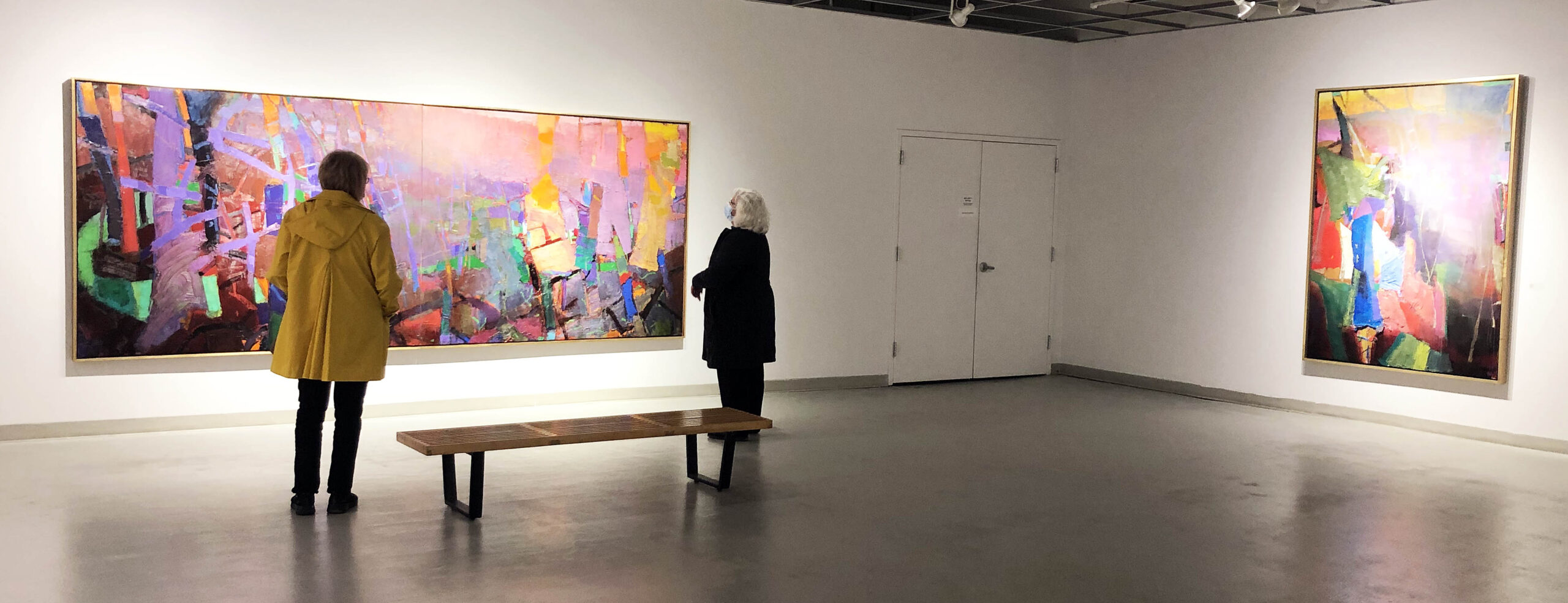
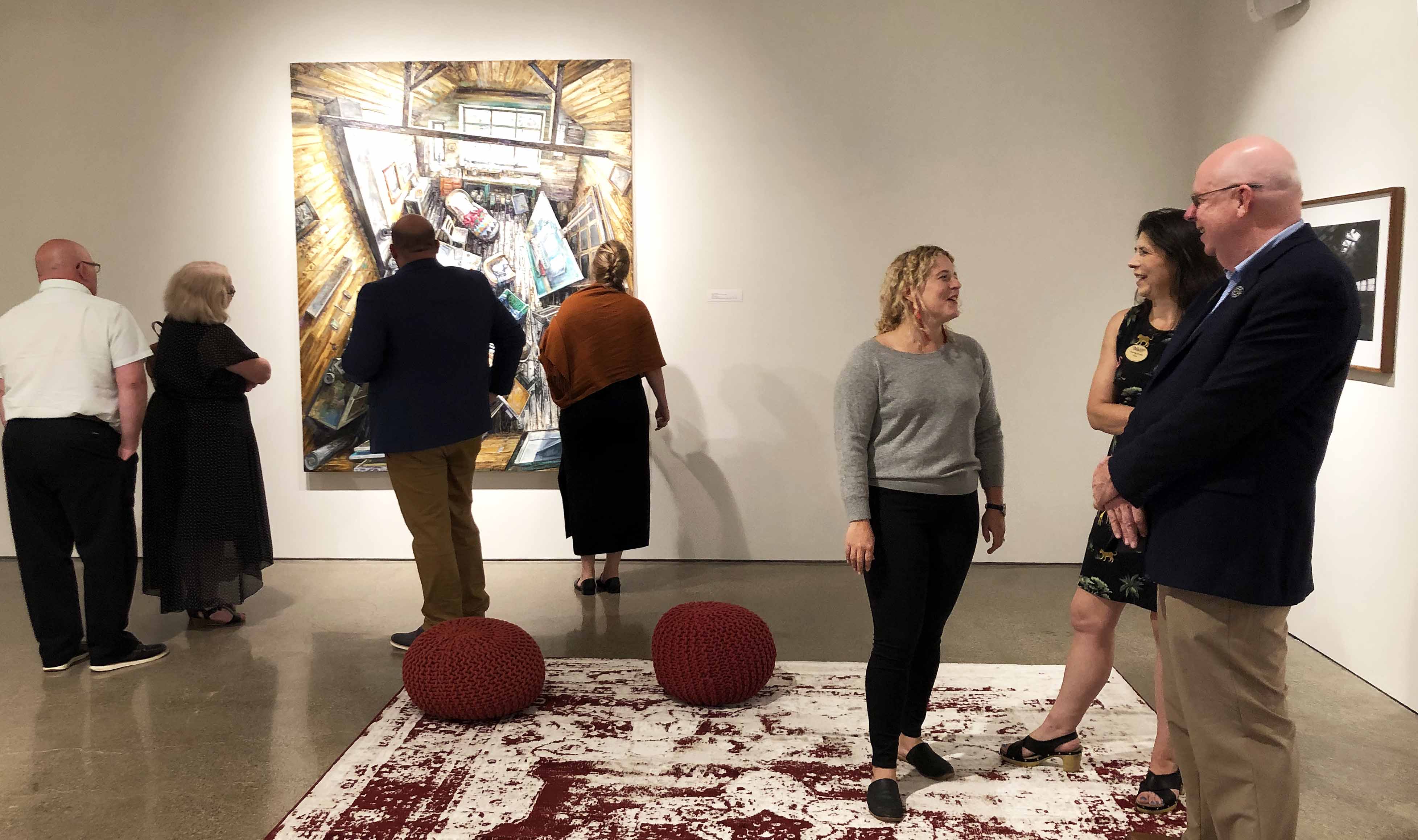
Taking over the entire single-room space at Reyes / Finn, a fairly new, professional contemporary art gallery in Corktown led by Terese Reyes and Bridget Finn, the markedly colorful installation crafted from clay, wood, silicone, and pigment, comprises over twenty works either in the form of a single object or a combination of several into an arrangement. Having worked with Simone de Sousa Gallery in 2015 and Reyes Projects in 2017 and 2018, among other venues, Copenhagen-born Hermann is no stranger to Detroit as she moved here after graduating from the Royal College of Art in London with an M.A. in Fine Arts in 2009, only to settle into an academic teaching position in ceramics at The School of the Art Institute of Chicago in 2018.
Installation detail of Marie Herwald Hermann, And the Walls Became the World All Around Us, 2021. Photo by Clare Gatto. Courtesy of the artist and Reyes | Finn, Detroit.
The title of Hermann’s vibrant and vivid show, And the Walls Became the World All Around Us, alludes to a 1963 American children’s picture book classic Where the Wild Things Are by Maurice Sendak that functions as a meditation on how dreams and the imagination are tied to experiences of confinement, restriction, and trauma. The main character Max, a young boy who is sent crying to his bedroom by his mother after playing recklessly in the house while wearing a wolf suit, envisions a magical journey to an island where he reigns over and dances with terrifying in appearance but playful and sensitive half-reptilian, half-mammilian wild things before returning home. Philosophers in the empiricist tradition believe that we can only imagine things using the materials that we have previously perceived. Since many features of the wild things’ world resemble Max’s actual world, including Max himself, this book, not unlike this exhibition, provides an opportunity to think about whether this empiricist claim is true.
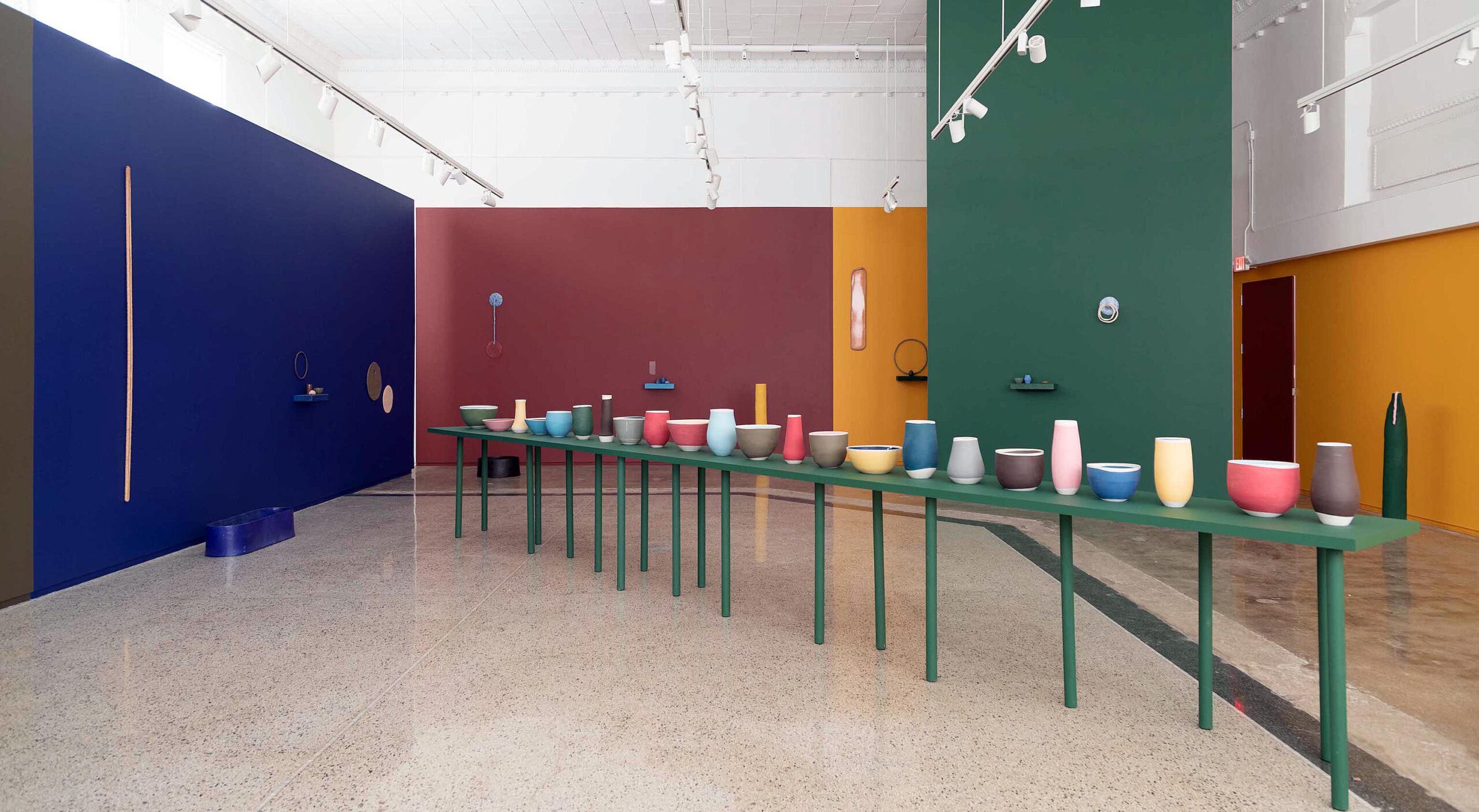
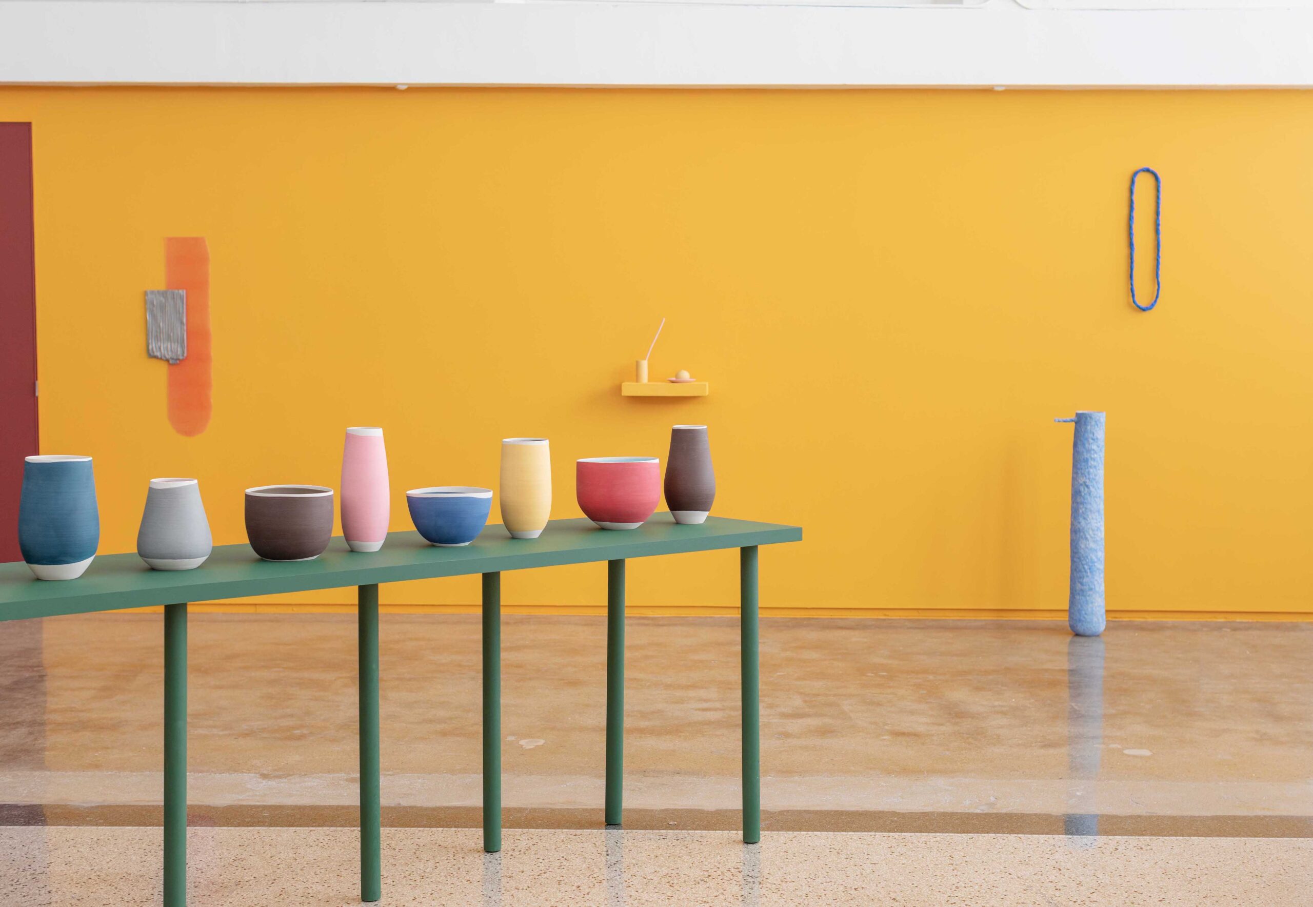
Exceedingly well executed and in pursuit of an overall aesthetic of cohesion, And the Walls Became the World All Around Us features in the very center of the space a long, green display table that cuts diagonally across the rectangular room. The display is reminiscent of the painted still lives of early modern Italian artist Giorgio Morandi known to depict apparently simple domestic objects such as vases, bottles, and bowls with great tonal subtleties, an art historical point of reference acknowledged by the artist.
Installation detail of Marie Herwald Hermann, And the Walls Became the World All Around Us, 2021. Photo by Clare Gatto. Courtesy of the artist and Reyes | Finn, Detroit.
While the green table perfectly matches the color of the tall, vertical wall right behind it, the entire arrangement stands out in shape, color, and process from the surrounding objects, albeit ever so subtly. The table and twenty-three ceramic vases and bowls set atop are, interestingly enough, not listed in the work inventory for the exhibition—a fact this author will return to presently.
Hermann’s installations in general, and this one in particular, deliver a delightful impression of unity between sculptural objects, surrounding walls, and the floor that many visual artists in the twentieth century have been after, including the passion of Minimalist and Postminimalist sculptors in the 1960s for placing objects directly on the floor. In a free-standing tub-shape of sorts, Untitled (Blue and Yellow), floor, wall, and object enter into a pleasing aesthetic unity with sutle variations in hue, texture, and material make-up.
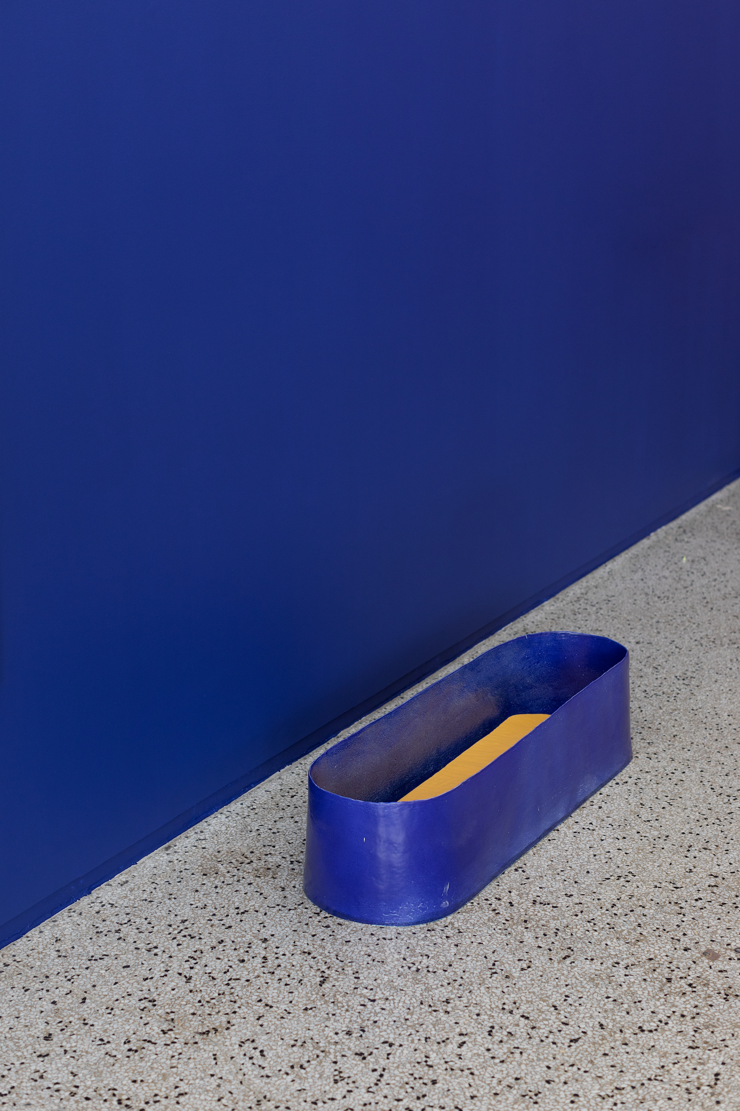
Marie Herwald Hermann, Untitled (Blue and Yellow), 2021 Stoneware and maple wood, 9.5 x 40.5 x 11.5 in. Photo by Clare Gatto. Courtesy of the artist and Reyes | Finn, Detroit.
As the human eye moves through the space from one field of vision to another, changing permutational differences in shape, color, and texture create a dynamic experience while preserving cohesion. As such Hermann operates with the logic of a visual artist who conceives of ceramic objects as entities that cannot be unbound from the coordinates of space-time perception. The many references that occur in her work to the history and practice of visual artists build a fruitful bridge between ceramics, sculpture, and painting. Color conceived of as a field, and this is something abstract painters explore, promotes sculptural integration between wall and objects. An exploration of the impact of color on human perception introduces a new avenue of pursuit for the artist.
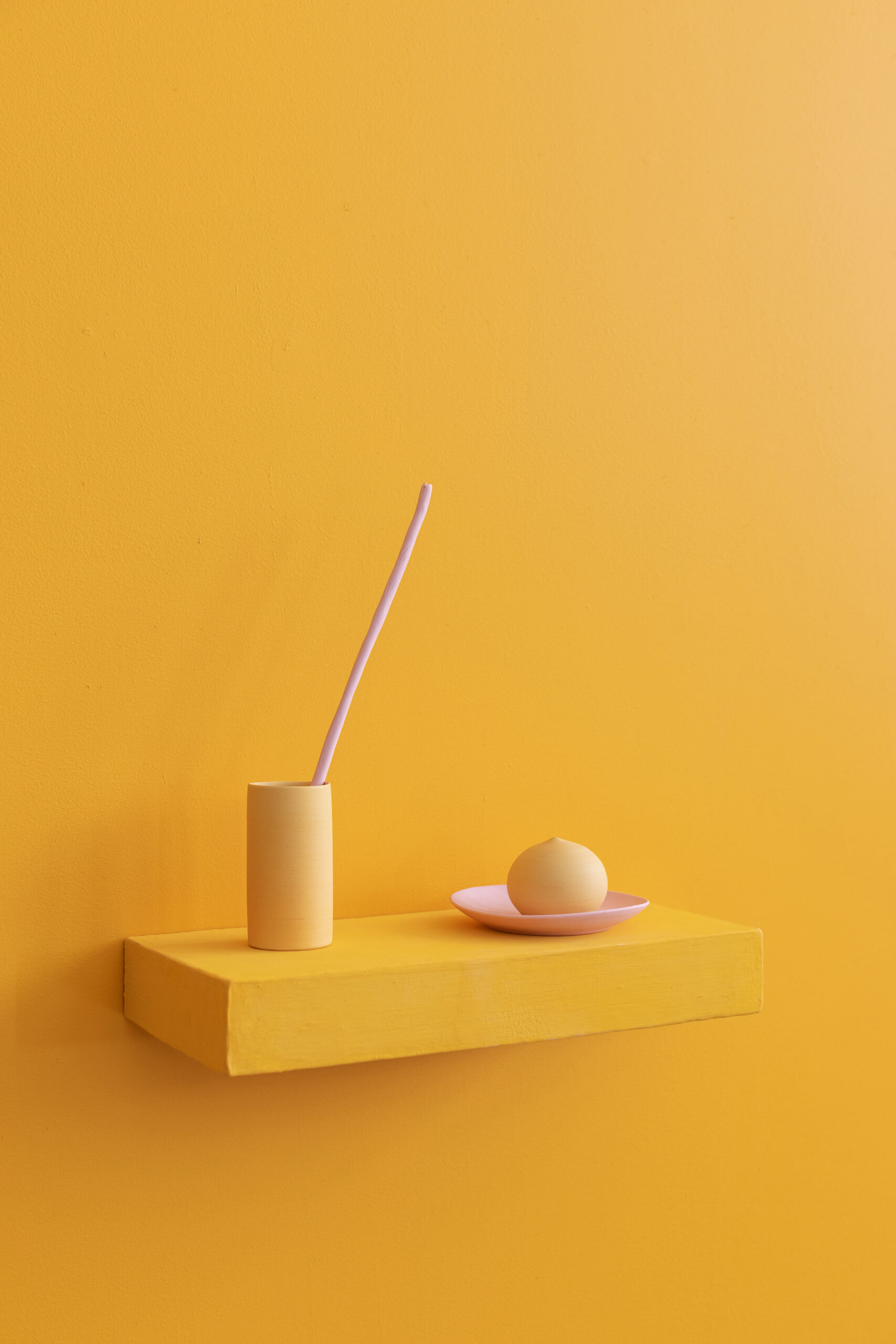
Marie Herwald Hermann, and the silence returned, 2021 Porcelain and stoneware, 15.5 x 16.5 x 7.5 in Photo by Clare Gatto. Courtesy of the artist and Reyes | Finn, Detroit.
In the bright yellow and pink arrangement and the silence returned, it becomes especially apparent that color holds power over feelings. The base color yellow has a strong orange tint that heightens its chromatic intensity. While the wall and shelf are painted in the same color, the cup and bulb-like object with its pointy tip appear in a somewhat lighter tone. Both hues enter into a pleasing resonance of barely perceptible difference with the light pink of the long rod and roundish saucer-like plate. Fashioning her signature wall shelves, and not just the objects supported by it, out of clay and in matching colors speaks to an artistic desire for integration as an aesthetic concern often accompanied by an intellectual desire for a more wholistic approach to life in general. In an unpublished artist talk in 2020, she states that objects “on their own they are un-significant,” only in a group will the object achieve “significance.”
Returning to the green table arrangement, Hermann acts yet again more directly like a painter when color pigments are brushed onto the vessels and protected by a transparent seal that acts like a varnish. By extension, the surrounding works appear in different colors and feature different shapes in porcelain and stoneware, two harder variants of clay fired at high temperatures. We cannot talk about ceramic objects without talking about texture and tactility. Despite the artist’s programmatic refusal to leave expressive finger marks on her ceramic objects, process is paramount to her work.
Throwing clay onto a wheel, the artist confesses to this author, is a purely automatic routine at this stage of her career, just like riding a bicycle, and there is an innate beauty to it. The “thinking body,” Hermann notes, can do “things” during the process of throwing. What we commonly but somewhat misleadingly might refer to as muscle memory (muscles cannot have memory only the brain does), scientists have termed a form of procedural memory that allows us to do certain tasks without thinking about them. In this sense, the ceramic vessels on the green table function as props for human experience. They stand for the thoughts and feelings that occurred during the physical task of throwing. A byproduct of the working process, rather than an end product, they are not for sale.
Memories play an important role in the work of Hermann in general. There is much that researchers do not understand about human memory and how it operates. Some suggest that instead of different, distinct types of memory, it operates in successive stages anchored in sensory memory, short-term and long-term memory occur. Sensory memories committed to explicit or episodic long-term storage in the form of autobiographical events repeatedly surface in her installations. The vibrant wall colors in And the Walls Became the World All Around Us are inspired by childhood memories of visiting the classical art collection of the Thorvaldson Museum in Copenhagen with her architect-parents. The clash between three-dimensional Greek and Roman marble sculptures offset against bright yellow, blue, or red backdrops gives way here to an aesthetic of integration and fluidity instead of contrast.
In addition to yellow and green, blue is the third dominant color in this installation.
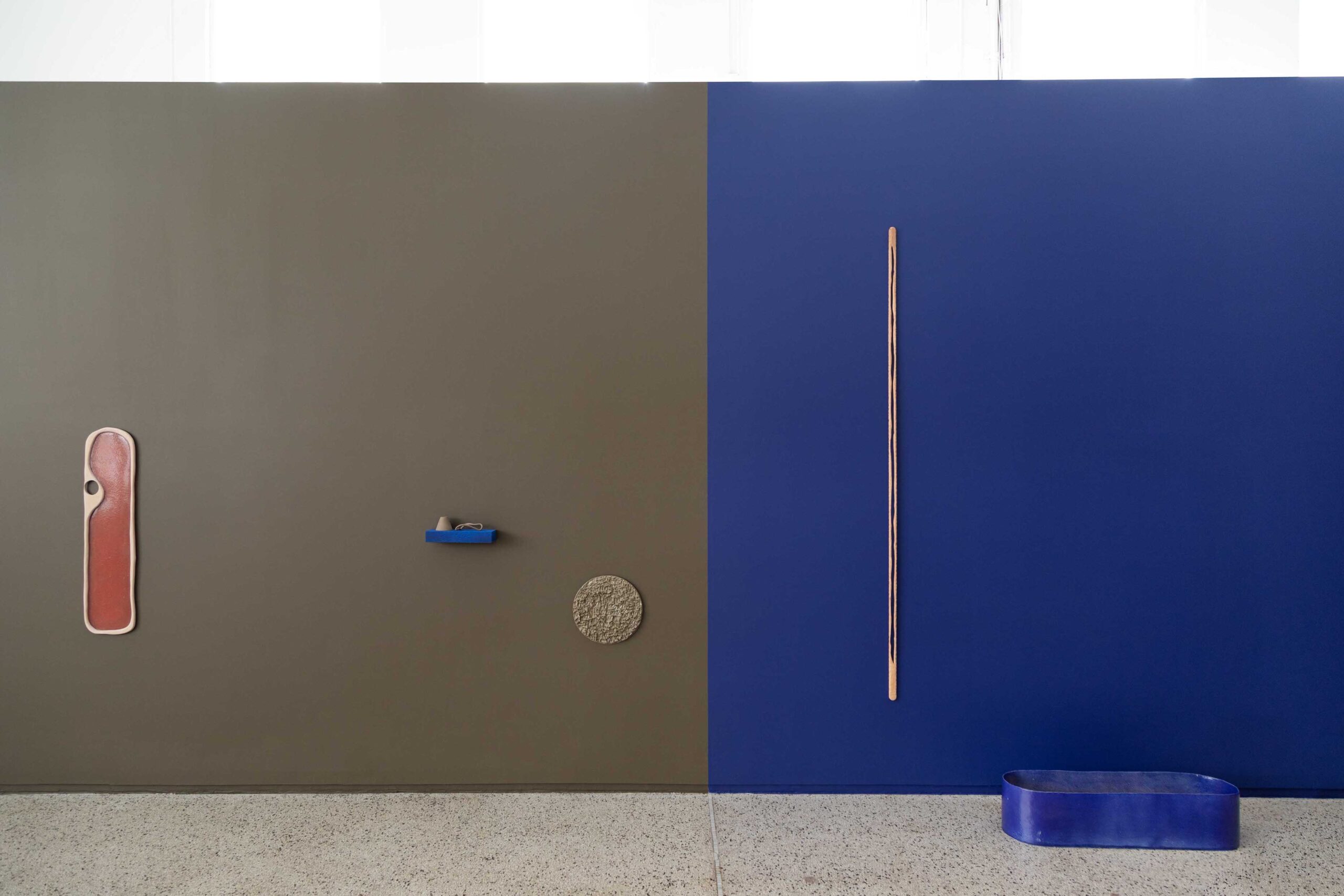
Installation detail of Marie Herwald Hermann, And the Walls Became the World All Around Us, 2021. Photo by Clare Gatto. Courtesy of the artist and Reyes | Finn, Detroit.
Interestingly, as memory studies emphasizes, yellow and blue are colors in our semantic memory that represent nature in language. We note that the “sun is yellow” or that the “sky is blue,” even though, in scientific terms, this is not accurate. The sky only appears to be blue as light and air contain the full spectrum of color and the sun is not a yellow planet nor is the light that it emits yellow.
Many types of shapes occur in the show: circles, rings, elongated ovals, needles, cups without handles, bowls etc. Some of the objects cary strong associations with kitchen utensils or plumbing fixtures such as towel rings evoking ideas of cleanliness, beautification, and the labor of washing, while others remain entirely abstract. At any rate, tentative links with elements of the domestic realm attributed to women emerge. This holds especially true for Double.
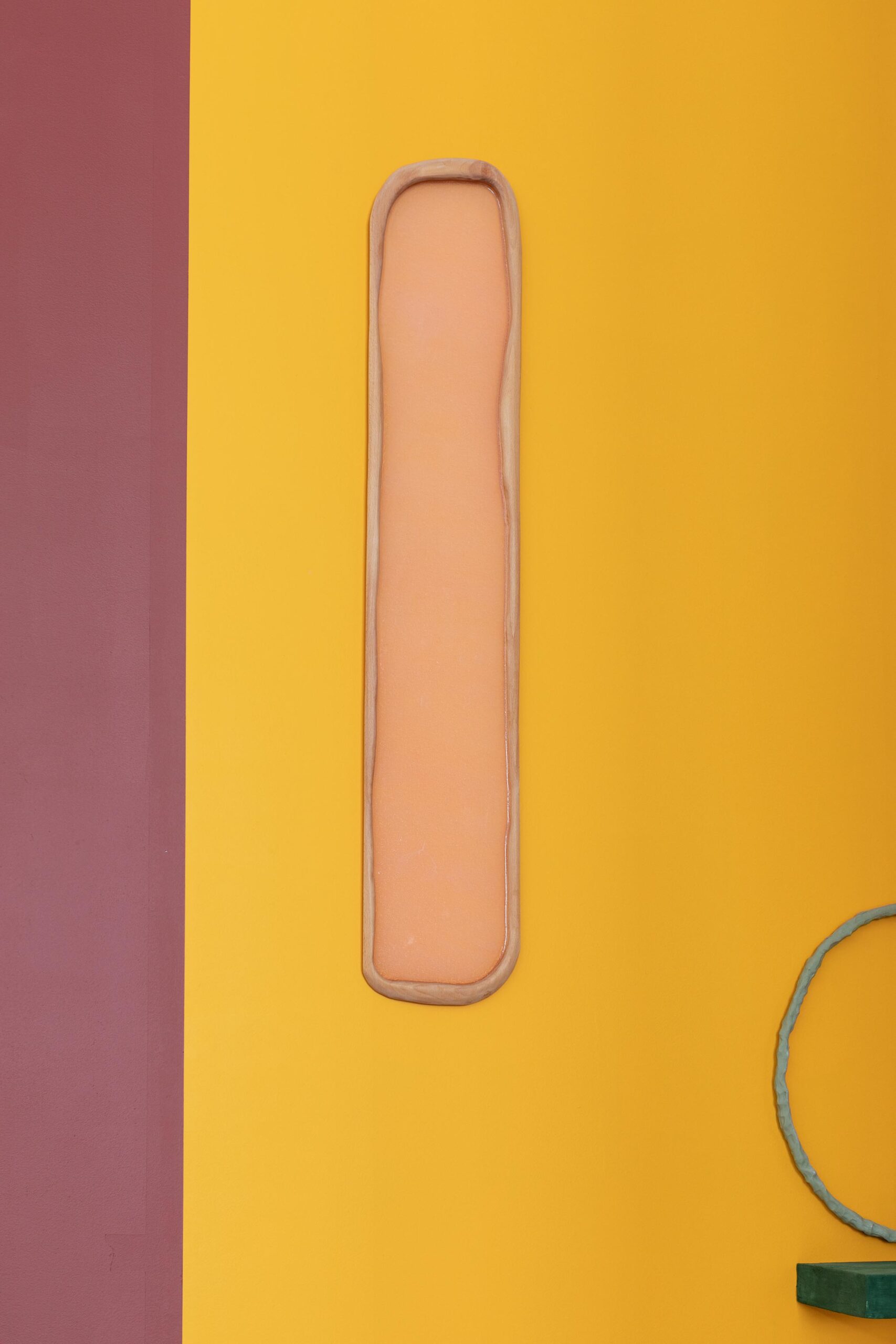
Marie Herwald Hermann, Double, 2021 Oakwood and silicone, 47 x 9 x 1 in. Photo by Clare Gatto. Courtesy of the artist and Reyes | Finn, Detroit.
Fashioned in oakwood, the irregular oval frame is reminiscent of a mirror in form and name. Double reminds us that a mirror image is a reflected duplication by means of light that only appears to be identical. Setting malleable materials such as latex, resin, or now silicone, alongside hard and durable stoneware and porcelain, allows for time and process to enter the work as silicone changes when it ages. That silicone is a material employed in kitchens and bathrooms, as well as in breast implants, as the artist reminded this author, expands on the larger theme of the work as a poetic meditation on everyday life.
“I like titles with hints at something romantic and beautiful, but also titles that withdraw in the end, and have a tone of sadness and melancholia,” Hermann revealed in a public interview with Glenn Adamson at Simone de Sousa Gallery in 2015. Reading the exhibition title And the Walls Became the World All Around Us in conjunction with the work titles reads like a nature poem: “whispers in passing, us, double, in passing me, in passing, you, three clouds, green as the woods I miss, and we watched, and the silence returned.” Like in a poem, meaning emerges by allusive references that are more or less present one moment, only to evaporate in the next.
To make ceramic sculpture speak to us in the manner of poetry, and with the intense visual satisfaction of radiant colors, interesting shapes and vivid textures, certainly feels like a tremendous artistic accomplishment. Anchored in the personal but speaking to the universal, Hermann’s walls advocate an integration of nature and culture, of work life and domestic life, of the visual and the textual, the sculptural and the pictorial.
Marie Herwald Hermann’s exhibition: And the Walls Became the World All Around Us at the Reyes/Finn Gallery through June 26, 2021.