Detroit Art Review

Critical art reviews of Detroit galleries and museums weekly

Matthew Hawtin @ David Klein Gallery

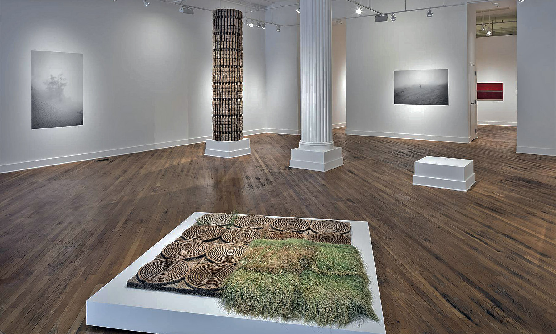
Matthew Hawtin, Installation image at the David Klein Gallery, image courtesy of DAR

In his Solo Exhibition, Matthew Hawtin Presents Minimal Abstraction

It seems fitting to mention that abstraction has been with us since the Russian artist Wassily Kandinsky migrated his landscape to a purely abstract form on canvas sometime in late 1910. I always make the comparison to music, since instrumental music is abstract by nature—it does not try to represent the exterior world, but expresses in an immediate way the artist’s inner feelings, from Mozart to John Cage.

The David Klein Gallery opened the Matthew Hawtin exhibit September 9, 2017, with pure minimalist abstract objects executing perfected forms and pristine surface qualities. These shaped canvases rendered in primary/secondary colors, could not be executed more flawlessly. Some are on “torqued canvas,” others on fiberglass panels, all accompanied by a variety of exquisite surfaces. The copiousness of Hawtin’s invention, and his conception seem to allow him to explore each and every multiplicity of these ideas uniquely.

Matthew Hawtin, Stargazer, 45 x 45 x 19, Acrylic on Fiberglass paner 2017

Hawtin says, “Although each series has its own technical demands, they all live in aesthetic parallel that blurs the line between artistic disciplines. There is a determination to continually push the work forward through aesthetic variations, technical refinements and experimenting with new materials. Within this forward trajectory, there is an overall vision to create art that is ‘other-worldly’ and in a sense, futuristic.”

Matthew Hawtin, Cardinal, 42 x 44 X 12, Acrylic on Fiberglass Panel, 2017

The basic context for Hawtin is the color minimalist from the 1970s, including Ellsworth Kelly, Frank Stella, Kenneth Nolan, and Anne Truitt. The secondary would be the shaped canvas artist, revisited recently in an exhibition by Luxembourg & Dayan in New York, with artists like Lynda Benglis, Elizatheth Murray, and Charles Hinman. Hawtin’s work is a hybrid of these two concepts that fights hard against representational artwork and abstract expressionistic painting, with a large degree of success. The new works that fit into corners are particularly interesting and unique. These works, composed of parallelograms, diamonds, trapezoids, rhomboids, and circles, are reductively streamlined, solid in their color and simplified in their forms that, forty years later, remain robust and encompassing in an array of approaches, especially with respect to the surface material.

Matthew Hawtin, Working in the studio, 2017, Courtesy of Artnet

Born in England, and then moved to Windsor, Canada in 1979, Matthew Hawtin earned a bachelor of fine arts degree from York University in Toronto and an master’s in architecture from the University of East London, in London.


Bryan Graf’s Photographic images: DEBRIS OF THE DAYS

Bryan Graf, Interstates, Shortcuts, A Factory an Open Field and a Few Homes, 2016 c-Prints mounted with cleats, 40 Unique, 8 x 10″

In the second gallery at the David Klein Gallery, the artist Bryan Graf focuses on Photograms, one of the earliest forms of photography, to create abstract tension between text and image, in a variety of scale.

Photograms are images made without a camera by placing objects directly onto the surface of a light-sensitive material, such as photographic paper, and then exposing it to light. Like drawing or painting, the process is like creating a collage without the need for scissors or glue. Rather, Graf has become highly skilled at controlling the process in the darkroom using color, shape and composition.

Bryan Graf, Chromatic Aqueduct, 40 x 74″ 2016, Unique Photogram and C-Print

Director of the David Klein Gallery, Christine Schefman says, “The photographs in Debris of the Days originate in a garden. It is a cultivation of ongoing works not limited to themselves, but rather a procession of generative images. Graf integrates his own gestural activity into the work by utilizing materials gathered on site as well the use of manipulations in the darkroom. His inquiry into the positive tension between text and image, as well as literary and musical influences, are evident in the arrangement of works for this show. His practice continues to reveal his interest in the history of photography and its relationship to design, painting and narrative fiction.”

Bryan Graf earned a bachelor of fine arts from the Art Institute of Boston and a master of fine arts from Yale University in 2008.

The exhibitions by Matthew Hawtin and Bryan Graf run through October 21, 2017

David Klein Gallery

Unpacking Frank Lloyd Wright @ MoMA

Installation view of Frank Lloyd Wright at 150: Unpacking the Archive. The Museum of Modern Art, New York, June 12–October 01, 2017. © 2017 The Museum of Modern Art. Photo: Jonathan Muzikar

The holdings of the Frank Lloyd Wright archive, jointly acquired by the Museum of Modern Art and the Avery Architectural & Fine Art Library at Columbia University in 2012, are vast—no surprise, since Wright’s career spanned a seventy-year trajectory. The archive’s holdings comprise 55,000 drawings, 125,000 photographs, and well over a quarter-million sheets of correspondence, not to mention models, architectural fragments, films, and other multimedia. If the celebrated 20th century architect were alive today, he’d be 150, and to commemorate his sesquicentennial the MoMA’s exhibition Unpacking the Archives presents over 400 works from the archives, offering an illuminating thematic and chronological survey of Wright’s career.

Installation view of Frank Lloyd Wright at 150: Unpacking the Archive. The Museum of Modern Art, New York, June 12–October 01, 2017. © 2017 The Museum of Modern Art. Photo: Jonathan Muzikar

The show’s title wittily puns on both the content of the exhibition, all gleaned from the newly-acquired archive, and on the show’s organization, for which twenty MoMA curators take an object of their choosing and explain (“unpack”) its relevance within the context of Wright’s career. This curatorial decision offers a refreshingly new approach to a survey of Wright, since some of his most iconic works (the Robie House, for example) are conspicuously absent, and viewers are introduced to some of Wright’s lesser known projects, such as his unrealized plans for Rosenwald School and his utopian Davidson Little Farms Unit.

Each of the exhibition’s fourteen galleries focuses either on a specific theme (ornament, ecology, circular geometries, and urbanism, to name a few) or an architectural structure (starting with the Imperial Hotel in Tokyo and culminating with the Guggenheim). Some gallery spaces reinforce some of Wright’s most characteristic attributes, such as his compulsive obsession with total design. Not content to merely design a structure, Wright famously maintained absolute control over all the interior furniture and furnishings, going so far as to show up uninvited on the doorsteps of prior clients to ensure sure that the totality of his interior design scheme remained unaltered.

Other galleries playfully stray from the conventional narrative arc of Wright’s career. One room, devoted to studio drawings, displays drawings by Wright’s own hand juxtaposed with drawings from studio assistants, making the point that the studio’s more refined and aesthetic “perspective drawings” were generally rendered by specialists, such as the manifestly talented Marion Mahony. Perhaps the most surprising and satisfying original drawings on view, simply because they burst with spontaneity, were the sketches Wright made on a napkin as he was working out some design problems posed by his mile-high skyscraper.

Frank Lloyd Wright (American, 1867–1959). Fallingwater (Kaufmann House), Mill Run, Pennsylvania. 1934–37. Perspective from the south. Pencil and colored pencil on paper, 15 3/8 × 25 1/4″ (39.1 × 64.1 cm). The Frank Lloyd Wright Foundation Archives (The Museum of Modern Art | Avery Architectural & Fine Arts Library, Columbia University, New York) © 2017 Frank Lloyd Wright Foundation, Scottsdale, AZ. All rights reserved

The exhibition is heavy on two-dimensional architectural layouts, floorplans, and perspective drawings, but there are also some examples of the furnishings Wright’s studio created, ranging from art-glass windows, furniture, tableware, rugs and drapery. Also on view are the elaborate sculptural models Wright produced to help pitch ideas to his clients. These include a model of his iconic Guggenheim, flanked by an early perspective-rendering of the building, reminding us that the structure was once to have been an alarmingly garish pink.

Frank Lloyd Wright (American, 1867–1959). Solomon R. Guggenheim Museum, New York. 1943–59. Model. Painted wood, plastic, glass beads, ink, and watercolor on paper, 28 x 62 x 44″ (71.1 x 157.5 x 111.8 cm). The Frank Lloyd Wright Foundation Archives (The Museum of Modern Art | Avery Architectural & Fine Arts Library, Columbia University, New York) © 2017 Frank Lloyd Wright Foundation, Scottsdale, AZ. All rights reserved.

Wright at 150 directly acknowledges Wright’s Michigan connection in its display of an elaborate layout Wright drafted for Kalamazoo’s Galesburg Community, known as “The Acres,” originally to contain a network of homes on twenty-one circular-shaped lots, though in the end only four were built. The exhibition also devotes significant space to his Usonian homes, the comparatively inexpensive do-it-yourself (in theory, anyway) home-kits Wright’s studio produced, intending to make quality architecture available to the middle class; the Detroit area boasts of three such homes: the Turkel House (Palmer Woods), the Smith House (Bloomfield township), and the Affleck House (Bloomfield Hills). And some of Wright’s textile patterns on view (such as his March Baloons, depicting an elaborate network of intersecting circles) have been adopted by Ann Arbor’s Motawi Tileworks, which produces a handsome line of Wright-inspired ceramic decorative tile.

Frank Lloyd Wright (American, 1867–1959). March Balloons. 1955. Drawing based on a c. 1926 design for Liberty magazine. Colored pencil on paper, 28 1/4 x 24 1/2 in. (71.8 x 62.2 cm). The Frank Lloyd Wright Foundation Archives (The Museum of Modern Art | Avery Architectural & Fine Arts Library, Columbia University, New York) © 2017 Frank Lloyd Wright Foundation, Scottsdale, AZ. All rights reserved.

Spread across a generous suite of galleries on the MoMA’s third floor, this exhibition at first glance seems perhaps austere (just one floor up, after all, are the reliably crowd-pleasing combines of Rauschenberg displayed alongside some of the zany 1970s kinetic works produced by the organization Experiments in Art and Technology). By contrast, Wright’s stately and geometric architectural plans on view in Unpacking the Archive seem emphatically cerebral, in some cases even displayed on mock-draft tables. But his ideas were revolutionary for his time, whether it be the need for sustainable architecture or for quality housing for all social classes, rather than just the proverbial 1%. And this cross-section of the Frank Lloyd Wright archive offers revealing and unprecedented access into the agile mind of an architect whose ideas remain uncannily relevant today.


Museum of Modern Art    Exhibition runs through October 1, 2017


To the End of the Earth @ Detroit Artists Market

“To the End of the Earth,” the new group exhibition at Detroit Artists Market, is grandly ambitious in its mission. As DAM’s press release states, it seeks to “… Bring together artists who seek to improve our bleak ecological reality through artwork that opposes political policy, presents objective data analysis, and conveys compelling emotional narratives.” This is an important show- it marks the importance of the humanities in general, and visual art in particular, in unpacking the increasingly urgent ecological crisis that is looming more heavily, day by day, on our planet and our lives.

Installation Image, Courtesy of Detroit Artist Market 2017 All images Courtesy of Detroit Artist Market

Curator Adrian Hatfield (himself no slouch as a painter of spiritual/earthly slippage- do check out his work) has assembled a group of artists who work predominantly in loving craft and visual narrative- there’s a refreshing lack of conceptual chillness to this show. The work largely avoids didactic environmentalist rhetoric, instead presenting us with feverish beauty and unsettling juxtapositions that ground examination of terrifying imbalance in the bones.

Dominique de Gery, Zug Winter, Oil on Canvas, 2017

Two standouts are Dominique deGery’s Zug Winter and Millie Tibbs’ Mountains + Valleys- Yosemite 4. deGery’s painting gifts uncommonly grand scale and highly developed technique to a familiar Detroit River view- her bisected horizon/underwater landscapes always make me think of Rothkos. She somehow manages to balance closely observed realism with visionary abstraction- a Hudson River School student granted multi-planar sight. deGery’s landscapes convey more about our delicate, wayward relationship with the land and water we live amongst than most artist statements or grim statistics could.

Millee Tibbs, Three Mountains & Valleys, Yosemite 4, Archival Print, 2013

It’s difficult to do interesting things with landscape photography these days. Millee Tibbs’ work is a notable exception. Her practice quietly probes unprecedented pockets in photographic imagery, spanning the figure, national monuments and many subtleties in between, unearthing the unsettlingly familiar and ungroundingly uncanny in every subject she engages. Mountains + Valleys- Yosemite 4 presents an iconic view of Half Dome, a famous, imposing feature of the Yosemite National Park skyline. This monument is one of the gods of nature photography, steadily indexed since the dawn of the medium. Tibbs’ layered meditation on the sublime, yet somewhat clichéd monument stakes its territory by manipulating the print itself, folding it into steep 45 degree angles reminiscent of paper airplanes. The delicate stratification of crease marks that remain once the print is again pressed flat enclose the phallic Half Dome in a yonic, halo-like embrace. On closer examination the jagged creases, like the mountain itself, turn out to be an illusion of captured light- Tibbs’ final image is a print of the folded print. This uncanny doubling casts everything about the image into doubt, except it’s frankly sexual examination of our relationship with iconic landscapes.

Clinton Snider, Senic Overlook, Mixed Media, 2016

More slow-burning revelation arrives through Clinton Snyder’s dirty/dainty mixed media sculptures, depicting meticulous miniature landscapes built atop found detritus of urban living. Scenic Overlook evokes the deceptive green crust floating uneasily atop a landfill, which is perfectly iconized by a worn-out old shoe.

While the truth of climate change and environmental degradation seems indisputable, one truth of our current relationship with these phenomena is that the message is not getting through. Statistics, studies, and choirs of frantic talking heads make facts readily available, along with steps that can be taken to slow the trajectory of climate change. The presence of all these facts in popular culture seems, on the ground, to change very little about the way we conduct our lives- at least in the Western First World. There is a need for new dialogs to open, in languages parallel to the logistical and statistic. Artists are uniquely suited to engage with this oncoming massive shift in our ability to bind and distill different forms of knowledge. For a scorchingly beautiful argument on this subject, see The Dark Mountain Project Manifesto.   “To the Ends of the Earth” presents some of the best artists working in visual narrative in Detroit right now, and lives up to its vision in providing a (much needed) new conversation on climate change.

“To the End of the Earth” is on display at Detroit Artists Market from September 8 through October 14.


Group Exhibition @ Oakland University Art Gallery

An exhibition, Ethics of Depiction: Landscape, Still Life, Human opens at Oakland University Art Gallery

Oakland University Art Gallery, Ethics of Depiction: Landscape, Still Life, Human, Installation Image Courtesy of OUAG, 2017

Rather than a Detroit-based solo artist or group show, Dick Goody, Chairman of the Department of Art and Art History, and Director Oakland University Art Gallery has curated an exhibition that draws on artists from various parts of world that provide an experience in imagery that questions fantasy, deception and truth. Fueled by contemporary image making, the exhibition is a collection of twenty-one artists ranging in gender, location, age, and location, providing artwork that includes photography, video, painting, and drawing. It could not be more diverse.

Goody says in a statement, “These works represent something just short of an inundation of content, and the presentation— “salon style” — affirms the idea that kaleidoscopic subject matter is enriching and arouses curiosity about the way in which contemporary artists use data and themes in their work to create a reflection of their lifespan on earth. The ethos of the exhibition sees parallels with the cabinets of curiosities from the past. Like the inquiring viewers of old encountering astonishing collections of objects, we today also experience a primary emotional connection to this type of work because its meaning is self-evident. Concurrently, the viewer’s entry point into these pictures is unclouded by unfamiliarity with Contemporary art. Anyone can find their way into these accessible depictions and explore the familiar, the strange, the formalistic and the conceptual stance of each image. But even using the phrase “conceptual stance” creates an unnecessary barrier between the viewer and the images. Perhaps it is much better to say “poetic stance.”

Richard Mosse, The Man Who Sold the World, 2015, digital c-print, 28 x 35″ Courtesy of the artist and Jack Shainman Gallery, New York

This image, The Man Who Sold the World, by Richard Mosse, an artist from Ireland, captured on infrared film, is shot in the Congo and feels like an ethnographic recording of workers, while moving away from a truthful depiction of the landscape. The reality of the image raises more questions than it answers.

Mosse says in a statement, “The subject of my work in Congo is the conflict’s intangibility, the irruption of the real beneath the generic conventions — it is a problem of representation. The word ‘infra’ means below, what is beneath. A dialogue about form and representation is one of the work’s objectives so I don’t think it’s a bad thing if people get hung up on the way Congo has been depicted, rather than what is being depicted.”

Jasper de Beijer, The Brazilian Suitcase (Part 2) #1, 2017, c-print 44.5 x 67 inches Courtesy of the artist and Asya Geisberg Gallery, New York

When I first experienced this image, I was taken back by my own thoughts of a place where a shrine was erected to the remnants of a Brazilian airplane. Again, this feels like an ethnographic image capturing a cultural act by what might be described as third world tribal individuals living in the jungle of Brazil. The images of Jasper de Beijer, an artist from the Netherlands, seem to want to break the perception of what we see as real, juxtaposed and complimented by our own experience and memory.

He says in a statement, “We experience reality through interpretation. For me, the most interesting feature of this process is that the interpretation of reality gains a new actuality, forming a corpus of imagery that becomes more and more disconnected from what actually took place. This is where images start to lead their own life — becoming more or less autonomous.”

Becky Suss, Hallway, 2017, oil on canvas, 84 x 180 inches Courtesy of The West Collection

The very large oil on canvas painting, Hallway, 84 x 180, by the artist Becky Suss from Philadelphia, dominates the entrance to the exhibition. This flat, neutral depiction of an empty house captures the mundane. If it were 6 x 12” on board it might pass as a postcard. The scale plays a major role in requiring the viewer to stop and study the contents, calling on our own memories and perceptions. In this work and for that matter all artwork, we bring our own experience to the moment and that is what can make all the difference. This idea works in the same fashion for all artwork.

Suss says in her statement, “In terms of the painting world, I do feel like sometimes there’s a dismissal of subject matter: “What is it? It’s just a room. It’s just a domestic interior. What does it mean?” There’s this idea that somehow it’s not terribly meaningful. But so much of our time is spent in these domestic spaces; they are where the scenes of our lives play out. Again, it’s something that’s undervalued. It’s taken for granted in some ways, like it’s an undeserving thing for a big painting to be made about.”

David S. Allee, Fireworks, 2016, dye sublimation metal print, 48 x 72 inches Courtesy of the artist and Morgan Lehman Gallery, New York

The photographic image, Fireworks, by David S. Allee, made me stop and study the large work, 48 x 72”, a dye sublimation on metal. I was first drawn to the image by the even lighting in the foreground and the sky, which led me to the question of exposure. Upon close examination, the viewer can observe movement in the detail of people, disclosing a long exposure time for the image. From the title one can assume we are viewing a group of people viewing fireworks, but the light source is intriguing and a mystery.

He says in a statement, “Structure, environments, spaces interest me for the stories they tell and layers of meanings they can describe. Photos of these forms usually require people to look closely, study, interpret and infer. If a viewer is drawn into an image of a built environment, they’re forced to use their imagination to understand it, make sense of it and in effect complete the image. The more an image has this relationship with people who view it the more successful I see my artistic process. I also have great interests in architecture and planning and a desire to build and create. Photographing these forms and framing them probably also helps to fulfill some of these desires.” After seeing the image, one can reimagine the landscape romantically, and change your perception of an experience. David S. Allee earned his MFA in Photography from the School of Visual Arts in New York City.

For this writer, this exhibition clarifies the role of a university gallery, especially with respect to their freedom to explore new ideas without the concerns of commerce. Goody at OAUG, focuses in his curatorial work, on educating his university students and raises the bar on exploration, dialogue, and meaning, not just for the students, but also for the Detroit Metro area at large.

Oakland University Art Gallery

Ethics of Depiction: Landscape, Still Life, Human runs through November 19, 2017


Fall Exhibitions 2017 @ BBAC

The Birmingham Bloomfield Art Center kicked off its 2017 fall season with exhibitions in all of its galleries, highlighting painting, sculpture, photography and ceramic work.

Birmingham Bloomfield Art Center, exterior, 2017

For a non-profit that was established in 1957, the BBAC continues to connect people of all ages with art from every part of the Detroit Metro Area.  These new exhibitions in all the galleries are good examples of how they provide venues for a large variety of artists.

The current exhibition in the large central gallery is an exhibition titled Simultaneous Contrast and illustrates how differently two artists approach figure painting. It is interesting that both artists came from the L’Anse Creuse High School program under the instruction of Ken Hoover during the early 1970’s and then went on to pursue their different paths in visual art. 

Christine A. Ritchie, Primary Passage VI, Oil on Canvas, 36 x 60″

In her painting Primary Passage VI, Ritche demonstrates her interest in process and the intrinsic qualities in oil paint where she delivers a loose abstract expressionistic interpretation of the figure(s). The surface, the brush-stroke action, and the moment, characterizes the way she renders the human form. Supported by strong gestural drawing the painting successfully communicates movement.  She says in her statement, “My work with the figure has been ongoing and is related to my interest in the qualities of figurative movement and the idea that there is a “shared” sense of the human figure moving through space that creates a “felt” or identifiable rhythm that belongs to and is uniquely recognized.” 

For this writer, the artist came along at a time when influences from the 1960’s, artists like Arshile Gorky and Willem de Kooning, were taking the art world by storm, supported by New York critics, Clement Greenburg and Harold Rosenberg.  But the language of painting the human figure as been with us since the art work done in the prehistoric caves of Dordogne, France and will be with us for some time to come. Christine A. Richie holds a MFA in Painting from Pratt Institute in Brooklyn, NY where she lived and worked for 23 years before returning to a studio in Detroit.

Kip Kowalski, IGGNOIRANTS, Oil on Canvas, 30 x 38″

The contrast to Richie’s work is the Picassoesque figurative paintings by Kip Kowalski is dramatic, hence the title of the show, Simultaneous Contrast.  These satirical figure paintings incorporate a kind of surrealistic still life component. In the oil on canvas, IGGNOIRANTS, Kowalski dishes up a surreal one-eared female figure, a pear and a dead bird on a string with abstract elements in the wand and background.  He says in his statement, “My work is an audacious and blasphemous satire of human ignorance and apathy that confronts the absurdities I find in contemporary religious beliefs.  I tackle the biblical lore that is celebrated as fact over the findings of empirical science, such as the denial that evolution is real. My work is also a reaction to the pervasive attitude in many secular and non-secular societies, including our own, that women are the lesser gender.”  

Kowalski’s paintings are grotesque at times as he admits, in that it may cause uneasiness to the viewer.  Are these visual distortions metaphors for the imperfections in our anatomy?  In the end, most people have a visceral reaction to viewing a work of art as opposed to the intellect, directing them to say either I like that, or not for me.  I find myself going back to Picasso in this work, whose painting from the mid-1930’s, especially the women seated series, remind me that he was the most prodigally gifted artist of the twentieth century. So when viewing Kowalski’s work, I make an effort to see his measure of detachment, perhaps even skepticism that results in a form of intrigue.  Kip Kowalski graduated from The Center for Creative Studies with a BFA and maintains a studio in the Detroit area.

Russ Orlando, Modifiers, B&W Photographic image

In the Robinson Gallery, the work of Russ Orlando combines sculptures, collages, totems and a row of photographic self-portraits that portrays this artist as having a variety of interest in media and execution. The row of black and white photographs are self-portraits that stand together as one piece and seems to this writer to be theatrical in nature and not part of a body of photographical work. 

He says in his statement, “When I start a work, I tend to gather materials that I find may be useful to me. When combining the materials, I try not to make much sense out of my choices for fear of being too rational.  In the end, the work should serve as only a stopping point, prompting many questions but leaving them unanswered.”  

Russ Orlando, Untitled, Slip Cast Porcelain, Gold Leaf, and metal stand.

The Untitled work of these three birds, slip cast porcelain, with the interior of gold leaf is interesting, assuming they are not commercially made and altered, which would make them found objects. The base height seems right, but I would prefer more attention is made to the base’s top material: not plywood, but stone, or glass. Perhaps these works are like the artist says, stopping points, prompting many questions, but leaving them unanswered.  Born in Detroit in 1964, Russ Orlando received his Bachelor of Fine Arts from Wayne State University, Detroit and his Master of Fine Arts from Cranbrook Academy of Art, Bloomfield Hills, MI.  As part of his Kresge recipient statement he says his work is informed by the lure of the sell, shaped from his many years as an advertising agency art director. His sculptures and performances-which he calls experiences-often employ his body as a flash point for social criticism and a viewer’s self-examination.

Rosemarie Hughes, House of Homage, Encaustic, Photo Transfer on Wood Panel

The BBAC has a Ramp Gallery that currently has the work of Rosemarie Hughes.  The smaller and more intimate work is base on a theme, The Home. In her statement she says, “My art is based on the idea of a home. I strive to create work that draws the viewer to take a closer look.”   Originally from the Detroit area, Rosemarie has lived and studied in Austin, San Francisco and London. She received a BFA and MA in photography but her passion for working with textures and a variety of materials ultimately led to her identifying as a mixed media artist.  She currently resides in the Detroit area where she divides her time between her studio and working as a licensed massage therapist.

The Birmingham Bloomfield Art Center is a model for communities through out the region to visit and learn how a non-profit can enrich their citizenry by offering classes, workshops, and exhibitions.

Birmingham Bloomfield Art Center 

Page 57 of 79

Powered by WordPress & Theme by Anders Norén